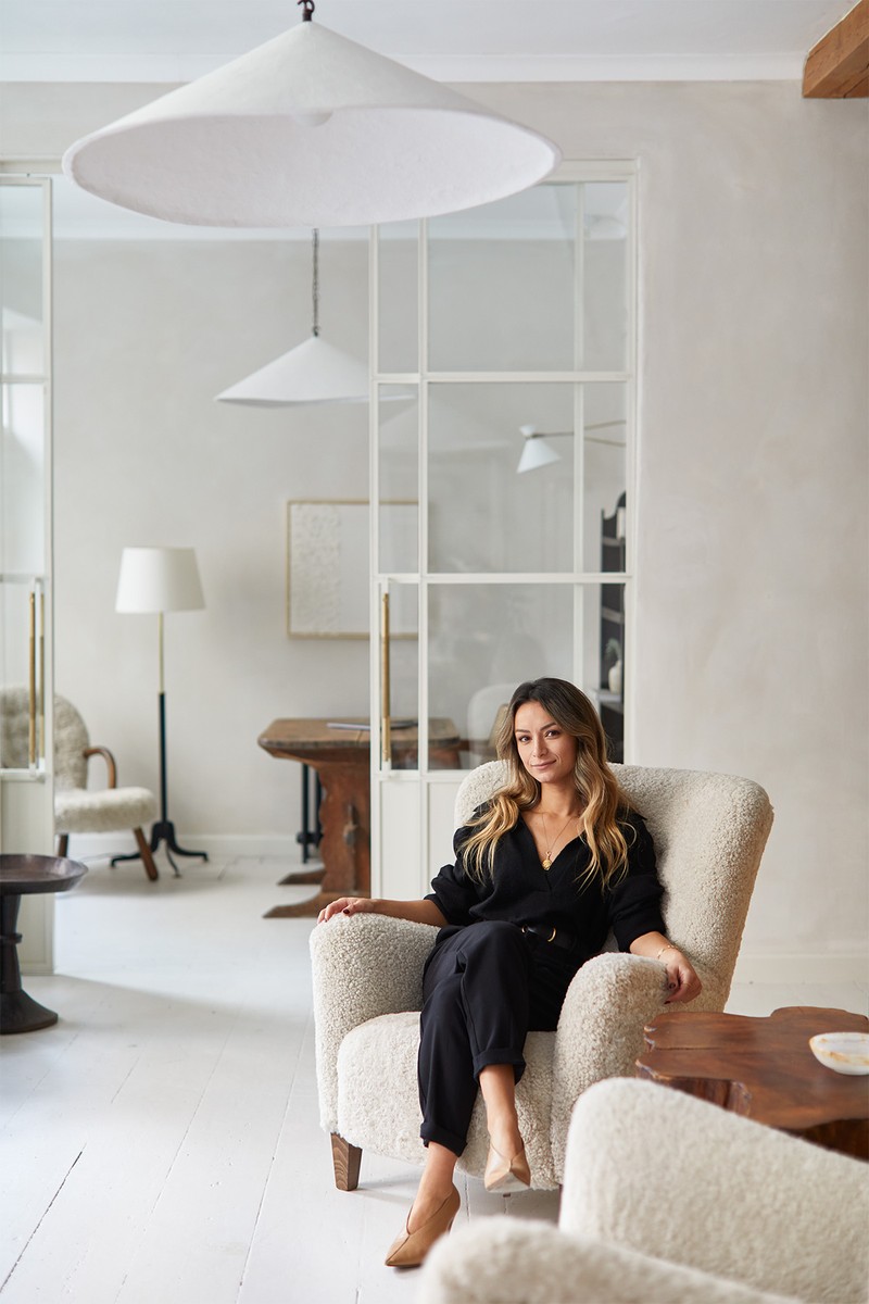
Meet The Interior Designer: Murude Katipoglu
Background
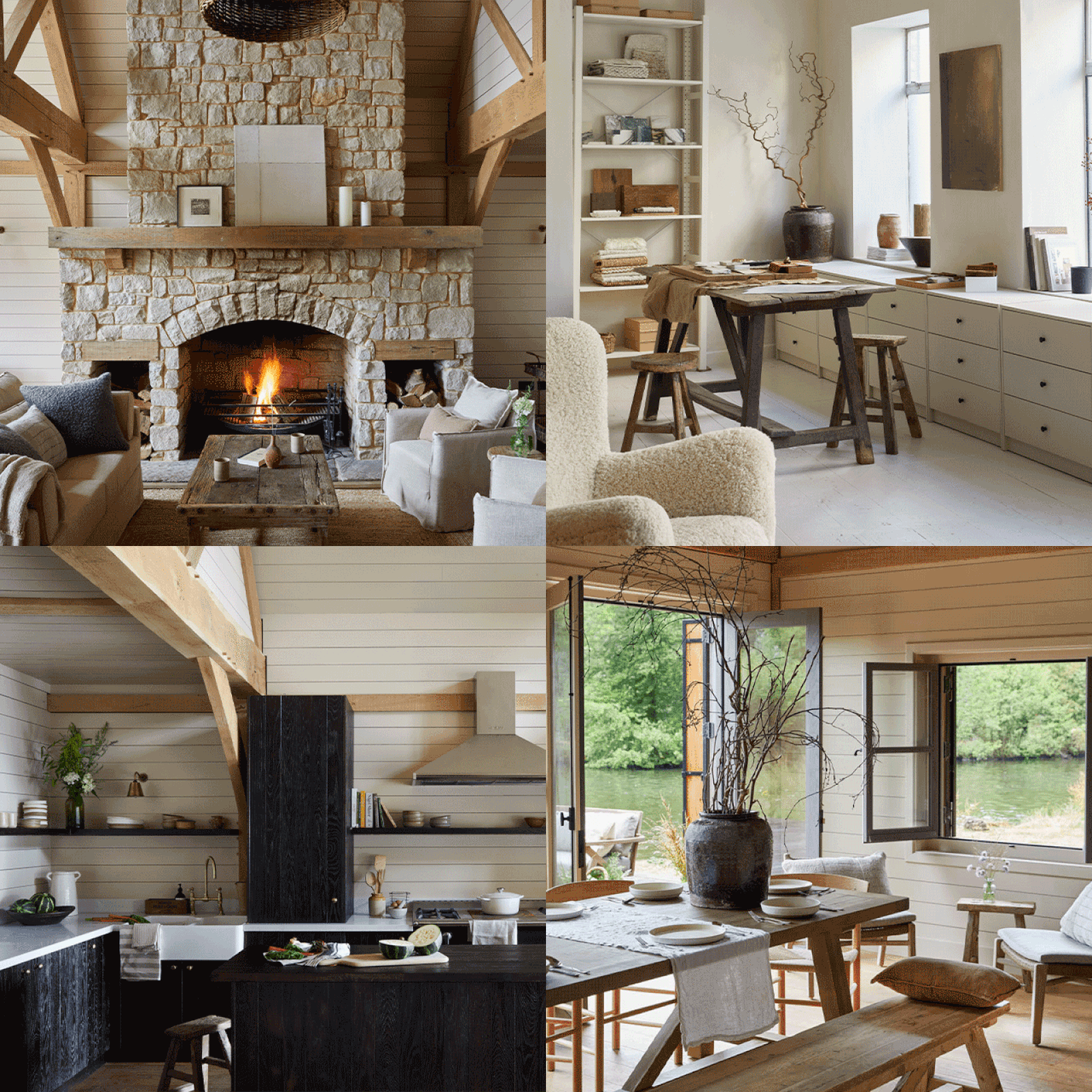
Growing up in Cyprus I was surrounded by nature and diverse history. As a result, I have a deep appreciation for natural materials and a love for textures and handmade furniture – especially pieces made using traditional techniques or antiques that have been passed down the generations.
Interiors have a substantial effect on how we feel and from a young age, I was curious about people's houses and how they live. I’ve always enjoyed visualising how spaces could look – even with the smallest of enhancements – so training in interior design felt like a natural path.
After graduating from Kingston University, I spent seven years working for reputable design studios on high-profile hospitality and residential projects in London. In 2017, I set up my own studio and Design Stories was born.
Design & Inspiration
My love of natural materials and textures is reflected in all the projects we work on. I like creating spaces that evoke emotions and connections – what you experience in the space is equally as important to me as how it looks. The studio's design aesthetic is best described as refined and eclectic, with a hand-finished quality.
We start each project by getting to know our clients and understanding their lifestyle, what matters to them and how they want to feel in that space. Whether it’s a residential or commercial project, we start by asking ourselves what we want to achieve with the design. The common threads between each project are usually elegance and warmth – two elements which are most apparent in the various finishes and furniture that ages well.
Nature, people, spaces and materials are all elements that excite and inspire me. The mix can change for each project. Sometimes we get to work on a historic building with plenty of history; sometimes we’re inspired by an antique we’ve sourced, or it can be our clients who we draw our inspiration from. It really depends.
There are so many wonderful designers who inspire me, too, especially Rose Uniacke’s use of old and new and Axel Vervoordt’s appreciation of natural materials and simplicity. Finally, Ilse Crawford’s passion for wellbeing is always a source of inspiration.
Colours & Materials
Nature is a significant theme in all the colour palettes we use. The colour palette depends largely on what emotions we’re trying to evoke in the space. You’ll often see neutral, tonal tones layered with shades of greens or deep blues in our work. For warmth, we use rusty tones of pink, corals, terracottas and mustard yellows.
As for materials, I love textured aged wood with lots of character and marble with strong contrasting veins. On the walls we love combining polished plaster and lime paint with heavily textured linens, bouclés and cashmere. I’m drawn to woven fabrics with lots of texture and love using rich mohair and velvets.
Finishing Touches
Artwork is incredibly important in any space. People build personal connections with art and it has the power to tell stories; without it, the project would never feel complete. Any good art collection should be mixed and varied – I’m fond of abstract art with some texture, be it woven, fabric, ceramic or acrylic; all of it can bring an added dimension to a room and can soften the space. We also love incorporating tall plants, too, and greenery plays a big part in our interiors. We have a black olive tree in the studio, which reminds me of Cyprus – it’s one of my favourites.
Accessories are also critical when it comes time to complete the project and bringing the vision to life. We dress all our interiors ourselves by sourcing antiques and mixing them with handcrafted pieces and the clients’ own heirlooms to create a space with a lived-in feel. When you pay attention to the small details, it makes a huge difference.
Instagram Accounts To Follow
I follow a lot of inspiring people, including great suppliers, interior designers and design accounts around the world. Try @Timeless.Interior.Design, @AmberInteriors, @WorldArchitectureInterior, @RoseUniacke and @Rosie__Seabrook for beautiful interior photos. For styling ideas follow @ColinKing and for inspiring content around interiors and antiques add @HouseToWrite to your feed.
01
Boathouse, Ewhurst Park Estate
Inspiration
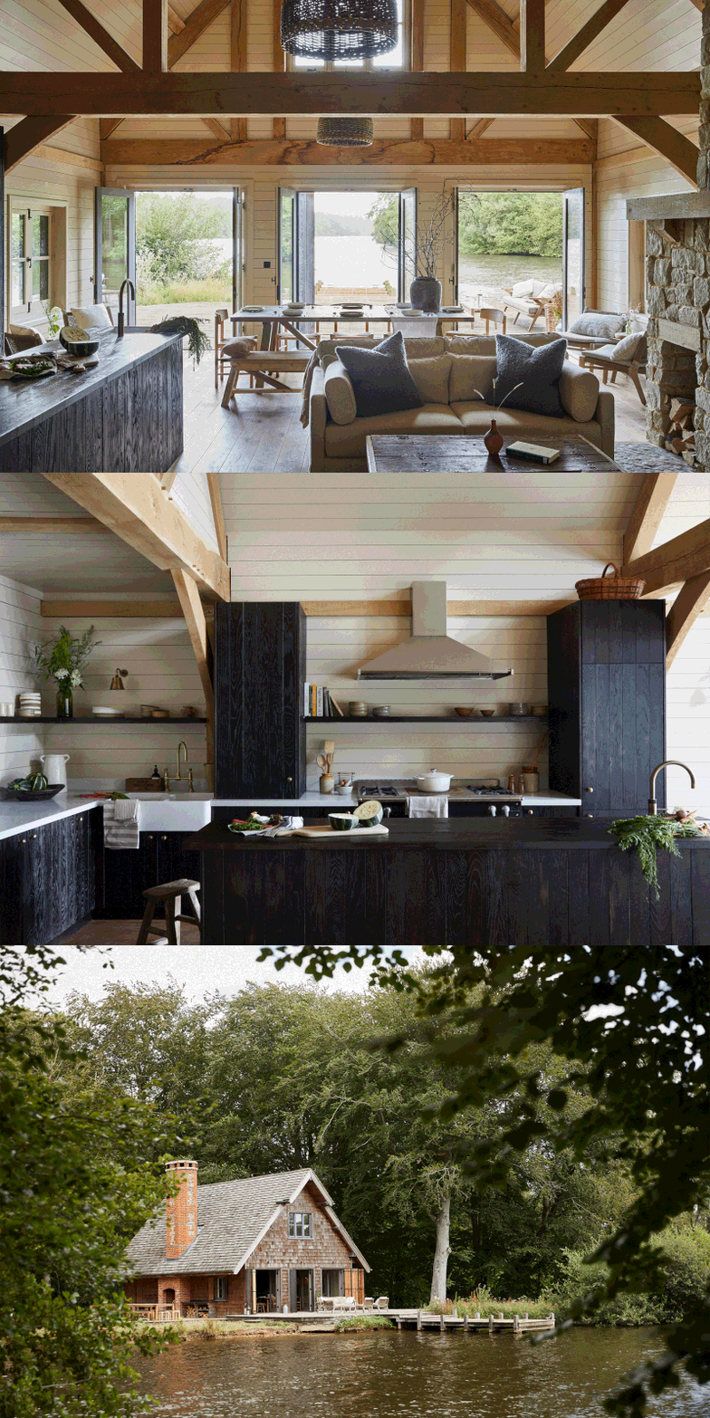
A charming timber building on a lake with stunning views, this boathouse is surrounded by nature – which is was gave us most of our inspiration. The aim was to create a calm and cosy space, with an open plan kitchen and dining area for long lunches and dinner parties overlooking the lake.
Planning
Previously, the space was very dark. The walls were painted dark grey, the furniture was all heavy brown leather and the small kitchen wasn’t functional. We knew the space needed to be lighter and that the layout needed to change to allow people to socialise. We designed a larger kitchen with open shelves and an island unit to help people gather and cook together. We also added extra counter space to house the under-counter wine fridges.
Colours
We selected a subtle colour palette of natural materials, rich textures and neutral linens to give the house warmth, energy and serenity. Light painted timber cladding contrasted beautifully with the rich tones of a bespoke solid oak kitchen and the walls are painted in Archive by Farrow & Ball.
/https%3A%2F%2Fsw18.sheerluxe.com%2Fsites%2Fsheerluxe%2Ffiles%2Farticles%2F2021%2F11%2Finterior-spotlight-murude-katipoglu-boathouse-ewhurst-park-estate-02-fb_0.jpg?itok=DU50QKYC)
Materials
We wanted the kitchen to have a rustic feel but still with clean lines, so we used open-grained oak for the cabinetry and paired it with a marble countertop. We love how the large Belfast sinks work with aged brass taps.
We picked heavy neutral linens for the sofa and chair upholstery and added some heavier textured fabrics like the bouclé cushions. A sisal rug, which is a very durable choice for high traffic areas, was selected for the main living area, along with woven rattan stools to add some extra warmth to this fireside spot.
Lighting
Because of the double-height ceiling, we wanted large pendant light fittings that gave off enough light while making a statement in their sculptural forms. We had large hand-woven willow basket lights made, which introduce yet more texture. Antique brass wall lights make a similar statement, and there are adjustable lights over the timber beams on the ceiling.
02
Lynette Avenue
Inspiration
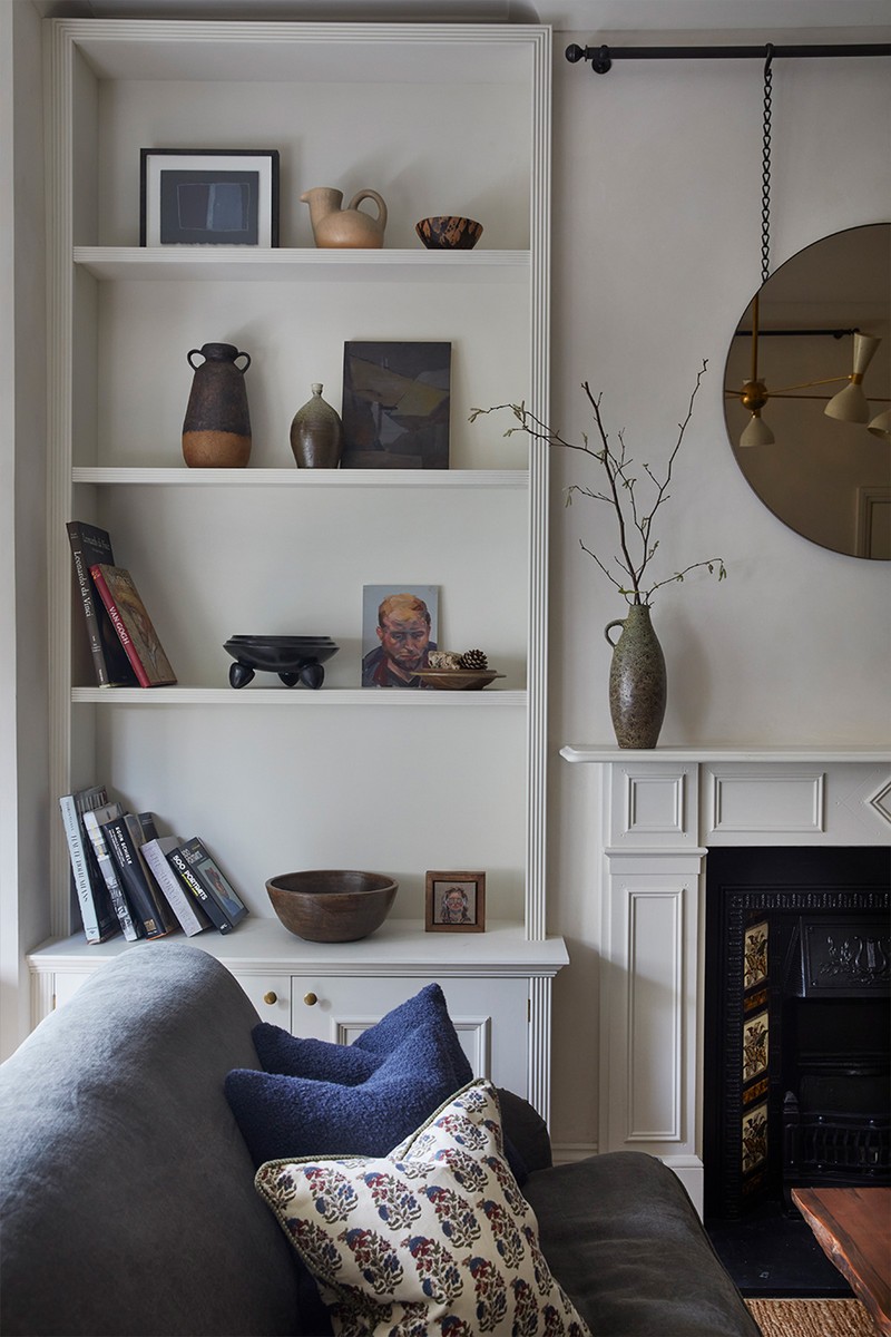
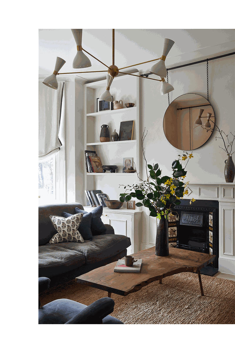
This west London house was designed with various moods in mind; the living room had to be calm and elegant; the master bedroom had to be as comfortable and luxurious as a high-end hotel, and the kitchen, dining areas and guest bedrooms had to be welcoming spaces in which to entertain loved ones.
Planning
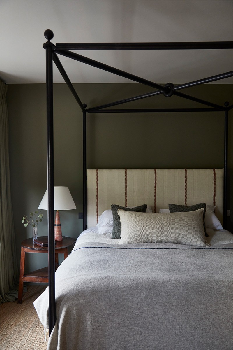
The clients asked us to bring more life and soul to the home, so we identified the colour and material palettes for each room individually. We teamed up with talented craftsmen to make the bespoke furniture and joinery and started collecting antiques and light fittings to bring some depth to each room. The bespoke four-poster bed was one of the many pieces designed by us in the studio. It was made by a talented UK-based blacksmith – everything, in fact, was made in the UK using traditional methods.
Colours
In the master bedroom, we paired the walls (which were painted in Treron by Farrow & Ball) with heavy linen drapes encourage this feeling of calm. We also added pockets of colour with coral-coloured upholstery details, such as the bed head fabric in Baratillo by Zak + Fox.
We wanted the living room to feel as elegant as possible, so we selected a lighter colour palette with a lovely limewash paint from Bauwerk on the walls, calming conifer green linen upholstery on the bespoke sofa, and the deep blue grey corduroy on the antique armchair.
Materials
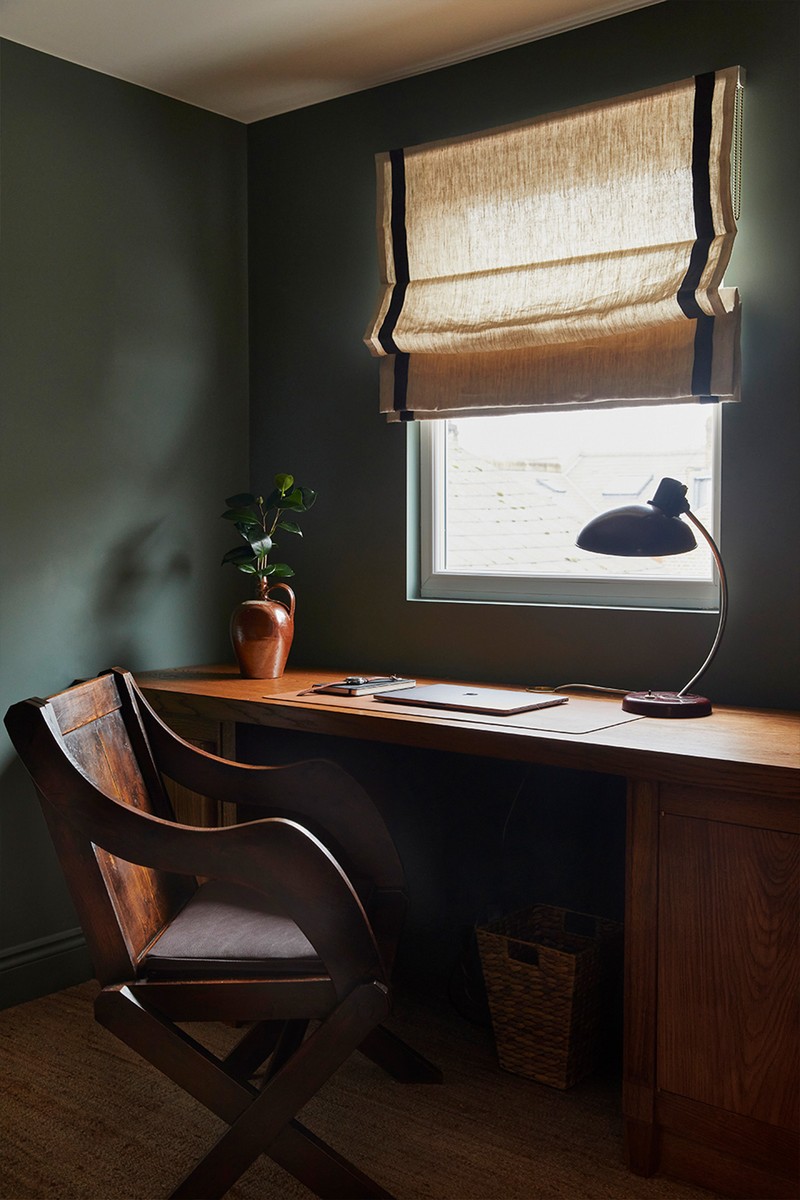
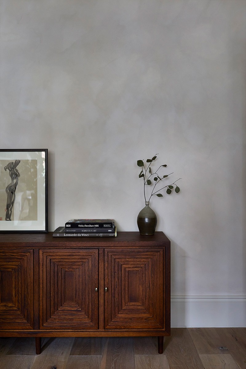
Throughout the house we used lovely fabrics from Howe 36 Bourne Street, Guy Goodfellow, Zak + Fox, De La Cuona, Robert Kime and Soane. The sisal carpets are by Tim Page Carpets. For the hard finishes on the bespoke joinery, we used a mixture of solid oak and elm, blackened steel and antique brass and bronze detailing.
Lighting
Lighting was a mixture of antique and new fittings. Above the dining table we installed a pair of alabaster lights from Robert Kime and one of our favourites was the reclaimed coral marble lamps in the master bedroom by Retrovious.
03
Design Stories Studio, Bermondsey
Inspiration
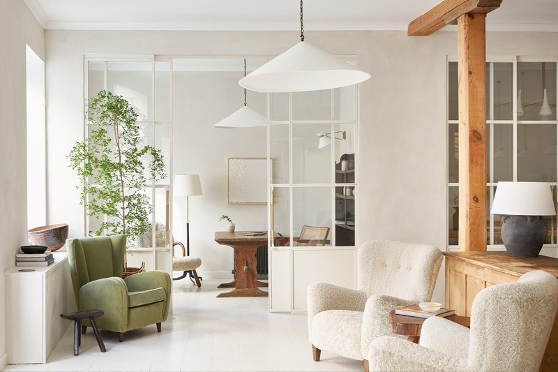
Our new studio space was once a former leather factory, although each floor was converted into different office spaces a while back. The iconic original pine pillars, which celebrate the history and heritage of this space, are still here, but we needed to strip down the rest.
I wanted the space to feel as refined as our studio aesthetic. It was important to me that it felt serene, comfortable and welcoming – almost domestic in feel but very inspiring to work in.
Planning
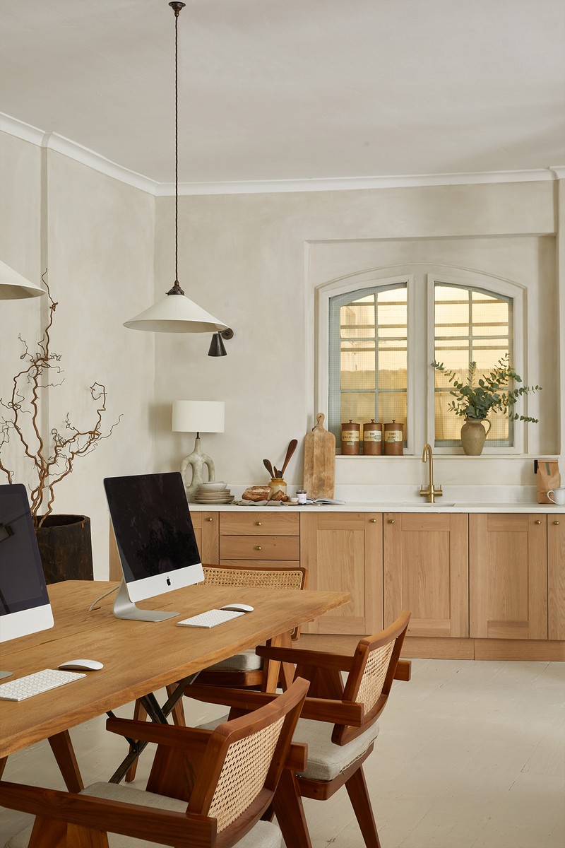
We needed to make sure the space could accommodate all our needs, while supporting collaborative work and creativity. It also had to allow for privacy for meetings and space for our ever-growing sample library. We designed a communal table for all the designers to be able to sit together and an open plan kitchen to create a homely feel.
We also designed bespoke Crittall-style screens to zone meeting rooms, while also allowing light to travel throughout. The sample library is one of the most used spots in the studio, and revolves around an antique primitive table. It’s where we work on our sample boards, and acts as a gathering spot for team lunches and drinks.
Colours
The colour palette is light and calm, which acts an understated backdrop to all our mood boards, samples and schemes. We used limewash paint on the walls by Bauwerk, which adds depth and texture and the timber floorboards are painted in Farrow & Ball, Skimming Stone.

Materials
We also have a mix of light and dark oak with aged brown leather, cream bouclé, lovely green velvet and cane upholstery. They are all timeless materials and fabrics. The Crittall-style screens arepowder coated in metal, and we have aged brass and bronze detailing throughout. Comfortable armchairs were a must, which is why we have several beautiful pieces dotted around the studio.
Lighting
Decorative lighting is what made this space special in the end. We love working with plaster, so when I saw the large wobble lights by Alexandra Robinson at the New Craftsmen showroom in Mayfair, I knew they had to be in the studio. They are simple but so effective. In the meeting room, a 1950s Italian chandelier sits alongside a mixture of ceramic pendant lights. In the kitchen we have Ripley bronze wall lights by Fosbery Studio.
Visit StudioDesignStories.com or follow @Design_Stories on Instagram.
Photography by Helen Cathcart
DISCLAIMER: We endeavour to always credit the correct original source of every image we use. If you think a credit may be incorrect, please contact us at info@sheerluxe.com.
