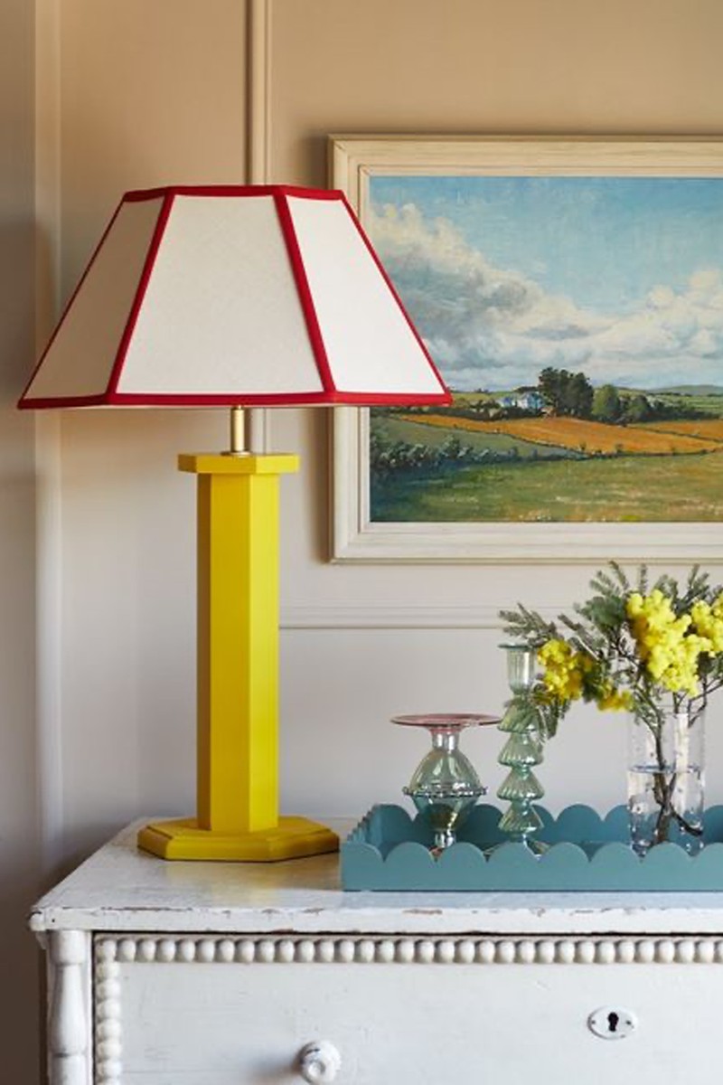
Interiors Trend Watch: Yellow
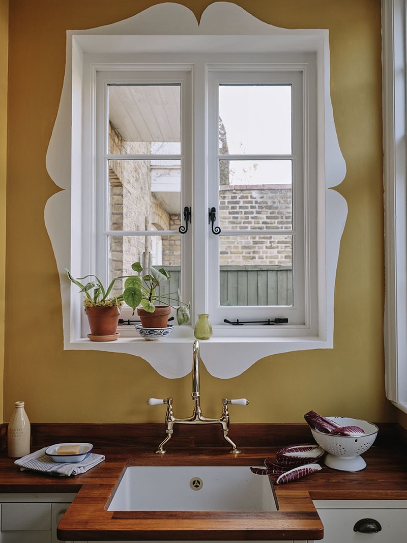
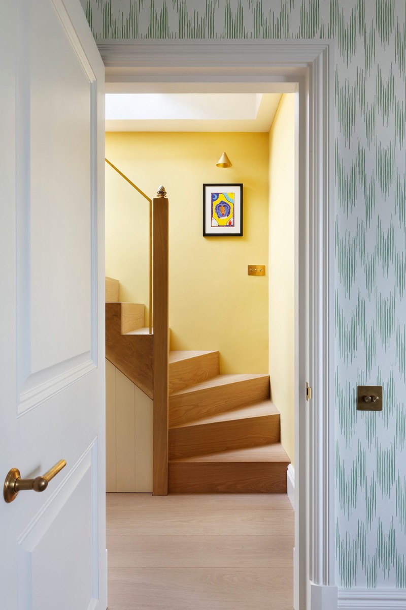
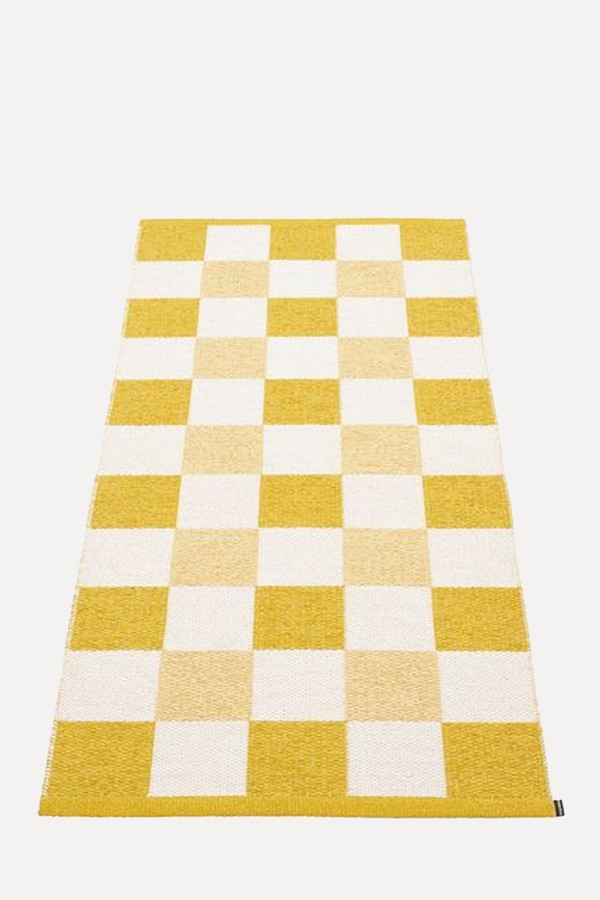
From hidden pantries and kitchen units to headboards and runners, buttermilk yellow is everywhere. What’s different from the yellows we’ve seen before? “I’d describe it as a gentler, more primrose yellow,” says Laura Stephens, who recently used this in-demand tone in a rug collaboration with Bombay Sprout. “Rather than mustards, which were a big trend a few years ago, I feel like the industry’s moved towards a softer shade, which is actually so much easier to work with. It’s more multi-seasonal too; it works really well with neutrals and adds plenty of warmth.”
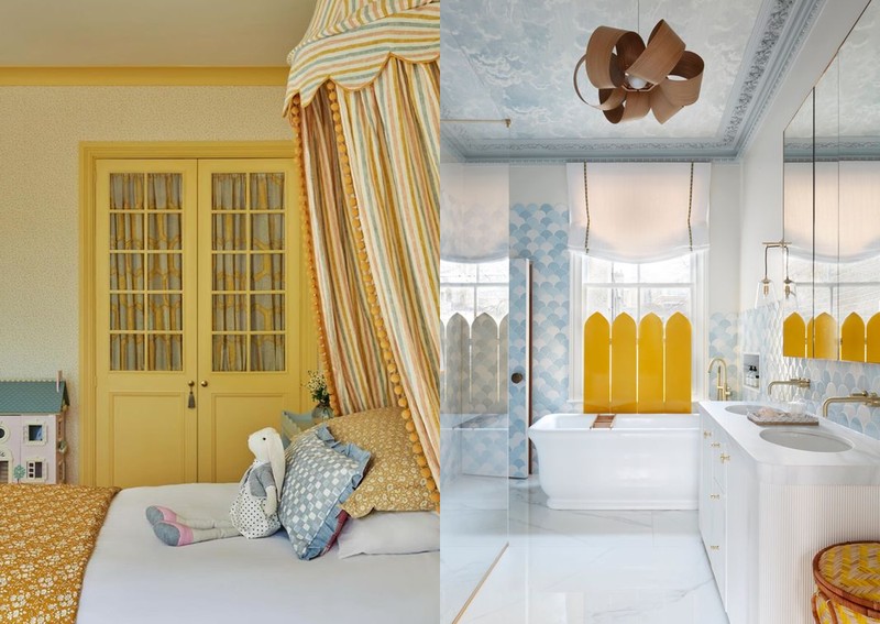
As well as looking good on kitchen units, the new yellow works well in pantries and utility rooms – but best of all, its versatility allows you to be bolder in the colour pairings. “I did buttermilk yellow cabinetry in a kitchen project recently and we contrasted the island by painting it a deep red – it worked really nicely, and it looks great with blue, too. By contrast, in my daughter’s room I’ve just done her headboard and valance in this yellow – it’s really soft and easy to blend with pinks and neutrals. It works with floral fabrics too, but whatever colour you’re using, the two need to connect – for example, by having a warm or cooler, grey undertone to both,” adds Laura.
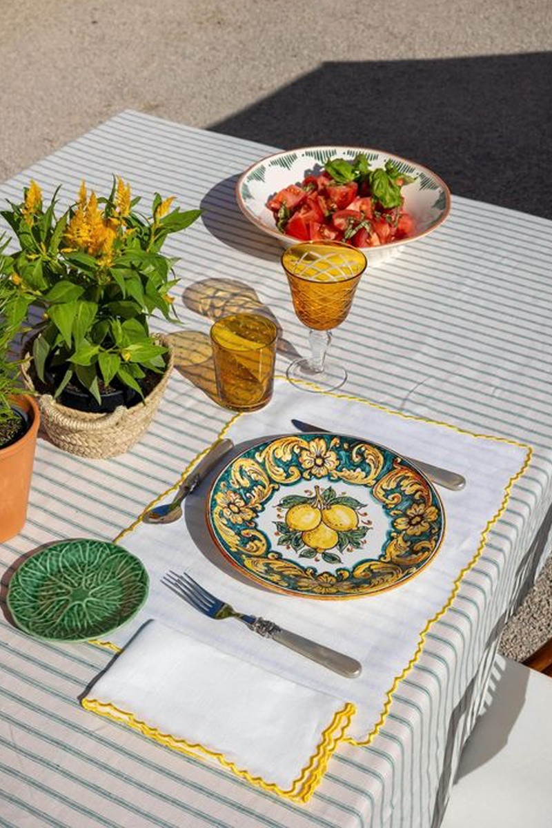
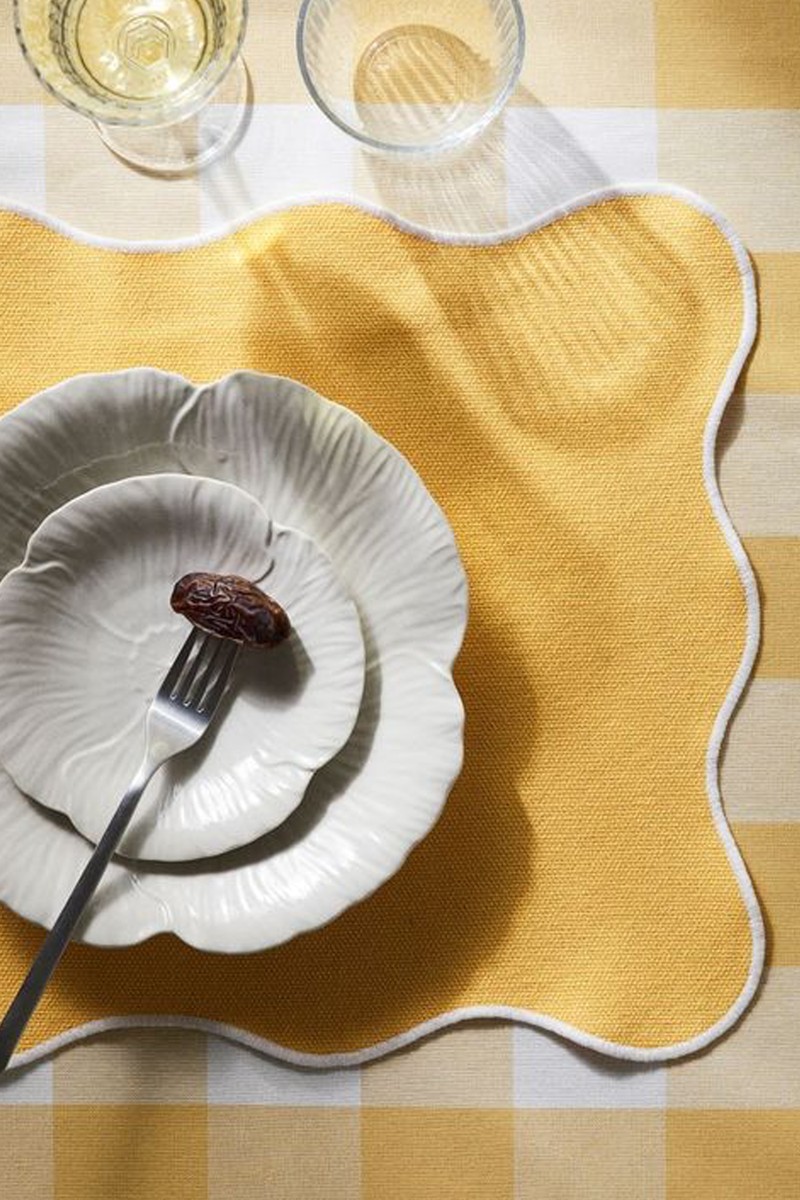
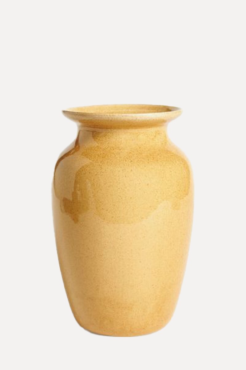
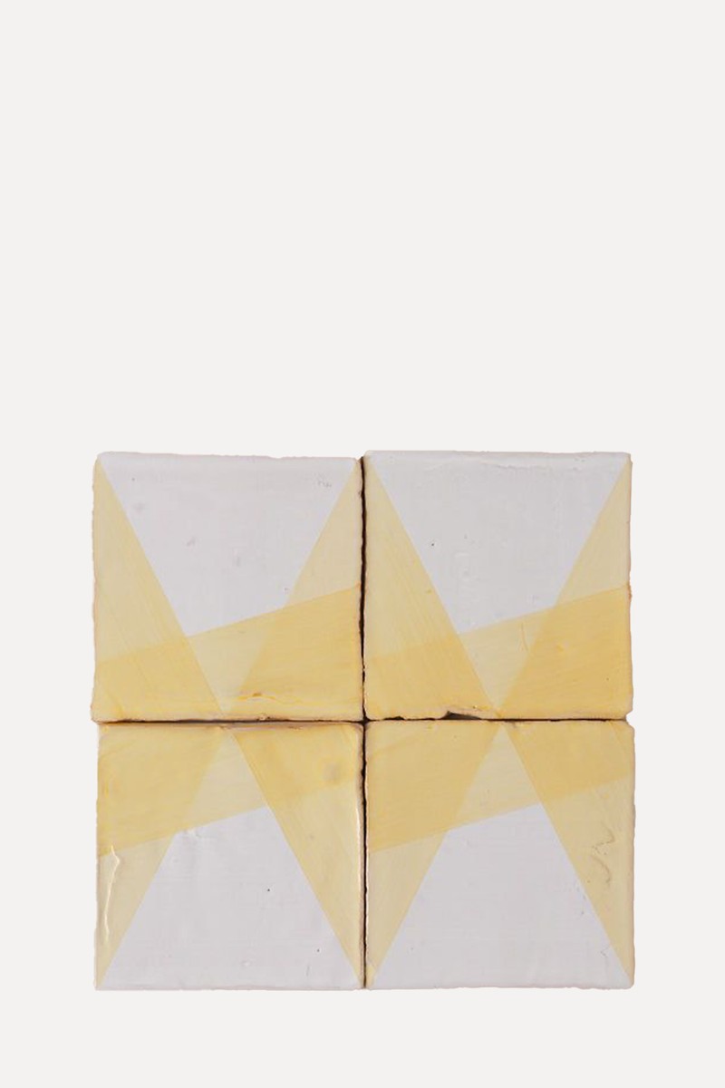
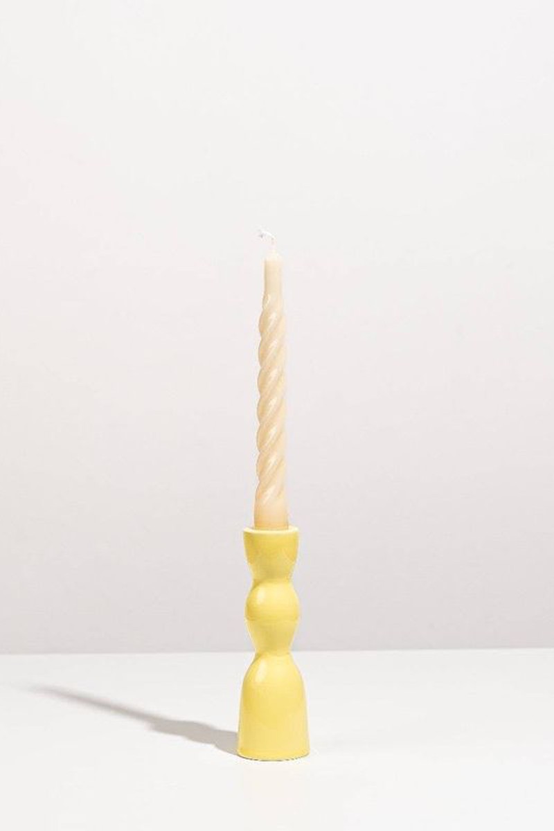
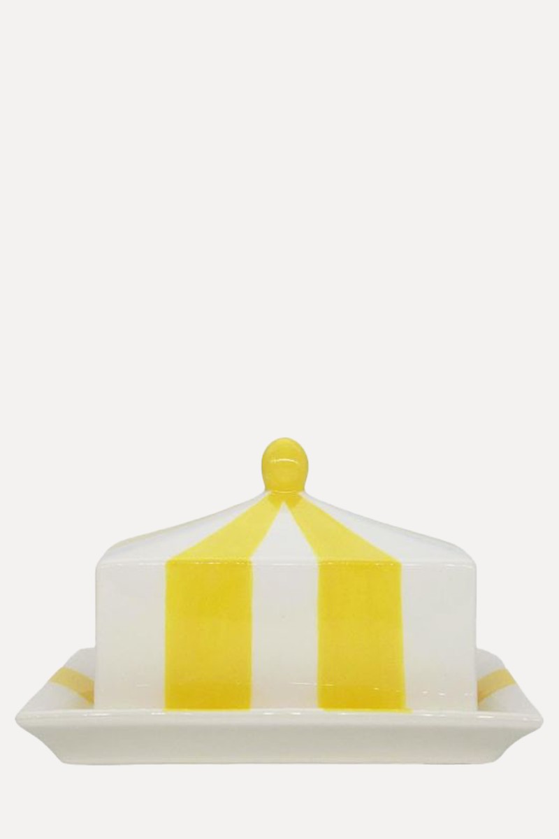
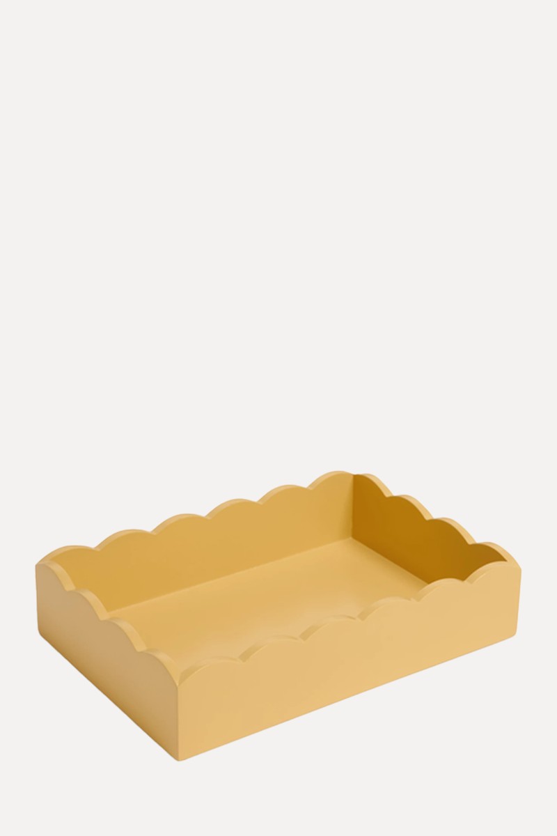
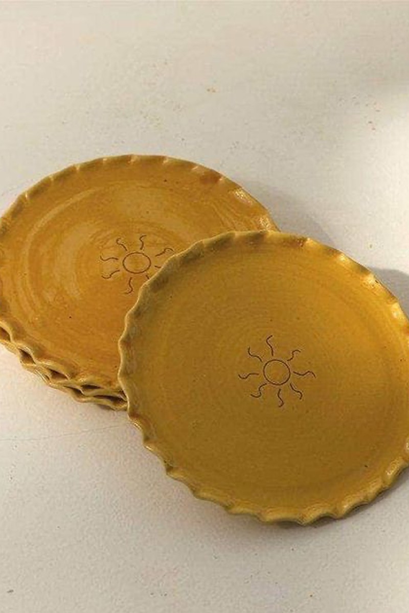
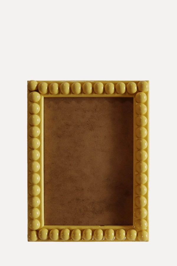
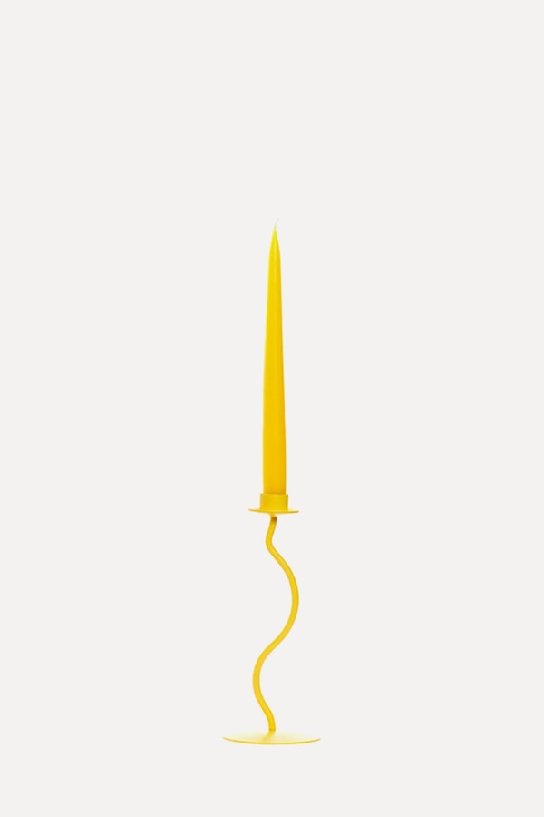
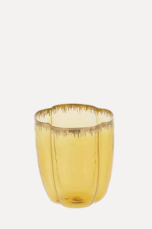
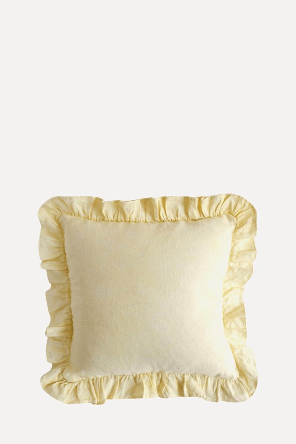
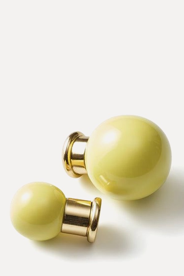
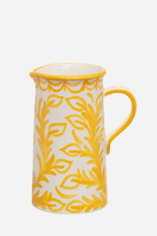
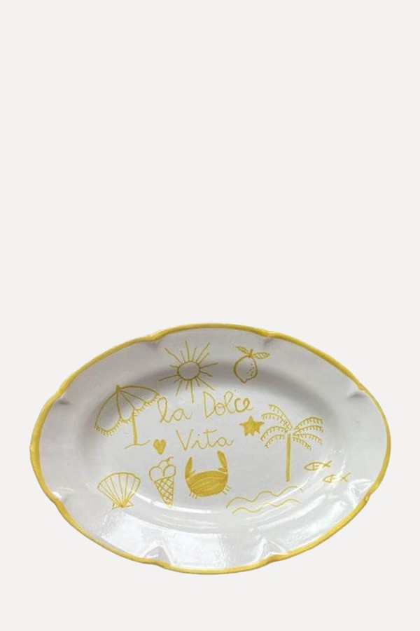
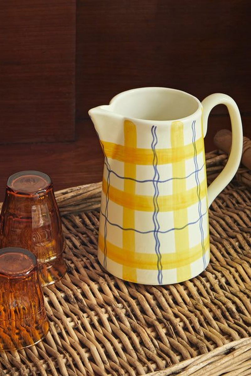
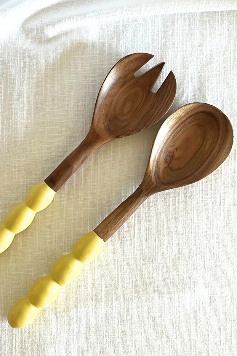
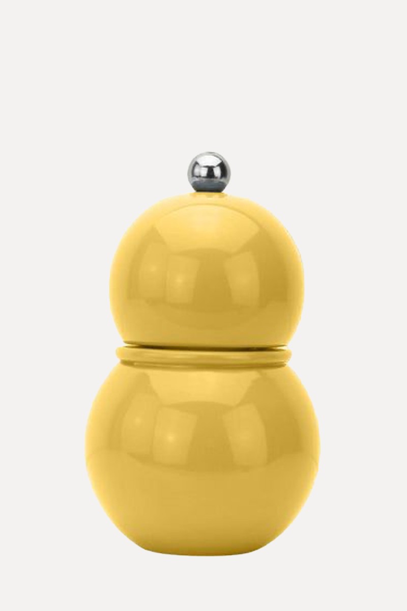
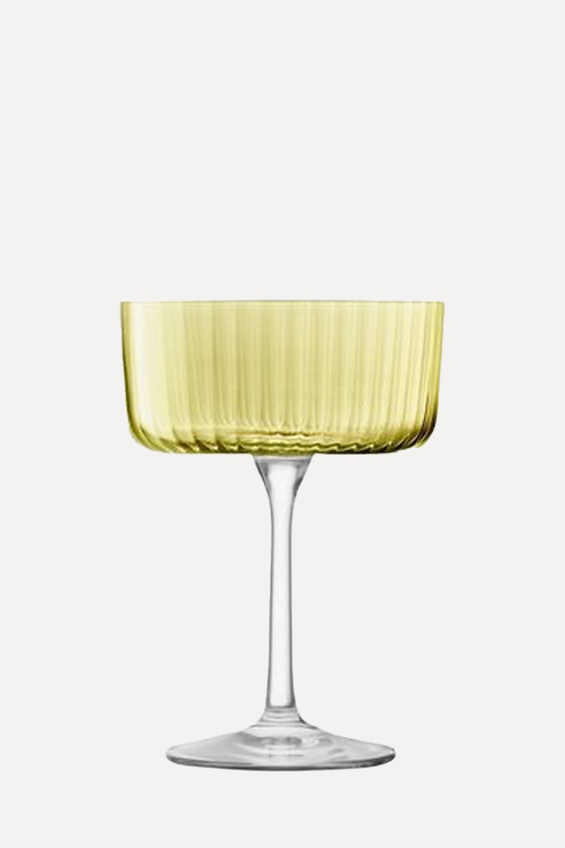
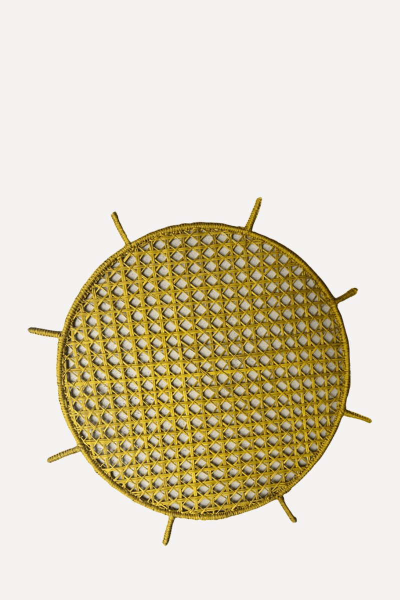
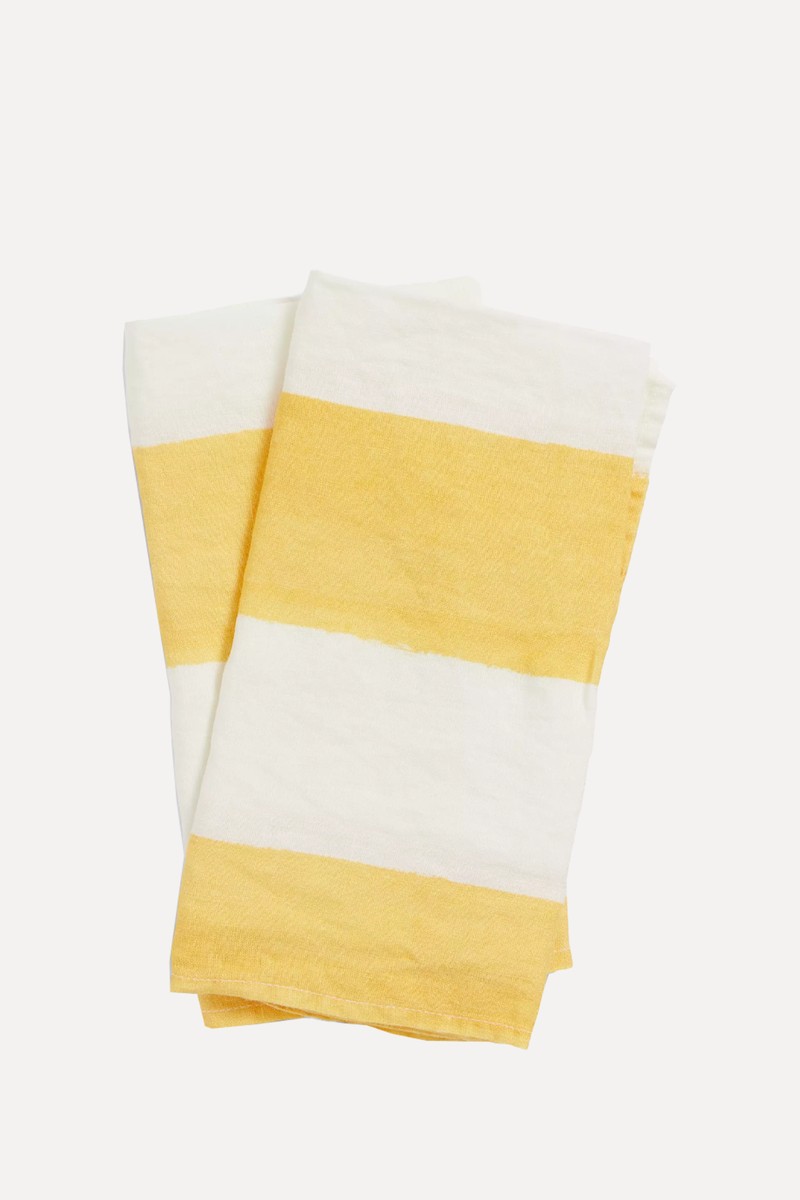
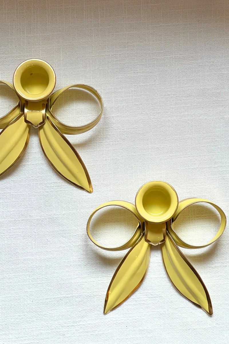
Not quite ready to repaint your kitchen? There are plenty of accessories out there to help you get the look…
DISCLAIMER: We endeavour to always credit the correct original source of every image we use. If you think a credit may be incorrect, please contact us at info@sheerluxe.com.
