Top Tips From A Cool Interior Designer
Style & Inspiration
I would describe my style as refined, soulful and fresh.
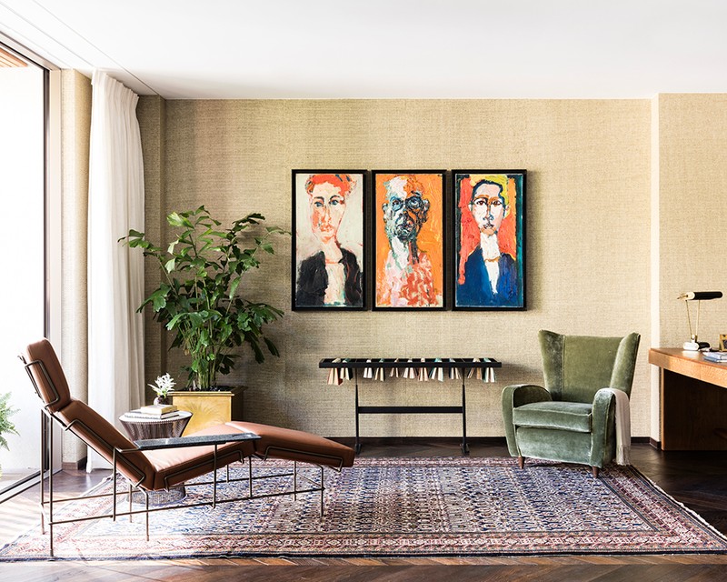
I aim to create places that people really want to spend time in. Our goal at Studio Ashby is to bring authenticity to each project, not only in the selection of furniture, lighting and art but by using a natural palette of materials and textures. We are generally unswayed by the passing dictates of fashion, and instead draw on a love of antiques, colour, contemporary world art, modernist furniture, photography and our latest discoveries to deliver an eclectic richness to each interior.
My husband’s store, Casely-Hayford in Marylebone, has been my favourite project. It’s such a personal project filled with objects that we’ve collected over the years. It was a family project where everyone pitched in to create an incredible space that’s full of memories.
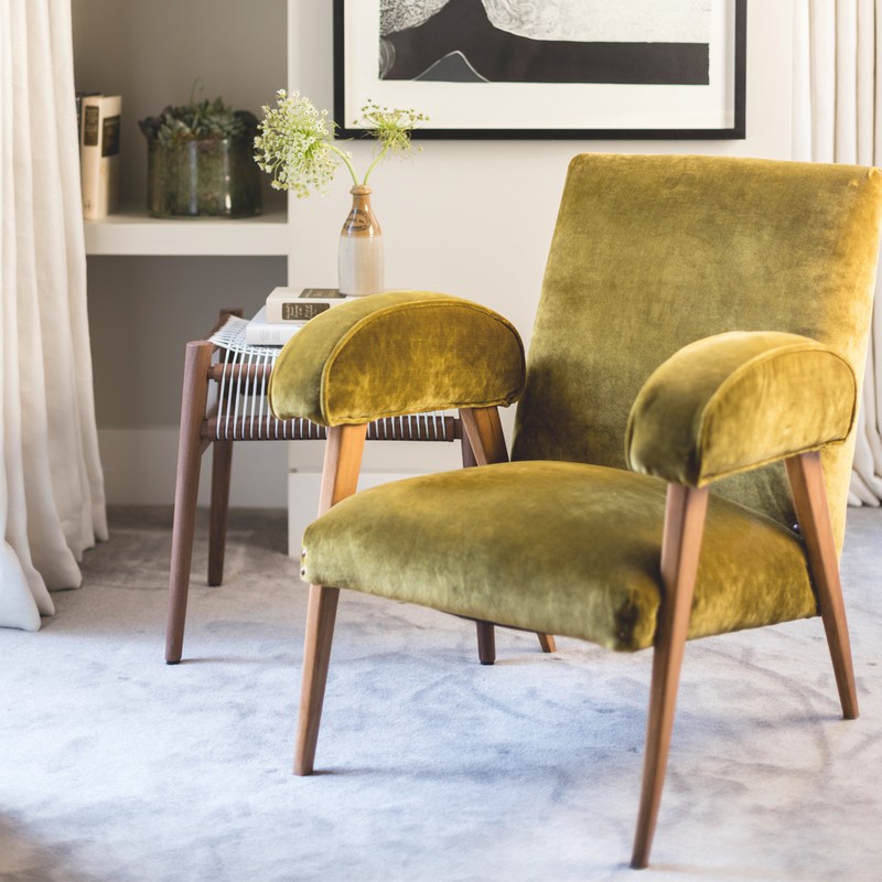
I love using earthy tones and nature-inspired colours; rusty orange, yellow, khaki and greens...I am obsessed with green. Growing up in South Africa has heavily influenced the colour palette and materials that I like to use.
My favourite rooms to design are home offices or studies. They are always quite small, cosy, characterful, spaces and I so dream of having a beautiful office at home.
Travel is one of my biggest sources of design inspiration and visiting different places always clears my head; I spend my holidays sourcing beautiful things and finding local suppliers. I think a lot about the Bushveld and the Karoo; the greens, yellows, heathers, clays and burnt oranges, and after sunset how all the colours change.
I always feel inspired, naturally, by South Africa - it’s where I grew up, and I’m always inspired and invigorated when I come back. The contemporary art and design scene there is incredibly exciting - so a morning of that, followed by lunch on the side of a mountain, in a vineyard with enough time to catch sunset on the beach is the best of everything.
I’m inspired by so many designers - Jacques Grange, Miuccia Prada, Lorenzo Mongiardino, Frank Lloyd Wright, Phoebe Philo and Joe Casely-Hayford amongst others.
Planning
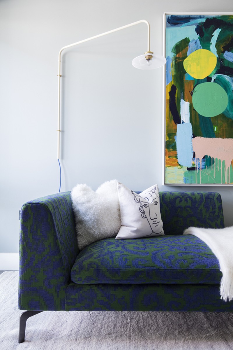
I always start with the art when planning a room - it’s so important in every space. In my opinion a room feels empty without it.
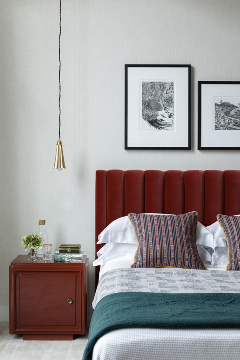
The best way to enhance small spaces is to keep the floor clear to make the room feel light and airy - so sofas, bedside tables and beds all raised on legs and feet. Go for a big rug, it will help make the room feel larger.
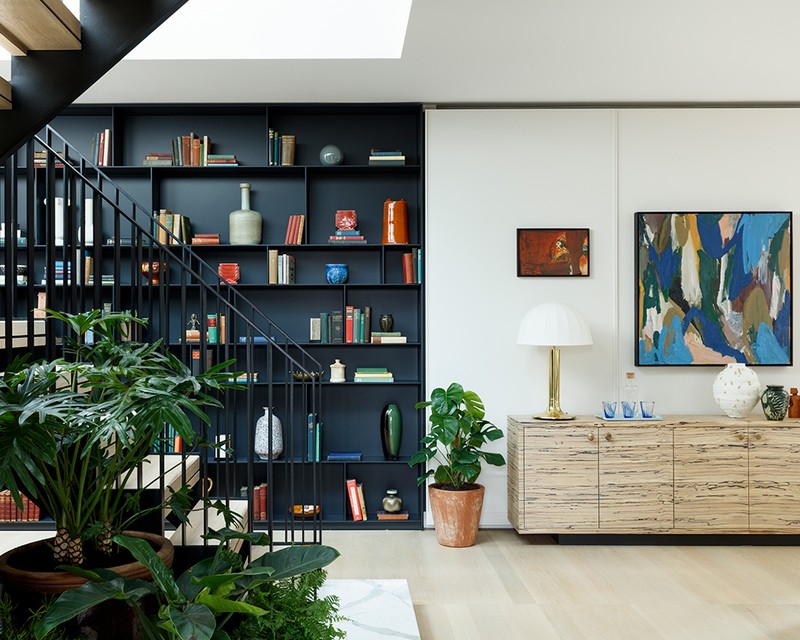
Large spaces are often harder to furnish than smaller areas if you’re looking to create a homely atmosphere. The key is to create clear zones using verticality to your advantage; a floor lamp and tall plants can help enclose areas and make them feel more intimate. Rugs are useful for dividing up the different zones of a room and anchoring the furniture to those spaces.
Decorating
I create an interior space as I would curate an art collection: with much consideration over each piece, its setting, its neighbours and its position within the room. It's about collecting a few quality pieces, like a beautiful Modernist chair or a coffee table from the Forties, and using them to speak for the rest of room. Personally, Modernism will always have a timeless appeal. I like to incorporate classic pieces from the era into my design schemes, alongside clean flooring, walls and surfaces. Quality over quantity will always be my mantra. Try eBay and 1stDibs for classic pieces.
You can use as many colours as you like providing that you keep the colour scheme harmonious throughout. Ensure everything works together and doesn’t jar. I would say if you choose three as a base, add one more to create that element of pop and surprise.
I don’t think there really are any rules when it comes to using colour, but I like to play around with opposites, so using a floral for one piece but a geometric for another.
I don’t follow trends - I think if you do, particularly in your home interior, you by definition create something transient rather than timeless.
The most important part of a kitchen is storage, storage and more storage. It’s also the specific journey of making a cup of tea - you should be able to get from kettle, to mug, to tea bag, to fridge, to bin without really moving too much!
I like timber flooring in a kitchen if it’s open plan and connects to the living room space. If it’s enclosed or separate I like stone, it’s practical and hard waring. When it comes to worktops, I would usually go for a beautiful marble which won’t stain too badly.
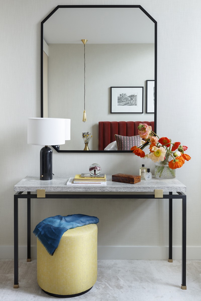
For lighting, choose one key pendant per room and then complement it with ambient lighting with table and floor lamps. I don’t like to use more than one pendant per room as the ceiling gets too busy. The colour of the bulbs are important as it can affect the rest of the colours in the space, I prefer a warmer yellow light to a cold, blue light. Oh, and don’t forget dimmer switches!
My advice is always to invest in original artworks - they last forever and increase in worth, whereas the value of most lighting and furniture sadly depreciates. Artworks can bring life to any space and can move with you easily making them constants in your life. I love finding new artists on Saatchi art or a graduate art shows.
Save on your glassware and ceramics as they have a horrible tendency to break - you don’t need to spend a lot to find beautiful pieces. Try Habitat for great glasses and vases, they champion interesting and innovative makers. And if you’re on a tight budget, plants are a great way to add a bit of life and soul without spending much money.
Where you go for:
- Furniture – 1stDibs
- Fabrics - Pierre Frey and Dedar
- Joinery - Treeslounge
- Kitchens - Lanserring
- Wallpaper - De Gournay
- Paint - Paint and Paper Library
- Lighting - Fiona McDonald
- Flooring - Dinesen
- Tiles - Emercy and Cie
Visit StudioAshby.com
DISCLAIMER: We endeavour to always credit the correct original source of every image we use. If you think a credit may be incorrect, please contact us at info@sheerluxe.com.
