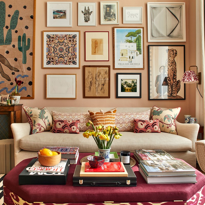
Meet The London Designer With The Element Of Surprise
STYLE & INSPIRATION
I like to create spaces that naturally come together. It’s important for rooms to be able to grow over time and ultimately stand the test of time. Originality and an element of surprise is important to us, so we definitely try to take risks and be bold with our use of colour, texture and pattern, while keeping comfort and usability high on our priority list.
The building itself is always the starting point. We take into account the context, architectural features and period before beginning the creative process. Every project is so different and we want our clients to feel like they’re getting a bespoke service.
My favourite project was 5 Hertford Street. We had the amazing opportunity to work with couture designer Rifat Ozbek on the design, procurement and installation. His taste is wild and wonderful, to say the least. Having now worked alongside Rifat on many projects, we are constantly inspired by his fearlessness in the face of clashing patterns and colours.
The cities that influence and inspire me are Lisbon, Seville or Istanbul – each of them is full of original craft and design which has emanated across the rest of the world.
Many designers inspire me. I love how Henriette von Stockhausen at VSP Interiors mixes antique furniture with contemporary colours and prints. Veere Grenney is an expert at making timeless schemes; Max Rollitt makes some wonderful antique finds; and there is such fun in the way Sarah Vanrenen uses colour and layers antiques and fabrics.
Usually I find inspiration in magazines like House & Garden or Milieu. We use Pinterest a lot and, of course, Instagram, where I follow @ByGloriaGonzalez, @Pino3Bravo, @CarlosGarciaInteriors, @Moro_Dabron @RobertKime and @Sarah_Balineum.
PLANNING & DECORATING
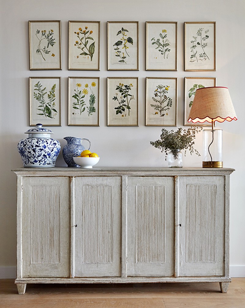
When I am designing a room, I usually start with a favourite fabric or a piece of art. It’s important for something to ground everything together. This could be something as big as the colour of the walls or as small as a patterned cushion.
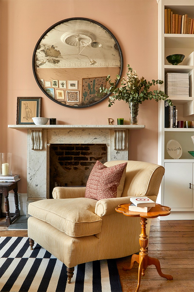
It’s always a treat to design rooms with history. Period architectural features like a beautiful cornice or fireplace can often be a great starting point to base the design around.
The best way to enhance small spaces is with mirrors, gloss paint and lighting. The right lighting is key for every space. Large open-plan spaces can be tricky; it’s best to break up the area into different pockets for different purposes. Rugs can be a great way of denoting these different spaces, whether they’re for sitting, studying or dining.
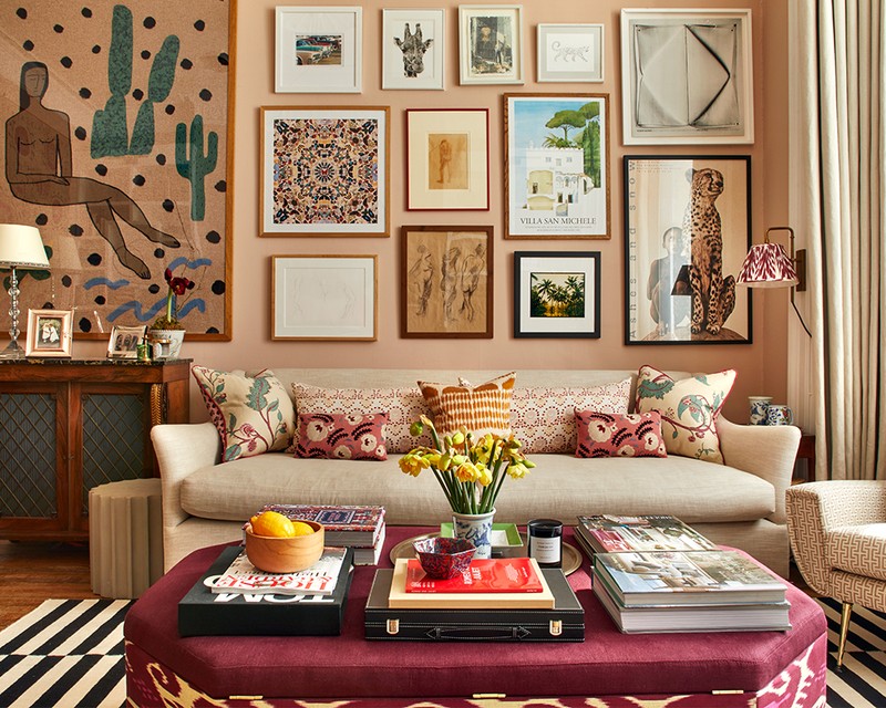
I don’t have rules when it comes to colour schemes. Sometimes the client has some existing furniture or a piece of artwork – this is often a good starting point. We love to create a layered look that appears as though it has grown together over time. We do like to get as much colour and pattern into our schemes as possible without it being overwhelming. Our favourite colours to use are brown on pale blue or plaster pink with burgundy. To be honest, the more colour the better for us!
I think trying to combine patterns of different scales and stripes with plains usually works. However, sometimes you see a whole mish mash of pattern and it can look like an amazing collage of colour – which I love. Using different textures is another great way to vary the patterns.
You can mix old furniture into a new scheme in so many ways. Look at the different materials you are using: where are the gaps? If there is already a fair amount of timber in the scheme, don’t add in more with brown furniture. Instead, look to materials like glass, lacquer or painted furniture. I think mid-century pieces can work well with contemporary furniture shapes. Conversely, traditionally shaped sofas or armchairs can look amazing with a modern print or weave.
We spend hours trawling eBay or auction sites for brown furniture. It can be picked up for next to nothing and always adds character to any space. Dining tables can be covered with table cloths, so you could even use an MDF sheet on trestles if you're on a budget! Check out websites such as Haines Collection for seconds of amazing fabrics at very reduced prices.
If you can, splurge on upholstery. Comfort is everything, and anything you can take with you from house to house is always a good investment.
If you have a tight budget, prioritise a good-quality bed and mattress. It should be as comfortable as possible and something you love. Again, this is something you can take to your next house which could last forever so it is worth the money.
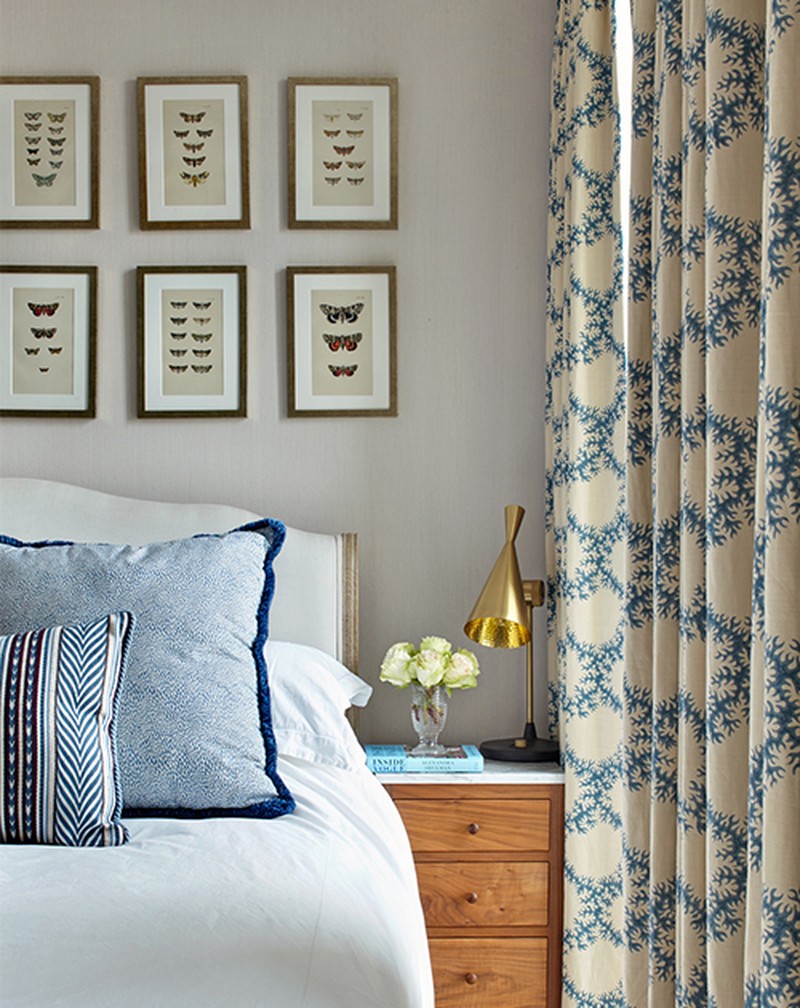
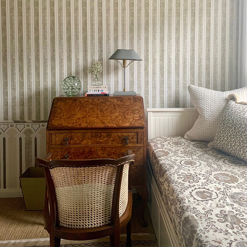
My favourite room to design is probably a bedroom. It’s often the most personal room to our clients, so we try to bring out their personality as much as possible. We love a patterned, shaped headboard or even a tester or four-poster bed for the right project. There are lots of ways to layer different fabrics with cushions, valances and bed spreads against wallpapers. We like to include antiques in the bedroom too –a beautiful chest of drawers with a marble top or a pair of antique bedsides can bring character.
When lighting a room, consider all the different types of lighting. Overhead, wall, lamps – try and think about the different combinations and what moods you might want to create in the space. Warm white lighting, like most standard bulbs and downlights, will make bright colours appear even brighter and cooler colours a little duller, so this is important with the positioning of lighting with furniture.
The most common mistake when lighting a room is thinking all the light has to come from ceiling downlights or pendants. We love using table lamps with a warm glow – it’s a much more flattering light. There are so many fun lampshades out there to add further interest to your schemes. We also love parchment shades or ones with pink or gold lining to give a subtle glow of light.

KITCHENS
Kitchens are always interesting to design. There are so many different directions you could go in. We like to work with kitchen designers because they’re the experts at utilising space as efficiently as possible and have the best knowledge of, for example, appliances. But it’s fun to make a highly functional kitchen personal to the client with artwork, furnishings for the chairs/stools, accessories and so on.
When designing a kitchen, it must be practical. The kitchen working triangle is a good place to start. This is the relationship between the cooker, sink and fridge – make sure these three aren’t too far from each other. Storage is also vital, but this goes for the whole house – you can never have enough of it.
Although we love a limestone flag in a kitchen, it’s not that practical because it’s very porous and stains easily. However, there are now some incredible porcelain alternatives that are almost impossible to differentiate. Villeroy & Boch has a great range.
A marble worktop always stands out, but if you’re precious about marks it’s probably best to use something like Silestone. Going to the marble yard and choosing the exact slab is such fun.
SUPPLIERS
Where Rosanna Goes For…
Furniture
We tend to get the majority of our furniture made. We have great UK-based upholsterers and joiners we have been working with for years. For antiques there are so many great online platforms such as 1st Dibs, Decorative Collective and, for more mid-century pieces, Pamono.
Fabrics
Guy Goodfellow, The Fabric Collective, Haines Collection, Lewis & Wood
Joinery
Alfred Newall
Kitchens
You can’t beat the beautiful designs by Plain English. DeVol also makes great kitchens.
Bathrooms
Lefroy Brooks and Waterworks for brassware; Duravit for sanitaryware.
Tiles
Bert & May, Milagros and Otto Tiles.
Wallpaper
Iksel Decorative Arts prints wallpaper to fit the space – I used its Kubilai Tent in my dressing room. We also love Soane Britain’s wallpapers, which are all hand printed in the UK.
Paint
Paint and Paper Library – we love its architectural colour collection, which is based on a set of colours (numbered 1-5) representing different strengths of the same pigment that work perfectly together.
Lighting
If you’ve no budget, Hervé Van der Straeten has some incredible pieces, almost sculptural like. Pooky has a great selection of lighting at great prices too.
Flooring
For timber, Element 7 and Havwoods. For carpets, there’s Sinclair Till.
Kitchen hardware
Joseph Giles and Collier Webb.

Visit RosannaBossom.co.uk
DISCLAIMER: We endeavour to always credit the correct original source of every image we use. If you think a credit may be incorrect, please contact us at info@sheerluxe.com.
