The Interiors’ Hue Of 2020
What's The Definition Of 'Classic Blue'?
After the energising warmth of last year’s Living Coral, the Pantone Colour Of The Year for 2020 is a timeless shade of blue, designed to bring a sense of peace and tranquillity to the next era - a tonic to growing political unrest across the globe and the significant daily stresses we experience in society. Associated with calm and quiet, Classic Blue is meant to introduce a sense of serenity and stability to the start of the new decade. It also perfectly captures the beauty of the night sky and deep depths of the ocean. “A boundless blue evocative of the vast and infinite evening sky, Classic Blue encourages us to look beyond the obvious to express and expand our thinking, challenging us to think more deeply, increase our perspective and open the flow of communication,” says Leatrice Eiseman, executive director of The Pantone Colour Institute.
What Effect Does It Have On A Room?
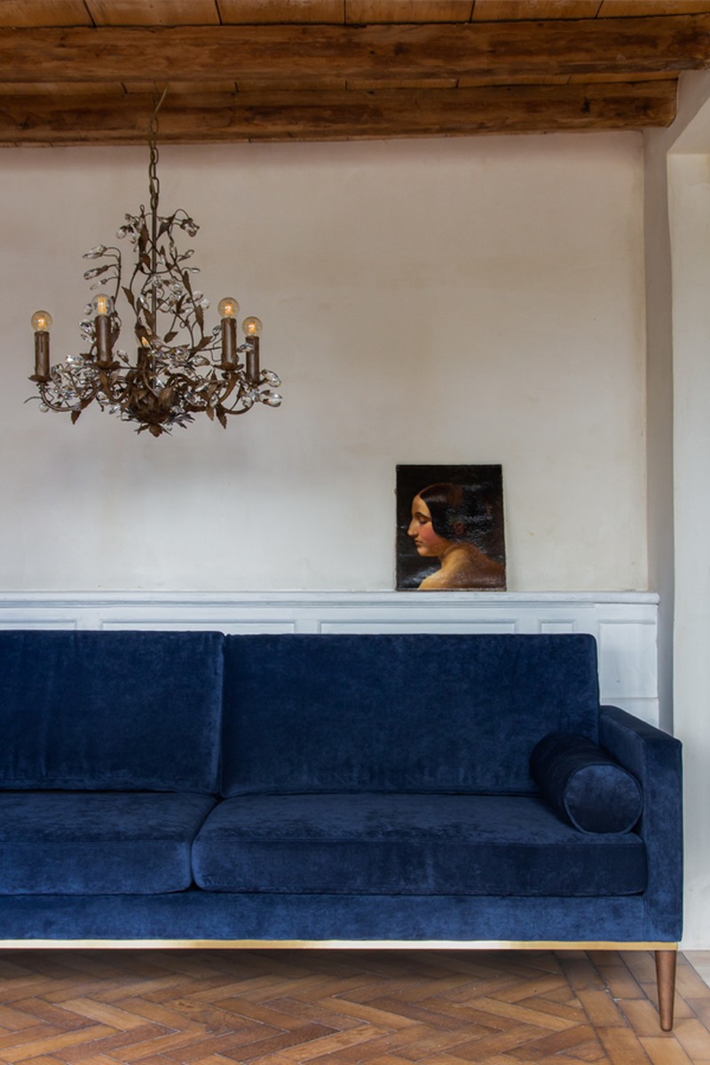
Dramatic, darker paint shades have been enjoying a renaissance for some time, so introducing this inky blue needn’t take you too far out of your comfort zone. “Because blue is one of the coolest of all the colours in the spectrum, it instils feelings of reliability and stability,” says Jane Rockett, co-founder of Rockett St George. “Darker blues project a sense of sophistication and tranquillity, and make the perfect backdrop for treasured artworks, collections and decorative displays. Think of an inky blue night sky enveloping you in a safe and calm atmosphere.”
How Versatile Is It?
Joa Studholme, Farrow & Ball’s colour curator, explains its versatility: “This colour is particularly suited to small spaces – well-lit studies and workstations would benefit from its stimulating feel, but in low level light it becomes a little more tender in feel so would work well in a TV room or sitting room. Light or bright kitchens could benefit from the energizing side of this colour especially when combined with All White for maximum contrast. It's also great for children’s bedrooms.”
Can It Be Used As An Accent Colour?
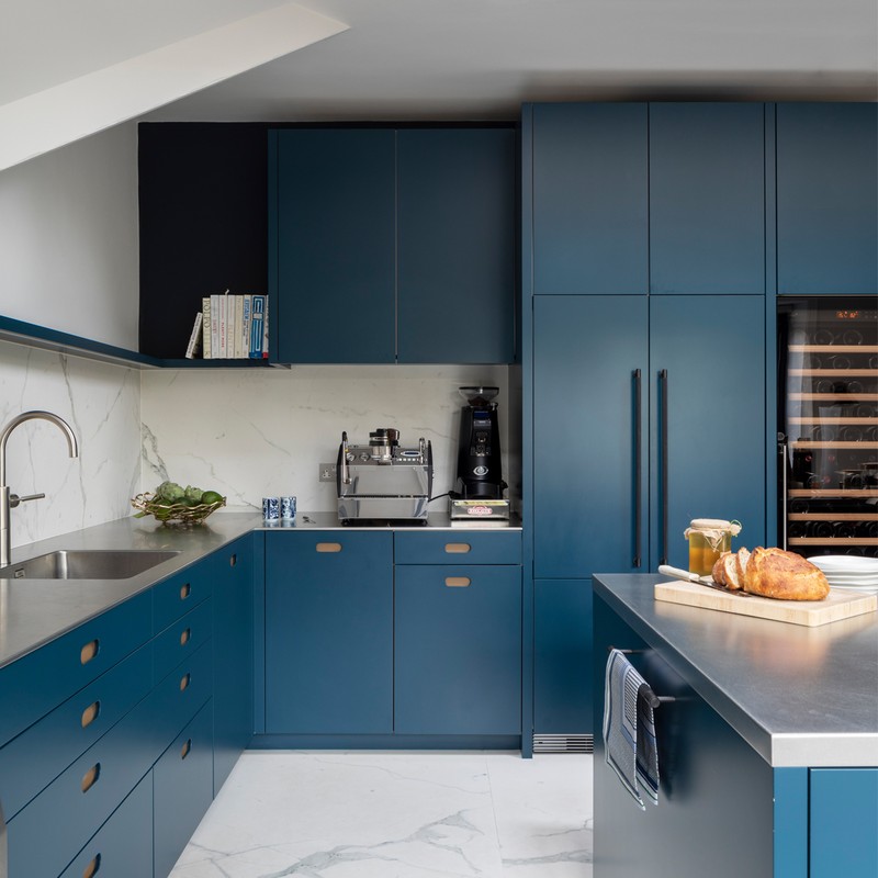
For those wary of colour, try adding it to the interior of bookcases or kitchen dressers, or even kitchen cabinets. “More and more, we are seeing requests for statement blue jewel-toned island counters,” explains Tom Howley, creative design director of Tom Howley. “The island counter is an integral part of approximately 80% of the kitchens we make, but our market is becoming much more imaginative and explorative with colour when it comes to cabinetry. Many opt for neutral surfaces, pantries and wall cabinets, which they pair with a brave tone, such as a deep blue, on the island counter. This gives the kitchen a more contemporary feel, without overpowering the whole space.” This trend was popular in 2019 and indications are it is only growing for 2020.
What Other Colours Does It Work With?
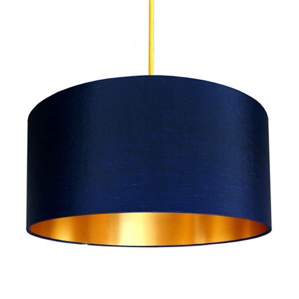
When it comes to accessories, Classic Blue works well with many different schemes, including clotted cream and turmeric yellow, blush pink furniture and textiles, and brass and gold accents. It’s a really adaptable colour to introduce all year round, says Wayfair’s resident style advisor, Nadia McCowan Hill, who claims searches for blue hues are up over 50%. “If you are seeking versatility in your interiors, ‘Classic Blue’ will successfully sail through the seasons, making this tone a solid option for investment furniture and décor,” she says. “Conjuring images of the hazy Mediterranean coast through summer and capturing the crisp, coolness of the winter months, its transformative qualities are boundless.”
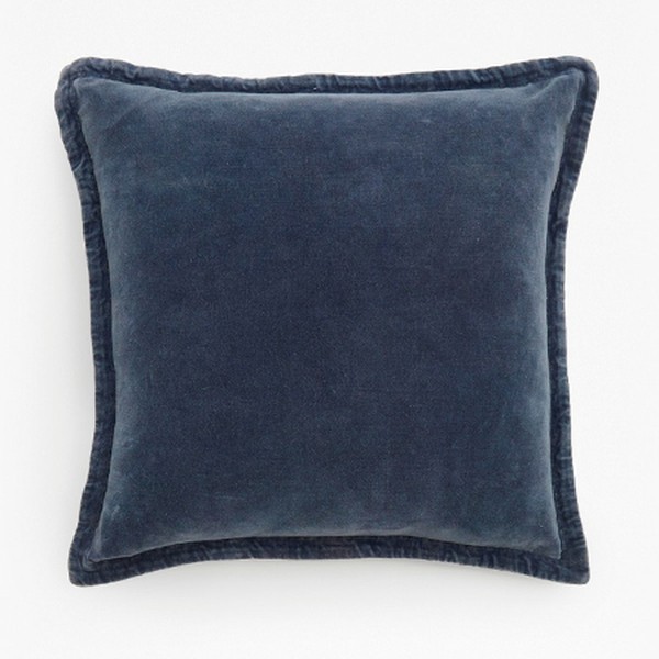
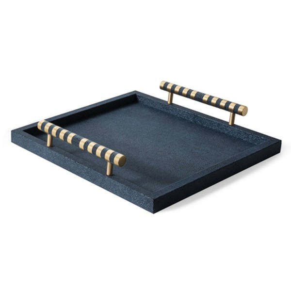
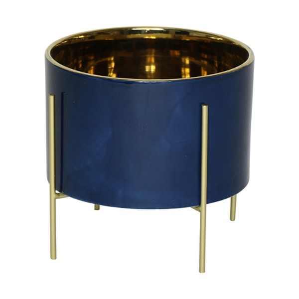
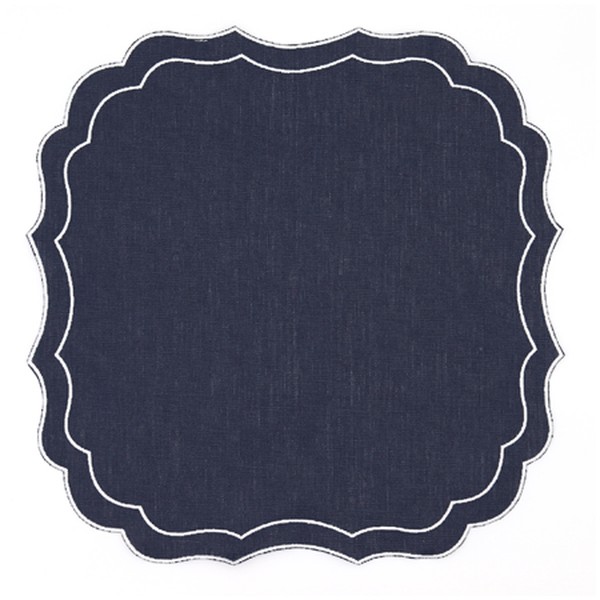
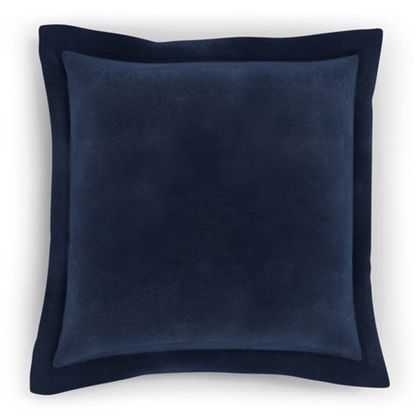
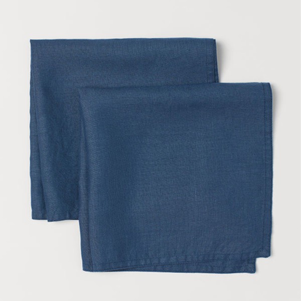
Shop our Classic Blue interior picks below...
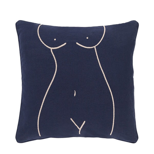
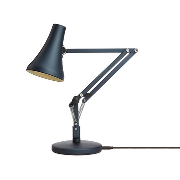
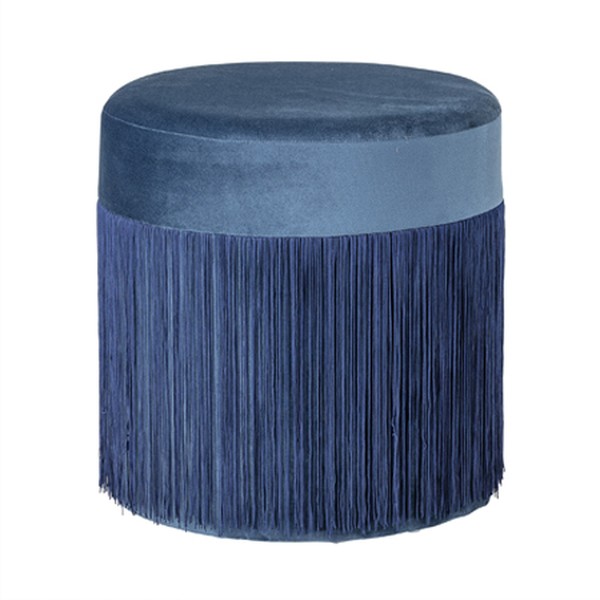
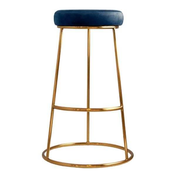
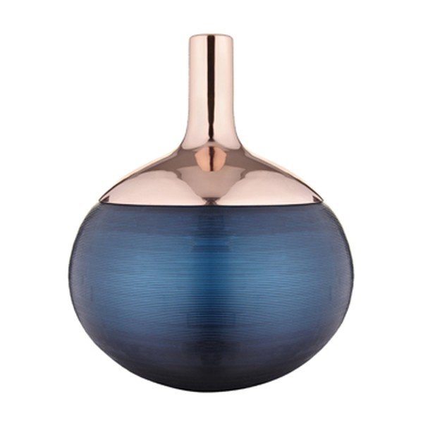
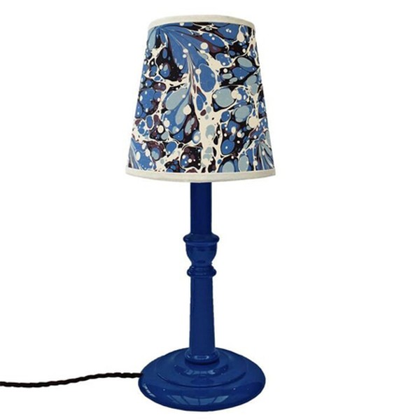
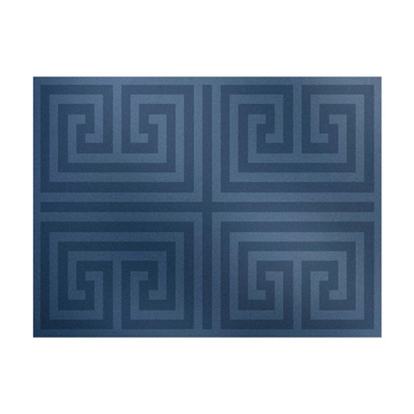
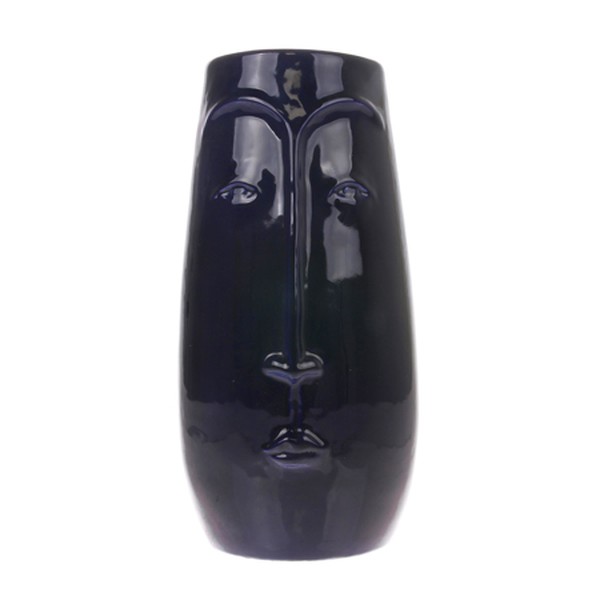
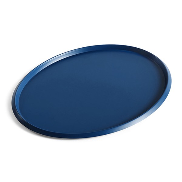
INSPIRATION CREDITS: Gunter&Co.com & Kitesgrove.com
DISCLAIMER: We endeavour to always credit the correct original source of every image we use. If you think a credit may be incorrect, please contact us at info@sheerluxe.com.
