Interiors: Get The Look
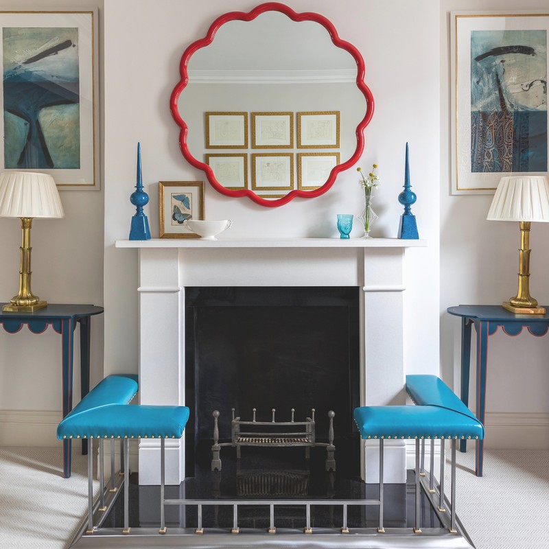
"We wanted the room to feel fresh and light, but still vibrant with lots of colour and pattern,” says Katharine. “Some of the artwork in the room already belonged to my client, and these paintings provided the starting point for our scheme, which we built on by layering up patterns, shapes, colours and textures. The pops of bright colour throughout the room are offset by the neutral paint, which we used on the walls and woodwork.
“We stripped away the dated picture rails, and in doing so raised the ceilings, making the space feel so much lighter and airier. We used fretwork panels at the window to provide privacy - they also felt lighter and prettier than traditional shutters."
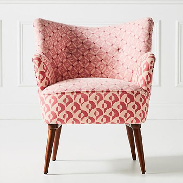
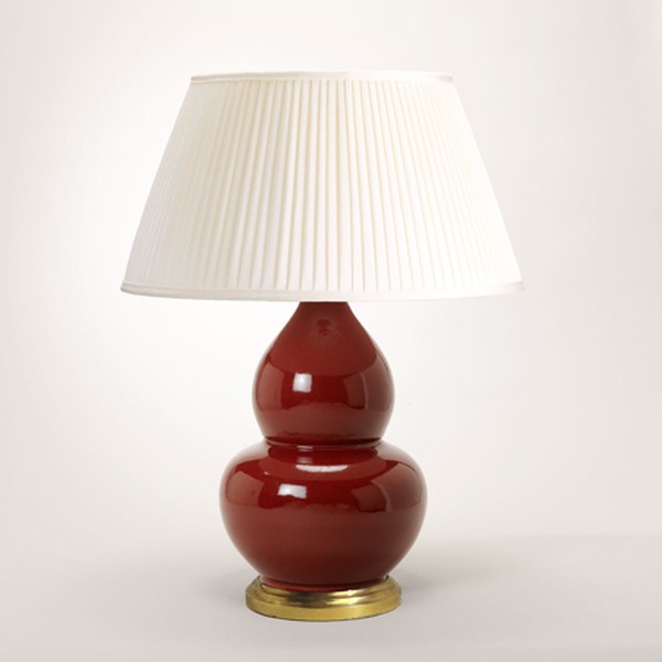
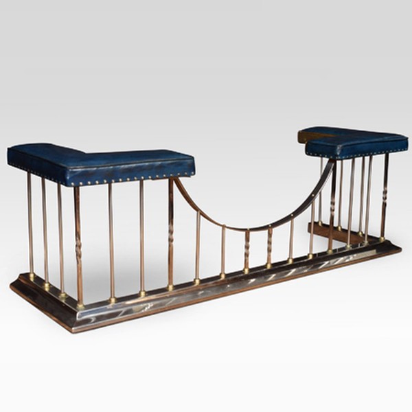
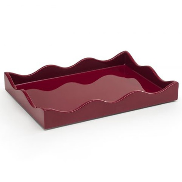
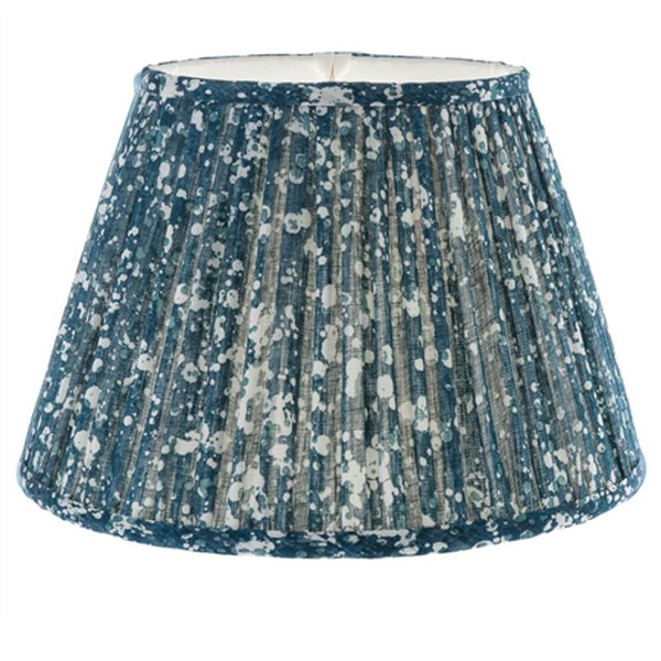
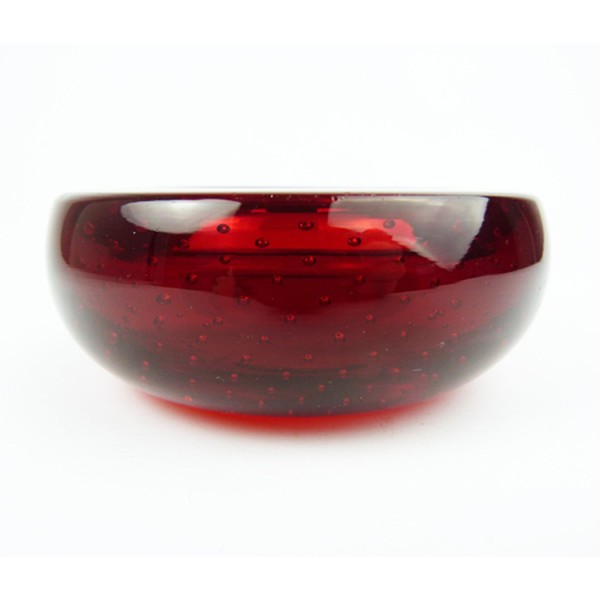
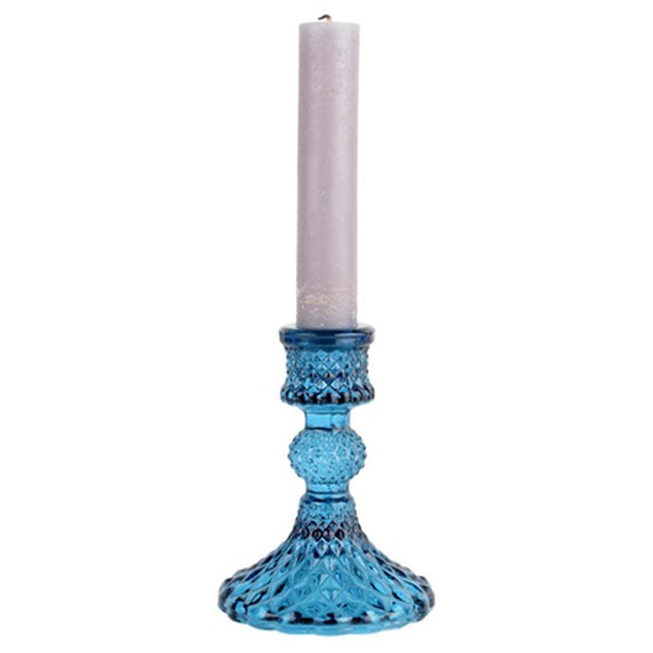
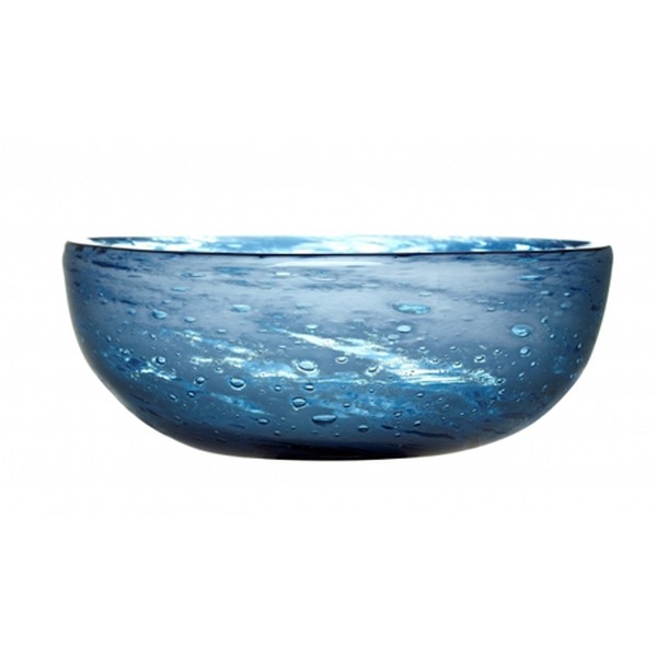
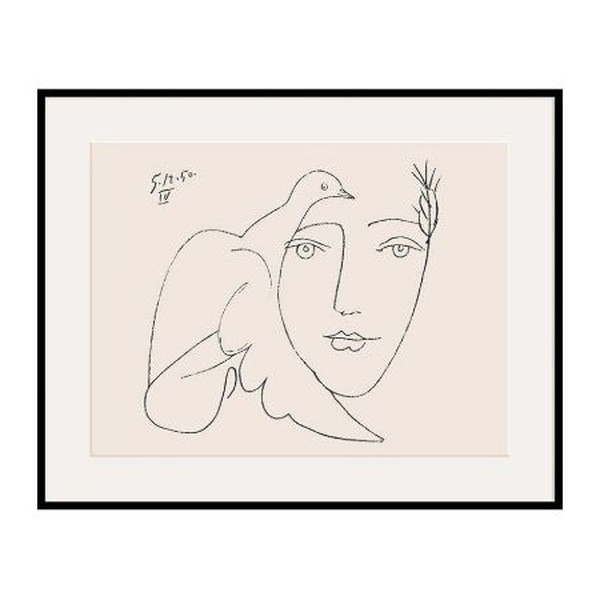
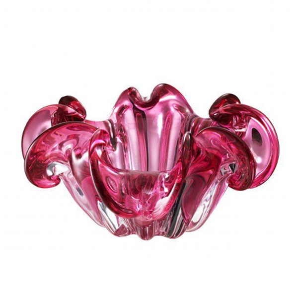
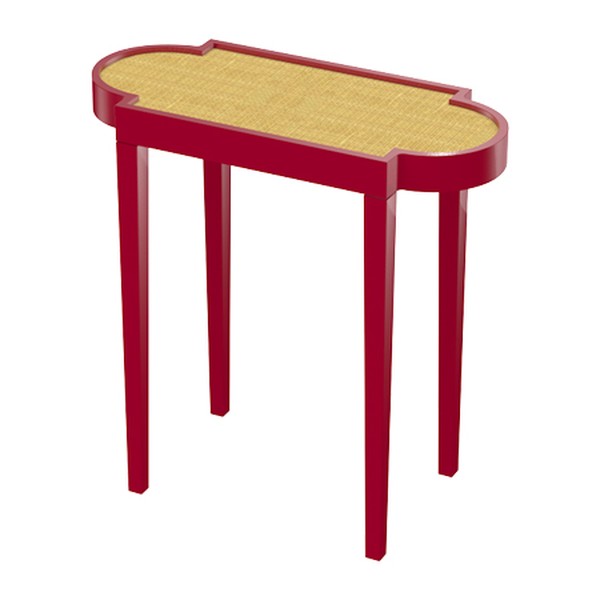
Shop the look below...



INSPIRATION CREDITS: Instagram.com/katharineparaviciniltd
DISCLAIMER: We endeavour to always credit the correct original source of every image we use. If you think a credit may be incorrect, please contact us at info@sheerluxe.com.
