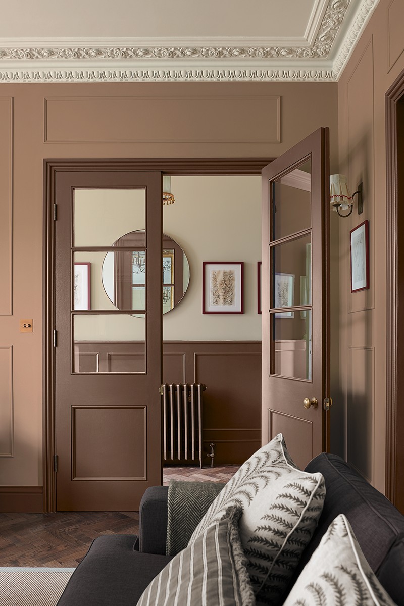
What You Need To Know About The Pantone Colour Of 2025
What is ‘Mocha Mousse’?
“It’s a warming, brown hue imbued with richness. It has the same indulgent qualities as chocolate and coffee, and also a sense of comfort. Naming it as Pantone Colour of the Year 2025 is a reflection of our collective desire for simple pleasures.” – Laurie Pressman, vice president of the Pantone Colour Institute
Why is it set to be popular?
“Because it’s a grounding brown. ‘Mocha Mousse’ is a warm, inviting shade that’s very versatile – the good news is it will work with most colours. It also creates a welcoming partnership with all of nature’s shades, from sage to terracotta. It adds drama to contemporary colours by creating a theatrical backdrop and it’s the kind of colour can be sophisticated or cosy, depending on the mood.” – Paula Taylor, head stylist & trend specialist at Graham & Brown
How should you use it?
“This rich, nuanced colour offers a number of options for residential interiors. Done right, chocolate brown can transform living environments, creating spaces that are both elegant and inviting – either through a beautiful dark walnut wood or a deep chocolate paint, this dynamic colour makes us feel connected to our surroundings. I particularly recommend pairing chocolate brown with more neutral colours such as beiges, creams or whites to create a harmonious feel. To create a more electric feel, pair chocolate brown with blues to really make them pop.” – Alexander Shepel, co-founder of SHEPEL
Is there an easy way to use it in your home?
“Similar to ‘Mocha Mousse’, I have recently used ‘Mummy’ by Edward Bulmer to paint our living room – it’s such a lovely cocooning shade, and it works with everything. You can also introduce this tone in other ways – brown lacquer is an all-time favourite, and brown mohair is so rich and sumptuous. I think pairing it with other colours such as pale or deep pink, or a light blue or butter yellow can really freshen it up. Also, consider the sheen level – a high gloss lacquered brown feels rich but not heavy, especially when paired with other unexpected finishes such as polished stainless steel or mirror. A lacquered, chocolate-hued ceiling or used only on the woodwork is a great option for smaller spaces. As a dark neutral, brown has a unique ability to be both calming and grounded whilst also being very striking when used in the right way.” – Tiffany Duggan, founder & creative director, Studio Duggan & Trove
SHOP THE PRODUCT EDIT


DISCLAIMER: We endeavour to always credit the correct original source of every image we use. If you think a credit may be incorrect, please contact us at info@sheerluxe.com.


/https%3A%2F%2Fsw18.sheerluxe.com%2Fsites%2Fsheerluxe%2Ffiles%2Farticles%2F2024%2F12%2Fsl-161224-pantone-coty-fb.png)


