22 Dos & Don’ts To Get Small Bathrooms Right
Caroline Stemp,
Co-Founder of Sascal Studio, says…
DO make space for a handwash bottle and waste bin.
You’d be surprised how often this gets overlooked. We always consider these when designing the space – whether it’s adding a small shelf above the sink or adding a built-in niche next to it. We’ve also used soap bottle holders before, which are a great space-saving option.
DON’T sacrifice the aesthetic for storage.
Bathrooms can be quite sterile spaces, so incorporating wall-mounted antique shelves not only allows for more storage without sacrificing floor space, but also helps to add warmth and interest to the room.
DO use wallpaper.
It’s a fantastic way to pack a punch in a small bathroom. We often wrap the wallpaper onto the ceiling in bathrooms (and even over extractor fans) as this helps to make the room feel more cohesive.
DON’T mix your metals.
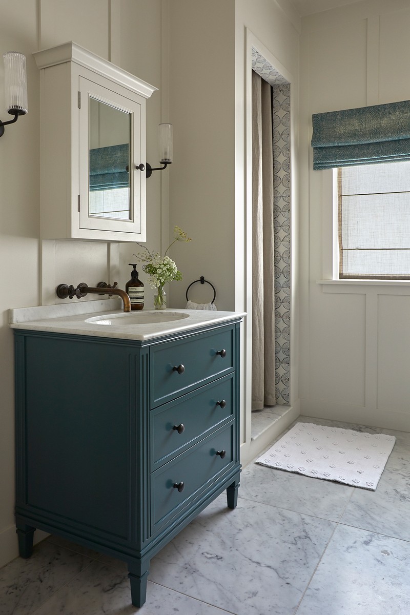
For a small bathroom, we would generally stick to one finish (whether that be antique brass, polished chrome, or polished nickel) for the sanitaryware, and mix in different metal finishes throughout the light fixtures and ironmongery for interest.
DO consider the layout.
We try to keep everything (toilet, sink, bath/shower) along one wall – this keeps everything within easy reach, and therefore makes it practical. We will then incorporate a fun shower curtain into the design, rather than a shower screen, to add softness and warmth, and we also try to position the toilet so it isn’t on show as soon as you walk in.
Visit SascalStudio.com
Iwona Budnik,
Senior Interior Designer at Own London, says…
DO use mirrors to enhance your space.
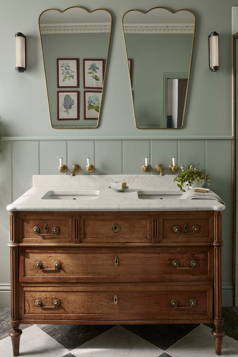
To help make the space feel bigger and brighter, a large wall mirror will reflect light around the space, making it look twice as big. If the mirror is wall to wall without division, this will encourage the illusion further.
DON’T go bland to feel bigger.
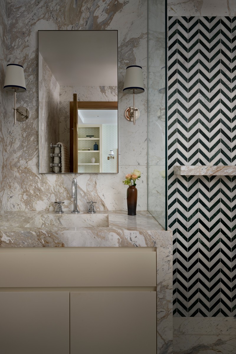
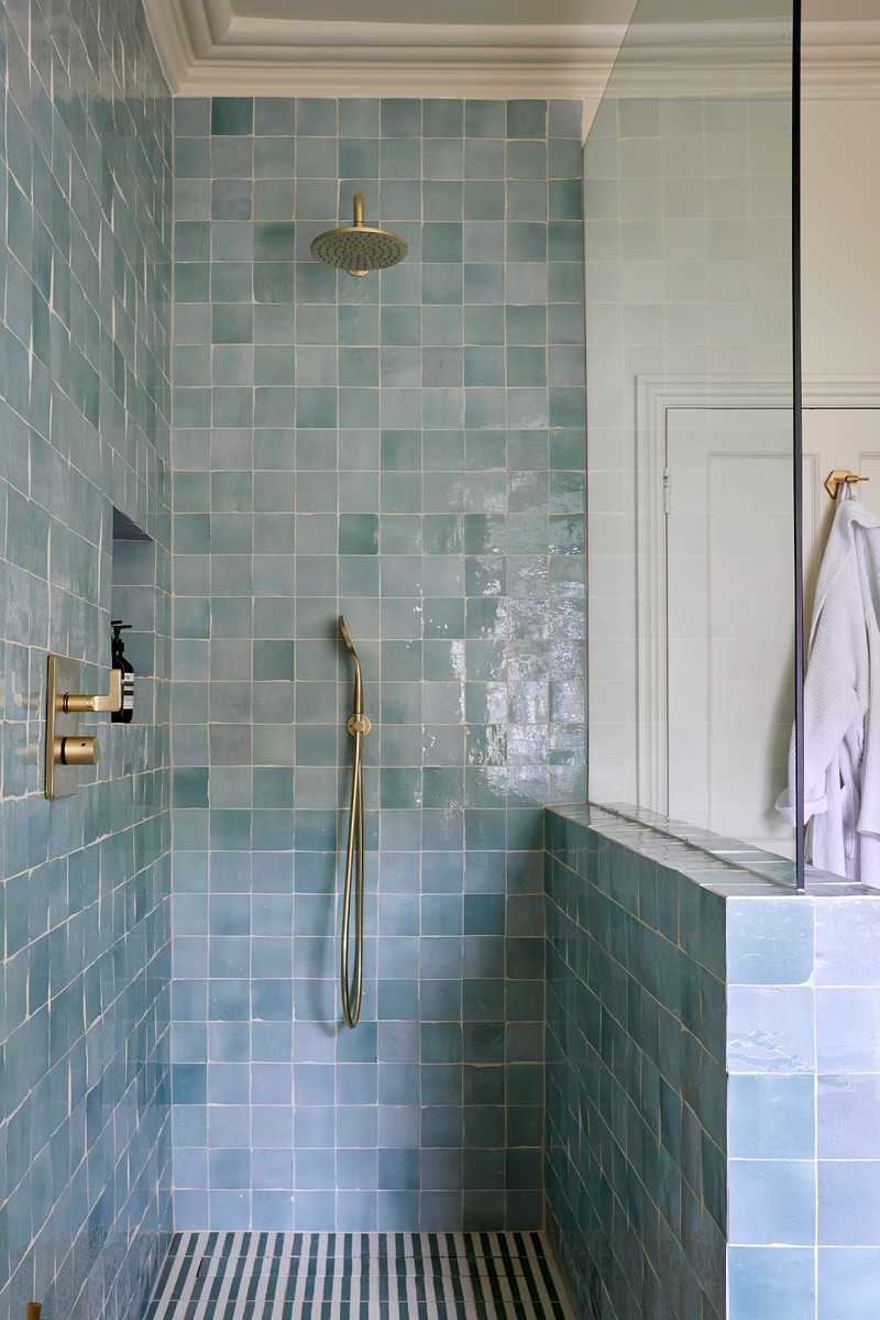
Some people suggest using white, large-format wall and floor tiles as these can help make a bathroom feel spacious, but I find creating ‘moments’ of interests, such as a colourful shower wall tile, or even a dramatic painted wall behind the toilet, can help make the space feel more multi-dimensional.
DO meticulously plan the storage.
Storage is key; a typical bathroom should ideally house shower items, hygiene items and beauty products. A sink with a cupboard underneath is effective; a mirror with storage will also help you; and if you have any unusual spaces or gaps in your bathroom, these can be utilised further. You can also source narrow shelving to fit between fortuitous gaps, such as a freestanding sink and wall. Utilise every space to accommodate your needs.
DON’T forget about heating.
If you can swap a traditional wall-mounted heated towel rail for underfloor heating, this will free up wall space for robe hooks, shelving and more.
DO think about windows.
Windows in small bathrooms are a common obstacle. It is usually the obvious spot to fit a vanity unit, so where do you apply your make-up? We designed a small guest bathroom for a large family home in Chelsea where the only place for a vanity was positioned underneath a window. This is not a traditional placement, as it disturbs any natural light from entering the bathroom. Our solution was to inset a swing mirror into the walls either side, which maximised the practical needs of a bathroom, while not covering over the window and losing the light.
DON’T emphasis the room’s boundaries.
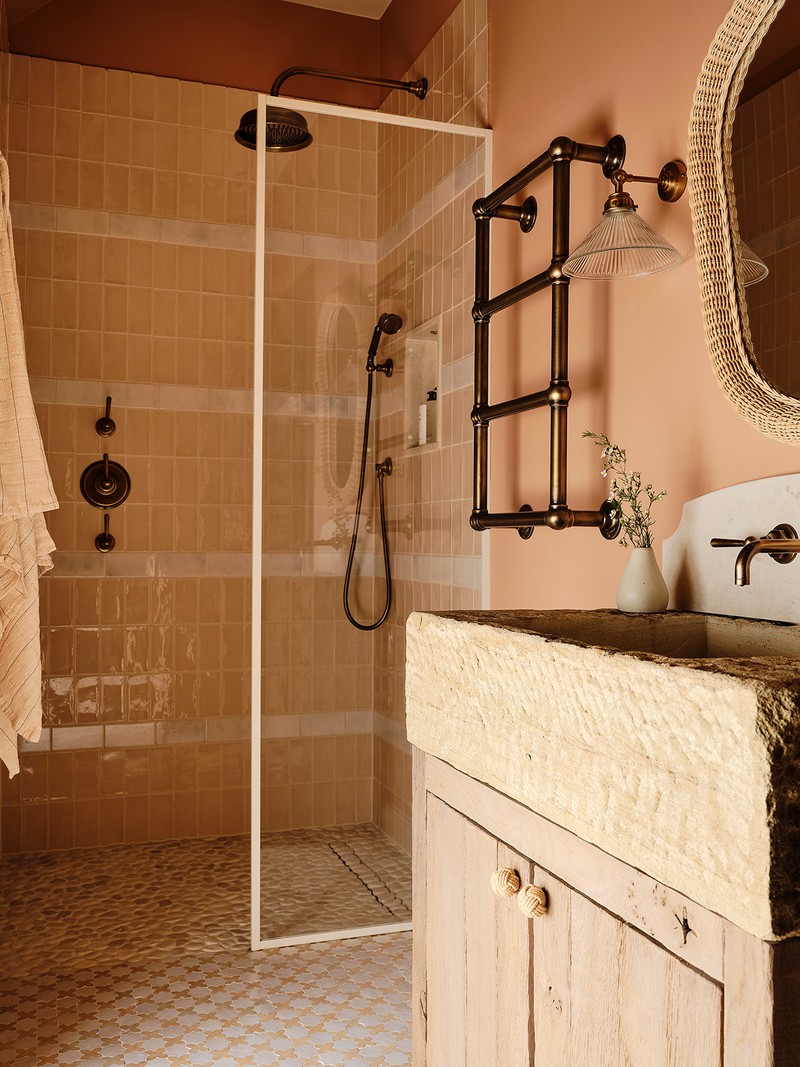
When dealing with a small bathroom, choosing one colour (or alternatively tone on tone) for the floors and walls is key. This will trick the eye into making the boundary edges fade away, no matter whether the colour is light or dark. If the bathroom has no windows, embrace it and go for a non-white, darker colour palette. This will make the space more sophisticated. Ideally, do not apply hard finishes all around the room, as this will make the walls close in and only use paint where there is no danger of water splashback. Choosing small to medium tiles also tricks the eye to making the space look bigger.
DO create a feature with the vanity unit.
Using a different texture such as wood, or painting it in a bold colour, will make the space feel inviting and less clinical.
DON’T underestimate the importance of lighting.
Bathroom lighting is critical, especially in a small space. I prefer using wall sconces only with dual up and down lights, especially when the bathroom has a low ceiling – plus, lights within the shower and essential mirror lighting. Use tiny pin downlights only in the shower or above the bath, otherwise avoid them entirely. I also like to position a small wall light above the WC to illuminate artwork or anything else.
DO de-clutter.
Install fitted joinery wherever possible to maximise every millimetre of space. Every product in the bathroom needs to have a place (have as many shelves as possible in every cabinet). Putting away all those products will leave space for accessories such as a vase, plants and artwork.
Visit OwnLondon.co.uk
Chloe Cutts,
Senior Designer & Interior Architect at Sims Hilditch, says…
DON’T underestimate the effect of materials.
You can make the space feel more inviting and less clinical by incorporating different materials and textures. Your choice of materials will also affect the amount of light that enters the room. If you want to brighten up the space, you can consider using reflective materials such as glass, marble, or mirrors. Traditionally, keeping the décor simple with light, bright and neutral tones would have been the way forward to give the illusion of space. However, injecting darker, bolder and more tactile texture and colour can create the same effect, especially when incorporating well-considered lighting and mirrors.
DO plan niches.
Niches are a great way to save space, whether it's a product niche in the shower or a foot niche for shaving. You can also utilise your mirror for storage by creating a ledge in front of it or a recessed cabinet behind it. Although it provides ample storage space, the mirror appears flush with the wall, minimising the disruption to the space. Recessed shelving keeps items organised while maintaining a streamlined look.
DON’T scrimp on the hardware.
Brassware can be an easy way to introduce softer tones and detailing to the space. Choosing brushed finishes can help soften the overall look, as opposed to selecting a polished finish, which results in a more thoughtful design. To bring the whole scheme together, always ensure there is a unified finish throughout the brassware and accessories. And consider adding wall-mounted components such as taps, toilets and vanity units to small bathroom designs. These always give the illusion of more space in small spaces.
DON’T neglect the view.
When designing the layout of fixtures in a room, it's crucial to consider the first view you'll see upon entering. Ideally, you would want to have a clear view of your vanity or bath before the toilet. A symmetrical layout is another good option, or you could align your focal point (such as a bathtub) with an architectural element such as a window.
Visit SimsHilditch.com
Amy Dalrymple,
Creative Director at Dalrymple Studio, says…
DO make your walls work harder.
Use wall cavities, for example above the WC cistern, or a wall built out to house a shower alcove. Wall mirrors are also great for hiding additional storage – these can be wall mounted or flush with the wall. Creating a shower wall allows you to place the vanity against a wall, and I like wall-mounted lights here, placed either side of a mirror hung above.
DON’T forget about scale.
Check the scale of the fittings and pay close attention to the projection of the towel radiator – once it has towels on top, it will take up more room, and you don’t want this to stick out too far and encroach on the space.
DO think about the door.
You could explore making the door smaller, so the door swing doesn’t clash with anything inside the bathroom. Otherwise, consider a sliding pocket door that doesn’t take up any additional space.
DON’T be afraid to dress the space.
Art in bathrooms is beautiful and often forgotten; it makes the space feel homier and more cohesive. We always try to fit a stool or chair. Pendants in bathrooms, panelling or beading add an extra level of detail that makes the space feel special, and those smaller details can help draw the attention away from the size of a space.
Visit DalrympleStudio.co.uk
DISCLAIMER: We endeavour to always credit the correct original source of every image we use. If you think a credit may be incorrect, please contact us at info@sheerluxe.com.
