8 Interior Design Rules That Are Made To Be Broken

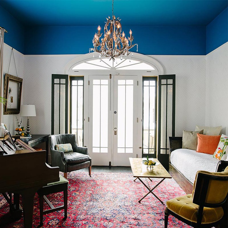
1. Ceilings Should Always Be White
Long uncharted territory when it comes to daring design choices, most of us wouldn’t even consider the ceiling as fair game. No matter how bold our walls have become, we have so far left this fourth dimension well alone. But just as a white ceiling opens up and brightens a room, it is only logical that darker paint could have a cocooning effect on a larger space. Going one step further and adding playful stripes or statement wallpaper can add real drama to a room of any shape and size.
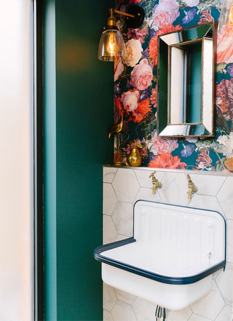
2. Keep Decor Simple In Small Spaces
Traditionally, the smaller the room, the more neutral the decoration is, in order to encourage a feeling of space. But in today’s interiors world, the modest loo has never attracted so much attention. This tiny room is having its moment and taking centre stage, dressed to impress from top to toe with the most amazing results.


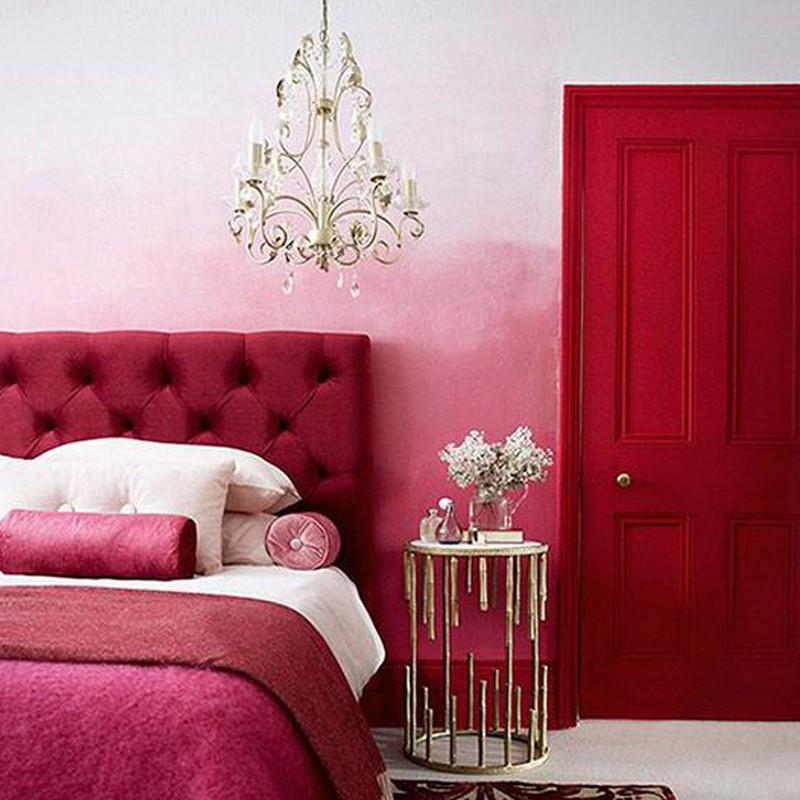
3. Don’t Clash Colours
We all know the old adage, ‘Blue and green should never be seen’. Traditionally, colours that sit next to each other on the colour wheel were thought to grate against each other – but who doesn’t remember Princess Di’s flawless red and pink fashion moment? Designers are showing that the right tonal balance can achieve truly fabulous results.
/https%3A%2F%2Fsw18.sheerluxe.com%2Fsites%2Fsheerluxe%2Ffiles%2Farticles%2F2018%2F12%2Fad-interior.jpg?itok=jFCFU3JJ)
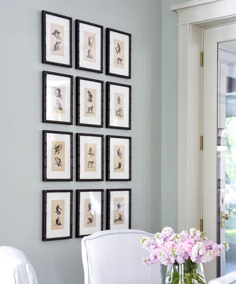
4. Stick To The Rule Of Three
This design principle works on the premise that arranging things in odd numbers is simply more visually appealing to the human eye. However, the rise of maximalism and the current trend for gallery walls is putting this theory well and truly under the microscope. More is not necessarily more for everyone, but it can undoubtedly result in the most striking of interiors.
5. Hang Art At Eye Level
Speaking of gallery walls, the traditional way of hanging art with the centre of the picture at eye level has well and truly gone out of the window. It is now totally cool to hang mismatched artworks all the way from the floor to the ceiling. More formal groupings can also have dramatic results, as can playing with the scale of the pictures.

/https%3A%2F%2Fsw18.sheerluxe.com%2Fsites%2Fsheerluxe%2Ffiles%2Farticles%2F2018%2F12%2Fmodern-vintage.jpg?itok=Yb5-2xyF)
6. Stick To One Style Or Period In A Given Space
Just because key pieces of furniture and accessories are from different centuries doesn’t mean that they can’t sit harmoniously next to each other. A vintage sideboard can be brought alive by adding a modern lamp, similarly a modern table teamed with vintage chairs can make a real style statement. Modern vintage style is all about mixing it up and as long as you have some cohesion amongst the pieces – the same wood or a clear colour palette for example – spaces that blend old and new can be filled with character.
/https%3A%2F%2Fsw18.sheerluxe.com%2Fsites%2Fsheerluxe%2Ffiles%2Farticles%2F2018%2F12%2Fcornersofa-newfinal.jpg?itok=jGCBOwH9)
7. Don’t Put Large Furniture In Small Rooms
While it’s logical not to cram a small room with large furniture, using lots of smaller pieces can also further emphasise the lack of space and create a cluttered look. A corner sofa may seem like madness in a small space but it can be the ideal solution for getting maximum bums on seats for movie night!
/https%3A%2F%2Fsw18.sheerluxe.com%2Fsites%2Fsheerluxe%2Ffiles%2Farticles%2F2018%2F12%2Fhigh-street-interiors.jpg?itok=nzrw4von)
8. You Have To Spend Big To Get The Best Results
You simply don’t need a big budget to create amazing rooms these days. The high street is bursting with brands that offer incredible value on great furniture and accessories. Even supermarkets are getting in on the action with their own trend-led interiors lines. Shop around before you part with your pounds.
For more interiors advice and inspiration, follow Jenny on Instagram and visit JennyBranson.com
INSPIRATION CREDITS: mybespokeroom.com, pooky.com, amyberrydesign.com, zarahome.com, primark.com, jennybranson.com & instagram.com/jenny.branson.interiors
DISCLAIMER: We endeavour to always credit the correct original source of every image we use. If you think a credit may be incorrect, please contact us at info@sheerluxe.com.

