Take A Tour Of This Clever, Colourful Home
The Property
This beautiful Chelsea townhouse is on a lovely residential street between the Fulham and King’s Road. When we took on the project, the property was dated and crying out for an overhaul. It was a full renovation project, although the architectural bones (the high ceilings and well-proportioned windows) were all there to start with.
The Brief
We were working for a young professional couple who entertained a lot and they wanted to do something fun and colourful. It was the perfect brief because they encouraged me to be bold, creative and imaginative.
The clients wanted me to reference nature (we used a lot of cloud and botanical motifs, wood and greens) as well as Japanese design, which inspired much of the art. I also looked at David Hockney’s swimming pool paintings to find colour inspiration for the living space.
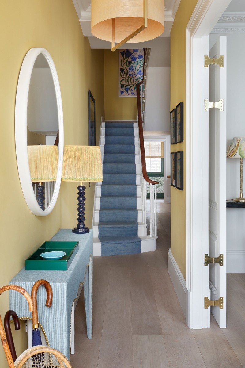
I was keen to maintain and enhance the traditional architecture of the house and contrast that with contemporary touches in the furniture and colourful fabrics. We researched the period of the house and installed the cornices and architraves so that it felt like they had always been there. We increased the height of the doors, put in higher skirting boards and also restored the original panelling and French windows on the first floor. The juxtaposition of traditional architecture and modern furniture and fabrics are what give the house that livelier feel.
TAKE THE TOUR
The Kitchen/Dining Area
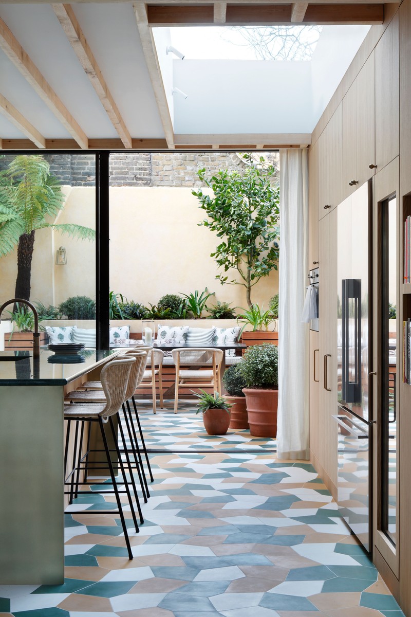
The whole of the lower ground floor was previously laid out across lots of little gloomy rooms. We wanted to open it up and create one large open plan sitting room, dining room and kitchen which opened onto and connected with the garden. The flooring choice was a bold one – irregular cement tiles in green, ochre and white – and I wanted to contrast that with more natural materials like wood.
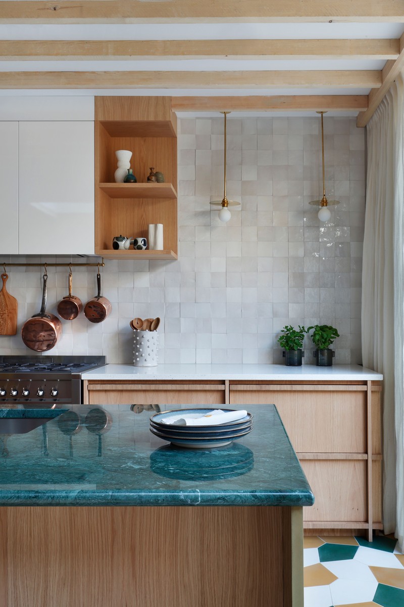
In the kitchen, the combination of natural materials, such as oak on the lower cabinets and the rustic, stone-coloured Zellige tiled wall contrasts with the brass fittings and high-gloss lacquer high-level cabinets. I think this play with contrast makes the room feel more alive.
ISLAND WORKTOP: Verde Guatemala
BAR STOOLS: Giovanna Ticciati
JAPANESE CERAMICS: Toad Gallery
CURTAINS: Rose Uniacke linen
PENDANT LIGHTS: Atelier Areti
FLOOR TILES: Mosaic Factory
The Sitting Area
The long brass pole curves around the whole of the front elevation and the curtain conceals the secret exit to the boring (but essential) bin store and utility room. I think there’s something disconcerting about relaxing in a cosy room where there is a visible door to the outside, so concealing that was key. The curved shape sofa also was important to make the area around the fireplace and bookshelves feel cosier within the open-plan floor.
SOFA AND ARMCHAIR: Bespoke design by Studio Peake
RUG: Nordic Knots
COFFEE TABLE: Galvin Brothers
CURTAINS: Rebecca Atwood
ARTWORK: David Matthew King via The Dot Project
The Downstairs Cloakroom
I had lots of fun in this tiny ground floor bathroom. I wanted it to feel as though you were in the jungle. The wallpapered arch with the mirror at the back reflects the patterns back at you, which created such drama. The amazing sink was made out a favourite marble of mine – Fior di Pesci. Green and pink is a timeless combination but the earthiness of the stone still feels feminine without being too girly.
WALLPAPER: Ulricehamns
WALL LIGHT: Atelier Areti
VANITY: Bespoke design by Studio Peake
Ground Floor Study
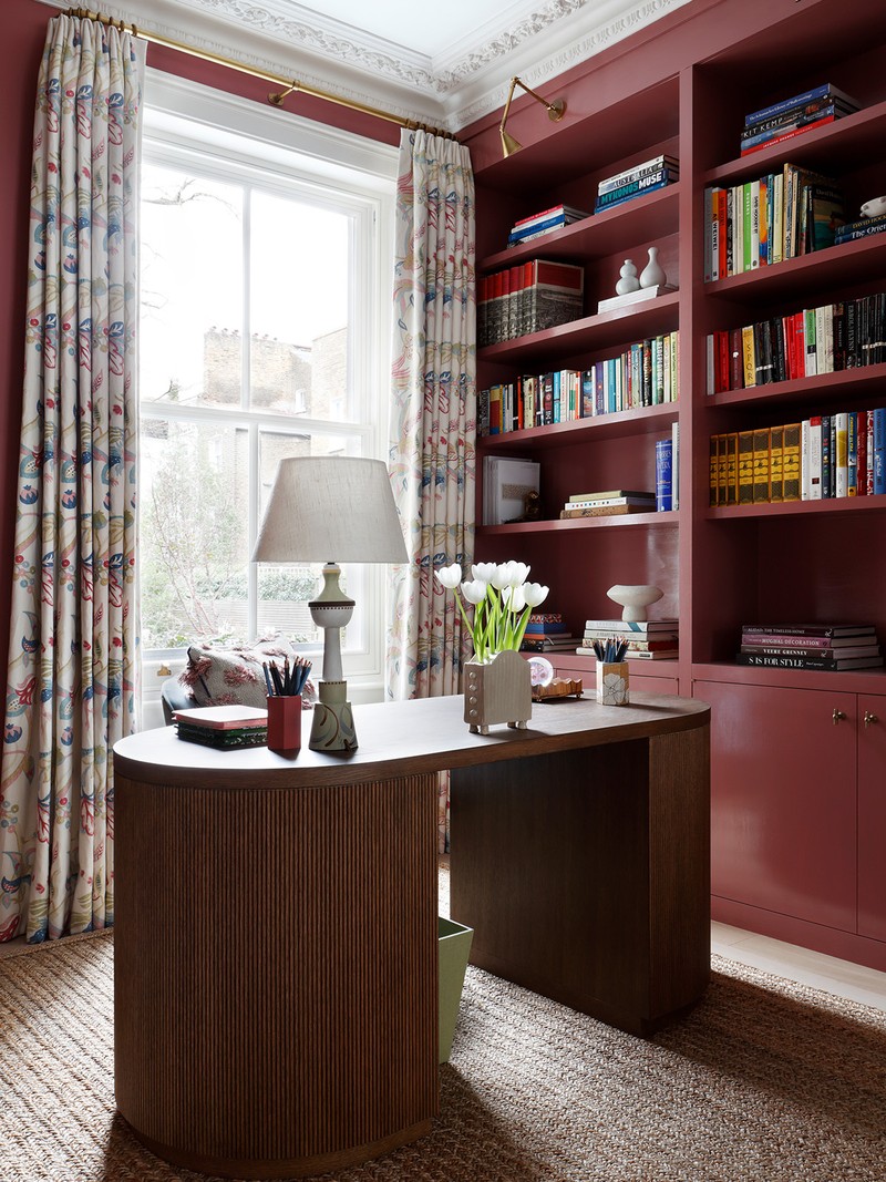
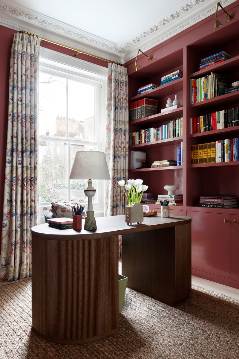
The layout of the house was very much dictated by the couple’s lifestyle. Both needed their own study and their own dressing rooms. This is her study – on the ground floor – which opens off the main sitting room through an arch and sliding doors.
WALLS: Rose by Edward Bulmer
DESK & JOINERY: Bespoke design by Studio Peake
CURTAINS: Curtain material Titley & Marr
TULIPIERE: Kate Monkton
The Main Bedroom
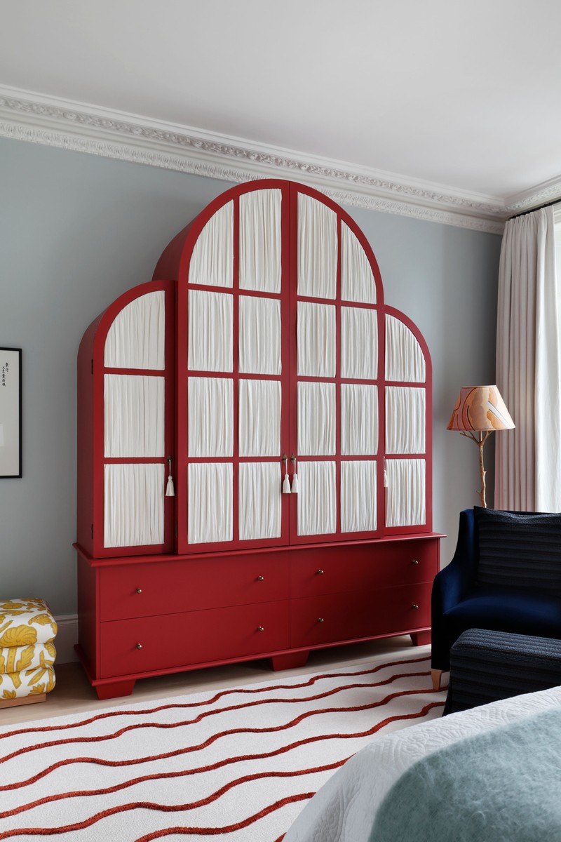
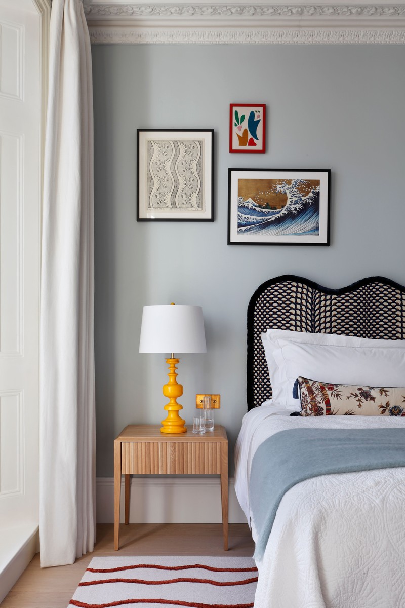
The main bedroom was one of the loveliest rooms in the house to design. It is on the first floor with almost full-height sash windows, which flood the room with light. I wanted to keep the overall feeling of the room calm, with punches of stronger colours bringing the room to life – hence the simple off-white linen curtain and pale blue walls. The cushion is from Repose Studio, a great company that sources off-cuts of amazing fabrics to turn into cushions.
HEADBOARD: Bespoke in fabric by Le Manach with a braid from Samuel & Sons
RUG: Based on an old Beni Ourain Moroccan carpet, made by Peter Page
CUSHION: Repose Studio
BEDSIDE TABLES: Knowles & Christou
WARDORBE & YELLOW STOOL: Bespoke design by Studio Peake
ARMCHAIR: Giovanna Ticciati
The Main Bathroom
The starting point for the main bathroom came from the cloud wallpaper on the ceiling. The idea was that you could lie in the bath and stare up at the clouds – that also informed the blue and white colour palette. I love the secret door covered in tiles with a special urchin knob and the relaxed roman blind – with the freestanding screen, it makes the bathroom feel more characterful. The pendant light adds a little bit of warmth – the gloss yellow of the privacy screen and the oak on the ceiling light were essential to warm up the cooler tones.
WALLPAPER: Fornasetti
URCHIN KNOB: Collier Webb
PRIVACY SCREEN: painted in Farrow & Ball's Babouche
PENDANT LIGHT: Tom Raffield
BLIND FABRIC: Colefax & Fowler
TRIM: Christopher Farr
VANITY UNIT: Bespoke design by Studio Peake
WALL LIGHTS: Drummonds
SENTOR BATH: BC Designs
WALL TILES: ‘Waterford’ scalloped ceramic tiles by Parkside
TAPS, SHOWERS, VALVES: Crosswater
FLOOR TILES: ‘Pariana’ porcelain tiles by Parkside
VANITY: Bespoke design by Studio Peake
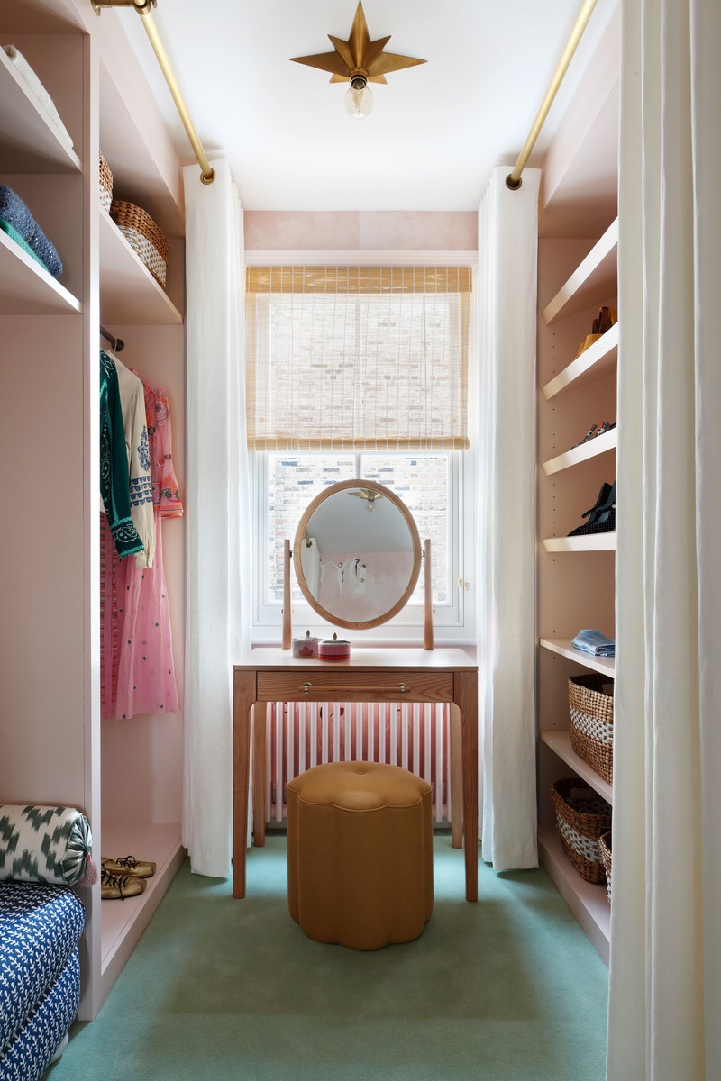
The Dressing Room
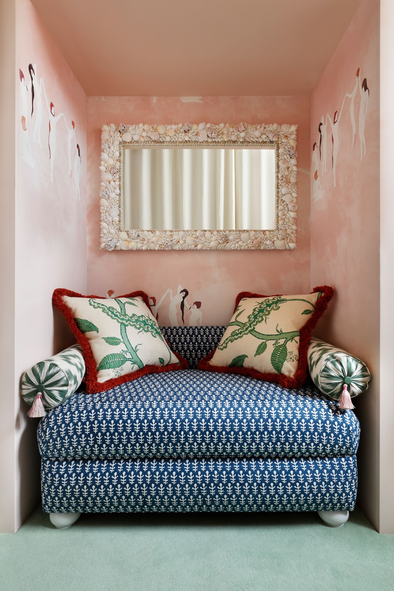
This was such a fun room to design. It is accessed through the secret tiled door from the main bathroom and it was where I let my imagination run wild – the result is a really girlie room. The wallpaper was the best background for this, and the shell mirror is a work of art; it’s possibly one of my favourite things we had made for the project.
WALLPAPER: Maison C
STOOL AND CUSHIONS: covered in Soane fabric
PENDANT LIGHTS: Visual Comfort
SHELL MIRROR: created for us by Katherine Lloyd
The Single Bedroom
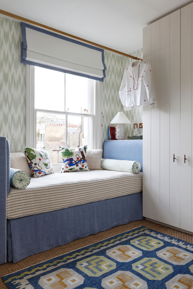
At the top of the house, we created a single bedroom slash dressing room. We designed a daybed with a brass rail above it for hanging up and planning outfits. Being a dressing room first and foremost, we had to incorporate a lot of storage so there are even drawers under the bed valance. The room perfectly converts to a single bedroom and the shelf behind the headboard works perfectly as a bedside table. The cushions are lively combination of colour and pattern, with the sheepskin adding a bit more texture.
ANTIQUE SWEDISH FLATWEAVE: Robert Stephenson
WALLPAPER: Ulricehamns
CUSHION: Josef Frank fabric from Svenskt Tenn
BOLSTERS: Brunschwig & Fils
SHEEPSKIN CUSHIONS: Shepherd of Sweden
Visit StudioPeake.com
DISCLAIMER: We endeavour to always credit the correct original source of every image we use. If you think a credit may be incorrect, please contact us at info@sheerluxe.com.
/https%3A%2F%2Fsw18.sheerluxe.com%2Fsites%2Fsheerluxe%2Ffiles%2Farticles%2F2024%2F02%2Fstudio-peake-chelsea-town-house-basement-living-space_0.png?itok=ccVRf15h)
/https%3A%2F%2Fsw18.sheerluxe.com%2Fsites%2Fsheerluxe%2Ffiles%2Farticles%2F2024%2F02%2Fstudio-peake-house-tour-downstairs-toilet1.png?itok=OzVCzsjN)
/https%3A%2F%2Fsw18.sheerluxe.com%2Fsites%2Fsheerluxe%2Ffiles%2Farticles%2F2024%2F02%2Fstudio-peake-house-tour-bathroom.png?itok=_EpsuX3s)
