Take A Look Around This Country Family Home
The Brief
An hour’s drive from London, this period property includes original features which date back to the 17th century. We didn’t make any structural changes, so it was all about breathing new life into the space with a cosmetic overhaul. The brief was to create a family home that felt like a refuge from weekday city living, so the owners could embrace a slower pace of life away from London. The client was also interested in mixing old and new furniture, and wanted to invest in antiques and use UK-based craftsman and artisans where possible. That said, we used plenty of high-street finds too.
Throughout the house we accessorised with a mixture of vintage finds and combined them with more modern high-street items from places like The Conran Shop, Zara Home and Etsy. We place huge importance on texture and materials, and the role they played in creating a cosy home. We chose to embrace natural and sustainable materials where possible, and in some rooms (particularly those overlooking the garden) we went for a Mediterranean feel.
My client embraced colour and pattern, but we were careful to scale it back when we felt it might overpower the space. We combined fabrics from Christopher Farr, Vanderhurd, Lewis & Wood and de Le Cuona, among others. There are no spotlights in the house apart from the kitchen. The other light sources are a mix of floor lamps, table lamps, uplights and pendants to create a calmer atmosphere.
/https%3A%2F%2Fsw18.sheerluxe.com%2Fsites%2Fsheerluxe%2Ffiles%2Farticles%2F2022%2F06%2Falice-leigh-130622-entrance-hall.jpg?itok=-w9_FUKV)
Hallway
We wanted to give this space a Mediterranean feel – it’s engulfed by the olive tree in the vintage pot and has a relaxing reading corner. The client already owned the bench and we had it recovered in Christopher Farr cloth. It works well with the mirror from Ilala Interiors which was handwoven in Africa. There’s a lovely ornamental jug here from Kanica, which also has lovely, framed textiles.
/https%3A%2F%2Fsw18.sheerluxe.com%2Fsites%2Fsheerluxe%2Ffiles%2Farticles%2F2022%2F06%2Falice-leigh-130622-reception-room-1.jpg?itok=qazgYkCT)
Reception Room
We wanted this to feel like a grown-up, calm and elegant space – one that combined elements of traditional and modern, with plenty of texture and tone. Painted in Farrow & Ball ‘Pigeon’, we used playful yellow accents – including the tray from the The Lacquer Company and the vintage side table from Quindry Antiques. I love the white cube side table from Margit Wittig – it’s like a piece of art. The vintage elm console table and earthy Spanish jug add textural touches, as do the jute stools from Soho Home. I love the statement lamps from Pooky, which are topped with Howe linen shades. The bobbin chair with zig zag fabric is from Litten Tree Antiques and the magnificent bar cabinet is a 1960s rosewood design complete with an inbuilt chessboard.
Playroom
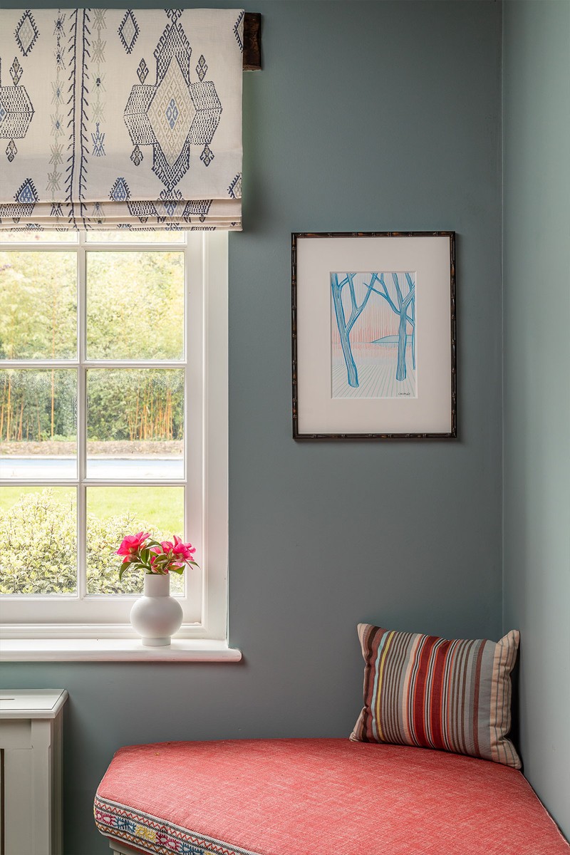
Inbuilt joinery runs the length of this room to store toys, and there’s a comfortable reading spot in the corner. We wanted to make this space look a little less utilitarian, so we added a seat cushion which is made in sections and can be easily removed for access. It also helps soften the acoustics. The blinds and cushion trim are from Christopher Farr and the seat cushion fabric is by Fermoie. I love the picture by Catherine Cazelet from Grandy Art – it works well against the walls, which are painted in Farrow & Ball ‘Oval Room Blue’.
/https%3A%2F%2Fsw18.sheerluxe.com%2Fsites%2Fsheerluxe%2Ffiles%2Farticles%2F2022%2F06%2F2alice-leigh-130622-family-living-room.jpg?itok=mshrc3MR)
Family Living Room
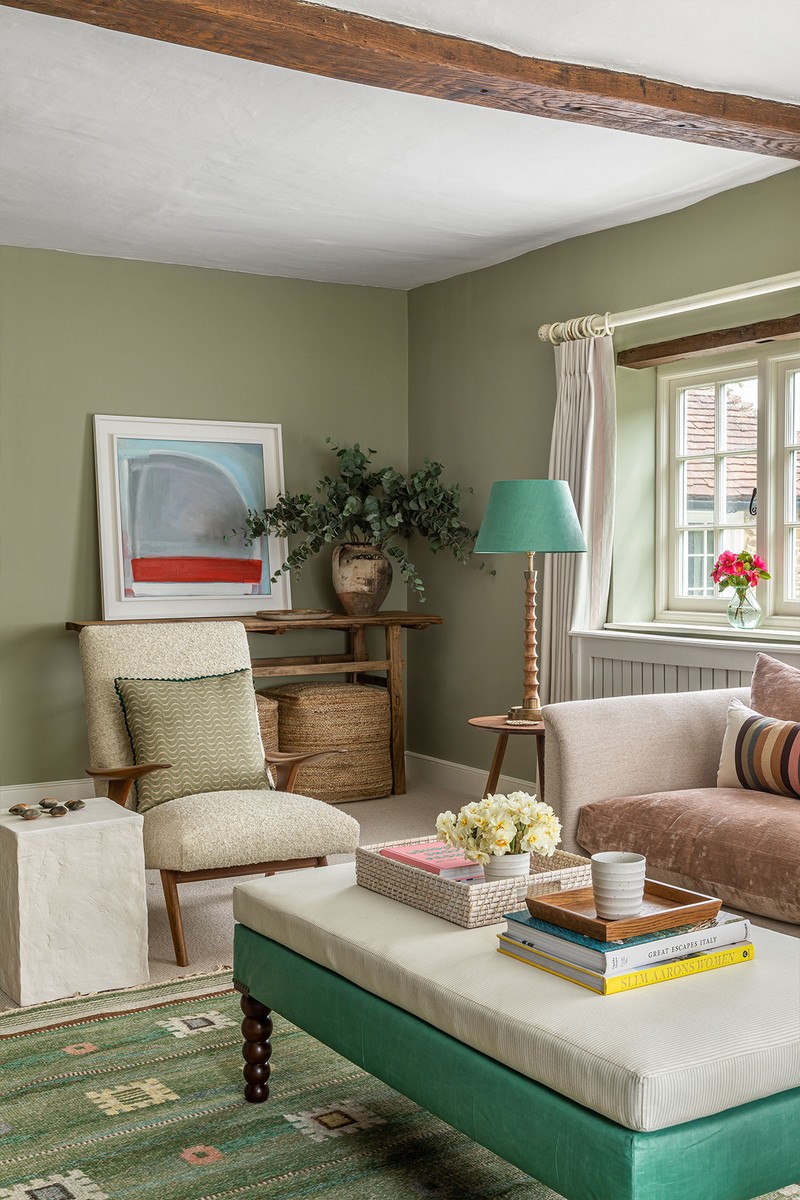
We wanted to use some quite earthy tones here, peppered with some richer velvets and bold stripes – suppliers include Tissus d'Hélène and de Le Cuona. Just off the kitchen, this room looks out onto the garden and is flooded with natural light. It also flows into the kitchen, so we needed the two spaces to relate to one another. I like using framed textiles where possible, as they stop it feeling too formal. The one above the sofa is by the Morocco-based lifestyle brand Lrnce, and was handwoven in Marrakesh – it works well against the walls which are painted in ‘Cromarty’ by Farrow & Ball. The lamp and shade are by Howe, the rattan chair is from Zara Home and the eye-catching spiral side table beside the armchair is from Galvin Brothers.
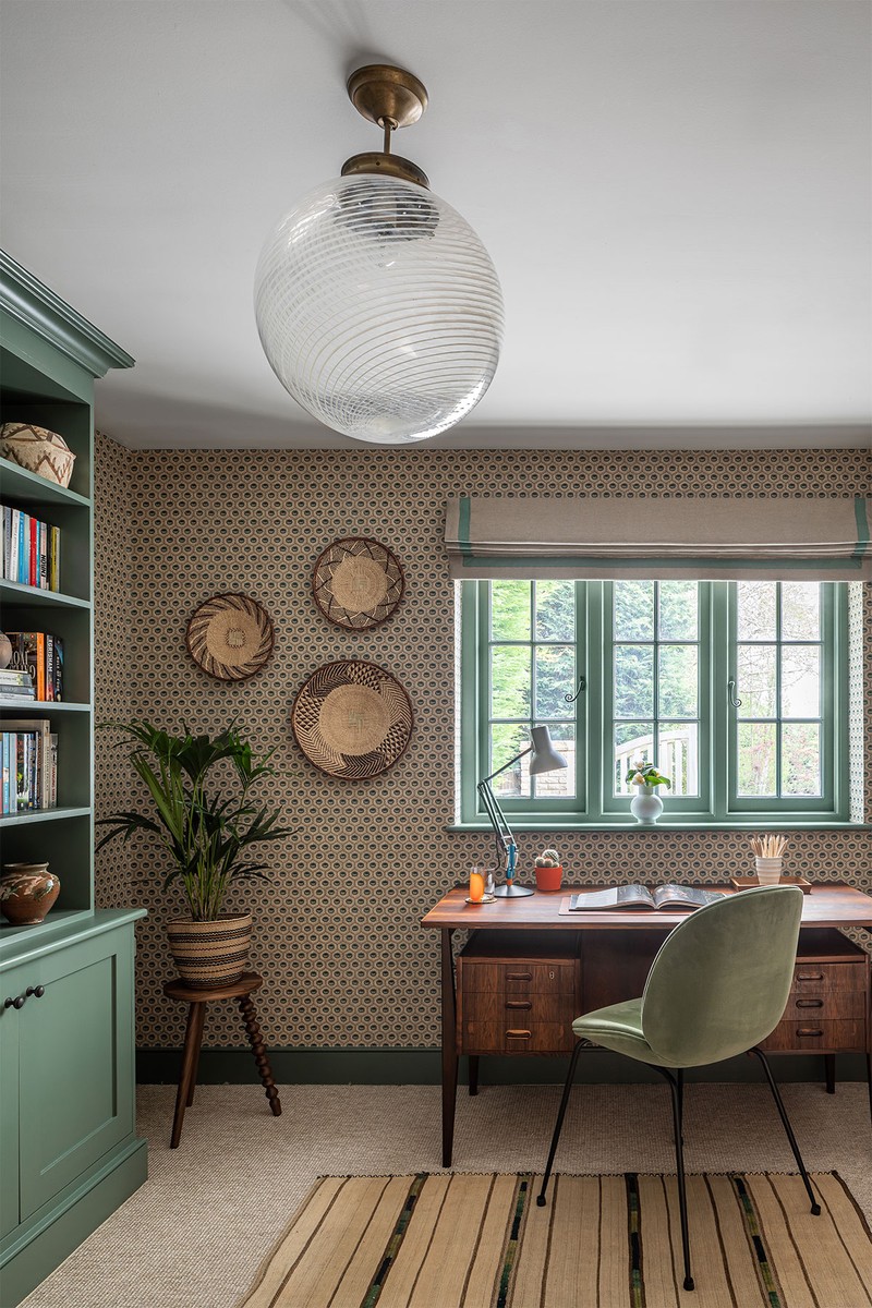
Study
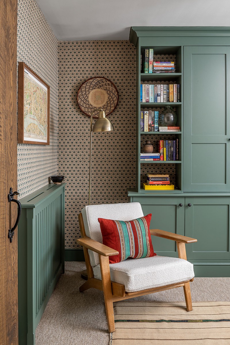
This room is tucked away in a quiet corner of the house. The starting point was the Robert Kime wallpaper – an easy geometric design complemented with paintwork in Farrow & Ball ‘Green Smoke’. The client had plenty of books, so we used these and added some additional accessories from an antiques fair. The rug is vintage by Birdie Fortescue, the armchair is Hans Wegner from Vinterior. The silk jajim cushion is from Nushka Home and the wall baskets are from Etsy. The 1950s Danish rosewood desk from Vinterior is paired with a Beetle Gubi chair.
/https%3A%2F%2Fsw18.sheerluxe.com%2Fsites%2Fsheerluxe%2Ffiles%2Farticles%2F2022%2F06%2Falice-leigh-130622-dining-room.jpg?itok=WDyFFXro)
Dining Room
This space came together with a good mix of vintage and new. I love how the antique Gustavian sideboard and vintage chairs sit so well together with the modern dining table from Galvin Brothers and pendant by Alexandra Robinson. The G Plan chairs were from Etsy – I had them restored and recovered in Christopher Farr fabric and 36 Bourne Street goatskin leather on the seat pads. The picture is by Emily Thornton.
/https%3A%2F%2Fsw18.sheerluxe.com%2Fsites%2Fsheerluxe%2Ffiles%2Farticles%2F2022%2F06%2Falice-leigh-130622-main-bedroom-1.jpg?itok=UuWXWgYz)
Main Bedroom
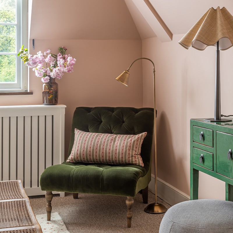
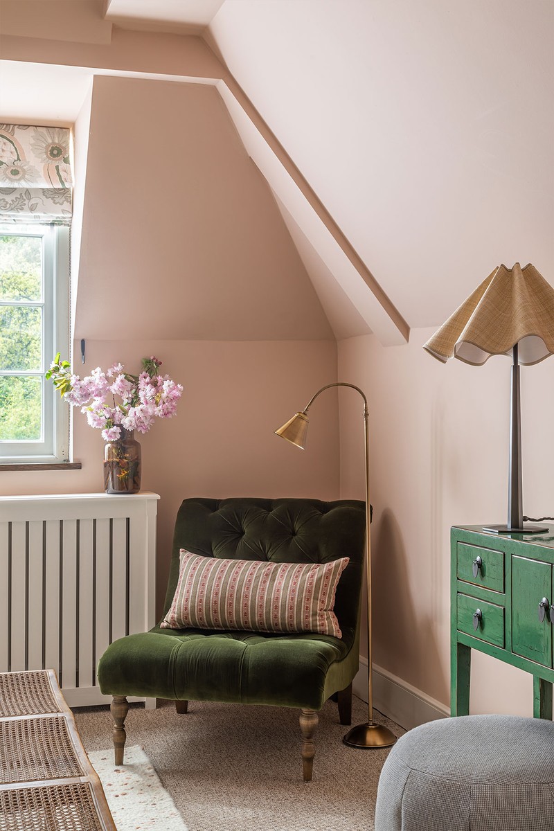
The client wanted this bedroom to feel feminine, so we combined numerous soft pink shades and green – which is always a winning combination. The walls are painted in Farrow & Ball ‘Setting Plaster’, the blinds are Christopher Farr’s ‘Carnival’, with a rug from Coral & Hive. There are Pooky lamps beside the bed with a Munro & Kerr shade on each and the olive armless chair is from Sofa.com (covered in fabric from GP & J Baker, which is the same fabric as the sides and piping of the headboard). The end-of-bed bench is Zara Home, the bed cushions are from Etsy and The Mews, and the bed throw is from de Le Cuona.
Kids Bedroom
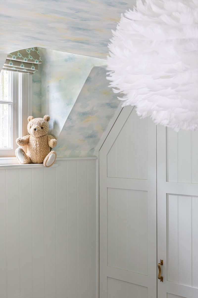
We wanted to do something really special and fun here for the children. We decided to take this restful cloud wallpaper from the top of the panelling right the way across the ceiling. The bow handles are from Beata Heuman and the feather pendant is by Graham & Green.
/https%3A%2F%2Fsw18.sheerluxe.com%2Fsites%2Fsheerluxe%2Ffiles%2Farticles%2F2022%2F06%2Falice-leigh-130622-guest-bedroom.jpg?itok=dMt2Xb12)
Guest Bedroom
We injected an otherwise neutral colour palette with a range of interesting patterns which, despite being busy, didn’t fight with each other. The eye-catching armchair already belonged to the client, and we retained its existing covers in Lewis & Wood’s ‘Bukhara’. I love the character of the bench by WoodEdit, the rug from the Conran Shop and the throw from Felinfach. The lamp is Vaughan Pisa with a shade from Rosi de Ruig.
Visit AliceLeigh.co.uk & follow @AliceLeighDesign
Photography by Jonathan Bond
DISCLAIMER: We endeavour to always credit the correct original source of every image we use. If you think a credit may be incorrect, please contact us at info@sheerluxe.com.
