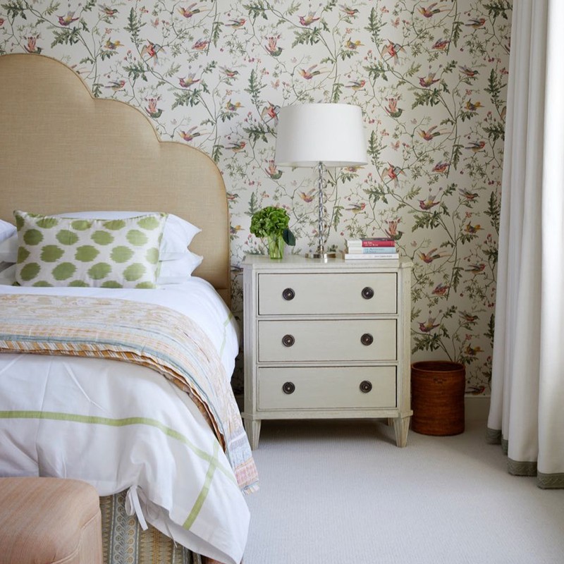
Get The Look: A Fresh & Feminine Bedroom
The Colour Scheme
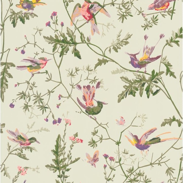
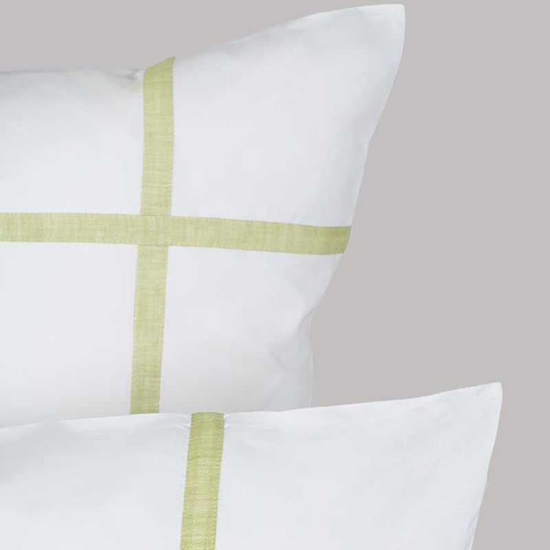
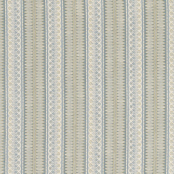
“The palette derives from the rug that was an existing client piece. We wanted to find a wallpaper that had a neutral background but still embraced colour, incorporating the rug’s blue and peach tones. Every fabric design and pattern was chosen with these key elements in mind – for example, picking out the colours in the wallpaper in smaller-scale patterns in linens and cottons. The neutral palette of the wooden furniture and joinery, paired with the plain linen curtains with green embroidered trim, freshens up the busyness of the surrounding patterns and gives a serene feel.”
The Finishes
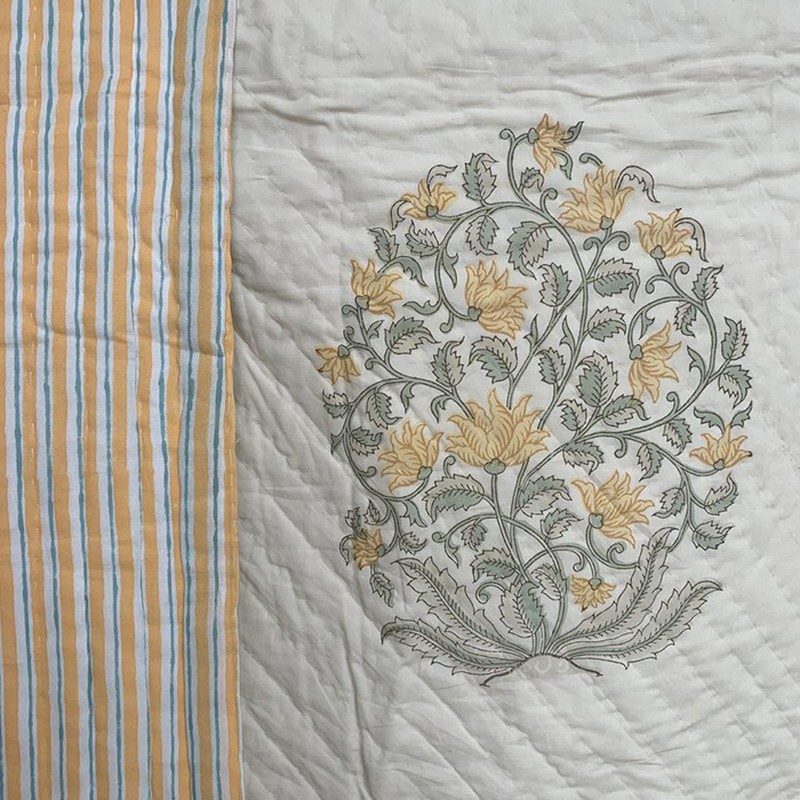
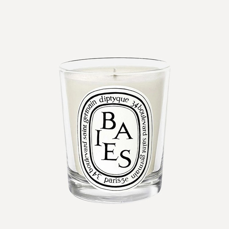
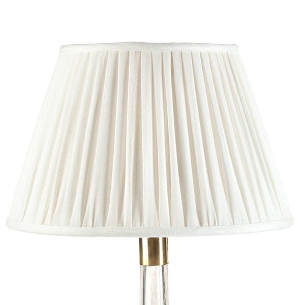
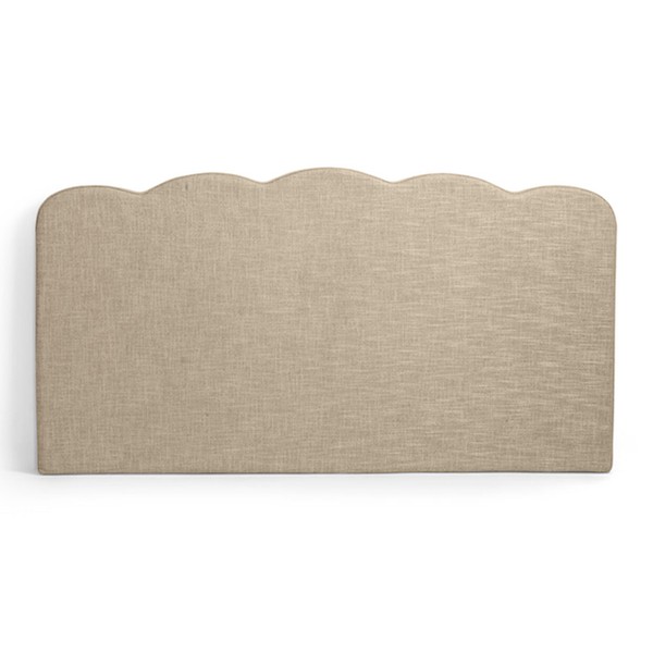
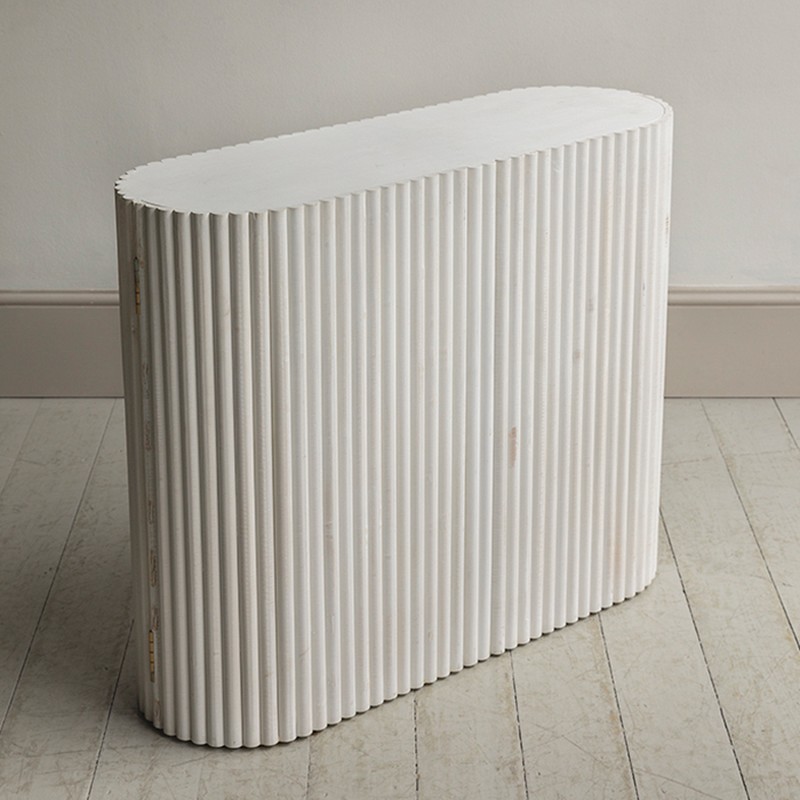
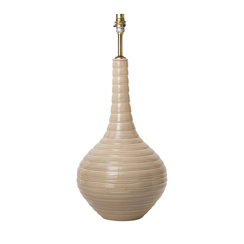
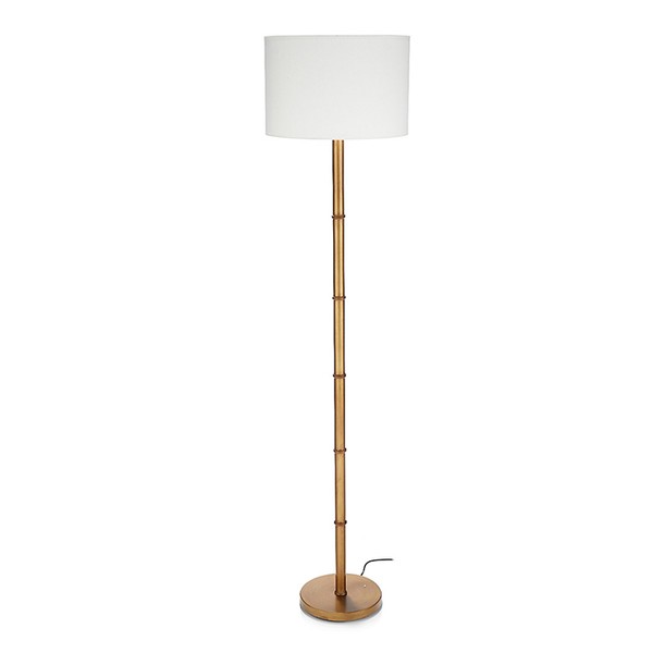
“The cabinet with curved tambour-style doors is hinged on the outer-most point of the curve. We contrast-painted the interior in Dutch orange to link in with the wallpaper and add some interest when open. We used natural organic materials to inject texture: the Penny Morrison ceramic biscuit teardrop lamp, hand-painted and finished in a high-shine glaze on the ribbed design; white-washed veneer-painted wardrobe doors; a natural raffia fabric on the headboard; and a block-printed Indian cotton bedspread.”
The Shapes
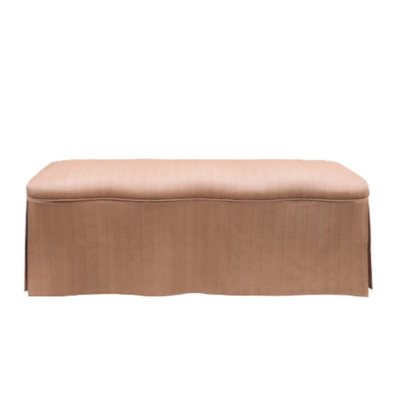
“The rug also inspired the shapes and finishes – we thought it would be playful to mimic the scallop in the flatweave in other elements of the room. The bespoke scalloped headboard was scaled to the elevation of the room, the end-of-bed ottoman is also scalloped, and the theme of curves continues in the fluted cabinet.”
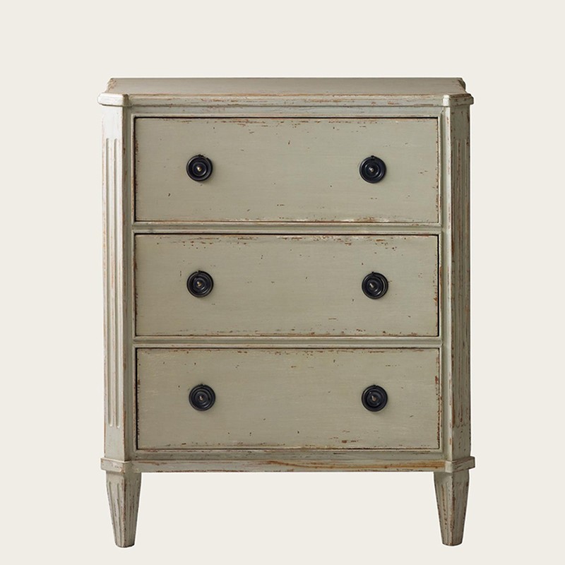
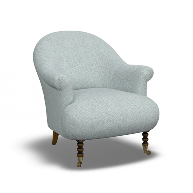
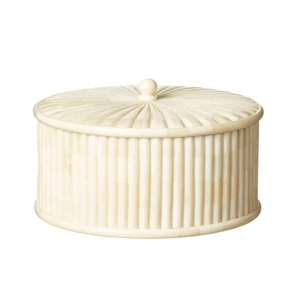
/https%3A%2F%2Fsw18.sheerluxe.com%2Fsites%2Fsheerluxe%2Ffiles%2Farticles%2F2021%2F12%2Fnew-lifestyle-get-look-bedroom-masseythenorland_0.png?itok=_pHmYVvE)

Visit TodhunterEarle.com to see more of its work.
DISCLAIMER: We endeavour to always credit the correct original source of every image we use. If you think a credit may be incorrect, please contact us at info@sheerluxe.com.
