
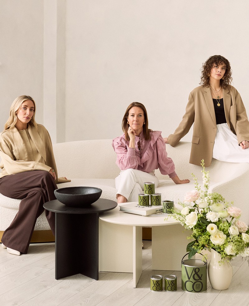
What You Need To Know About This Exclusive Collaboration
Created in partnership with V&CO
The Colours
Each paint in the collection carries its own distinct mood and inspiration:
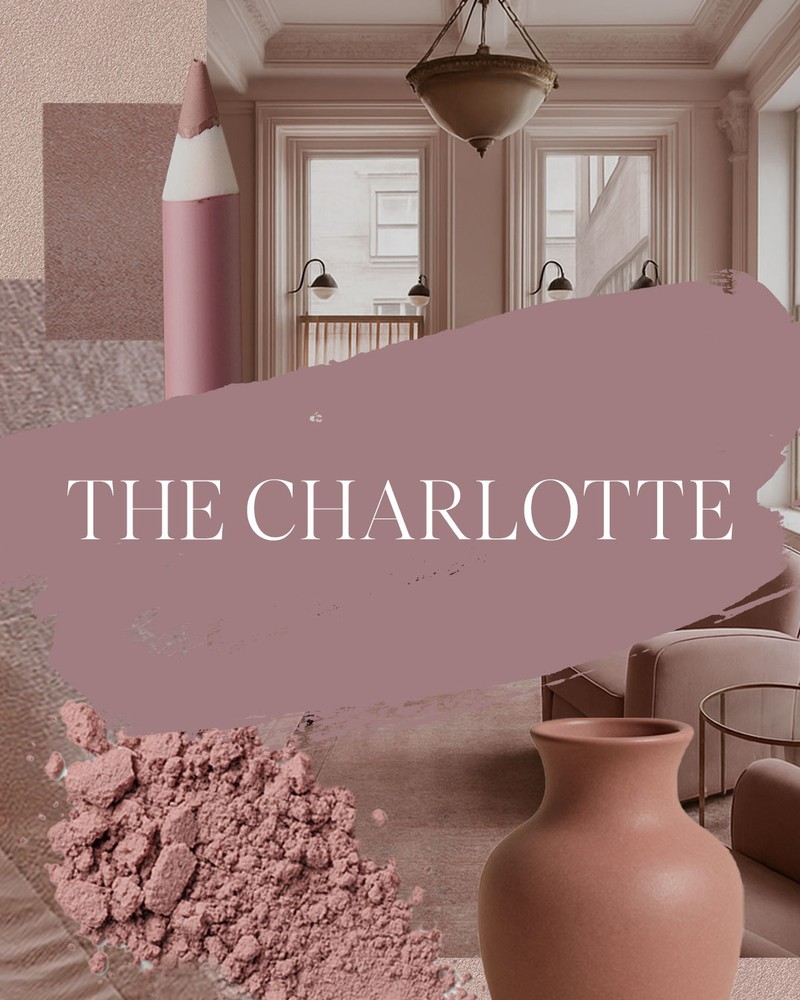
The Charlotte
A sophisticated dusty pink, this colour is ideal for areas where you want a touch of warmth and elegance. Inspired by vintage velvets, it creates a rich, enveloping atmosphere.
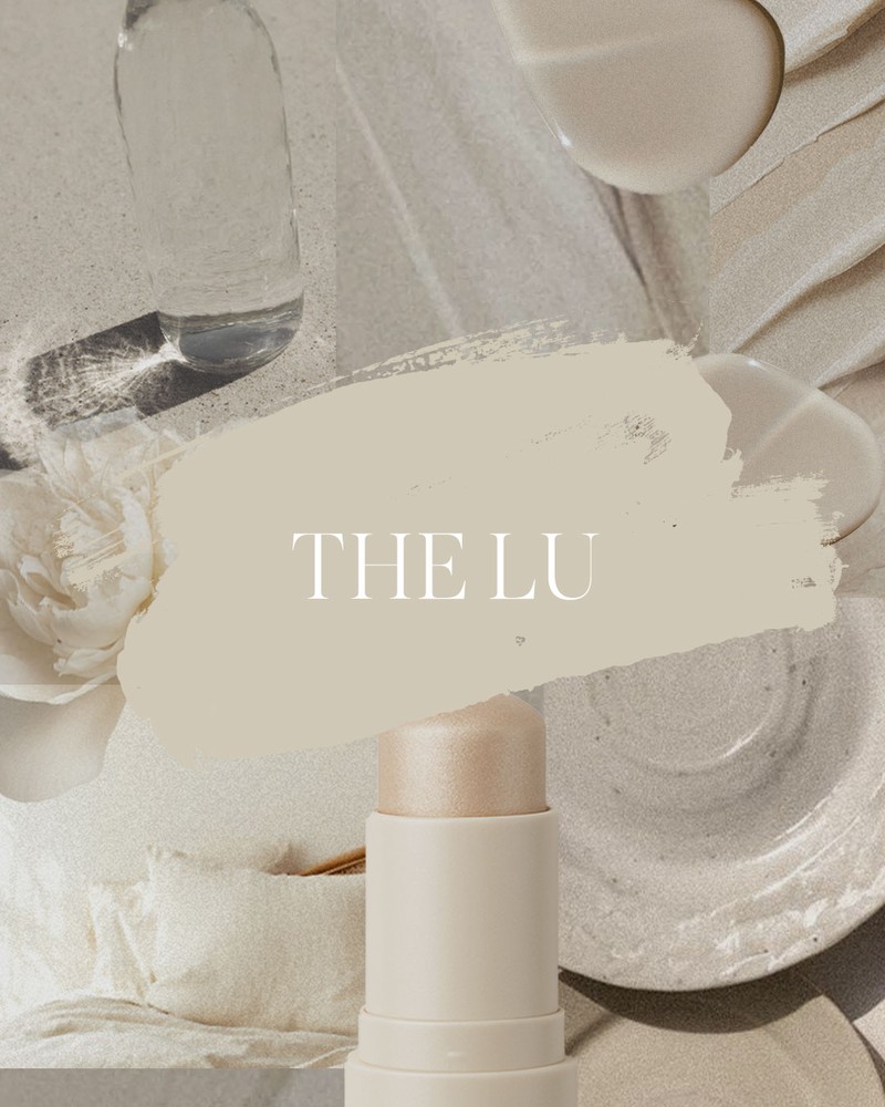
The Lu
A creamy, light-filled neutral that feels calm and reflective, it works as a fresh backdrop for both modern and traditional spaces.
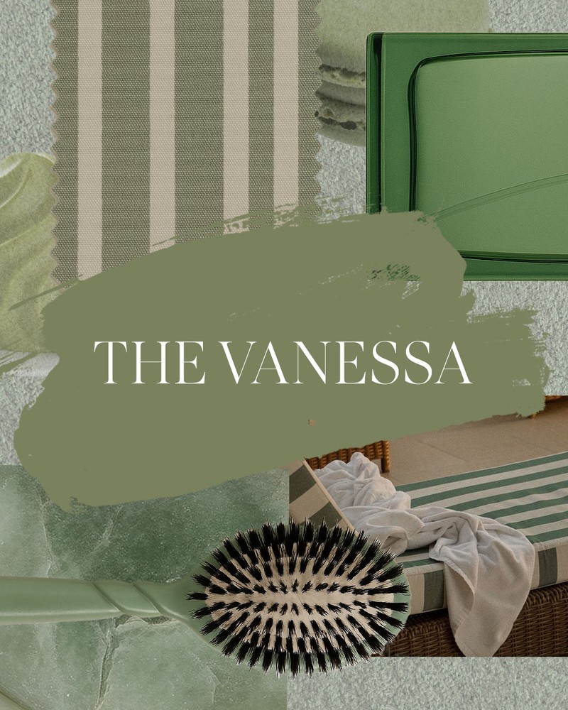
The Vanessa
A soft, earthy green with an organic edge, this gentle and grounding colour works in bedrooms, kitchens and on feature walls, drawing on linen, rattan and natural textures for inspiration.
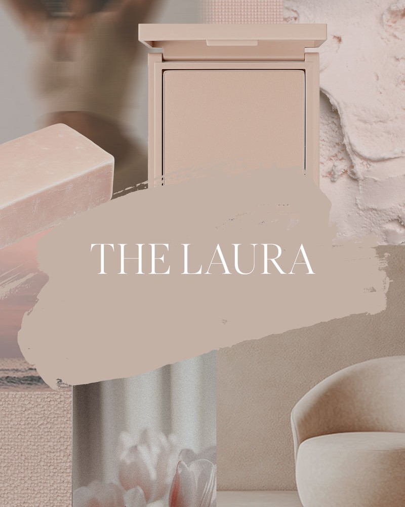
The Laura
A creamy beige with subtle rosy undertones, The Laura is versatile and serene. Think of it as a reliable neutral that works well with both deeper and lighter shades.
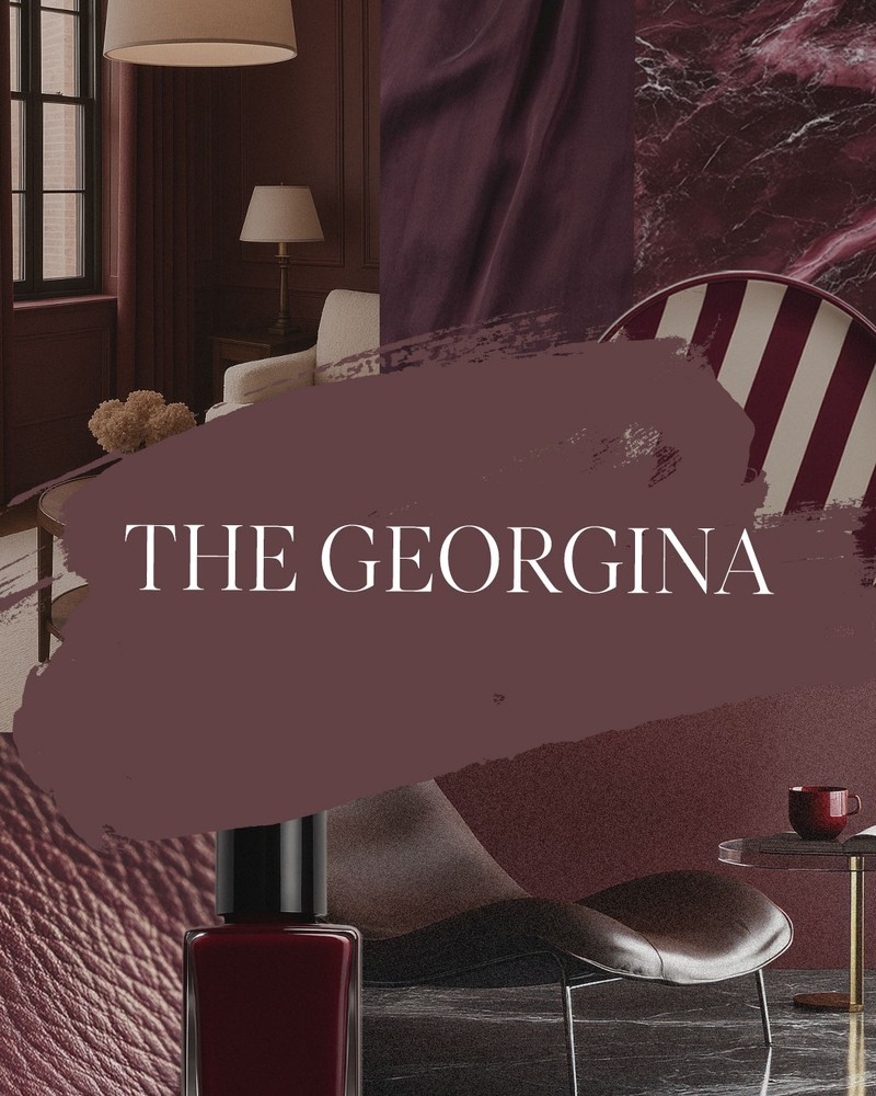
The Georgina
A bold burgundy designed for cabinetry, feature walls or woodwork, this is dramatic yet warm. Plus, it takes cues from terracotta and lacquered finishes for a cinematic, cocooning effect.
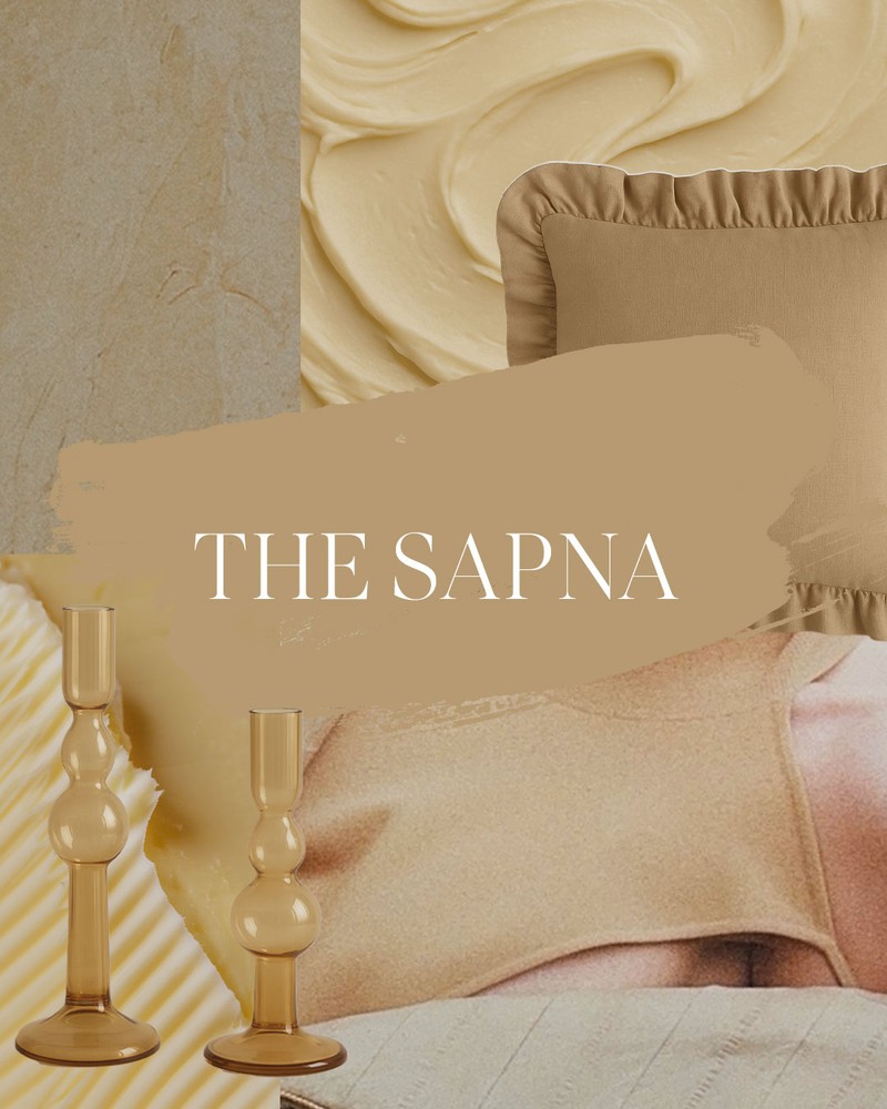
The Sapna
A golden tone that feels sunlit and understated, The Sapna is inspired by earthy palettes and natural textures. Use it to add depth to cabinetry and team it with complementary blues or greens.
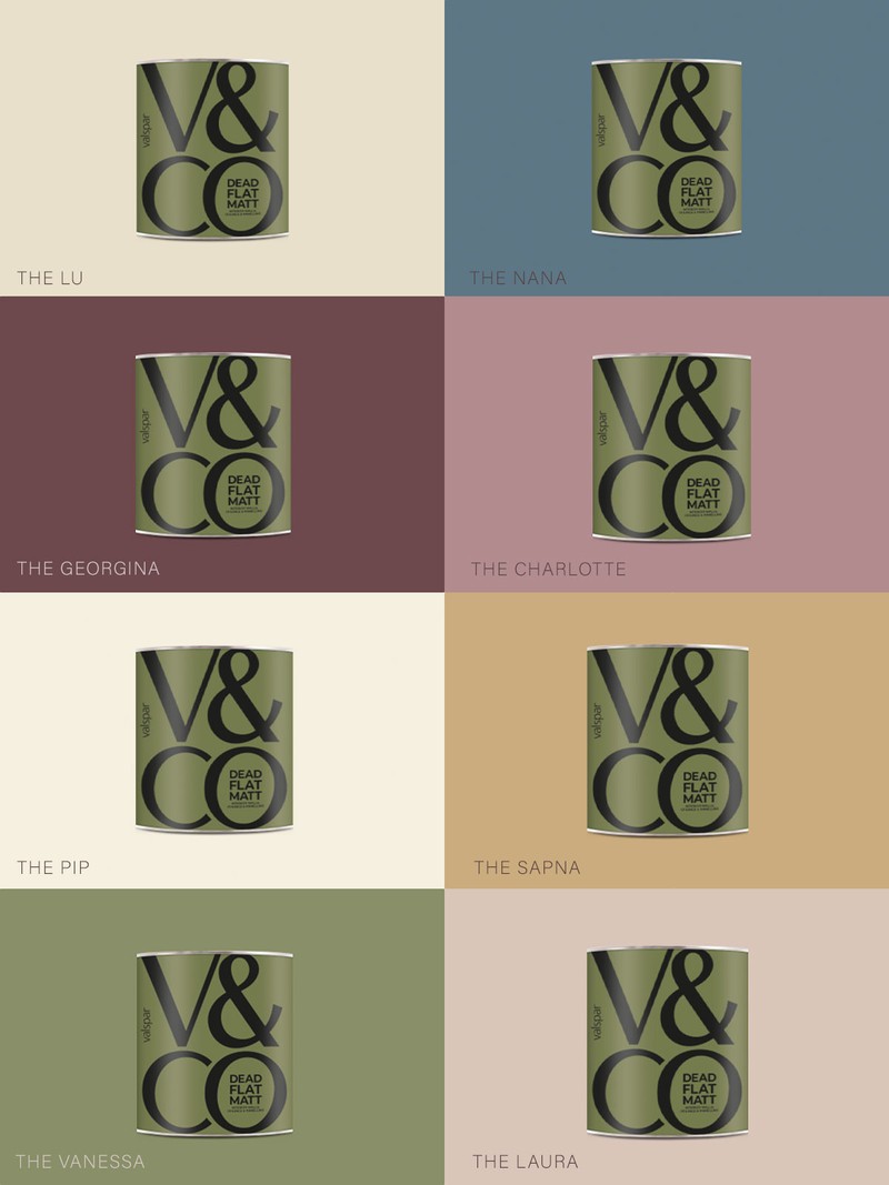
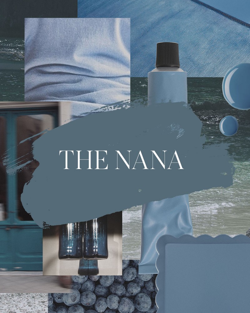
The Nana
This is a deep slate blue that lends a sense of quiet luxury to studies, bedrooms and dining spaces. Moody but not overwhelming, it’s inspired by traditional libraries and tactile fabrics like velvet.
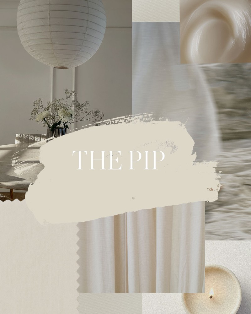
The Pip
A clean, adaptable white that maximises natural light, this is ideal for trims, walls or cabinetry. Timeless and versatile, it’s the ultimate foundation colour for modern living.
The Pairings
While each shade holds its own, the real beauty of this collaboration lies in the pairings. Here’s how to use them together to bring out the best in your home.
For A Dressing Room:
The Georgina & The Charlotte
A dressing room should feel glamorous, intimate and flattering, and this pairing delivers exactly that. The Charlotte’s soft dusty pink sets the tone on the main walls, while The Georgina adds drama and sophistication on the woodwork, wardrobes and door frames. Together, they create a chic, couture-inspired space.
How To Style It
Lean into the luxurious mood with tactile materials and metallic accents. A velvet ottoman in blush or burgundy could double as seating or storage, and a nod to The Charlotte’s vintage glamour. A full-length gilt mirror bounces light around the room, while also giving the space a studio feel. Finally, brushed brass handles on wardrobes or drawers tie the scheme together with polish and practicality.
For A Utility Room:
The Pip & The Sapna
Functional doesn’t have to mean boring. The Sapna’s golden tone is the perfect shade for cabinetry, forgiving of scuffs while bringing warmth to the space. Paired with the crisp freshness of The Pip on the walls, it transforms a purely practical room into somewhere that’s uplifting and enjoyable.
How to Style It
Opt for materials that balance utility with charm. Patterned encaustic floor tiles will add energy underfoot and stop the room from feeling too plain. Rattan baskets and hampers provide texture, while also keeping laundry and essentials organised. For lighting, a matte opal wall sconce is both functional and stylish, ensuring the space feels bright but considered.
For A Cloakroom:
The Laura & The Vanessa
Cloakrooms can often feel uninspiring but this pairing strikes the perfect balance between functional and sophisticated. Use The Laura on the walls to create a soft, welcoming backdrop, then paint the vanity unit or panelling in The Vanessa for depth and glamour. Together, they hit that boutique hotel note without ever feeling heavy.
How To Style It
Choose fittings that complement rather than compete. Brushed brass tapware adds warmth against The Vanessa’s earthy green, while black fittings deliver sharp contrast. Add linen towels in neutral tones for tactile luxury and hang an oversized round mirror to bounce light and expand the sense of space. The result is a cloakroom that feels indulgent yet calming.
For A Study:
The Lu & The Nana
Atmosphere is key in a home office and this pairing is polished and East Coast-inspired – timeless, confident and characterful. The Nana envelops the walls in slate-blue depth, cocooning the space and encouraging focus. The Lu then steps in on the ceiling and trim, lifting the look with its creamy neutrality.
How To Style It
Anchor the scheme with a dark wood desk for gravitas, then balance it with a leather desk chair for both comfort and texture. Built-in bookshelves painted in The Nana will create visual depth, while a library-style wall sconce or antique brass task lamp adds atmosphere and function. The combination makes working from home feel both elevated and inspiring.
Finally, The Finish
The SheerLuxe x V&CO paint collaboration is more than just a colour palette – it’s a toolkit for creating spaces that feel stylish, personal and timeless. The Dead Flat Matt finish adds richness and depth while disguising wall texture, making the curated shades feel elevated and luxurious. What’s more, the multi-surface formula enables full colour drenching across the walls, skirting and even the radiators. Proof, if ever it were needed, that the right paint isn’t just a finishing touch – it’s the foundation of great design.
DISCLAIMER: We endeavour to always credit the correct original source of every image we use. If you think a credit may be incorrect, please contact us at info@sheerluxe.com.
/https%3A%2F%2Fsw18.sheerluxe.com%2Fsites%2Fsheerluxe%2Ffiles%2Fwebsite-images%2F2025%2F03%2Fsign-up-pop-up.jpg)
