Be Inspired By This Luxe Family Home
The Brief
Our client was clear the property needed to be renovated and completely ready to move into within one year. Within this parameter, the creative brief centred around quite practical requirements as well as the characters and ages of the four children, which informed the style of their bedrooms. The family are widely travelled but love London; they mostly use this home in the summer and over Christmas time, so many of the references we have used are rooted in their love of travel.
The Property
This is a large lateral apartment within a beautiful 1930s art deco building overlooking one of London’s most elegant garden squares. To meet the client’s specifications, it needed a full-gut renovation and improved space planning, which is what we specialise in. With no scope to extend outside of the parameters of the apartment, the skill is in clever adjustments to the space to ensure storage and room sizes are ample. We designed it to now have an open-plan reception and dining space which is open to the entrance hall; then there’s a guest cloakroom, large kitchen, master suite, three further bedrooms – two of which are en-suite – and a family bathroom. There is also a large utility space to the rear of the property.
The Entrance Hall
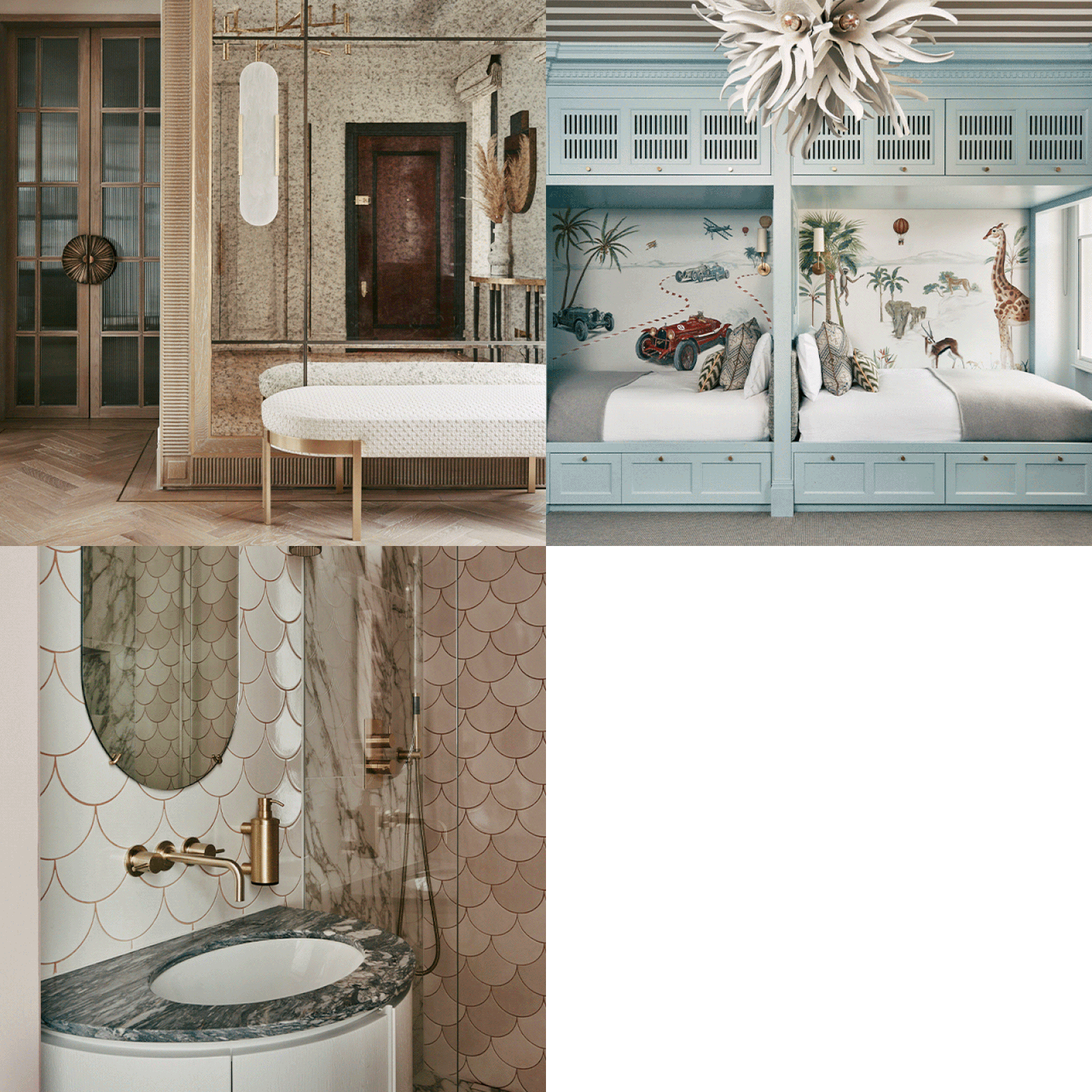
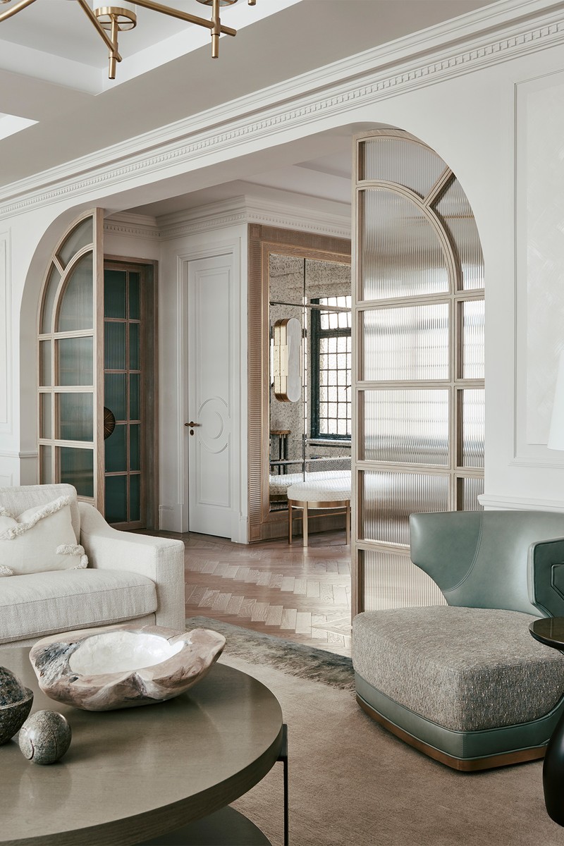
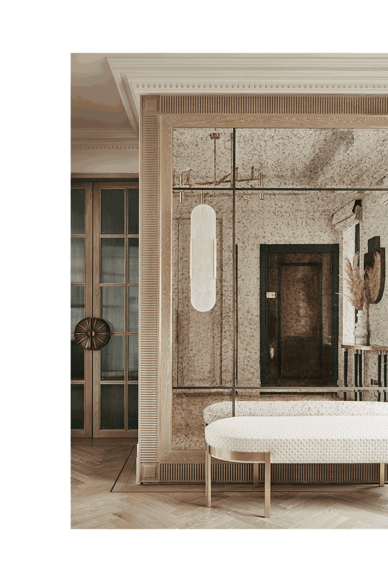
Thanks to the footprint of the building, this apartment lends itself to a large and quite square entrance lobby. I wanted to celebrate this by almost doubling the space through the use of a mirror. The sense of welcome is important to any home but especially in an apartment – you need a transition space between the street, the common parts of the building and finally the entrance into your own home. We sought to give depth to the space and the use of an antique mirror adds warmth and texture to an otherwise cold material. By framing it in wood, we created a further level of detail and finish to the mirror; it also creates harmony with the floor finish and the screen partitions that divide the hallway from the living area.
It’s also important that this space feels cosseting rather than intimidating or stark. For a family home, a timber floor is wonderfully sturdy and resilient, yet inviting and warm. Bringing it through from the entrance hall to the living space unites these areas.
/https%3A%2F%2Fsw18.sheerluxe.com%2Fsites%2Fsheerluxe%2Ffiles%2Farticles%2F2021%2F11%2Fbase-interiors-living-room-nw_0.jpg?itok=vlZ7UuvO)
The Living/Dining Room
The client was keen to preserve an opening between the entrance hallway and the living space, but the original opening felt too large and unfinished to me, so I designed these side light panels as a way of framing it in a decorative way that nods to the art deco period of the building. By using the same timber as the flooring, the screen becomes part of the fabric of the property rather than a loose piece, and this unites the spaces. The reeded glass adds a layer of interest and texture, and the light plays beautifully on it in the evening.
A large, open space needs careful planning. Rugs are a great way to zone a space without creating a vertical divide. The feature pendant over the dining table also creates a focal point so this becomes more of an area of its own with its own centre point, and the fireplace and coffee table serve the same purpose in the living area.
I think the beauty of this space lies in the focal walls at each end of the room. The fireplace is flanked by tall storage at one end, and this is mirrored by the two armoires with the mirror between in the dining space. In this way, the room does not feel as though there is a dining table sitting behind a sofa, which can feel cluttered and imbalanced. The central opening into the room also gives the feeling of walking into the heart of the space.
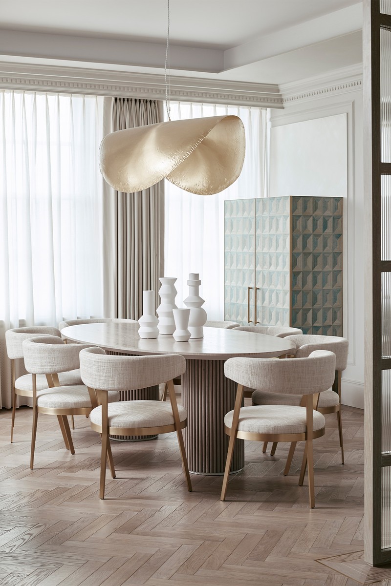

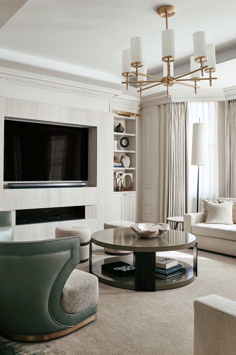
The client was keen for a neutral palette and the building does lend itself to lighter tones as the architecture is very solid. The warmer tones are kept contemporary through the use of texture and pattern. Bolder colour is introduced in the upholstered furniture and soft furnishings, including cushions and curtains.
We had quite a few pieces made by specialist upholsterers and joiners including the sofas, the dining chairs, table and the armoires. Fabrics were sourced internationally from houses including GP&J Baker, Whistler Leather, Chase Erwin, Zimmer & Rohde and Dedar. One of the furniture suppliers we used repeatedly in this property is Frato, a designer our client introduced us to. It supplied the beautiful bedside table lamps and dressing table in the master bedroom as well as the entrance hall console table.
The pendant light over the dining table is a popular talking point – it’s a Paola Navone piece available from Gervasoni. We adore the playful swivel chairs in the reception room which we had made then upholstered in leather by Whistler Leather and a contrasting fabric by GP&J Baker. Curtains are made by our makers – the heavier curtain is 004 DUO, Sable Du Desert, by Dedar and the sheer is Criste by Casamance. Timber flooring is laid herringbone style and stained, and available from Walking On Wood.
The Kitchen
The brief was to create a functional eat-in kitchen. We chose to work with an Italian manufacturer, Arredo 3. Its quality is very good and it’s economical, creating stylish kitchens without breaking the bank. We designed the kitchen in-house at Base Interior, working with the Arredo 3 modules so this is a semi-bespoke kitchen. It is formed from a mix of lacquer cabinetry with some veneered doors as accents, a manmade quartz worktop and brass handles, grip rails and plinth board, which are a link to the antique brass ironmongery used throughout the apartment. The lighter tones and the mixture of finishes create a feeling of warmth that is present throughout the home.
/https%3A%2F%2Fsw18.sheerluxe.com%2Fsites%2Fsheerluxe%2Ffiles%2Farticles%2F2021%2F11%2Fbase-interiors-kitchen-nw_0.jpg?itok=rfLaIxrd)
The Master Bedroom
The scheme was inspired by the client’s desire for a luxurious but understated bedroom, a play on a hotel suite but with playful touches. We worked with pattern and colour to bring in character – some of our favourite accents are the pattern on the curtains and the textured cushions on the chaise at the end of the bed. I liked the idea of introducing curves in this scheme to echo the bay window and to add interest as a counterpoint to the geometry of the room.
We chose a shaped headboard which is attached to and wraps a little around the bed, rather than a straight wall-mounted headboard. This allowed us to use a beautiful De Gournay silk wallpaper as a centre panel. I’m not usually keen on a feature wall, but this works well in balancing the room and creating symmetry in the space that is left from the bay window.
/https%3A%2F%2Fsw18.sheerluxe.com%2Fsites%2Fsheerluxe%2Ffiles%2Farticles%2F2021%2F11%2Fbase-interiors-master-bedroom-fw_0.jpg?itok=ilUkZ6g2)
The curtain fabric is by Thibaut and it is a dress curtain – we have motorised blackout blinds sitting within the window reveals. The cover board or pelmet is covered in the same material and creates a nicely finished detail to hide the motorised sheer curtain tracks. The cushion fabrics are highly textured or patterned and give a layered, effortless and indulgent atmosphere. We used fabrics from Romo, Mark Alexander and De Le Cuona with additional piping and trimmings. For example, the large cushion on the bed which matches the curtains is piped with a beautiful trimming from Samuel & Sons – these are the details which give such a finished look to the scheme.
We designed the bespoke wardrobes with wallpaper in a shaped geometric inlay which was inspired by the art deco origins of the building itself. We were lucky to be able to have so much bespoke furniture made for this scheme: the bedside tables were made for us by Hyde House which intrepeted our drawings to create something unique; the end of bed sofa was made by SM London as was the bed base. The Frato wall lights either side of the bed were on the wish list from the client– they’re quite dark and dramatic, but they are balanced beautifully by the ethereal crystal chandelier with its organic shapes, which is from Arteriors Home.
The Twins’ Room
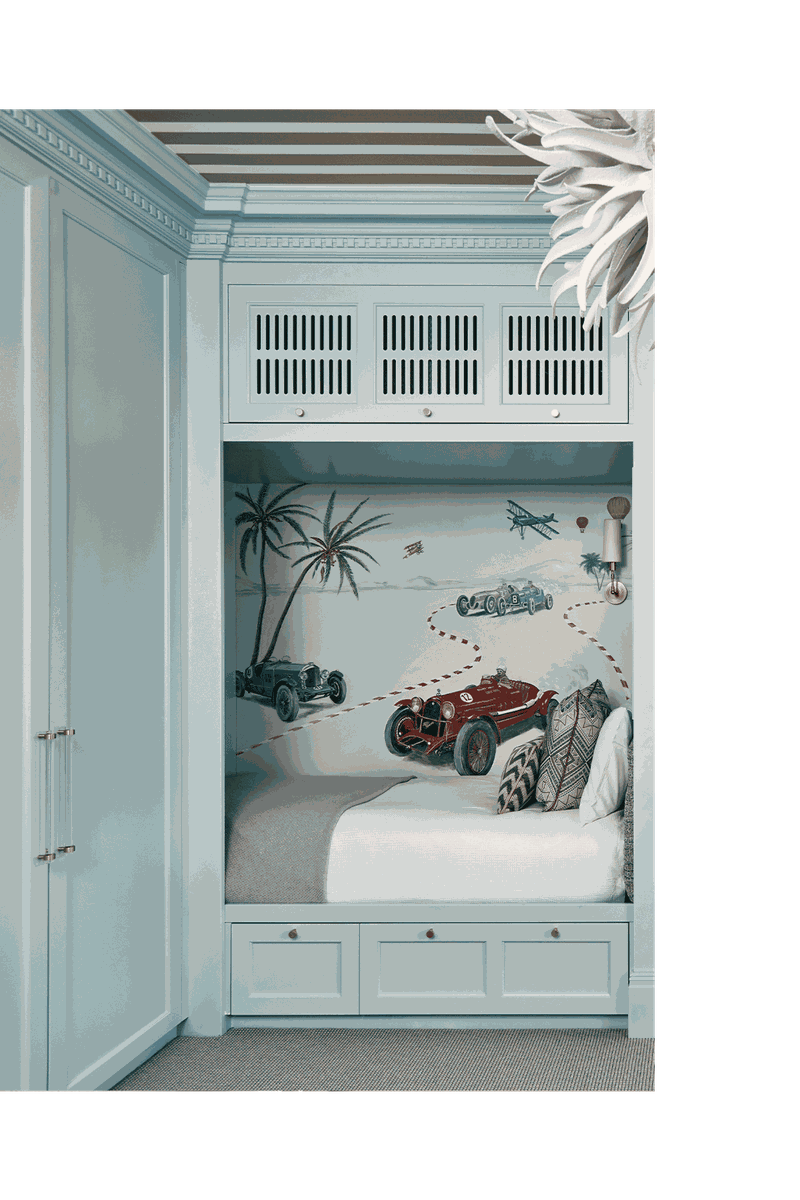
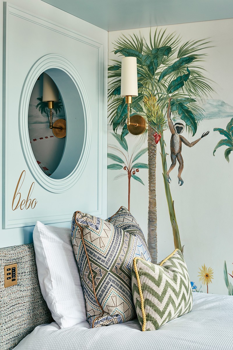
This very special bedroom was designed for two little boys, each with unique personalities – when it came to the brief this was a very important part of it! Their mother had a vision for the room with these side-by-side beds so we worked to make this happen, simultaneously integrating storage below, AC above and wardrobes to the side. We adore these cabin-style beds which remind us of sleeper trains, each with their own wall light and a bespoke mural based on their personality – a scene that spreads across both compartments but that is populated with both cars for the car fiend and a wild safari for the animal lover.
This is the perfect room for a playful, circus-inspired wallpapered ceiling – we used a Kate Spade wallpaper for Kravet, sadly now discontinued. The ceiling fitting is inspired by the sea and is the Urchin Chandelier by Porta Romana.
The Teen Boy’s Room
While not the largest bedroom width-wise, we created drama by using a bold colour scheme – blues and oranges – as well as this funky geometric wallpaper and mirror. The room had to be designed practically to allow for important video game ergonomics. The desk incorporates multiple monitors and cable management systems, all built by our joiners to our detailed drawings. This small room incorporates a large television screen opposite the bed (the end of the bed has a small sofa with storage within), as well as a larger desk space for proper gaming... We are constantly learning in our line of business!

The Teen Girl's Room
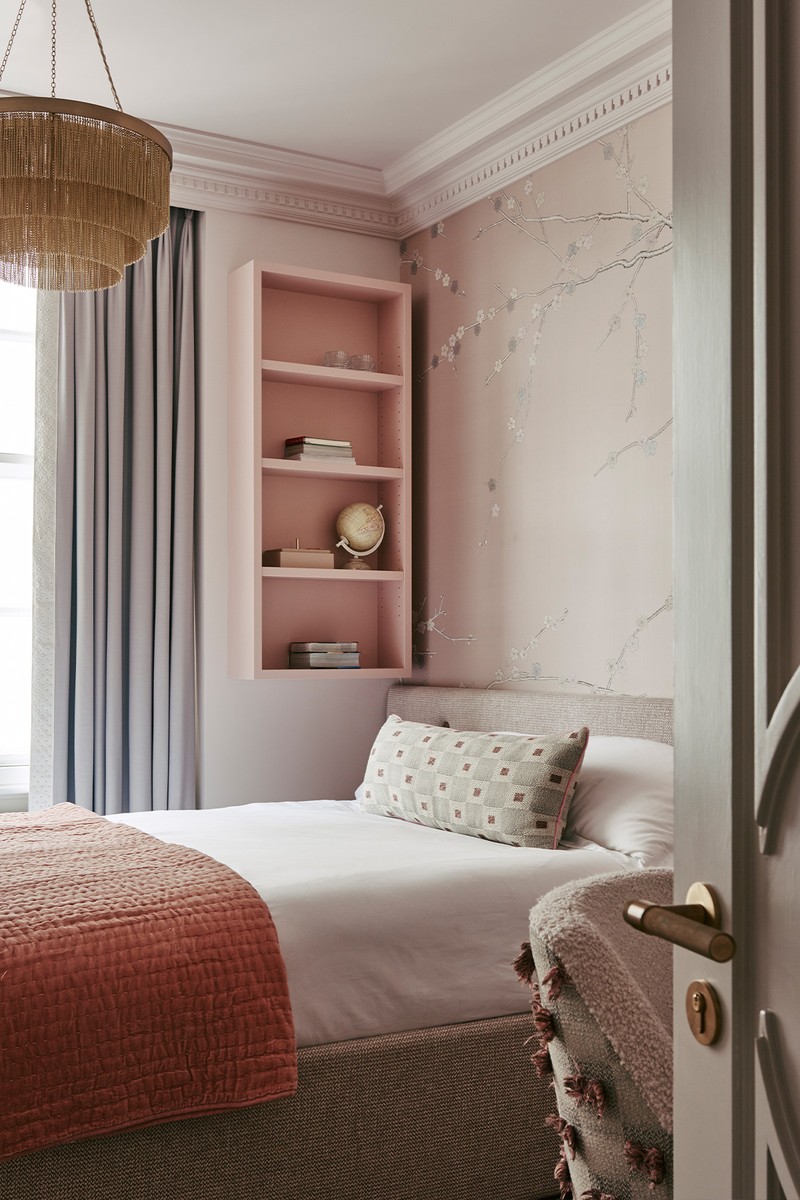
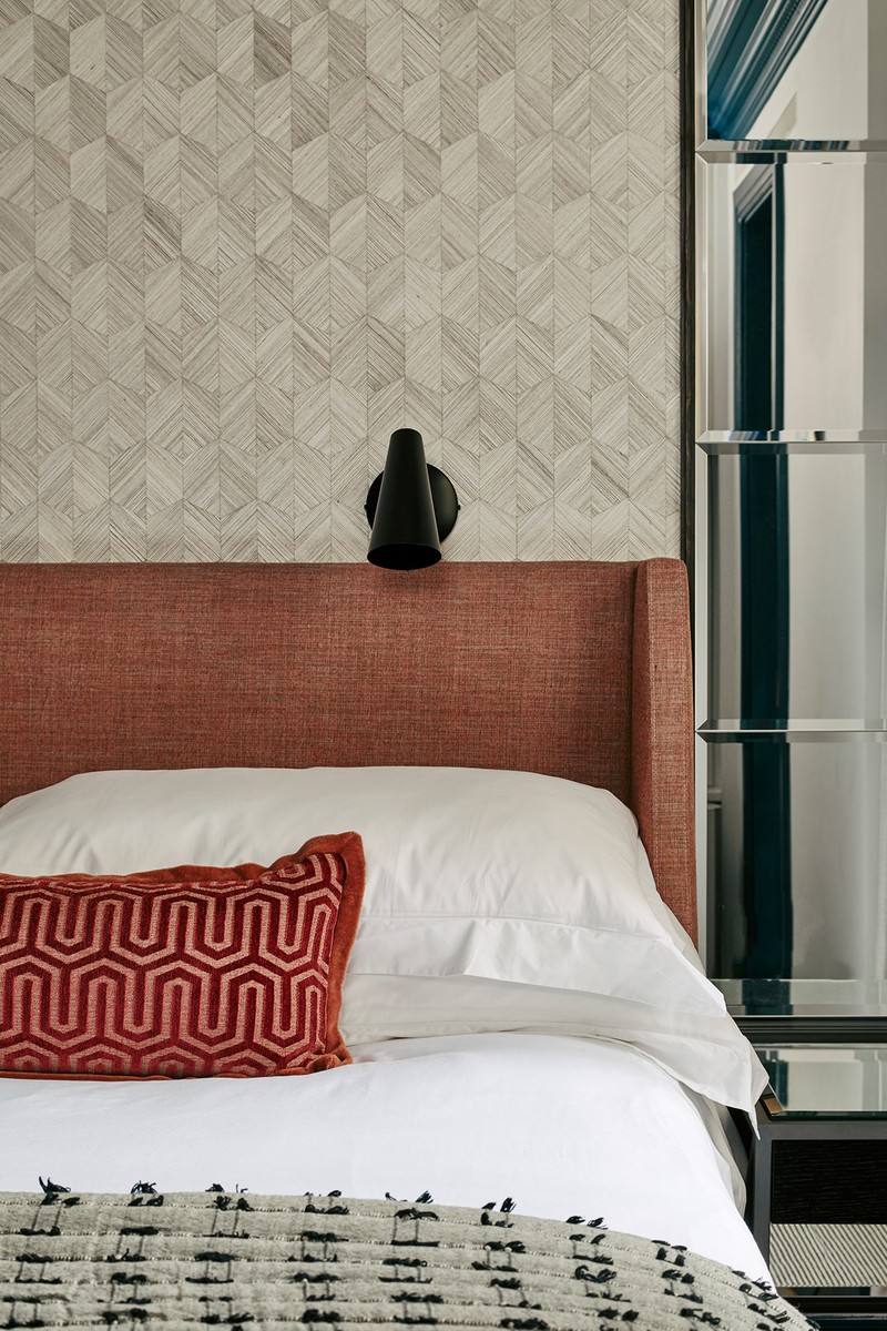
The girl we designed this room for is a young teenager. We felt it was important there was elegance, sophistication and timelessness in the scheme, so she wouldn’t outgrow the room. We used a subtle pink stripe for the carpeting and more blue-based pinks that would layer up well together tonally. The headboard material has an almost Chanel tweed quality to it which we adore and the Tibor fabric to the back of the desk chair is a detail that we feel really elevates the interior.
The De Gournay Sakura wallpaper above the headboard was the starting point for the scheme and is inspired by a family trip to Japan during cherry blossom season. The brass accents throughout unify the scheme.
The Bathrooms
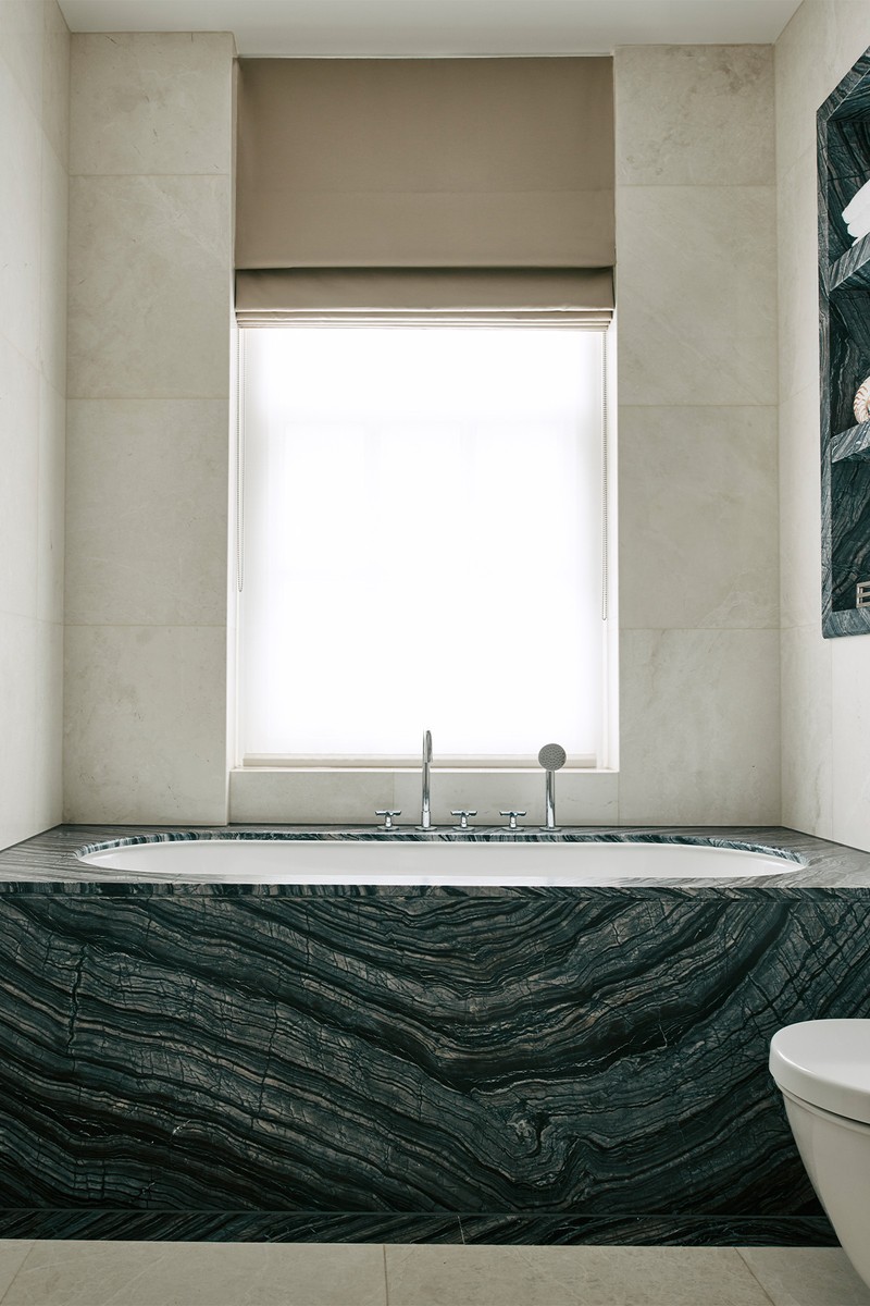
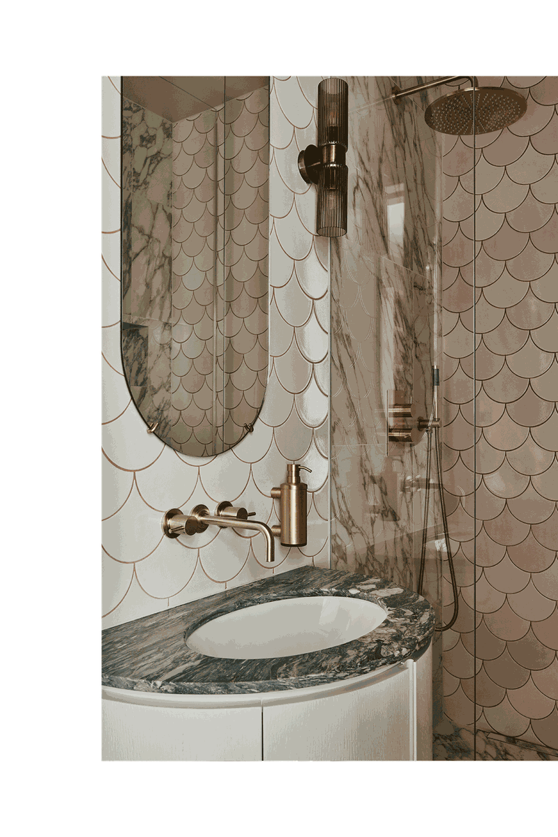
Bathrooms have many practical considerations, such as ease of cleaning and the importance of non-slip finishes, but there is still space for beauty. It is important to us that there is continuity between the room and the bathroom when the two are attached – a colour reference carried into the bedroom can achieve this. In the pink bathroom we used a pink grout to highlight the scallop tile and grounded it with this unusual marble – it has a glamorous yet vintage feel. The use of mirror is important in these smaller spaces and the combination of finishes, whether using two different stones or a porcelain tile and a timber vanity, creates a more sophisticated and warmer scheme – we avoided a minimal look throughout in favour of texture and tone.
Photography By Chris Horwood
Visit BaseInterior.com
DISCLAIMER: We endeavour to always credit the correct original source of every image we use. If you think a credit may be incorrect, please contact us at info@sheerluxe.com.
