Meet The Interior Designer: Sheena Murphy
Background
When I moved to India and later Seattle, my career in HR no longer made sense. I toyed with the idea of doing something else instead – something I was more passionate about. After working for a local Seattle designer, I moved to New York to start a post-grad degree at Parsons School of Design. I was 30 at the time and largely starting from scratch. I went into the programme as a fan of traditional English country homes but left passionate about Brutalism and full of admiration for designers like Louis Kahn and Carlo Scarpa. I then spent a very intense two years working at an architectural practice in Manhattan, designing residential and hospitality projects all over the world. But I quickly burnt out and decided it might be better to start my own business. Little did I realise that journey would be more intense – though the satisfaction, I have to say, is far greater.
Style & Ethos
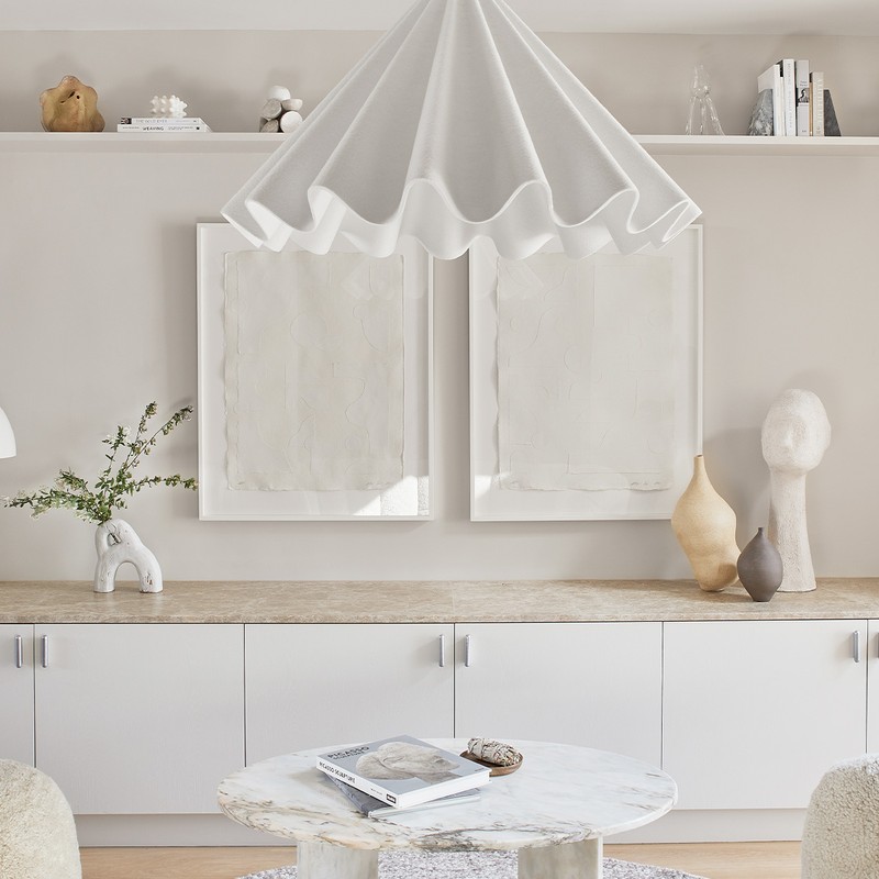
Design can dramatically impact the human experience, so creating spaces that encourage positive emotional and physical responses is really important. Most of our clients are professionals living in cities who are drawn to the sense of calm and comfort our work evokes. We also work hard to ensure our carbon footprint is as light as possible. By promoting and sourcing sustainable or non-toxic materials, finishes and furnishings, we're not just being kinder to the planet, we’re creating cleaner interiors for our clients to live in. We also mix high and low, old and new, and enjoy collaborating with our clients – especially when we push ourselves out of our creative comfort zones.
Inspiration
I love homes that have been designed by the owners – they offer such a unique and authentic window into a way of life. It’s why we try to ensure our interiors don't feel contrived or impractical, and take into consideration people's traditions and rituals. We’re always inspired by travel and being in nature – not just because of the sensory experience, but because it helps reset our brains if we're ever feeling creatively challenged or overworked. Really, inspiration can come from anywhere: listening to a podcast; reading; or playing with my daughter. Sometimes, tuning out of anything happening in the industry or at work is what helps us see things more clearly.
Colour Palette
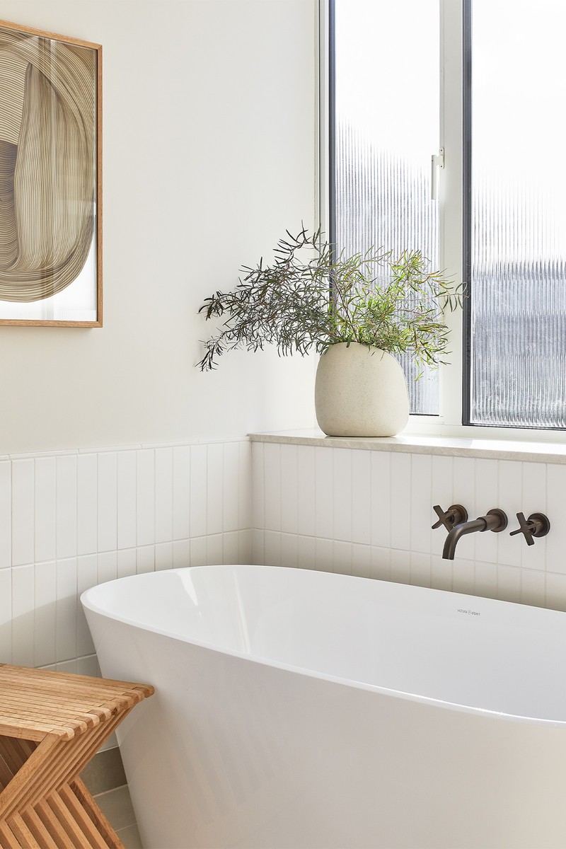
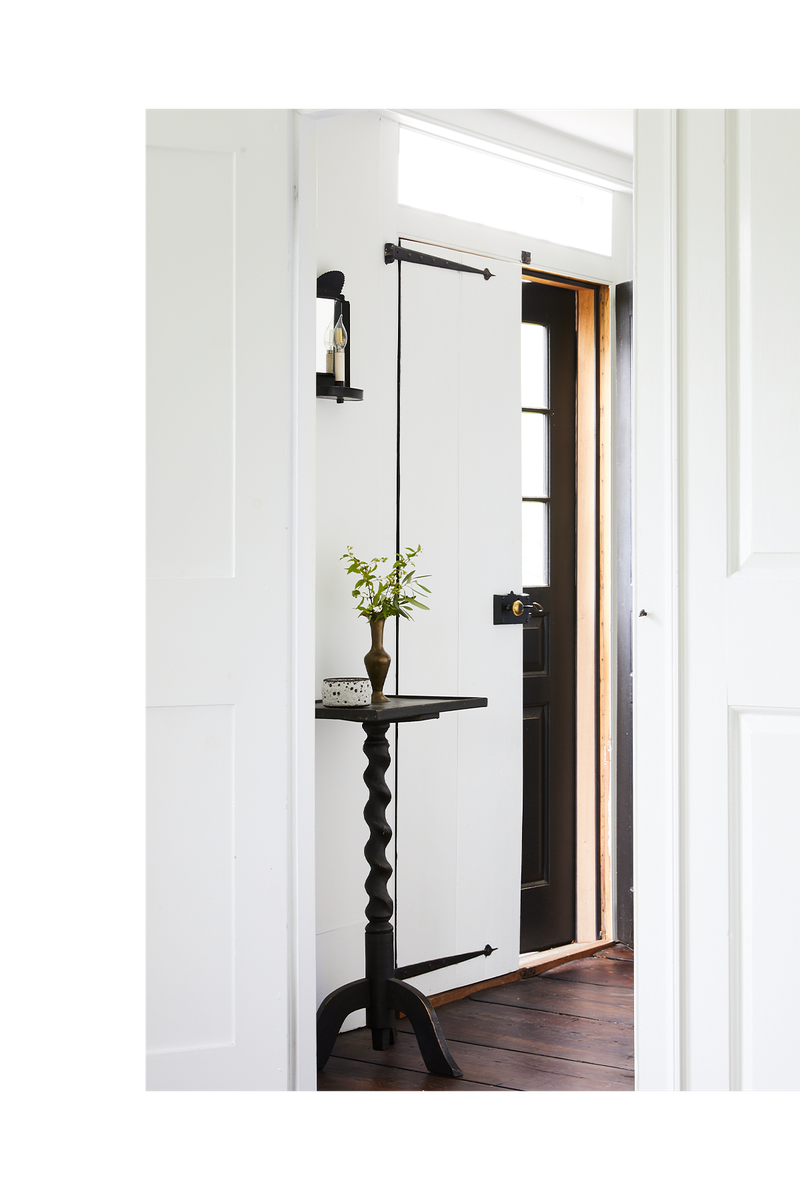
We largely work within a neutral colour palette – as well as dark greens, soft pinks, burnt reds and mustard yellows. Living in New York as a new mum and running a growing business left me feeling a little depleted and in need of a sanctuary in a busy city. Turns out, lots of people are looking for a similar kind of respite these days. Not only do neutrals create a calm environment, we love the cohesion. They also offer a versatile backdrop for pieces to be moved around when you're tired of looking at them.
Materials
We like to work with a diverse set of materials on each project and tend to take cues from the original architecture of the home. Woods, metals, linens and wools are all go-tos – the more natural, the better. Natural stone is also one of our favourite materials; we use it as much as we can. It adds so much dimension to a space and there are endless options – it looks even more beautiful with age, so long as you buy the right type. Just think of all the old stone Italian buildings and how beautiful they look all these years later.
Bronze tones and aged metals look great in kitchen and bathroom fittings, and we would always recommend polished nickel over cooler metals like chrome. A mix of wools and linens is a winning combination when it comes to upholstery and drapery, and linen is much kinder to the planet than cotton.
Who To Follow On Instagram...
@Avenue.Design.Studio
01: Townhouse, London
Photographer: Renée Kemps
/https%3A%2F%2Fsw18.sheerluxe.com%2Fsites%2Fsheerluxe%2Ffiles%2Farticles%2F2021%2F12%2Finterior-designer-profile-sheena-murphy-project-01-nlw_0.jpg?itok=PcWQ6IzH)
Inspiration
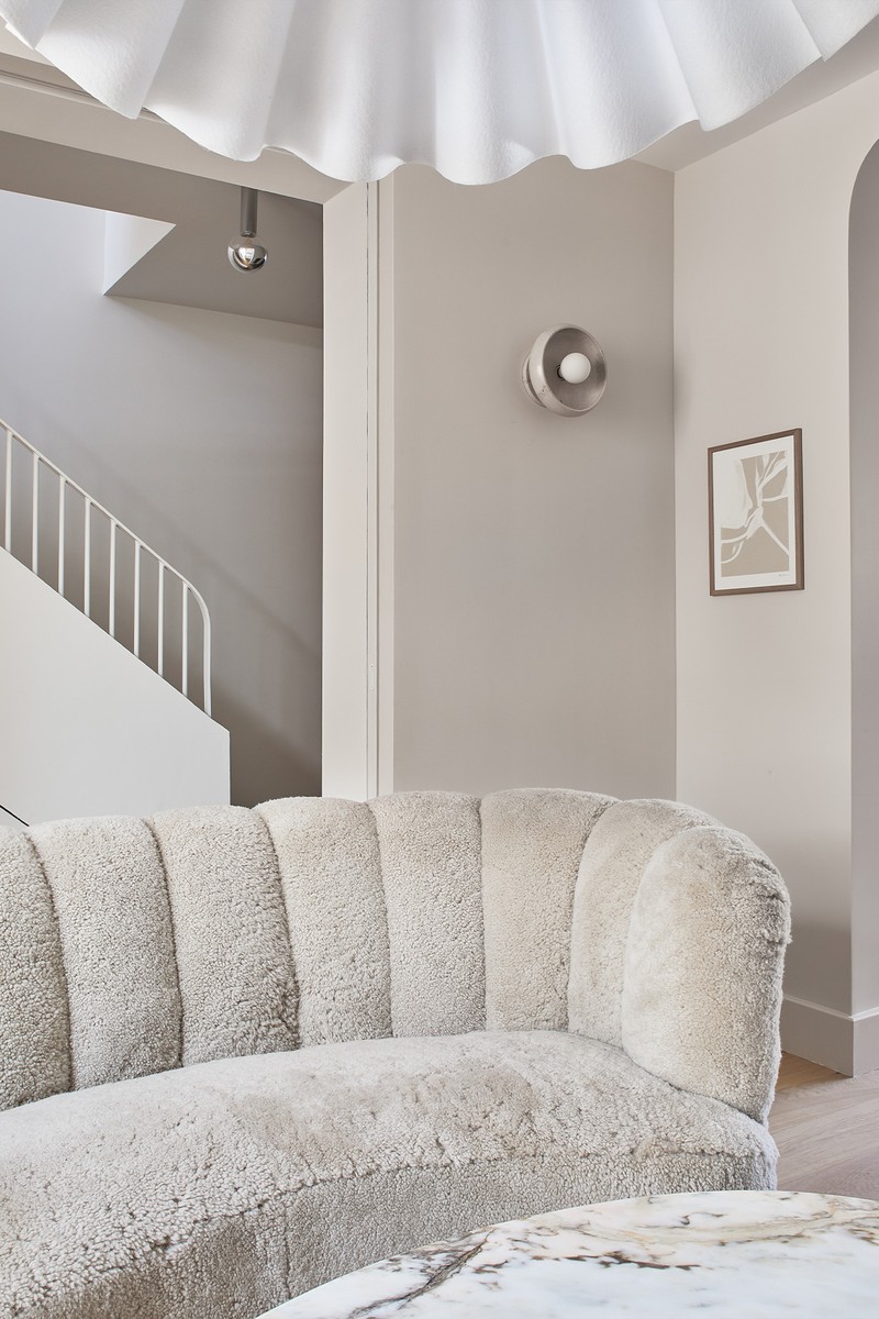
We took inspiration from the 1950s, when this house was built, but steered clear of any mid-century furniture to avoid it becoming ‘themed’ in any way. The house was largely void of detail but we embraced the residual art-deco influence so often seen in mid-century architecture, like the curved openings and radiused edges on the tiled fireplace.
Colours
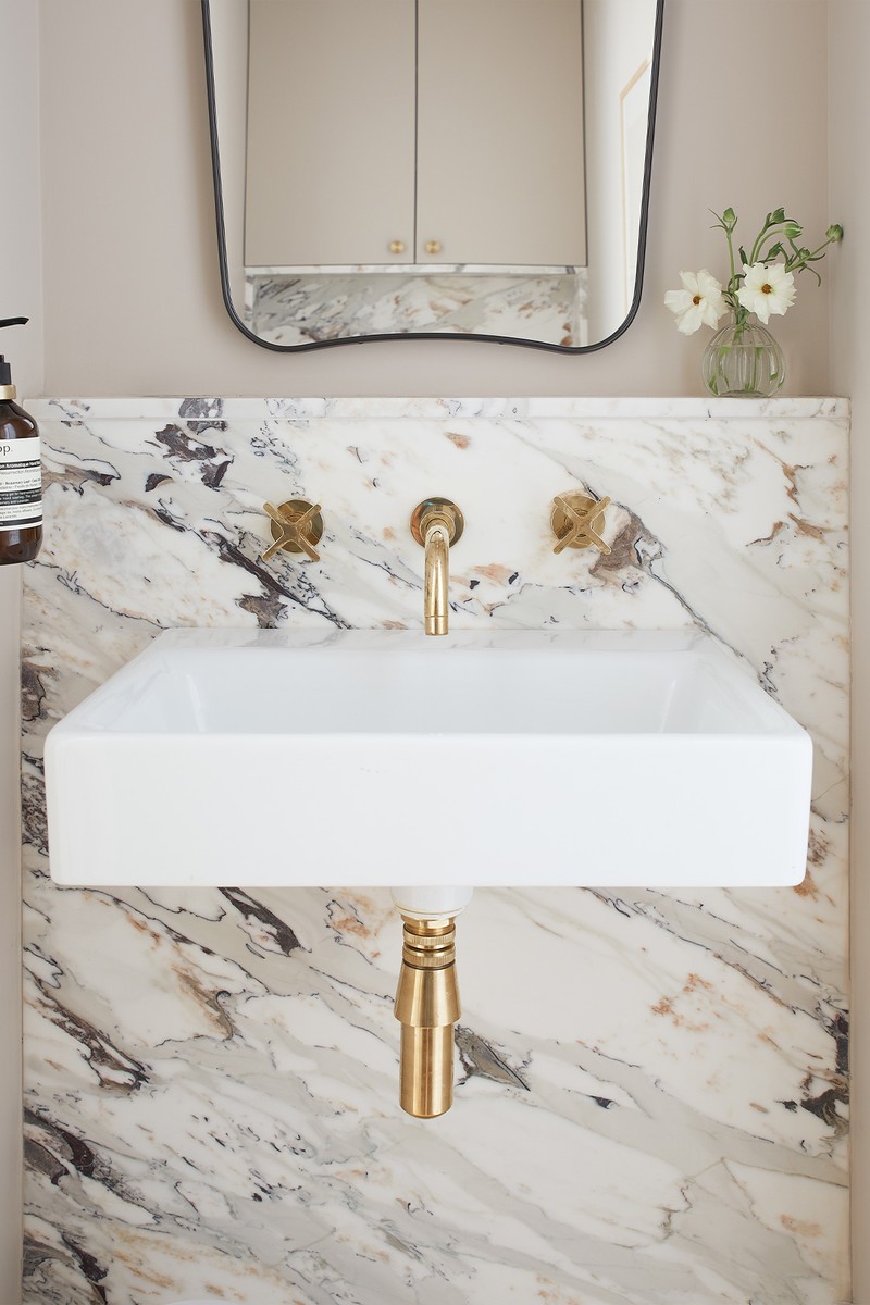
The colour palette is very restrained, with very little contrast. Subtle shifts occur as you move through each space, so you feel the transition but it’s never jarring. The house is very cohesive – the only mild departures being the pink toned marble in the powder room and the pale mustard on the walls in the children's room.
Materials
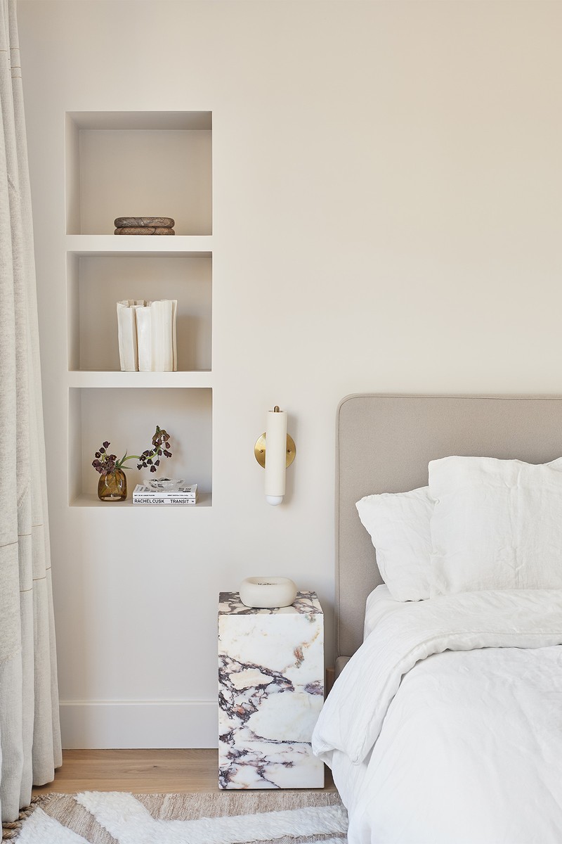
As is typical of our projects, you will find different woods, metals, stone and fabrics throughout, although the variety is perhaps a little more controlled here. We also minimised the contrast to ensure a warmer feel – something largely achieved through the golden oak flooring, neutral painted walls, taupe-y marbles and vintage brass details.
Lighting
We always try to allocate a good amount of the budget to lighting and we had fun compiling a lighting package for this house. There are lots of vintage pieces, which we mixed with some of our favourite New York lighting designers – the effect is very novel for a London home.
02: Country Cottage, Connecticut
Photographer: Nicole Franzen
/https%3A%2F%2Fsw18.sheerluxe.com%2Fsites%2Fsheerluxe%2Ffiles%2Farticles%2F2021%2F12%2Finterior-designer-profile-sheena-murphy-project-02-nlw_0.gif?itok=qFyuicEQ)
Inspiration
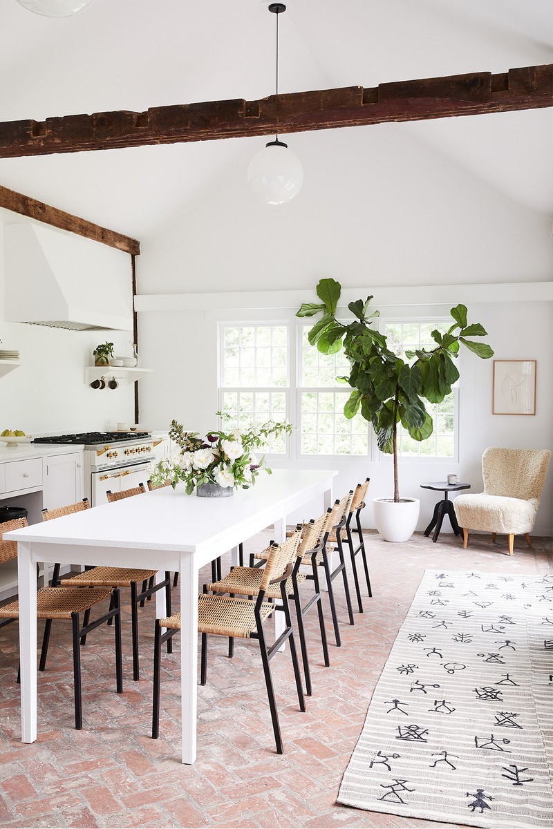
This cape house in Connecticut was bought by a boutique residential developer, Branca & Co. Originally built in the late 1700s, it had already been partially restored and came with incredible bones. We took lots of our inspiration from the existing materials within the house, like the large granite fireplaces, terracotta floor tiles and iron window and door hardware. When it came to sourcing pieces with which to furnish the home, much of what we settled on was vintage.
Colours
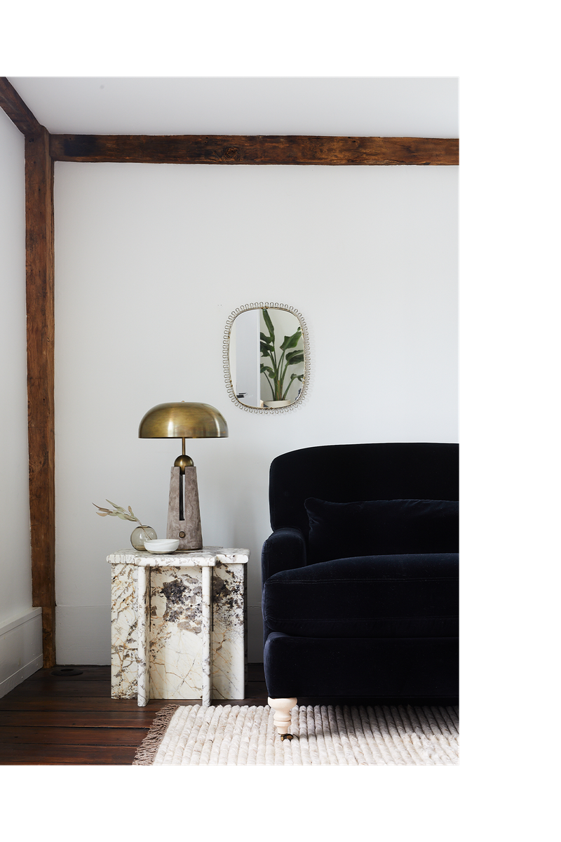
We turned up the contrast in this house – the darker elements we sprinkled throughout played nicely with the existing dark-stained wood flooring and original wood columns and beams. The house is quite small, so we kept the various tones quite controlled, so it still felt cohesive and part of the same visual story. We also played with form, without deviating from the strict colour palette of black, white, brown and cream.
Materials
Age and texture is evident in almost everything here, from the kitchen floor to the occasional lighting and accessories. Everything we sourced was highly considered and played a part in telling a strong and layered story – just like the house itself. It was really important that nothing felt too new or contrived, and that everything felt as though it had been here for years.
Lighting
We used a lot of occasional lighting, including patinated vintage floor and table lamps. We also worked with local designers and makers to create unique pieces with lots of visual interest so it all felt part of the same family. We also played with shape and scale to ensure the lighting wasn’t just functional but interesting too.
03: Apartment, Manhattan
Photographer: Brooke Holm
/https%3A%2F%2Fsw18.sheerluxe.com%2Fsites%2Fsheerluxe%2Ffiles%2Farticles%2F2021%2F12%2Finterior-designer-profile-sheena-murphy-project-03-nlw_0.jpg?itok=PWhFsYHu)
Inspiration
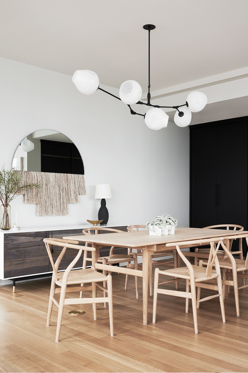
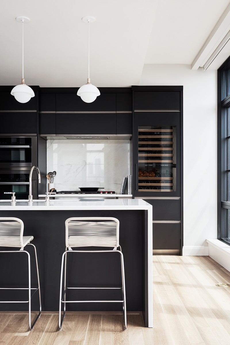
This new apartment building had very few architectural constraints. Because the owners were Norwegian and American, the inspiration for the design came from their collective heritage, style and aesthetic values. We renovated the kitchen, moved some walls to create an open-plan living space and added lots of built-in storage.
Colours
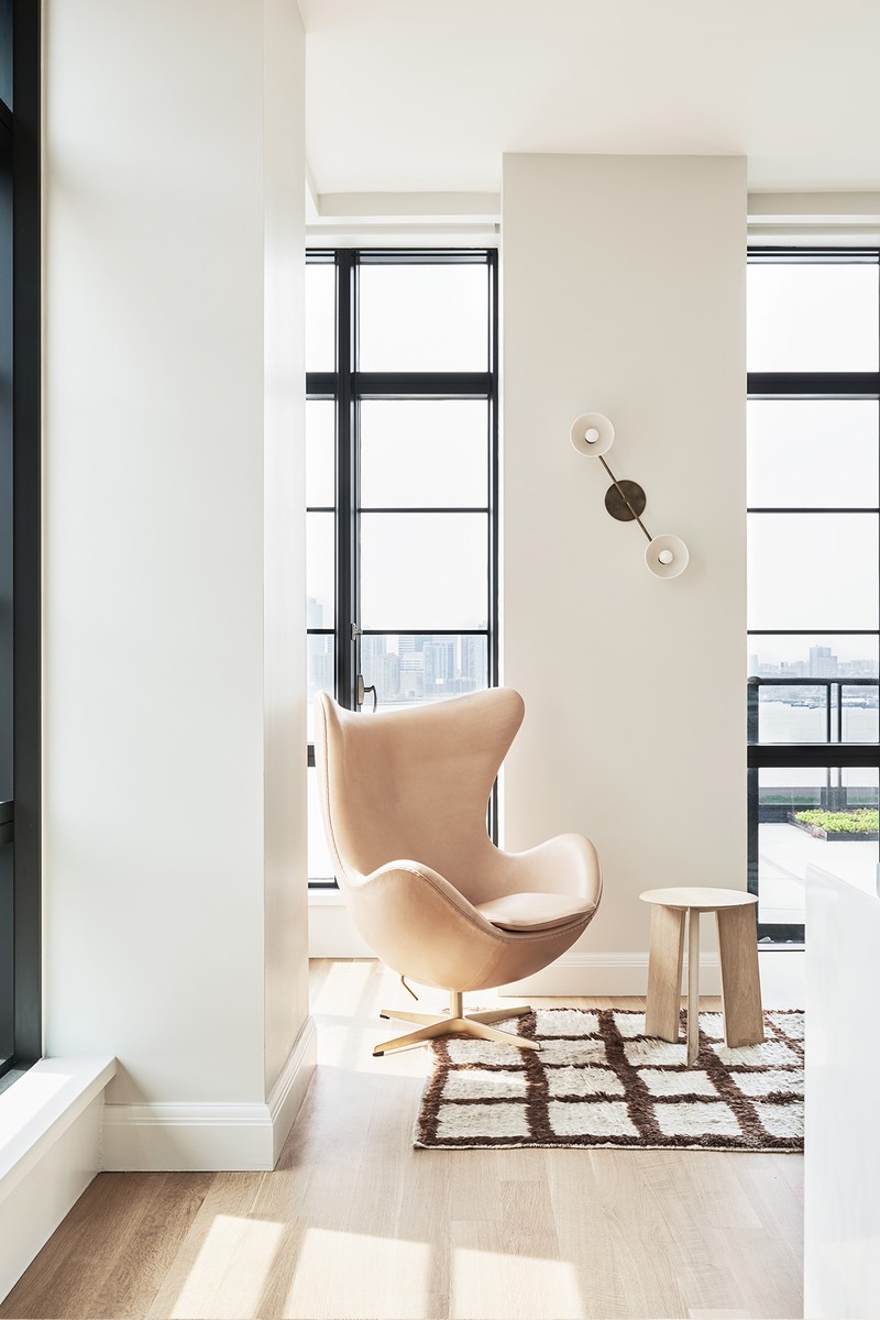
We worked with a range of neutral but high-contrast colours, as well as the black window frames that exist on three sides of the apartment – and whose grid pattern ended up playing a big part in the overall design. In the office, kitchen, hallway and main bedroom, we embraced the high-low look of the black-and-white architecture and replicated the tones in the joinery and furnishings. We also introduced soft greens and pinks alongside pale oaks and white in the nursery, and more earthy mustards and rust in the living room. These spaces feel like a slight departure, but they’re still heavily connected to the rest of the house in the architectural palette and materials used.
Materials
There’s a good amount of brass in this home, which played nicely with the darker elements and pale honey-toned floors – it provided warmth and contrast to some of the heavier black elements. As always, we worked with local designers and focused on natural, eco-friendly materials such as wools, linens, sustainable oak, glass and stone.
Lighting
This home called for more contemporary lighting, and we used a lot of modern classics like Greta M. Grossman’s Grasshoppa lamp and Serge Mouille’s three-arm ceiling lamp. We paired them with pieces by Workstead, Apparatus and Lindsey Adelman to create a diverse look that not only provided enough illumination, but added a sculptural quality to each of the spaces.
Visit NuneNune.com
DISCLAIMER: We endeavour to always credit the correct original source of every image we use. If you think a credit may be incorrect, please contact us at info@sheerluxe.com.
