Meet The Interior Designer: Henry Prideaux
The Background
After working at several design practices, including Nicky Haslam’s NH Design, I set up Henry Prideaux Interior Design in 2014. We provide a personal interior design service to private residential and boutique commercial clients. My partner Amy joined the team in 2018, bringing with her a wealth of experience from her own professional background at Candy & Candy, and now supports all aspects of the business from marketing to PR – as well as being mum to our six-year-old son, Willoughby.
Style & Ethos
Any room within a new scheme should be thought of as an updated take on a traditional interior. We often work on houses of a certain age, so respecting the history of the building is important, particularly when you’re considering whether or not to reinstate certain bits of interior architecture which have perhaps been lost over time. Layouts need a sense of order and practicality. Once established, they can be infused with colour and pattern to bring them to life. We also aim to create interiors that have a timeless quality to them; the families we work for often plan to live in these properties for a long time so they need to feel good in their surroundings. We also take any specific living requirements under consideration, which stops our designs from feeling formulaic or predictable.
Design & Inspiration
There are so many wonderful new brands and product designers to discover through interiors magazines, design blogs, or even scrolling through Instagram. The key is to make sure a new product is actually deliverable and of the right quality – it should never be a case of style over substance. Nicky Haslam’s creativity and clever use of space is a constant source of inspiration, as is the work of Jacques Garcia, Peter Mikic, Veere Grenney, and Sims Hilditch – all of whom have expertly created their own signature look.
/https%3A%2F%2Fsw18.sheerluxe.com%2Fsites%2Fsheerluxe%2Ffiles%2Farticles%2F2021%2F10%2F2-henry-prideux-headshots_0.png?itok=05mSmMlx)
Colour & Materials
I like to work with high-quality marbles, velvets, and timbers. However, it’s important to follow your client’s brief and present them with a palette of materials which are suitable for their lifestyle and appropriate for their budget. I love wooden floors with rugs rather than fitted carpets and will always introduce architectural detailing like panel mouldings and cornices if possible. I always try to add some passementerie into a project – you can’t beat a tassel on a door handle or a brush fringe trim on soft furnishings.
I tend to be drawn to inky blues, sage greens, and rusty tones – all of which we blend with a range of neutral finishes to create balance. Within any room I generally stick to a palette of three or four colours to achieve a harmonious scheme, with plenty of unexpected pattern and texture.
Finishing Touches
A simple touch that runs throughout most of my work is the use of trimmings – usually as an additional decorative detail on window treatments or cushions. I also like to use grosgrain ribbon on the walls to frame an area or create the illusion of panelling. I firmly believe all the rooms in a house should be different, but with a common thread throughout. It gives the home a much more ‘decorated’ look, but still allows for plenty of beautiful colour, different fabrics and pieces of furniture. We try not to insist on styling every space for a client with new pieces (either bought new or antiques new to the client) – this way they can have some of their familiar items around to make it feel more authentic. We provide an art curation service too, as I always like to finish rooms with artwork – it brings everything together. These pieces needn’t be expensive, and it’s an enjoyable process working with clients to find works which resonate with them.
Instagram Accounts To Follow
There are so many great interior design accounts but some I like to follow include: @DesignWithinCopy which is an interesting new account about copying in the interior design world. @BrutBuilds posts about brutalist buildings, the shapes of some I love. Contemporaries of mine whose work stands out are @VSP_Interiors, @StudioDuggan, @TurnerPocock, @BeataHeuman and @SalvesenGraham. For a bit of fun @DJ_FatTony _ provides some light relief!
01
CHELSEA TOWNHOUSE
Photography by Tom Sullam
/https%3A%2F%2Fsw18.sheerluxe.com%2Fsites%2Fsheerluxe%2Ffiles%2Farticles%2F2021%2F10%2Fhenry-prideaux-chelsea-townhouse-01_0.jpg?itok=EL7emKOU)
Inspiration
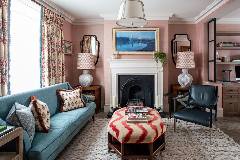
Our international client already owned several houses in the US that were quite traditional in style, but with interiors that featured very bold use of colour. It gave us the confidence to push the boundaries, as we knew the client would welcome the idea of plenty of colour in his London home. The brief was to create ‘a country house in the city’ and to use mostly English brands – it provided a good starting point from which to develop the eventual design.
Planning
Initially, the project brief was only to provide furniture and soft furnishings; fortunately, it soon expanded to include all the joinery as well. A developer had finished the house in a typical neutral white and grey colour palette throughout, so there was an opportunity to replace the somewhat uninspiring colours with something far more invigorating. The only thing that stayed was the wood flooring. The client was overseas for most of the process, so we only had two meetings to get all the selections finalised. Once the client had bought into our initial proposals and approved the design direction, he then trusted us to deliver his vision.
Colours
The exciting part of designing this house was using all the different colours – red, white and blue in the living room, and blue and rust in the lower ground dining area and TV snug. We used combinations such as green and white, blue and white, and sand and duck egg in the bedrooms. Selecting the perfect colour and textured carpet for the staircase, landings, and all three bedrooms provided the common thread which was needed to connect all the spaces.
/https%3A%2F%2Fsw18.sheerluxe.com%2Fsites%2Fsheerluxe%2Ffiles%2Farticles%2F2021%2F10%2Fhenry-prideaux-chelsea-townhouse-02_0.jpg?itok=1VViNtcX)
Materials
The client wanted to embrace as many English brands as possible, so we used Soane, Claremount, Christopher Farr, and Robert Kime, among others. While they’re some of our favourite brands, they’re not always appropriate for every project, so it was a real joy to be able to showcase them here. We used some fine linens for the curtains; bouclé, velvet, and mohair for headboards; and lots of brush fringe trimmings from Samuel and Sons for the cushions, the leading edge of the curtains, and even to frame a pair of mirrors.
Lighting
Decorative lighting gave this scheme its warm, homely feel. We installed new wall lights and picture lights in several locations. As the ceilings were not overly generous in height, we added several flush mounted decorative ceiling lights as well. Pendants, where feasible, were installed above coffee or dining tables. Architectural lighting is important to a room’s functionality, but I love to use decorative lighting as the pieces themselves become an intrinsic part of the design – it’s not all about simply illuminating the space.
02
NOTTING HILL TOWNHOUSE
Photography by Dylan Thomas
/https%3A%2F%2Fsw18.sheerluxe.com%2Fsites%2Fsheerluxe%2Ffiles%2Farticles%2F2021%2F10%2Fhenry-prideaux-notting-hill-townhouse-01_0.jpg?itok=_3UyRoQs)
Inspiration
We worked very closely with the client to help them create their first family home. It was important to keep it classic in terms of the design – however, with family origins spanning Africa, America, the Mediterranean and the UK, it also needed to reflect these cultural influences. You can see some of the subtle references in certain rooms, be it in the wallpapers, decorative lighting, artwork or furniture design. Some areas were tailored to specific artwork and furniture the client already owned, which also determined elements like the scale of the bespoke wall panelling and other pieces of furniture.
Planning
The house needed to be completely reconfigured after previous conversions had left it very unloved and confused. We had to design this reconfiguration around a few key items of furniture and artwork but, once approved, all the other decisions flowed smoothly. A full specification and drawing package were created for the contractor, so they knew what they were doing, and we designed all the joinery ourselves. Quite often, clients know what they want but don’t know how to achieve it. In this case, we guided the client into making the right decisions, so the house worked in both a structural and decorative sense.
Colour
We didn’t want to inject too much colour here, so we kept most of rooms in a neutral, tonal palette. That said, we did use more colour in the guest bedroom and guest WC to create a bit more impact, while the kitchen, including an oversized island, was painted in a deep inky blue. It became a real focal point on the lower ground floor, and provided an inviting place for guests to gather when they were entertaining.


Materials
Key materials used in this refurbishment included a polished concrete floor on the lower ground kitchen floor; wood floors in the principal living spaces, as well as the main bathroom; book matched marble in the en-suite shower room for the main bedroom; simple textured and patterned wallpapers; and wall panelling to match the joinery. The guest WC on the lower ground floor was finished in London Underground tiles, which were paired with brass fittings to create a unique and nostalgic feel.
Lighting
Lighting is such a key component to any interior and throughout, we installed a variety of different pendant lights, wall lights, picture lights and table lamps. This combination of decorative light sources always helps any room feel complete. We always recommend incorporating lights at different levels and on different circuits to create different moods.
03
KENSINGTON TOWNHOUSE
Photography by Tom Sullam
/https%3A%2F%2Fsw18.sheerluxe.com%2Fsites%2Fsheerluxe%2Ffiles%2Farticles%2F2021%2F10%2Fhenry-prideaux-kensington-townhouse-01_0.jpg?itok=rjHLAHpO)
Inspiration
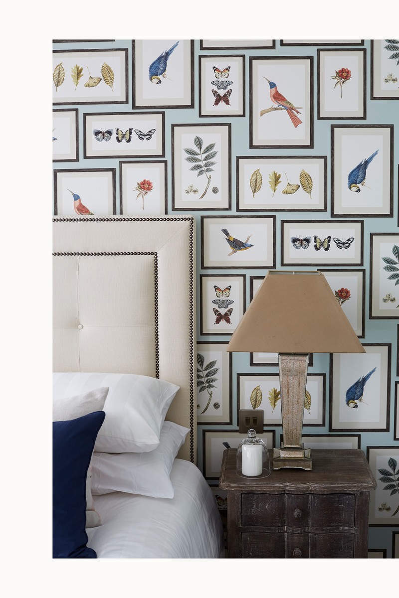
The main aim with this family home was to create a serene environment and for all the spaces to flow together seamlessly. The client wanted a neutral, elegant grey colour palette, which we used as a base in the high-traffic spaces with all adjoining rooms given their own, more individual scheme. The client really loved the wallpapers from De Gournay, which we were delighted to use. To stay within budget, we split them across three rooms in three different designs to maximise their impact. – in a guest WC, as a headboard design in the master bedroom, and as a sliding screen as part of a large custom joinery piece concealing the television in a living room snug area. This way the client can enjoy the designs throughout the home rather than in a single space.
Planning
We were fortunate enough to work with a brilliant architect, building surveyor and project manager – Andrew Marshall from Marshall Associates. As a team, we reconfigured the house to make it more suitable for modern-day living. That included designing a cinema room that doubles up as a guest bedroom, a yoga room complete with soft floor covering, a dedicated study for working from home, separate spaces for adults and children, dining areas for both formal and informal use, and a walk-in wardrobe which was carved out of a niche between the main bedroom and en-suite bathroom.
Colour
We enhanced the neutral colour palette the client had originally requested by choosing complementary colours that worked well in all the rooms. We also incorporated a warm off-white palette for the main living room, a hint of lilac in the master bedroom, a light mauve in the kitchen and family dining space, and silvery blue in the study. Additionally, we added accents of fuchsia pink in areas like the dining snug, to create moments of interest in the calmness of the house.
/https%3A%2F%2Fsw18.sheerluxe.com%2Fsites%2Fsheerluxe%2Ffiles%2Farticles%2F2021%2F10%2Fhenry-prideaux-kensington-townhouse-02_0.jpg?itok=gzU1kip9)
Materials
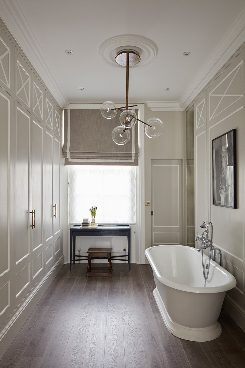
The hand-painted silk De Gournay wallpaper provided the design direction in some of the key spaces, while across other rooms, various wood veneers were used – notably sycamore for joinery in the study which we teamed with inlaid brass details. The en-suite bathroom off the main bedroom features a walk-in shower and vanity clad in a Volakas marble with a delicately lilac veining, and the entrance hall was set with a honed marble, contrasted with a darker polished inset border. Soft leathers were used on fitted banquette seating in the formal and family dining areas. A smooth timber floor ran through the principal rooms complemented with wool and silk blended rugs to soften the spaces.
Lighting
Because of the high ceilings, we were able to use several different types of chandeliers and hanging lights, including a modern take on a traditional globe lantern in the entrance hall, a blown glass droplet light in the living room and master bedroom, as well as a chandelier over the master bath to add some drama. We also selected picture lights and wall lights to provide light and another mood-enhancing layer. Additionally, architectural lighting was cleverly incorporated within the joinery and behind cornices to provide atmospheric lighting, depending on the time of the day.
Visit HenryPrideaux.com
DISCLAIMER: We endeavour to always credit the correct original source of every image we use. If you think a credit may be incorrect, please contact us at info@sheerluxe.com.

