A Look Inside A Georgian Townhouse in Bath
The Property
We purchased a Georgian townhouse in Bath which had been converted into two flats, just as the UK went into the first lockdown. We exchanged contracts in early March 2020 and a few weeks later, the world closed down. I remember wondering if it had been the right thing to do – renovating in lockdown felt quite overwhelming – seeing as we weren’t even allowed to drive and collect the keys on completion day.
It turned out to be a the perfect distraction. Having such a beautiful house to work on over those months kept us sane. We converted it back into a townhouse again, moved the kitchen to the front of the property on the ground floor and fully renovated the entire property. Even with all the planning delays, we managed to finish it in time to move in by November 2021.
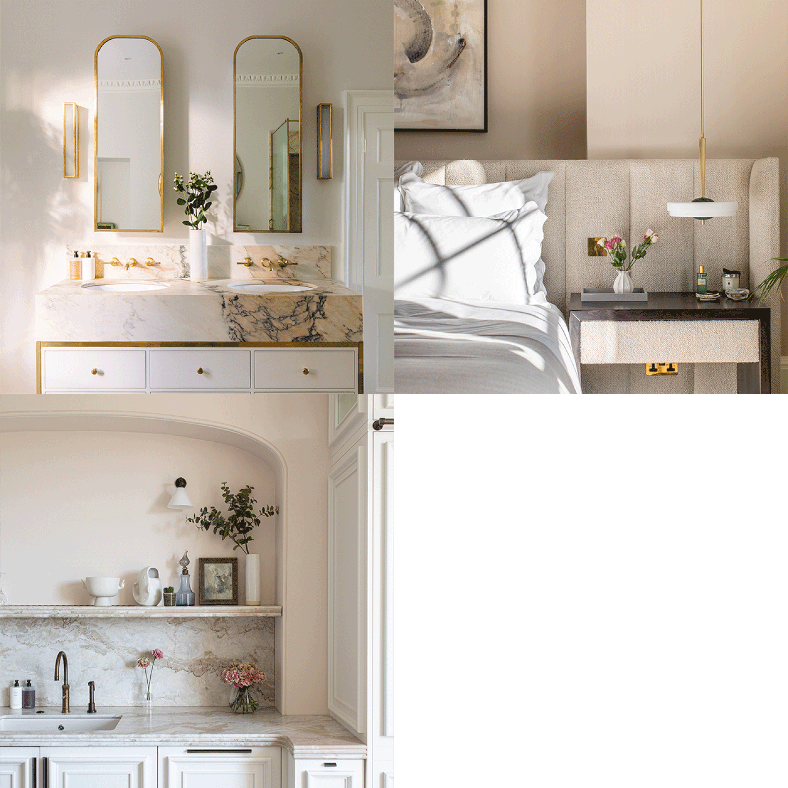
The end result was such a product of the strange life we were all living back then. I wanted a calm sanctuary and chose lots of soft colours throughout (except for in the pink cinema room!). My work tends to be based on calm colour palettes, with the furniture, artwork and lighting adding some fun character to each space. I love nature and it’s always central to my designs; in this house I used lots of natural stone and marbles, as well as tactile wooden flooring and soft natural textures in the carpets and upholstery.
The Hallway, Stairs & Landings
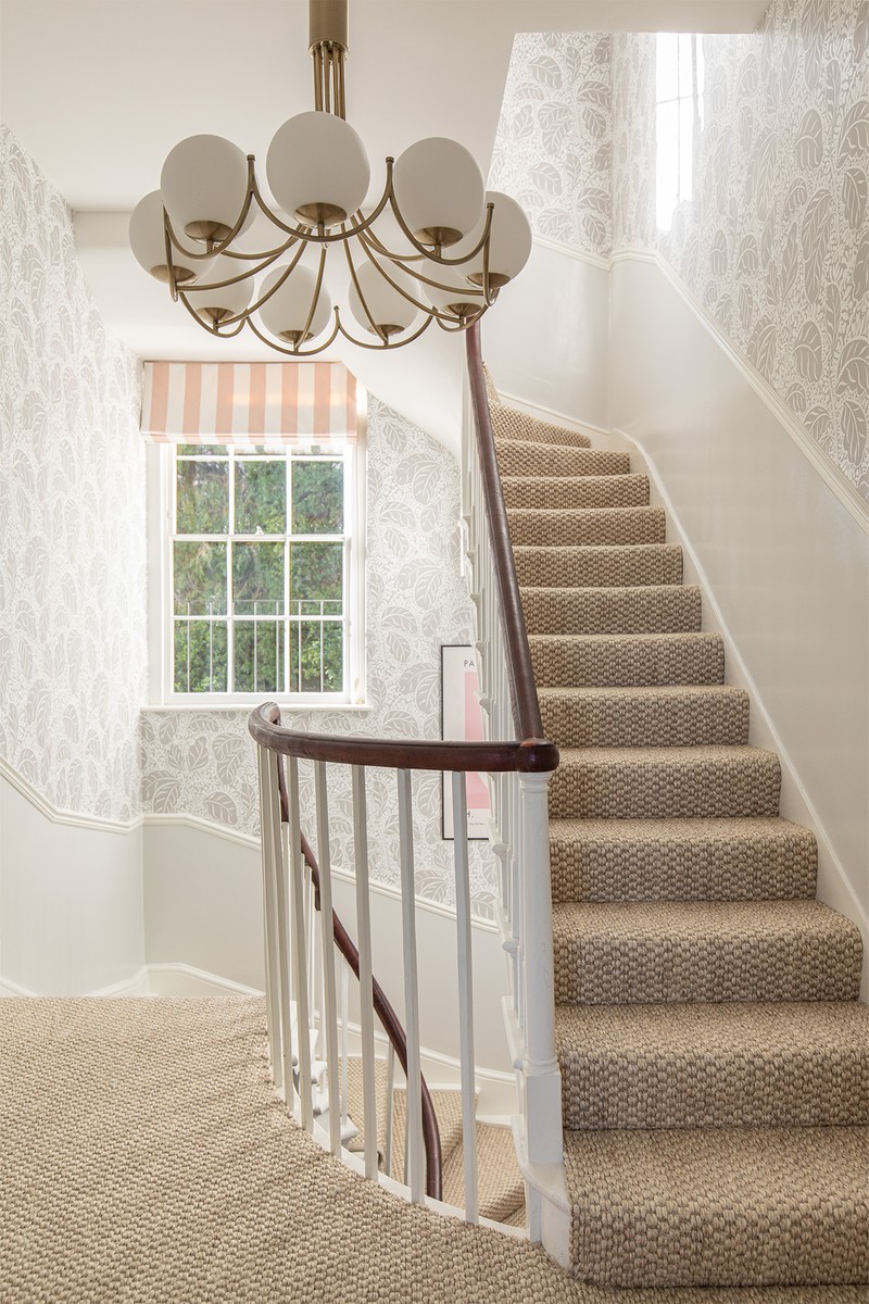
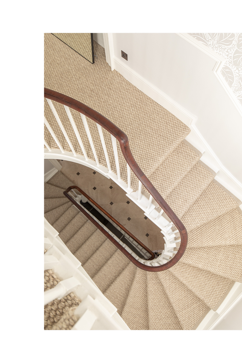
We were so lucky his house still had its original Georgian staircase, which was in wonderful condition. We wanted to create a space that made the most of the existing architecture – I love to have fun with wallpaper and fell in love with the Bananas wallpaper from Pierre Frey. This, combined with Belgravia gloss paint from Mylands and the pale sisal carpet (Divine Morning Frost from Crucial Trading) made for a calm, but still fun space. We also added pops of pink with the blinds, which are made from a striped Romo fabric.
The Kitchen
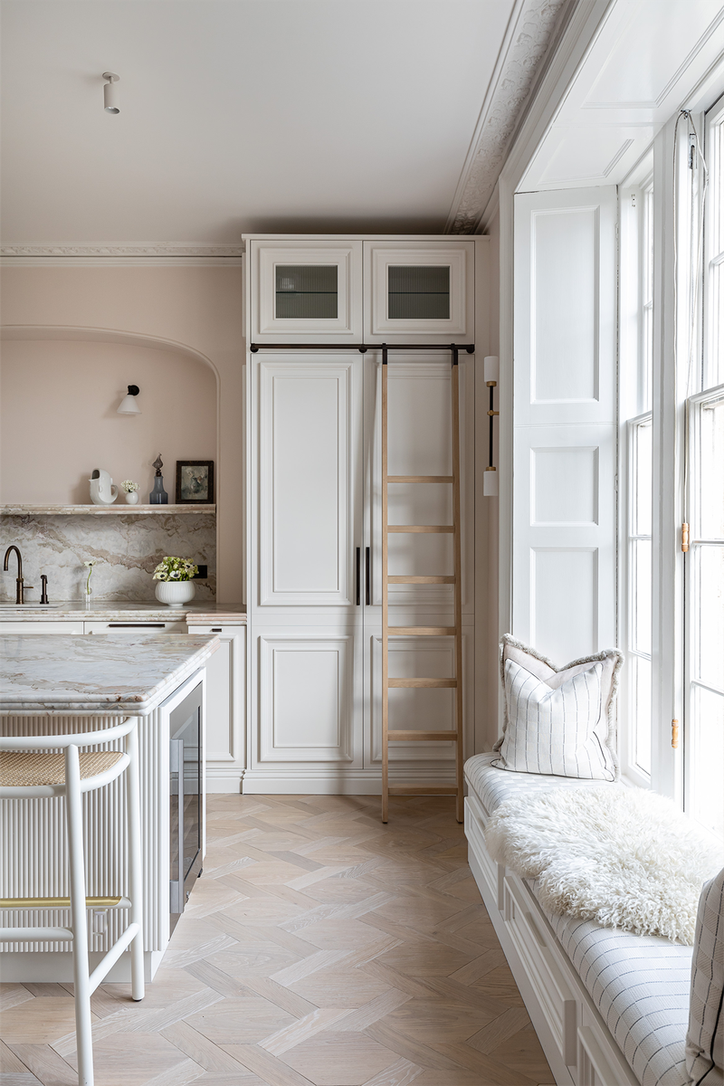
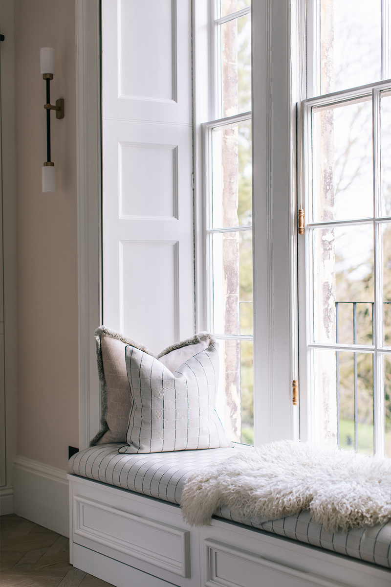
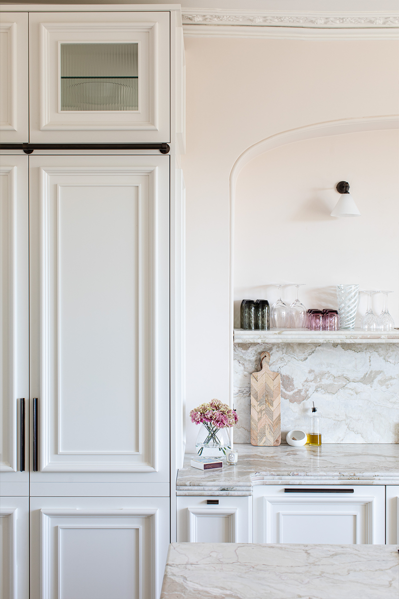
We wanted the kitchen to be a real showstopper – we love designing kitchens and we also spend a lot of time in there as a family. We designed the cabinetry with Blakes London and I knew I wanted a beautiful creamy stone with hints of pink, which was very hard to track down. Luckily, the team at Porter Bathroom came up with this La Dolce Vita marble, which worked well. We designed a triple bullnose edge to compliment the fluting on the island – I wanted a gloss finish so it was tactile, as well as lovely to look at, and we settled on Holland Park by Mylands. Finally, we worked with Trunk Floor to create a mansion weave pattern for the floor – lots of lovely texture within a calm colour palette.
The Dining Area
/https%3A%2F%2Fsw18.sheerluxe.com%2Fsites%2Fsheerluxe%2Ffiles%2Farticles%2F2022%2F01%2F6laura-butler-madden.png?itok=v9qiLcln)
I love banquette seating and use it in my designs whenever I can – it’s a great space saver, comfortable and perfect for families. It also allows you to add colour and texture to your dining space with different fabric and cushions. We didn’t have a huge space to work with here, so a banquette made total sense – we designed the table with Trunk Floor and added classic Gebrüder Thonet chairs from Matter of Stuff. We also commissioned one of my favourite artists Kristin Gaudio Endsley to paint something special for the space, which sits so well next to the Bert Frank wall lights.
The Family Living Space
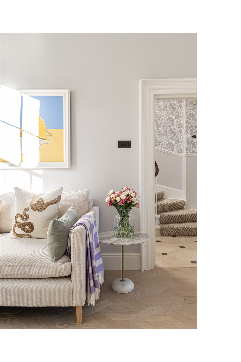
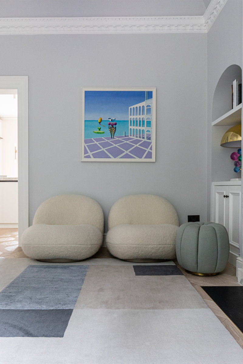
This snug space is connected to the kitchen – we created the arched cabinetry to sit either side of the fireplace, which we also replaced. I love iconic designs in furniture and the Gubi chairs were something I had been lusting after for a long time. We covered them in a lovely soft textured fabric from Pierre Frey, which matched the soft Designers Guild velvet on the sofa. We added pops of colour with the Frieda Rug (in bespoke colours) from The Rug Company, as well as artwork by my husband Patrick’s late mother, Marcela Butler-Madden.
The Pantry
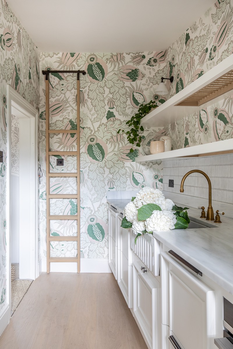
I predict butlers’ pantries will feature much more in homes in future – a bit like walk-in wardrobes have. Essentially, it’s an extension of your kitchen; a place to hide away some of the functional and less pretty pieces and tools so you can the main space feels more elegant. In ours, we had a second oven and dishwasher installed, as well as a large sink and extra cabinetry – it’s also the ideal place to hide away the dirty plates after a dinner party until you get time to wash and put them away. I chose this Christopher Farr Carnival wallpaper to make it a fun, as well as functional, space though.
The Cinema Room
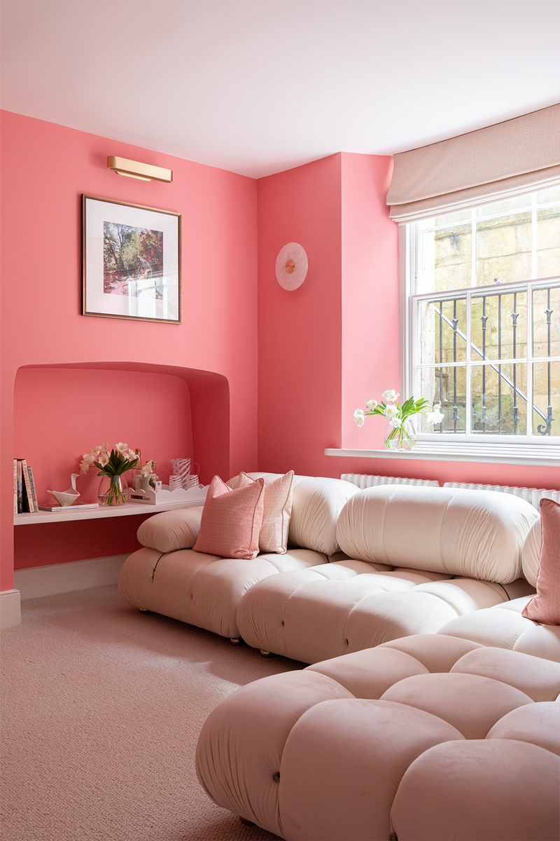
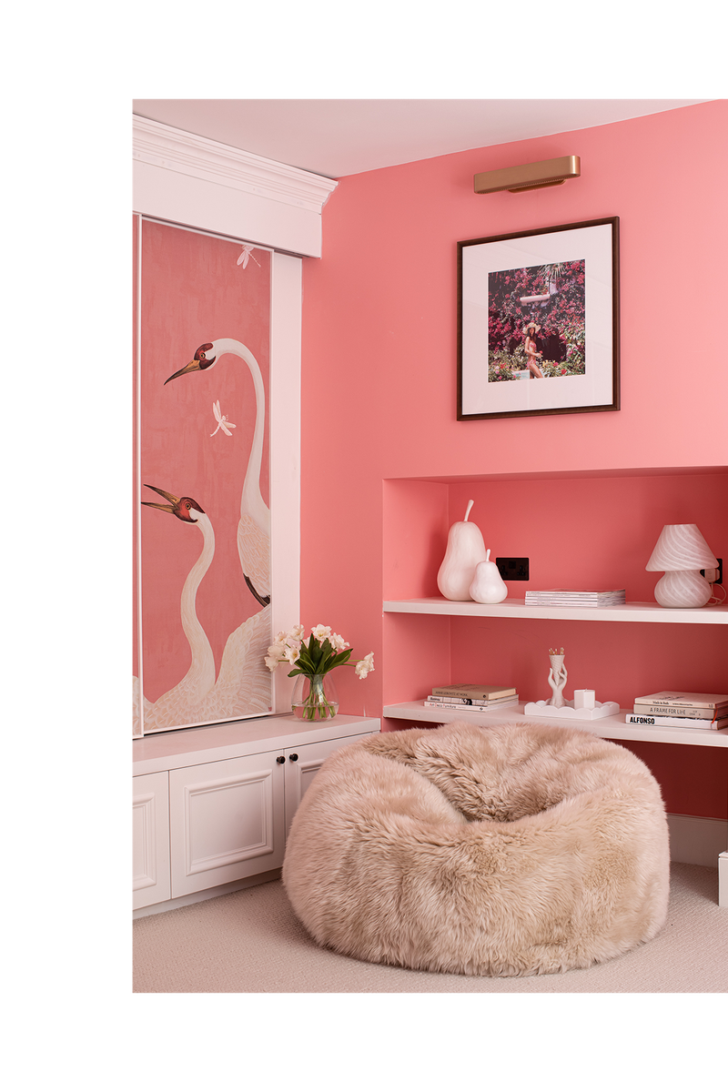
The darkest room in the house on the lower ground floor (which was previously the kitchen in the lower flat when we bought the property) is where we wanted to create a cosy family space or cinema room. I’ve long admired the Guccio Heron Wallpaper, so decided to use that on the sliding panels that cover the large TV. Mylands helped me create the perfect wall colour to work with the bright pink of the wallpaper. Our decorators thought I was crazy as they were painting it on – calling it Peppa Pig pink, but once it was on, it was amazing. It’s a colour that pushed me totally out of my comfort zone, but once the soft cream wool carpet (from Crucial Trading) was down, and the huge cinema-style curtains in a soft wool from Johnstons of Elgin were in place, it all came together perfectly.
The Main Bedroom
/https%3A%2F%2Fsw18.sheerluxe.com%2Fsites%2Fsheerluxe%2Ffiles%2Farticles%2F2022%2F01%2F7laura-butler-madden.png?itok=SSoHQUn5)
The main room on the first floor would have originally been the drawing room, but we felt it would be better used as a main bedroom, partly because it’s closer to our daughter Lily’s bedroom, but also because it already had a connecting room that we could use as an en-suite. We wouldn’t have been able to get permission to connect two rooms that weren’t already, so it felt like an obvious decision. I love designing bedroom suites – they’re such an important part of the home and the proportions here are amazing – as are the breath-taking views across the city.
It also has lovely high ceilings and lots of the original features, including the cornicing and fireplace. I wanted the architecture to be the focus, so chose a soft colour that worked with the colour of the Bath stone houses you can see through the window. The colour on the walls is Hoxton Grey by Mylands and we designed bespoke cabinetry to enhance the space, as well as a bed with a wraparound headboard and matching bedside tables from The Sofa & Chair Company. Finally, the beautiful painting in the arch above the bed (a gift from Kristin Gaudio Endsley) pulled the scheme together.
The Main Bathroom
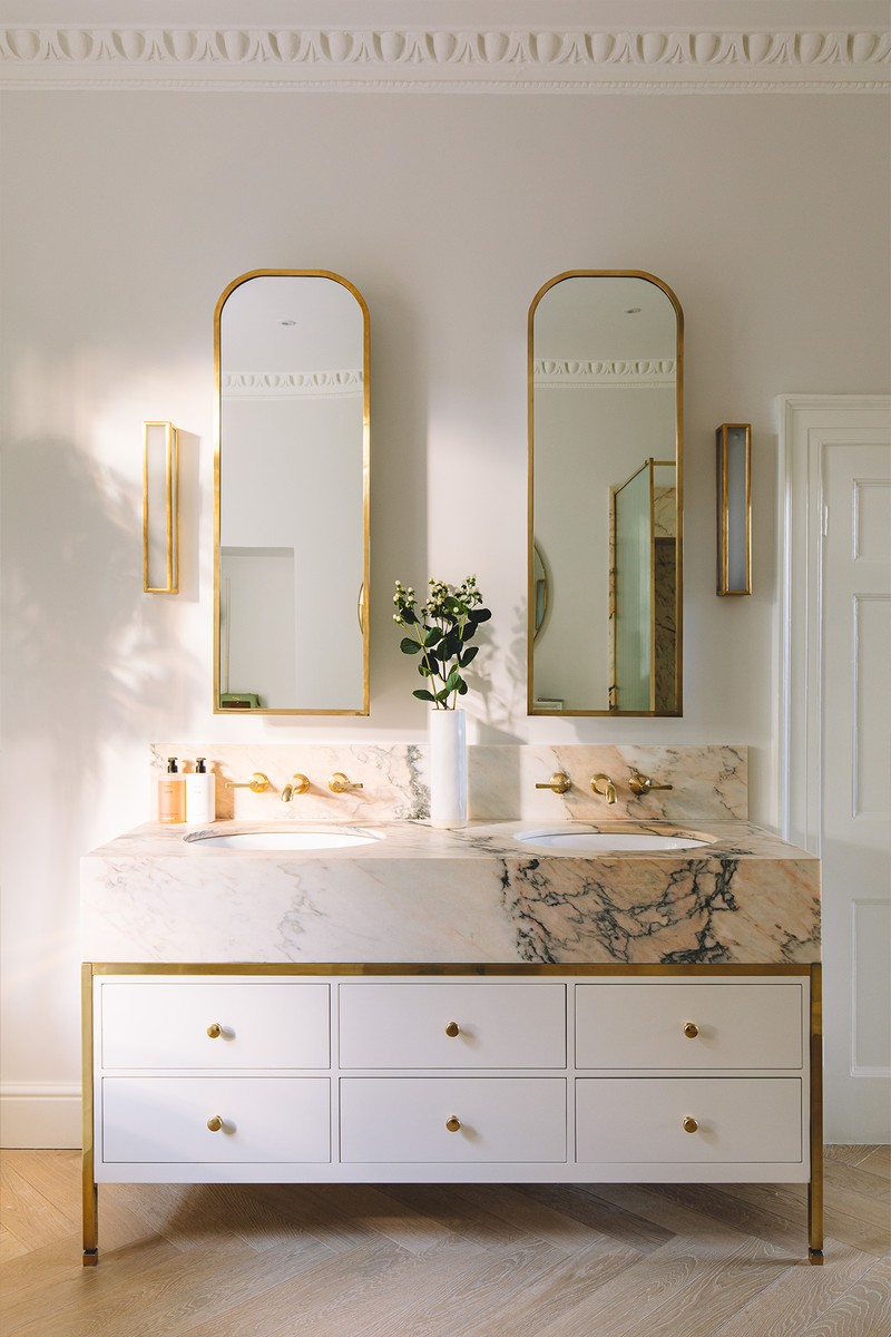
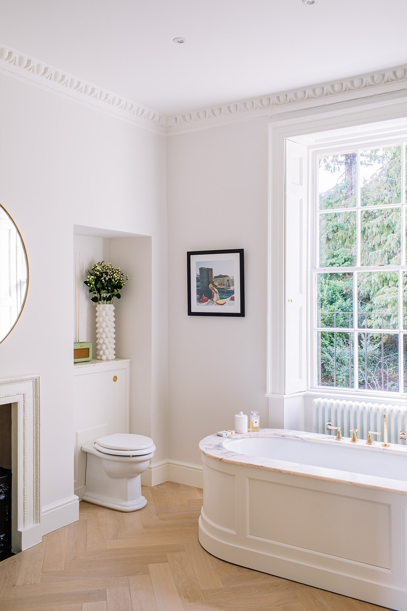
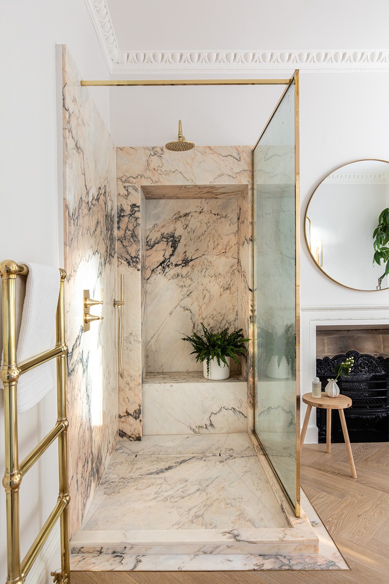
We worked very closely with Porter Bathroom and Trunk Floor on a lot of the key elements of this house, but particularly this bathroom. They both have a wonderful eye for stone and helped us source the Rosa Antico marble for the shower; it is honestly one of the most beautiful pieces of stone I’ve ever seen. It’s the perfect example of how nothing can really beat natural beauty. We designed the shower, as well as the stunning vanity unit bespoke – the vanity unit was beautiful to look at and touch, but also came with lots of hidden storage, which is so important in a bathroom.
The Children’s Bedroom
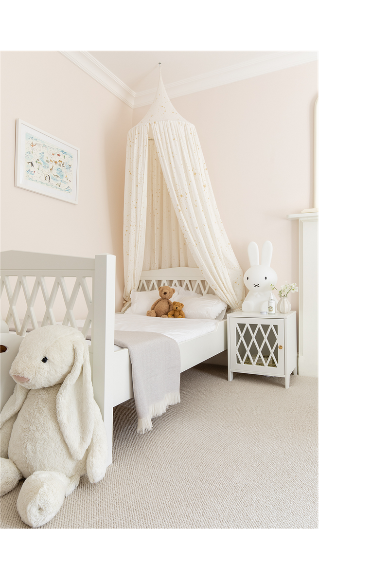
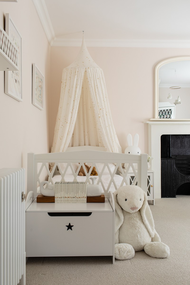
The house is set over five floors and on the top floor we had a guest bedroom, Lily’s bedroom, and a lovely family/guest bathroom. Lily’s room was inspired by the beautiful Cam Cam Copenhagen furniture from Scandiborn – we had the cot and changing table when she was a baby and I wanted to stick with that design, as it’s so fresh and pretty. We painted the walls a lovely soft pink, Kensington Rose by Mylands and added a beautifully soft wool carpet (Crucial Trading Pearl) as well as curtains in a fabric by Christopher Farr.
Visit LauraButlerMadden.com
Photography Credit: Patrick Butler-Madden
DISCLAIMER: We endeavour to always credit the correct original source of every image we use. If you think a credit may be incorrect, please contact us at info@sheerluxe.com.
