Interiors Masterclass: How To Create A Rustic Look In The City
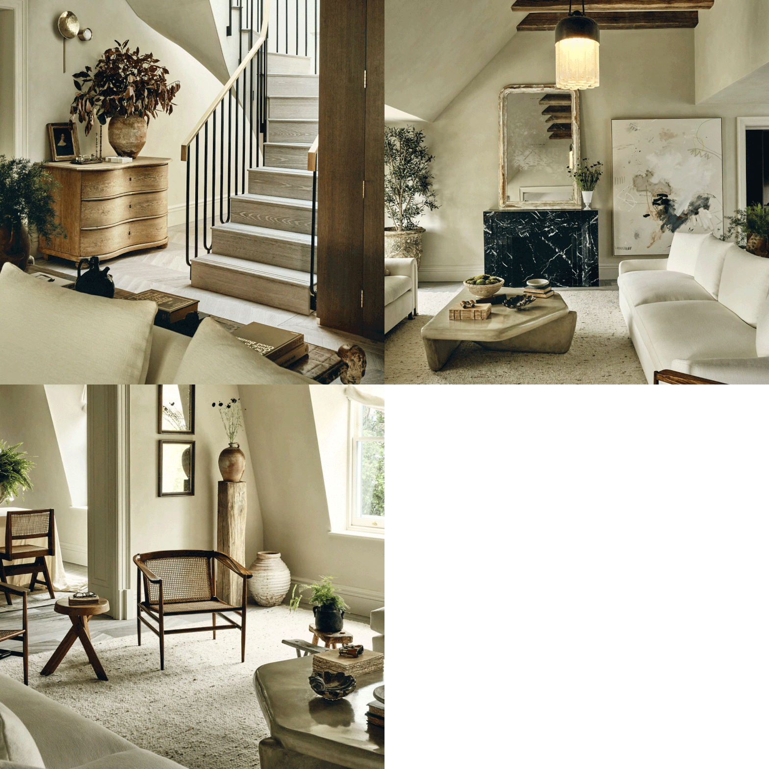
The key elements of a country look include a muted, neutral colour palette, wooden beams, and lots of natural textures, all of which contribute to the elegant and laidback feel.
All of these elements can be transferred to the city as long as the design is authentic and consistent. Ideally, you do need a room with large windows to let plenty of natural light in.
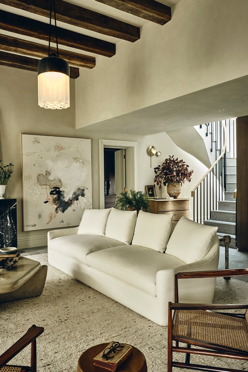
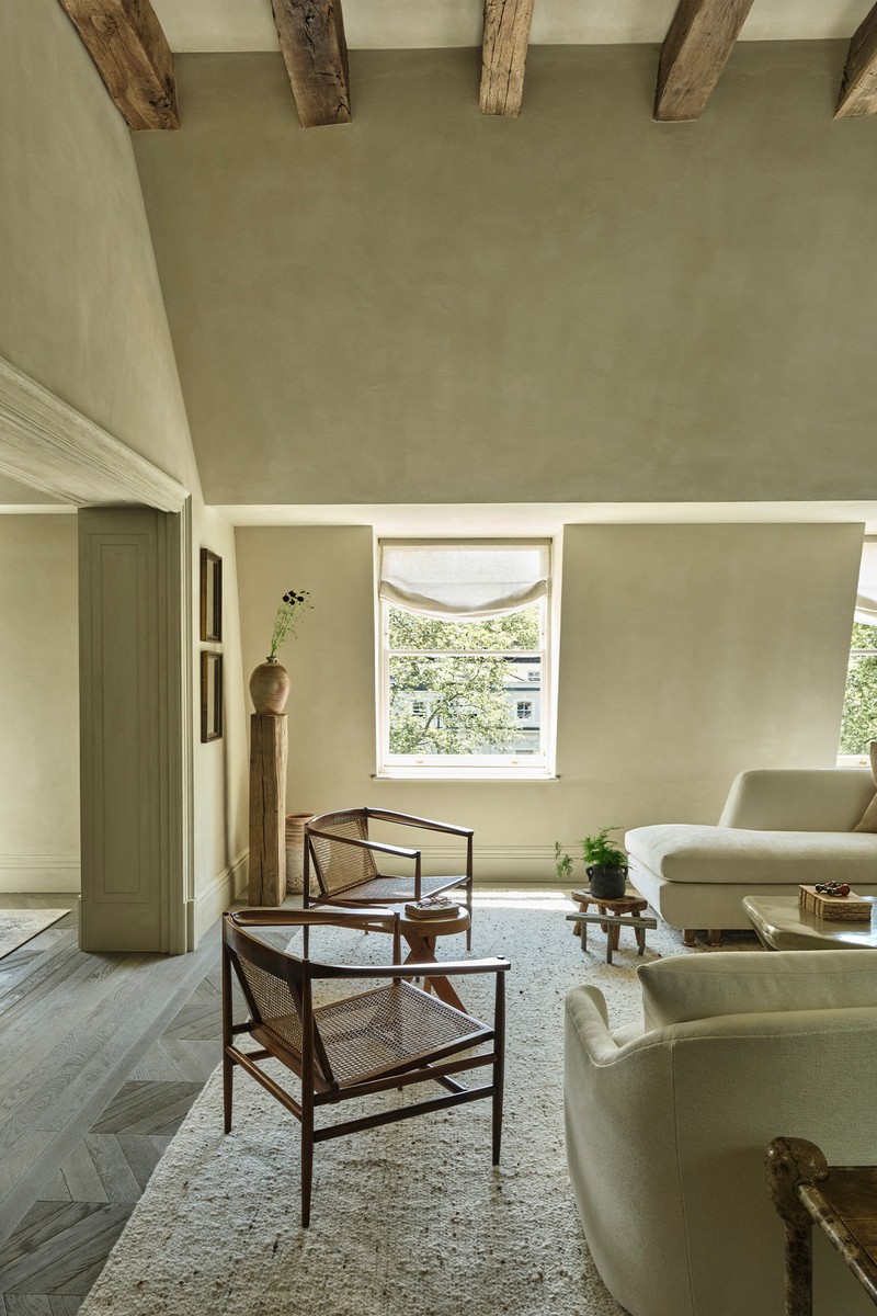
You don’t need to have existing beams. In fact, it’s sometimes easier to start without them. That way, you can pick exactly the right shade for the room.
Decide whether the beams are for aesthetics or structural. In this project, we chose original old beams, but there are plenty of modern engineered options available, too. Reclamation yards are a great place to start, as many of them will be able to work on each beam individually to ensure it's both the right shade and length for your space.
/https%3A%2F%2Fsw18.sheerluxe.com%2Fsites%2Fsheerluxe%2Ffiles%2Farticles%2F2021%2F10%2Finteriors-masterclass-banda-penthouse-03_0.jpg?itok=ZDeLoBBG)
The history behind old beams helps tell a story. For example, they might have been sourced from an old ship or older property close by. In this apartment, the oak beams are actually antique.
Remember adding beams can reduce the headroom considerably. You always need to work with the space you have. If you have low ceilings, it might not be the right look. Also, you need to be sure that the ceiling can support the added weight of the beams.
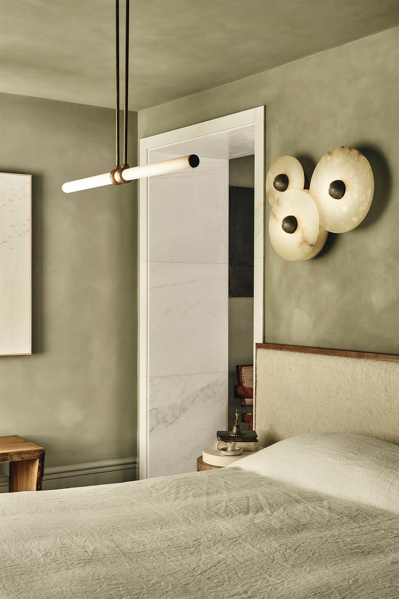
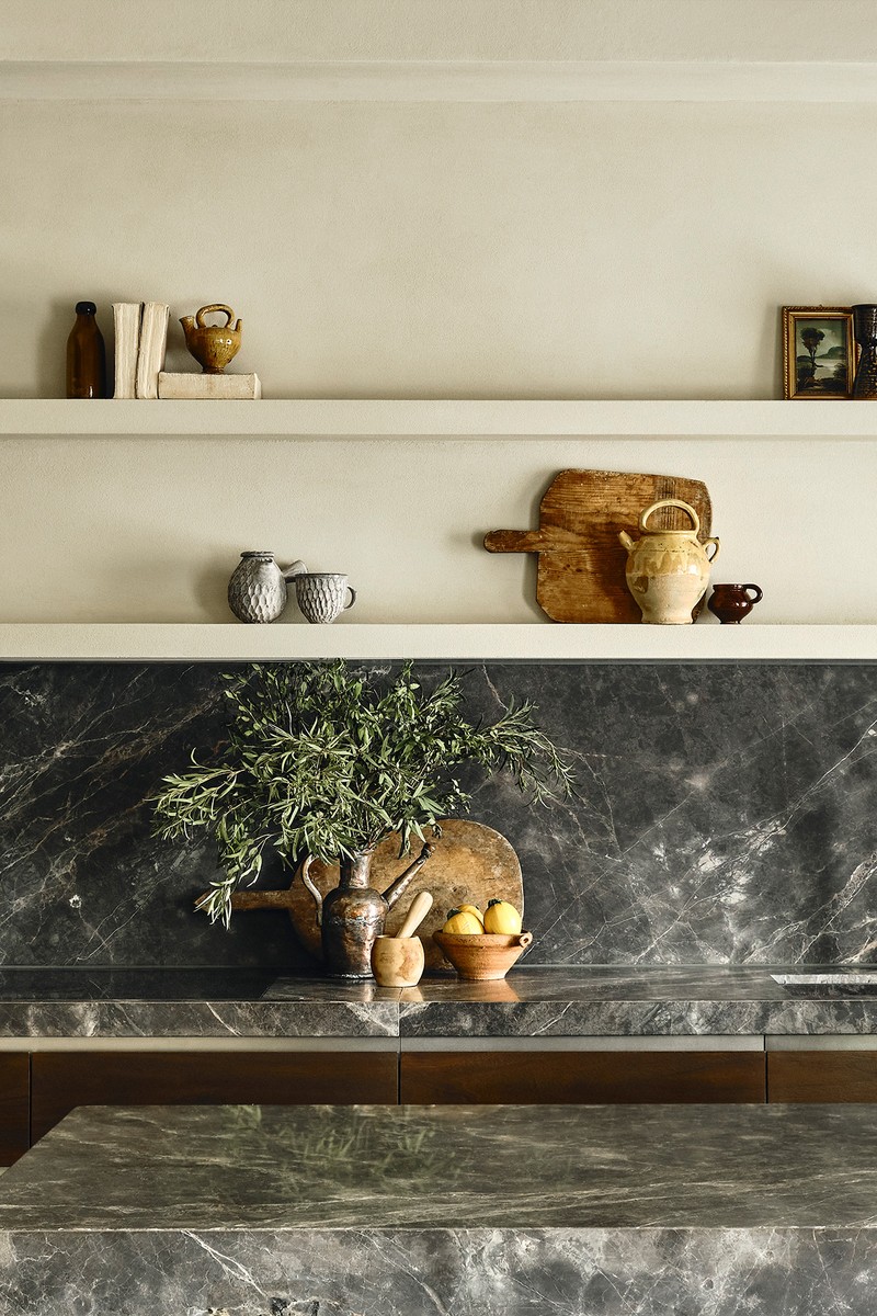
Beams don’t have to age a room. We decided to use contemporary, statement lighting to keep the look fresh and modern – the slightly industrial feel of some of the pendants adds that unexpected juxtaposition.
Look at how the windows relate to the ceiling. The beams work particularly well here because, although the ceilings are high, the windows are actually set quite low. Using the same colour palette for the window treatments brings everything together.
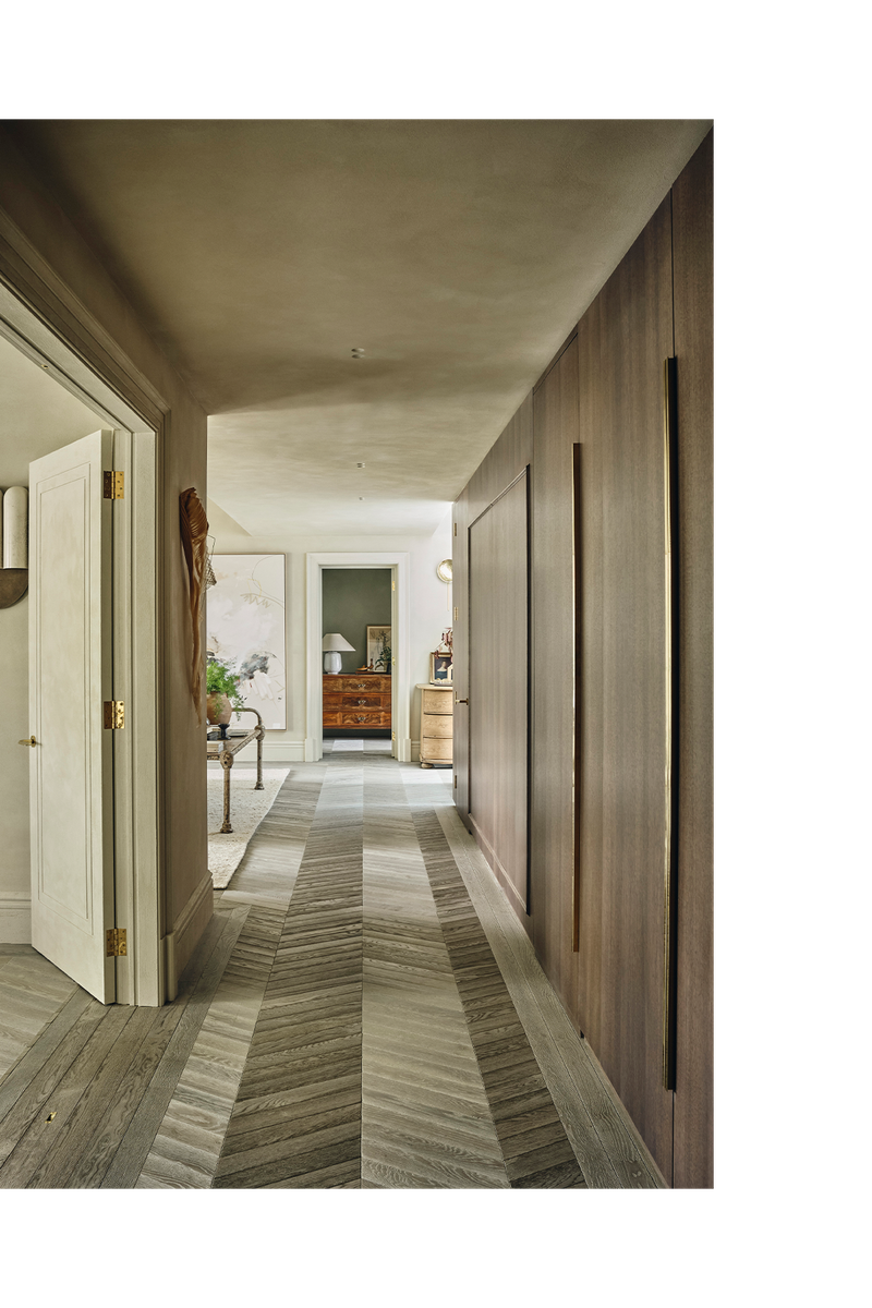
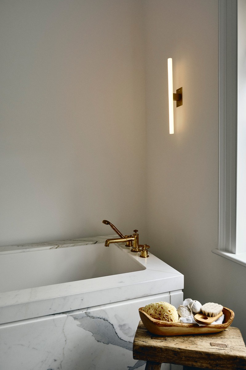
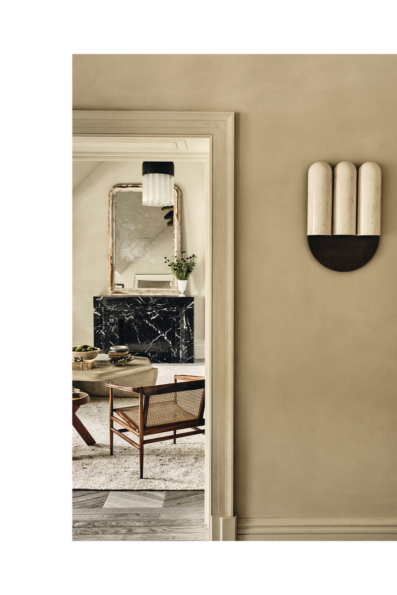
Think beyond your location. We wanted to do something a little different in this space and found inspiration from France and Italy – city living doesn't have to be stark, it can also have lots of character.
The mix of old and new is a signature of ours. The mid-century rosewood chairs by Joaquim Tenreiro are so iconic, and they’re offset by the modern oversized linen sofas and statement tadelakt coffee table. Elements of old and new are woven together seamlessly and blended with antique pieces that fit perfectly within the space – such as the vintage chest by the staircase.
For more information, visit BandaProperty.co.uk
Photography by Ben Anders
DISCLAIMER: We endeavour to always credit the correct original source of every image we use. If you think a credit may be incorrect, please contact us at info@sheerluxe.com.
