An Interior Designer Shows Us Around Her Favourite Project
The Property
This house is very special to me because it was my first solo interior design project when I started Studio Peake. It’s a double-fronted Georgian cottage on a wisteria-filled terrace in South London, but the previous owners had used a lot of black and grey – favouring a rather industrial aesthetic. A rear extension done in the 1980s hadn’t been done sympathetically, either, so a lot of the early work on the project was about re-thinking, adding or replacing the different architectural elements (like architraves, doors, skirtings, cornices and radiators) that would have been there originally. My clients had bought the house and moved in straight after their honeymoon and, after spending six months living there, getting to know all the nooks and crannies, they brought me on. The brief was to come up with a colourful, original design but also to create a comfortable, cosy home.
The Kitchen
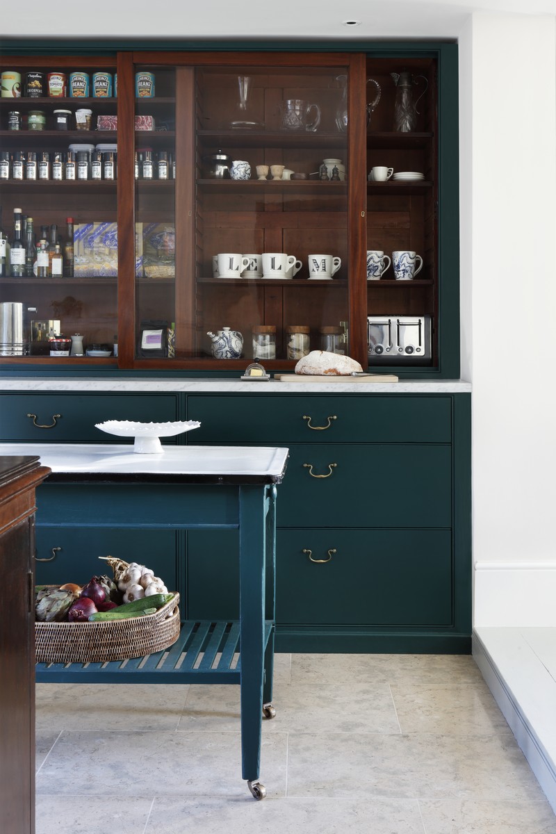
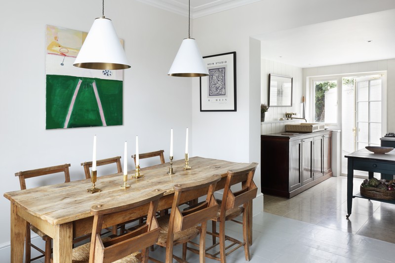
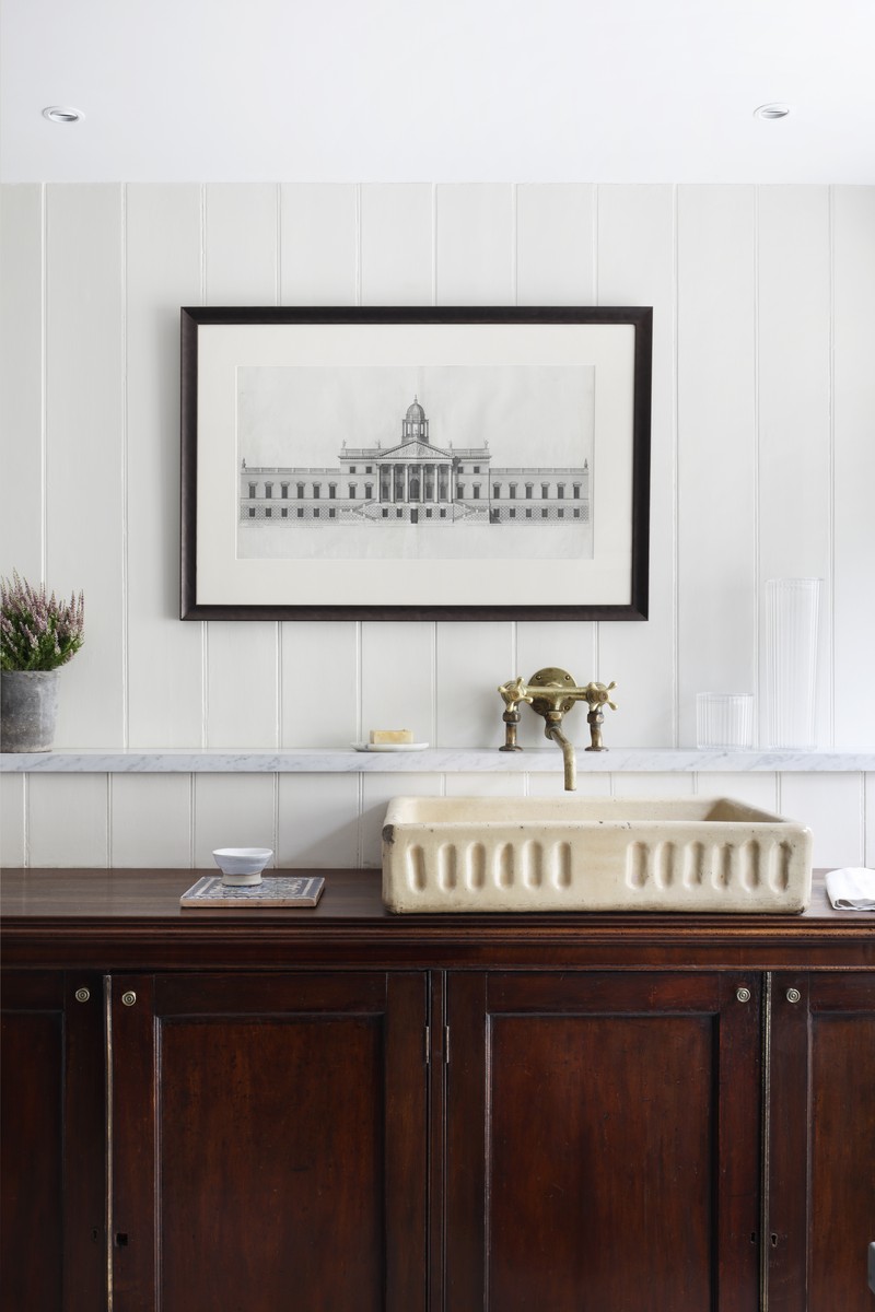
There wasn’t the budget – or the desire – to completely replace the kitchen, but it definitely needed a refresh. We really wanted to work with what was already there, however, so the combination of old and new resulted in a very characterful space.
We laid a new limestone floor (Lanyan Limestone by Artisans of Devizes), painted the existing joinery in a green paint matched by Dulux, replaced the laminate tops with Carrara marble and found new drawer handles at Lassco reclamation yard. We also brought in a French polisher with the help of Portobello Painters to restore the existing timber cupboards.The floor paint was a special mix from Papers and Paints and the walls were painted in Stone I from Paint and Paper Library’s architectural range.
Cosiness was also a key part of the brief, so we filled the front part of the kitchen with soft furnishings – and also framed the new windows with curtain fabric from Namay Samay and a Samuel & Sons fringe, as well as including a beautiful rug from A Rum Fellow. You can also see an oversized embroidered cushion on the chair from William Yeoward, and a white lamp from Porta Romana. This softness offset the hard finishes in the rest of the space really well.
The Living Space
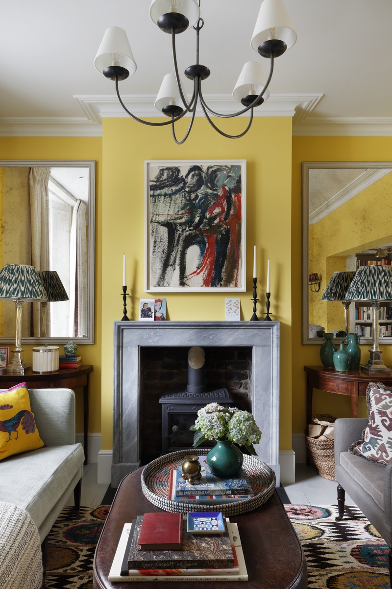
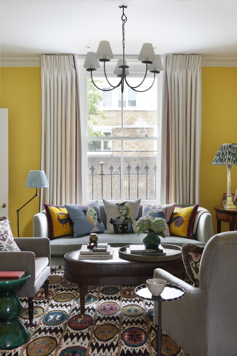
It was an early decision to paint the walls of the the main living space yellow, but finding the perfect shade and tone took time. In the end, we had a bespoke colour mixed for us by Papers and Paint. The painted wooden floor from the kitchen continues through into the main living room and is further amplified by a colourful rug we found at Ornate Rugs. We had the fireplace surround made at Jamb from Bardiglio marble, and the chandelier came from The English House. Luckily for me, our client had a keen interest in – and great eye for – art: above the fireplace hangs a William Crozier painting we found at Piano Nobile. The upshot was a cosy but characterful space where the mix of patterns, plains and finishes came together to make a room that was interesting without being overbearing.
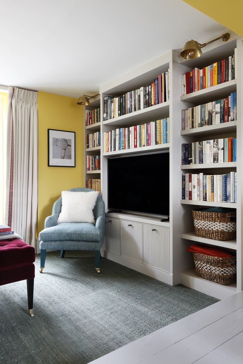
There is a small area towards the back of the space which is down a step from the front part and has a very low ceiling, so we worked with it to create a cosy little nook. The bespoke TV and bookcase joinery was designed by us and made by Billy Crawshaw who helped make the most of the space. We carpeted the floor in Tim Page Claremont and David Seyfried made the little chair, which was covered in Fermoie fabric, with the legs painted in gloss paint. The lights in the joinery are from Besselink & Jones, which we customised with a brass shade and a straight arm.
The Main Bedroom
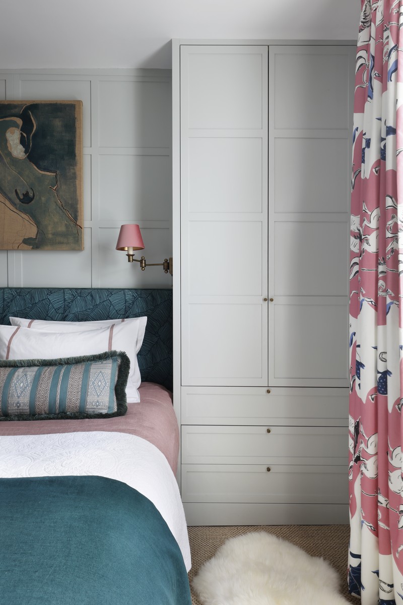
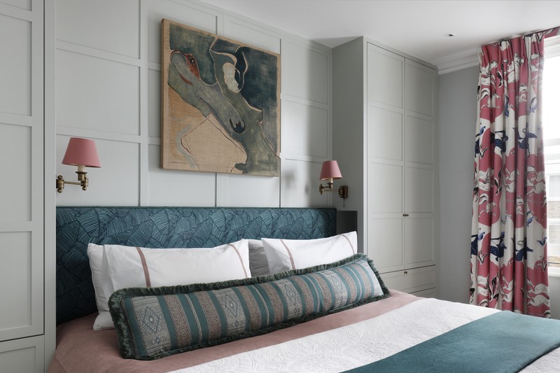
The master bedroom is my favourite room in the house and benefits from plenty of natural light. It’s colourful, but still feels like a calm refuge – as a bedroom should.
The paint colour on the walls and joinery is Fencing Blue by Papers and Paint Library. The curtain fabric is Lasso by Pierre Frey and the headboard is Kelly Wearstler with Romo Linara piping. Above the bed there’s a painting by Venetia Berry, a piece my client already had before we started the project which became my starting point for all the other colour choices we made for the room. The bed linen is Gayle Warwick Siena appliqué, the throw is from Once Milano and the long cushion we had made out of Guy Goodfellow fabric with a Samuel and Sons fringe.
The Landing & Stairs
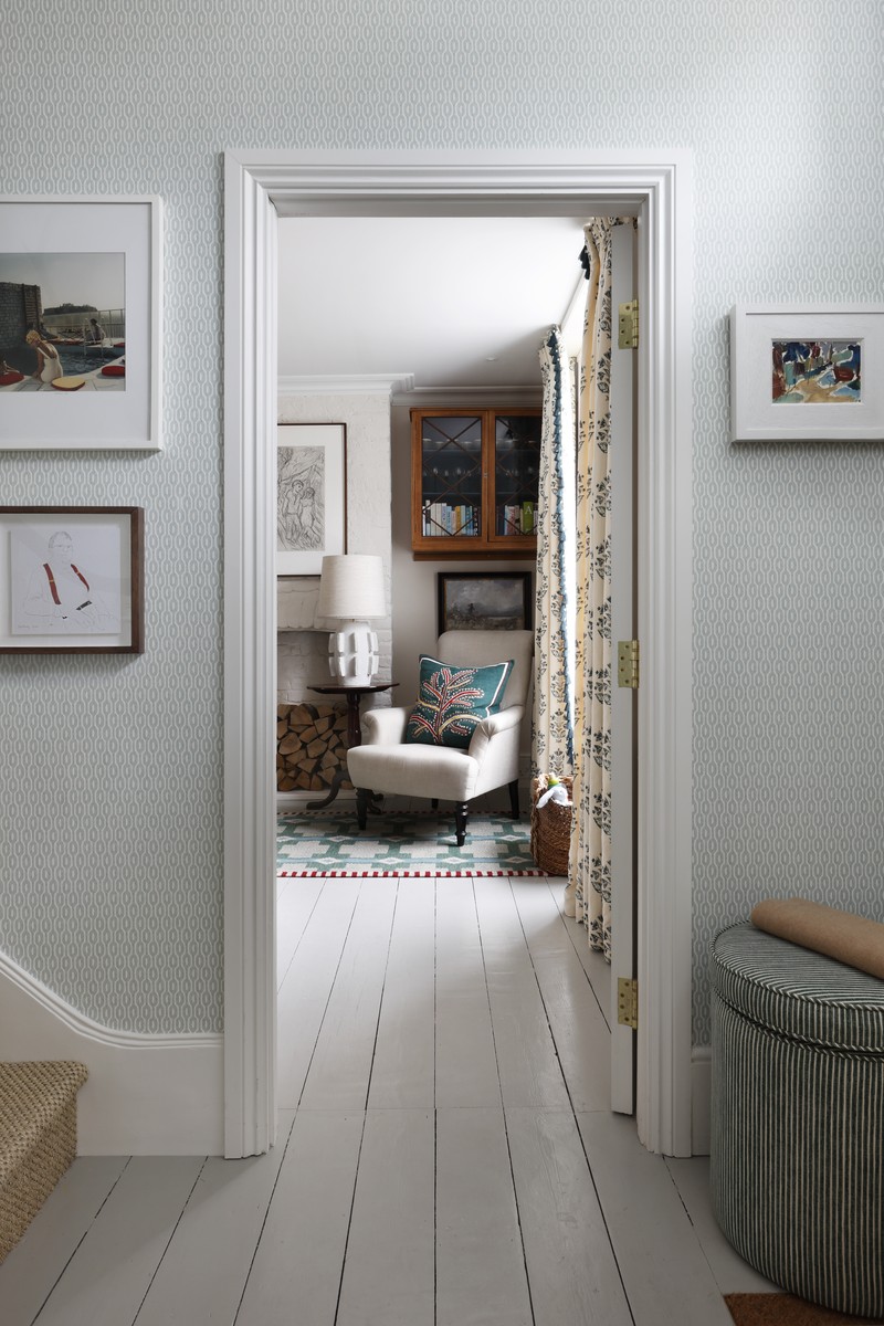
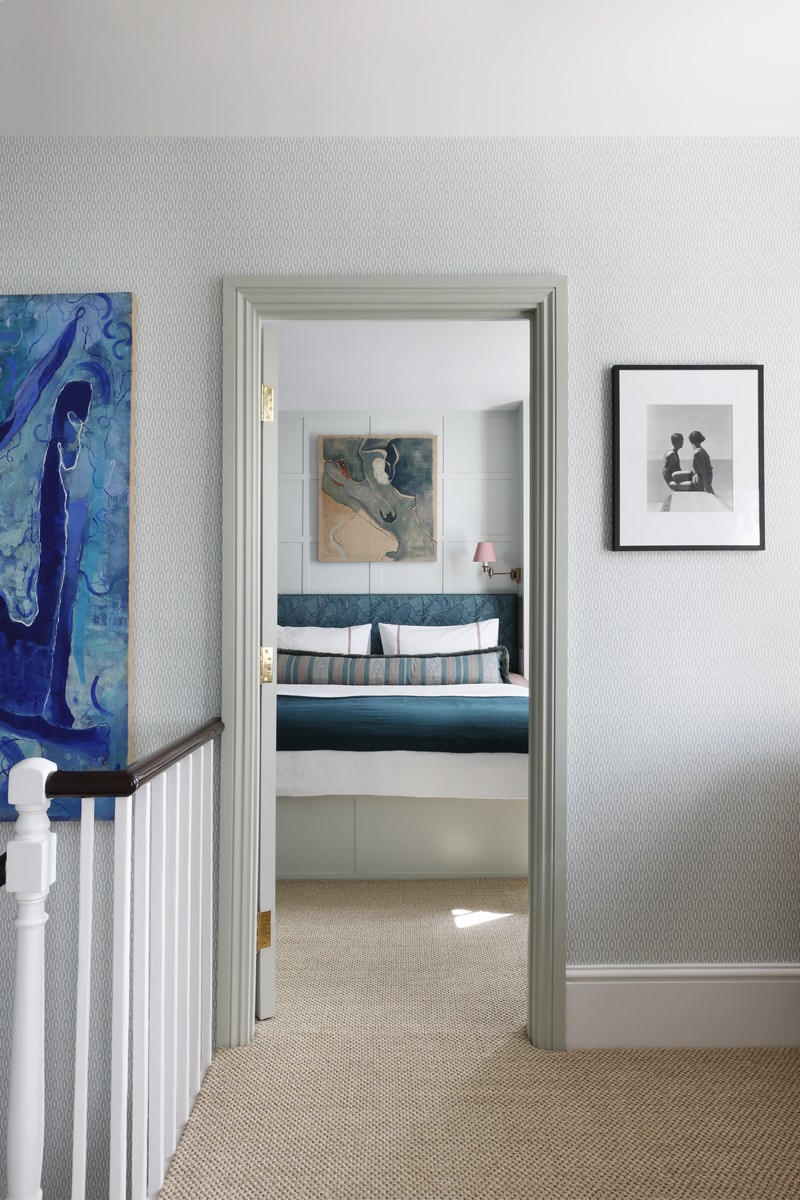
The entrance hall is the first thing you see when you walk in and so, from a design perspective, it acts as a crucial introduction to the rest of the house. It also plays a part in framing the rooms that lie directly off of it, which is why we went for this wonderful wallpaper called Sanderson ‘Hemp’, which acts as a more muted introduction to the more defined colours in the adjacent rooms.
We continued the entrance hall all the way up the stairs to the landing. Portobello Painters’ French polisher worked his magic on the handrail, and we painted the architraves and doors in Edward Bulmer’s Celadon paint. Outside the bathroom door, on the half-landing, there’s another antique chair below a painting by Sarah Balme. The chandelier is a mid-century find from Pamono and the white lamp is from Porta Romana.
The Guest Bedroom
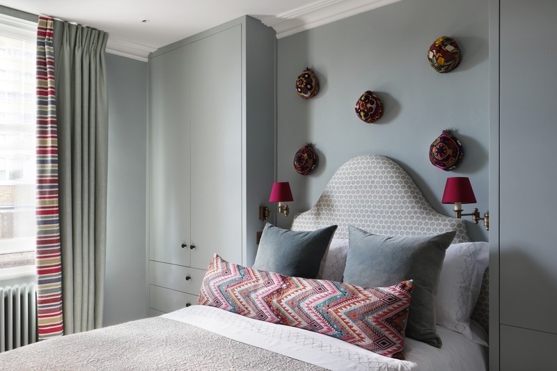
The guest bedroom is directly opposite the main bedroom, so the view of the bed had to be good. The shaped headboard was made by Pat Giddens Ltd and the fabric is from Holland and Sherry. Above the bed are a selection of rather fun little Afghan hats sourced from Etsy. The large cushions on the bed are hand-dyed velvet by Kirsten Hecktermann and the long rectangular one was hand embroidered and specially made by A Rum Fellow (it felt extravagant at the time but it was so worthwhile).
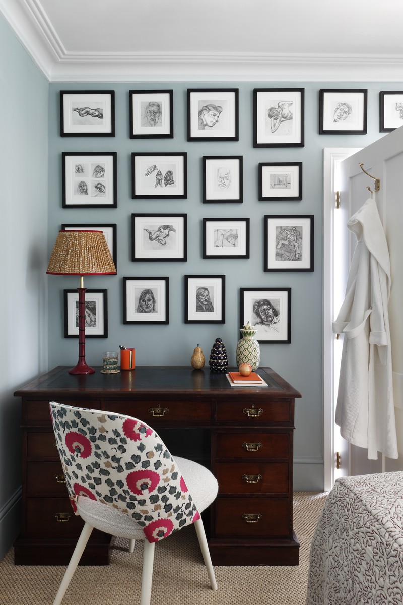
Behind the door we tucked an antique pedestal desk, which was then livened up with more colourful modern pieces, including a chair by Benchmark upholstered in Vaughan and Holly Hunt fabrics. The raspberry lacquered lamp is from Salvesen Graham and the gathered silk shade is by Penny Morrison.
The Box Bedroom
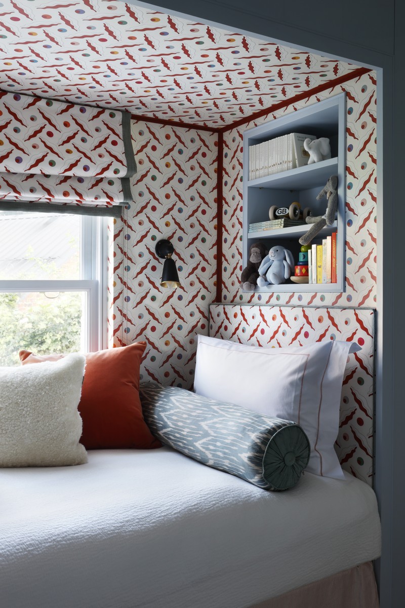
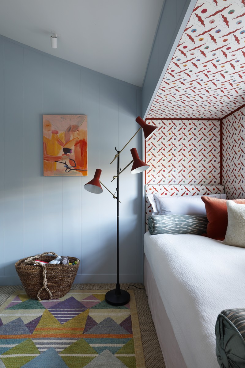
This tiny box room was one of the biggest transformations of the entire project. Originally, the room was painted black with acid green wallpaper and there was a harshly angled ceiling which came incredibly low above the window. We designed a ‘bed nook’ near the window where the ceiling was low. This meant that, in the standing area, the ceilings felt higher. With Billy Crawshaw’s expert help, we also panelled all of the walls with MDF and painted them in Edward Bulmer’s Fair Blue.
Within the bed nook we had a bit of fun using Ottoline Devries’ wallpaper, fabric and contrast piping around the headboards from Samuel and Sons and roman blind borders from Colefax and Fowler. We incorporated a bookcase above the headboard, as there was no room for a bedside table, and also included a wall light within the nook in place of a bedside lamp.
The Bathroom
This bathroom was an interesting one as we decided early on that it worked well and there was little need to re-do it. In the end, we couldn’t resist making a few small changes, which actually ended up making a big difference. We used some leftover stone from the kitchen floor and marble from the worktops and continued the Edward Bulmer Celadon paint from the landing on all the woodwork. Just a touch of Soane wallpaper made such an impact on the only non-tiled wall with a pretty blind, while a rattan mirror from Kempton Racecourse ended up being perfect for the space.
Visit StudioPeake.com to see more of Sarah’s work.
Photography by Alexander James
INSPIRATION CREDITS: ALEXANDER JAMES
DISCLAIMER: We endeavour to always credit the correct original source of every image we use. If you think a credit may be incorrect, please contact us at info@sheerluxe.com.
/https%3A%2F%2Fsw18.sheerluxe.com%2Fsites%2Fsheerluxe%2Ffiles%2Farticles%2F2021%2F05%2Fspkitchen1.jpg?itok=cNeG3PbR)


/https%3A%2F%2Fsw18.sheerluxe.com%2Fsites%2Fsheerluxe%2Ffiles%2Farticles%2F2021%2F05%2Fspguestroom3.jpg?itok=bAb2ro9s)
