SheerLuxe Scandi Style Home Tour
We took a peek inside her home - fans of pared-back Scandi style, this one's for you...
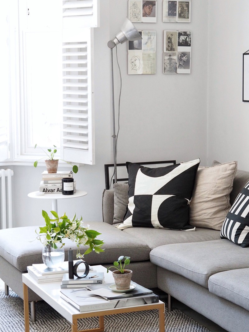
LOUNGE
What things should people invest in when looking to update their lounge?
I'd say splurge on the main pieces of furniture that will become the focal point of the room, such as the sofa, picking well-crafted designs that are built to last and will stand the test of time no matter how your style evolves. You'll likely be spending every day on the sofa so you want to invest in comfort and a high quality, hardwearing material that will see you through the years. The sofa then becomes a foundation to add colour and texture with accessories and details. I also think it's worth spending a bit more on paint to get a rich depth of hue and quality finish.
Which bits can you do on a budget?
The decorative accessories that you might change up more often – things like cushions, prints, throws and objects. They're easier to swap around as the seasons change and trends come and go.
How did you pick the colour scheme?
I wanted the walls to become a calm, neutral backdrop for all the other things that bring life to a space; my books, artwork, plants and favourite objects. I chose Blackened by Farrow & Ball – it's a pale light grey that has a warmer, cosier feel than if I had gone for all white walls. It also brings out the period detail of the cornicing. When choosing a shade of grey, make sure to consider the natural light in the room; here Blackened, with its soft blue tones, works in a south-facing room, but if you have a darker north-facing room, those same blue tones could make the space feel quite cold, so you'd want to go for a warmer grey with beige tones.
How do you mix textures and colours with soft furnishings?
I love using natural textures such as linen, wool and waffled cotton to appeal to the senses and bring a sense of tactility. It's about building up layers – here I've picked out similar tones and textures so they complement each other, there's the neutral linen and then black and white geometric patterns to provide contrast and pattern. In a pared-back minimal scheme, my tip is to stick to no more than three colours so they don't start to clash and fight with one another.
Where should people look to buy affordable art?
One of my favourite online shops is The Poster Club, they have a lovely curated collection from a range of artists, photographers and creatives from across the world. They also have a range of frames too.
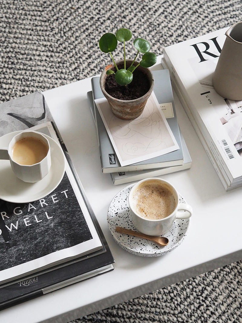
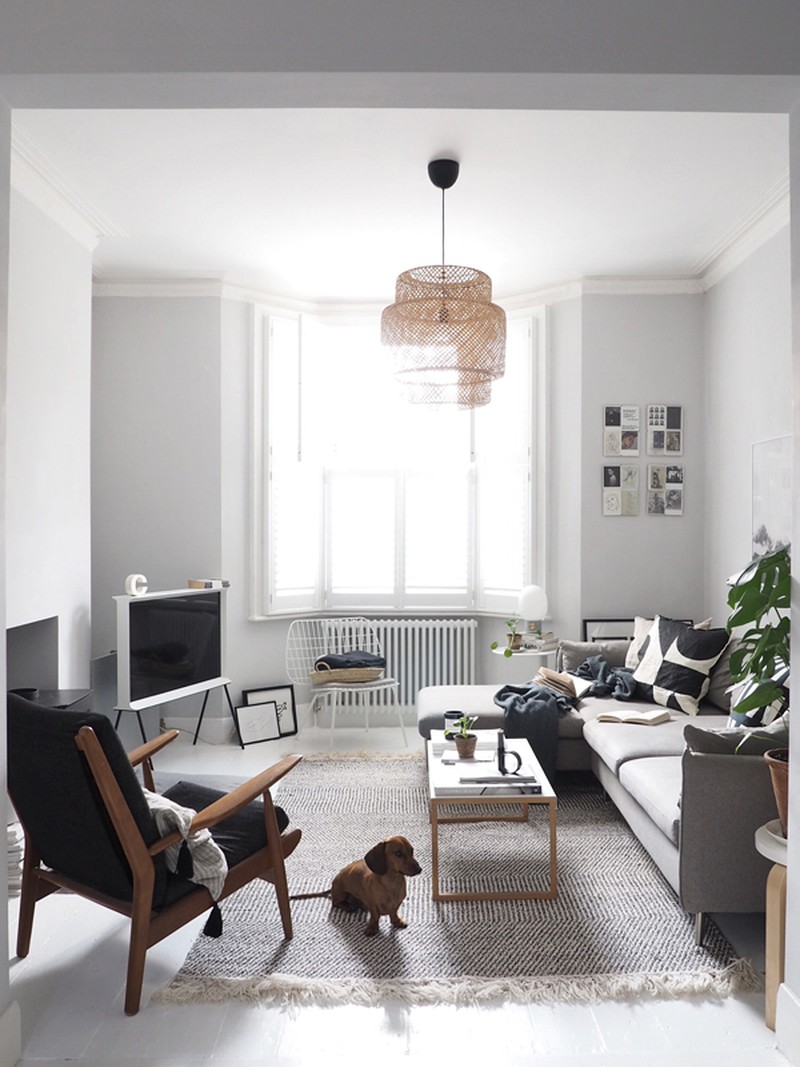
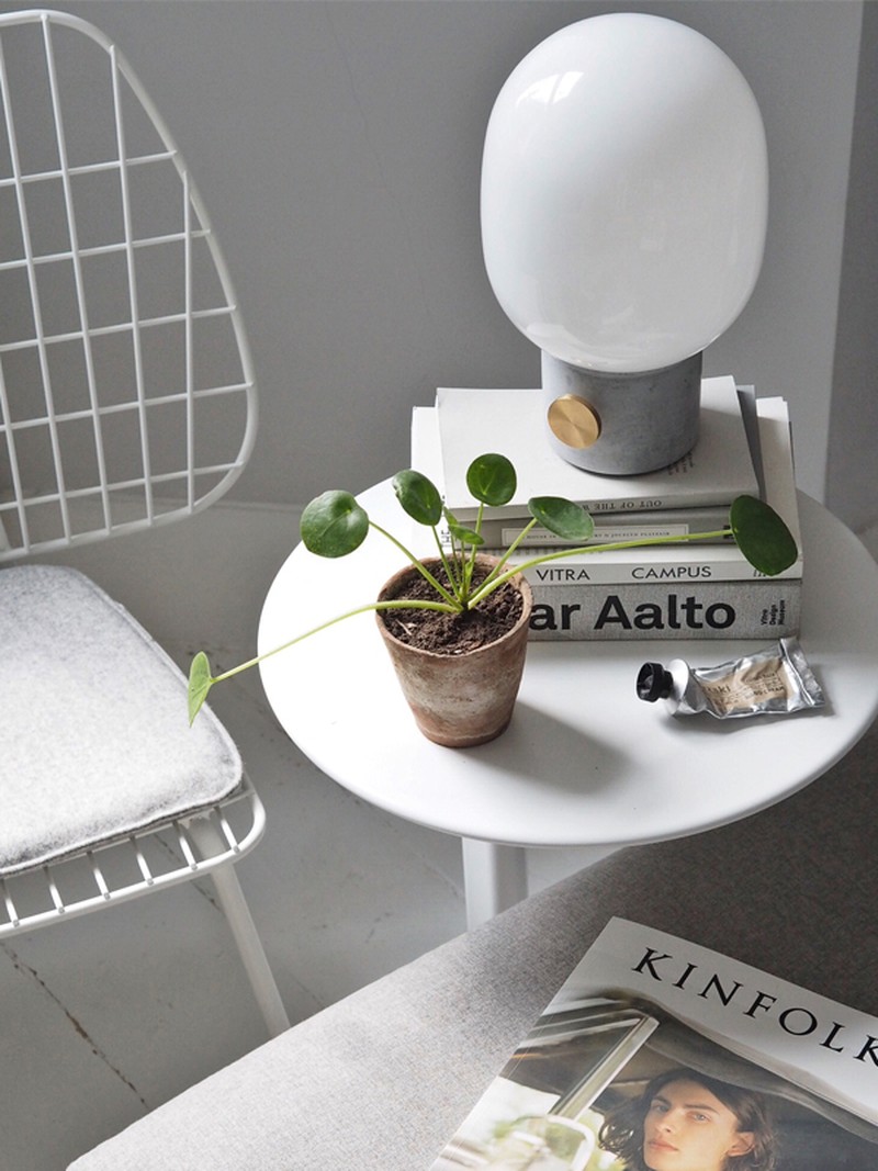
Vento 3 Seater Left Hand Facing Chaise End Corner Sofa, Manhattan Grey, £999 | Made, Sinnerlig Pendant Lamp, £40 | Ikea, Serif TV 40’’, £1,199 | Samsung, Kinfolk Magazines, Elle Decoration Magazines, Cereal Magazines, JWDA Concrete Table Lamp, £143.65 | Menu, Ritual Repeat Cushion, £30 | John Lewis, 50 x 50 Cushion Covers, £30 | Happy &Co, Washed Linen Cushion Cover, £8.99 | H&M, Duet Indoor/Outdoor Rug, £119.95 | West Elm, WM String Lounge Chair, £249 | Menu
KITCHEN
How did you come up with the design for the kitchen?
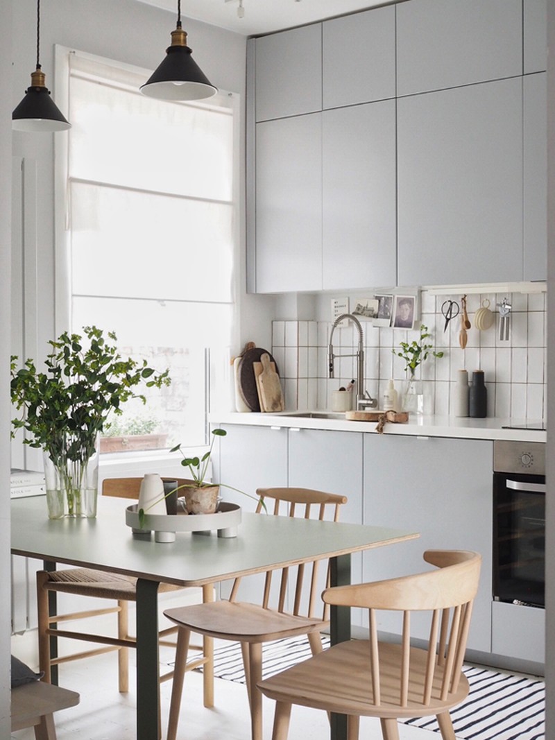
Originally the kitchen and living room were two different spaces; they were quite dark and uninviting. We knocked down the wall between them and opened up the space to create one, big, multi-functional living space that's flooded with natural light. We knocked down the chimney breast where the old kitchen was so that we could gain a bit more space and run the units along one wall, creating an area for a dining table opposite. I designed the units to go right up to the ceiling to maximise every inch of space and create a clean, streamlined look. I always think that the area above units gets so dusty anyway, so it's great to have some extra storage for bottles, vases and the things we don't always use every day.
As it's a flexible, open plan space, I didn't want the kitchen to look too much like a kitchen and overpower the room, so I chose simple finishes such as handleless doors (they open with push openers) and concealed, built-in appliances. Arranging white rectangular tiles vertically creates an alternative look to classic metro tiles.
Tops tips for saving space for small kitchens?
Plan the space strategically so there's a place for everything. You want things to feel intuitive to use so you're not making unnecessary trips across the kitchen or bumping doors. Pull-out drawers with different heights in bottom units help arrange items – for instance, shallower drawers for cutlery and deeper drawers below for pans (you can always conceal them with one door you pull out). Choosing an in-built extractor fan takes up much less space and you can use the shelves in the unit above to store oven dishes. You can even get half-size dishwashers if you're tight on space. Taking things off the worktop will give a greater illusion of space, so try hooks for utensils, shelves for favourite cups and mugs and a trolley with napkins, placemats and condiments that you can wheel out of the way.
Favourite kitchen brands?
IKEA for kitchen carcasses, Custom Fronts, Superfront or Reform for bespoke doors to IKEA kitchens, Miele for appliances, Fired Earth for tiles.
People often say the kitchen is the heart of any home – how do you make yours feel unique?
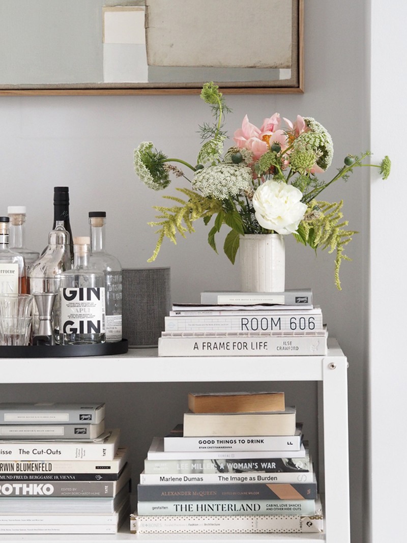
I like to treat the kitchen like any other room in the house. Adding personality with artwork and beautiful objects to make it feel homelier and less clinical; I've pinned postcards above the sink, for instance. It depends what you use the kitchen for as well. If you're a budding chef you might want shelves to display cookbooks and Kilner jars of ingredients, if you like entertaining you might want a bar cart with everything you need to make cocktails for friends.
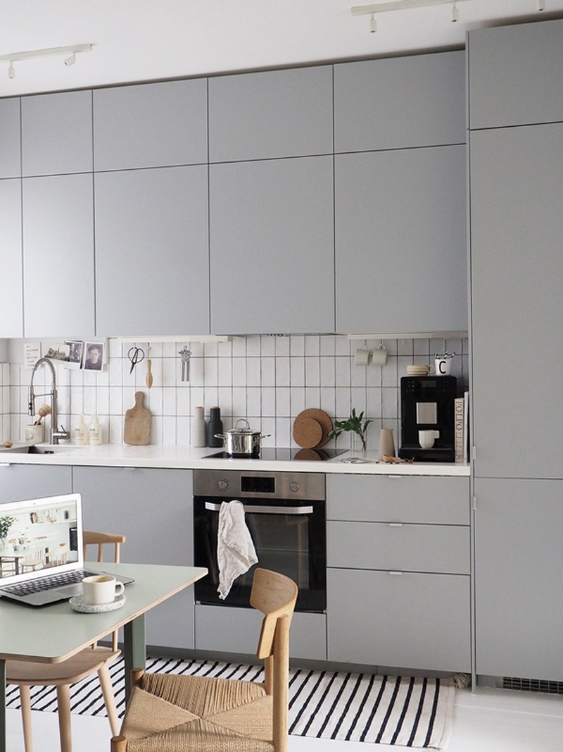
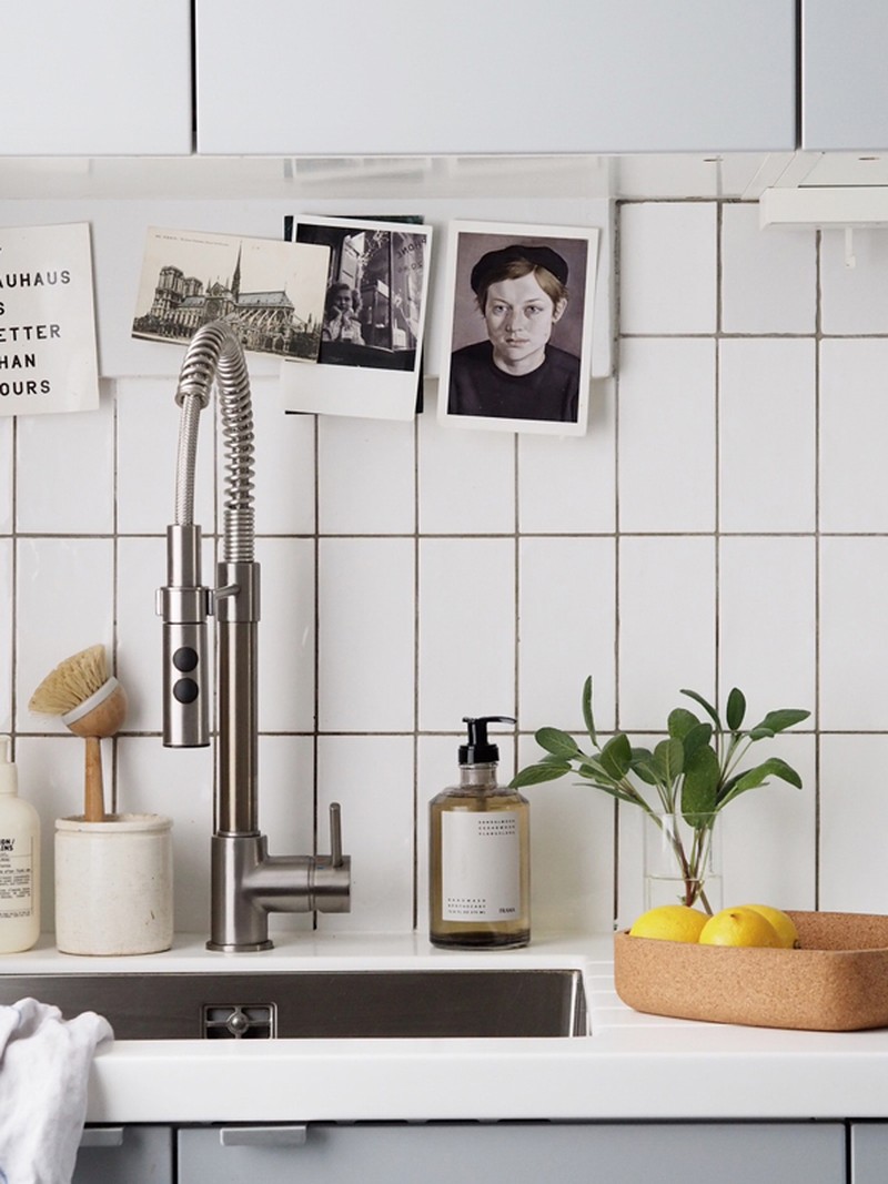
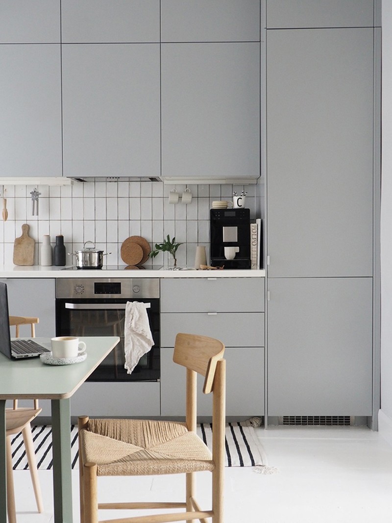
Kitchen Cupboards, £409 | Ikea, Kitchen Mixer Tap, £150 | Ikea, Raskog Trolley, £50 | Ikea, 70/70 Table, £1,139 | Muuto, Norraker Bench, £40 | Ikea, Folke Palsson’s J77 Dining Chair, £139 | HAY, Carl Hansen CH23 Dining Chair, £745 | Innes, Small Pendant Light, £95 | Pooky, Platform Tray, £54.77 | Muuto, String Pocket Shelving, £122 | Utility Design
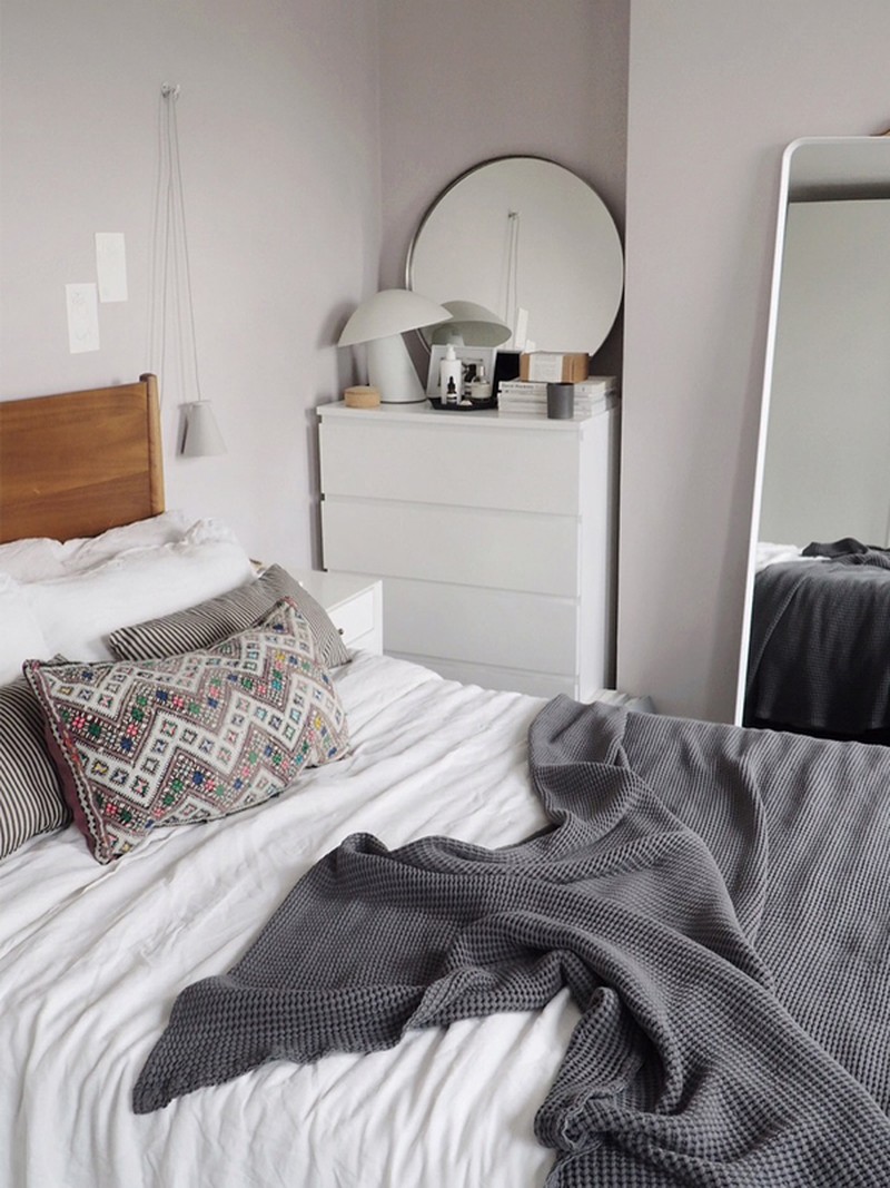
BEDROOM
How would you describe the style?
It's a calm and relaxed space. I wanted to create a quiet sanctuary to escape to at the end of the day.
Any tips for making a room cosy but still cool and modern?
It's all about layering up textures with rugs, soft throws, blankets, bed linen and cushions. I love natural linen because it has a relaxed, undone appearance, it doesn't even matter if there are a few creases. Invest in good storage to hide away the things you don't want to see and keep other surfaces relatively clutter-free so that the bed becomes the focal point and you focus on creating a serene, cosy space.
Where's the best place to buy linens?
Piglet, H&M Home and Soak & Sleep.
Top tip for people who are wary of using colour?
Build up colour and your confidence gradually – it's easier to swap accessories around than have to repaint a wall. Reflect on where you find your inspiration, it might be a colour in your wardrobe you like to wear or something reflected in your surroundings.

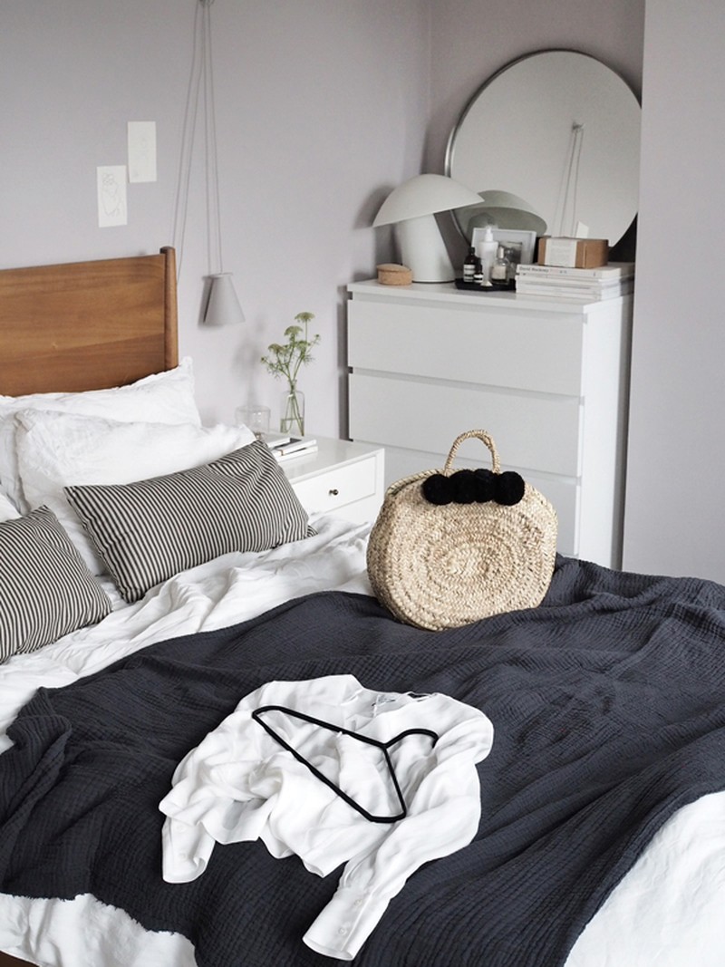
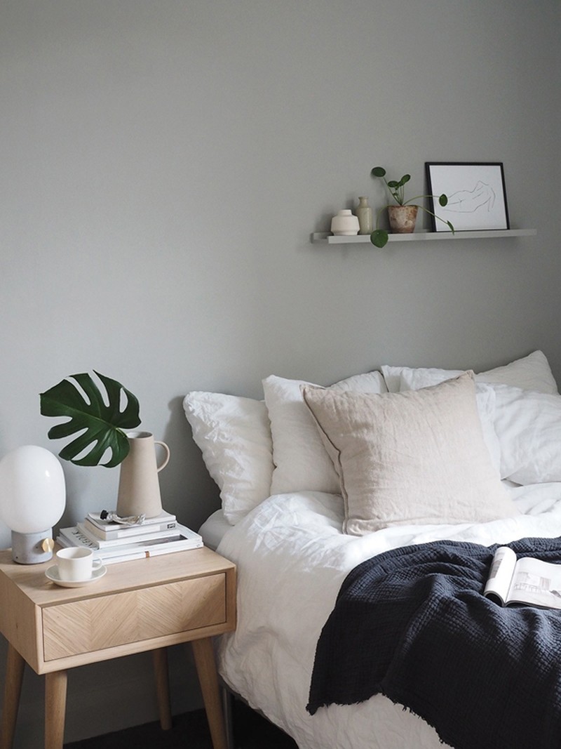
Mid Century Bed, £799-999 | West Elm, Mid Century Upholstered Stool, £119.95 | West Elm, Mid Century Tufted Dining Bench, £299 | West Elm, Penelope Mini Desk, £399 | West Elm, Flip Mirror, £84.75 | Norman Copenhagen, Norm Floor Mirror, £449.95 | Menu, Bollard Lamp, £75.65 | Menu, Mid Century Bedside Table, £299 | West Elm, Krusning Pendant Lamp Shade, £9 | Ikea, PAX Wardrobe, £265 | Ikea
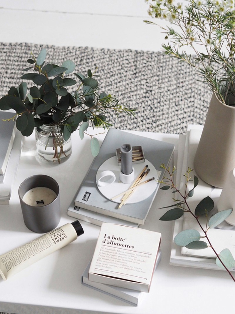
STUDY
As an interior stylist, where do you find your inspiration?
I love to travel and bring back inspiration, visiting cities, museums, art galleries and interiors fairs. I can find inspiration in hotel rooms, wine bars and cafes. I love scrolling through Pinterest and Instagram as much as anyone but I also like getting outside, wandering around London or walking through the park with my dog. I like my interiors and style to reflect the seasons.
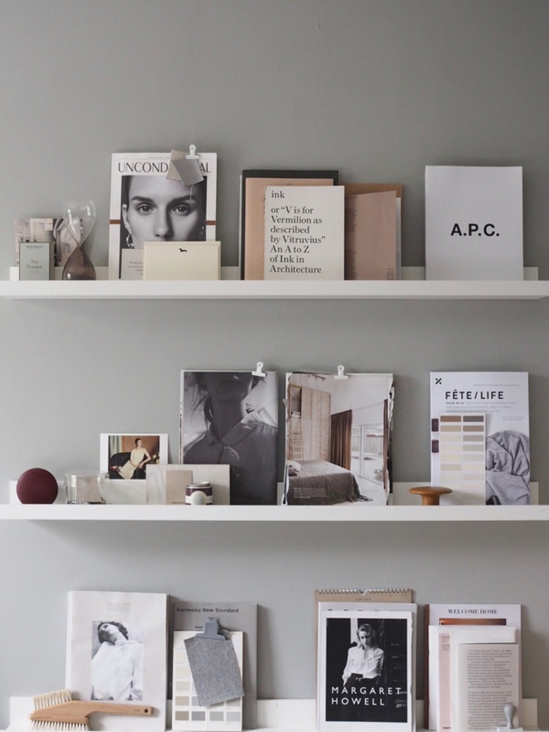
We love the mood board you have in this room. Any tips for people wanting to do something similar?
The picture ledges are Mosslanda shelves from IKEA. They have an inbuilt ridge in the shelf so you can lean framed pictures and artwork; you could put one above a sofa to display bigger pieces of art, or I've seen them in children’s rooms to hold books and toys. I can never commit to a picture on the wall and have nailed holes everywhere, so I like that with these you can easily change things around. I like to display favourite books, magazines and postcards I've picked up from exhibitions.
What’s the best way to counteract properties with minimal storage?
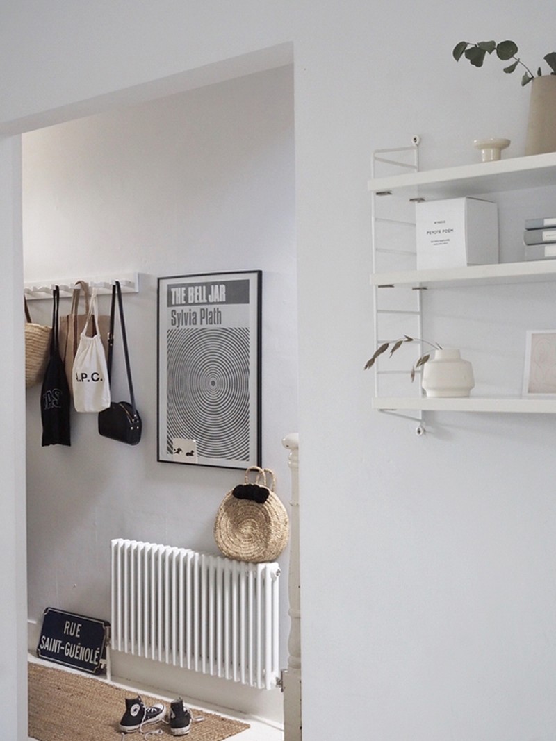
Storage is the key to a clutter-free home, so it's one of the first things I like to consider when designing a space. Simple sideboards lifted off the ground and secured to the wall are great because they give a greater illusion of space. If you're in a rental and can't screw things into the wall, there are contemporary clothes rails, ladder shelving units that lean against the wall and cleverly designed beds with concealed storage underneath.
GARDEN
How did you come up with the concept for your garden?
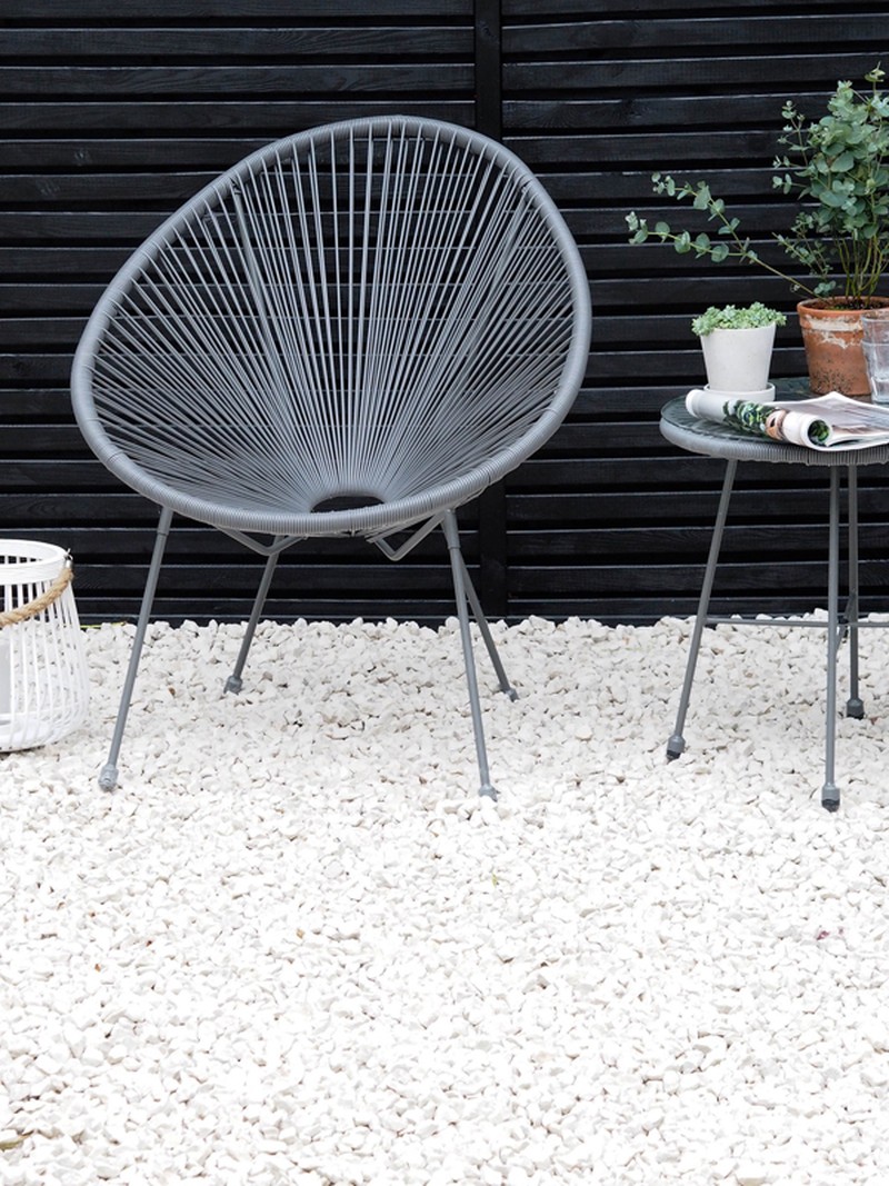
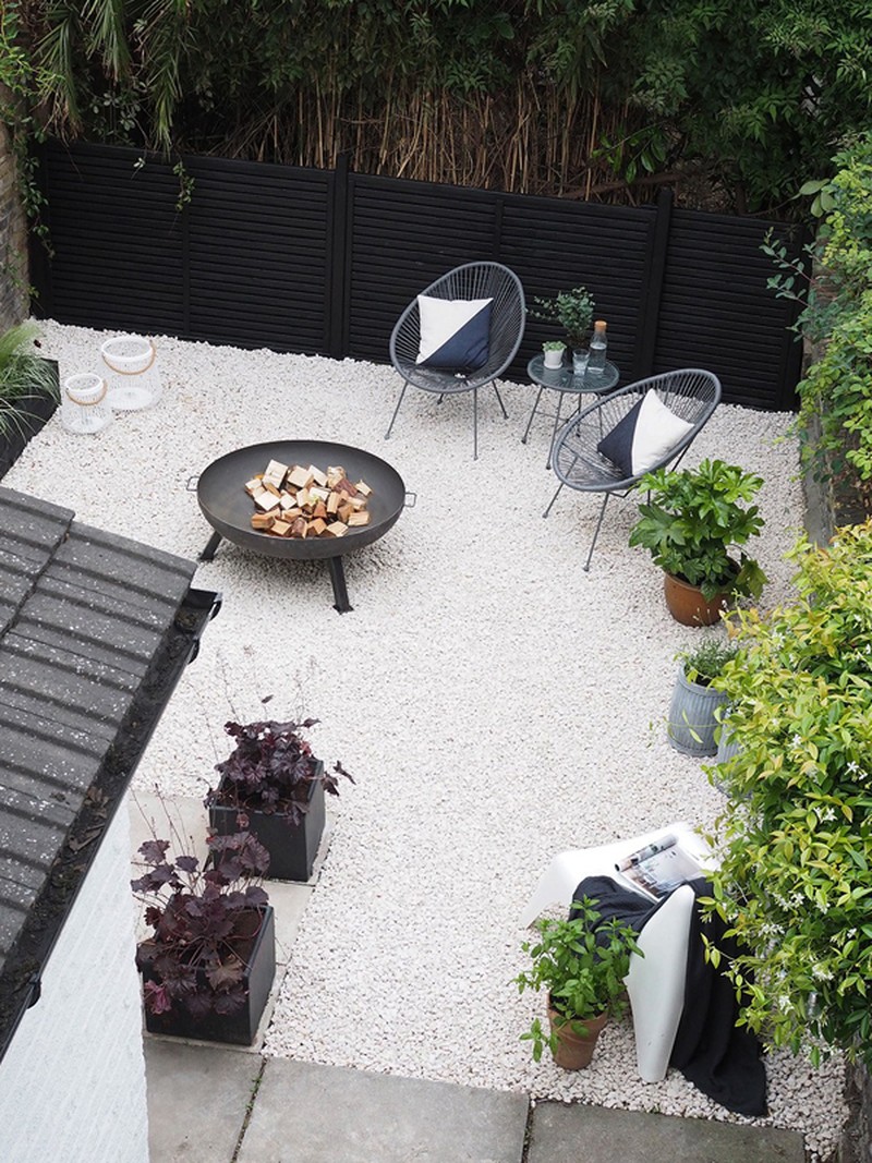
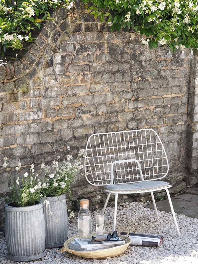
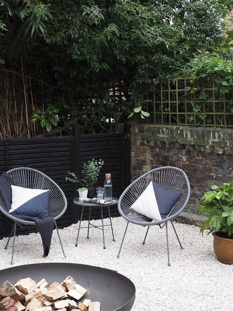
I wanted to create a low maintenance, fuss-free garden that was easy to keep so I used light coloured pebbles to give the illusion of space and structured planters for a clean, contemporary look. The garden is a bit of a hidden oasis in the city; the greenery at the back is from the neighbour's garden but it means that we're not overlooked at all. Black fencing contrasts with the light stones while the colour palette of the foliage is kept simple with green, white and black.
Did you already know the colour and plants you wanted to include?
Fragrance was a big part in choosing the planting, with white lavender and chocolate cosmos, which actually smells like chocolate! I chose some grasses for structure and big leafy foliage to provide coverage.
What’s your top tip for a low maintenance garden?
Keep plants restricted into certain areas of the garden, otherwise they can spread and become too wild. Choose hardy plant varieties that last all year round so there is always some colour and greenery. Grass requires a lot of upkeep, especially in the UK, so consider simple paving or pebbles instead for a cleaner look.
What’s the easiest way to make an impact on a budget?
Planting can soon add up and become expensive – I'd say the easiest way to make an impact is either by painting the fencing and creating a smart backdrop for the garden or with the garden furniture, adding colour and texture with cushions, lanterns and plant pots.
All Photography | Cate St Hill
Visit Catesthill.com
DISCLAIMER: We endeavour to always credit the correct original source of every image we use. If you think a credit may be incorrect, please contact us at info@sheerluxe.com.

