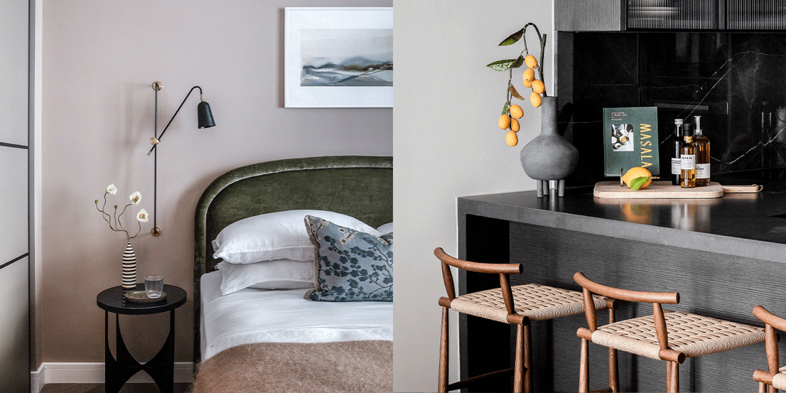
Meet The Interior Designer: Petra Arko
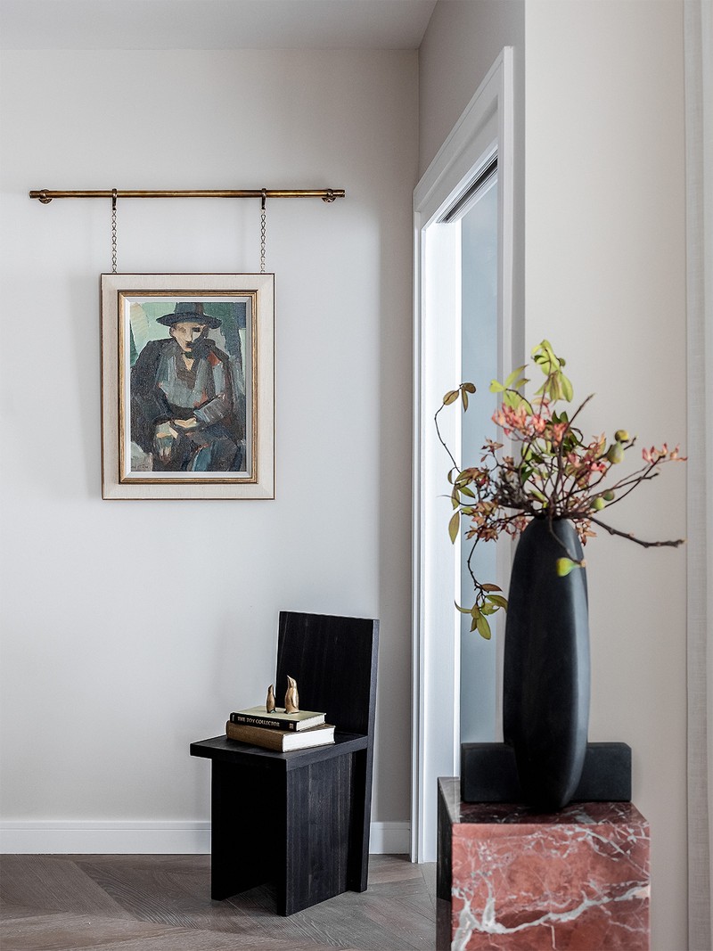
Background
Ever since I was little, I’ve been interested in interior design, architecture and furniture. Looking back, it probably stemmed from my upbringing in socialist Yugoslavia. The country was self-sufficient, and our primarily modernist, mass-produced furniture was all made in the country. I studied economics and international business and, after a few years in consulting, I did an interior design course at KLC. When I finished the course, my daughter was three, so the prospect of working long hours for other interior designers prompted me to choose freelance work instead. First, I worked on gastro pubs with Jo Clevely – I really admired her pragmatic and entrepreneurial approach. Then I joined the Hudson & Mercer team and worked alongside Sophie Ashby. That time really defined me as a designer.
Style & Ethos
At Bergman & Mar, we look at interior design like a beautiful, complex puzzle. Above all, we’re passionate about creating aesthetic, practical and functional spaces. We also invest significant time tracking down talented emerging designers, artists, artisans and craftsmen in the UK, EU and further afield. We travel, spend weekends away, and constantly search for exceptional makers. It’s how we’re able to bring a colourful, diverse, creative approach to the spaces we design.
Inspiration
Our vision for every project comes from a deep understanding of the property, the area and the history of both. Each piece is carefully chosen to create a story and we invest time in finding the right people to deliver the kind of aesthetic our clients want and need.
Colours
We love warm, desaturated colour palettes – it’s often about mimicking the colours found in nature, and pairing them with different textures. This mix is what creates a warm, homely and calm space. When it comes to selecting the colour palette, we always consider the client’s needs, the mood we’re trying to create, and the amount of natural light on offer; colour has the power to impact the mind and generate different emotions.
Materials
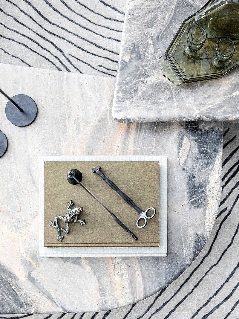
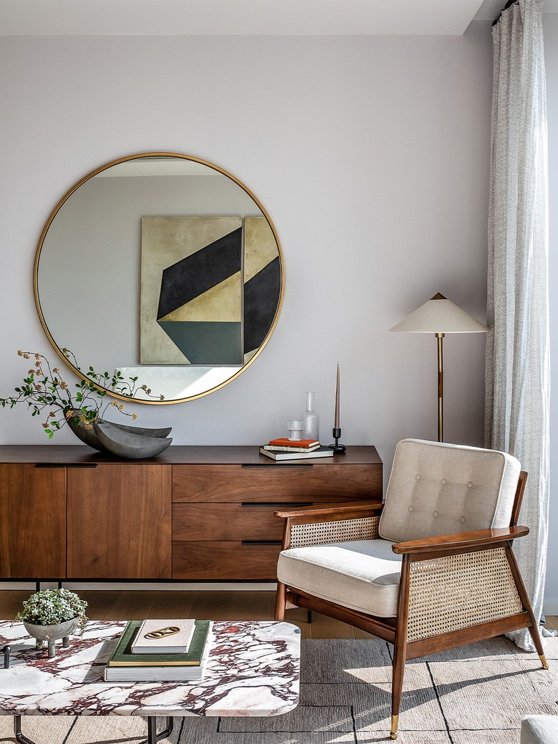
We use authentic and solid materials. Our joinery is made from solid timber and brass, and we love working with the incredibly talented duo at Martello & Mo. We choose unusual marbles for our bespoke tables – they make such a statement. My personal favourite? The hand-woven woollen and mohair rugs made by Coral & Hive. The texture is just divine.
Favourite Instagram Accounts
My favourite accounts for composition, colour and styling are @Nicole_Franzen, @HannahFranklinInteriorStylist and @AnnaGillar. The studios I admire the most are @ColinKing and @JakeArnold in the US, @YSG.Studio and @ArentPykeStudio in Australia, @LiljenCrantzDesign in Sweden and @Charles_Zana in France.
/https%3A%2F%2Fsw18.sheerluxe.com%2Fsites%2Fsheerluxe%2Ffiles%2Farticles%2F2022%2F03%2Fpic-credit-taran-wilkhu-bm-3-bedroom-101-cleveland-picture-credit-taran-wilkudukeleasebmhr-19.jpg?itok=R2E4Vfan)
01
101 On Cleveland, Fitzrovia
Here, we wanted to incorporate the rich history of the area into the scheme, and there was lots of craftsmanship involved in the design concept. We really wanted to create a space that was a combination of cultures, so we sourced items from various suppliers to curate an edit of re-editioned pieces and future icons.
The colours were carefully designed to represent the diversity of the location. A variety of deep tones, such as deep reds, blues, greens layered with walnut and brass made for the ideal palette. Lots of organic elements, combined with brass detailing, flow through the entrance space, which then leads to the living, dining and study area.
We used a variety of lighting throughout. The kitchen features handmade white ceramic pendant lights to add warmth and texture, while still maintaining that modern, refined feel. A handmade geometric pendant light by Pericles Frementitis hangs over the dining table to act as a bit of a focal point. Its inviting yet minimal form is what draws your eye towards it.
02
Southampton Street, Covent Garden
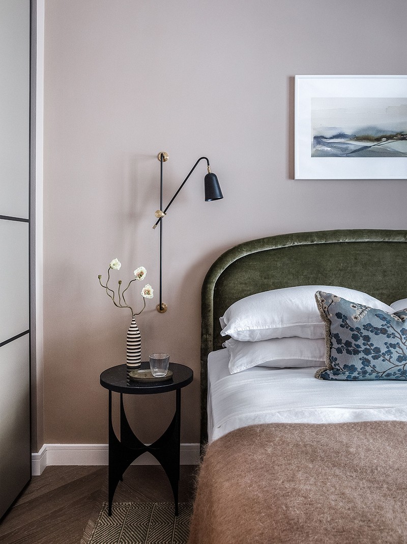
The brief was to create a space suitable for a professional, and one that was characterised by contemporary British style. The client appreciated London history and the city’s constant effort to embrace improvement and change. We wanted the interior to reflect these ideals and those of the people living there.
The interior architecture of this apartment is timeless and uncomplicated, and we wanted to make sure the finishes worked hand in hand with these details. We went for a softer colour palette with pops of colour throughout. The materials were tactile and inviting – they soften the architecture and give the apartment a sense of homeliness.
/https%3A%2F%2Fsw18.sheerluxe.com%2Fsites%2Fsheerluxe%2Ffiles%2Farticles%2F2022%2F03%2Fbergman-mar-southampton-st-6.jpg?itok=ITWztXQu)
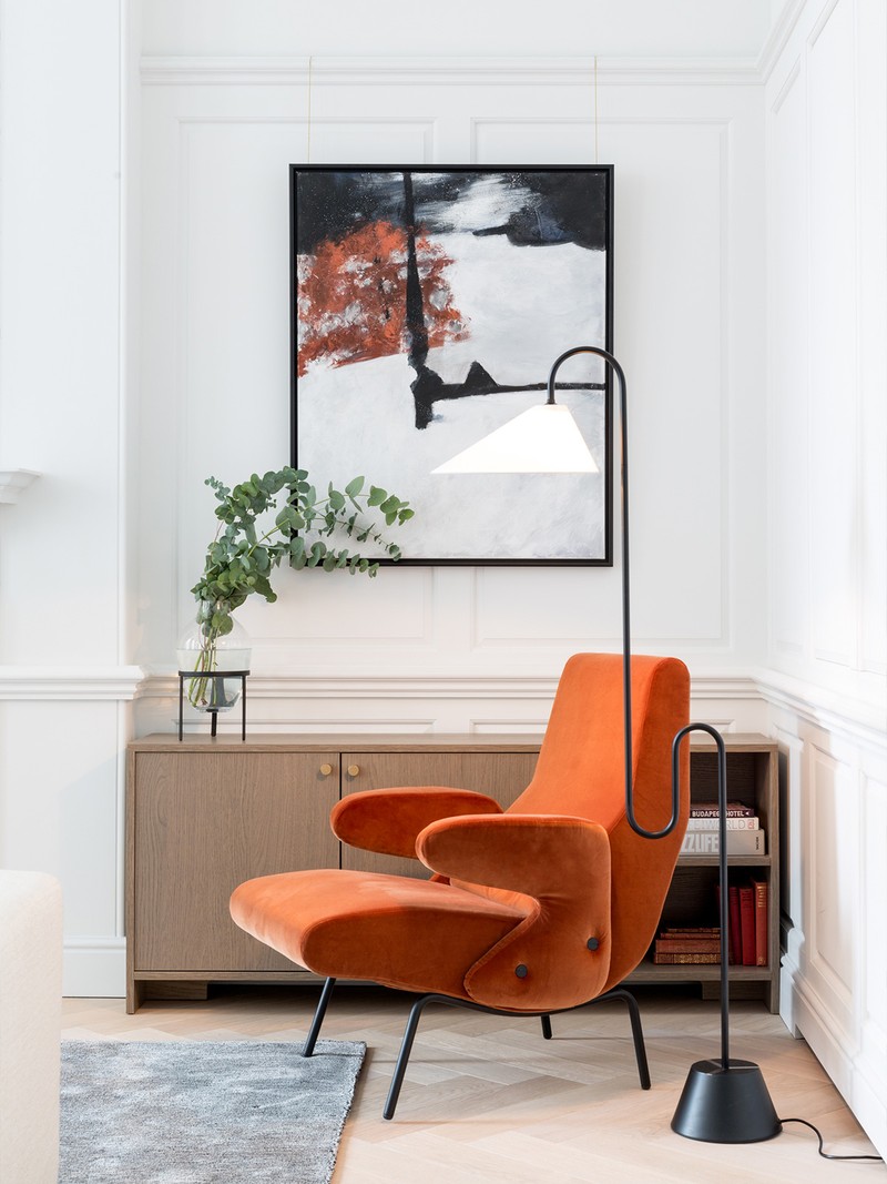
The key to good lighting is creating layers of warm light and using it to define zones. It can also help bring different textures and colours to life. In this project, we used mainly decorative lighting to give the space various focal points. Well-placed pendants create more of an atmosphere around the dining table and kitchen island, and we chose a glass and brass pendant fitting from Gallotti & Radice to highlight the dining space.

03
Lillie Square, Earls Court
This was a fun space to design as it was full of natural light. For that reason, we wanted to allow the sun to really enhance the materials and energise the space.
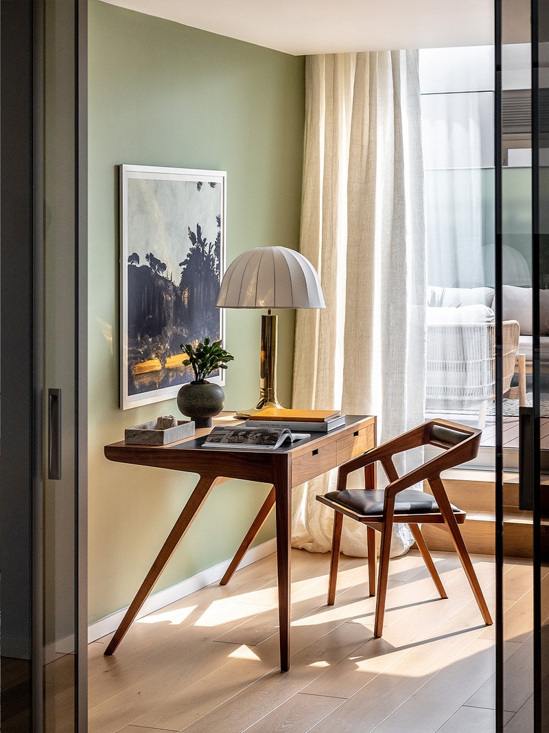
The planning stage was critical, but conceptualising Lillie Square was such an exciting process because of all the fun colours, shapes and materials involved. Everything was chosen to complement the natural light and amplify the space’s calming atmosphere. We played around with a range of colours by incorporating accent walls and used softer materials to add texture where it was needed.
/https%3A%2F%2Fsw18.sheerluxe.com%2Fsites%2Fsheerluxe%2Ffiles%2Farticles%2F2022%2F03%2Fbergman-marlillie-squarehr-11.jpg?itok=xWtkPTve)
Using a variety of lighting – such as pendants, floor lamps, and bedside lights – creates great contrast between the light and shadow. The kitchen is shared with a dining area and having a round table turned it into a beautiful entertaining space. An attractive low-level pendant fitting helps distinguish the dining area. Meanwhile, the correct lighting creates a more comforting atmosphere in the bedrooms. We used bedside lamps in both, to generate a softer light that’s more relaxing when it’s time to sleep.
Visit BergmanAndMar.com to see more of Petra and the team’s work.
DISCLAIMER: We endeavour to always credit the correct original source of every image we use. If you think a credit may be incorrect, please contact us at info@sheerluxe.com.
