Interiors Tips From An Industry Legend
STYLE & INSPIRATION
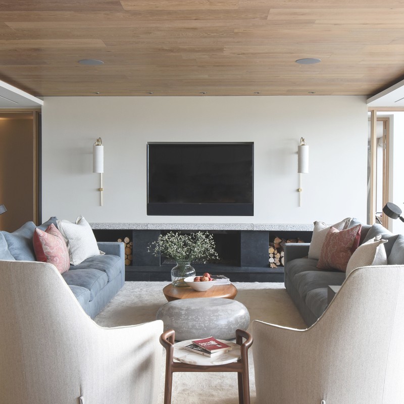
Our house style at th2designs is relaxed luxury. This stems from my natural style as a designer and what I believe sums up the perfect interior. As well as looking good, an interior has to feel comfortable and welcoming – somewhere you can truly relax and feel at home in.
My mantra is ‘less is more’. I love to create calm spaces; I want my clients to walk into their home and immediately feel relaxed and chilled. We are known for our tailored interiors and this is achieved by really thinking through how a home will be used. Clever storage is essential in creating a calm interior. Clutter can make you feel frazzled and, in this crazy world we all live in these days, I want to make my clients’ homes their personal sanctuaries from all the mayhem.
I am a ‘cool pastel’ person, so my house is full of gentle, organic colours like soft blues, greens, caramels and greys – with a few accents of rich colour and lots of artwork collected over the years to give punches to the colour palette.
I love to open rooms up to create a flow of multifunctional spaces. It is a bit of a signature thing for us now at th2designs because it works so well for modern living. In my own home, I opened the whole ground floor through with the kitchen, dining room, family room and more formal living space all linking, but with hidden sliding doors if you want to shut off spaces for any reason. It means you can co-habit without being on top of each other. Someone can be cooking, another watching TV, listening to music or reading, and someone else working – connected but separated at the same time!
There are so many great designers out there. Patricia Urquiola has always been a great favourite of mine. Her architectural detailing is spot on and, at the same time, she designs exquisite pieces of furniture. On a more personal level, I am very inspired by George Khachfe, who I have known for many years. He has such a passion for the projects he works on, and has a very strong and consistent design ethic. But most of all, my partner in th2designs and th2studio, Sheila El-Hadery is my greatest inspiration. We have worked together for more than 25 years and she has one of the best and most detailed design eyes in the industry.
I find inspiration, quite literally, everywhere. I am so lucky to have been born with a creative eye which is on constant lookout for new ideas. My design radar is always on – whether I am at a design event, walking in my local park, on my travels, eating a fabulous meal, looking through a blog or website, on social media or flicking through the latest design journal. My phone is chock-a-block with images to remind me of inspirational colours, shapes and textures to inspire me at a later stage. I have just returned from the most incredible work trip to Japan; it was so inspiring and so many of the Japanese principles in design work so well with my design principles.
PLANNING
When I am designing a room, I start by considering the person or people who will ultimately be living in and using that room. Who are they? What do they need? How can we enhance their expectation and think of things to make their room even better than they could dream of? I then consider the space available, how to use this to its very best advantage, and consider the light – or lack of it – and how best to utilise that.
Very often the small spaces can be the best spaces if they are really well thought through. Storage, again, is a crucial part in making a small space sing. Very often we enhance a small space by giving it a real sense of drama – using a deep feature colour or stunning piece of art to make sure it feels as important as any bigger spaces around it.
For an open-plan space, make sure you work on the floor plan to ensure the spaces are broken down into functional chunks. These can be delineated with lighting or by placing furniture on rugs. Using floating walls or screening is a clever way to divide up the spaces without shutting them down. If you think sometimes you will need complete privacy, hidden sliding doors set into the wall thickness work well. Make sure the colour palette flows through the space and the colours work harmoniously together.
DECORATING
When thinking about colour, I start with just getting a feel for the concept. Spending time with the client, in the space, looking at the plan, all naturally fuel the design process. I like to have a final image of the space in my mind and then work backwards from there.
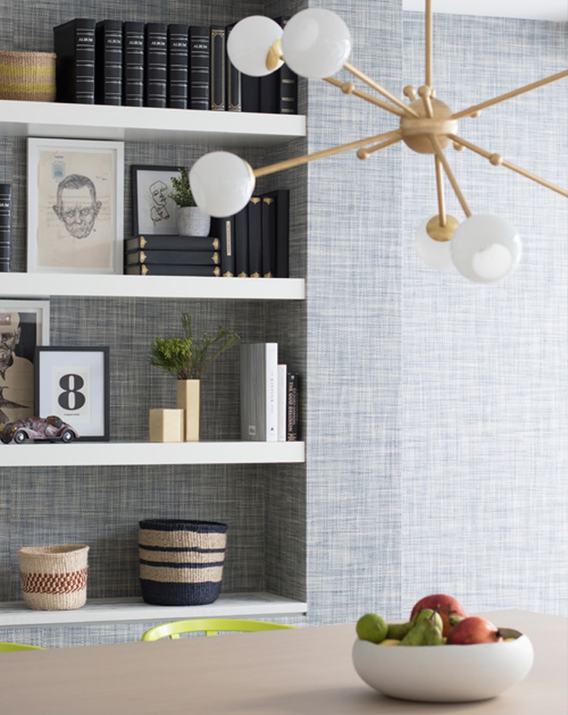
There is no hard and fast rule as to how many colours we use in any one scheme. It is about having an overall palette that works together, then we often add accent colours on the odd piece of furniture, a piece of artwork or a selection of cushions and accessories. For example, one Chinese red vase on a shelving unit alongside other more neutral accessories can look very strong.
Pattern is very personal. Some people like a lot of it and others none at all. We do always try and introduce some pattern into a scheme to our less adventurous clients, as it makes an interior so much more interesting even if it is just on one cushion or in a blind. When thinking about scale, you need to ensure the scale of the pattern fits with the scale of the furniture you are using it on.
When mixing old and new, anything that has history for you should be included in your home. Using old pieces inject the owner’s personality into their space. We like to work with our clients to ensure their old favourites work in their new space. If they are going for a completely new look, our tailored interiors lend themselves perfectly to adding loved and special pieces into them over the years.
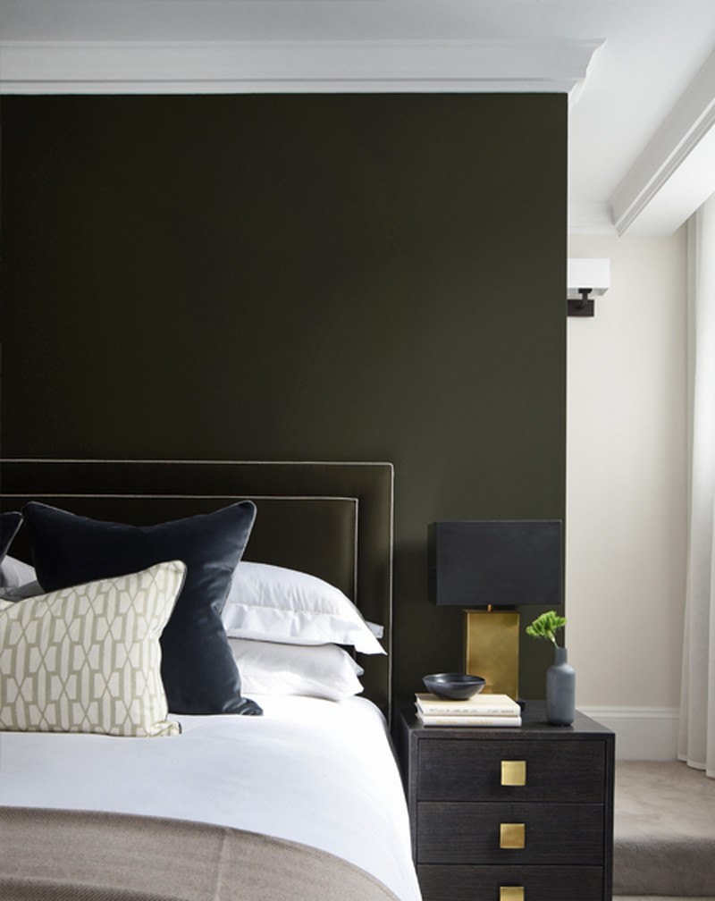
You need to be careful with trends. We are not working in a throwaway industry, so I always advise using truly ‘on trend’ pieces in areas that can easily be changed at minimal cost at a later stage. The organic Forest Green paint colour we have just used in our studio redecorations is my current favourite. We have used it on one feature wall which can easily be painted over when we feel it is time for a change.
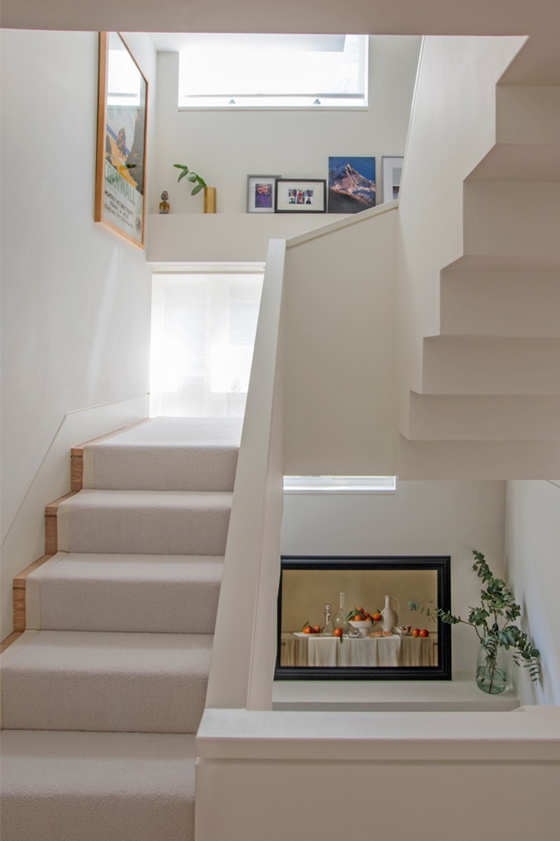
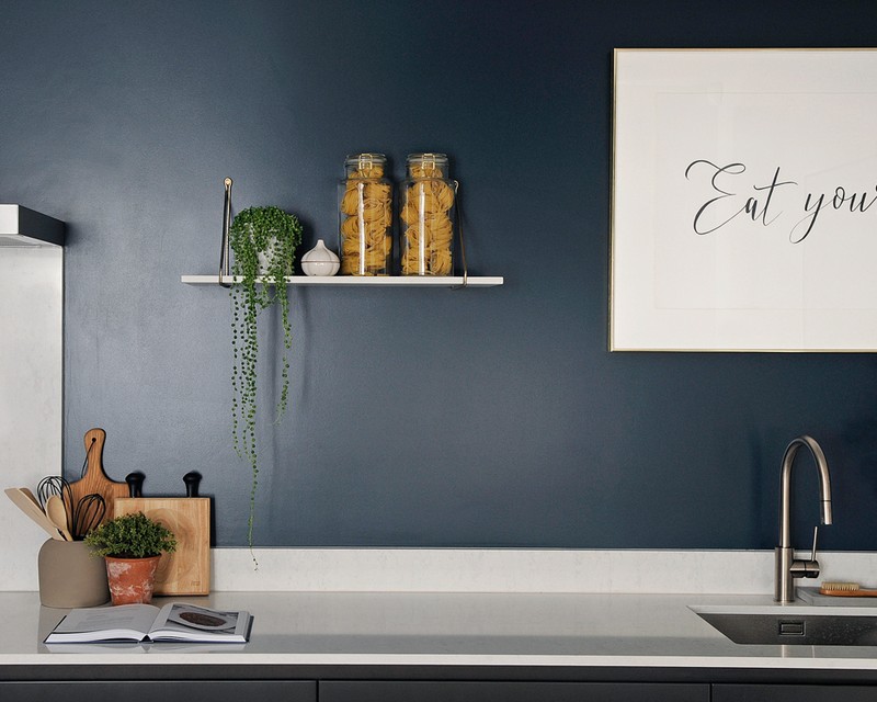
I love natural timbers, stone and concrete for the look and feel. But in a kitchen, I would always ensure there are also areas which are super practical ,where you can do the preparation work, something like stainless steel. Do not be afraid to use two or three different worktop materials in the same kitchen; it gives a more modern end result to the overall look.
Lighting is crucial. Very often we work with a lighting designer because well planned and designed lighting can enhance an interior no end. There is so much to think about: how much natural lighting is there? What is the room being used for? Do you need task lighting? Is there artwork to light? Do you want to include some decorative lighting? What sort of atmosphere do you want from the lighting in the room? We are happy to guide our clients on this element but, if the budget allows, we would always advise working alongside an expert in this field.
Lighting can completely change the colours in a room. I always advise putting a sample of paint or wallpaper up in the actual room to see how the light affects the end result before you go ahead and order gallons of paint.
One of the most common mistakes in lighting is a lack of flexibility to change the different layers of lighting. We would always have at least two or three different circuits for lighting in a room and not just one main switch. This way you can achieve different light levels for different moods.
Splurge on the things you can’t change later like kitchens, bathrooms and architectural features.
Sometimes I add a less expensive piece to my existing furniture to give it a little update. I have just put our th2studio rattan barstools in my kitchen and it has given the whole room a more modern feel for not a huge extra cost.
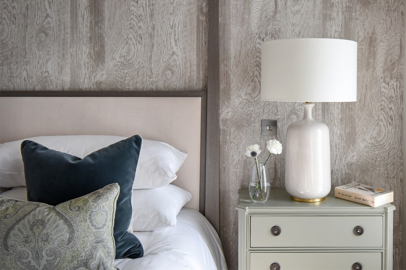
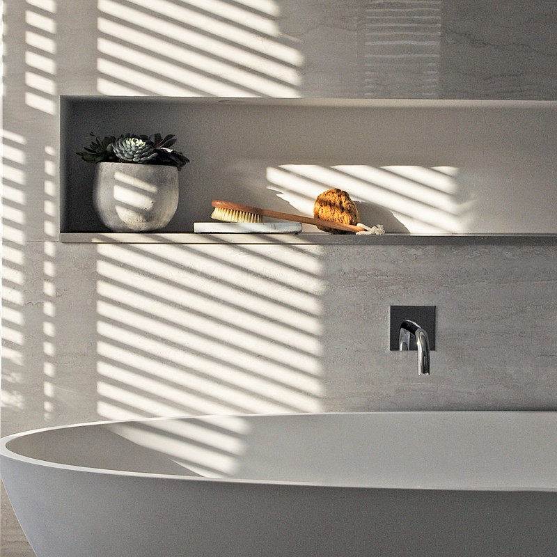
WHERE GAIL GOES FOR…
Furniture
We have our own secret suppliers who we have built up over the past (nearly) 30 years in this industry. But with the introduction of th2studio, we are now able to offer many of these pieces online to both purchasers and trade customers wanting to access our network.
Fabrics
Most of these are located in Design Centre Chelsea Harbour (DCCH):
Abbott & Boyd - For smart and sophisticated patterns and textures.
Fox Linton - Beautiful Loro Piana velvets in amazing colours, as well as lovely soft fabrics in subtle, feminine colour palettes.
Turnell & Gigon - For some of the best patterns around, especially the Schumacher range, which adds a great pop of interest to any scheme.
Holland & Sherry - For the smartest soft wools.
Perennials - For fabulous outdoor fabrics that are so good looking you can use them inside or out. Perennials is so ahead of the game on the technology of fabrics for the future.
De Le Cuona - Its paisley wools and cashmeres make gorgeous cushions and throws.
Christopher Farr - For fun, funky and affordable patterns in bright, punchy colours.
Kvadrat - Super smart and practical upholstery fabrics. Designed for commercial use, they work brilliantly in all interiors.
Romo - Reliable and affordable upholstery, as well as a great selection of sheers.
Wallpaper
A few of our favourites are:
Stereo
Elitis.fr (available from Abbot & Boyd)
Phillip Jefferies
Paint
We often reach for Little Greene’s Colours of England paint chart to start things off.
Lighting
Porta Romana and Original BTC are two firm favourites.
Flooring
For timber, I love the range from Element 7. Tim Page and Tai Ping are two companies we often turn to for carpets and rugs for our private clients.
Tiles
Domus Tiles in south-west London has a wide a selection to choose from. It also does great timber flooring.
Kitchen Hardware
For cooking appliances, Gaggenau is the very best, especially its hob – which includes a hob burner. My husband, who is a great cook, swears by it!
Visit Th2Designs.co.uk & Th2Studio.co.uk
DISCLAIMER: We endeavour to always credit the correct original source of every image we use. If you think a credit may be incorrect, please contact us at info@sheerluxe.com.
