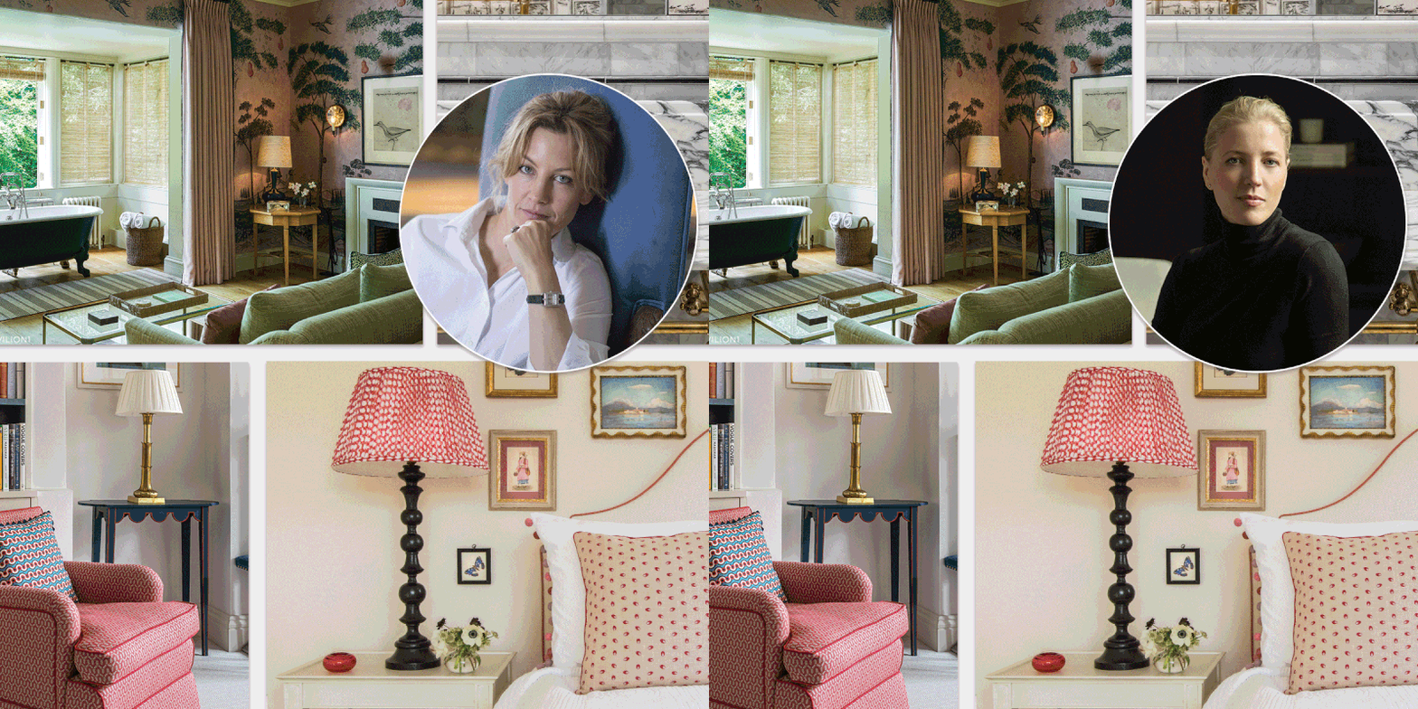
The Interior No-Nos, According To The Experts
Lucy Barlow, Barlow & Barlow
Don’t rip out original, period features. We are lucky to work on period houses and I’m always surprised at how many have architectural features ripped out. Always keep any original elements you can – they are often so unique and add character. Where possible, keep original windows or invest in good quality alternatives and avoid UPVC. Never scrimp on fixtures and fittings – poor quality windows will really jar with an otherwise beautiful scheme.
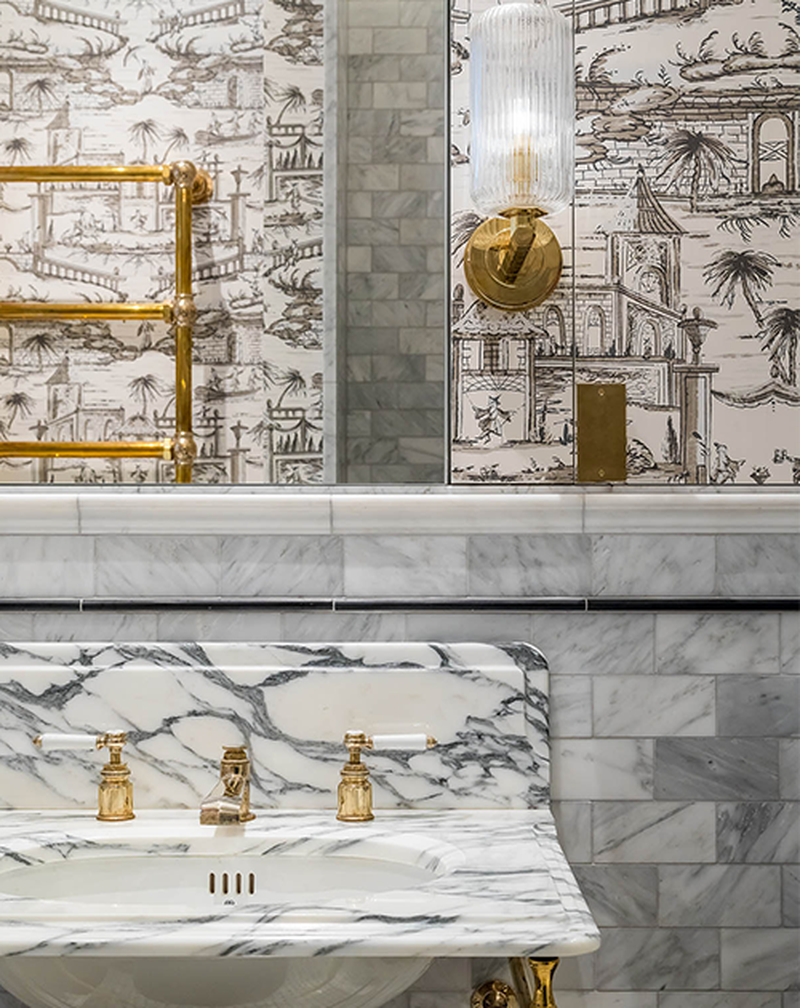
Don’t go for large format, porcelain tiles in bathrooms. Bathrooms offer the chance to be bolder than you might be in everyday living spaces, so more creative tiles are a great opportunity to inject bright, pure, glossy colour.
Don’t ignore layered lighting. My clients and I always approach lighting in layers, so it looks directional and not randomly placed. Avoid lighting features like coffered ceilings that are directed at nothing in particular.
Visit BarlowAndBarlow.com
Emily Williams, co-founder, BradyWilliams
Don't paint a north facing room white. The lack of natural light will make it feel stark and cold as opposed to light and fresh. If you want it to stay light, go for an off-white like Paint & Paper Stone 1 or embrace the darkness and go for a mid-tone like Stony Ground by Farrow & Ball.
Don't hide beautiful windows with too much curtain. Either opt for simple sheers or lightweight unlined fabric, or make the pole or curtain track wider than the window so it doesn't obscure anything.
Don’t use too many bold colours. Choose shades which sit together within a palette and can be threaded throughout the home. On that note, try not to use too many of the same materials. Adding texture is key to creating a cosy interior.
Visit BradyWilliamsstudio.com
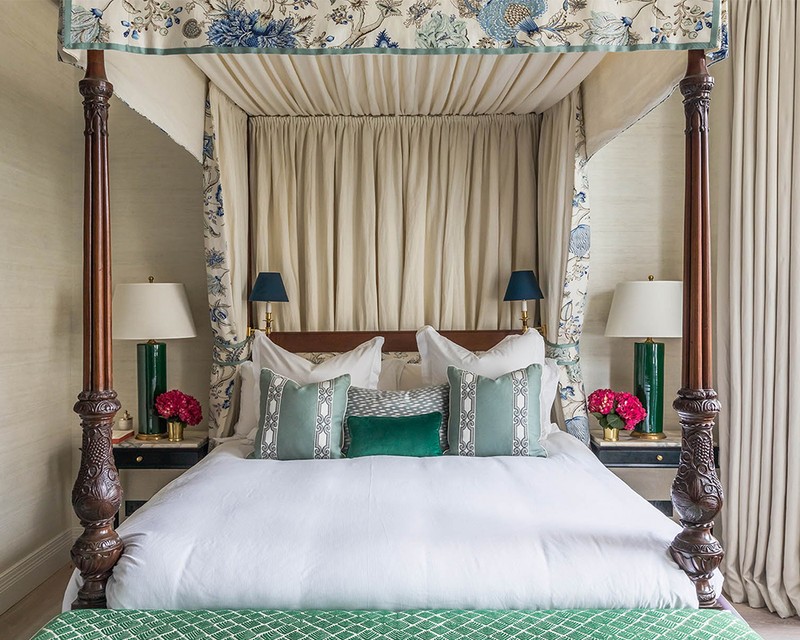
Jennifer Jarvis, senior designer, Helen Green Design
Don’t buy furniture that comes as a set or suite. It’s the only way to avoid your home looking like it belongs to your grandparents.
Don’t put carpet in your bathroom. Not only is it seriously dated, it’s also unhygienic.
Don’t buy everything at once. Rome wasn’t built in a day, so take the time to curate pieces that add visual value to the space.
Visit HelenGreenDesign.com
Bee Osborn, Osborn Interiors
Don’t let curtains stop at window sill height. Shorter curtains are fine, but make sure (given where the rod is) that the curtains finish at least 3in below the sill for a professional finish.
Don't use coloured lighting. And always remember to consider what ceiling down lights are intending to highlight, specifically. Don’t just automatically put them in rows.
Don't use foam inners to stuff cushions. No matter what, you’ll find they just never sit properly.
Visit OsbornInteriors.com
Katharine Paravicini
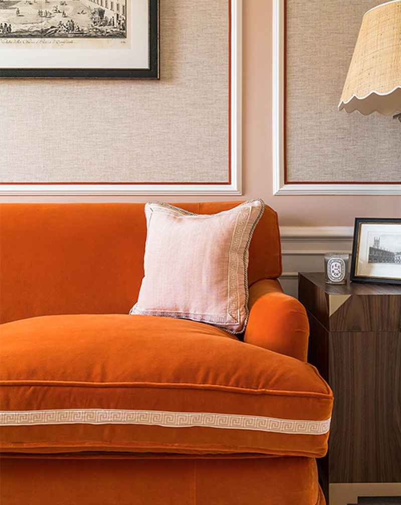
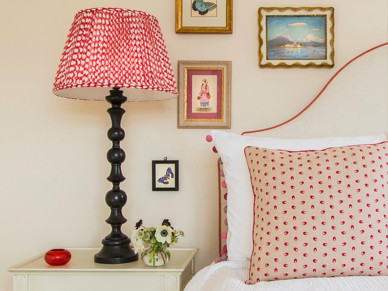
Don’t try to make a feature out of one wall. Be it one wall in a room painted in one colour, or one wall of wallpaper. People often do this when they are too afraid to use a paint colour or wallpaper throughout the space, but it actually just ends up looking jarring.
Don’t always think it’s better to stick to neutrals. Too much beige or grey in an interior is a personal no-no for me.
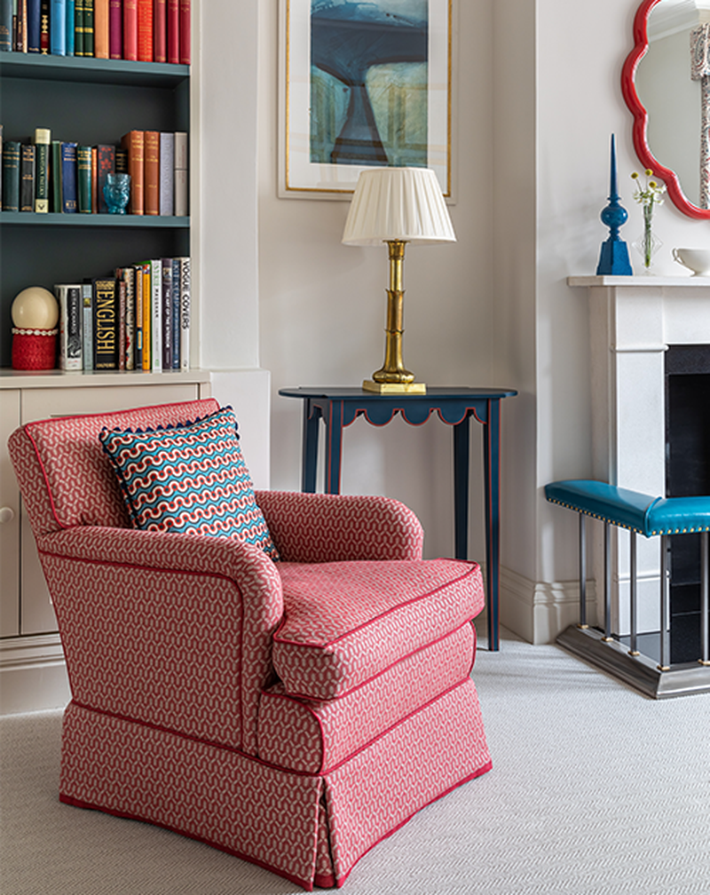
Don’t ignore the styling details. This includes pictures which are hung too high, and cushions which are placed on their points. They should always be on their bottoms.
Visit KatharineParavicini.co.uk
Emma Sims Hilditch
Don’t use all your budget on building works. Remember to set aside some money for furnishings, otherwise it will leave you frustrated, and with an unfinished house.
Don’t put the TV above a fireplace – unless there’s really no other option. You will always end up having to crane your neck.
Don’t put spot lights in the ceiling in a grid format. Use them judiciously and only where you think they are necessary for task lighting.
Visit SimsHilditch.com
Laura Hammett
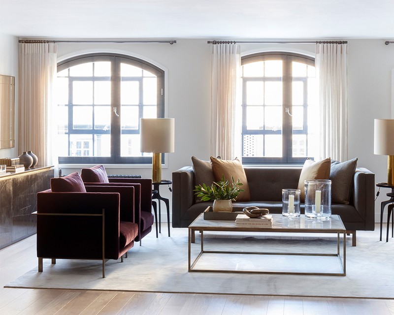
Don’t place furniture half on and half off a rug. It looks clumsy and the thickness of the rug will mean that the furniture won’t sit level. Ideally, a rug should be as big as possible and most furniture should sit fully on top. Otherwise, go with a smaller size that sits in front of the furniture.
Don’t use too many similar fabrics in one space. Ensure there is more contrast in texture and colour when selecting fabrics for the same room, otherwise it looks messy. Fabrics that appear different on a small sample can look much more similar en masse.
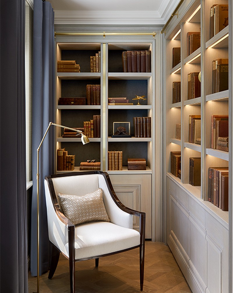
Don’t think small furniture in a small space makes it look bigger. As long as you still have enough space to move around, good-sized furniture looks much more luxurious and elevates the space. It’s always better to opt for few, big pieces than lots of small ones.
VIsit LauraHammett.com
Henriette Von Stockhaussen, VSP Interiors
Don’t blindly follow trends. They need to make sense in their surroundings and not look out of place.
Don’t scrimp on curtain fabric. It will look mean and won’t achieve the comfort factor associated with heavily-lined curtains.
Don’t have everything too matchy-matchy. It can look forced and over-designed, which will leave a room uninteresting and unloved. Rooms need to look like they have evolved with the character of the inhabitants and tell a story.
Visit VSPinteriors.com
INSPIRATION CREDITS: Barlow & Barlow; Katharine Paravicini
DISCLAIMER: We endeavour to always credit the correct original source of every image we use. If you think a credit may be incorrect, please contact us at info@sheerluxe.com.
