How To Use Internal Glazing In Your Home
Emma Turner & Bunny Pocock
Founders of Turner Pocock say…
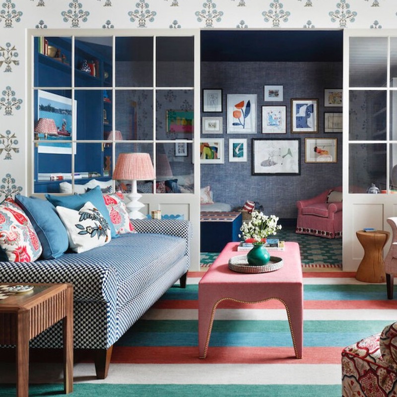
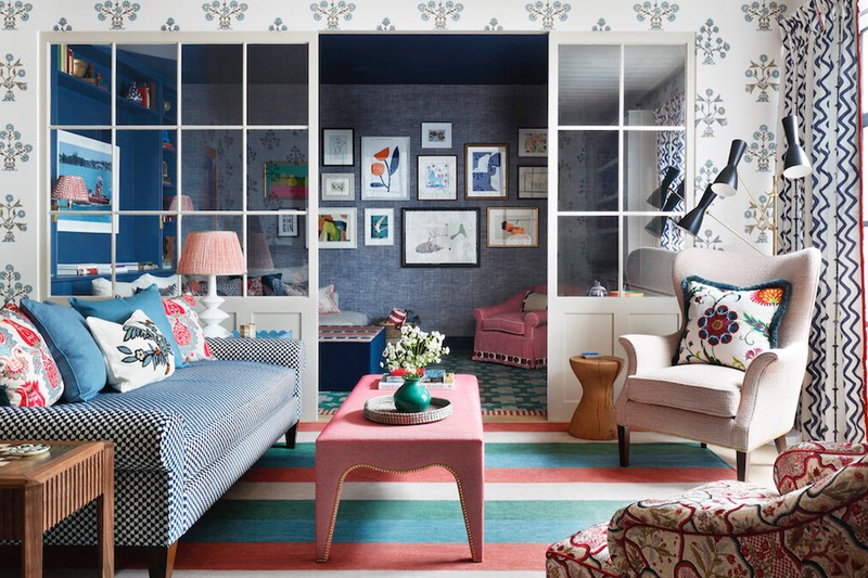
“After years of searching for a new home, but never finding a space they loved as much as their existing house, we worked with the owners to help them ‘have a new house without moving’. Their growing family meant we needed to maximise and reconfigure every inch of the house. We decided to divide this room with glazing, which enabled us to create a more formal sitting area for grown-up conversation, while still allowing it to ‘flow’ into the neighbouring room, which is a cosy TV den. A wall would have blocked all the energy, whereas the use of glazing here strikes a subtle balance to make the space more versatile.”
Visit TurnerPocock.com
Bee Osborn
Founder of Studio Osborn, says…
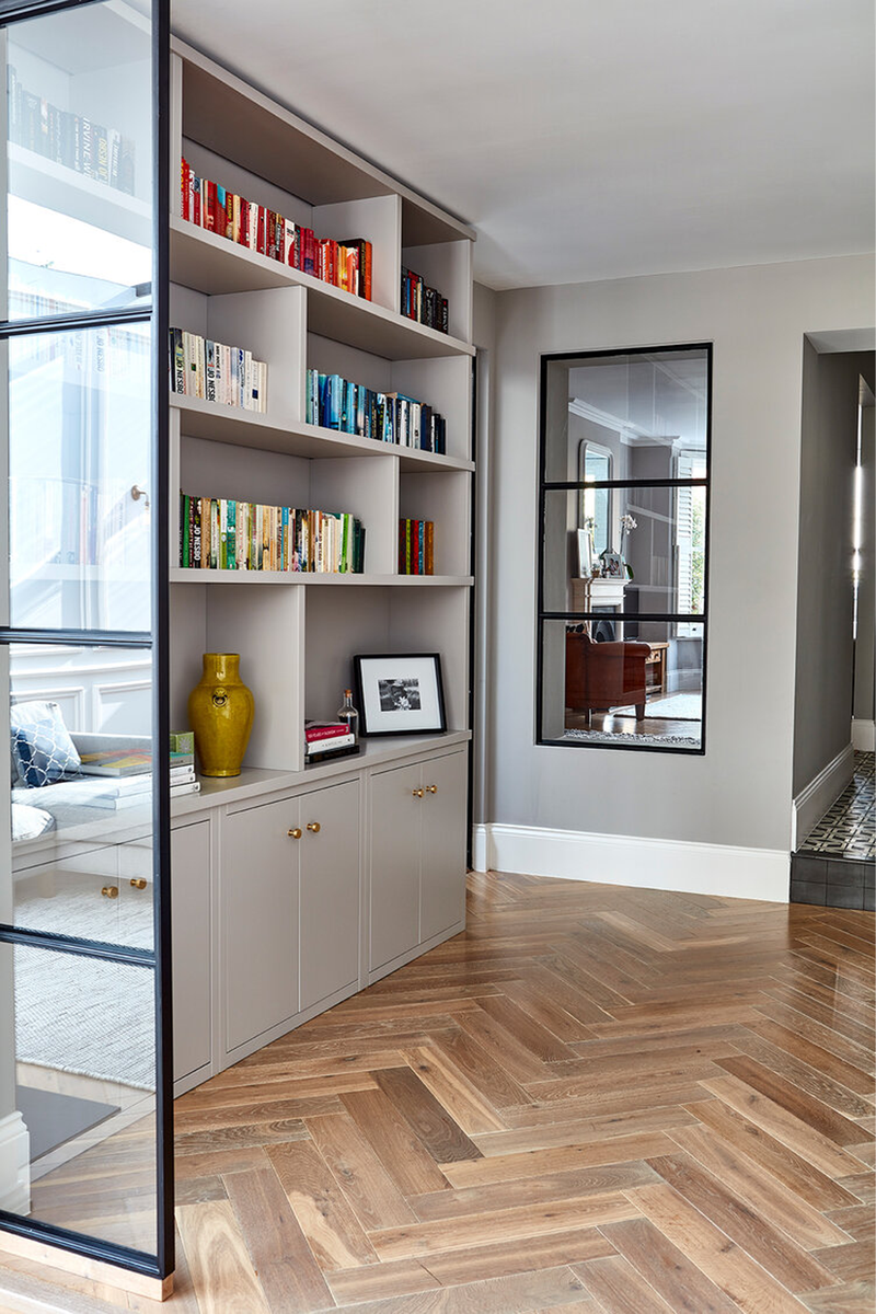
“The internal glazing in this room started as an existing window at the back of the original cottage, which was uncovered during the renovation. Through the window you can see the extension we added. I do love internal windows as they’re a good alternative to doors or walls, and they aren’t difficult to install. This was actually a relatively affordable option – just a sheet of glass with faux glazing bars made out of beading – but it was very effective.”
Visit Studio-Osborn.com
Sarah Peake
Founder of Studio Peake, says…
“We used a glazed screen to separate a very large basement space into two smaller, cosier seating areas. It effectively created two different moods: a lighter and brighter area nearer the doors to the terrace; and a darker, cosier living room with a roll-down projector screen. It’s important every space has a purpose, and this glazing allowed us to create two spaces without sacrificing the sense of scale you get from a large basement like this one. We emphasised the size of the space by ensuring the colour schemes on either side of the glazed screens, although different, worked in harmony, using similar colours as a common thread running throughout. It meant both spaces, although separate, felt part of a coherent whole.”
Visit StudioPeake.com
Tom Cox
Co-Founder at HÁM Interiors, says...
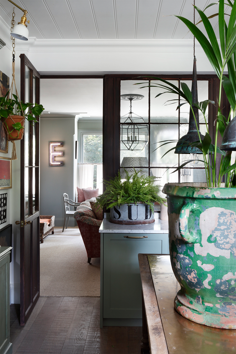
"We like to use glazed partitions as you can create the illusion of space without having a fully open-plan layout. They afford beautiful views from one room to another and let light flow throughout - as well as being architecturally striking. In my former Barnes pied-à-terre, the wall between the kitchen and sitting room was replaced with a reclaimed Georgian shop front, painstakingly laid out with our restoration expert, the frontage was reconfigured to include reclaimed window panes for authenticity."
Visit HamInteriors.com
Irene Gunter
Founder of Gunter & Co, says…
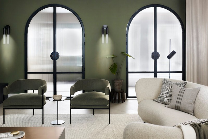
“The arched doors in the living room of this Chelsea townhouse are something of a Gunter & Co signature, and feature in several of our projects because they add interest, flow and movement to a space. Here, we wanted a modern look, so a black steel frame was the obvious choice. This was paired with ribbed glass to allow light to flow from the adjacent space.”
Visit GunterAndCo.com
Alex Keith
Founder of Otta Design, says…
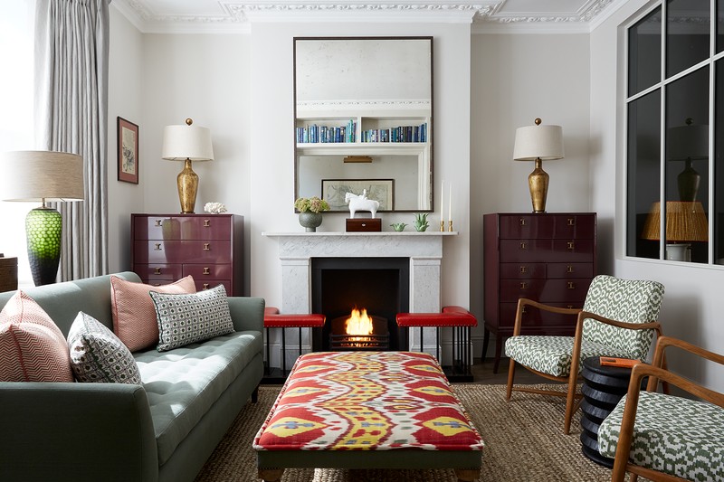
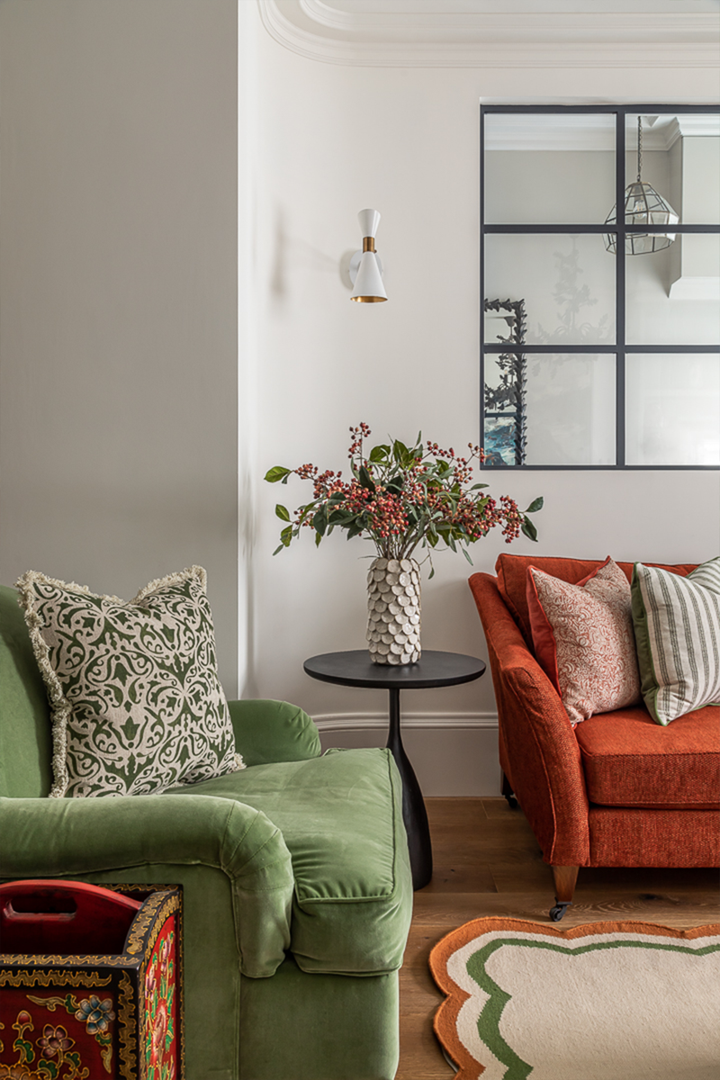
“One of the main complaints about terraced houses in London is they can be narrow and dark. This isn’t an issue in this house close to Battersea Park, however. A crittall-style window was installed between the living room and hallway to allow light to flow through. It also makes the room feel more spacious as your eye reads the additional depth of the hallway. An added bonus is the mirror in the hall and specially commissioned oil painting above the mantlepiece can be seen from both areas.”
Visit Otta-Design.com
Ian Chapman
Director at The Vawdrey House, says…
“Internal glazed screens and doors are a brilliant way to create a ‘broken plan’ layout – i.e. combining openness and the ability to close off individual spaces. There are several systems available: steel-framed crittall styles are really versatile; timber-framed solutions are great in period homes; or screens can be installed to appear totally frameless with the frame recessed into the wall. Opening walls and adding glazed screens can affect how your home complies with building regulations, particularly regarding fire safety, so be sure to take advice from an architect first.”
Visit TheVawdreyHouse.com
Annie Ebenston
Lead designer at Blakes London, says…
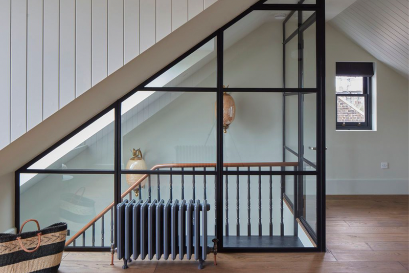
“As well as introducing visual breaks and creating zones within a space, another reason to add internal glazing is to allow natural daylight to filter through the room. In smaller, tighter areas, or basements and lower ground floors, internal windows or glazed screens work well to demarcate specific areas for different functions in the same way that a wall would, but without having to sacrifice on light. Glass walls make it feel larger, airier and less cramped, and can draw the eye to specific points of interest. It's also worth considering the type of glass you want. Fluted or reeded glass works well in areas where you want to maintain a bit more privacy or hide away a messier area. People do ask about frosted glass, but we don't tend to use it much – there are normally more stylish alternatives.”
Visit BlakesLondon.com
DISCLAIMER: We endeavour to always credit the correct original source of every image we use. If you think a credit may be incorrect, please contact us at info@sheerluxe.com.
