How To Design A Small Space
What are the key principles to keep in mind when designing for small spaces?
Emma: For me, it’s about making everything count. In a small space, every detail is likely to be something you look at regularly, so it’s important to make everything work hard. Small spaces can easily feel overwhelmed by stuff, so it’s crucial to find clever storage solutions. Design upwards, too, using the wall space for more than just art. And play with scale – lots of small things in a small space will feel cluttered quickly, so consider oversizing certain focal points to create a sense of space.
Robyn: I think people get frightened of small spaces so they put lots of small things in them. Actually, big patterns, large accessories and oversized art all serve to distract us from the overall scale – but use these big hitters sparingly so they don’t become too overwhelming. Above all, focus on the feel of the space, making sure you’re choosing clever pieces that work hard without looking like they are.
How can you maximise storage without compromising on the look?
Emma: Multi-use furniture – the kind that lets you put things squarely out of view so you can pretend they don’t exist – is a godsend in small spaces. Think the ottoman-style bed with all the storage underneath, the footstool that has your gym kit in it, the minimal shoe storage that also holds the dog lead and towel. Prioritise form as well as function and you can’t go too far wrong.
Robyn: Antiques are great as they subvert expectations. Using pieces with a little more personality obscures their functionality, maintaining the style of a room so that’s what sticks in your mind as opposed to the square footage.
Any layout techniques you recommend in compact areas?
Emma: Anything modular. If you’re somebody who likes to switch things up every now and again without buying anything new, choose pieces with interchangeable attachments. A sofa that’s made from multiple parts can be switched up or separated to create different looks, as can a shelving system you can configure into your own design. Choose editable furniture and it’ll likely work for multiple homes and spaces over the years.
Robyn: Adaptability is key. Choose multi-use items that can be deployed elsewhere. An oversized footstool with a tray on top is also a coffee table. Use small cabinetry as side tables so you have somewhere to stash things. Anything that has a flip-down surface, a foldaway element or that can live in multiple areas of your home is going to work.
How can you use lighting to make a small space appear larger?
Emma: Too often, people go for LED spotlights to save on head room. But no space feels comforting with this layout. In my old tiny flat, we never really turned them on, choosing instead to turn on softer, dimmable lamps at various heights. You can also suspend plug-in pendants from the ceiling with hooks to create softly lit zones – one for reading, one for working etc. Choose different tones for different tasks – that way, when you move in and out of each zone, the space will start to feel bigger.
Are there colours or patterns that can create the illusion of more space?
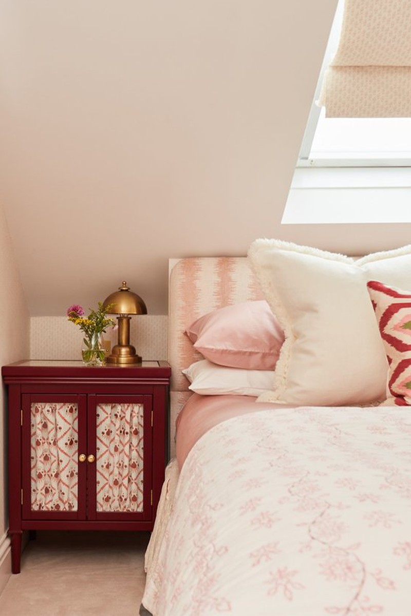
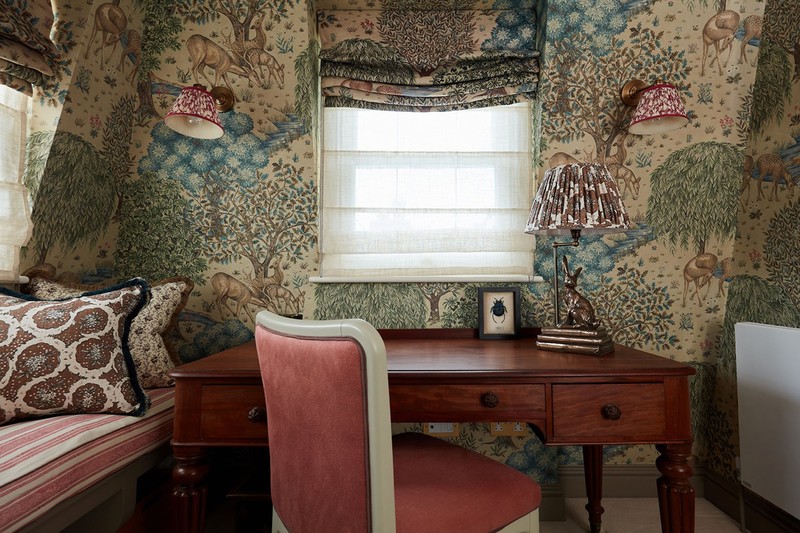
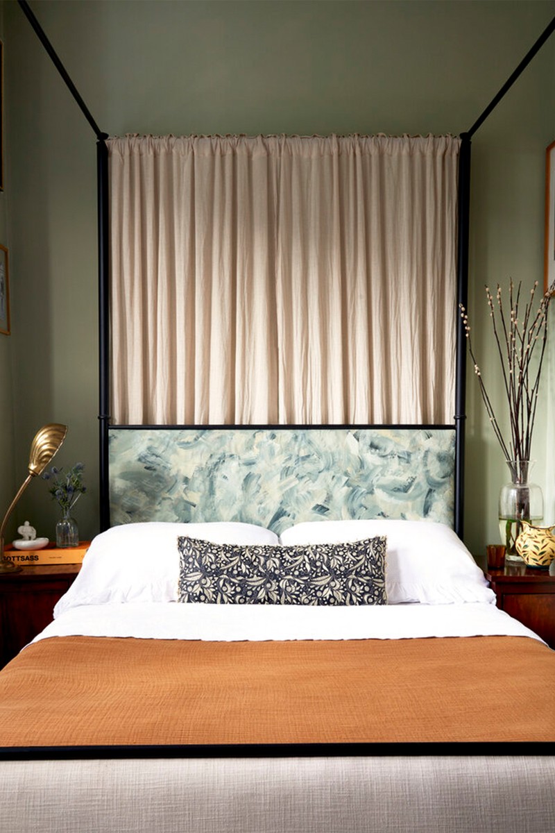
Robyn: The number one way to make a room feel bigger is to paint the walls and the ceiling in the same colour. That way you lose the lines and everything blurs into one. If that’s not possible, at least go as high as you can with a colour – never stop at a picture rail, always go up to the cornicing if you can. Oversized patterns also work well as it’s tougher to see where the room starts and ends.
Emma: It’s the totally opposite approach, but I’m the queen of beige. I love to keep the colour palettes soft and neutral, and bring in points of difference through texture. If you can, paint a gently tonal shape that stretches over the wall and ceiling to zone an area. But if you can’t, no problem – you can achieve the same effect with art and textiles instead.
What about furniture? Anything that’s particularly suited to small spaces?
Emma: It’s important to think about how surfaces, shapes and edges will work together. Lots of hard, straight lines in a small space will make it feel like a storage cupboard, so introduce as many round edges and organic shapes as possible. Rather than having everything in wipe-clean white, consider using some untreated woods to add a hit of warmth.
Robyn: I find vintage 50s and 60s pieces tend to be made for smaller spaces. Many of these pieces were made when furniture was less mass produced (and homes much smaller) so they had to be really innovative and serve several purposes.
How can you create a sense of openness and flow in a small space?
Emma: The flow is so important in a small space. It’s about placing pieces strategically to draw your eye around the home, creating the illusion of more space. So, let’s say you’ve zoned out a living room area with a tan flat-weave rug. Do you have a bedroom you can see into? Try placing a wall hanging in similar textures so it’s visible through the doorway. Keep your tones in the same family but switch them up depending on the zone -– darker caramel accessories in the living area, breezy corn meadow vibes in the bedroom. Those little pockets of design allow you to create rooms within rooms, get your brain into the correct emotional state for resting or cooking, and help you avoid the cardinal sin of placing all the furniture against the walls and leaving the middle of the room empty.
How can mirrors enhance the perception of space?
Emma: Find the biggest mirror you can fit in the space and place it somewhere where it’ll reflect the other design details. I love an arched mirror for adding a little shape to a space.
What role does minimalism play in designing small spaces?
Emma: Lots of people think minimalism just means painting everything white. But it’s actually about having fewer things and making those things more meaningful. In a small space, everything is on show all the time, so it absolutely makes sense. A few carefully curated pieces will help a space feel considered and purposeful. One oversized vintage bowl on a shelf instead of 25 things you grabbed from the supermarket home section will always make a space more impactful.
How should vertical space be used?
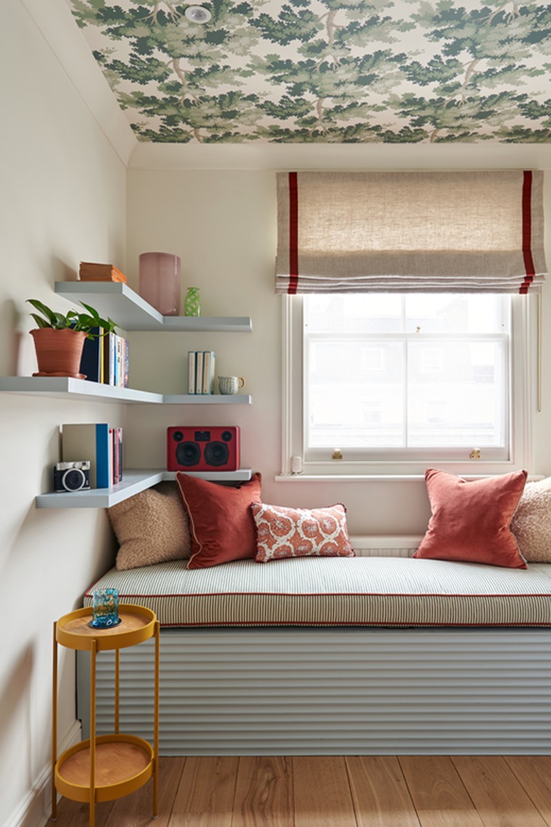
Emma: Go to town on the walls. For renters, a free-standing shelving system can offer great floor-to-ceiling storage – just make sure you choose one with doors and drawers, as well as display space, so you can hide everything you don’t want to look at. Be careful installing cupboards above head height as they can make the room feel claustrophobic, but do consider wall-mounted storage below waist height. Wall-mounting means you’re left with the feeling of more floor space, which is always a win.
Robyn: As a homeowner, there's nowhere I don’t go full height, as cutting things off before the ceiling can sometimes foreshorten a room. Fitted floor-to-ceiling wardrobes are the dream, but shelving all the way up also works and can be very adaptable. You can mix up open shelving with ornaments, books and basketry, and if things are feeling too busy, you can instantly edit down.
Are there any specific window treatments that work well in small spaces?
Emma: I’m a big fan of anything that softens a small space, but still lets in the light. That includes treatments like gossamer-thin linen curtains pooling on the floor or romantic voile that floats in the breeze. You can layer something heavier on top, ready for when the lights go on in the evening, but in the daytime these lighter options will keep out prying eyes and create some much-needed texture.
Robyn: I think blinds are great as they’re tucked away into the recess of the windows. Also, café curtains work on the same principle – by not taking up any precious real estate in the room.
Can you give us some creative ways to add personality and style to a small space?
Emma: Try anything with texture that you can easily switch out. Why not fabric-cover a pinboard and use it to display postcards and magazine cuttings? Choose interesting vintage curios, like curved candlesticks and obscure decorative bits. You want to create a space that feels like you, not like an interiors catalogue, so go for one-offs that make you happy.
Robyn: If you’re choosing things that accurately reflect your persona, you won’t overwhelm a small space as you’ll have a feel for what works and stop at the limit of your comfort zone. Use pieces with movement, interest and nothing too blocky. A coffee table with a glass top takes up less visual space but it’s still a statement. Also, a halo-shaped vase allows you to peek through. Just bear in mind the scale of the room.
How can textures and materials contribute to the design of small spaces?
Emma: Layering textures creates a sense of richness and depth in what might otherwise feel like a white box. They help to reinforce the purpose and emotional intention of every zone.
Robyn: They are a fantastic way of introducing playfulness, colour and print in a way that is adaptable and changes up the feel of a room in an instant. Cushions and blankets are key to small space living, as they are moveable and adjustable.
Finally, any last techniques or hacks that can instantly make a small space appear larger?
Robyn: Blurring the lines and not being afraid of colour! Don’t get in your head about the size of the space or you’ll overthink it and end up with something sterile. Get the scale of the big pieces right, then have fun with everything else.
‘All Up In My Space’ by Robyn Donaldson & Emma Hopkinson is published on 6th July. Visit AllUpInMySpace.com
DISCLAIMER: We endeavour to always credit the correct original source of every image we use. If you think a credit may be incorrect, please contact us at info@sheerluxe.com.

/https%3A%2F%2Fsw18.sheerluxe.com%2Fsites%2Fsheerluxe%2Ffiles%2Farticles%2F2023%2F07%2Fsl-henry-prideaux-living-area.png?itok=2wzb1ADK)
