The Designers Creating Modern, Timeless Interiors

Style & Inspiration
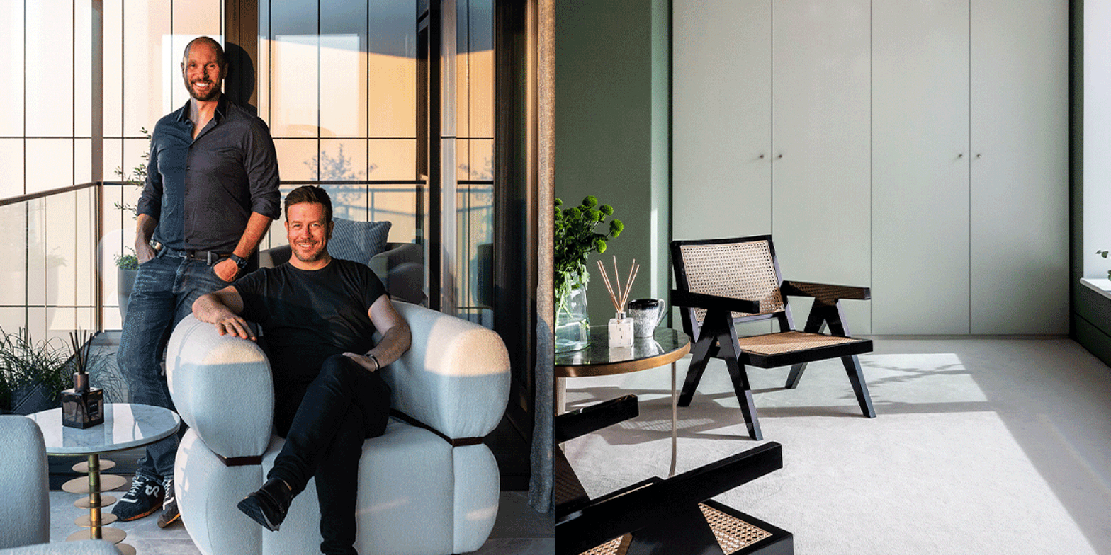
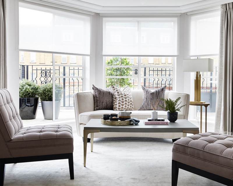
We don't really have a ‘house style’. We take inspiration from each property and its surroundings and tend to work back from there. We also try to think carefully about the person or people that will live there and design the space with them in mind. That said, we tend to favour a bold colour palette and love experimenting with texture – often with a masculine edge – to create timeless but sophisticated interiors.
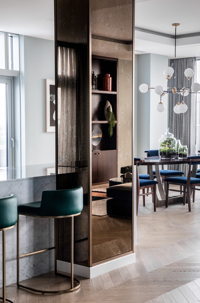
Our latest project is one of my absolute favourites. Each project has elements I love, but this one – a stunning apartment we designed at The Dumont, a luxury new development on Albert Embankment by developer St James – is a standout. We designed it amid the backdrop of the pandemic, which was challenging, but it made us think differently about the importance of a home. We introduced lots of vibrant and bold colours to lift the spirits and enhance the natural wellbeing of the residents. The apartment also has a fabulous view over the Thames, so we took references from that, too.
We find inspiration everywhere – architecture, art, hotels, fashion, travel. We are always ‘on’, so we find things everywhere we look. Some of my personal favourite travel destinations are New York and Mexico. New York for its high-end style and Mexico for its mix of colours and pattern.
We also take inspiration from so many fellow designers. Some that spring to mind include Jonathan Reed, Douglas Mackie, Kelly Wearstler and Tara Bernerd. On Instagram you should follow Dpages , Studio Ashby, Carpenters Workshop Gallery, Jan Hendzel Studio, Kristjana Williams.
Planning & Designing
When designing a room, we start by planning the layout. The starting point might be a new fabric or a piece of furniture, and we go from there. One of the main priorities is to ensure the space flows smoothly before you consider the colours or textures. From there, you can start choosing your key pieces.
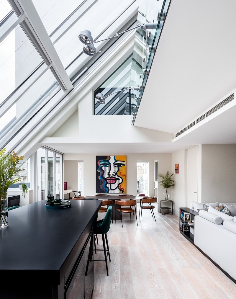
The best way to furnish a large, open-plan space is to zone it. Rugs are a simple way of doing this, but you can also achieve the same effect with joinery or room dividers. We’ve done it in several recent projects, including a penthouse we designed at The Atlas Building in Shoreditch, where we introduced a large piece of joinery with a fireplace to break up a very large reception/open-plan living area.
Bedrooms are a joy to design – there are so many layers to add. Think upholstered walls, gorgeous linens and bed throws, details on cushions, interesting shaped lamps. We’re also known for our statement headboards – they can take over an entire wall to really command attention and make the room feel grander and more luxurious. Designing social spaces (kitchen/living/dining in one) is also one of our favourite things to do.
The classic triangle of hob, sink, fridge should be your priority when designing a kitchen. But there should also be enough usable worktop space to prepare your food. For flooring, ceramic tile is always going to be user-friendly and easy to maintain. For worktops, Dekton is a new product which gives the look of stone but is as bulletproof as stainless steel. You can’t beat a classic Carrera marble, either.
Lighting and mirrors can help enhance small spaces. However, it’s worth trying to use larger, but fewer, pieces of furniture to create the illusion of a bigger space. Don’t be afraid to use bold colours in small spaces, either – people often think keeping it all white will make it feel more open, but often, a pop of colour can re-focus the eye away from the size of the room.
Decorating
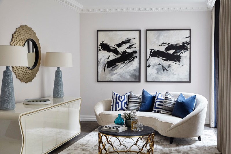
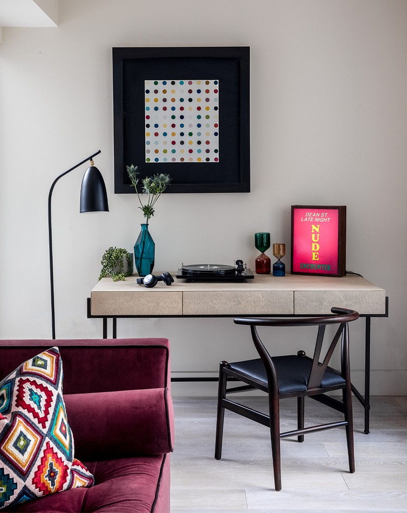
Some of our favourite colours are inky blues and deep reds. When it comes to creating a colour scheme or mood board, we start by asking whether the client wants – or the room dictates – a light base or a moodier, richer tone. Specifically, we love to use bold colours for statement headboards or creating points of interest in a large space through accents such as rugs and cushions.
When it comes to pattern, larger scale florals look less twee and more contemporary. When you’re putting different patterns together, you should find some form of unifying thread to link them together; that might be a colour or a shape, but visually it will stop them clashing.
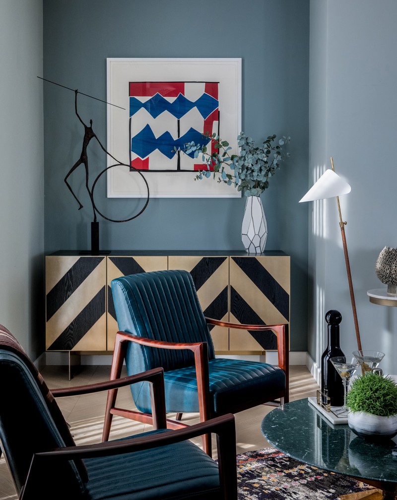
If you want to mix and match furniture, use the architecture of the room. Using mid-century furniture in a new property is a great way of adding character, for example. As with patterns, find a visual thread between the modern and the old – shapes and materials will help bring everything together.
We don’t tend to follow trends. However, because of the pandemic, people are craving comfort, sanctuary and a connection to nature, so natural shapes and forms, soft luxurious textures and, of course, a dedicated space for working from home are becoming consistent themes.
It’s worth splurging on big ticket items like the sofa and fixed joinery – things you aren’t likely to change as much. Only buy things you truly love, too. Right now, there are so many great independent brands out there – and you can always find some bargains when it comes to accessories and scatter cushions.
Lighting
For lighting, it’s important to think about how the room needs to adapt during different points of the day. For that reason, it’s preferable to use lots of different types of lighting: directional task lighting for work or to display artwork, floor lamps and table lamps for setting the mood, and a central pendant over a dining table – and always on a dimmable circuit.
The bulb warmth can really affect the existing colour of a space. Warm lights will enhance reds and oranges while cooler lights will enhance green and blues.
Over-lighting a room is a very common mistake. It can make it feel cold and sparse. Not enough task or mood lighting can also make it feel utilitarian – the key is balance and nailing the right mix.
Suppliers
Furniture
We make a lot of bespoke pieces, but other names worth knowing include Julian Chichester, Galotti & Radice, Ecco Trading, Vinterior , Brabbu
Joinery
Fabrili UK, Yorick Bespoke, Hope End Design
Kitchens
Charterlife, Life Kitchens
Bathrooms
Wallpaper
Paint
Little Greene Paint Company, Andrew Martin, Farrow & Ball
Lighting
Lee Broom, CTO, Heathfield, Martin Huxford
Flooring
Broadleaf, Tsar Carpets, Annette Nix rugs, Mohebban Milano
Tiles
Fired Earth , Minoli, Bert & May
Kitchen Hardware
Visit AngelO'Donnell.com
All images courtesy of Angel O'Donnell
DISCLAIMER: We endeavour to always credit the correct original source of every image we use. If you think a credit may be incorrect, please contact us at info@sheerluxe.com.
