A Colourful Cottage – With Healing Qualities
The Property
This is an ancillary cottage in the grounds of one of our client’s large estates in Berkshire. We had been working on the main residence initially and this project followed on from there. As a committed supporter of Cancer Research UK, our client was aware of the long treatment and recuperation process many patients undergo and she was keen to transform the cottage into a welcoming retreat for these people and their families. Somewhere to escape, reflect and relax.
We were absolutely thrilled to be able to assist in making this a reality and began work on a transformation plan. A fair amount of structural work was needed, which took 18 months from start to finish. We worked with Yiangou Architects as we needed to completely strip the cottage and design a new internal layout. Now there are three bedrooms, two bathrooms, and a bathroom downstairs alongside an open-plan ground floor.
/https%3A%2F%2Fsw18.sheerluxe.com%2Fsites%2Fsheerluxe%2Ffiles%2Farticles%2F2022%2F07%2Fsitting-room-fireplace-view_0.jpg?itok=1xyVFZgg)
Most of the work on the cottage took place during the pandemic, so the logistics became rather challenging, and we were forced to navigate our way through the ever-changing restrictions. To oversee the final installation, we were permitted to stay a few nights in the cottage, which was brilliant. Not only did we get to test-run everything, but we could really discover which elements sang and provided the joy that can be derived from considered design.

Our aim was to create a space that inspired joy and our lovely client was keen to emphasise the importance of comfort. This came naturally to us as we love our spaces to be practical, beautiful and have a sense of fun, with numerous places in which to relax and unwind.
/https%3A%2F%2Fsw18.sheerluxe.com%2Fsites%2Fsheerluxe%2Ffiles%2Farticles%2F2022%2F07%2Fsitting-room.jpg?itok=IxRGeSI7)
The Ground Floor
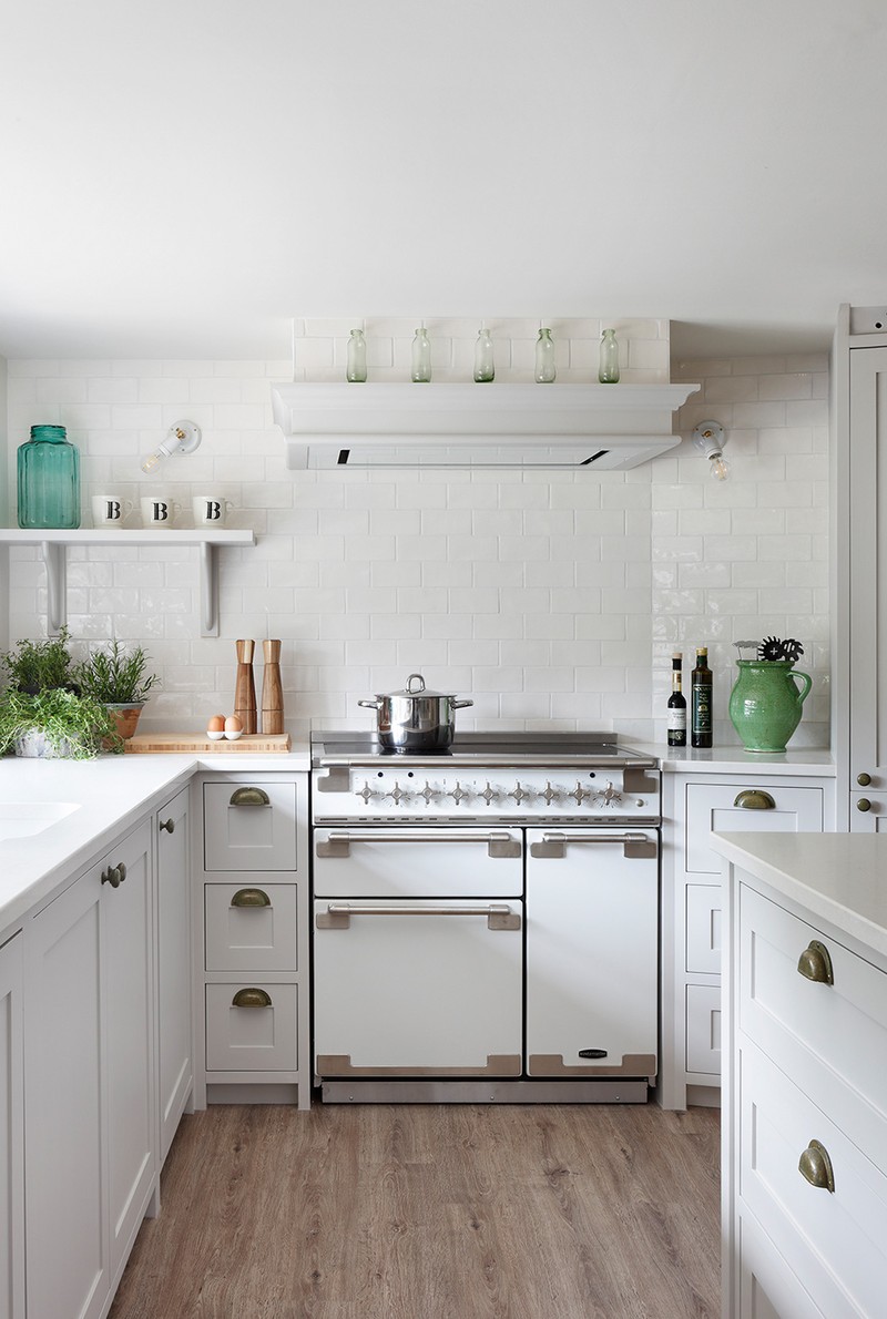
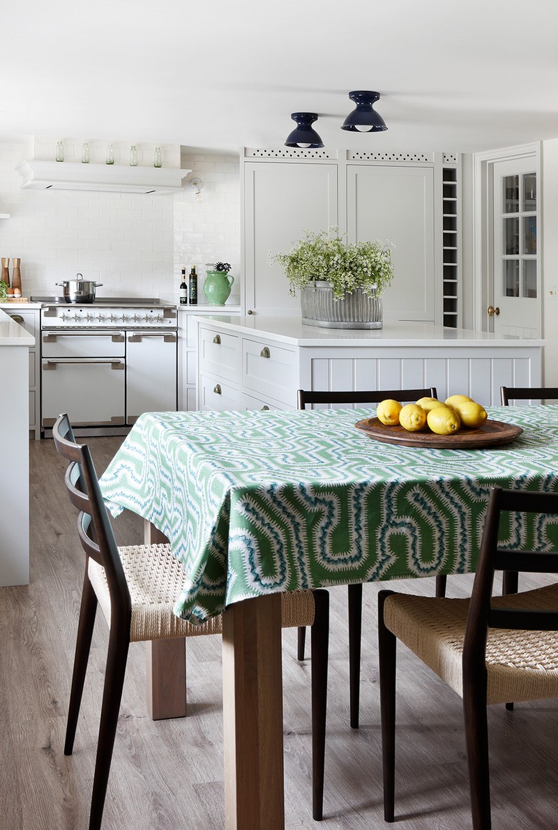
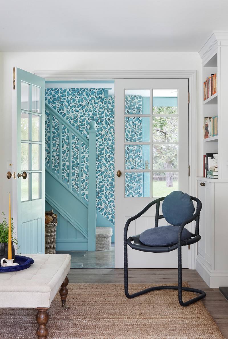
The open-plan ground floor is a truly light and bright area with bold blues and lush greens introduced through the soft furnishings. From the clean and streamlined white kitchen, through to the dining table with its Rapture & Wright tablecloth, and on into the sitting room area where leaf prints and bold stripes are complemented by the beautiful and bold landscape painting above the fireplace, the whole space feels calm yet revitalising.
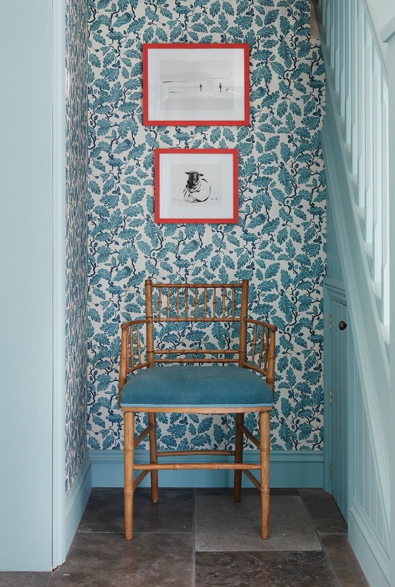
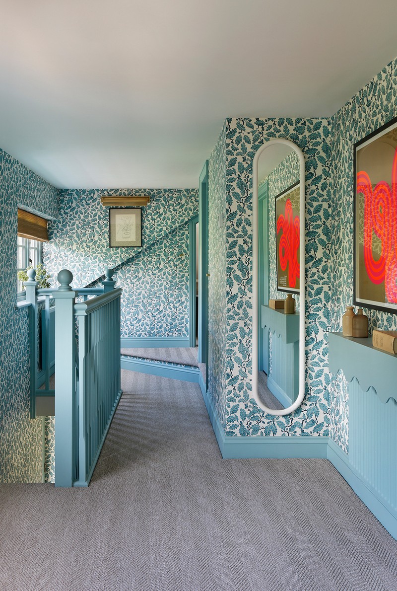
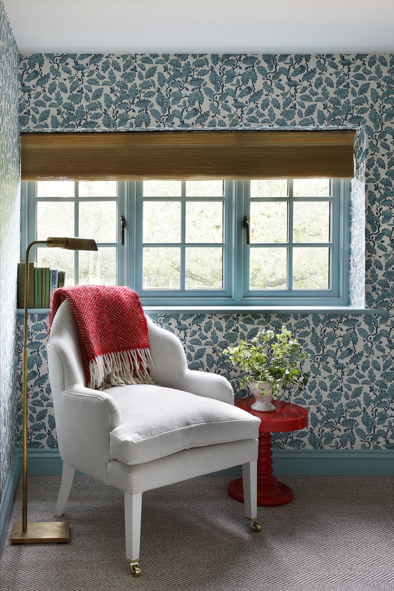
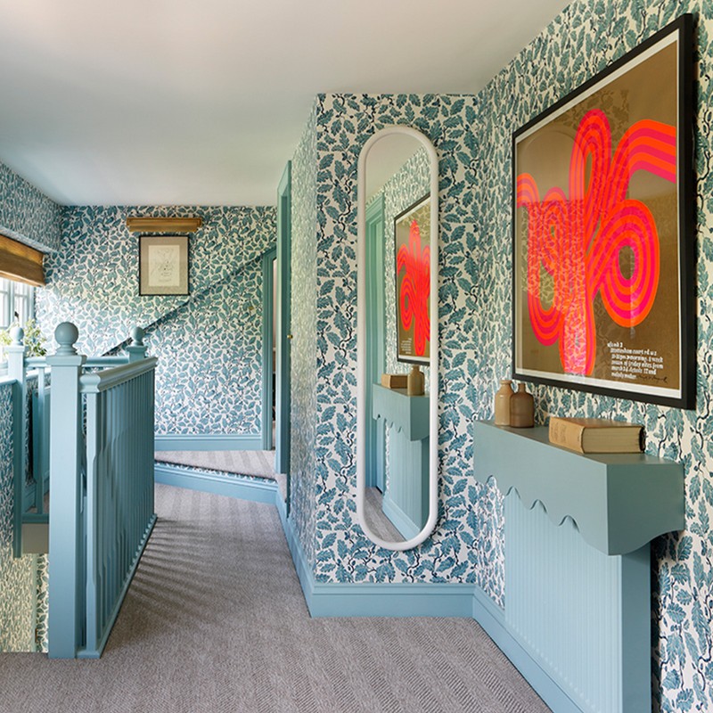
We were delighted that Fanny Shorter created a bespoke colouring of her timeless oak leaf wallpaper design to create a joyful and rather nostalgic stairwell and hallway. This was paired with Farrow & Ball’s Dix Blue, which plays a key role in creating a sense of the loved and lived-in vintage style. It is described as a relaxed colour and it is certainly a very warm green blue.
Scalloped edges are a feature throughout the property, reflecting the comfort of the home with soft, feminine, playful lines. The art continues the theme with depictions of nature and fluid, swirling lines. The artwork came from various sources – we purchased via Etsy, from antique markets such as Ardingly, as well as Etalage.
/https%3A%2F%2Fsw18.sheerluxe.com%2Fsites%2Fsheerluxe%2Ffiles%2Farticles%2F2022%2F07%2F8-turner-pocock.jpg?itok=4yhmkS2S)
The Bedrooms
The use of colour within the house was carefully considered to ensure visitors derived immediate pleasure from the spaces, and felt cocooned and protected in a world of soft angles, tempting textures and mood-enhancing colours. Each bedroom is designed to be wonderfully welcoming and very homely.
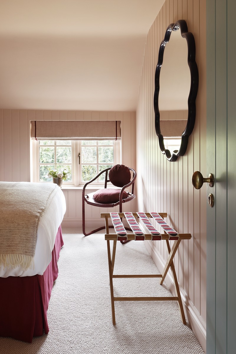
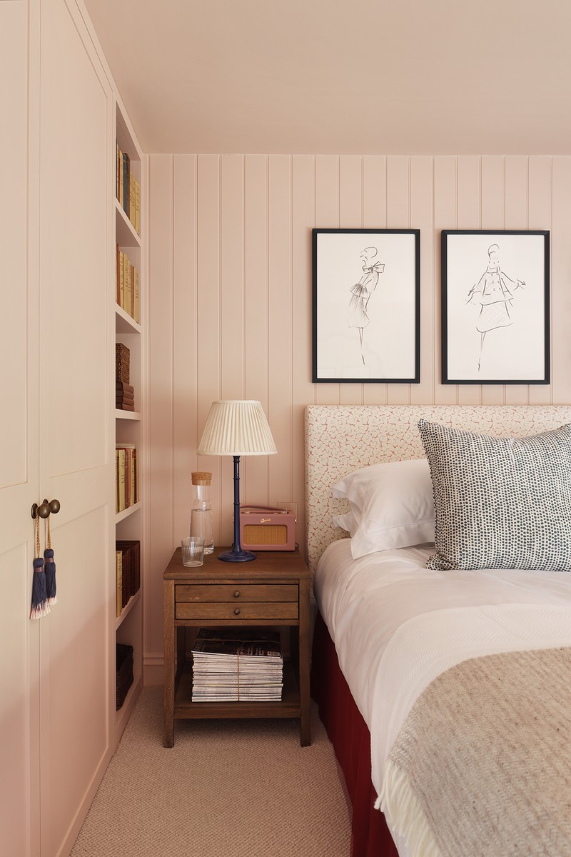
The main bedroom uses Farrow & Ball Oval Room Blue, another historic shade that is perfect for creating a cosy feel. Wallpapers featuring birds, flowers, foliage and pops of colour are found throughout the house. This playful CFA Voysey wallpaper with all its birds and bugs felt so appropriate for the cottage – it’s impressive and also timeless. The tall Asker lamp bases are painted in poppy red with lampshades from Fermoie. We quite like to put beds across windows, particularly if it means you will walk in to the end of the bed, because this makes the room feel more generous. The trick is to lower the headboard a little so it doesn’t steal the light. Other bedrooms include lamps from Pooky and Vaughan, bedside tables for Chelsea Textiles, fabrics from Soane and trims from Kit Kemp for Christopher Farr.
/https%3A%2F%2Fsw18.sheerluxe.com%2Fsites%2Fsheerluxe%2Ffiles%2Farticles%2F2022%2F07%2Fbedroom-3.jpg?itok=tNV6rzOv)
Especially important was to offer guests a good night’s sleep, so choosing the right beds and bedlinen was key. The beds are from Multibends and Loaf – whose Spare Room mattresses are very comfortable. John Lewis’s synthetic soft and light mattress toppers are great value. All bed linen is by Gilly Nicolson. The headboards are by Robert Langford – we always go for upholstered padded headboards for extra comfort. We purchased the coloured wool bed throws from Klippan at Nordic Nest.
For more, visit TurnerPocock.co.uk & TPCaringSpaces.co.uk
DISCLAIMER: We endeavour to always credit the correct original source of every image we use. If you think a credit may be incorrect, please contact us at info@sheerluxe.com.
