

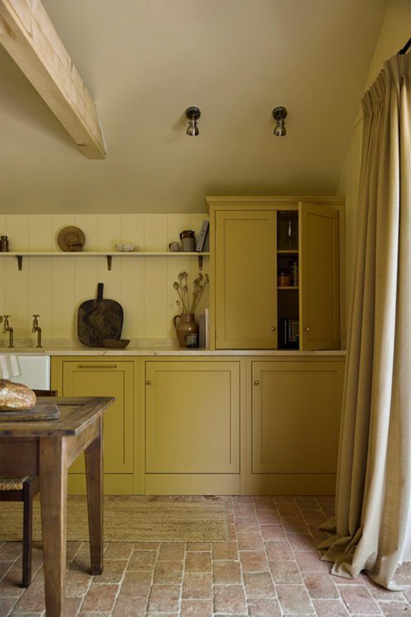
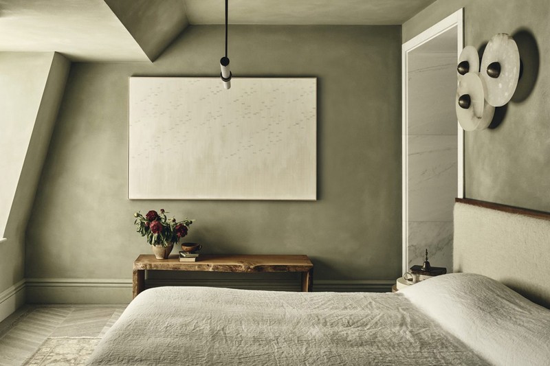
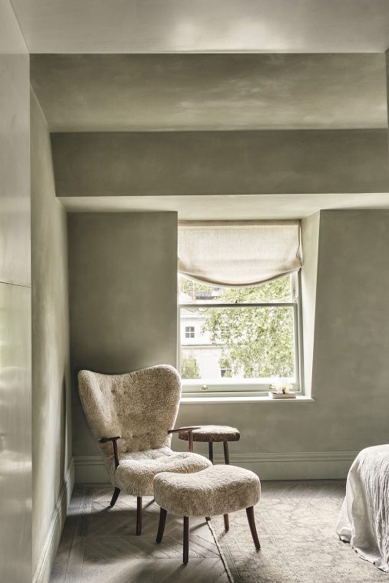
This Interiors Trend Is Going Nowhere
What makes colour drenching different and special?
“Traditionally, most of us grew up in homes where the walls were painted in colour, but the skirtings, doors and ceilings were all kept white – that was just the done thing. But in the last few years, colour drenching has become one of the most exciting shifts in how we decorate. It’s all about taking one single colour and using it across multiple surfaces – walls, ceiling, woodwork, even radiators – to create a totally immersive, cocooning feel. Unlike traditional decorating with its sharp contrast lines, colour drenching lets your eye flow smoothly around the room, which makes the space feel calmer, more cohesive and beautifully designed.” – Tash Bradley, director of interior design, Lick
“Colour drenching is a bold yet sophisticated design approach. By enveloping a room in a single tonal palette, you invite calm and cohesion. Unlike traditional colour approaches that rely on contrast or accents, drenching focuses on continuity. It allows architecture and materiality to speak louder than decorative contrast, creating spaces that feel considered and quietly powerful.” – Edo Mapelli Mozzi, founder of Banda
“It's a bit like the modern version of a country-house bedroom that has been pattern drenched, where they use the same pattern on the walls, the bed, the curtains etc. Usually in a designed room you would expect to see three or four colours balanced expertly, each playing off each other. To have just one colour so dominant is unusual and therefore has great impact. Colour drenching can be a cool way to add wow factor to a space inexpensively.” – Pandora Taylor, creative director, Pandora Taylor
Tell us more about the design benefits and emotional uplift it can deliver…
“From a design standpoint, it creates visual unity. It can elongate sightlines and reduce visual ‘noise’, which often makes a room feel more expansive. Emotionally, it offers a sense of retreat, particularly in urban homes where overstimulation is a constant. The psychological effect of stepping into a singular palette is calming, grounding and often deeply restorative.” – Edo
“One of the biggest benefits of colour drenching is the way it allows the eye to move freely around a space without interruption. By removing contrasting lines – such as white skirting boards, door frames or ceilings – you create a seamless, flowing effect that makes a room feel more cohesive, and often significantly larger. This approach is particularly effective in smaller rooms. By using one continuous colour across all surfaces – walls, ceiling, woodwork, even radiators – you blur the visual boundaries and remove any harsh cut-off points. This softens the overall look and creates the illusion of more space. From an emotional perspective, colour drenching is a powerful way to establish atmosphere. It sets the tone the moment you walk in – whether that’s calming, cocooning, or energising. With less visual contrast competing for attention, the focus shifts to the furnishings and key elements in the room’s centre. This not only grounds the space but also allows texture, shape and personality to shine through.” – Tash
“Colour drenching is great to use if you want a space to feel cosy. If you have the same colour on the walls and ceiling, it generally will bring the space in, like a big hug. It's the opposite of a space feeling big, open and bright – unless you've gone for all white! However, in small rooms it can help make them feel bigger. I often paint the walls and ceiling the same colour if the ceiling is quite low. This tricks the eye, so the walls don't seem to end quite so abruptly.” – Pandora
Are there any guidelines worth knowing before you colour drench?
“Balance is everything. We always consider how light interacts with the chosen colour throughout the day. We tend to lean towards earthy or muted tones that feel generous and forgiving – they shift beautifully with natural light. Texture is key. A matt or plastered finish adds depth, especially when paired with natural materials like linen, wool and timber. That’s what stops a space from feeling one-note and instead creates a sense of quiet richness.” – Edo
“I always start by asking one key question: how do you want to feel in the space? That emotional intention should guide every colour decision. Once we’ve established the mood, I look at the natural light in the room. For cooler, north-facing rooms, I always recommend warmer tones to help balance out the grey light. Think soft warm whites, pinks, terracotta reds, or greens with rich yellow undertones – these add warmth and depth where the natural light can feel a bit cold. In contrast, south-facing rooms that get plenty of sunlight can really embrace cooler hues – soft blues, sage greens, and earthy, dusky pinks work beautifully in those spaces. If you live in a new build that lacks period features, colour drenching can also be a brilliant tool for adding personality and softness. It’s a really effective way to stop a space feeling boxy or characterless, and instead brings in a sense of depth, intention and individuality – without needing architectural detailing.” – Tash
Which rooms lend themselves best to colour drenching?
“It works beautifully in bedrooms, living rooms, home offices – and honestly, I love a colour-drenched loo! Those smaller spaces are the perfect playground to be a bit braver. The kitchen is the one space I don’t often colour drench, because in my experience clients usually prefer a contrast between the units and the walls.” – Tash
“It’s not just about rooms, but about areas and how they’re used. At Banda, we sometimes drench entire floors for flow, or focus on single spaces for impact. What matters is applying it with sensitivity to light, purpose and tone. Brighter, lighter hues work well in open-plan areas or ground floors that see daily use and natural light. Deeper, more cocooning tones are ideal for spaces like bedrooms, powders, cinema rooms or speakeasies; places designed for rest or retreat. It’s about the right approach in the right context, not rigid rules.” – Edo
“Done well I really think this technique can be used anywhere to great effect. I think bathrooms can be particularly striking – there is something about using different textures such as tiles, flooring and paint all in the same colour that works really well. I have also colour drenched a living room to great effect. It was a classic London Victorian terrace with the living room in the large front room, a space we have all seen so much of before. Colour drenching it just immediately made it feel different and new.” – Pandora
/https%3A%2F%2Fsw18.sheerluxe.com%2Fsites%2Fsheerluxe%2Ffiles%2Farticles%2F2025%2F05%2Fsl-colour-drenching-penrose-tolbury.jpg)
Is there a way to experiment with colour drenching if you’re feeling a bit cautious?
“Start with a palette that feels close to nature – think sage, clay, chalk, or stone. These hues offer warmth and sophistication without visual heaviness. Test your chosen tone on multiple surfaces in the room and observe it across the day. Incorporate subtle tonal variation through furnishings and finishes. The goal is immersion, not uniformity.” – Edo
“I would probably start with lighter colours such as a pale blue or green. And stick with paint rather than wallpaper, which can be easily gone over if you decide it's not for you. If you’re using textiles on a bed or curtains, say, pick a fabric you love rather than one you think works with the drench. Then, if you decide to change the colour of the room, these pieces will still work for you.” – Pandora
Any final words of advice?
“For true immersion, we recommend including ceilings, skirtings, radiators and woodwork in the same shade. Avoid high gloss, unless it’s a powder room, cinema area or speakeasy, where a reflective finish can enhance mood and atmosphere. Generally, opt for matt or mineral-rich finishes like clay or lime-based paint to add depth and tactility. To make the look feel intentional and elevated, use natural materials that either echo or gently contrast the dominant tone – think timber, marble, brushed metal. And always consider lighting: warm bulbs soften monochromatic spaces and bring out tonal nuance.” – Edo
“Definitely drench the ceiling, skirting and cornice to give the scheme the umph it needs. If a radiator is prominent and easily painted, then yes do it, but if it's a nice cast-iron radiator, I wouldn't worry too much. A good drench needs pops of other colour or textures to really set it off, so things like contrast mantelpieces, doors and flooring will help balance the room. I would also pick perhaps one other complimentary colour, as well as a neutral, which you can use throughout the room in accessories and upholstery.” – Pandora
“A successful colour-drenched room involves enveloping all surfaces—walls, ceilings, woodwork, doors, and even radiators—in a single, cohesive hue. This approach creates a seamless and immersive environment. Our durable matt and eggshell paints are multi-surface, making them ideal for this technique. A matt finish offers a smooth, non-reflective surface that absorbs light, providing a contemporary and sophisticated look. It's excellent for concealing imperfections. Eggshell, with its slight sheen, adds a subtle lustre that's perfect for woodwork, doors and radiators, offering a gentle contrast without disrupting the monochromatic scheme.” – Tash
Visit LICK.COM | BANDAPROPERTY.COM | PANDORATAYLOR.CO.UK
DISCLAIMER: We endeavour to always credit the correct original source of every image we use. If you think a credit may be incorrect, please contact us at info@sheerluxe.com.
/https%3A%2F%2Fsw18.sheerluxe.com%2Fsites%2Fsheerluxe%2Ffiles%2Fwebsite-images%2F2025%2F03%2Fsign-up-pop-up.jpg)
