How De Gournay Transform Homes
Hannah, hello, how wonderful to be chatting to you. For those that aren’t familiar with de Gournay, can you give us a brief overview of the business, its history and what you do?
My father has always been passionate about interiors and decoration. It all started when he was looking for a hand-painted Chinese wallpaper to decorate his own home and discovered that the art of hand-painting chinoiserie wallpapers had almost died out. He saw a gap in the market to produce something beautiful and reignite 18th-century traditions of hand painting these wallpapers in China.
What are the wallpapers actually made of?
Our chinoiserie designs are hand painted in watercolours onto silk which is then paper backed. The silk is hand dyed and the paper backing is handmade Chinese rice paper. For our traditional chinoiserie designs, we use the same materials that were used in 18th-century wallpapers. When it comes to our more modern collections, we use a wide range of other materials such as hand-gilded metal-leaf grounds and textured papers. We then have beautiful finishes that can be added, such as silk embroidery or beading.
What effect do they have on a space?
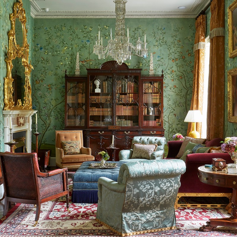
We believe our wallpapers bring interiors to life. They envelop a room and transform it in a way that a piece of furniture can’t. It has the ability to create and set an entire mood. In my home I used a vibrant chinoiserie design in the kitchen/dining room: lots of greens on a mauve/grey silk background with jewel-coloured tones in the flowers. It sets a fun and vibrant mood that is perfect for entertaining. The design also creates the feeling of being in an amazing tropical garden, which is the perfect sanctuary in a busy city like London.
Are there particular rooms to which wallpapers or murals are better suited?
That's a hard question because I love to use it everywhere! Every inch of my walls is covered. We have such a breadth of designs and colourways, there really is something to suit every space – modern or traditional, large or small, neutral or colourful. If I had to choose, it would probably be the living room or the dining room – especially if either is one of the first rooms you enter in the house. I love the feeling of stepping in and being totally transported. To be surrounded by pattern and colour is such a stark comparison to the drab roads and pavements outside.
Would you advise covering every wall in a room?
Yes, definitely. One wall feels like an art installation. All the walls makes you feel like you are in another world.
What are the main points to consider if you’re keen on the idea?
There is very little to consider to be honest. Because our wallpapers are tailored to each space, we take care of all the details so they look beautiful in every room. Our clients send us their measurements and we provide a miniature black-and-white drawing to confirm the design. The client then selects the colour and texture – silk, paper or metal leaf – and the colourway.
How practical are your wallpapers?
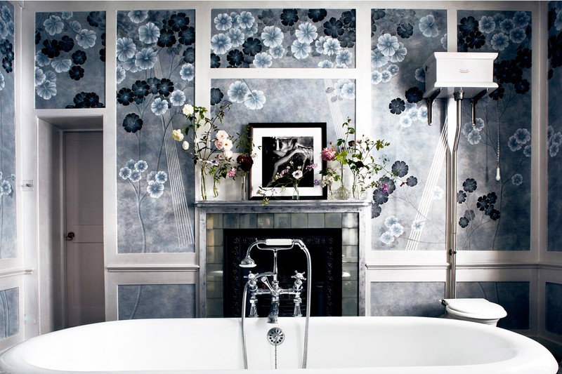
We offer all sorts of protection for them, from stain-repellent treatments to waterproof glazes that make the wallpaper wipeable. The glazes have all been carefully adapted so they don’t alter the appearance of the wallpaper. In my kitchen, bathrooms and children’s bedrooms, I have added protective glazing to all the wallpapers. In the bathroom, this meant I was able to install the wallpaper behind the shower glass, so the flamingo design continues on the inside. And if my children put their mucky hands all over their bedroom walls, I can wipe them clean.
Does a mural come first in terms of room design?
It’s a wonderful starting point because it lays a strong foundation for other colours and pattern. It also makes selecting furniture, upholstery and accessories much more straightforward.
What’s the process for creating a mural at de Gournay?
Every design we create has a story. Our wallcoverings are designed by our in-house design team, led by Jemma Cave. Jemma studied fine art and is a very talented artist. Our designs are also often created by interior designers that we work with who want something bespoke for a project.
Which of your designs are the most popular?
Our ‘Earlham’ and ‘St Laurent’ chinoiserie designs, our ‘Early Views of India’ Papiers Peint Panoramiques design, and our ‘Fishes’ and ‘Plum Blossom’ Japanese and Korean designs. Recently our ‘Namban’ design has also been very well received.
Which of your designs do you personally like the most?
I love our ‘L’Eden’ design on our gold-leaf paper. It was used in Annabel’s, and is rich and intense. It depicts a tropical paradise, while its incredible perspective makes any room feel so much bigger. The design is in our Papiers Peints Panoramiques collection, which includes all of our landscape designs, all of which work well to open up different spaces. In my sister’s flat she used it in the corridor. It now feels far less narrow!
Which do you have in your own home?
In my bedroom, I have an antique de Gournay wallpaper from the 1980s. It was one of the first wallcoverings my father made as a test when he founded the company, although he disliked the colours so much it was held in stock in our painting studio. I discovered it a few years ago and fell in love with it.
The wallcovering in my kitchen is a custom version of our ‘Sans Soucis’ design. We originally made this colourway for Steven Gambrel, who is one of my design icons. He installed it in a beautiful store in Palm Beach, Florida, called Kirna Zabete. When I saw his installation on a visit to Palm Beach, I loved it. It always stayed in my mind and, when I had a kitchen with white walls, I knew immediately what I wanted to put there. I love the mauve, beetroot and green tones.
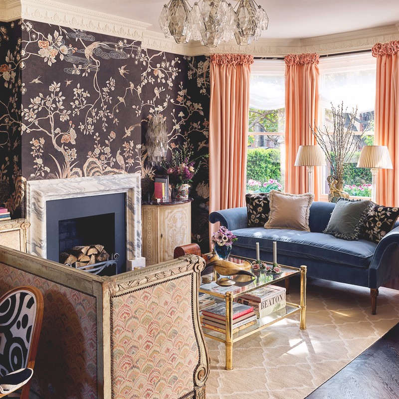
In my living room I have ‘Coco Coromandel’ from our new collection. We had never done a full installation of this wallpaper, so we were really excited to have a large space to see how it looked. Everyone told me chocolate brown would be too dark, but they were wrong – the room still feels light and bright thanks to the chalky white and apricot accents. The design is based on the famous Coromandel screens in Coco Chanel’s iconic Parisian apartment.
What’s the most elaborate request or mural you have done?
For one client in Germany we painted the story of ‘Around the World in 80 Days’, starting in her hallway, going up the staircase, through the corridors and into various first-floor rooms. We painted Phileas Fogg riding an elephant, in a hot air balloon and on a steam engine – all with amazing scenes of the exotic landscapes through which he travelled.
You’ve done a few collaborations too, haven’t you?
In the past, we’ve teamed up with Lady Rose Cholmondeley and Houghton Hall, Aquazzura and Kate Moss. Now we’re working on a collaboration with Erdem which will launch next March. I’m incredibly excited about it – it’s a dream come true.
What is the most common question you are asked about murals?
People always want to know how many hours it takes to make one panel. The answer is anything from 60 to 160 hours depending on the design.
Your prices vary quite substantially. Talk us through them…
We have such a huge range of products. Prices start from around £180 per square metre up to £1,000 per square metre. For a chinoiserie, you could choose a simpler dyed silk or you could opt for a 22kt gold gilded paper background. You could then decide to add hand embroidery, which would increase the price. We advise clients to choose products according to their budget. People often think our products are more expensive than they are, but it really depends on what you want.
Visit DeGournay.com
DISCLAIMER: We endeavour to always credit the correct original source of every image we use. If you think a credit may be incorrect, please contact us at info@sheerluxe.com.

/https%3A%2F%2Fsw18.sheerluxe.com%2Fsites%2Fsheerluxe%2Ffiles%2Farticles%2F2019%2F12%2Fdegournay-douglas-friedman-miles-redd-new.jpg)


/https%3A%2F%2Fsw18.sheerluxe.com%2Fsites%2Fsheerluxe%2Ffiles%2Farticles%2F2019%2F12%2Fimage-row-1-mariam-medvedeva-angelika-grundler-new.jpg)

