Take A Look Around This Cool East London Home
The Property
The house is one of De Beauvoir Square’s iconic, Grade ll-listed, 19th-century Jacobean-style townhouses. The house has four floors, with four bedrooms and two bathrooms spread over the top two. On the raised ground floor is the hallway and double reception room, with the addition of a glazed box office at the rear. On the lower ground floor is the hallway, downstairs cloakroom, utility room, then the open-plan living room, dining room and kitchen. The clients were a young married couple who over the course of the two-year project welcomed a little boy.
The Brief
The clients purchased the house in a shabby but not awful condition. That said, in order to make it right, it needed a full renovation. The lower ground floor layout was too small to include a good-sized family kitchen and dining space, let alone any living space, so it was clear an extension was needed. This was a two-stage project where we redesigned and renovated the lower ground floor first, keeping in mind the extension to come. As the house is listed, the planning process was long. We worked with our collaborator, Envelop Architects, to get the relevant permissions. Today, the extension is a marriage of new glass and old brick – materials that juxtapose with the original building.

The Kitchen
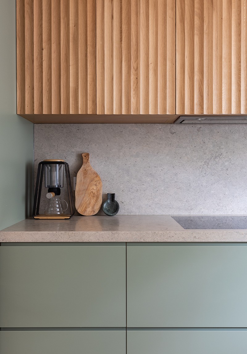
The kitchen, dining room and TV space are open plan and flow into each other in a way that’s compatible with modern living. We wanted to design something modern and minimal to sit inside the newly extended lower ground floor. The kitchen was designed by us and the joiner was made by a local East London-based cabinet maker. The majority of the cabinets are drawers (all of which have pan-dividing peg boards) with the exception being under the sink and the pantry.
Meanwhile, the calming green mirrors the garden beyond and we added solid oak, scalloped high-level cabinets and shelves to bring warmth to the space. Because of the listed nature of the building, we couldn’t open the original rooms with the hallway, so the kitchen and dining space is relatively narrow. Even though the clients were keen on the idea of an island, it was clear this would work in the space, so we ended up designing a peninsula for added prep space that also creates a visual line between the open kitchen and dining spaces. The worktops are solid 50mm-thick Moleanos Blue Limestone, a natural material which matches the low-level bench that runs down the whole lower ground floor and the floating bench in the TV area. The wall lights came from Holloways of Ludlow.
The Dining Area
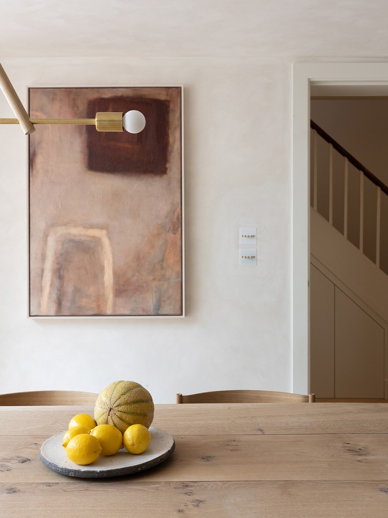
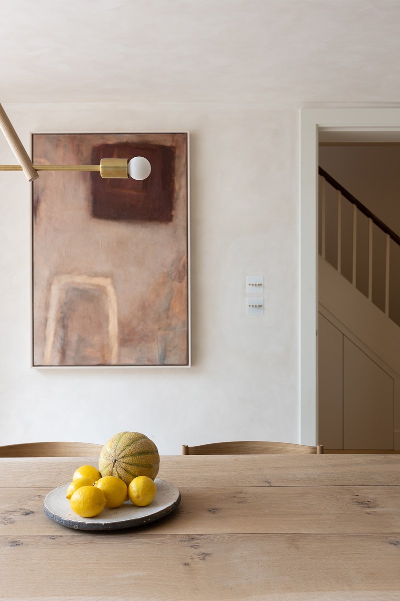
The dining area sits between the front kitchen and the rear living space. We wanted this to be the perfect transitional area between those two. It carries the same textures, tones and materials between the two, notably the scalloped oak storage bench, full-length shelf and Bauwerk lime-wash walls. This space was a little narrow (due to the nature of the house) so we designed a slightly narrower table to fit, with a live-edge top to continue that natural feel. We worked with James Bowyer Furniture to design the wavy-edge dining table which is long and narrow to reflect the space it sits in, offering plenty of dining space.
Dining Table: James Bowyer Furniture
Dining Chairs: Nest Pia Dining Chair
Pendant Light: Workstead Lodge Chandelier
/https%3A%2F%2Fsw18.sheerluxe.com%2Fsites%2Fsheerluxe%2Ffiles%2Farticles%2F2023%2F02%2Fde-beauvoir-tv-snug-3.png?itok=redWDBi_)
The TV/Living Space
This room opens up to the full width of the house as it sits entirely in the extended space. The triple roof light floods the whole lower ground floor with light, as do the triple sliding doors and Oriel window. There’s a continuation of the oak and limestone bench for material continuity, with plenty of storage and extra seating space. A Samsung Frame TV keeps the minimal aesthetic, and the single sofa pointed straight at it makes everything feel cohesive. The flooring throughout is a large format Trunk chevron to add drama and a long shelf from the dining room all the way to the end of the house is filled with plants to bring the outdoors in.
Wall light: Lamp twist Valerie Hanging Lamp Wall Light
Sofa: Hay Arbour 3-Seater Sofa
The Garden
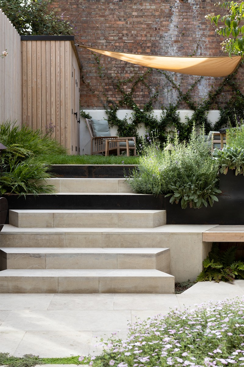
Designed by our collaborator Farlam & Chandler, the garden is split into three sections, with the front patio space flowing out from the living room. You have to walk on solid limestone steps with planting in between to access the back patio, which has a dining space complete with a handmade bespoke table with scalloped central pedestal legs. The shapes of the steps up to the lawned area reflect the geometry of the original window detailing, and the blackened steel planter divides the low patio and raised lawned area. The rear patio has a bespoke larch shed, and the fencing – also made from larch – is shaped to reflect the geometry of the garden.
The Living Room (Raised Ground Floor)
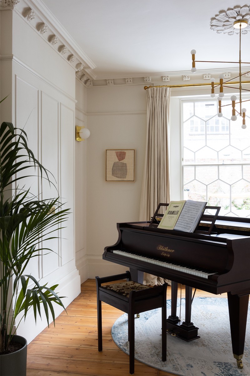
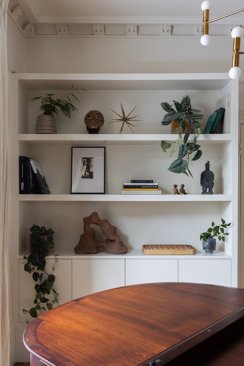
This open-plan double reception room has the front section as a living room and the rear as the piano space. The original coving and ceiling roses were exposed, sanded and treated, as were the original floorboards, and we added moulding to the walls for character, depth and texture. The modern lighting and furniture were chosen to contrast with the original and traditional elements, which we were unable to play with. The TV is hidden in the joinery next to the front bay window, which also has moulding to match the walls. Finally, the bookshelves are all painted in with the walls to keep everything as one.
Wall light: Tom Dixon Plane Light
The Main Bedroom
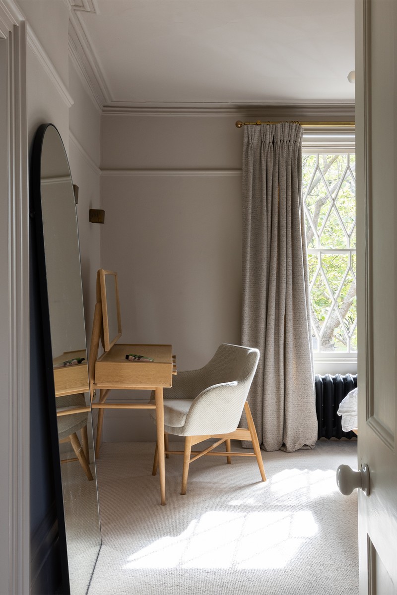
This beautiful room has a large window to the front, overlooking De Beauvoir Square. We removed the existing wardrobes and added an L-shape solution that wraps around the room. The shape was troublesome to add enough storage while also making room for the super king bed and vanity area. That’s why we set the bed into the wardrobes and arched the space above to add a sense of order. The clients opted for carpet in here, so we chose an extremely thick pile wool which feels so soft underfoot. Listed building consent was granted to add a doorway into the small shower room from the main bedroom to make this an en-suite.
Mirror: The White Company Chiltern Mirror
Wall lights: Lola Wall Lights
Vanity Chair: Roger Lewis Sintra Chair in Kvadrant Coda 2
Vanity Table: Ercol for John Lewis Shalstone Dressing Table
The Child’s Bedroom
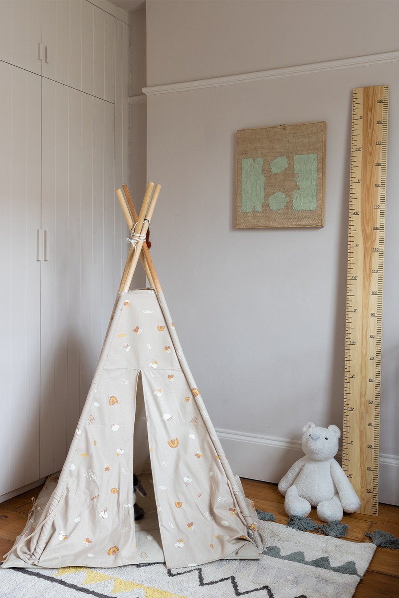
This is also on the first floor, to the rear of the property. It was initially designed to be a study and then the baby arrived. It has fitted wardrobes, sanded and treated original floorboards, and is decorated in a light, neutral palette. The paint colour is Little Greene’s ‘China Clay’.
Spare Bedrooms
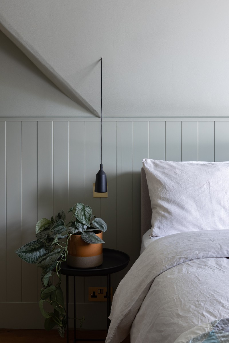
There are two further spare bedrooms on the top floor where we added panelling to match the original tongue and groove on the pitched roof in the loft. We went with darker moody colours up here to add warmth to the guest bedrooms.
Visit AllAndNxthing.com
DISCLAIMER: We endeavour to always credit the correct original source of every image we use. If you think a credit may be incorrect, please contact us at info@sheerluxe.com.
