Look Around This Quirky London Flat
The Property
The property in Academy Gardens, Kensington, was originally a part of the Queen Elizabeth College for Ladies. A Grade II-listed Neo-Georgian building, it was converted into apartments by a developer. Unfortunately, that conversion didn’t really do justice to the property, and while the apartment itself was in a perfectly liveable condition, it was clear there had been a bit of ‘copy and paste’ going on with regards to the specification of finishes and design choices. The apartment is split over two floors, with an open-plan living and dining room, a separate kitchen, a bedroom and a guest shower room leading off the entrance hall. On the upper floor, there is a desk/library area on the landing. Off that is the master suite and a child’s en-suite bedroom, as well as a small utility room. The renovation took approximately six months, in addition to any planning permissions, and was completed shortly before the summer.
The Brief
My client, her husband and their two children live in the property, but as the kids are in their teens and at school, and the family splits their time between London and Hong Kong, the home was designed with flexibility in mind. In practice, this means two permanent bedroom suites and a third snug/teenager’s bedroom/guest room. Apart from turning quite an uninviting and outdated apartment into a workable, timeless family home, my client wanted this apartment to feel like a London version of their Hong Kong home, which had also recently been renovated. While there was plenty of scope to interpret that brief, it did mean that the overall aesthetic was clean and contemporary.
The Colour Palette
When it came to selecting a colour palette, the client had a single (almost abstracted) image of some flowers and plants which she loved the look of. We decided to base all the colour choices on that one image, interpreting it where necessary. Unfortunately, the design of the building (being a former school building) didn’t provide large expansive windows, so rather than fight the light, we opted for a rather dark and dramatic colour palette on the joinery and furniture to add impact and, in a way, a bit of moodiness.
/https%3A%2F%2Fsw18.sheerluxe.com%2Fsites%2Fsheerluxe%2Ffiles%2Farticles%2F2022%2F10%2Fchristian-benseholland-park-house-tour-2.jpg?itok=r_eu90ew)
The Materials & Furniture
The client really had a love for detail, and while we didn’t want that to overcomplicate or interrupt the design, it did mean we opted for materials and finishes which had intrinsic depth. For example, velvets with a simple crosshatch, linens where you could see the weave, rugs that felt handmade, woods with interesting grains, and stone used throughout which had movement and life. The furniture trod a fine line of being suitable for both an English home and a very modern apartment. We opted for pieces that felt inspired by design classics, adding a sense of mid-century but without being obvious about it. The bulk of joinery was designed to be very simple and uncomplicated, which then meant we needed to amplify some of the period detailing to ensure we weren’t doing what the previous developers did and removing the soul from the building. We added beading to the walls, updated the traditional cornicing, and in certain areas we designed joinery to feel more traditional to act as a counter balance.
The Entrance Hall
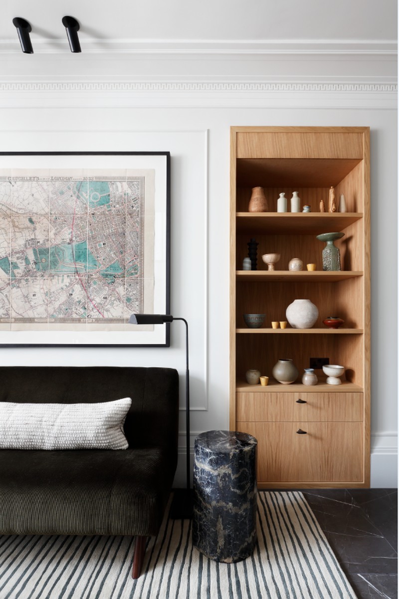
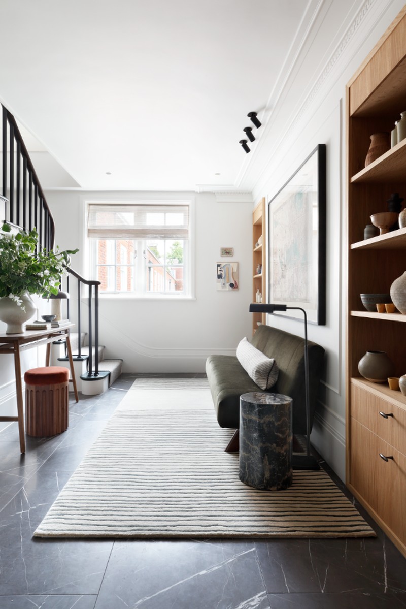
As an apartment, there are three other common lobbies that one needs to get through before reaching the front door, so I didn’t want to create a fourth. This room started as just that, a thoroughfare, with no real purpose, so we wanted to design it to look and feel like a living area.
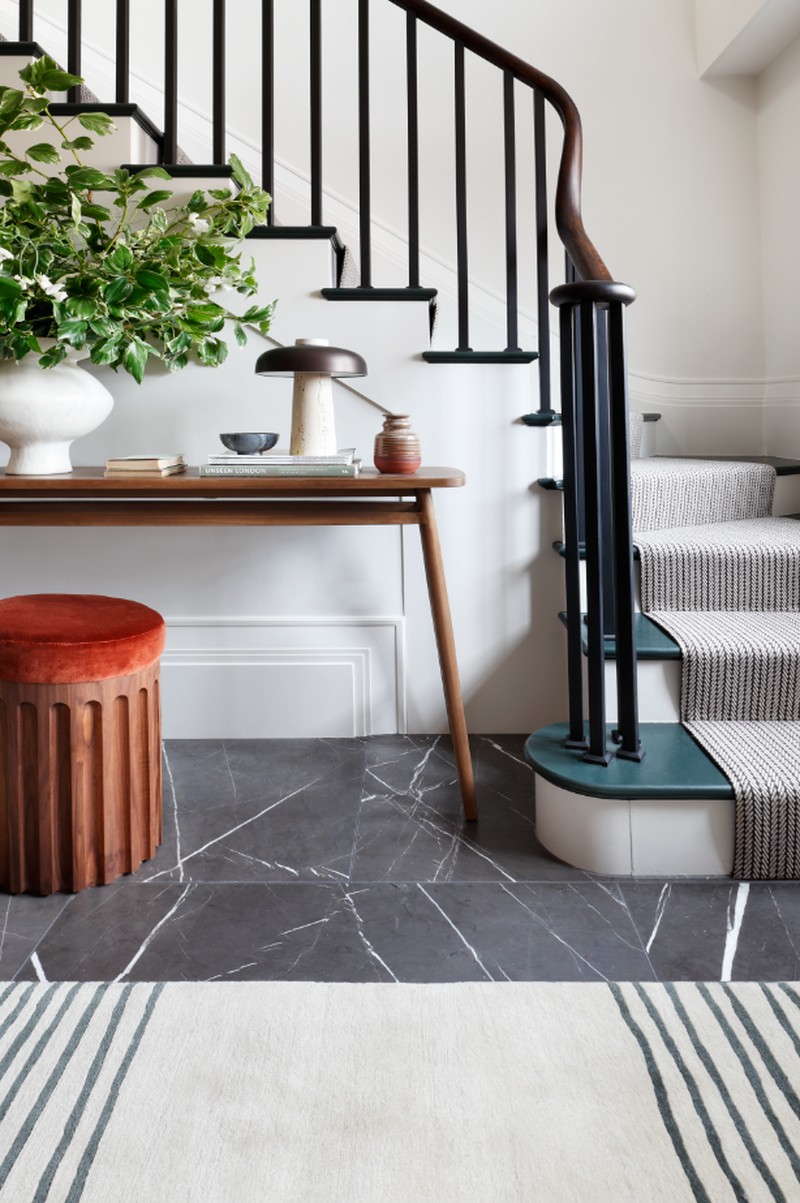
The retro-inspired bench is covered in Rose Uniacke corduroy – an example of selecting materials with depth – and sits on a bespoke striped rug from Amy Kent. Lamps and side tables make the room feel relaxing and a framed map of the area dating back to 1837 adds traditional flavour. We added interest through clever design elements – the timber joinery (for shoes in the drawers and my client’s ceramic selection on the shelves) brings warmth and provides storage solutions, and we swapped the existing cream stone floor for a dramatic black marble, adding in beading behind the sofa. On the staircase, we cut down the existing spindles to an appropriate height, and replaced the handrail for a dark stained oak. There’s also a new herringbone runner which feels contemporary and traditional at the same time.
/https%3A%2F%2Fsw18.sheerluxe.com%2Fsites%2Fsheerluxe%2Ffiles%2Farticles%2F2022%2F10%2Fchristian-benseholland-park-house-tour-5.png?itok=v-73gcAs)
The Dining Area
This space started as a huge L-shaped room which was actually too big, so I added in the timber room divider to form the back wall for the dining banquette seat, and it also created a separate room for the teenage son and his visiting guests. Fortunately, this actually worked with the beams dividing the ceiling, so the dining area still felt separate from the main living space.
That did mean we halved the living space, but the linear dining arrangement and the way we formatted the living room with joinery and a fireplace on either end meant we could comfortably seat eight people at the table, and have at least ten in the living room at any given time.
The dining table from Tom Faulkner with a stone top at the client’s request. The banquette is suede and there’s a mix of dining chairs, in timber and stained. The Howe pendant light leads your eye to the large brass framed mirror, which opens up the space, and we used wall lights for added mood. My aim was to ensure a large mix of materials, which allowed us to keep the forms quite simple, but prevented things from feeling flat.
/https%3A%2F%2Fsw18.sheerluxe.com%2Fsites%2Fsheerluxe%2Ffiles%2Farticles%2F2022%2F10%2Fchristian-benseholland-park-house-tour-6.jpg?itok=yHQKSJKR)
The Living Area
One of the biggest challenges here was the fireplace – it isn’t the right proportion for the room, but it couldn’t be changed, so the artwork above was chosen because it added a horizontal line. It’s from Emily Forgot via Partnership Editions. Joinery was added either side of the fireplace, along with the wall lights – the niches were originally mismatched, but made equal and raised off the floor. The traditional-looking TV joinery contrasts with the very contemporary bookshelves, and we added grasscloth wallpaper to the joinery doors to soften the look. Unfortunately, due to the building’s listing, the cornice (which was not the right size for the room) had to be retained, but was refitted to allow for a continuous curtain track. The curtains now work with the joinery and form a wall of curtains that help rationalise the odd-height windows.
This space needed to function as both reception room and TV room, so furniture was selected to look structured and tight, but it still needed to be relaxed and comfortable. In terms of fabrics, we went for mixed linens, velvet and bouclés. Twin coffee tables meant we could elongate the room slightly without it feeling stretched, and there are two bespoke poufs for extra seating and a PlayStation zone for the children.
We chose lots of lamps and lighting options to allow for various moods: floor lamps for reading, large table lamps for diffused lighting; and small lamps within the joinery to make things feel curated and collected.
The Kitchen
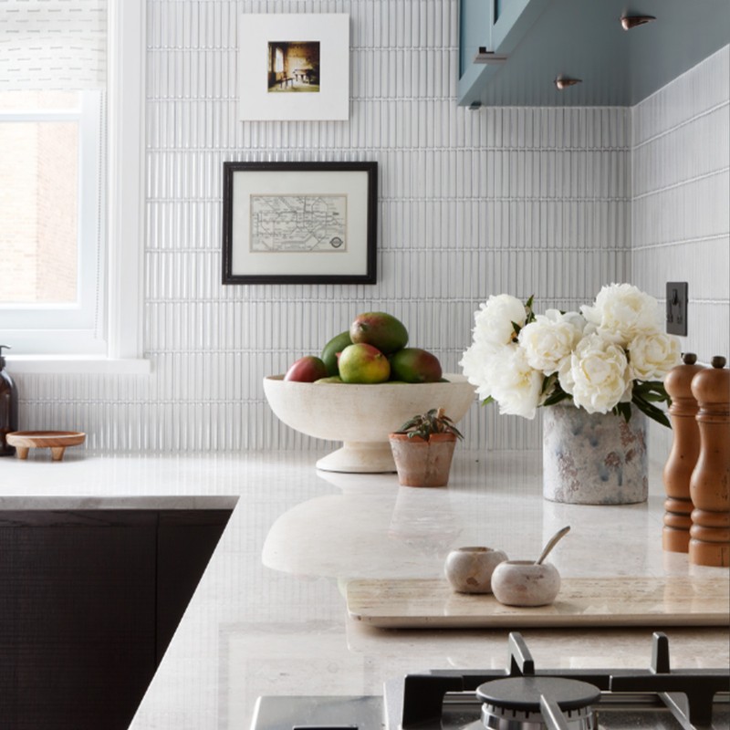
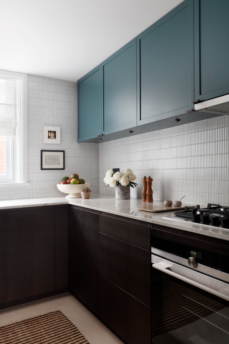
When we subdivided the open-plan area, a second door into the kitchen was blocked up, which allowed for a few extra units to be added into the galley-style kitchen. While the original plan was to try and retain most of the existing units, it became very apparent this wasn't going to be possible. The rest of the apartment is very obviously open plan, so it was important the kitchen felt warm and inviting, with as many different textures as possible. We kept the floors, which were an off-white marble, and opted to layer the off-white tones with the kit-kat wall tiles on the splashback.
The joinery is grain sawn oak, so nicely textural, and the worktops are warm marble with the green linking elements introduced by the simple shaker units. The roman blind fabric adds in a subtle hatch detail which is picked up in the fabrics used elsewhere.
/https%3A%2F%2Fsw18.sheerluxe.com%2Fsites%2Fsheerluxe%2Ffiles%2Farticles%2F2022%2F10%2Fchristian-benseholland-park-house-tour-8.jpg?itok=XATCBxzt)
The Main Bedroom
The client wanted the bedroom to feel like a calm retreat from the rest of the home, so we opted to wallpaper the entire space in a light blue herringbone linen, and introduce colour sparingly. The headboard is in a berry velvet, and is an ottoman style for extra storage. The mid-century side tables from Fiona Mcdonald keep things linked with the rest of the home, and the double wall lights and bedside lamps allow the room to take on different moods. Texture and pattern were added carefully, with the subtle checkerboard fabric on the scatter cushions (Soane) and the bespoke purple and grey striped bed blanket with a blanket stitch. The throw at the end of the bed is a vintage kilim from Morocco. The dressing table is leather wrapped from Ochre, with a shaped mirror in brass to break some of the clean lines.
The En-Suite Bathroom
No structural changes were made to the bedroom, but we did completely reconfigure the bathroom which previously had the most shocking layout. It meant moving the door by 30cm – a small tweak made the whole room useable. It also meant swapping bath and shower locations, creating a large timber double vanity with a heavy grain, and a shower enclosure with a small ‘kite’ mosaic. The bath now sits beneath a window which feels far more relaxing.
Bedroom Two
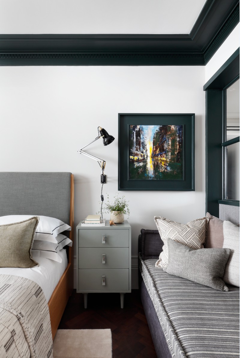
This room was previously the dining room and was born when we added in the room divider. The primary use is for my client’s teenage son or as a guest room when necessary. A simple electric roller bind pops down within the room divider to screen off this room when it’s in use. Otherwise, it’s mostly visible from the new open-plan dining and living room.
The brief from my client’s son was ‘grey’ which I admit was a little hard to navigate. With the addition of the dark green, now introduced in the cornice, the room still feels connected to the main living space, and layers of neutrals and greys created a monochromatic palette that easily passed for grey.
Sticking with the theme of picking materials with interest, there are lots of subtle textures here: marble-based lamps, a desk with a leather inlay, a distressed frame, blanket stitching on the pillows, carved rugs and woven curtains. We added in a day bed that sits directly parallel with the room divider, allowing for additional seating or sleeping within.
Bedroom Three
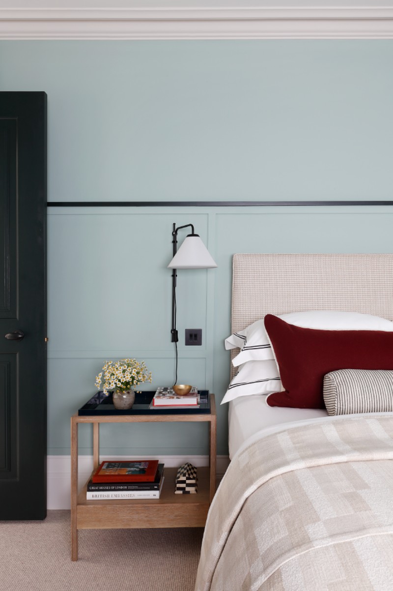
This is a room for the youngest member of the family, so we wanted to make the space transitional. Their daughter wanted a vibrant hotel-inspired room, so we took cues from the Hoxton, but neatened it up. While the layout stayed the same, I added in the wall panelling to zone the space and used lacquered side tables from The Lacquer Company. This room also has a day bed for overnight guests.
The En-Suite Bathroom
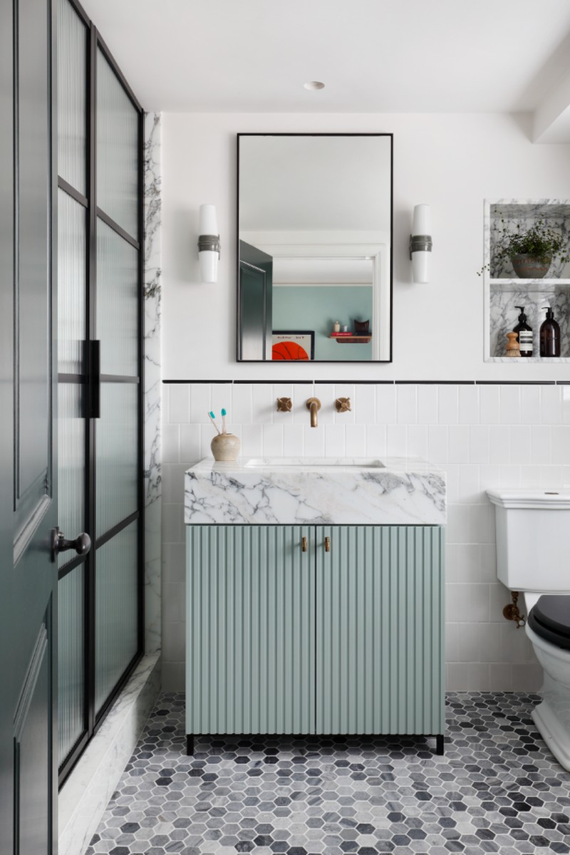
The bathroom was a complete overhaul. The blue in the reeded vanity unit adds to the flow of the space and a pencil edge marries with the detail on the headboard wall. We also contrasted a heavy grained marble and small hexagon mosaics on the floor, to add detail and interest.
Visit ChristianBense.com for more information.
DISCLAIMER: We endeavour to always credit the correct original source of every image we use. If you think a credit may be incorrect, please contact us at info@sheerluxe.com.
