A Look Around This New-Build Family Home
The Property
This new build property is in Hampstead, close to the heath. The site has been in our client’s family for over 40 years. The architect firm Chris Snow was appointed to design a new home on the existing site which would cater to the needs of the family, which includes multiple generations living together. The property is unique in many ways, with a neo-Georgian exterior constructed in line with the regulations of the borough, and an interior that’s surprisingly contemporary in style. There are eight bedrooms in total, occupied by two brothers and their families, as well as their parents, all of whom divide their time between Nairobi and London.
/https%3A%2F%2Fsw18.sheerluxe.com%2Fsites%2Fsheerluxe%2Ffiles%2Farticles%2F2022%2F09%2Fdining-area_0.png?itok=ALSYBHQa)
The Brief
Our clients were keen to avoid ending up with a home that felt too ‘designed’ and therefore sterile. At Frank & Faber we always take a personalised approach to try and bring the client’s personality to life, listening to and understanding their needs and lifestyle, rather than enforcing a pre-defined aesthetic. Our clients are of Indian descent and have a real passion for travel. They were very keen to have a home that, while very reflective of its geographical setting, mirrored their international heritage. They are passionate about history and the heritage of the pieces they own, so they wanted to design a home filled with unique, special pieces that all had an interesting back story.
The interiors are a mix of classic and contemporary. Specifically, classic materials including marble, timber and stone are executed in contemporary details like full-height pocket doors and joinery. These natural materials in the base finishes, furniture and lighting bring an innate warmth and sense of wellbeing to the various spaces. The elegant window drapes add softness and the subtle colour palette is informed by the surrounding gardens and neighbouring Hampstead Heath. Free-standing furniture and accessories blend bespoke designs with contemporary, vintage and antiques, all sourced from a range of international suppliers selected for their provenance and connection to our clients (as well as the aesthetics).
/https%3A%2F%2Fsw18.sheerluxe.com%2Fsites%2Fsheerluxe%2Ffiles%2Farticles%2F2022%2F09%2Fdining-and-living-area.png?itok=is6yyJP7)
The Living/Dining Room
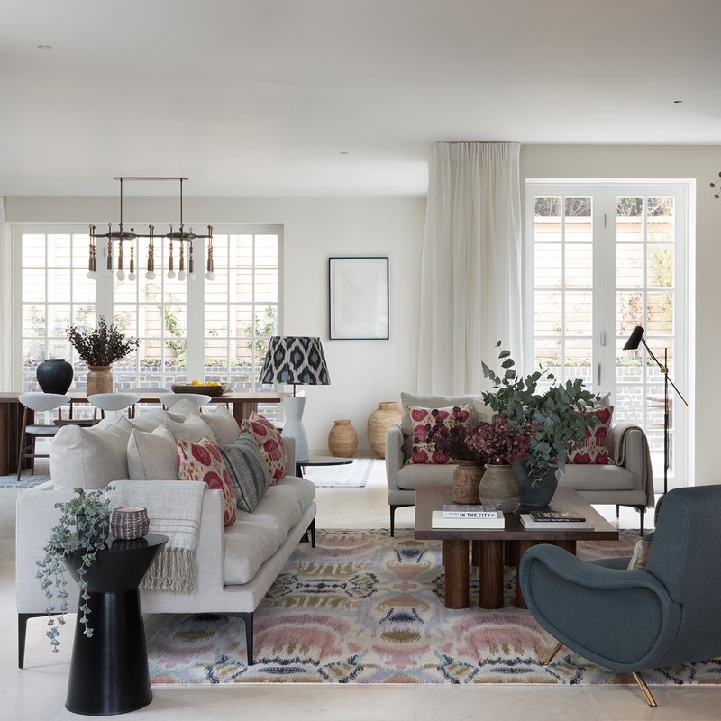
The ground floor is open plan and full of natural light. We wanted to retain the sense of open-plan living with a largely neutral colour palette, which is further enhanced by the soft furnishings, art and accessories.
We intentionally chose a very simple, neutral linen (very close to the colour of the walls) for the curtains, so they were soft without being overpowering. The rug was one of the first pieces we chose – we totally fell in love with the ikat design and modified the colours slightly to suit the scheme. The clients were concerned it might be too bold but we knew it would balance the neutrals and work well with the mix of cushions. All the cushions are bespoke designs and we chose a mix of ikats and bold geometric prints, balanced with plains, to bring the space to life.
We kept the downlights to a minimum, instead relying on floor and table lamps – which were also decorative accents in their own right. The dining table was sourced from an independent retailer via 1st Dibs and the feature pendant light over the table frames the space. Sourced from the American brand Apparatus Studio, it features a beautiful mix of bronze and brass and natural stone beads. The bespoke joinery is designed with sliding doors to conceal the TV and, finally, we used a fabric wall finish to add softness.
The Hallway
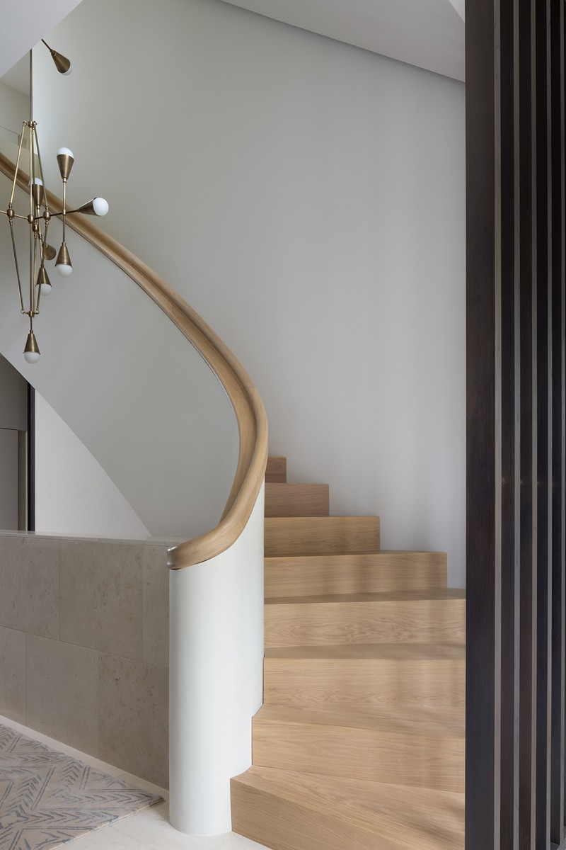
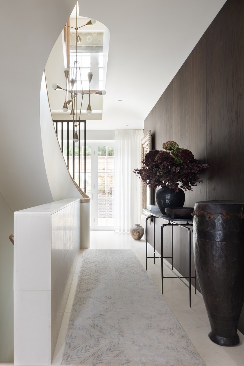
The stone flooring was consistent throughout the ground floor; it’s a beautiful Portland stone with subtle variation, providing a simple, elegant and natural backdrop. The timber panelling is a fumed oak, selected by Chris Snow, and again it’s used consistently throughout the property. The pendant light was a critical decision – we wanted a fitting which would reflect the palette of warm, aged metallics and still have a bit of wow factor without being overpowering. This piece was also by Apparatus Studio but it was adapted to suit our space. The console table is a beautiful cast bronze design by Willer.
The Downstairs Loo
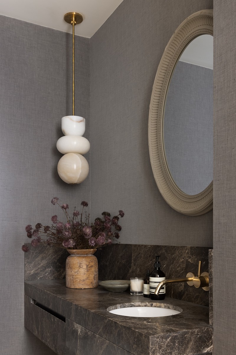
The marble here is a stunning grey marble – it also features in the main bathroom and on the fireplace for consistency. We wanted to bring a feeling of softness and luxury to these compact spaces, so again we chose a fabric wall finish. The light by Allied Maker is a mix of alabaster and aged brass, and the result is a truly stunning, sculptural piece. Alabaster is another material we used repeatedly and features in several light fittings throughout the house.
/https%3A%2F%2Fsw18.sheerluxe.com%2Fsites%2Fsheerluxe%2Ffiles%2Farticles%2F2022%2F09%2Fingram-ave-8.png?itok=iKxDeYnw)
The Snug
The snug is open plan to the rest of the ground floor – which is why the base finishes are consistent, as are the curtains. The bespoke marble fireplace (designed by Chris Snow) is the focal point, with a beautiful asymmetric design, once again using the grey toned marble that we used elsewhere. The thick Berber rug adds softness, and it’s accompanied by an antique Indian grinder table. We sourced so many beautiful lamps for this project and the floor lamp in the snug is one such example. From Porta Romana, it’s a beautiful carved bronze base with a simple linen shade.
/https%3A%2F%2Fsw18.sheerluxe.com%2Fsites%2Fsheerluxe%2Ffiles%2Farticles%2F2022%2F09%2Fbedroom-one_0.png?itok=m8gzglsq)
The First Bedroom
Our clients wanted this bedroom be completely calm. The bed and headboard by Pinch are upholstered in a natural linen and accompanied by an aged, washed timber in the drawers and antique mirror. There’s a gentle, colourful mix of ikats and Indian fabrics on the soft furnishings and the rug is a beautifully subtle piece from Tufenkian. Once again, I love the floor lamp’s natural cane base and the ikat lampshades on the ceramic table lamp bases.
The Second Bedroom
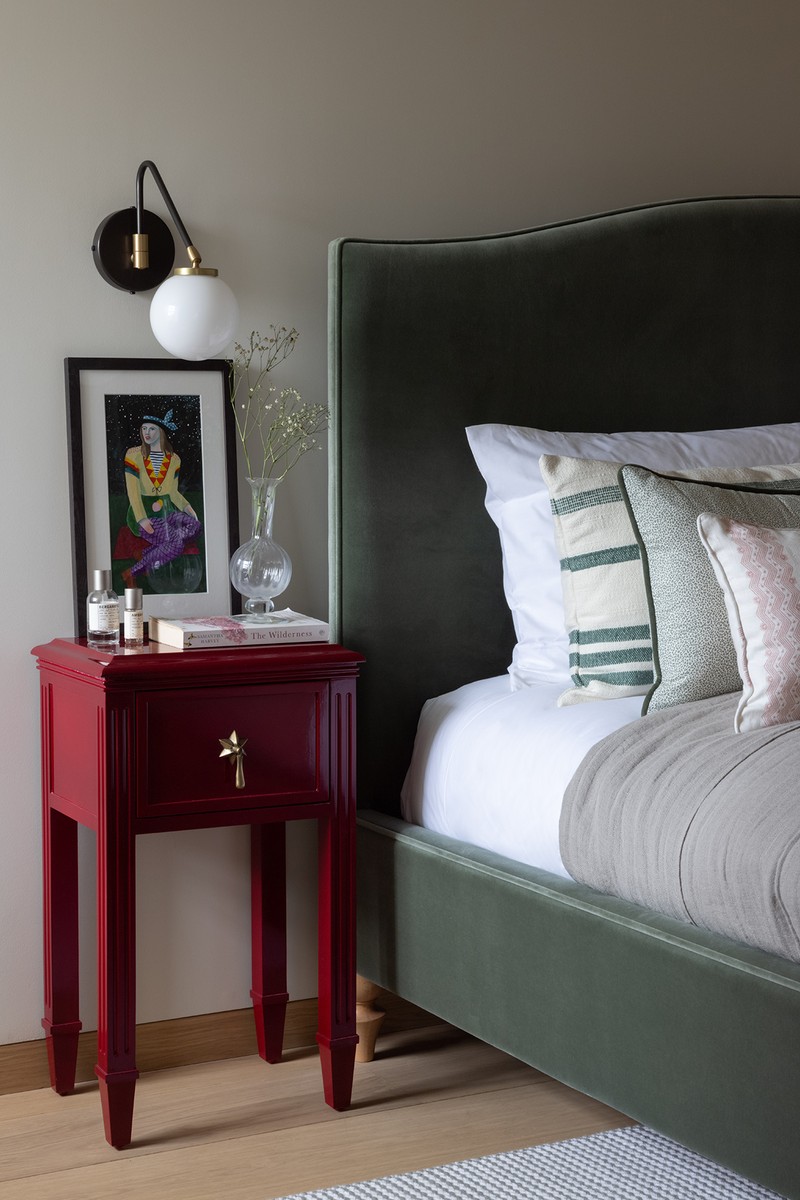
A soft, feminine colour palette is a bit more fun for this little girl’s room. The soft green velvet headboard is complemented by a red gloss side table from Trove and the fabric on the armchair is from Carolina Irving.
Bathroom
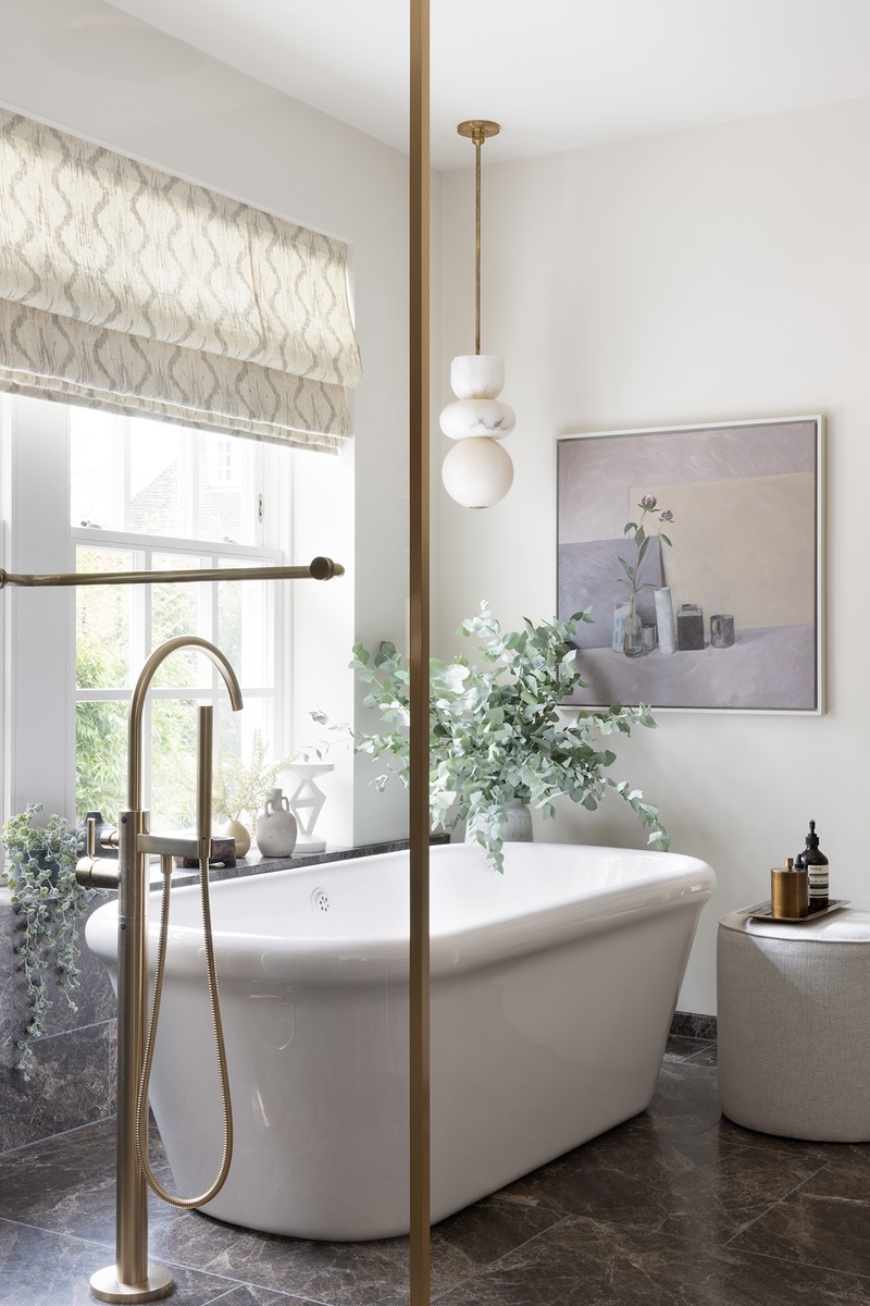
The design for the bathrooms is intentionally elegant and simple. The same grey marble is the dominant material across the floors, walls and bespoke vanity units, while the stunning (and comfortable) bath by Waterworks sits underneath the window. The pendant light is the Alabaster Totem by Allied Maker and the fabric and sheer window treatments, upholstered pouffe, choice of artwork and plants really soften the space. The artwork is by William Packer from Kittoe Contemporary.
/https%3A%2F%2Fsw18.sheerluxe.com%2Fsites%2Fsheerluxe%2Ffiles%2Farticles%2F2022%2F09%2Fbasement-1.png?itok=DwHJfHkf)
The Basement
The basement floor is also open plan and comprises a TV room, snug area and study. We wanted to create a sense of separation within the space without breaking up the volumes. This was achieved through bespoke joinery and a soft voile curtain. The joinery unit, designed by Frank & Faber, consists of smoke oak, brass and bronze details. It provides functional storage as well as display room for a selection of ceramics and artefacts which were sourced locally and internationally from a range of suppliers. The joinery has worked brilliantly at delineating the TV zone from the study zone.
There is abundant light in the basement thanks to the lightwells which Chris Snow used to permeate the structure and bring in natural daylight from above. Fixtures and fittings once again mix contemporary and traditional – a favourite being the beautiful and unique antique Persian rug, which really brings the colours of the upholstery and soft furnishings together.
Visit FrankAndFaber.co.uk & ChrisSnowArchitects.com
Photography by Paul Craig
DISCLAIMER: We endeavour to always credit the correct original source of every image we use. If you think a credit may be incorrect, please contact us at info@sheerluxe.com.
