

How This Interior Designer Created A Warm & Welcoming Family Home
All products on this page have been selected by our editorial team, however we may make commission on some products.
The Property
The property is a late Victorian terraced house in southwest London which the clients had already been living in for years. It had four bedrooms and the growing family were trying to decide whether to move elsewhere or to do a total gut job. We did a full renovation project, creating extensions into the loft to create more bedrooms, out into the garden for a larger kitchen and pushed back further in the basement to include another bedroom and a large family living space and utility room. We ended up with six bedrooms and a house that worked much better for them.
The Brief
My brief was to create a fun and colourful family house while maintaining function and form – it was important that each space worked as hard as possible. The clients are keen art collectors, so art played a big part in the design direction of each room. It’s always great when a client loves art, as it’s a good starting point in a scheme. They also had lots of existing interesting furniture and lighting which we repurposed around the project.
The colour palette was bold blues on the woodwork, softer colours on some of the walls to allow for a nice neutral backdrop for the art, and then plenty of wild and wonderful wallpapers. The clients did not shy away from bold patterns and bright colours, which made it a really fun project to work on.
TAKE THE TOUR
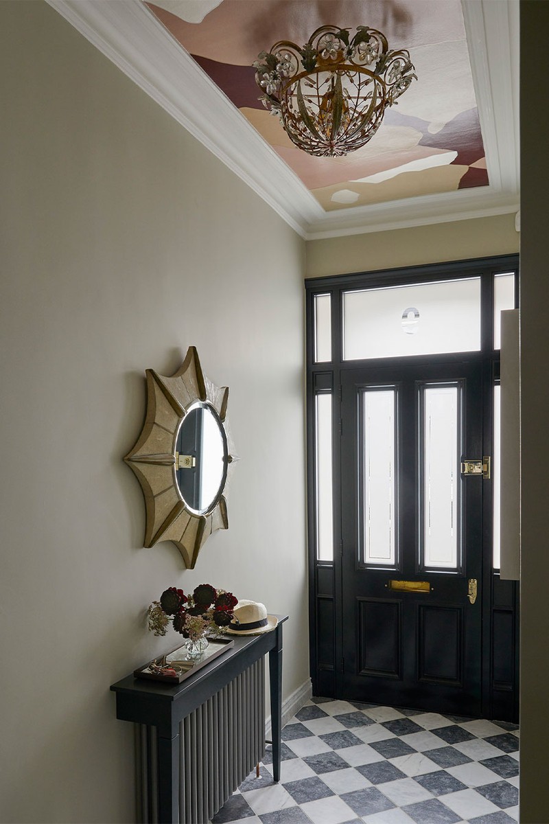
The Hallway
The original plan was to do a bold and colourful wallpaper in the hallway but as the project went on the clients decided they wanted to keep this a more neutral space and let the lovely marble chequerboard floor speak for itself. However, towards the end of the project, we all agreed it needed something more, so we went for the amazing panel on the ceiling to give it that wow factor.
Floor: Aliseo Marble & Minton Marble, both Artisans of Devizes
Wallpaper on ceiling: Fromental
Mirror & ceiling light, clients own
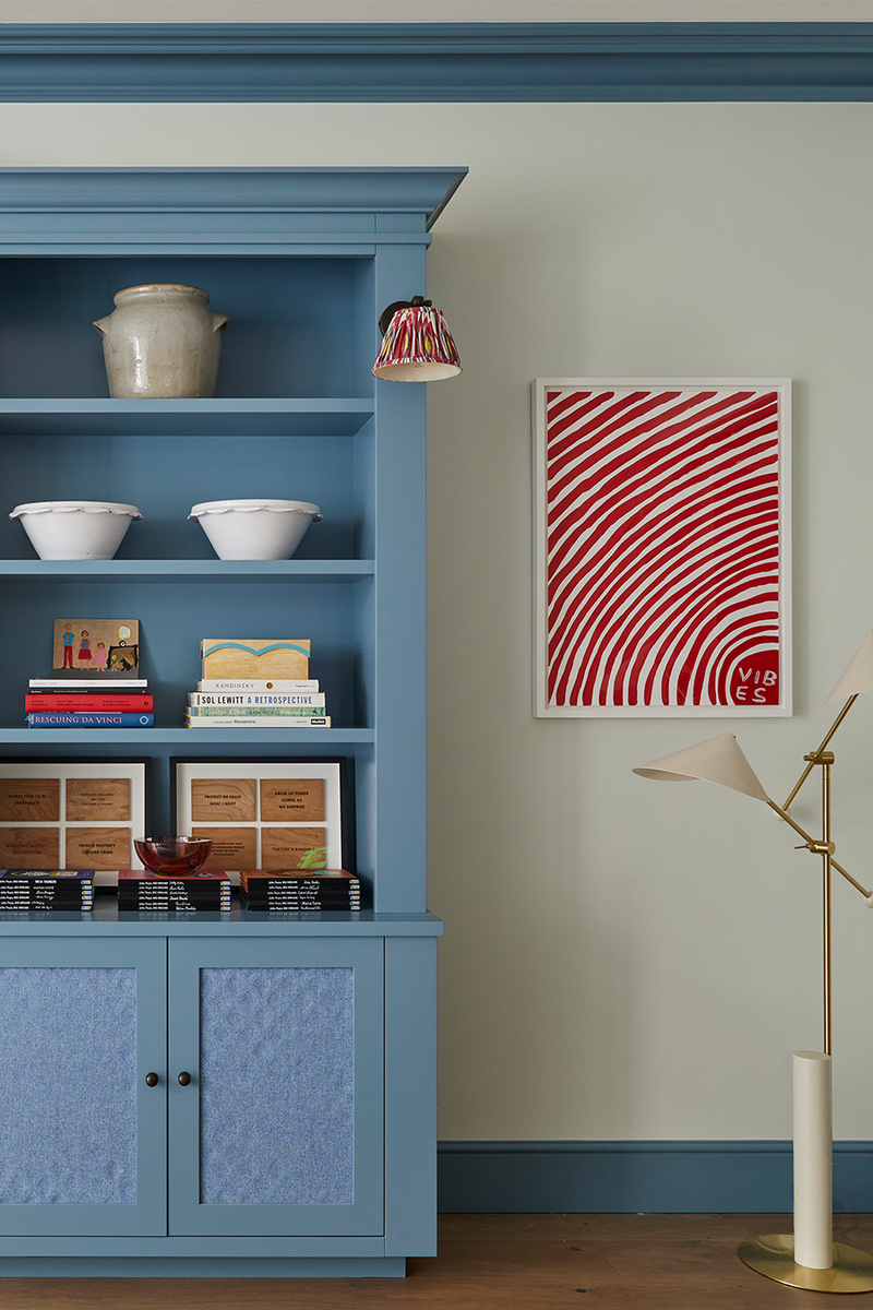
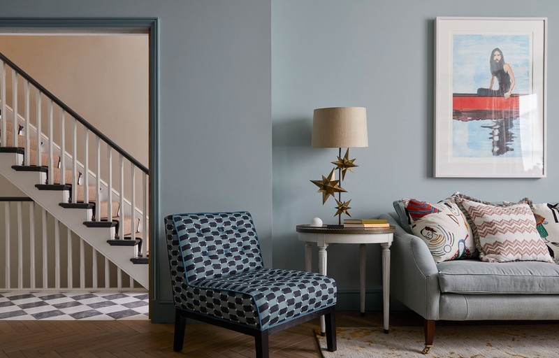
The Drawing Room
This was originally a rather unloved room, so we opened up the doorway from the hall to make it more welcoming and cut off the walk through into the kitchen to stop it becoming a dumping ground. The scheme started with the client’s existing curtains which she wanted to re-use but the silk on the edges was slightly perishing, so I added the striped edges and track to add a more contemporary edge.
We used lots of the clients’ favourite existing pieces of furniture in here, including the chairs in the window and the chair by the door, all of which we recovered. They already had the side tables but weren’t that keen on using them as they were dark mahogany, so we had them limed (a wood treatment) to give them a new lease of life and soften them for our scheme.
The client chose the ceiling lights; they are more contemporary than I would have gone for, but I think they work well in the space. We were keen to make this room special – as the existing fire surround was not that interesting, we removed this (and used it in the garden) and replaced it with a beautiful design from Chesneys in bold Pele Tigre marble. We decided to do blue on the walls and woodwork in here to create a calming feel, and I also think blue works well as a backdrop for art.
Sofa: David Seyfried
Console: Julian Chicester
Ceiling lights: Catellani & Smith
Fire surround: Chesneys
Walls: Ethereal Blue, Edward Bulmer
Woodwork: Oval Room Blue, Farrow & Blue
Rug, coffee table, chairs in window, chair by door & tables, all clients own
/https%3A%2F%2Fsw18.sheerluxe.com%2Fsites%2Fsheerluxe%2Ffiles%2Farticles%2F2025%2F04%2Fsl-olivia-emery-drawing-room.jpg)
The Kitchen
This originally had a smaller footprint, and we pushed out into the garden to give the kitchen more space and allow for a seating area, with sets of bespoke garden doors. We went back and forth as to where the dining table should be and ended up creating a bespoke seating nook along the side wall which felt like the best use of space.
The client wanted a large central island, and we even found space for a small pantry in what used to be the unused walkway into the drawing room. I worked alongside Devol kitchens to create this kitchen using bold work tops (San Simone Quartzite on the main run and copper on the island); we also opted for a dark island to contrast against the lighter units along the side to give it that lovely contrast.
/https%3A%2F%2Fsw18.sheerluxe.com%2Fsites%2Fsheerluxe%2Ffiles%2Farticles%2F2025%2F04%2Fsl-olivia-emery-kitchen-2-fb.jpg)
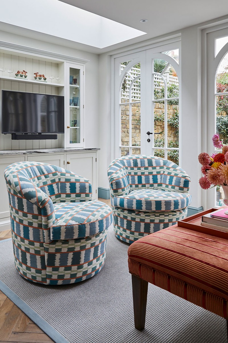
For the TV area, we used swivel chairs so that they could function as space for guests to enjoy pre-dinner drinks facing the sofa and then could be swivelled around to the bespoke TV unit on the opposite wall. We carried the same colour of woodwork into here from the drawing room, but painted the walls in a crisp clean white for more of a utilitarian vibe.
Banquette: bespoke in Colefax & Fowler & Kirkby Design
Dining chairs: OKA
Kitchen: Devol
Swivel chairs: Charlotte James covered in Christopher Farr
Wall lights: Visual Comfort
Walls: Steam, Benjamin Moore
The Garden
As mentioned before, we used the fireplace that was originally in the drawing room to create this outdoor fireplace seating area. We had the original seat cushions on the sofa recovered in an outdoor fabric to bring some pattern into the space, and added a couple of ceramic drum stools in black and white stripe to bring the colour of the kitchen worktop out here.
Garden furniture: Neptune in Christopher Farr
Stools: OKA
/https%3A%2F%2Fsw18.sheerluxe.com%2Fsites%2Fsheerluxe%2Ffiles%2Farticles%2F2025%2F04%2Fsl-olivia-emery-garden-sl.jpg)
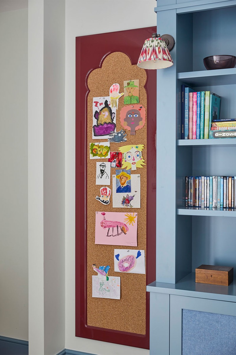
The Basement TV Room
This room was all new space that we had dug down into, and the room needed to function as a playroom for the clients’ three children as well as a cinema/TV room when friends came over. I designed this sofa with David Seyfried, so the coffee table sections could either work as a coffee table or if butted up against the sofa you could put your feet up like a chaise sofa. We used very durable fabric to allow for the high usage.
We stuck with the blue theme on the walls in here but lighter than upstairs as there’s less light down here. Because the ceilings are so high, I used a dark wood colour to bring the ceiling down a bit. We designed a bespoke TV unit for books, toys and specialist AV fabric on the doors for all of the equipment to be housed within. The client wanted a craft area for her girls, so we dedicated one end of the room to this and I designed a large pinboard to display their work in style.
Sofa: David Seyfried
Rug: Ikea
Bespoke joinery: Lethbridge Lines
Cushions: Andrew Martin
Walls: Pavilion Blue, Farrow & Ball
Woodwork & joinery: West Coast, Benjamin Moore
The Guest Bedroom
This basement guest bedroom has nice high ceilings, so we went for a tall bold velvet headboard and used the curtain stripe fabric horizontally to widen the window space rather than add to feel of the ceiling height. The end of bed stool and side tables belonged to the client and we added the table lamps and bedspread with a bit of pink to soften the space.
Curtain fabric: Ian Mankin
Bedspread: OKA
Table lamps: Pooky
/https%3A%2F%2Fsw18.sheerluxe.com%2Fsites%2Fsheerluxe%2Ffiles%2Farticles%2F2025%2F04%2Fsl-olivia-emery-guest-room-1.jpg)
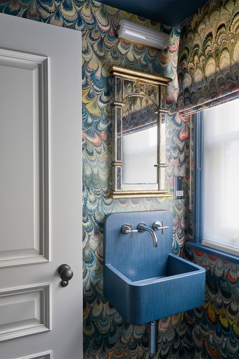
The Guest WC
The client was very keen to use this wallpaper in the project, so we created a decadent guest WC and used the same pattern on the roman blind to cocoon the space. The blue sink, woodwork and ceiling colour were a nice bold contrast to the wallpaper.
Wallpaper: Wallpaper, Beata Heauman
Fabric: Beata Heauman
Basin: Kast
Paint colour: Stiffkey Blue, Farrow & Ball
The Master Bedroom & The Family Bathroom
The Master bedroom
We wanted to use some chinoiserie style wallpaper to create a lovely boudoir feel to the master bedroom but the hand painted ones were not within budget, so we used this printed version from Coordonné. The client’s own lacquer desk worked brilliantly in the window, which can double up as a working from home space or a dressing table. We used a soft pink herringbone linen for the curtains and added a brush fringe along the leading edges to create a nice contrast against the darker wallpaper.
Curtain fabric: Sarah Hardaker with trim, Paolo Moschino
Wallpaper: Coordonné
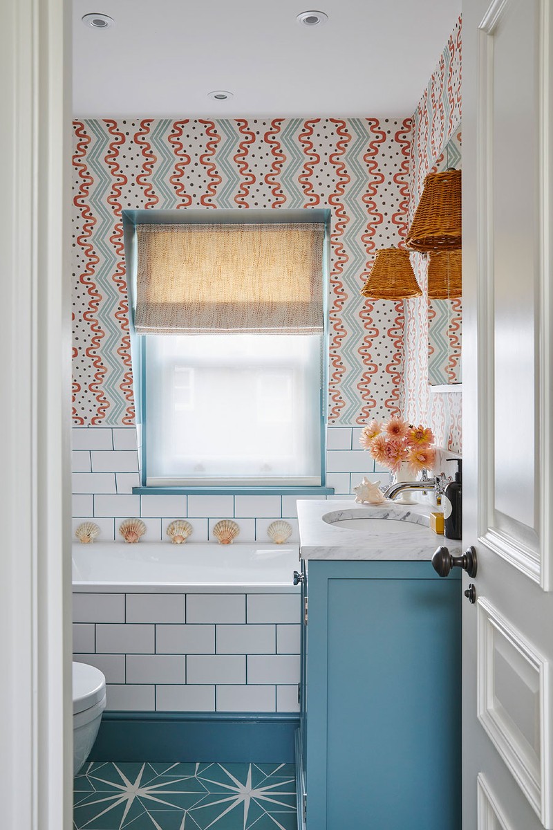
The Family Bathroom
This was fun to design as although small, we wanted it to be bold and colourful. The wallpaper was the first decision and the rest of it followed. We went for some good value tiles but by using a turquoise grouting, we elevated them in the space. The star floor tiles were a firm favourite from the start.
Wallpaper: Ottoline
Floor tiles: Artisans of Devizes
Wall tiles: Artisans of Devizes
The Study
We designed a big wall of joinery with a built-in desk for the study, with a space for air con within it. As the husband was going to predominantly use this room, we went for quite a masculine colour scheme with blue walls and even darker woodwork. We included a sofa bed too for guest overspill at busy times.
Bespoke joinery: Lethbridge Lines
Desk light: Original BTC
Sofabed: Sofa.com
/https%3A%2F%2Fsw18.sheerluxe.com%2Fsites%2Fsheerluxe%2Ffiles%2Farticles%2F2025%2F04%2Fsl-olivia-emery-study-sl.jpg)
Visit OLIVIAEMERY.COM
DISCLAIMER: We endeavour to always credit the correct original source of every image we use. If you think a credit may be incorrect, please contact us at info@sheerluxe.com.
/https%3A%2F%2Fsw18.sheerluxe.com%2Fsites%2Fsheerluxe%2Ffiles%2Fwebsite-images%2F2025%2F03%2Fsign-up-pop-up.jpg)
