An Exclusive Tour Of This Stylish London Flat
The Property
The flat comprises the ground and lower-ground floors of a grand terraced house on a square in south-west London. Built in the mid 19th century, the flat is Grade II listed, so we had to work closely with English Heritage and the local council.
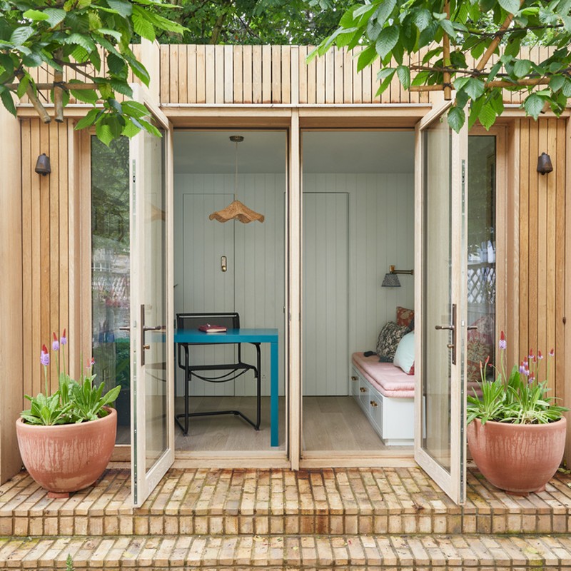
A double drawing room and dining room are on the ground floor off the entrance hall. There’s a galley kitchen at the back of the house with direct access into the garden. Then there are two bedrooms and a bathroom on the lower ground floor. We wanted to increase the footprint of the lower ground floor to allow for a more spacious main bedroom and a separate dressing area. The garden is very generous for a London terraced house, and we obtained planning permission for a garden room at the end to house a separate home office, storage room and bathroom.
The Brief
Our client is incredibly creative, and she wanted somewhere to escape her busy work life, relax with friends, entertain. We wanted to make sure the design was elegant and not too tied to current trends – but with a few unexpected elements as well. When designing for a city home, we always want to maximise the space and make sure all storage opportunities are taken full advantage of.
The Hallway
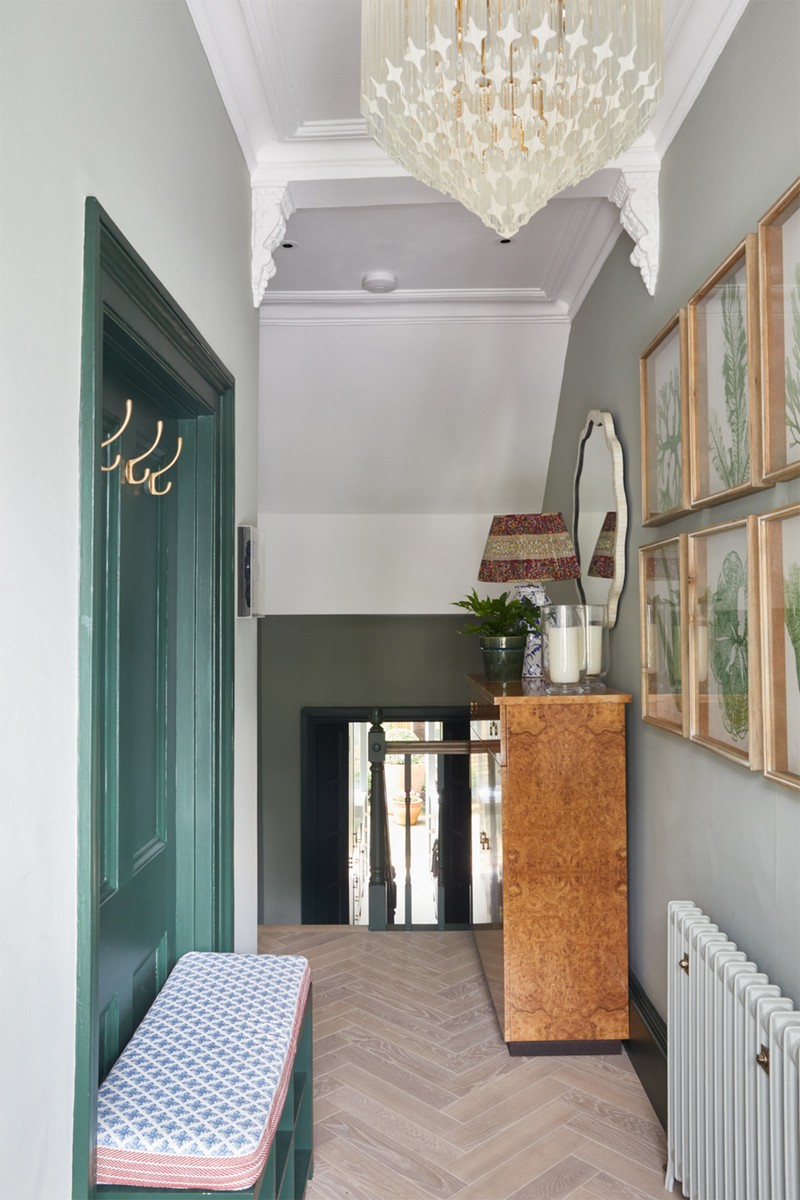
The doorway into the living room that we wanted to block off had to be kept according to the Grade II listing, so we decided to make use of the slight recess as a coat-hanging area and small bench. We then wanted to draw focus to a piece of furniture (otherwise hallways just get lost as a transition space). We designed a piece from burr walnut with internal shelves for specific shoe heights and a large drawer at the top. Pale oak herringbone flooring was matched with Farrow & Ball Cromarty on the walls and Fired Earth Malachite on the woodwork. The lamp is by Penny Morrison and the shade is by Vaughan.
The Living Room
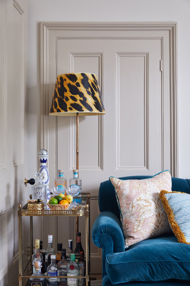
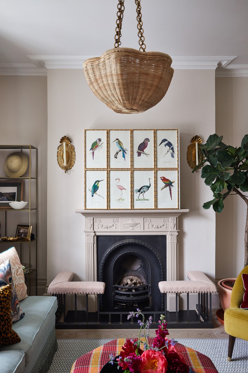
Our main concern was making this a room to relax in, as well as somewhere to entertain friends and enjoy cocktails. We housed the television in a unit above the fireplace, with eight framed bird prints in gilt bamboo frames mounted onto the doors. The doors bifold back to reveal the TV, which means there isn’t a massive black rectangle left when it’s off. We used velvets, linens and soft weaves on the upholstery, as well as an eclectic mix of patterns on the cushions. A fuchsia tartan on the ottoman nodded to the client’s love of Scotland. There’s also a shell floor lamp from Nicky Haslam, sofas from George Smith, a rattan pendant light by Soane Britain, and an animal print shade hand-painted by Hutley & Humm.
/https%3A%2F%2Fsw18.sheerluxe.com%2Fsites%2Fsheerluxe%2Ffiles%2Farticles%2F2022%2F04%2Fsl-house-tour-hutley-humm-dining-room.jpg?itok=TMT76qgu)
The Dining Room
This room includes a bespoke table that extends from circular to oval, and the colours continue from the living room. It’s an open space but has its own identity. Lacquer furniture helps to bounce the light around the space. The pendant is by Beata Heuman and the sideboard is from Chelsea Textiles.
The Kitchen
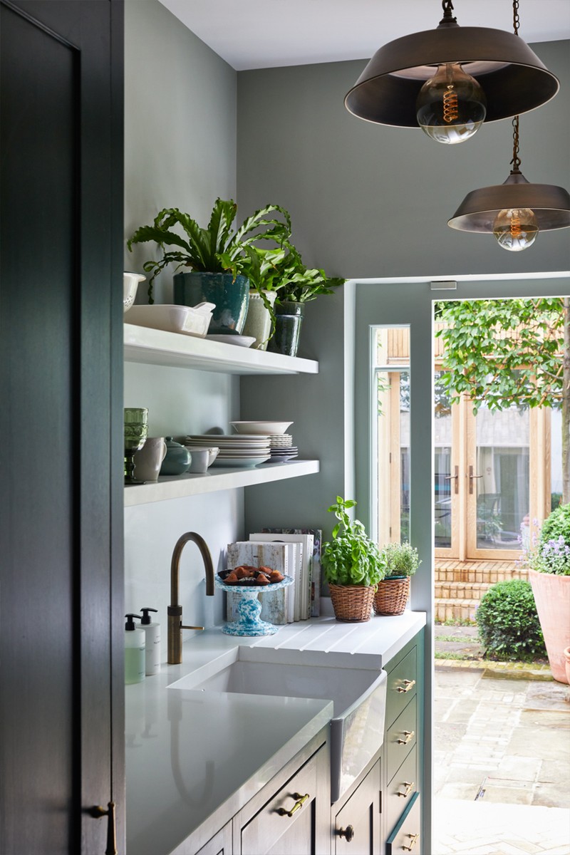
We used open shelving to help the kitchen feel more spacious, while a white composite top will better withstand spillages and offers a sharp, bright contrast against the darker units. The units are British Standard by Plain English, painted in Fired Earth Malachite, while the pendant is from Jim Lawrence.
The Downstairs Cloakroom
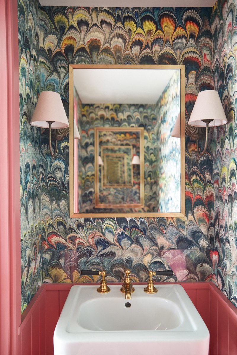
We wanted the downstairs loo to be an unexpected surprise – there are two mirrors above the sink and toilet so you get a never-ending repeat reflection, which emphasises the marble effect wallpaper. The brass taps and sink are by The Water Monopoly, the wallpaper by Beata Heuman, and the lights by Jim Lawrence.
/https%3A%2F%2Fsw18.sheerluxe.com%2Fsites%2Fsheerluxe%2Ffiles%2Farticles%2F2022%2F04%2Fsl-house-tour-hutley-humm-garden-room.gif?itok=5aE1YU2y)
The Garden Room
We wanted the garden room to have space to work, storage solutions and somewhere for a friend to stay. The daybed was built into the space with a mattress-style cushion so it could be slept on, and the storage drawers underneath were a must. The desk is in an L-shape and returns in front of the window to make the most of the garden view. Tongue and groove panelling adds warmth and we used a combination of turquoises and pinks in the cushion fabrics, as well as a Pooky wall light.
/https%3A%2F%2Fsw18.sheerluxe.com%2Fsites%2Fsheerluxe%2Ffiles%2Farticles%2F2022%2F04%2Fsl-house-tour-hutley-humm-main-bedroom-01.jpg?itok=pPJ0HdzJ)
The Main Bedroom
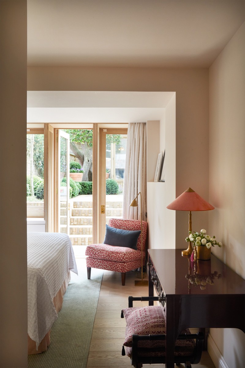
With doors opening onto the garden, this room is airy and light – despite being on the lower ground floor. We kept the walls and curtains light and used a deep damson-coloured velvet on the headboard. We had the dressing table sprayed in a burgundy lacquer, while the dressing room uses high-gloss joinery in a bright crimson. We also used the Bow Handles by Beata Heuman.
The Bathroom
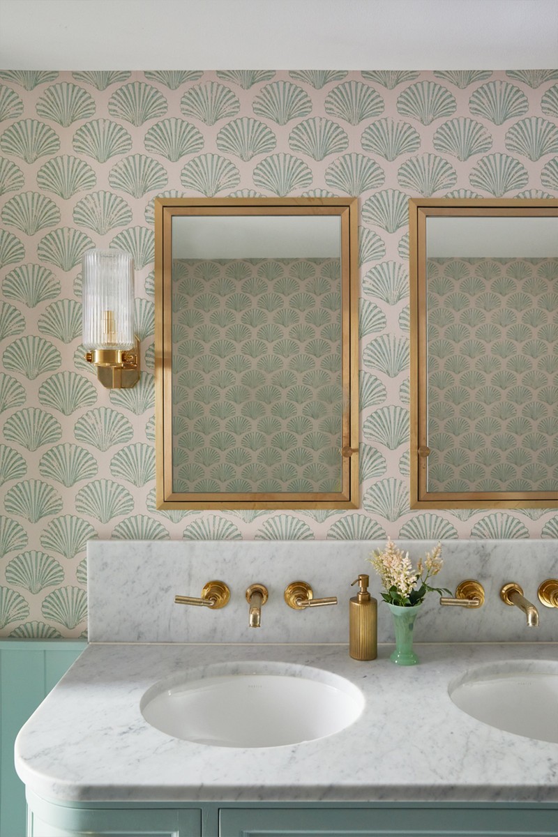
Our client wanted the bathroom to be somewhere she could unwind, which is why we wanted it to feel like she was spending time in a beautiful hotel suite. The calming colour palette of soft green and pale pink with the brass fittings are what elevate it. We added panelling to the lower walls, painted in Farrow & Ball Teresa’s Green with Barneby Gates Shell wallpaper above. We also used Zellige tiles from Mosaic Factory, an amazing company, as they have so many specialist trim tiles with which to create niches and finish edges. The flooring was a marble tile that tied in with the marble worktop from Porter.
The Guest Bedroom
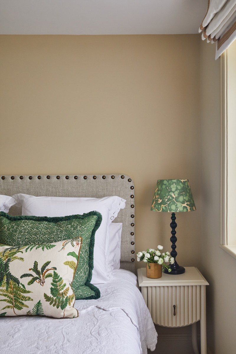
Making the most of a warm and neutral colour palette, the walls are painted in Farrow & Ball Slipper Satin. We designed the room to have lots of flexibility for future in case the situation changes. A simple linen headboard with oversized nail heads is complemented by a Schumacher tropical leaf print on one of the cushions. The bedside tables by Trove are the perfect finishing touch.
Visit Hutley-Humm.com & Follow @HutleyHumm
Photography: Helen Cathcart
DISCLAIMER: We endeavour to always credit the correct original source of every image we use. If you think a credit may be incorrect, please contact us at info@sheerluxe.com.
