English Country Meets French Elegance In This Picture-Perfect Home
The Property
This French home just outside Paris has gone from being an overlooked property into a vibrant, character-filled family residence. The project was a complete overhaul and involved a full renovation to better suit modern family life. Over the course of 18 months, we worked closely with the young family to reimagine the space, creating a home that reflected their lifestyle while bringing charm, warmth, and individuality to every room.
The Brief
The owners wanted a home that felt entirely their own. They found the right property in the perfect location but it required a full renovation, offering the ideal opportunity to create something personal from the ground up.
From the outset, they were drawn to pieces with craft and character. The brief was clear: avoid anything that felt overly decorated or designed. Instead, they wanted the space to feel collected and lived-in, a family home layered with objects, antiques, and personal artwork that carried meaning and aged well over time.
Their art collection was central to the process. With an extensive mix of pieces – lots that had a folksy-style influence – many of the design decisions were shaped around how best to showcase these individual pieces. Each room was approached with the artwork in mind, ensuring that the collection sat naturally within the home. The home now balances function with personality, and is grounded in craftsmanship, built around the client’s lifestyle and reflects a thoughtful and tailored design approach.
LET'S TAKE THE TOUR
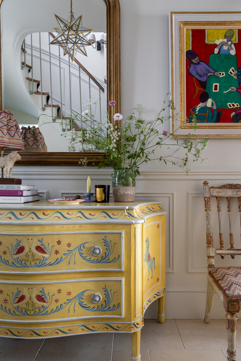
The Entrance Hall
The entrance sets the tone for the rest of the home – layered, welcoming and considered. A hand-painted antique chest of drawers by Tess Newall acts as a focal point to anchor the space, adding colour and craft to the hallway.
Decorative accents and soft lighting complete the look, offering a glimpse of the design language that carries through the rest of the home.
Paint: Ceiling, Walls & Woodwork In School House White, Farrow & Ball
Curtain Fabric: Aditi, Schumacher
/https%3A%2F%2Fsw18.sheerluxe.com%2Fsites%2Fsheerluxe%2Ffiles%2Farticles%2F2025%2F10%2Fsl-house-tour-kitchen-fb.png)
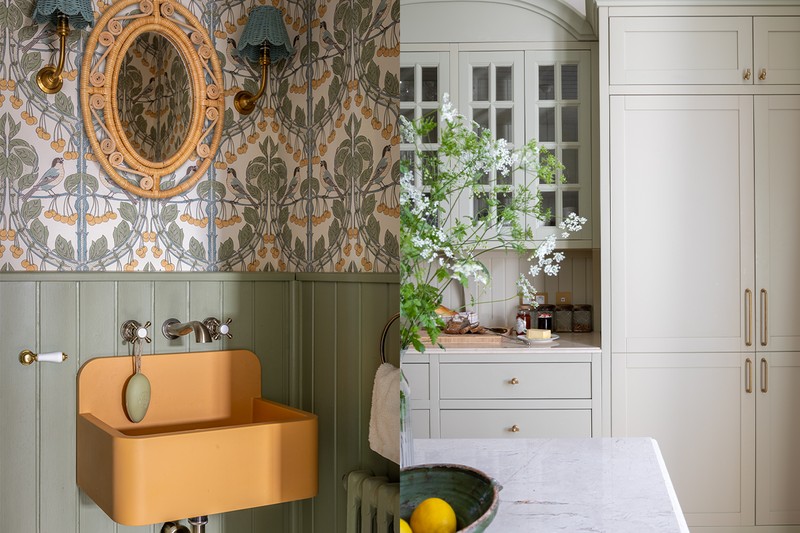
The Kitchen
Originally on the opposite side of the house, the kitchen was re-positioned to improve better connection and flow with the rest of the property, turning it into the true hub of the home. A generously-sized island sits at the centre of the space, painted in Farrow & Ball’s India Yellow, a rich, grounding tone that adds warmth and contrast. Positioned for ease of use and open views, it anchors the space both practically and visually.
Paint: Joinery In Vert De Terre, Farrow & Ball
Pendant Light: The French House
Curtain Fabric: Birds & Cherries, GP & J Baker
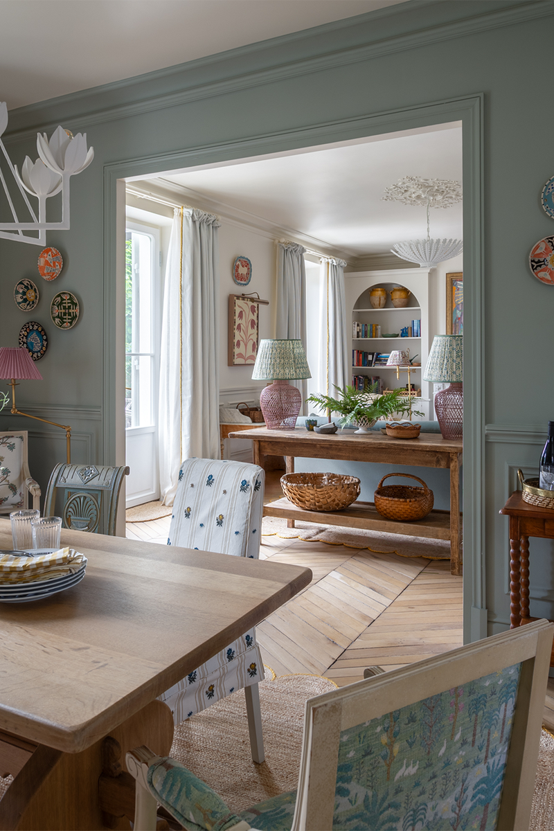
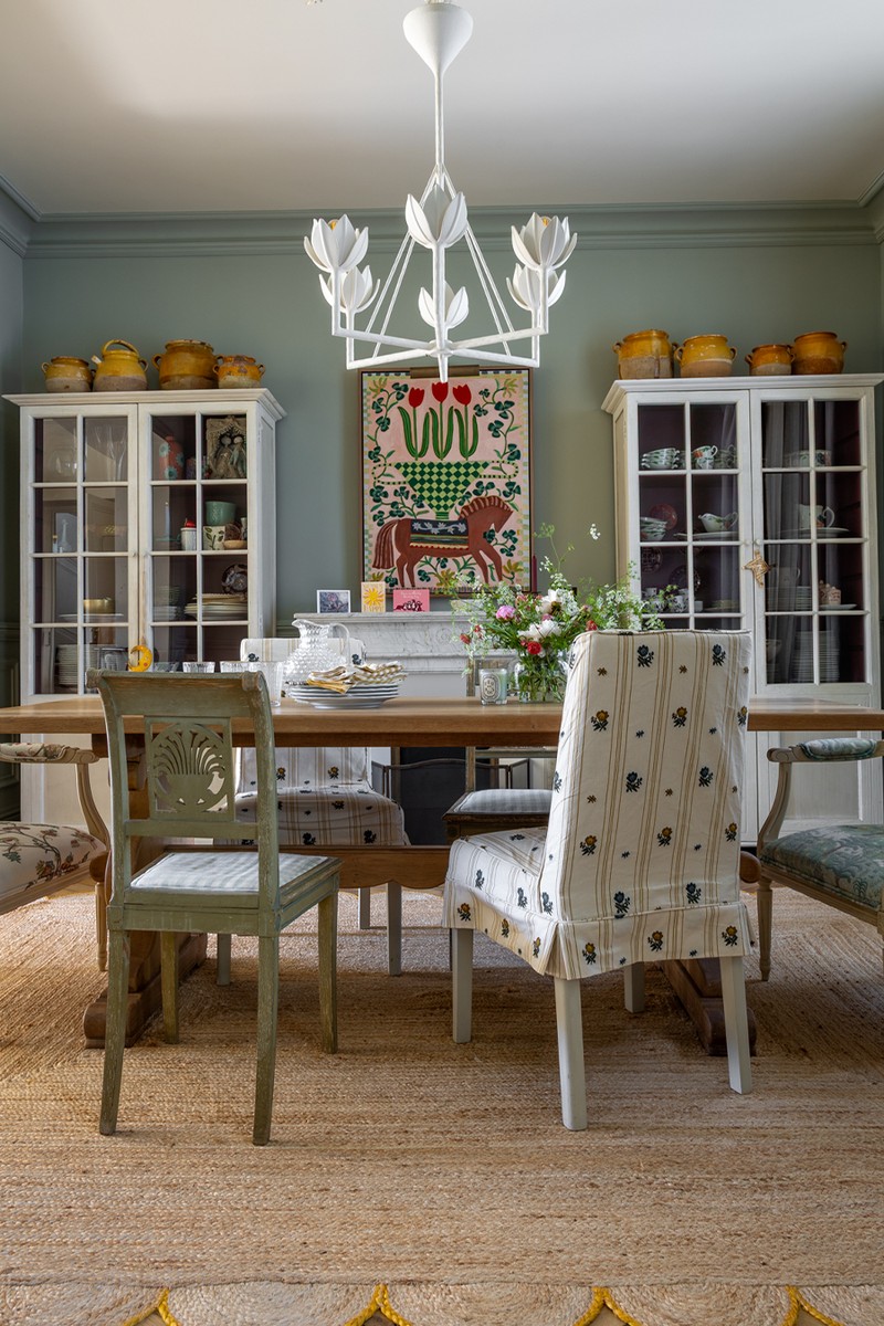
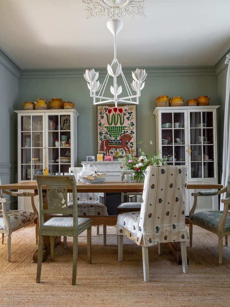
The Dining Room
Positioned between the kitchen and sitting room, the dining area acts as a natural transition point – open, informal and designed for everyday use. At its centre sits an old farmhouse table, chosen for its patina and sense of history. It’s surrounded by a mix of mismatched chairs, some slipcovered for softness and practicality. The set-up feels collected rather than coordinated, in keeping with the home’s broader approach to layering and comfort. This is a space for busy family meals and relaxed entertaining. The furniture is robust, the atmosphere laidback and the design intentionally unpolished.
Paint: Walls & Woodwork In Blue Gray, Farrow & Ball
Dining Chair: Ikea
Chandelier: Visual Comfort
/https%3A%2F%2Fsw18.sheerluxe.com%2Fsites%2Fsheerluxe%2Ffiles%2Farticles%2F2025%2F10%2Fsl-house-tour-sitting-room-fb.png)
The Sitting Room
The sitting room was intended to feel layered, comfortable and quietly elegant. The fireplace was sourced from a reclamation yard and is similar to the one in the dining room, creating a sense of continuity between the spaces.
The artwork above the mantelpiece was the starting point for the room’s overall palette. Colours were pulled from this striking piece and echoed throughout the soft furnishings and finishes, giving the space a cohesive but unforced feel. As with the rest of the home, the clients’ art collection played an important role in shaping the overall scheme. A mix of soft, textured fabrics is paired with rustic and antique pieces, bringing warmth and depth. The combination of materials, art, and found objects lends the room its character.
Paint: Ceiling, Walls & Woodwork In School House White, Farrow & Ball
Sofa: Sofa.com
Footstool: Isabelle Baldwin
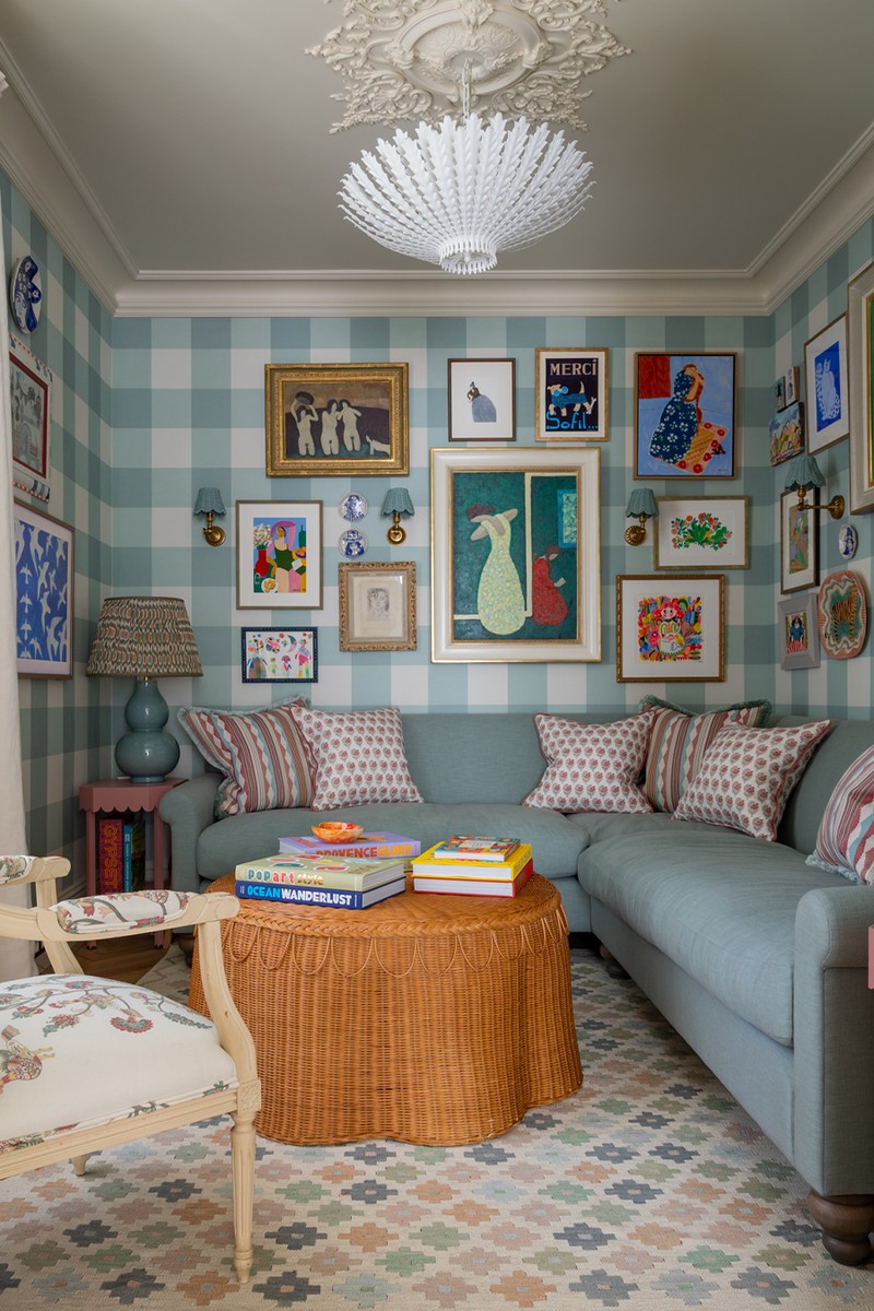
The Snug
Just off the sitting room, the snug was conceived as a cosy retreat, a space to curl up and switch off. We had a clear vision from the outset: a “chocolate box room” that felt rich, warm, and inviting. The client loved gingham and checks, which led to the choice of a bold, large-scale wallpaper. The graphic lines of the pattern brought balance to the room, offsetting the inherent asymmetry of the space with something more structured and intentional. Artwork was layered across the walls, sitting confidently against the gingham. The mix of scale, colour, and texture gives the room a sense of charm and quiet energy.
Coffee Table: Sharland England
Bespoke Sofa: Anthony Taylor Upholstery
Chandelier: Visual Comfort
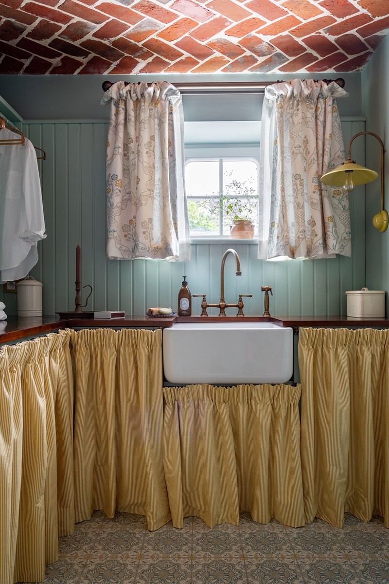
The Utility & The Larder
The Utility
A room often overlooked, the utility room was treated with the same level of attention to detail as the rest of the house. It’s a space that works hard – for laundry, storage, and to supports the everyday rhythm of family life, so it needed to feel both functional and well-resolved.
The design continues the visual language established in the kitchen and art room, with Shaker-style panelling and warm wooden worktops. Patterned tiles were introduced to add subtle interest underfoot, sitting comfortably alongside the exposed brick ceiling, a feature we were keen to retain and highlight. To soften the joinery and add charm, skirted curtains were fitted below the counters. They provide an easy, tactile way to conceal the appliances while keeping the space feeling light and informal.
Paint: Walls, Woodwork & Joinery In Green Blue, Farrow & Ball
Shirt Fabric: Romo
Wall Light: The French House
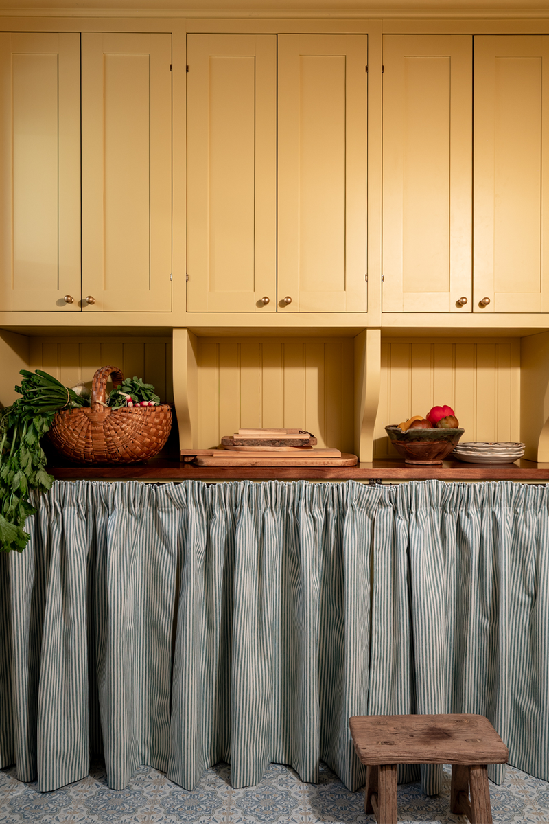
The Larder
Much like the utility room, the larder was treated as an extension of the home’s overall design rather than an afterthought. It’s a practical space, but one that still needed to feel warm and considered. A warm yellow was used on the joinery to lift the room and keep it light, while concealed storage was introduced with the addition of a skirted rail, a simple detail that helps maintain order without feeling overly functional. A rustic wood countertop ties the space back to the kitchen and utility areas, adding texture and reinforcing the home’s subtle French influence.
Paint: Joinery In India Yellow, Farrow & Ball
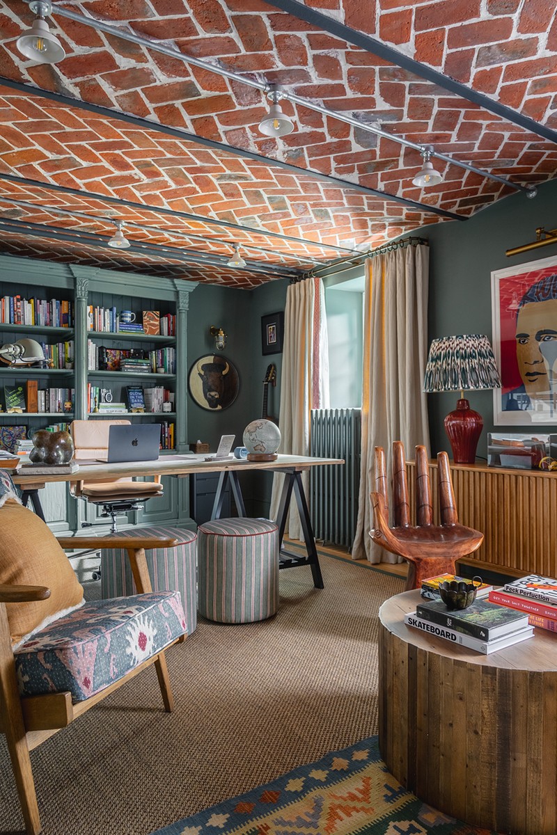
The Study
The study is a dedicated space for focus and quiet, with the original brick ceiling becoming the defining feature. Rather than covering it up, the aim was to celebrate the texture and history it brought to the room. Steel conduit and lighting were introduced to work with, not against, the existing architecture. The industrial detailing added contrast without overwhelming the space and also allowed the ceiling to remain the visual focal point, with just enough structure and function to let the materiality speak for itself.
Paint: Wall, Woodwork & Joinery In Green Smoke, Farrow & Ball
Sofa: Sofa.com
/https%3A%2F%2Fsw18.sheerluxe.com%2Fsites%2Fsheerluxe%2Ffiles%2Farticles%2F2025%2F10%2Fsl-house-tour-fb.png)
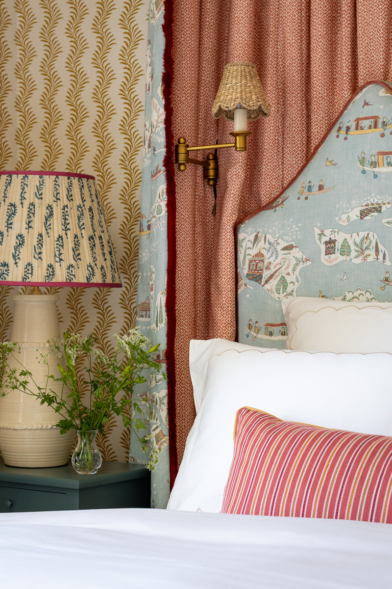
The Main Bedroom En-Suite
The main bedroom is a space where we embraced colour, comfort and the clients’ eclectic style. Out of shot, at the end of the bed, a Napoleon settee – sourced from Sunbury Antiques Market and originally from France – was reupholstered in a sunny yellow embroidery. With the room’s generous proportions, we felt it needed a warmer, more grounding note, and this piece helped anchor the space. The headboard became a focal point, upholstered in a punchy, patterned fabric that set the tone for the rest of the scheme. It brought energy to the room while also tying in with the clients’ collection of folksy artwork. The print served as a hero piece, with its palette of blues, pinks and yellows echoed across cushions, upholstery, and accessories.
Paint: Ceiling, Walls & Woodwork In School House White, Farrow & Ball
Paint: Walls & Panelling In Light Blue, Farrow & Ball
Bedside Table: Trove
Lamp: Penny Morrison
Stool Fabric: Colefax & Fowler
Wallpaper In En-Suite: Common Room
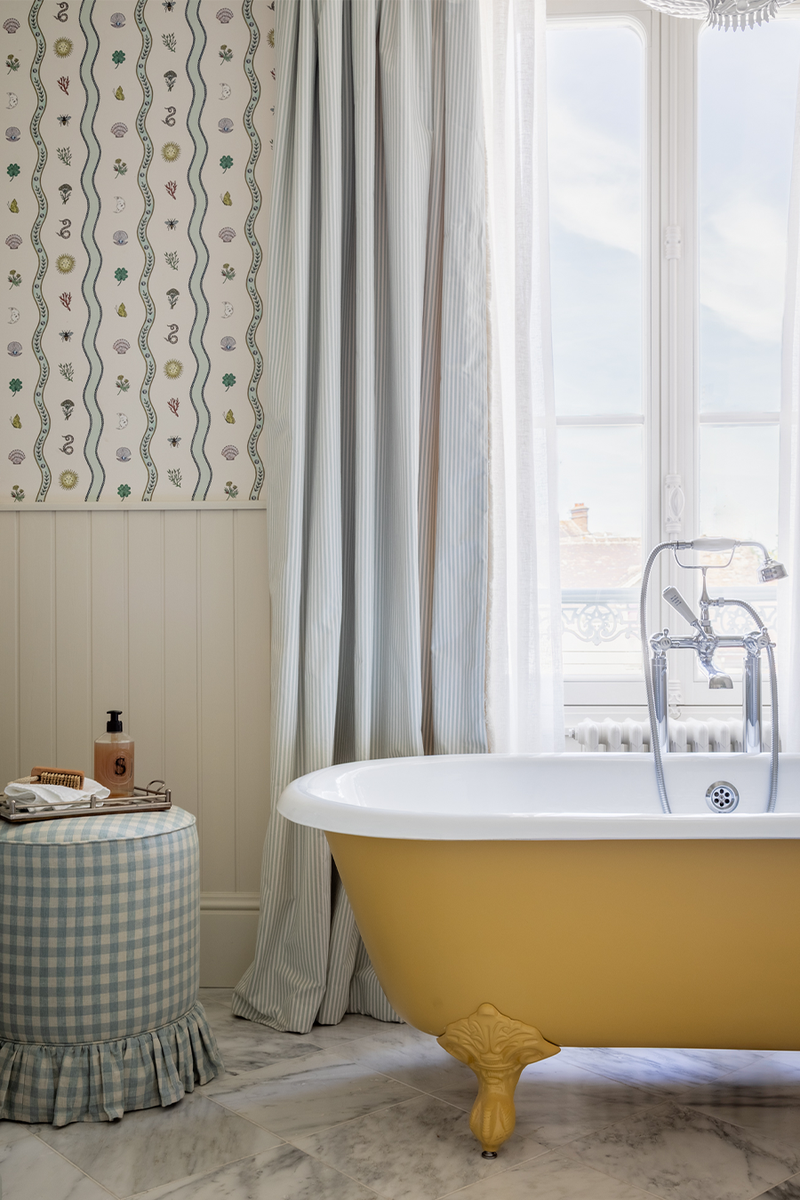
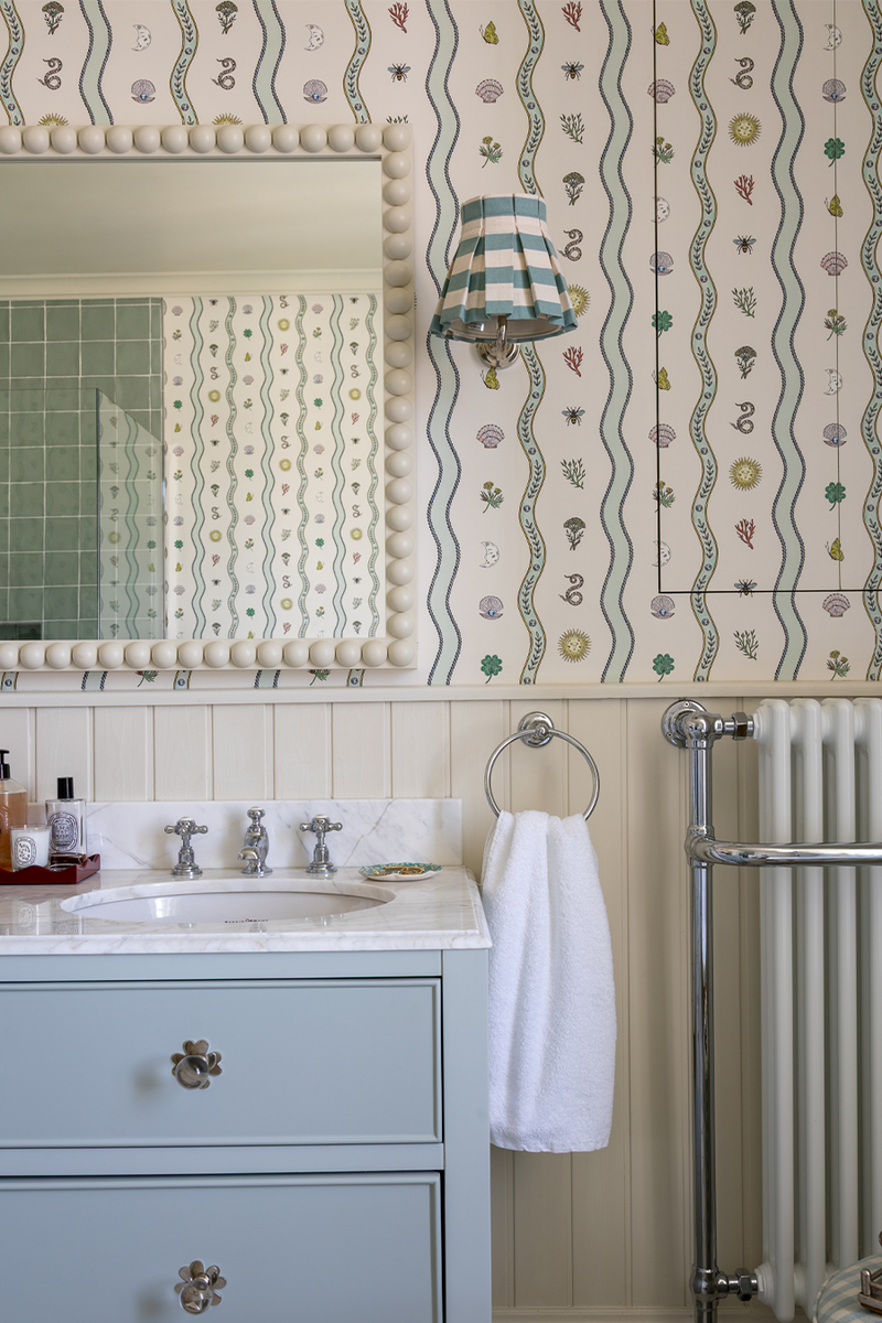
The Guest Bedroom En-Suite
The guest bedroom en-suite feels calm and layered – the perfect retreat to welcome guests. A stunning vintage kimono on display with vibrant berry and yellow tones shaped the scheme. This piece informed a subtle colour palette that carried through into the en-suite, with soft blues, corals and warmer accents used to complement the colours and maintain a cohesive feel. The bed canopy was added to create a sense of intimacy and enclosure. The layered fabrics softened the room and brought a gentle formality that echoed the elegance of the kimono.
Paint: Ceiling, Walls & Woodwork In School House White, Farrow & Ball
Bedside Lamps: Priory Antiques Studio
Lamps: Penny Morrison
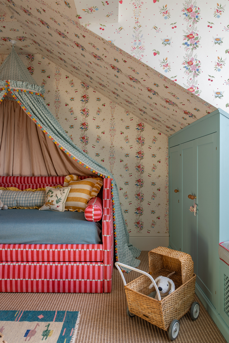
The Kids’ Bedrooms
The top floor attic was fully converted to create a dedicated space for the children, a self-contained level complete with bedrooms, a bathroom and a shared playroom. Tucked into the eaves, this floor was designed to be the least serious and most fun part of the home. Playful patterns and a lively palette of bright yellows, punchy berries and soft blues run throughout, giving the space energy while still feeling timeless enough to grow with the children.
Trundle day beds were bought for both rooms to accommodate sleepovers and future needs, while dormer windows bring in more natural light. Built-in window seats offer extra storage and make for cosy reading spots – making the most of every inch of space. Original beams were sandblasted to remove the existing paint and then left exposed, adding natural warmth and texture.
Wallpaper: Tess Newall
Tester Fabric (Exterior): Thibaut
Tester Fabric (Inside): Ian Sanderson
/https%3A%2F%2Fsw18.sheerluxe.com%2Fsites%2Fsheerluxe%2Ffiles%2Farticles%2F2025%2F10%2Fsl-house-tour-kids-bathroom-landscape_0.png)
The Kids’ Bathroom
The children’s bathroom continues the playful energy of the top floor, combining bold colour with practical design. A red rolltop bath takes centre stage – a standout feature that adds a sense of fun while still feeling classic. The floor tiles are in a cheerful design by Nina Campbell, chosen for its pattern and personality. It brings a lively touch to the space without overwhelming it, tying in with the colours used throughout the children’s bedrooms and playroom.
Paint :Vanity Unit In Oval Room Blue, Farrow & Ball
Wall Light (Bathroom): Alice Palmer
Bath: Cast Iron Bath
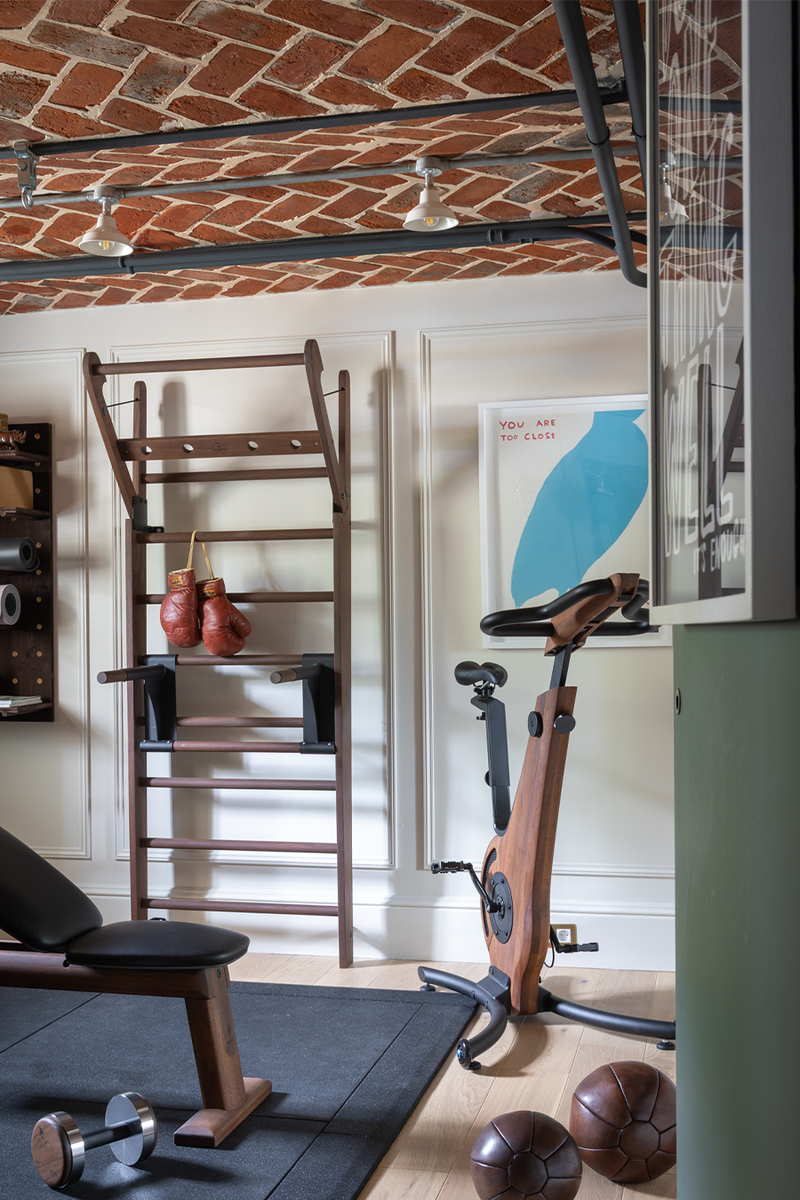
The Gym
We wanted the gym to feel more like a boutique studio than a purely functional space. With limited natural light, getting the lighting right was key – so a balance was struck between brightness for energised workouts and softer, ambient options for winding down. As in the study, the original brick ceiling was left exposed, with steel conduit used again to keep the detailing minimal and cohesive with the rest of the lower ground floor. The natural tones of the brick introduced a warm base, which was continued throughout the space. To complement this, soft blues were layered in – a subtle but effective pairing that adds both warmth and energy.
Visit SEANSYMINGTON.COM
Photographer credit: Chris Wakefield
DISCLAIMER: We endeavour to always credit the correct original source of every image we use. If you think a credit may be incorrect, please contact us at info@sheerluxe.com.
/https%3A%2F%2Fsw18.sheerluxe.com%2Fsites%2Fsheerluxe%2Ffiles%2Fwebsite-images%2F2025%2F03%2Fsign-up-pop-up.jpg)
