Farrow & Ball’s Colour Expert Shows Us Round Her Home
The Property
The main Victorian schoolhouse building has remained pretty much unchanged – apart from the floor in the main room, which was originally much lower to prevent the children from looking out the window and ending up distracted. The extension with the bedrooms was added in the 1970s. There’s sometimes a tendency to think only large, light-filled rooms can ‘take’ strong colours, and that small, dark rooms should be restricted only to light shades. But this house demonstrates why this isn’t necessarily the case.
The larger rooms, in which we spend the most time, have been kept light and airy, while the smaller bedrooms are enriched with colour so you feel fully embraced when you’re in them.
The Front Porch
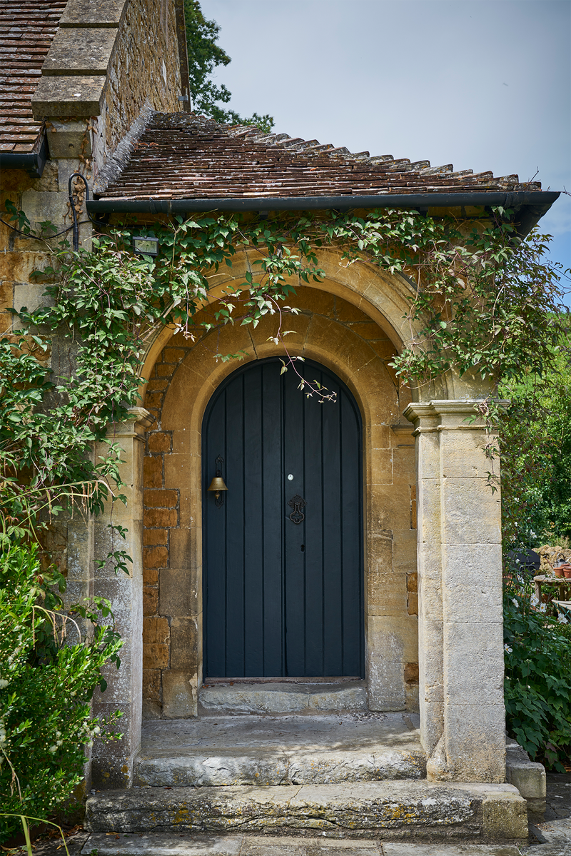
The exterior woodwork of this old schoolhouse was painted to reflect the colour of the cows in the surrounding fields. Soft Black Blue is undeniably the perfect match. It also hints at the various colours that await inside – be it the recycled curtains or vintage furniture.
The Hallway
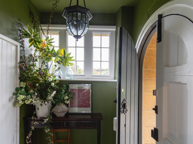
On entering the house, you’re greeted by rich green Bancha on the entrance hall walls, which echoes the hues of the lush garden outside. This strong-coloured space exudes plenty of drama, making the living room, which leads off it, feel more spacious and lighter in comparison.
The Downstairs Cloakroom
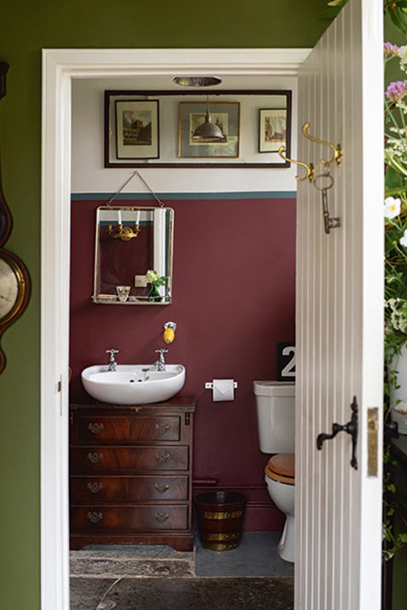
We used luxurious Preference Red on the cloakroom walls, with a chic line of Inchyra Blue sectioning it off from the upper part of the walls, which was painted in School House White. All the colours enhance the proportions of the room and make the lofty ceiling height feel a bit lower.
The Open Plan Living Area
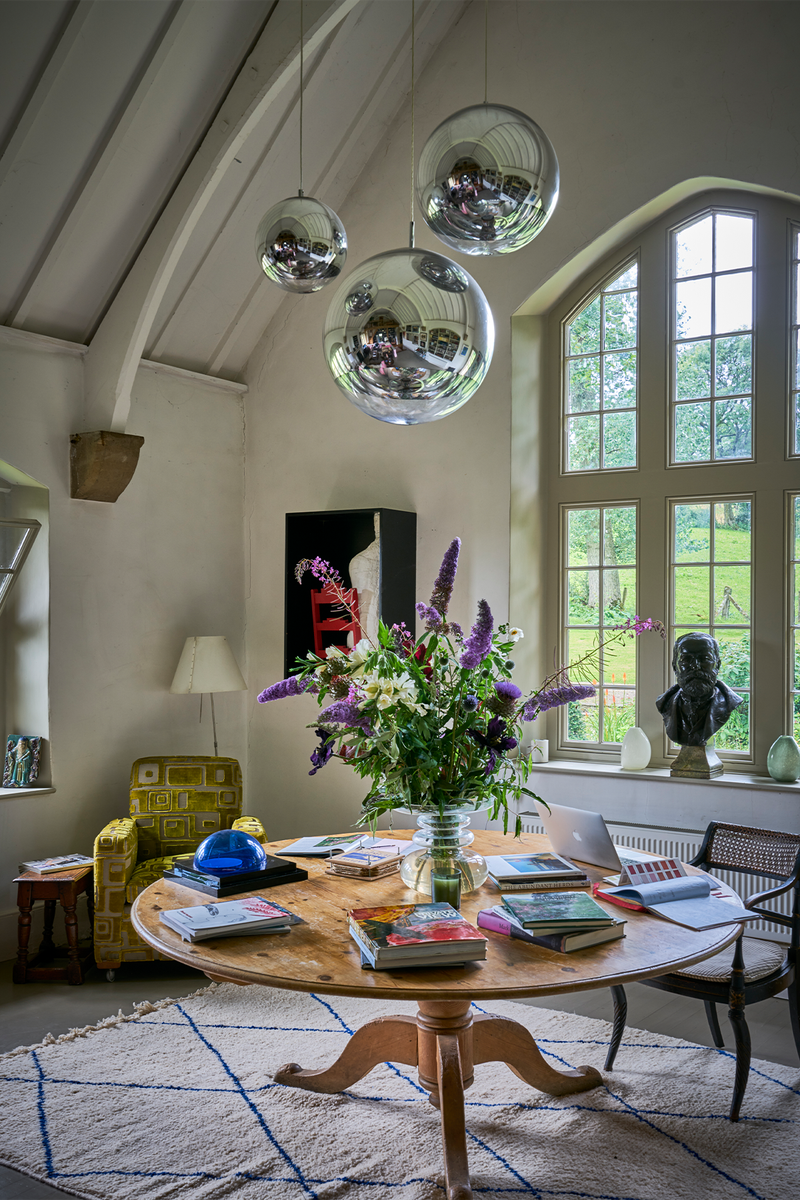
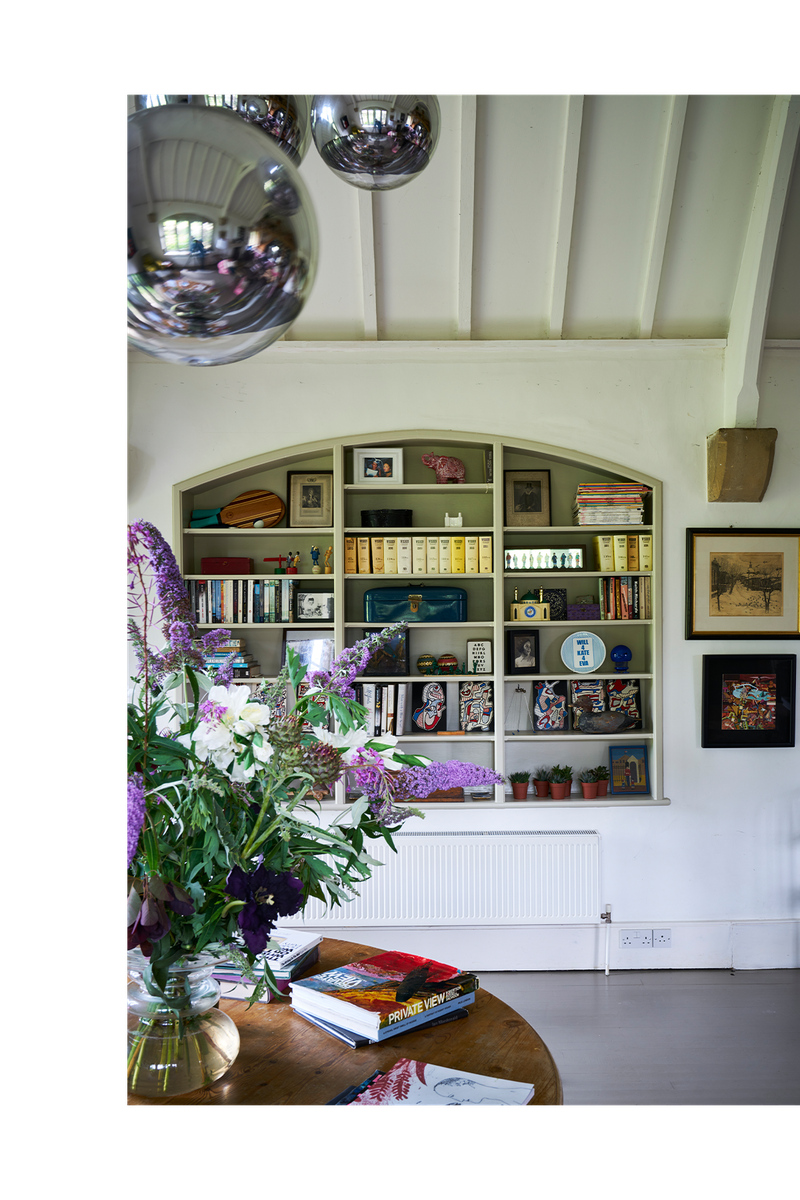
The entrance to the living room sits beneath the gallery, and has been kept dark to create a sense of intrigue. Railings, a softer alternative to black, has taken over the door and bookcase, and contrasts with the rest of the walls and ceiling, which are painted in a soft white – appropriately, School House White again. This emphasises the size and light of the room, and helps retain the spirit of the building, as does the use of the slightly darker Drop Cloth on the windows and beams, which is complemented by Mouse's Back on the floor. We chose the latter to create a sense of warmth, as well as to disguise any muddy boot marks. A low wall around the seating area is painted in Nancy's Blushes. This helps achieve a snug atmosphere, which can be difficult to create in a large, open-plan space. All the furnishings were picked up in local flea markets and have been mixed with contemporary prints and lights throughout.
The Kitchen
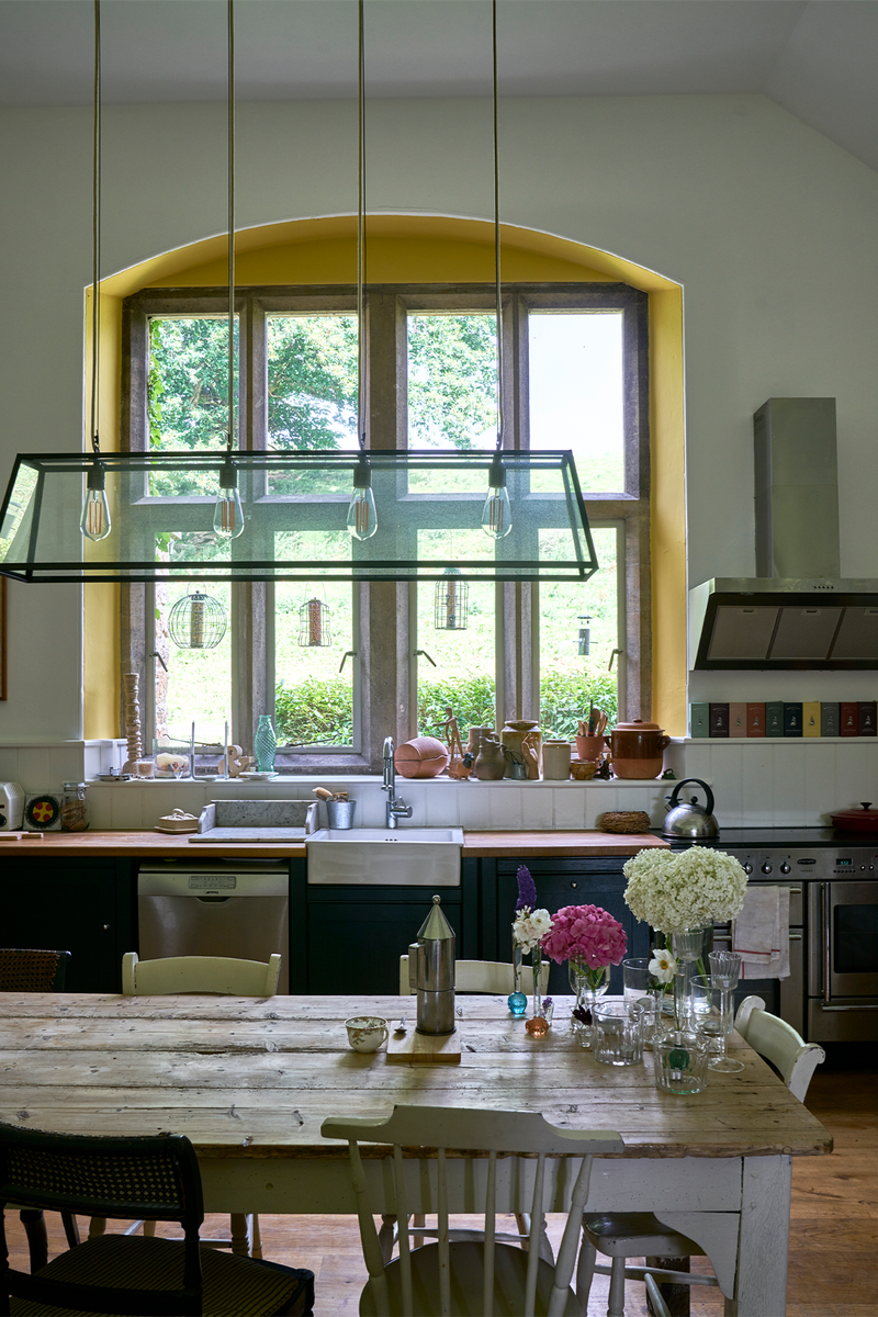
The kitchen is painted in School House White, but the window recess has been picked out by the unexpected use of Babouche, to reflect the colour of the forsythia hedge outside. This simple use of colour creates a happy glow in the kitchen, even on the gloomiest of days. Meanwhile, Studio Green on the units feels suitably modern, while still being totally appropriate for the country.
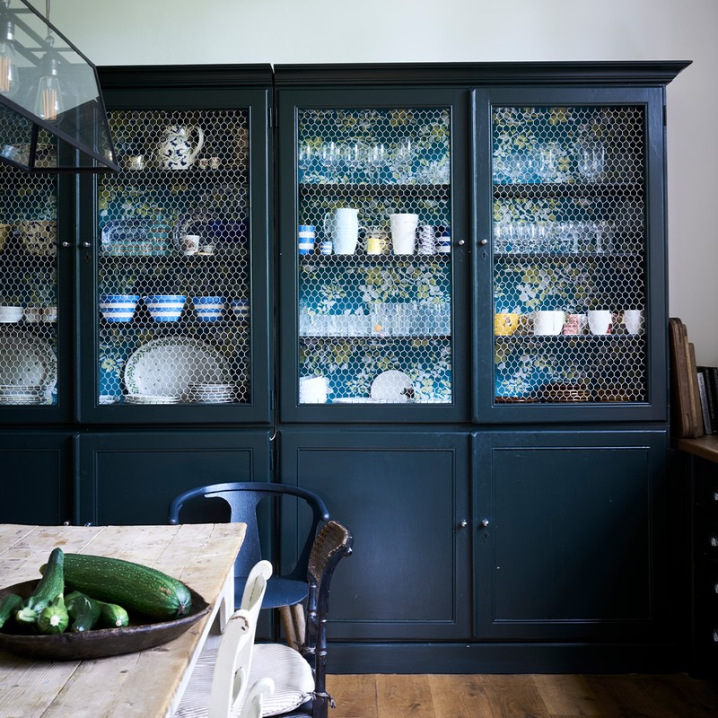
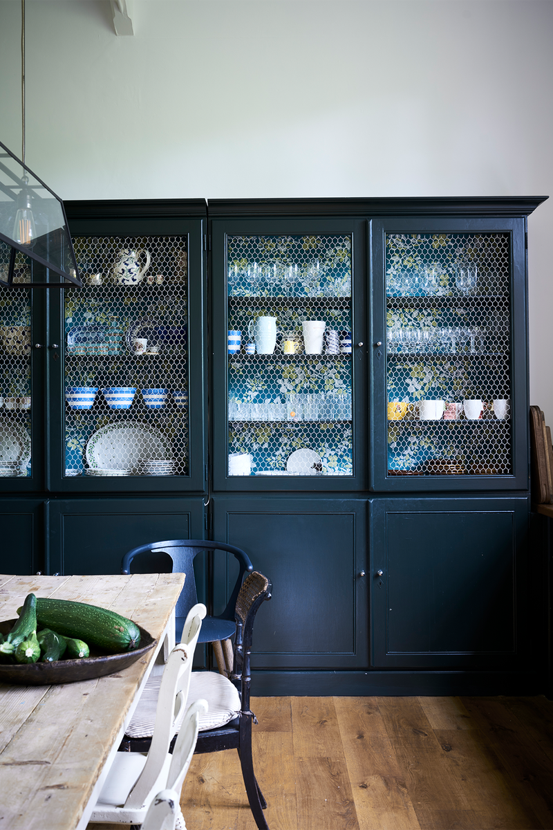
A cheerful wallpaper has been used in the back of the dresser (which had the door panels replaced with chicken wire). To make this space feel totally relaxed, we also went for a mix of De Nimes and Paean Black to upcycle the table legs and dining chairs – which were found at various flea markets.
The Pantry/Boot Room

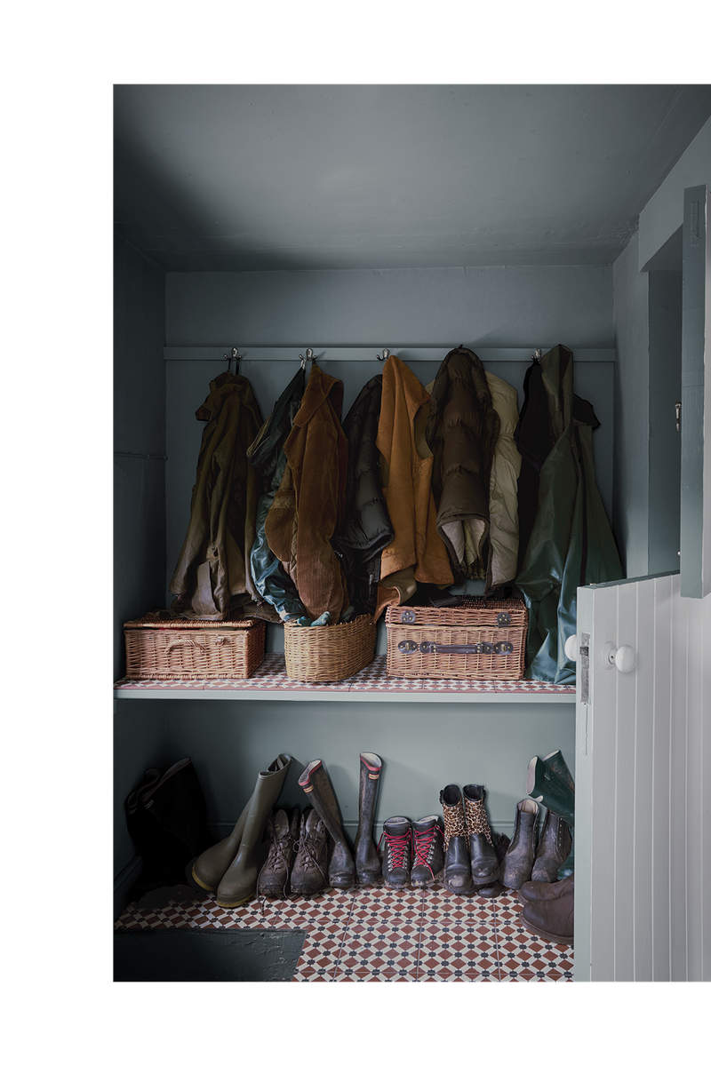
The colours of the boot room and pantry only add to the decoration of the kitchen, as their doors have been cut in half to allow for glimpses of their more upbeat colours. Oval Room Blue in the boot room and Rangwali in the pantry is used on every surface in these rooms, including the ceiling, to create brilliant gem-like antechambers that beg you to enter them.
The Bedrooms
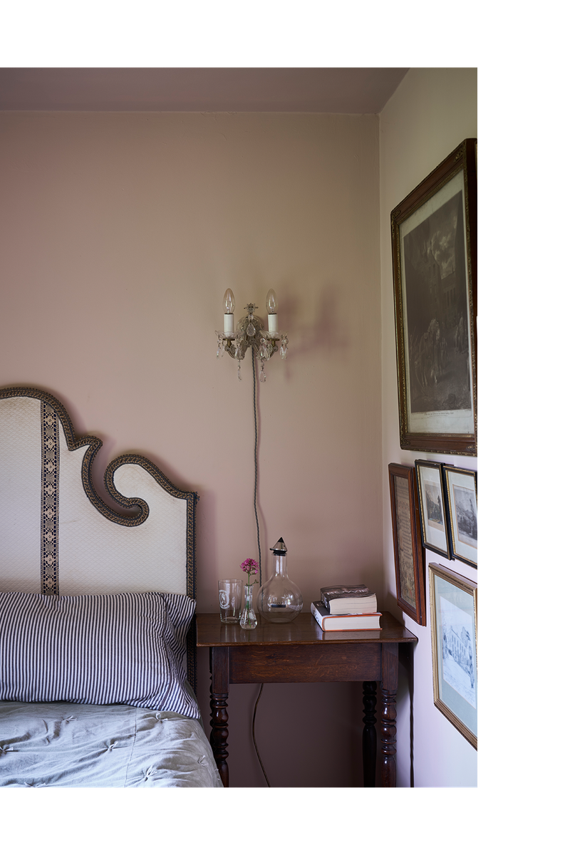
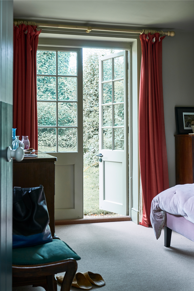
Each bedroom uses only one colour, because most of them are so small. That colour, whatever it might be, is used on the walls, ceilings and woodwork, so the confines of the space are less obvious and the rooms feel bigger. With its doors opening straight onto the garden, the master bedroom is painted in a restful green to make the connection between the interior and exterior spaces seamless. French Gray is the perfect shade.
Similarly, the second bedroom, with windows on three sides, was only ever going to feel right painted in Light Blue. It seems to change according to the different light at various times of the day – it’s positively blue in strong morning light but becomes greyer as the evening progresses. The features of the smallest and most intimate third bedroom have been embraced by Setting Plaster, which makes it feel really soothing.
The Corridor
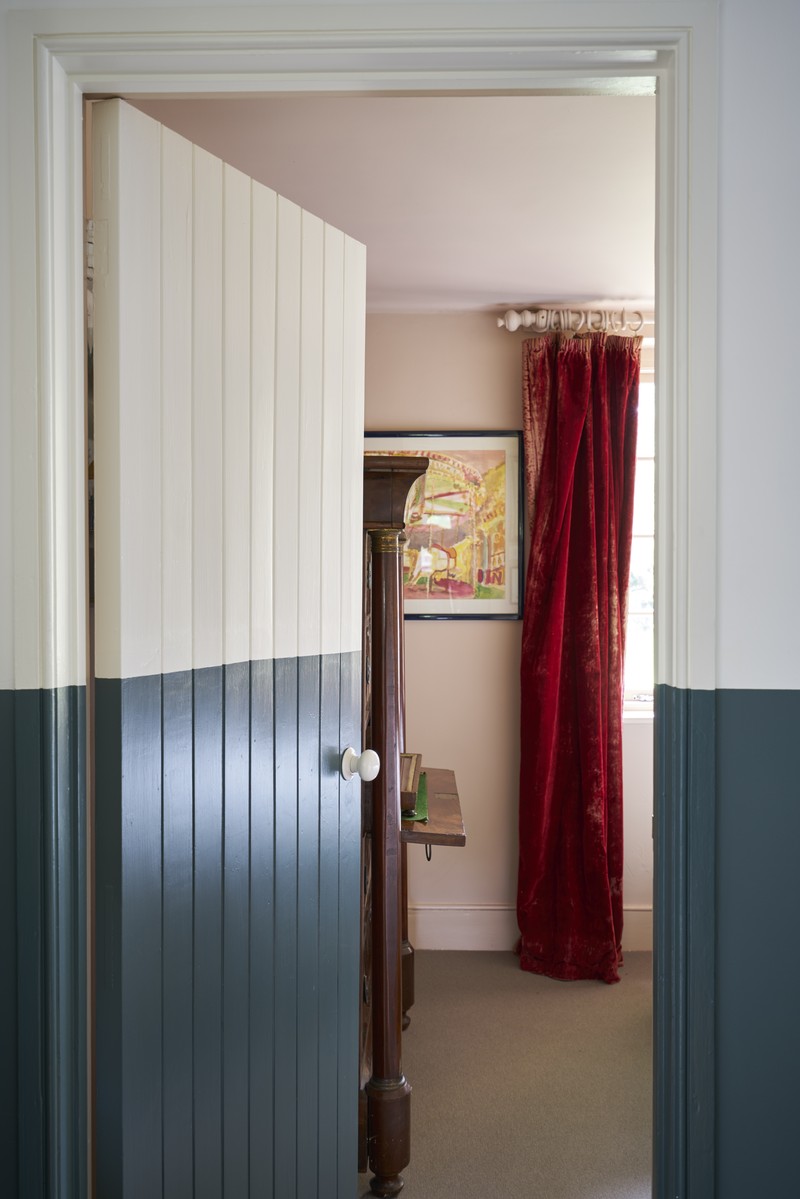
The corridor to the bedrooms is a dark, compromised space but it has been transformed by using Inchyra Blue on the lower part of the walls and doors, and School House White on the top half and the ceiling – the latter opens out the space and makes it feel wider. Using School House White here, as well as in the kitchen and living room, also creates a link between the more recently built bedroom extension and the main part of the house. The same colours and decorative device also appear in the more traditional cloakroom situated off the entrance hall, to achieve the same effect.
Visit Farrow-Ball.com and follow @JoaStudholme on Instagram
Credit Recipes For Decorating
Photography By James Merrell
DISCLAIMER: We endeavour to always credit the correct original source of every image we use. If you think a credit may be incorrect, please contact us at info@sheerluxe.com.
