Expert Tips For Decorating A Loft Room
Beams
DO embrace the features of the room to enhance your layout. For example, if your space is interrupted with rafters, use these to define areas of the room.
DON’T underestimate the space in the eaves. It’s a great storage solution if you make it into built-in cupboards.
DO remove infill plaster between purlins (horizontal beams) to allow light to flow through the space.
DON’T hide imperfections. If your beams have historic woodworm or lots of nooks and crannies, just fill and paint them.
Walls
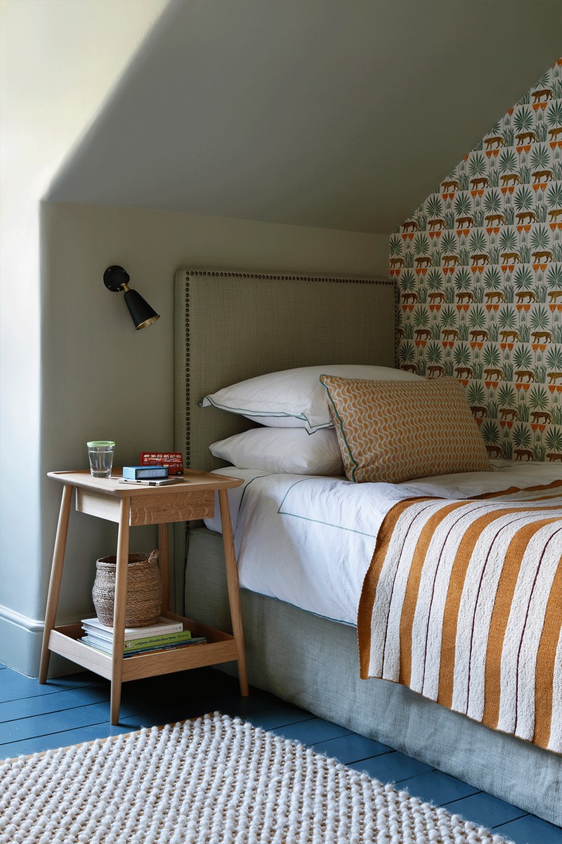
DON’T be afraid to use large, printed wallpaper in small spaces – it’s surprising what a small room can take.
DO wallpaper the ceiling. With sloping walls and a low head height, it can create a warm, cocooning effect.
DON’T just go for standard paint. A finish such as Bauwerk can add interest to walls and also works well with imperfections.
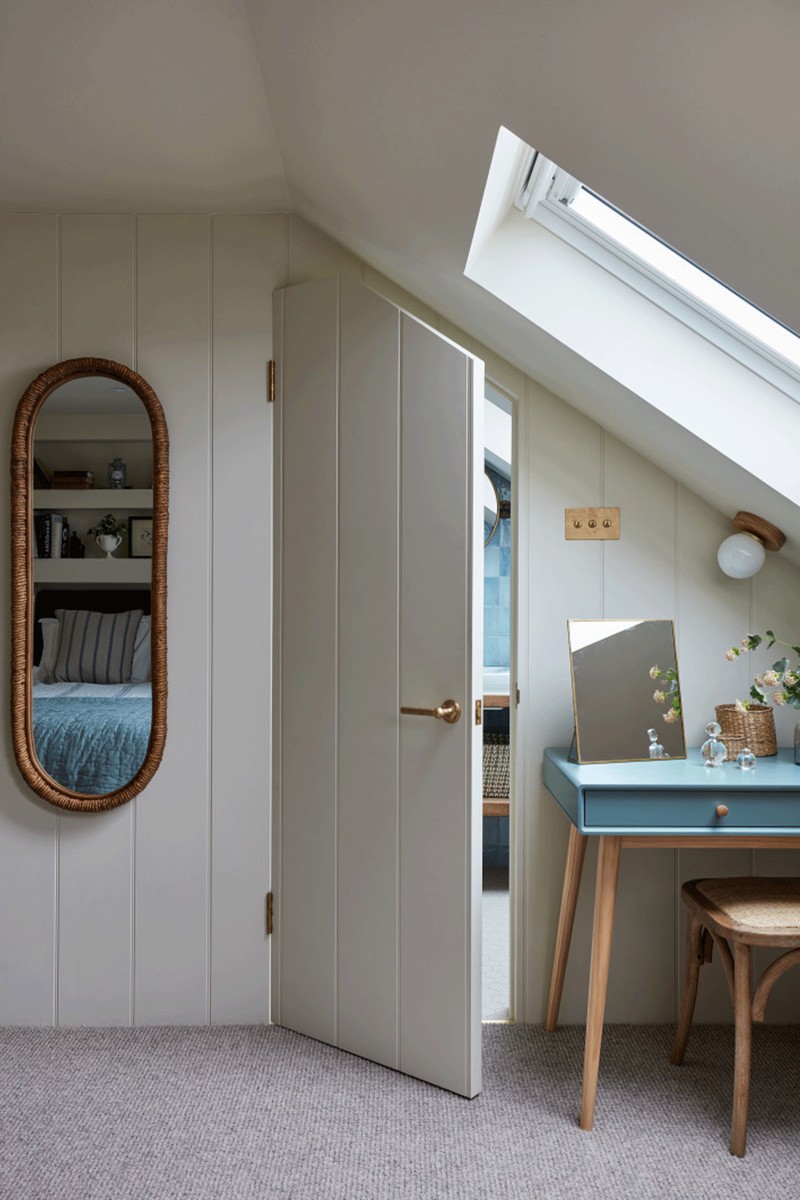
DO choose wide-plank tongue and groove if you clad the walls because wider planks appear less fussy. They also instantly give the room warmth and character.
Windows
DON’T overdress small windows. Long curtains will restrict daylight and drown the window.
DO install a blackout blind on sloping windows – Velux windows come with one neatly built in.
DON’T use conventional curtain styles on dormer windows. Try a swing-arm curtain rod with tie backs or café rods screwed into the frame
Lighting
DON’T scrimp on lamps – as well as being a practical solution for dark corners, they’ll add a decorative element to the room.
DO use wall lights in tight spaces. These can be either side of the headboard or even on a pulley so they can be raised out of the way when not in use.
Bathrooms
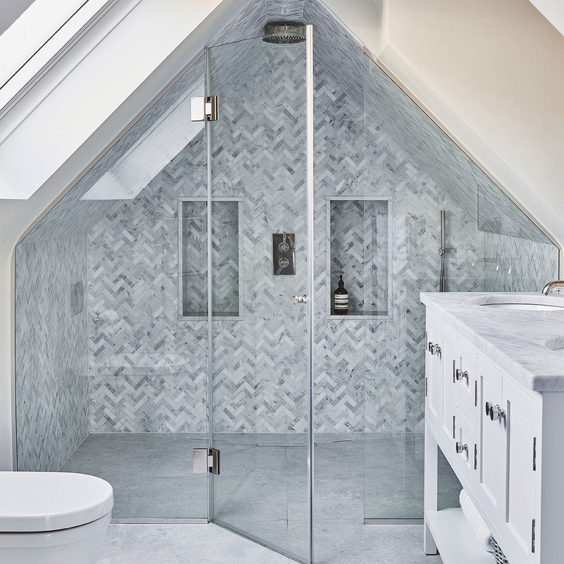
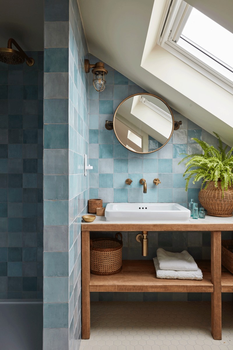
DO put a bathroom under the eaves – it’s a great space saver but the design needs to be well executed to work. A bespoke vanity unit is your solution here.
DON’T just go for plain white tiles. An uneven, glossy, coloured surface is far more interesting in a compact bathroom.
DO install a cleverly hidden, panelled door into an ensuite – as well as creating a fun element of surprise, it gives a seamless finish to the wall.
CASE STUDIES
Six interior designers talk us through their loft rooms and explain how they overcame the challenges of the spaces…
Interior designer Laura Stephens on tongue & groove panelling…
The key to loft rooms is to make clever design decisions so they feel less like the bolt-on box they can sometimes appear to be. This loft was designed for a teenager with a view to her parents moving in there at some stage. The first thing I did was to put wide-plank tongue and groove on most of the walls. I wanted the bathroom door to disappear into the panelling, so it appears ‘cut out’ here. Putting the bathroom under the eaves is a great space saver – but the design had to be slick to make it work. I avoided glass on shower areas and we managed to fit a shower into the highest part of this little bathroom and divide the space with a tiled wall. I love how these tiles from Mandarin Stone look contemporary but not uniform.
Visit LauraStephens.co.uk
Victoria Barker, interior designer at Studio Faeger, on embracing the imperfections…
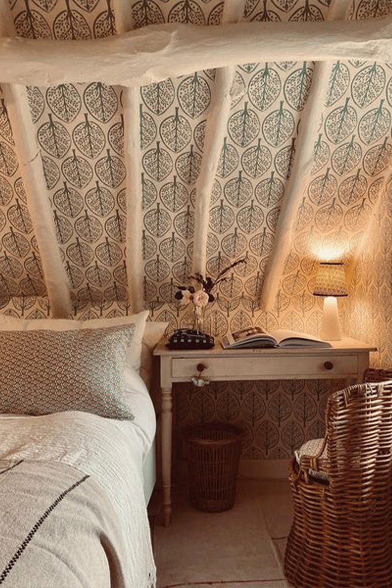
This cottage is over 450 years old, and the beams are remarkable whole tree trunks supporting the thatched roof structure, so I was reluctant to cover these up. The beams had regretfully been stained a very dark black by a previous owner; to sand blast them back to raw timber would have damaged them, so we decided to paint over them to lighten the space. I love painted beams – it’s an effective way of retaining the history of the house yet bringing it up to date. Old beams like this can have a lot of nooks and crannies, so you’ll have to accept you won’t have a pristine, perfect finish. I love wallpapering rooms with tricky junctions, wobbly walls, pitched roofs and low ceiling lines as I feel this adds to the charm of the paper and the imperfections. Wallpaper also really warms up a space that can otherwise feel cold or stark – especially in a loft.
Visit StudioFaeger.com
Interior designer Joanna Plant on wallpapering everything…
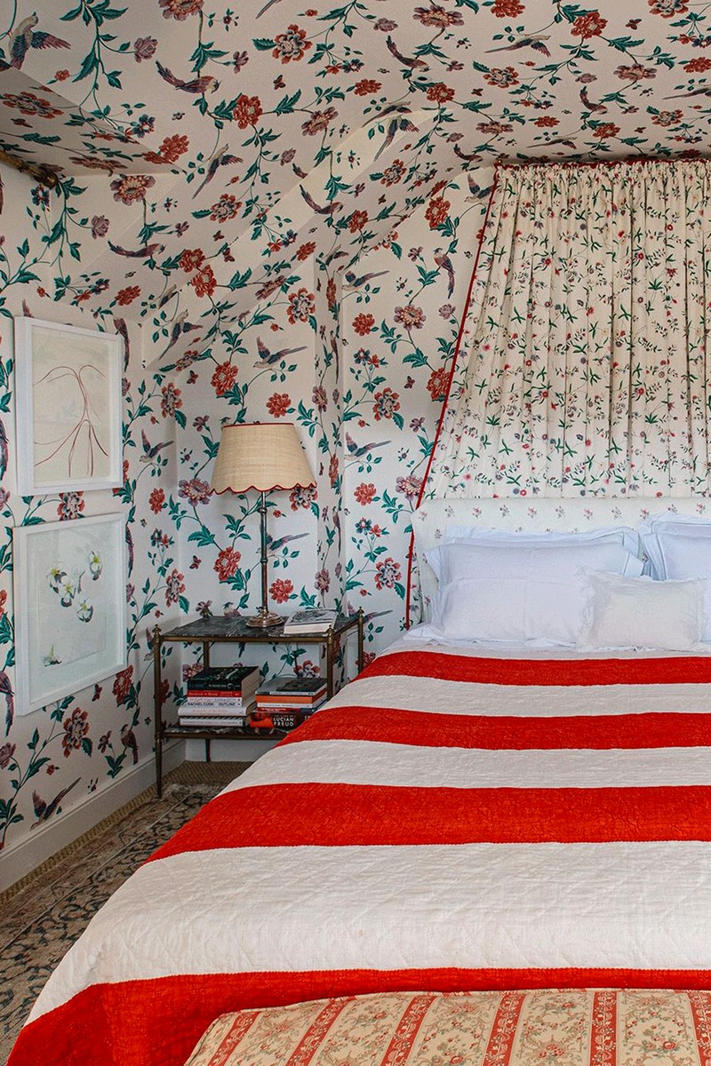
I decided to use wallpaper up and over the ceiling in my own loft bedroom because there wasn’t any space to hang pictures due to the nature of the layout, and when it was painted, the room just looked very ‘blah’. The wallpaper is vintage Laura Ashley which I slowly and diligently collected roll by roll on eBay. It continues through into the adjacent bathroom and I love the effect that gives – maximalism with a small dose of prettiness. The fabric used for the bed canopy is ‘Chinese Paper’ from Bennison and it has the same colours so it all works together, It’s often said you shouldn’t use red in a bedroom, but the red details introduced here sharpen up the space. All in all, pattern on pattern ensures this bedroom is anything but boring.
Visit JoannaPlantInteriors.com
Interior designer Octavia Dickinson on curtains for dormer windows…
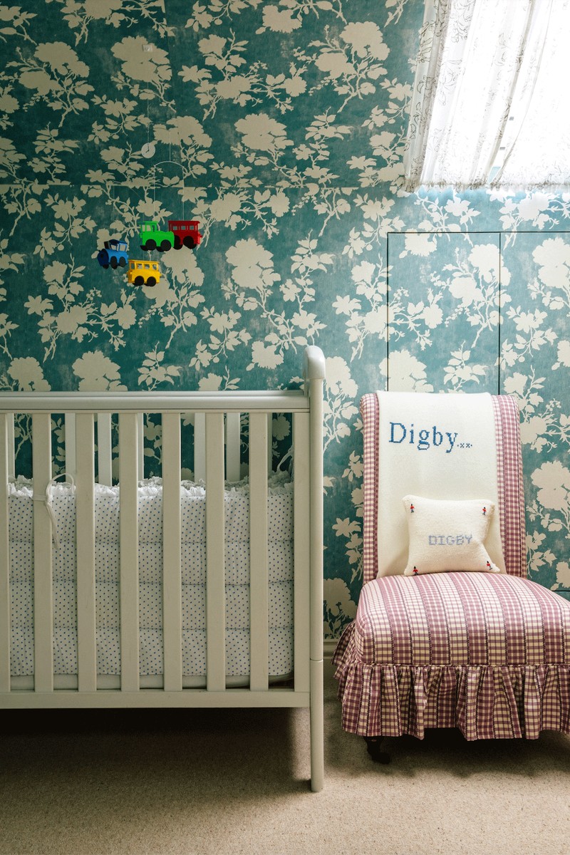
You often encounter dormer windows in a loft and there are a few ways to make curtains work. The simplest is a swing-arm curtain rod with tie backs. For Velux windows, buy the Velux blackout roller blind and use curtain rods to install fabric curtains. In this room we had a Velux blind, so we used their blackout blind then had café rods top and bottom with a gathered curtain. I quite often use two fabrics, one for the inside and one for the outside. These can be lined or blackout lined and you can have a frilly edge, tie backs or no tie backs. They’re very easy to install – just screw them onto the window frame. This room was designed for a baby, so I utilised the eaves as built-in cupboard spaces, but if you’re feeling more adventurous, eaves also work for built-in beds. When it comes to decorating, go for it with the wallpaper. Even if it feels counter-intuitive, don't be afraid to use large, printed wallpaper in small spaces – as we did here. And if you have a tricky ceiling (which we did) just wallpaper it all.
Visit OcatviaDickinson.com
Interior designer Anna Hewitson on optimising storage...
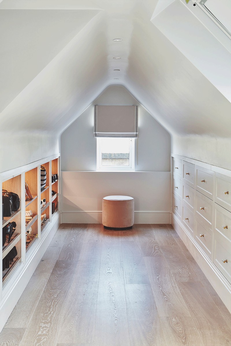
The great thing about installing storage in a loft room is that you can make use out of any depth. Just bear in mind that if you’re designing a dressing room, or even bedroom storage, you need at least 350mm for shoes. We didn’t have enough room for hanging in this room, and there was sufficient space in the bedroom for that, so we opted for drawers and shelves only, which worked better with the restricted height. When designing a loft dressing room, you will almost always have slanted ceilings, so you need to be conscious of furniture placement and how you’ll be able to move around the space. Equally, ceilings can present issues with knowing where to start and stop with paint colours or wallpaper. Its nicer to paint the walls all in one colour or to use wallpaper everywhere to avoid cutting the room in half. Use clever lighting to enhance dark corners – in this case we installed LED strip lighting to the underside of the shelves and inside the cupboards.
Visit AnnaHewitsonDesign.com
DISCLAIMER: We endeavour to always credit the correct original source of every image we use. If you think a credit may be incorrect, please contact us at info@sheerluxe.com.
