An Interior Designer Shows Us Inside Her Home
The Plans
We spent four years submitting various plans for an outdoor covered swimming pool with a basement area to add onto our original ground floor flat. But they kept getting rejected. We also submitted an appeal, but that was rejected, too. Having lost hope about extending our family home, an offer to purchase the flat above suddenly presented itself. It’s safe to say, the challenge was accepted!
Our top priority was to work with the original features – something that ended up dominating most of the design decisions. For example, the main living space had unusual proportions, as the ceiling was 4m tall. It meant the furniture had to be on the large side to make an impact in the space.
The electrics, plumbing, lighting, windows, tiling, flooring all needed replacing, too. The windows had to be historic glass and the handles were also difficult to source, as they weren’t the standard, traditional type. Furthermore, it was a big surprise to find a ceiling made from cardboard. In addition, we also found weak floor joists. Any period home will throw up these sorts of issues, most of which are impossible to prepare for. Nevertheless, it’s what having a contingency plan is for – a little wiggle room.
The Concept
We tried to make the most of the natural light and the window frames were extenuated to better frame the trees and garden outside. The mix of mid-century, modern and clean silhouettes, along with real wood and calm tonal colours, complimented the energy of the family home. Every piece of statement furniture has space to breathe, and the artwork was kept simple but interesting, so it remained an intrinsic part of the design.
The selection of furniture and interior collections started from a 20-year passion for iconic designs. I had an opportunity to incorporate some of my favourite pieces, for example, the tapestry by Alexander McQueen in the guest room and the extended wall light in the lounge by French designer Jean Prouve. I have admired them for a long time and they were the basis for much of the design.
The Home Office/Living Room
/https%3A%2F%2Fsw18.sheerluxe.com%2Fsites%2Fsheerluxe%2Ffiles%2Farticles%2F2021%2F06%2Fnw3lounge02.png?itok=5R6xLVuu)
This is supposed to be a hard-working room where our family can live, work and entertain. An accent of classic rich blue helped create a sense of calm, while black was incorporated to add drama and contrast. Every corner of the room was thought through in detail to make sure all coving and panelling came back to life. The print on The Rug Company rug ties everything together and the furniture includes some iconic brands, such as Gubi and Knoll.
The Dining Room
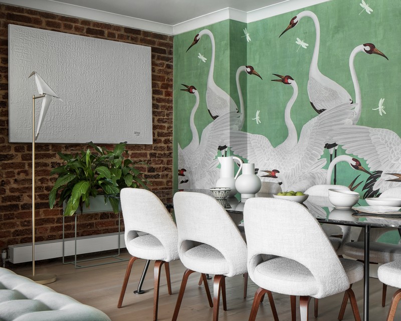
Where old meets new, the existing exposed brickwork adds warmth and compliments the tones of the statement Gucci wallpaper. Warm browns were picked out in the wooden legs of the dining chairs and a striking green marble tabletop from the Grasshopper dining table (both from Knoll) works seamlessly with the feature wall.
The Living Space
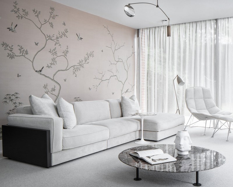
Overlooking the garden with floor-to-ceiling windows, this whimsical and calming space uses a neutral palette of soft blushes and warm whites, framed with dark chestnut wood panels on the Knoll Gould sofa and rich reds on the marble coffee table – all designed to revolve around the hand-painted, hand-stitched silk feature wall from Fromental.
The Snug
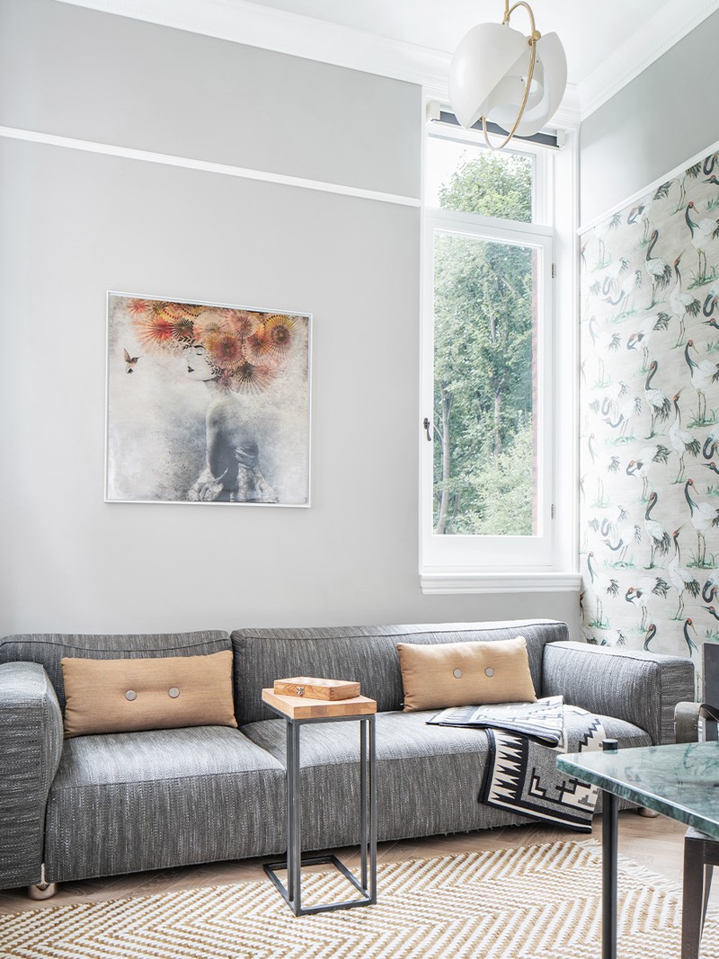
The nature theme continued into the additional snug room, which also serves as a guest room and study. It incorporates the same tonal colour palette of mustard, green and rust tones, and features statement lighting from Gubi and Bert Frank.

The Kitchen
Inspired by mid-century Danish design, this kitchen by DK3 was designed to open up the space, while maintaining most of the storage. Complete with a pocket door, a coffee-making area and a recessed fridge and oven space, it means most of the unsightly machines are kept out of sight.
The Main Bedroom
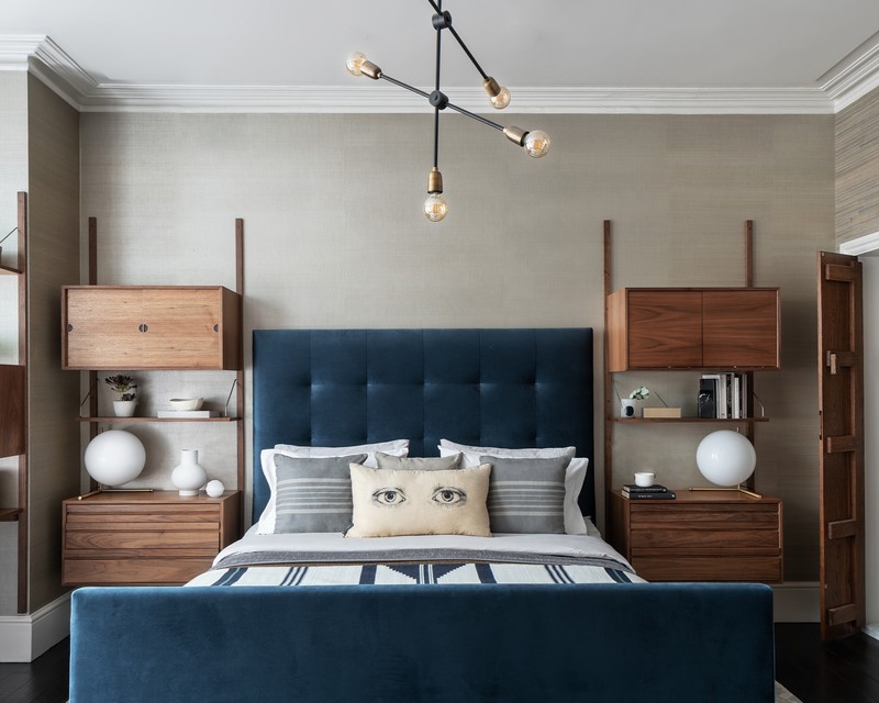
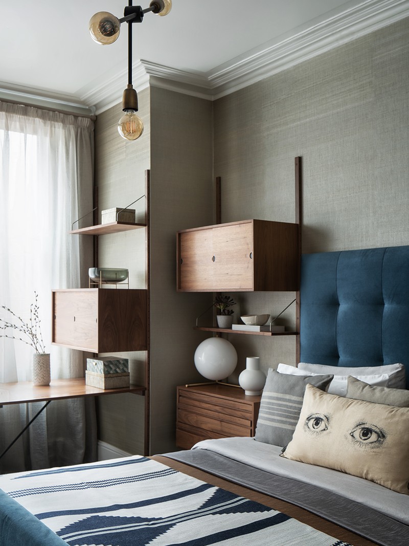
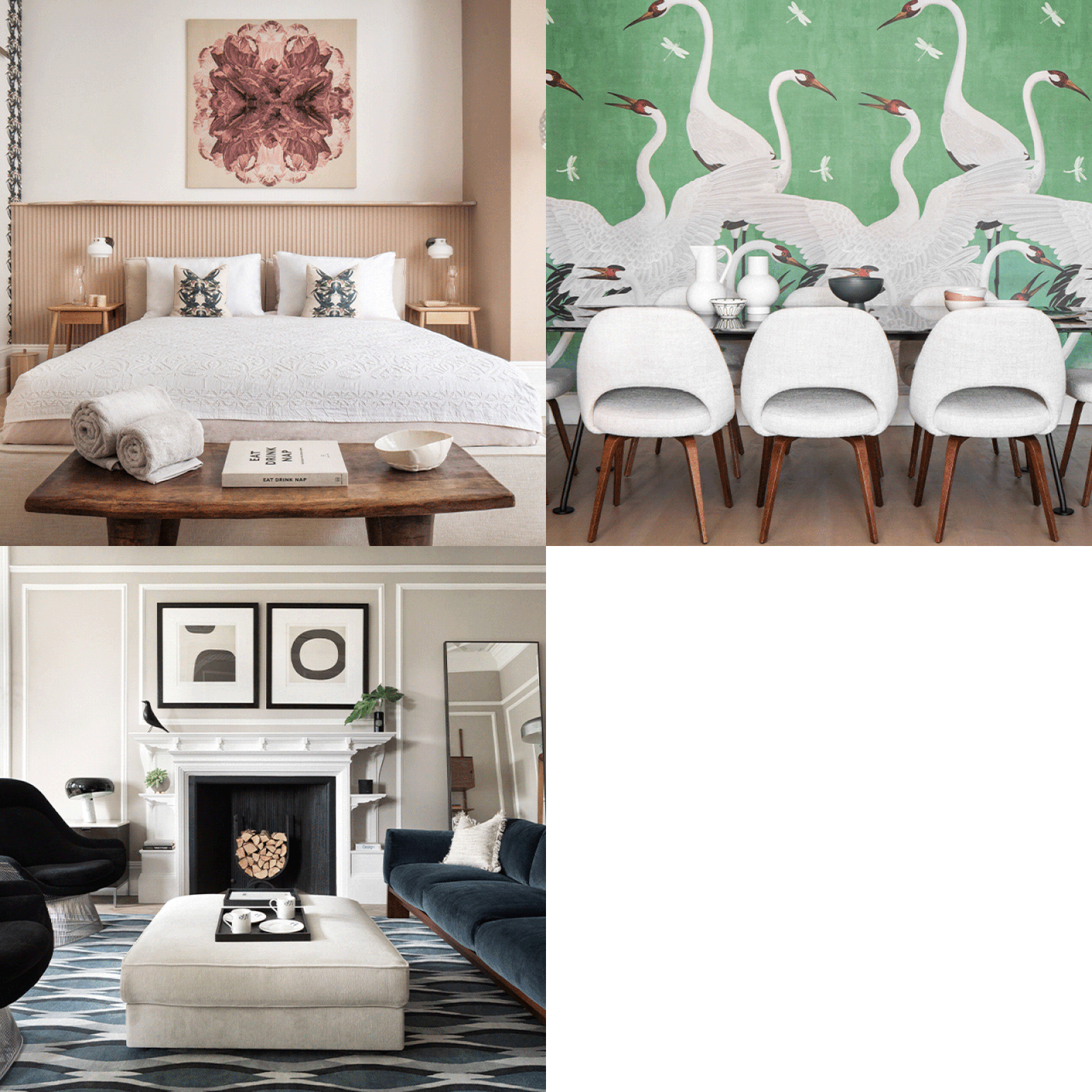
Here, mid-century modern meets total luxury. A combination of textures, such as the blue velvet bed frame, the handstitched silk wallpaper from Arte and the warm walnut wood of the DK3 Royal Wall System gives the space a chic hotel vibe – with double doors leading to the en suite. The tailored units sit comfortably either of the bed to frame it, and accentuate the height of the room, too. An industrial style pendant was added to create more ambient lighting.
The Guest Room
/https%3A%2F%2Fsw18.sheerluxe.com%2Fsites%2Fsheerluxe%2Ffiles%2Farticles%2F2021%2F06%2Fnw3guestroom01.png?itok=Cz8_mDRY)
Mid-century, eclectic and modern all come together in this room to keep the design as timeless as possible. The iconic Barcelona chair in white leather paired with the raw wood bedside table and natural fabrics on the bed balance each other out perfectly. It also helps to guide your eye around the room, noticing some new details each time.
A palette of neutral, earthy tones with the soft pink creates a gentle backdrop for the introduction of strong prints and patterns, too – like the cushions from Tradescant and Son. The Orac half-height wall conceals the unsightly wires and pipework, and it adds texture, in turn balancing the high ceilings as well. Finally, the soft opal wall lights really accentuate the feminine curves throughout the space.
The Spa Bathroom
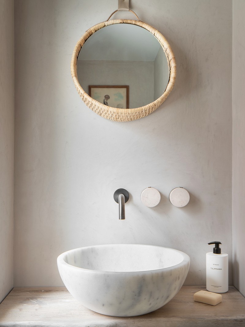
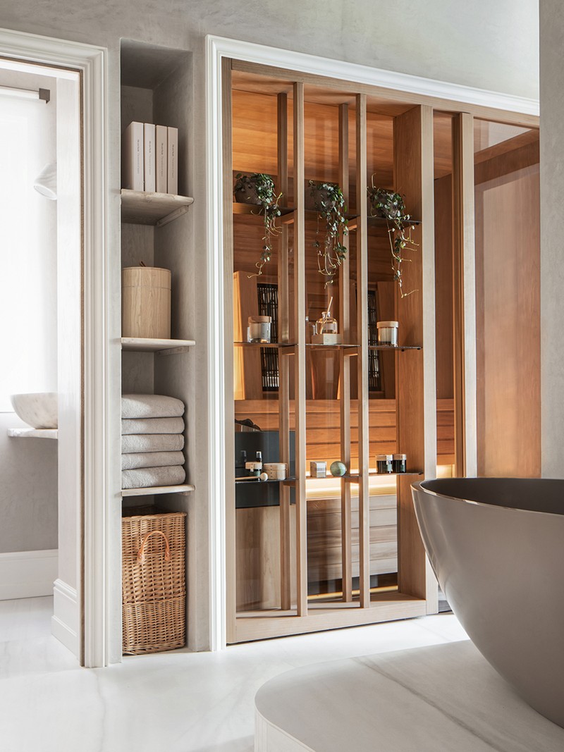
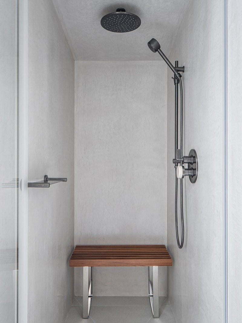
The spa suite bathroom features a Japanese style sauna, which was made in Italy. The walls of the wall-in shower and steam room are tadaelakt, with bronze accents from The Watermark Collection, with warmth added via wooden accents. A rattan mirror adds a bohemian vibe – making it the perfect place to unwind.
The Gym
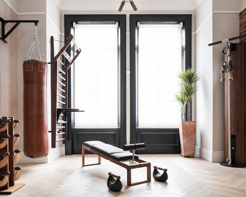
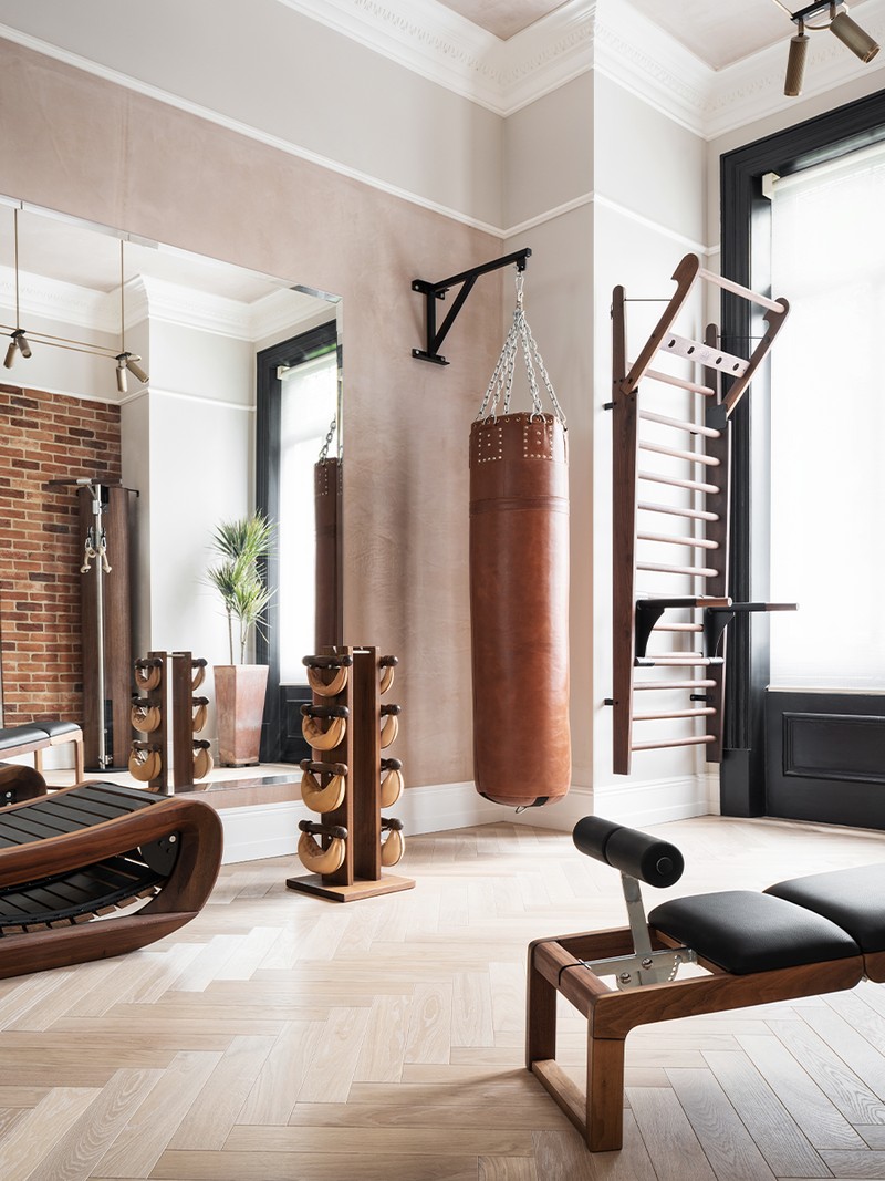
Large-scale mirrors were placed on the surrounding walls to give the feeling of openness and light. A single wall mirror would only allow for certain activities in one direction, whereas three allows for movement and flow – whether it’s kickboxing, weights or yoga.
The Pool Changing Room
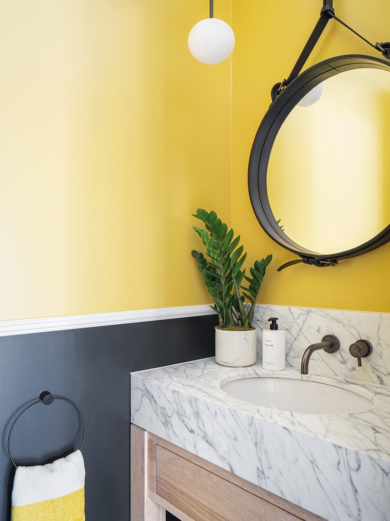
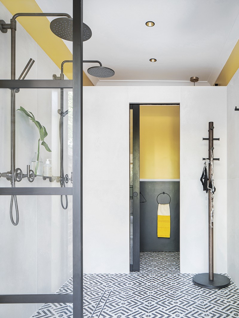
This changing room was inspired by Soho House – industrial but cool, it’s balanced by interesting patterns and bold colours. The tiles and yellow tones are a continuation of the exterior patio design, connecting the indoor with the outdoors –while the Brooklyn taps are from The Watermark Collection. The toilet is connected with the pool shower room and although small, comes with a substantial, full-width marble sink and large round Gubi leather mirror. There are also additional period details, such as the dado rail. We also installed a freestanding hot tub and this changing room is an essential for teenage pool parties.
The Terrace
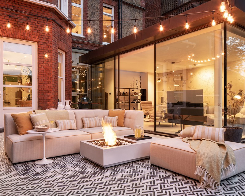
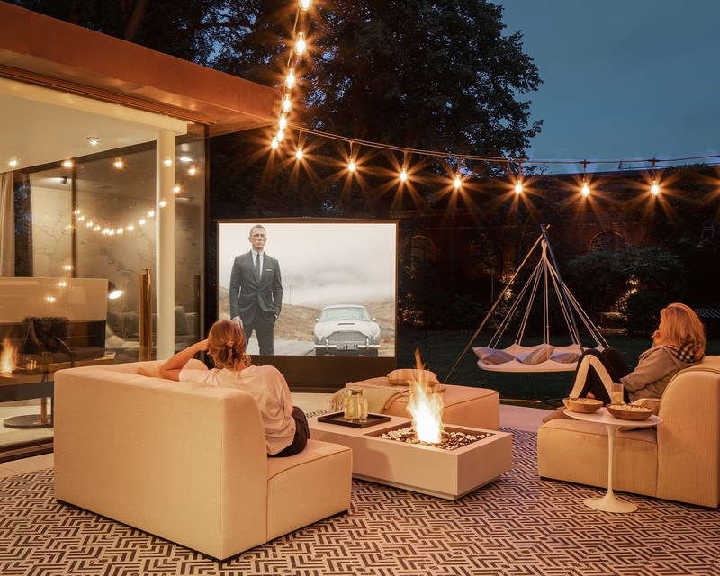
NW3 Interiors designed this outdoor space. Full planning permission for a swimming pool was denied, however, a hot tub spa-swim pool with an electric lid was craned into the extended terrace area. Meanwhile, the furniture is by Coco Wolf, a brand founded by a New Zealand couple and manufactured in the UK – luxurious loungers suitable for outdoors, which are very comfortable.
The colour combination was designed to suit the architecture of the home and the glass room, complete with bright yellow accents. Also, this worked with the scheme in the pool room. As you leave, the vibe changes, but it’s still cohesive. The outdoor screen came from Amazon and the projector is by Viewsonic.
PHOTOGRAPHY CREDIT – VIGO JANSONS
Visit NW3InteriorsLTD.com
DISCLAIMER: We endeavour to always credit the correct original source of every image we use. If you think a credit may be incorrect, please contact us at info@sheerluxe.com.

