Interior Designer Isabella Worsley Shares Her Favourite Projects
Style & Ethos
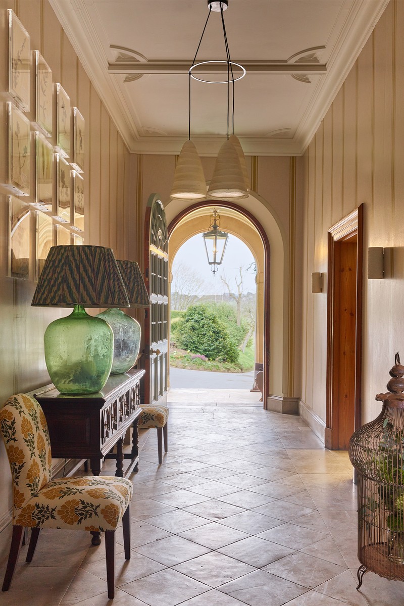
Our style is always dictated by each project we work on, whether that’s a residential property or a commercial client. I try not to be too tunnel-visioned in my aesthetic and instead allow the building to do the talking. Normally, that kickstarts the design process, whether it’s influenced by the architecture’s detailing, the landscape, or most importantly what it’s going to be used for. My signature style has a sense of eclectic Britishness to it. I had quite a classical training, but I moved on to work with interior designer Kit Kemp who has a great flair for colour – she definitely gave me the confidence to have fun with interiors and not be too rigid. When tackling a project, I think about what’s appropriate for the building, and then work to give it character and personality through unexpected design details, fabric, artwork and objets.
Design & Inspiration
There’s such a plethora of cultural availability to us, especially in London. I find buildings always trigger interest. I also try to go to as many exhibitions as I can – if I’m lacking inspiration, I always go to the V&A. Going to places with such scale and volume always results in inspiration. Galleries and other traditional institutions can often lead to quite contemporary ideas – the unexpected can be a great source of inspiration.
Colour & Materials
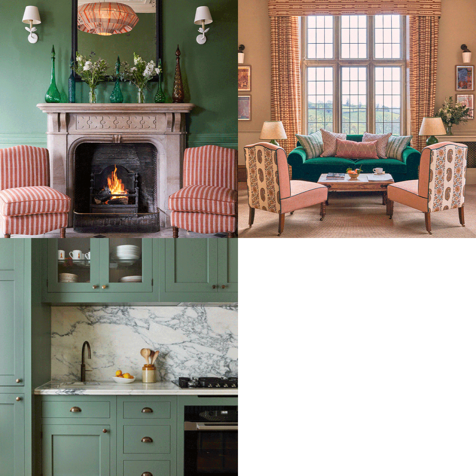
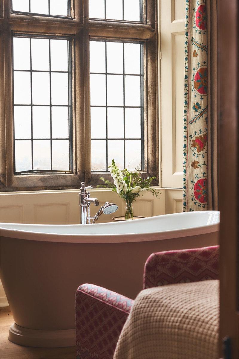
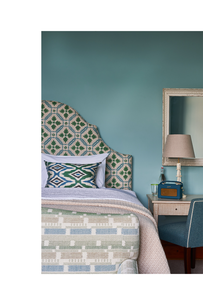
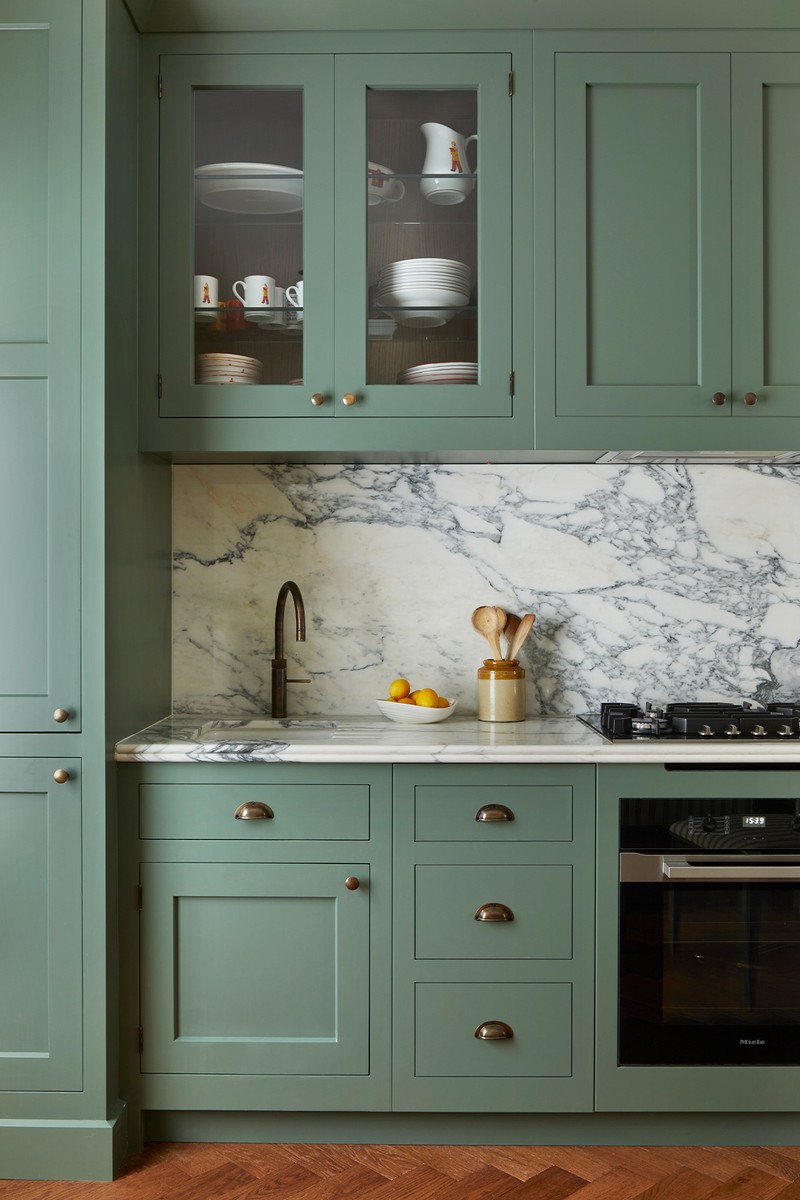
I’m definitely drawn to natural fabrics and tend to stay away from man-made, shiny ones. Organic fabrics can help you build up textures and I love using richly coloured fabrics and prints – not being too polite with it can result in really exciting interiors, particularly if you have a strong backdrop colour with layering on top. I often use jewel-like, rich colours, which are enveloping and cosy. It all depends on what the room is to be used for, but the English climate goes particularly well with warmer colours. Whitewashed walls work brilliantly if you’re designing a house in Greece, but in the UK it’s important to inject a bit of cheer against those grey skies – emerald greens, reds and jewel-box colours can add real richness.
Finishing Touches
Finishing touches always start with the clients themselves. It’s very important for a house to feel like a home, so the last thing I would want is for a client to move into somewhere they have no connection with. It’s important, therefore, to play on people’s heritage and story with trinkets and bits and bobs they’ve collected along the way.
We also design all our joinery bespoke at our studio, where we develop it in sketch format, before moving it into special software called AutoCAD to develop the joinery in elevation. It’s technical, but a really helpful way of making sure the proportions are correct in the space – we make sure everything fits together seamlessly.
Designer Influences
I’ve been heavily influenced by the two designers I trained under – Guy Goodfellow and Kit Kemp. They both have very different aesthetics, but I learnt a huge amount from both. Guy taught me how to understand classical proportions, to pay tribute to the bones of a building, and not to overshadow it with design, while Kit taught me how to be confident with colour and use items in an unexpected way.
Instagram Inspiration
Instagram is such a great resource for inspiration. To have an accessible platform that makes it easy to see what other designers are doing is great. You feel like you’re aware of the moment and what everyone’s doing right now, as well as what they’ve done in the past with their portfolio. I love the work of @Susie_Atkinson who has a great eye for design, and I also love following @RobertKime who makes beautiful fabrics and textiles. @Tat.London is another account that shows such a great selection of interiors with a real sense of Britishness, which is such a successful look. Other favourites include @Atelier_LK and @Studio_Squire.
01
PEAK DISTRICT HOTEL
/https%3A%2F%2Fsw18.sheerluxe.com%2Fsites%2Fsheerluxe%2Ffiles%2Farticles%2F2021%2F08%2Fisabella-worsley-peak-district-hotel-image-01.gif?itok=dRd67Hv1)
Inspiration
Callow Hall in the Peak District was the first project I started solo, having previously only worked for other designers. It was a real labour of love and a fantastic opportunity to create a whole brand, as well as the interiors. I worked very closely with the directors from the beginning, finding out exactly what they wanted to achieve and who the guests were going to be. It was important to create an exciting hotel that didn’t feel intimidating, but also didn’t feel flat, while ensuring every space had its own character. The Victorian building was previously a private residence. Victorian architecture can sometimes feel quite sombre, so it was important to lift that and bring in some colour and light.
Space & Planning
Callow Hall comprises the main house and a selection of woodland treehouses and cabins on the estate. We had to make sure the additional accommodation fitted into the surrounding landscape and preserved it, too. There were a few planning restraints, but we managed to work around them.
Colour Palette
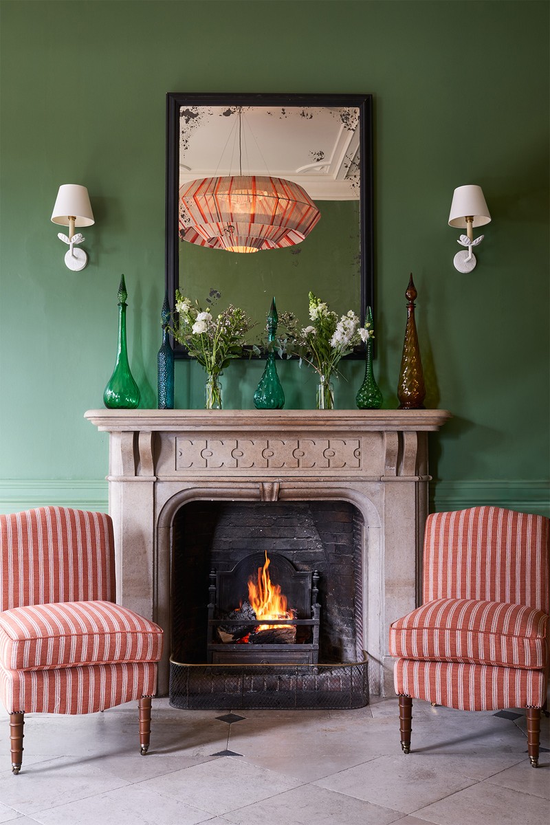
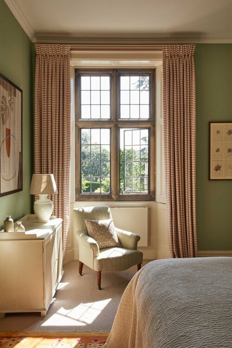
There are 15 individually designed guestrooms in the hotel and it was important that each of them – as well as the other communal rooms – had their own identity. In the public areas, I wanted to create spaces that adapted to different times of the day. For example, one of the rooms has rich emerald green panelling with red and cherry tones to feel cosy during the evenings, when guests can settle down with a glass of whisky, while the living room has a much fresher palette so it feels more appropriate for daytime.
Materials
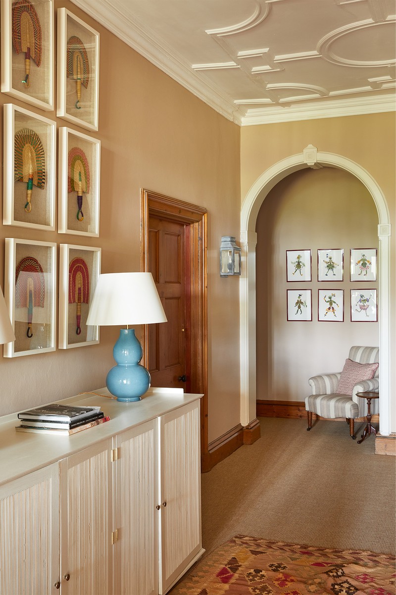
I often fall in love with one fabric and build around that with other complementary fabrics during the design process. At Callow Hall, there’s one key fabric in each room but I made a point not to replicate them elsewhere, which made it a bit of a lengthier process, but a very enjoyable one. I was also keen to incorporate young British artists into the scheme, so commissioned a mural by Melissa White to bring the outdoors in – she created a piece that reflects the beautiful Peak District and its surroundings. We also included pieces by up-and-coming artists Karl Blossfeldt and Jonathan Schofield.
Lighting
Throughout the hotel, I wanted the lighting to feel gentle and at harmony with the Victorian architecture. We steered away from down lighting and kept it low level, so there are lots of table lamps with shades to give a real softness and glow. We also sourced a few quirky pieces to add something a bit different. For example, in the main lobby we commissioned a large string pendant to give the space its own identity and create a centrepiece – it was important to bring in something a little unexpected.
Photography by Adam Lynk
02
A CHELSEA PUB
/https%3A%2F%2Fsw18.sheerluxe.com%2Fsites%2Fsheerluxe%2Ffiles%2Farticles%2F2021%2F08%2Fisabella-worsley-chelsea-pub-image-01.gif?itok=zBnRlFf_)
Inspiration
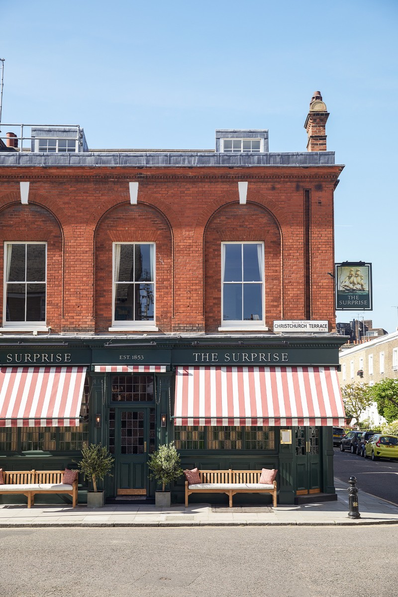
The brief for this project was to create a traditional British pub that paid homage to its role in the Chelsea community. With The Surprise, we wanted to create a really welcoming space where people could come and have a pint at the end of the day, as well as a full supper – it was important that it didn’t feel exclusive in any way. I was influenced by the building’s history – The Surprise was a ship the British captured during the Napoleonic war. Having a story woven into any interior will give it interest and weight, so we really drew on the naval links. With the interiors, we wanted to use reclaimed pieces throughout, so we knew we had to bring in lots of vintage items that would bring their own part of the story to the table.
Space & Planning
The proportions of the pub were great to start with. The ground floor has beautiful, glazed windows which bring in lots of light to two sides of the building. There was also lovely detailing on a glazed partition which we made sure to incorporate into the design. On the first floor, the private dining room has three big sash windows which, again, brought in lots of light – we were careful to restore the original features and give them a gentle update. In terms of planning, it was already a working pub, so we didn’t need to get much permission. The owners had wonderful archives of the building, so it was great to have an accurate history to help create a cosy space that would still feel timeless.
Colour Palette
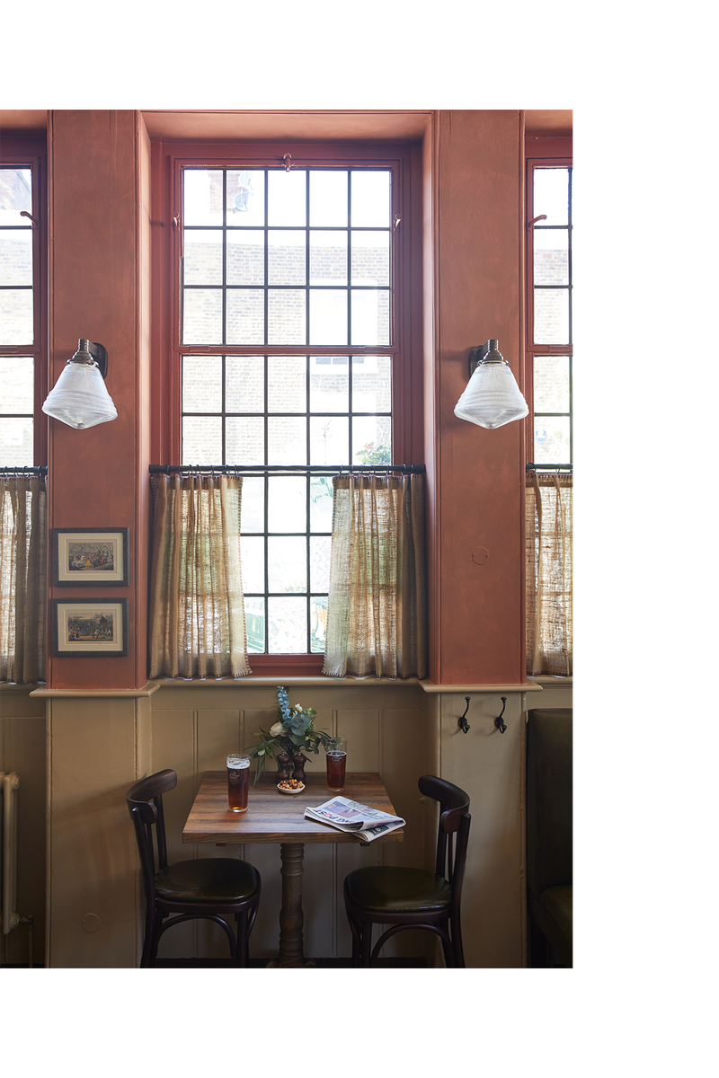
I was keen to create an earthy, natural feel in the pub, so I worked with a specialist painter to create a bespoke terracotta colour for the main room. It had a mottled finish, rather than a flat one, which worked well to give it a bit of an edge and create a look of imperfection – a pub should have a slightly aged feel to it. Luckily, my client was very open minded and trusted me with the colour. It looks great against the freshness of artwork.
On the ground floor, we played with earthy autumnal colours like olive green, dark leather banquette furnishings and hessian on the curtains. The outside of the pub is also painted in a rich olive-green colour, which is contrasted by a striped awning to keep it a little more contemporary.
Materials
I liked the idea of using fabrics with some history, so we used café curtains in the windows to inject a bit of roughness. These were made from hessian, traditionally used for potato bags in England, which was a nice way to contrast material and texture. We also incorporated naval mats and had fun finding lots of quirky pieces along the way that nodded to the building’s history. It was nice to have a mixture of leather, wood and furnished seating so guests could have options, while also adding different dimensions to the space.
Lighting
On this project, getting the lighting right was key as it needed to suit both day and night. We used lots of wall lights throughout and found some large ones that reminded me of those found on naval ships. They’re fixed around the ground floor and are slightly oversized, so they feel gutsy and make a bit of a statement. We also sourced some polythene pendants from a reclamation company called Retrouvius. It was very important to feel as though we were restoring old items, as oppsed to buying things new, straight off the peg.
Photography by Helen Cathcart
03
CHELSEA TOWNHOUSE
/https%3A%2F%2Fsw18.sheerluxe.com%2Fsites%2Fsheerluxe%2Ffiles%2Farticles%2F2021%2F08%2Fisabella-worsley-chelsea-townhouse-image-01.gif?itok=4z4cZyZz)
Inspiration
This project was for a client who lived in Hong Kong. It was his London residence and he wanted it to be a family home for his children to visit when they were in the UK. My client was very trusting, and he was keen to do something a bit different as it was his second property. He wanted it to feel quintessentially British, in contrast to his home abroad, so that was my main starting point. From when we started work to when it was finished, he wasn’t able to see the project due to Covid-19, so it was lovely having a bit of space to really develop the design and explore all the options.
Space & Planning
The building itself had already undergone some development but it hadn’t been done very well, as is often the case. We stripped it back to the bones, down to putting in new flooring, fireplaces, cornicing and joinery – it was a total reconfiguration throughout. That said, we made mainly minor structural changes, like moving some bedroom walls. We also raised all the door heights to open it all up and improve the proportions, and fitted in pocket doors to conceal the hinges. In most London properties, you need to make the most of every square inch, so the design has to be even more considered when you’re working with smaller rooms or spaces – not just in the aesthetic but also in the practicality, like adequate storage space.
Colour Palette
We wanted to inject colour but not be too bold with anything that would date. In a few of the rooms, we started with one fabric, for example in one of the bedrooms we used a beautiful Robert Kime fabric on the curtains called Tashkent which has beautiful blues and raspberry pinks, and built the scheme around that. This was for the daughter’s room which felt more feminine, compared to the son’s which was more masculine with edgier prints, fabrics and textures to give it more masculine weight. On the upper floor, the windows were slightly awkward in terms of curtain treatment, so we opted for paperback linen to give the space a lovely softness – a great idea when you can’t do that through fabrics and texture.
/https%3A%2F%2Fsw18.sheerluxe.com%2Fsites%2Fsheerluxe%2Ffiles%2Farticles%2F2021%2F08%2Fisabella-worsley-chelsea-townhouse-image-02.jpg?itok=nHv3V-Qo)
Materials
We used wooden panelling in the hallway at a lower height to break up the space as there was a tilted ceiling on the staircase area – this helped to improve the flow and open up the rooms. In a masculine space, more bronzed finishes give a slightly tougher feel, whereas those with a mottled effect can be more feminine, so it’s about drawing on the material and ironmongery to ensure it feels unified. Making the bespoke joinery was particularly enjoyable as we started from scratch, so we had a blank canvas to work with.
Lighting
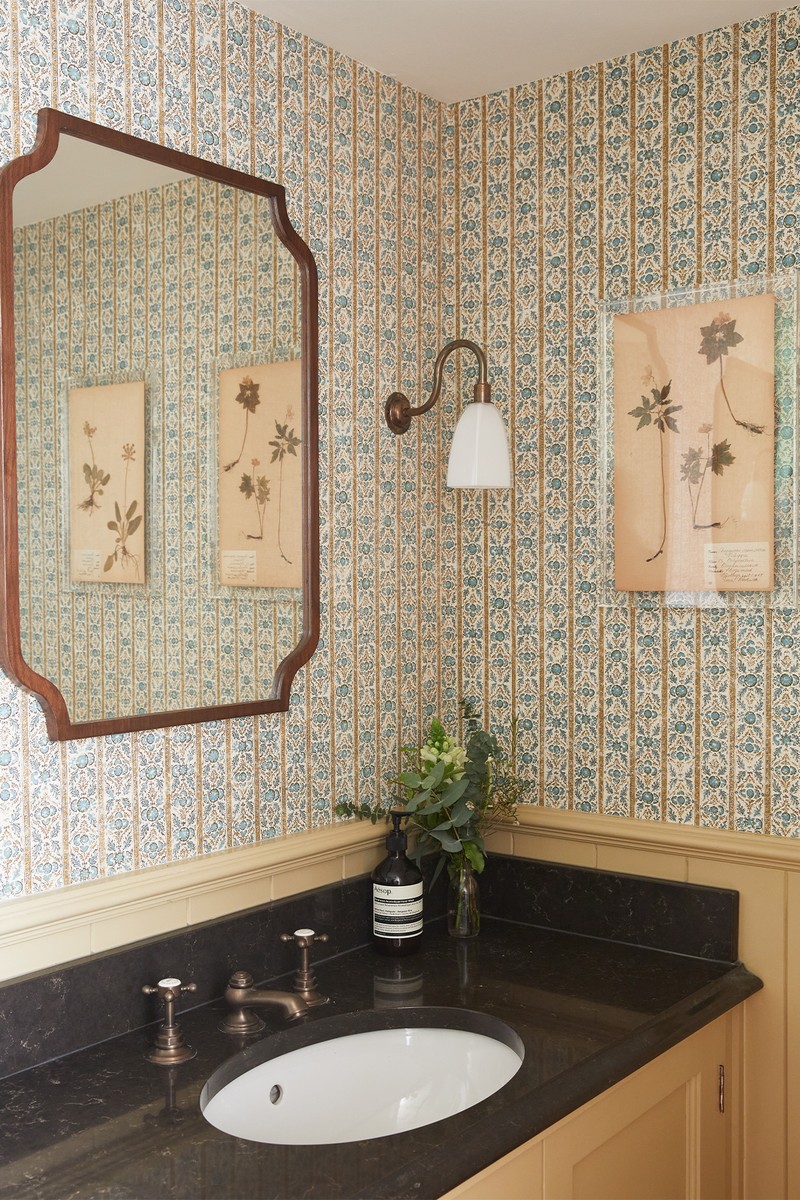
We wanted to create subtle lighting accents, rather than floodlighting the space. Again, we were quite restricted in some of the sizes of the rooms, like the cloakroom, and one of the bathrooms had no natural light at all. To work with that, we clad the wall in mirror and fixed lights to it which helped bounce light around the space and detracted from the lack of natural light.
Photography by Astrid Templier
Visit IsabellaWorsley.com
DISCLAIMER: We endeavour to always credit the correct original source of every image we use. If you think a credit may be incorrect, please contact us at info@sheerluxe.com.
