One Couple Shares Their Home Renovation Journey
SAVING & PLANNING
Prior to the renovation, neither of us had done building work on this kind of scale before. Fortunately, I had a bit of construction and project management experience thanks to my job, which helped us more than we first anticipated.
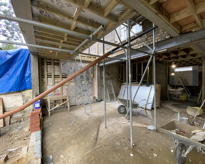
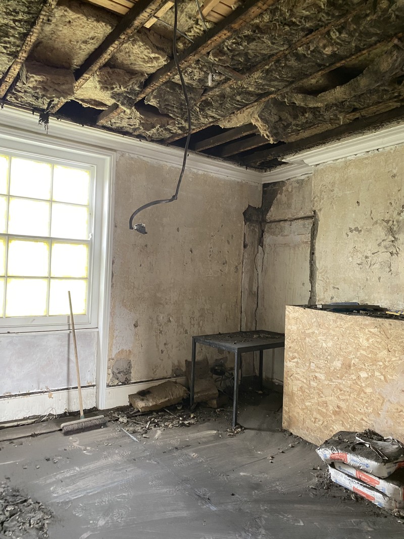
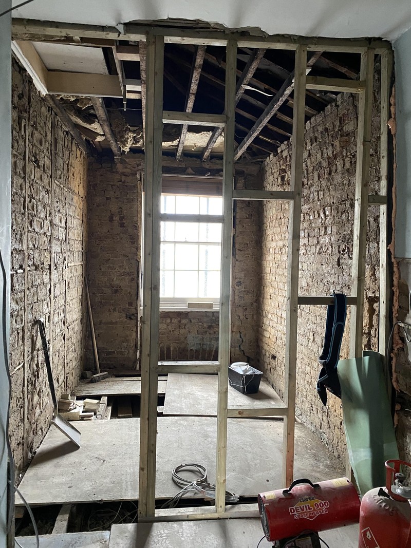
When we bought it, the house was dated, but it still felt perfectly liveable. It had been a family house handed down through several generations, before briefly becoming a rental property, so zero money had been spent on it for quite a few decades. Fortunately, the fact it had been loved by one family for so long meant most of the original features had survived, even if the kitchen was a damp, narrow 1980s addition. We unearthed most of the structural stuff in time, which brought with it issues like a bowing side wall, asbestos, collapsed ceilings and weak joists on the top floor.
We initially had tenants living there for a year while we stayed in a family flat. This enabled us save up some money while we worked on the architect plans, getting planning permission (it’s in a conservation area) and finding the right construction team. Once the build started, it became unliveable due to the scale of the project. It meant we only moved in last August once it was safe for our daughter, and we had the kitchen and one bathroom complete. My poor in-laws probably didn’t expect us to stay in their flat for two and a half years.
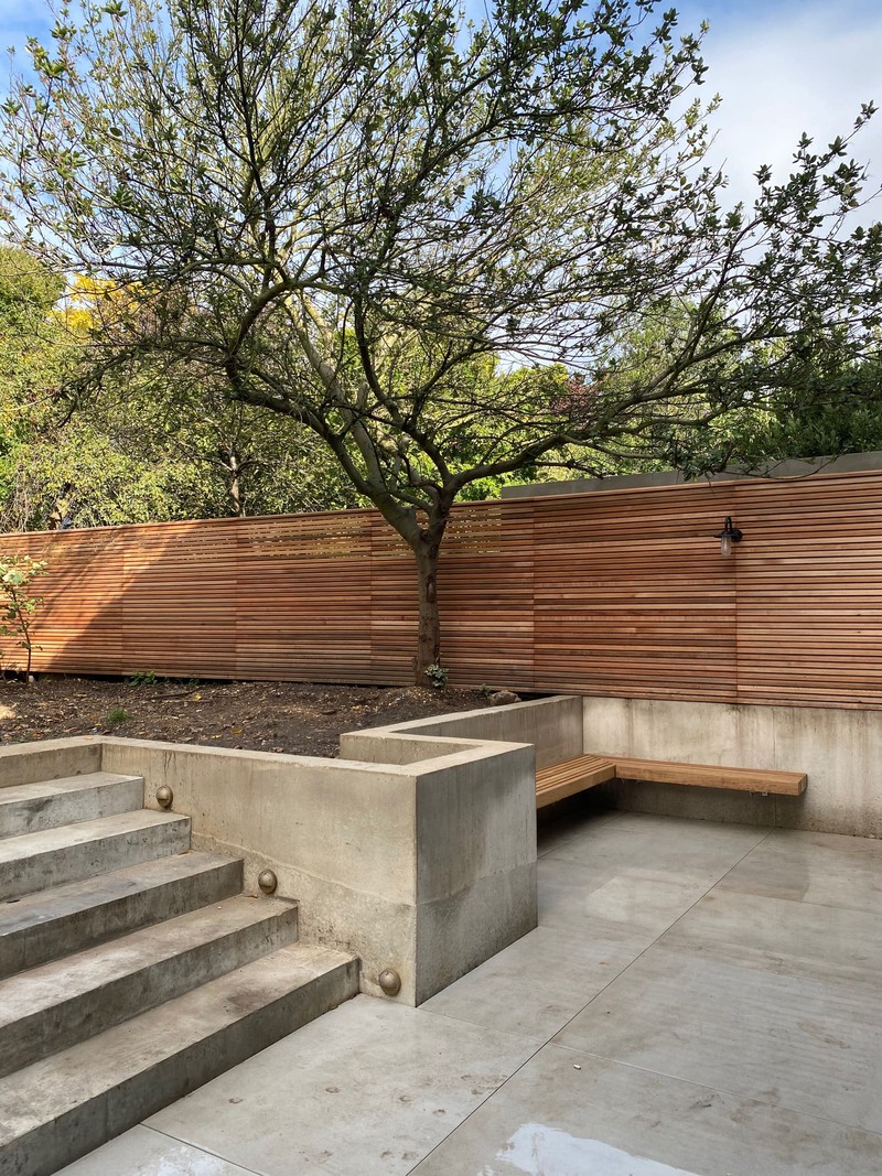
We saved up enough money to do everything at once. At our age, with a little one and another one on the way, we were in a different position to where we might have been 10 years ago – we did some investigating and worked out we could buy a house in need of some love, do it up to our taste and come in on budget. We took the back and side walls off the house, added a narrow side infill extension to add another bedroom, and a larger rear extension to give us a large, open plan kitchen.
ALLOCATING THE BUDGET
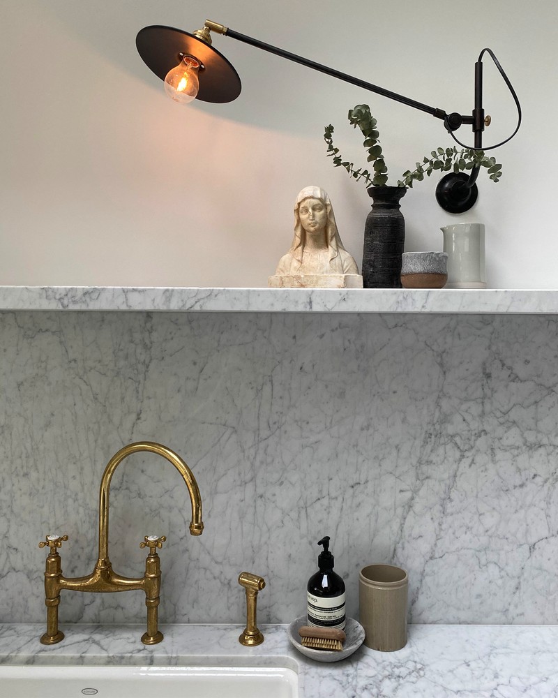
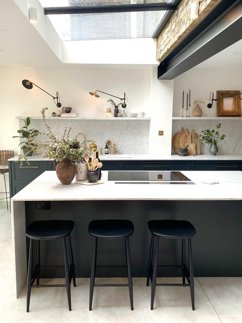
Aside from the main structural work, most of the money went on the kitchen. Professional and architects’ fees do add up, too, but the kitchen was our biggest splurge – and so worth it. We live in that space and we are so pleased with it. We decided to stick to our vision for that space, and compromise elsewhere.
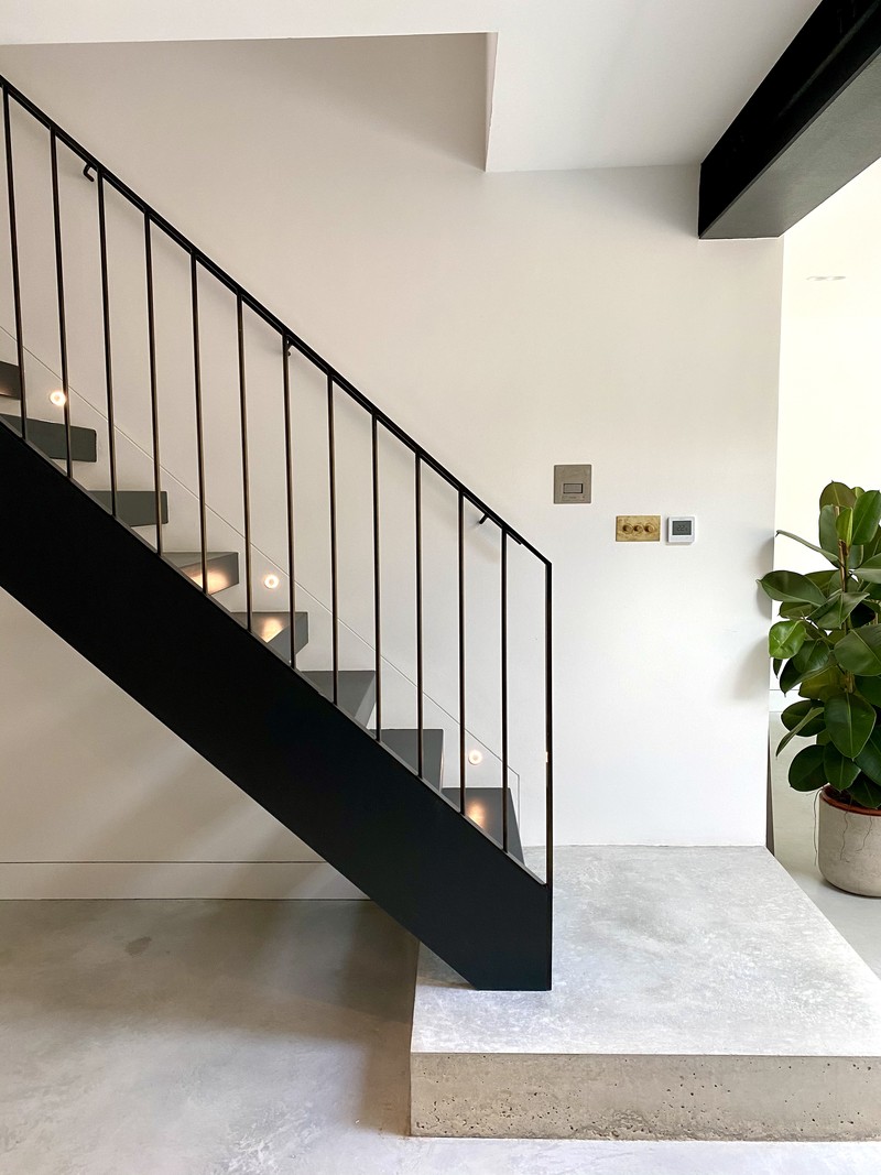
I always wanted a concrete floor. We have a big floor space that runs continuously from the patio through to the kitchen, pantry, utility and shower room. So we wanted something that would offer visual continuity, be practical and allow us to have underfloor heating, too. It’s as easy as anything else to maintain and a lot less precious than wood. I’m also not a fan of floor tiles in a big space, so we chose to invest in concrete instead.
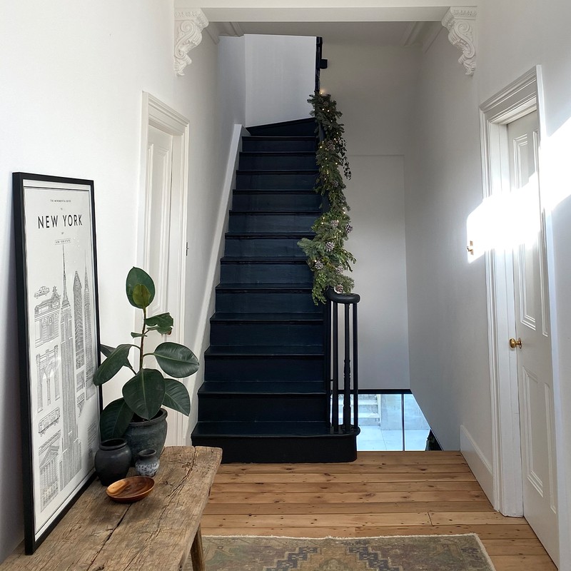
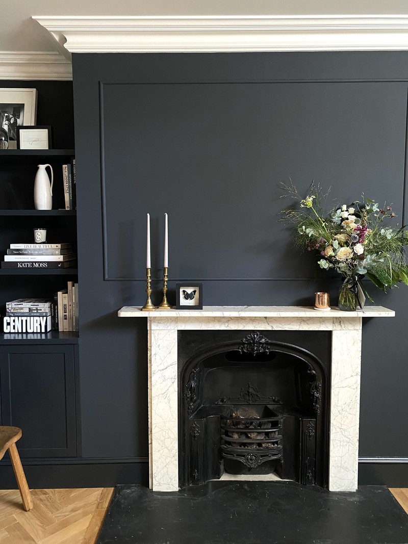
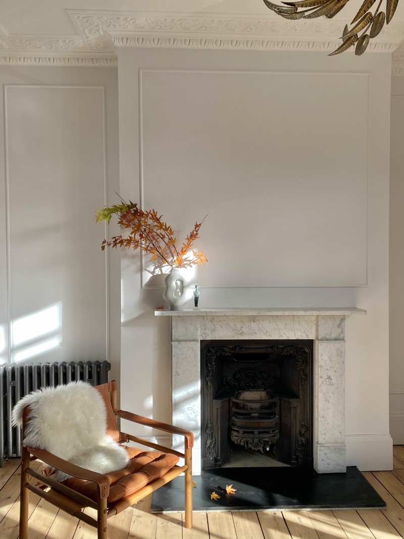
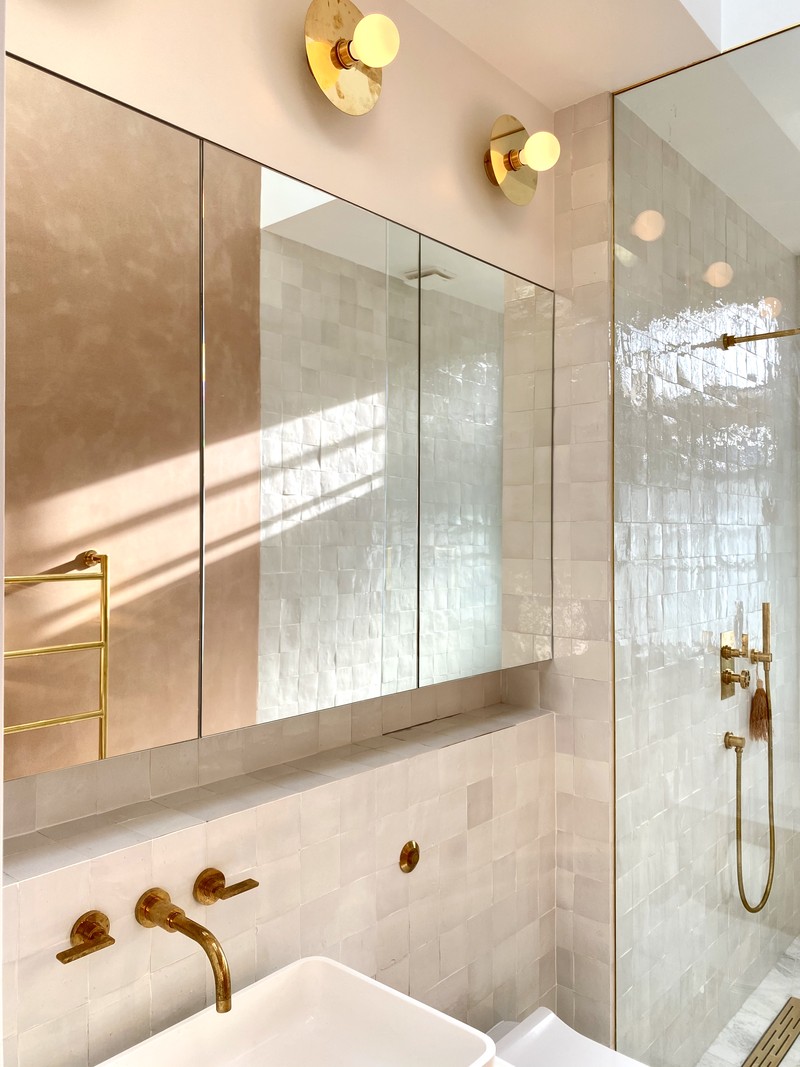
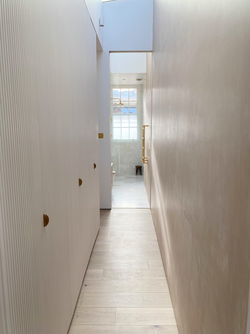
One of the ways we offset the cost of the kitchen was with the utility room. We bought Ikea carcasses, had a joiner make the doors, and bought handles off Etsy. The whole room came in at £1,000. Our guest bathroom has cheap subway tiles laid in a pattern to create interest, which also offset the cost of having Zellige in the en-suite. We were lucky we loved a lot of the original features – it meant we could retain and restore the original floorboards and fireplaces, which saved us some money.
DECORATING THE SPACE
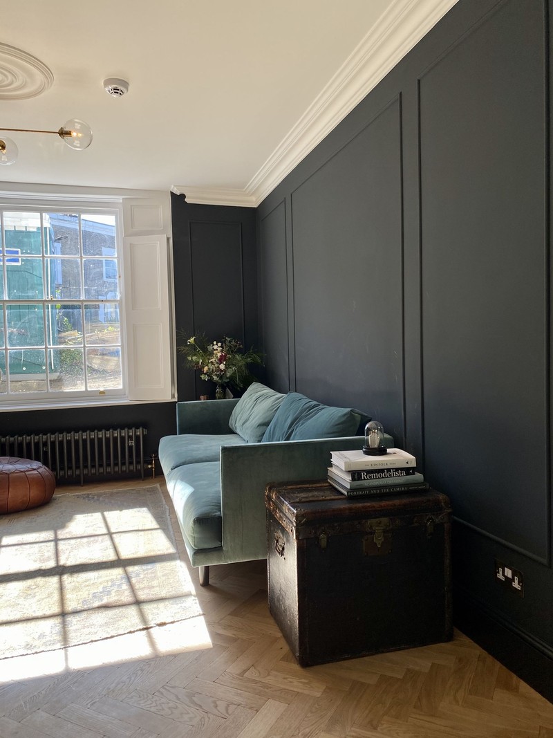
The parquet floor is from The Reclaimed Flooring Company. We used the original 1840s wide plank floorboards from the den to patch upstairs and didn’t have enough for down in the Den and guest bedroom, so chose to do this weathered-looking parquet. It flows nicely off the concrete and is a timeless style. We kept it light with no stain, to make it feel more modern, and less like the industrial parquet that was very trendy ten years ago.
All the walls are painted now, but we’re a long way off with furnishings. Textures and tones are more important to me rather than overt pattern or colour – I just find a lot of colour and pattern isn’t restful or easy to live with. We’ve largely stuck to monochrome, but we have raw pink plaster in our bedroom and en-suite for a softer feel. The guest bedroom is painted in Farrow & Ball Mizzle, the den is Railings, the living room Wevet and the utility room is Pigeon. I like a more neutral base where your possessions can sit on top to add interest.
I’m always on the hunt for inspiration. I love visiting different spaces – whether it’s hotels, restaurants, or even retial stores like Celine and The Row. I love looking at Joseph Dirand, Athena Calderone, Colin King, Jake Arnold, Vincent Van Duysen, Kinfolk, Arch Digest, Rum, Elle Deco, and lots of fellow renovators on Instagram. We find the social media community are very supportive.
WHAT WE’VE LEARNT
If we were to do anything differently, it would be project managing more of the build sooner. I was furloughed in the spring, and we couldn't afford to pay for that help any more. But once I took it on, I soon realised how it sped up communication, decision making and general progress on site. We’ve also recognised how much we love a challenge. We’re a good team, too: James is good at budgets and timeframes, I'm better at concepts, sourcing, and pulling it all together.
Our biggest mistake was underestimating the timings and cost. We’ve all seen Grand Designs, so you think you're prepared, but you're not. And it's painful when it's your own life. The various setbacks can be hard to deal with emotionally. Obviously, nobody enjoys living with dirt, noise and disruption, especially during a year of WFH, but we have a lovely team and being on site was helpful when it came to progressing the project.
Ultimately, I’m so happy we did it. I love the house so much it feels like the financial gamble, hard work, time and stress was worth it. I find joy in lots of small moments – the marble in the kitchen, our en-suite tiles, the wardrobe doors, my daughter having a bedroom of her own, having a garden. I have to admit that on some of the worst days of the build, I worried none of it would feel worth it.
My final piece of advice is to do your research. Sourcing takes a long time, so plan, budget, and then be decisive based on your hard work. Make sure you really want to do this, because it can force sacrifices elsewhere in your life. Everyone’s expectations and projects are different, but I promise you it will be worth it in the end.
DE BEAUVOIR HOME’S SOURCEBOOK:
Kitchen – 202 Design
Flooring – Tedd Todd Floors, The Reclaimed Flooring Company
Furniture – It’s mostly vintage/collected pieces we’ve collected over the years. We haven’t had the budget to buy many new things yet.
Fixtures and fittings – Forbes and Lomax, Flos, Modular Screens.
Paint – Farrow & Ball Wevet, All White, Railings and Mizzle all work well in our home, but it really depends on your space, light and taste. We also used Bauwerk and I love Stone, Bone, and Mallorca.
Bathrooms – Aston Matthews, Lusso Stone, Studio Ore, Duravit, Bespoke Taps, Topps Tiles
Follow @DeBeauvoirHome on Instagram to see how Zoe and James’s project continues.
DISCLAIMER: We endeavour to always credit the correct original source of every image we use. If you think a credit may be incorrect, please contact us at info@sheerluxe.com.
/https%3A%2F%2Fsw18.sheerluxe.com%2Fsites%2Fsheerluxe%2Ffiles%2Farticles%2F2021%2F02%2Fdebeuvoirhomebathroomkitchenwide0.png?itok=K6kw2cbR)
