Meet The Interior Design Duo With Intelligent & Artisanal Style
Ethos & Approach
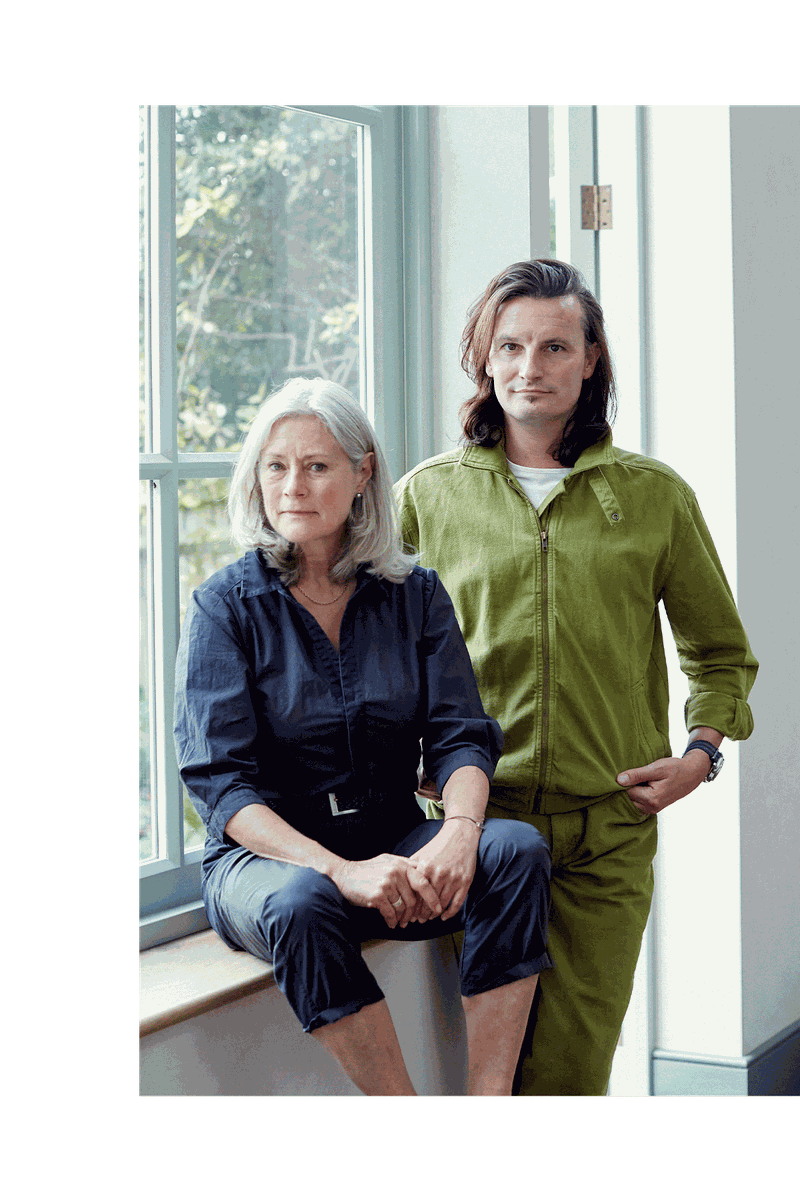
We’re meticulous about attention to detail, which is why we try to get a thorough understanding of how people live and how they want their home to work for them at the start of any project. We ask a lot of specific questions and are also mindful of the property’s history, architecture, and structure.
As a design studio, we’re committed to sourcing from and supporting both existing and up and coming British and international artisans and craftsmen, many of whom help us design bespoke solutions for our clients around the world. During lockdown, we produced a series of videos with some of our favourite names.
Design & Inspiration
Because each project is unique, we undertake exhaustive space planning exercises to ensure the eventual layout fits the client’s lifestyle. Our aim, always, is to reflect the client’s wishes and personality.
The concept stage of any project is complex, and can involve an enormous exchange of ideas and imagery. We start with a series of hand sketches to explore the space and asses the client’s appetite for various aesthetics. Often, a client will love one concept and their partner will love another. It’s our job to produce a refined solution that resonates with both. It’s always a fascinating challenge and there is nothing more satisfying than seeing both clients identify with the final vision.
Colour & Materials
Respecting the bones of the building is essential and we tend to resist trends in order to design interiors with longevity in mind. We believe in layering, so we carefully piece together colour and unusual finishes and textures. Where possible, we love to introduce hand-blocked wallpapers and regularly collaborate with specialist decorators and artists to create bespoke and personal designs.
Often, a paint colour is only nearly right – it’s usually perfect once it’s been carefully de-saturated. However much a scheme is developed in the studio, it can never be completed without colour testing on site. The aspect and everything that feeds into the space from the outside is such a strong influence. We recently completed projects in Hong Kong and Cairo only to discover the blues and greens read entirely differently when under the influence of the South China Sea and the Nile.
We’re always testing out and working with recycled products, too – worktops upcycled from yoghurt pots, terrazzo into which older, broken products are mixed, marbles purposely made from offcuts. When specifying timbers, as we so regularly do, we’re especially mindful of their provenance. We find ourselves using stones and timbers in different ways to display their characteristics – end grain is a favourite.
Finishing Touches
The design package is normally complete before work on the project starts. We know from experience that it’s vital to remain engaged throughout any construction or decoration works and everything is in the detail.
Working closely with antiques and decorative dealers around the UK, we tend to order in an array of decorative small furniture pieces and objects which we then curate within the larger scheme or with the client’s existing pieces. This can be a fun and time-efficient process for everyone involved.
Influences
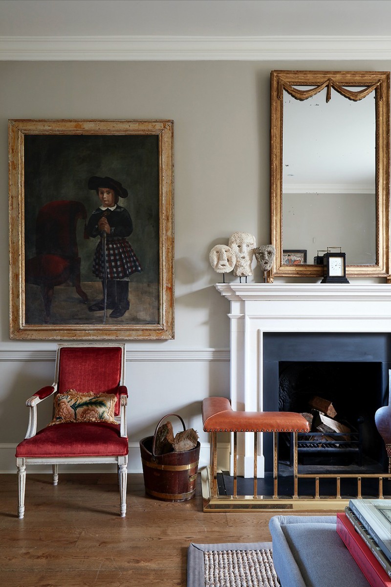
Madeleine Castaing. Her interiors pull together several elements borrowed from different historical periods to create a super sophisticated whole. She cleverly combines antique textiles with neoclassical patterns and Victorian textures. Her interiors are always refreshingly original and joyful.
Veere Grenney builds on everything that’s wonderful about the typical English country house style: the beautiful, printed textiles, the antiques with their lifelong patina and the rich historical colours. He successfully rationalises each scheme, removing all elements of shabbiness and his rooms are restful and always chic without being daunting. You can’t help but to want to spend time in them.
David Hicks is certainly worth a mention. His cutting-edge use of colour and pattern went completely against the grain for the time.
01
Georgian Rectory, Oxfordshire
/https%3A%2F%2Fsw18.sheerluxe.com%2Fsites%2Fsheerluxe%2Ffiles%2Farticles%2F2021%2F09%2Fkh-georgian-rectory-01.gif?itok=KjSmk8W-)
Inspiration & Planning
Our aim here was to take an empty house and create a personalised family home – one that felt like it had been there for years. We wanted to create a sophisticated and timeless design that felt understated rather than over-designed but we only had four months to redecorate and fill it with pieces that made it look as if the furniture and accessories had been collected over time. The house was made up of two halves: the original Georgian rectory and a more recent large extension. This natural divide enabled us to create different environments for different uses, for example, a classic, formal reception room in the Georgian house and a more contemporary kitchen and family living space in the newer wing.
Colour Palette
It was important to reimagine the Georgian palette for the 21st century. We used environmentally friendly paints (Edward Bulmer and Farrow & Ball) to create a calm and understated backdrop and refinished the floors to mute the tones and enhance the character of the timber. In the new wing, we used a fresh, contemporary colour palette, whereas in the Georgian wing we used a more classical palette in keeping with the formal nature of the rooms.
While different colour schemes may exist, there’s always a thread of continuity running throughout. For example, in the drawing room we used warm Georgian colours, such as rich reds and terracotta tones, and in the library (which faces the drawing room) we picked up these same colours in some of the accessories we chose for the shelves. Each of the seven bedrooms had their own distinct character but again, the devil is in the detail, so it was crucial to see the house come together as a whole.
/https%3A%2F%2Fsw18.sheerluxe.com%2Fsites%2Fsheerluxe%2Ffiles%2Farticles%2F2021%2F09%2Fkh-georgian-rectory-02.png?itok=gwcVFGJc)
Materials
The clients had an exacting eye for detail and are enthusiastic art collectors, so it was important to create backdrops that were suitable for both traditional and contemporary works. We carefully mixed antiques and classical oil paintings with mid-century collectables and more contemporary pieces, creating a timeless design and feel overall. To ensure the right scaling for the room, we also designed some bespoke upholstery.
The Georgian sofas in the drawing room were specially designed, both scaling them to the room and to the leg and back length of our client. Ensuring the single seat cushions looked well-loved and not brand new, we opted for soft feather down fillings. In the breakfast room we chose mid-century (Niels Moller) dining chairs alongside a Rose Uniacke Draper Table, and reduced the the height of the table to perfect the proportions.
Lighting
We created a bright, light feel to the property by using mirrors to bounce light around the house, as well as plenty of lamps and candlelight throughout.
02
Family Home, Fulham
Inspiration & Planning
This project was not about dictating a practice style; it was all about listening, thinking, and often combining conflicting client requirements, as well as proposing, addressing, and developing – along with plenty of imagination, attention to detail and tremendous care.
Our client is a British family, made up of parents in their late 40s and three teenage children, one dog, a steadily declining glint of goldfish and a bearded dragon. They had lived in the property since 2002 but their children were getting ready to leave for university, so their needs were becoming different. Progressively, we understood they had been looking for the right interior designer for several years and had interviewed several. They were looking for a team who could hold their hand from inception until the last detail was complete and they wanted their home to still reflect the family’s DNA when the new design was complete; we worked meticulously with them to achieve this.
We thoroughly reconfigured their family home by adding value and space. The basement was dug in 2002 but rarely used – the ceilings were low, but it didn’t make commercial sense to re-dig it. However, by applying our knowledge of structure, we were able to increase the floor-to-ceiling height to a more viable 2.6m. We worked with the existing structural pillars, too, which consequently saved the client a lot of money.
Colour Palette
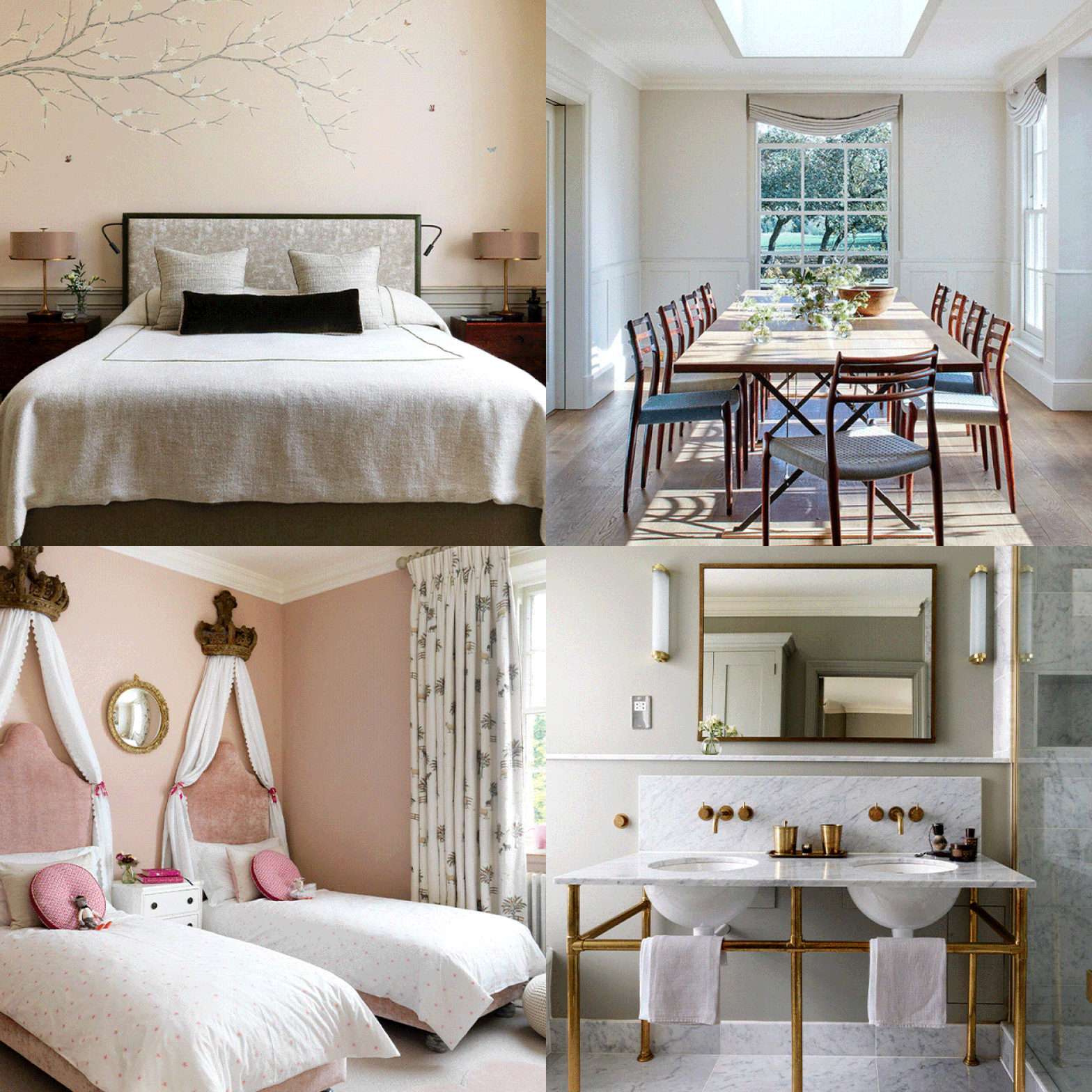
Both the husband and wife love colour, particularly blue, so we worked colour into each scheme to give every room its own identity. The purpose, mood and aspect of the room determined our decision on whether to use colour more subtly or not. To create a sense of calm in the master bedroom suite and to reflect the parkland views, we used muted hues of pinks, greens, and blues, layered with exquisite pattern and artwork to achieve a real sense of luxury.
In the guest bathrooms we were more expressive with colour. The graffiti mural in the basement shower room was inspired by East London street artists and the powder room on the ground floor has a gold leaf ceiling paired with Clarence House Tibet 9985, by Turnell & Gigon wallpaper.
Materials
This client shared our passion for original detailing and creating inviting and comfortable rooms. And while we worked with a lot of the finest joiners and specialist decorators out there, our client was keen to support up-and-coming artisans. This gave us the opportunity to discover and collaborate with some of Britain's finest rising stars.
For the basement staircase we used a mirror by Rupert Bevan, manufactured in Shropshire and an antique brass and polished steel stair rail fabricated in Yorkshire. The two together create an illusion of space.
In the master bathroom, the Bardillo marble frames the bespoke deep bathtub and the double sinks. It provides a smart border to the mosaic in Calacatta and Bordillo by Waterworks. It is softened by the specialist paint and the old rose wall colour, matching tonally with the bedroom silk wallpaper.
The eglomise is a bespoke design by K&H in collaboration with the artist Emma Peascod. It was a response to the client’s brief to design one-off items that one day she could take away with her. The bath step is made up from an old billiard table! Brushed nickel is used throughout, too.
We also found ways to use inexpensive original details in the teenagers’ rooms. The wardrobe handles in one of the girl’s rooms are made from recycled driftwood sourced by artist Ella Robinson, who then embroidered each one with hearts.
Lighting
We used a wide variety of makers and suppliers for the lighting. We commissioned London-based designer Margit Wittig to create a bespoke table lamp for the hallway and a chandelier for the drawing room. We also used J’aimes wall lights by Hannah Woodhouse, a British maker, to flank the drawing room in the hallway. These add sculptured texture, and a vertical, warm glow. In the master bedroom we chose Cox London’s oak leaf chandelier but modified it to suit the bedroom by thinning out the number of leaves.
Our lighting solutions in the basement add to the minimal, industrial and architectural design. We sourced a pair of Michael Anastassiades tube wall lights in satin brass.
The Mondrian-inspired Crittall doors through to the gym, utility room and media room, increase light flow and are practical for the day. By night, when entertaining in the media room, the gym and utility doors glow like light boxes. To light the staircases in the four-story Victorian house we chose sculpture and art to provide both light and decoration. The neon swimming lady light from Gods Own Junk Yard points towards the basement. The top floor we used the Solstice and Constellation wall light by Porta Romana.
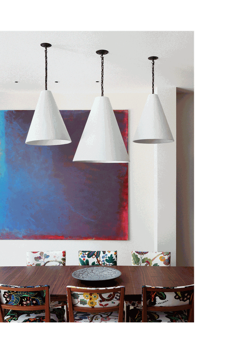
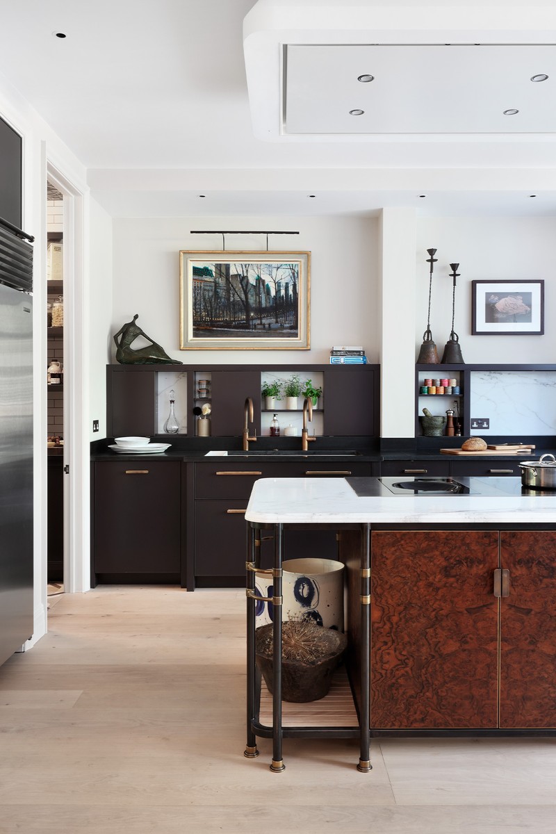
In the kitchen, a trio of gossamer thin Rose Uniacke plaster cones, made in England, create a focal point and zone the dining area – they provide lower-level lighting when at the table. The pendant lights in the pantry add a bit of fun with the family’s favourite food printed on the glass.
03
Family Home, Kensington
/https%3A%2F%2Fsw18.sheerluxe.com%2Fsites%2Fsheerluxe%2Ffiles%2Farticles%2F2021%2F09%2Fkh-kensington-home-01.gif?itok=fzjXY-zK)
Inspiration & Planning
This five-storey stucco fronted house in Kensington is the fourth project we’ve done with this family. It included a full redesign of the children’s bedrooms, an edited re-design of the master bedroom and reception rooms.
Having already designed bedrooms for the same children in their country home, we were familiar with their likes and dislikes. However, we’re ever mindful that a young person’s taste is subject to change as they mature. With that in mind, when we plan a child’s room, we think about how the space will be used as they grow up and how the palette can be adapted rather than totally changed over time. The smaller the bedroom the more challenging – but arguably the more stimulating – the design.
Colour Palette
In the main bedroom, we worked with the existing, deeply beautiful Misha Milano wallpaper. Sometimes, it’s just as satisfying to curate and develop a scheme as it is to start afresh. In the daughter’s bedroom our inspiration was a soft and fresh Scandinavian palette, using pastel colours from Edward Bulmer and adding a practical warm timber floor. The diamond wall was also inspired by an existing dolls house. We created a diamond stencil and with careful hand painting we applied All White by Farrow & Ball as the background with the diamonds in Pavilion Grey by Farrow & Ball and the pink and green diamonds in Laylock and Celadon by Edward Bulmer. The colours and patterns from an existing miniature play tent influenced the choice of fabrics for cushions, her bed throw and bedside lighting design.
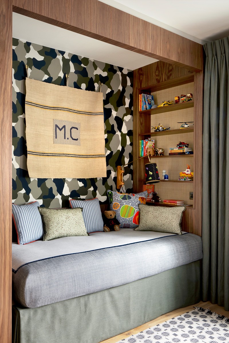
In the son’s bedroom, we created a fusion of Danish mid-century meets Action Man and Lego. After sketching a few designs, the client chose a military camouflage wall and man cave-style bed. We used stencils to decorate the camouflage wall. The predominant paint colours are Invisible Green, Basalt and Mortar by Little Green, and Slate IV and Lusi from the Paint and Paper Library.
Materials
The headboard in the master bedroom is upholstered in one of Lauren Hwang’s exquisite fabrics. To add a touch of masculinity and the contemporary the headboard is finished with a green leather border. We designed the bedspread using the softest Pierre Frey fabric and, as a nod to the headboard design, we introduced a thin green trim. We were pleased to be able to include this sumptuous Toyine Sellers fabric in the cushion arrangement, too.
The daughter’s bed needed to work as a day bed, a single bed and be extendable for sleepovers. Inspired by The Princess and the Pea fairy tale, the stack of faux mattresses doubles up as a pull-out bed for sleepovers. We used fabrics from Nicholas Haslam, Christopher Farr Cloth, George Spencer Design, Zimmer and Rohde and Pierre Frey. Always thinking practically, the top panel has been designed to work with our young client’s bed guard.
The workspace is separated from the bedroom area with a loft-style glazed screen, and we used saddlery leather with which to ‘hang’ the shelves. The work area is further defined with hand-blocked paper from Hamilton Weston. Simple linen curtains hang to the side and the desk is neatly accessorised with a Tolix-style chair. For the aspiring artist, we sourced a picture wall and painted it in line with the colour scheme, to display her artwork.
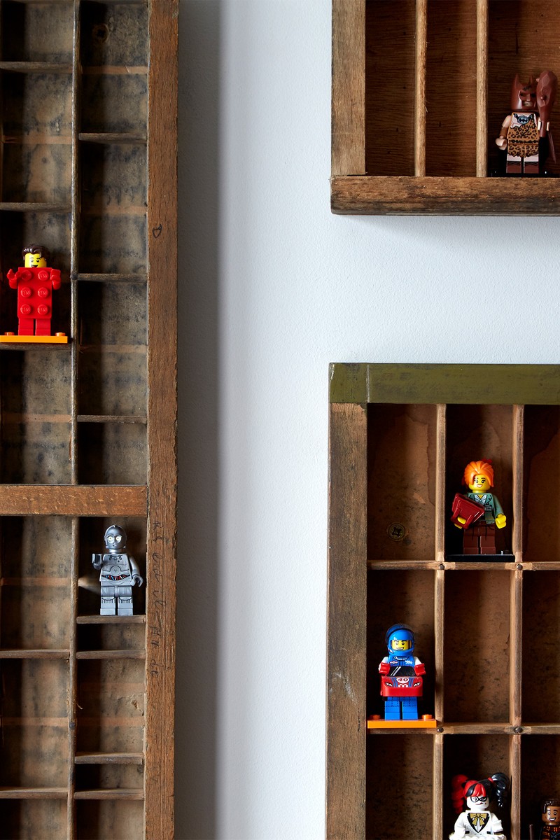
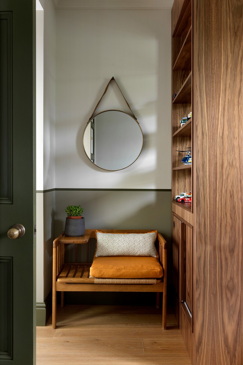
For the son, we sourced a mid-century telephone table in vintage American oak rush and seagrass. We are confident it’s something he will still like in his teens. The seat cushion leather is by Howe, and for the back cushion we used Howe Formica, Olive as the main fabric and heavy weight Corduroy and Mouse for the reverse. Reclaimed vintage ink trays hang above the bespoke desk. We sourced these to maximise storage for our client’s extensive Lego collection, and to be able to display them as cool wall art. Using the existing fitted wardrobes, we removed the original glass and installed MDF board into the nine wardrobe panels. We designed the outside to have magnetic linen so our client could use it to display his artwork. For the internal wardrobe panels, we used a green ticking fabric.
Lighting
For the main bedroom, we sourced two aged brass and walnut wood base lamps – and had the lampshades made from Claremont’s Bois de Rose. The two bronze reading lights are from Astro.
The rotating arm wall light in the daughter’s room is from Janie Knitted Textiles. The wall light above the little boy’s bed is from Mercer with a bespoke switch from Lorfords Antiques. We had the shade made of a dark grey felt with a green trim. The shade is even more special thanks to the hand stitching. While he’s young, he can add fuzzy felt safari animals – which can of course be removed as he grows up. Finally, the desk lamp is from West Elm.
Visit KAndHDesign.co.uk
Photography by Simon Brown
Photography by Alexander James
DISCLAIMER: We endeavour to always credit the correct original source of every image we use. If you think a credit may be incorrect, please contact us at info@sheerluxe.com.
