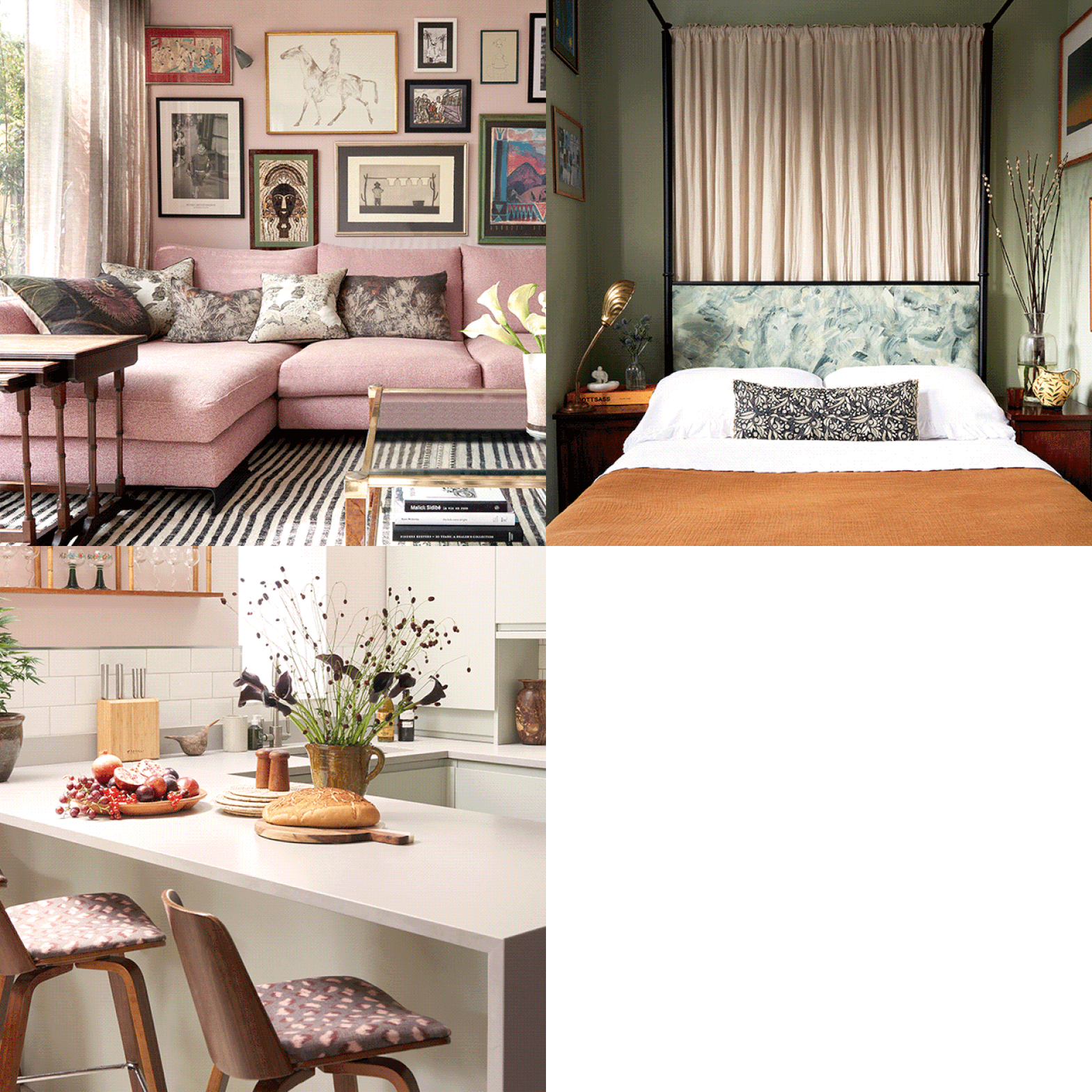
A London Flat Transformed By Two Interior Designers
The Property
We moved into our flat in 2019 with a plan to live in it together for five years – as we weren’t going to be there for a long time, we wanted to find somewhere that was a blank canvas so we could make it our own, but which didn’t require lots of structural work. As soon as we saw this flat, we loved it – it’s a Victorian terraced house in southwest London which has been converted into two flats (ours being the ground floor). It has three bedrooms and a rear extension, which works as an open plan living/kitchen/dining area.
The Living Space
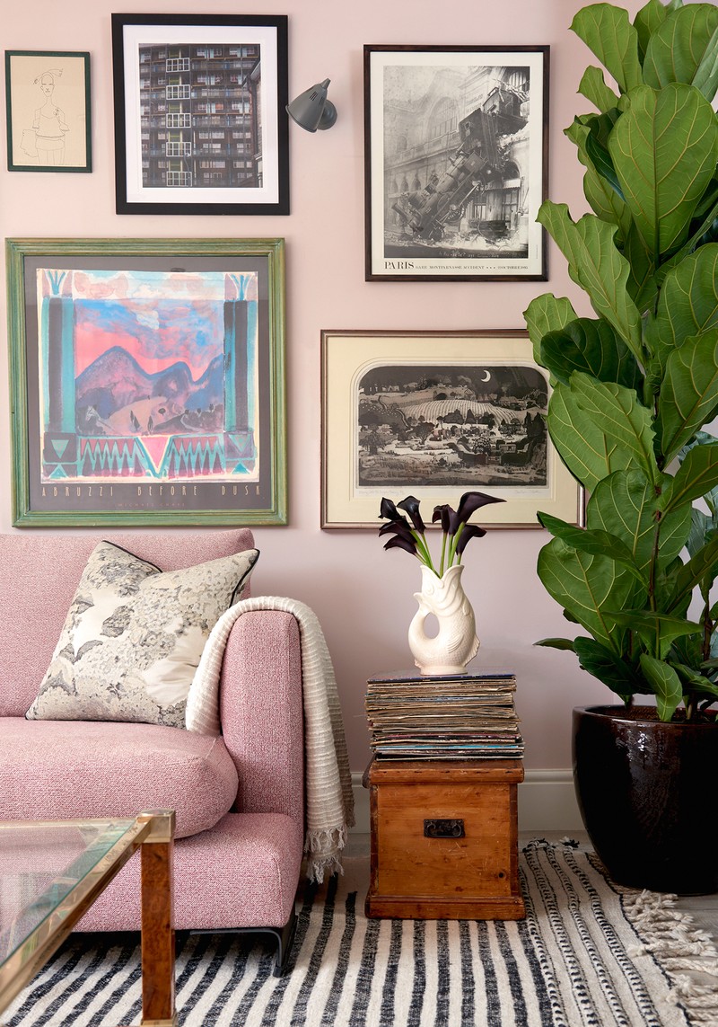
The main living area is flooded with light during the day. Growing up, we always talked about having our first flat together and always knew we wanted to have a soft pink living room. We ended up going with Calamine by Farrow & Ball, which is such a calming colour. It’s also so subtle – when the sun is bright, it looks almost like a white, which makes it a great way to add a colour without it being too overwhelming. It also works as a great backdrop for layering other pieces into the scheme.
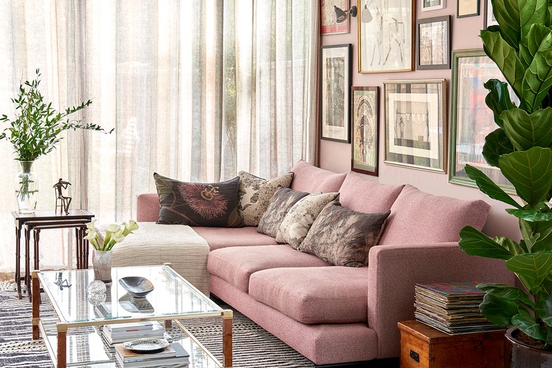
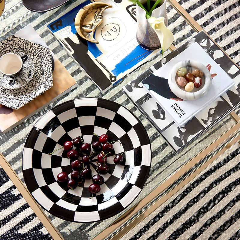
The sofa is by Camerich (their Lazytime sofa), the cushions are a mix of linen Isobel Sippeland Rubellidesigns. Around the window are sheer curtains – Stardust Stripes by de Le Cuona– on a bronze curtain pole. The coffee table is vintage Pierre Vandel from Brocante Furnishings, and it sits on a striped black and white berber rug from Morocco. The trio of side tables are a vintage set from our grandparents’ home.
Behind the sofa is a variety of artwork, including an Elisabeth Frink lithograph called ‘Horse & Rider’, a Kate Moss illustration by Frida Wannerberger from SHOWstudio, and illustrations by young up-and-coming artists James Owens and Minna Williams.
The Study Area
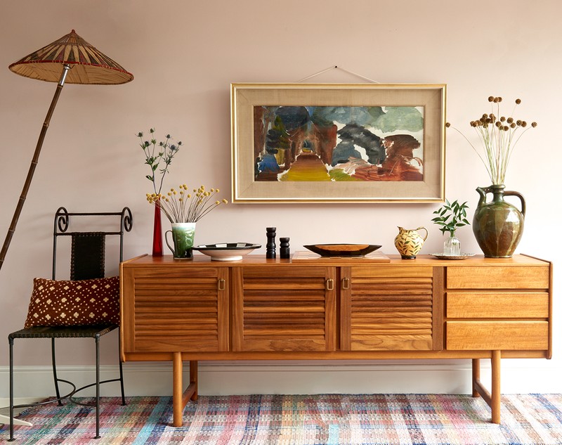
The previous owners had a small French dresser in this space, so when we moved in, it was a vast blank wall. As the room is so open plan, it was important for us to zone it, to create defined areas and enhance the feeling of it being a 'working studio space', as well as a living space. It’s why we designed this bespoke shelving/desk unit.
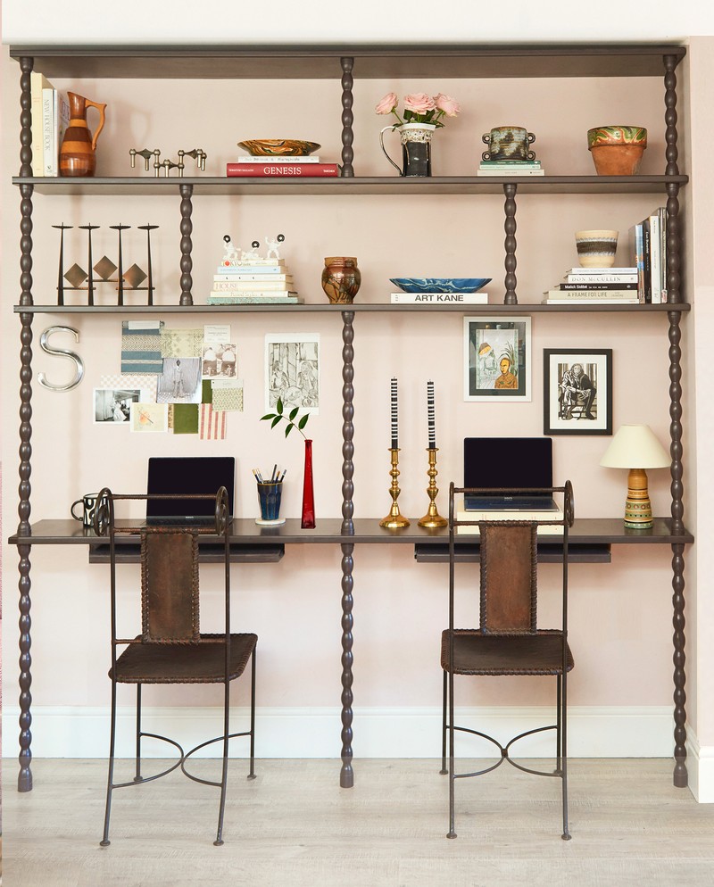
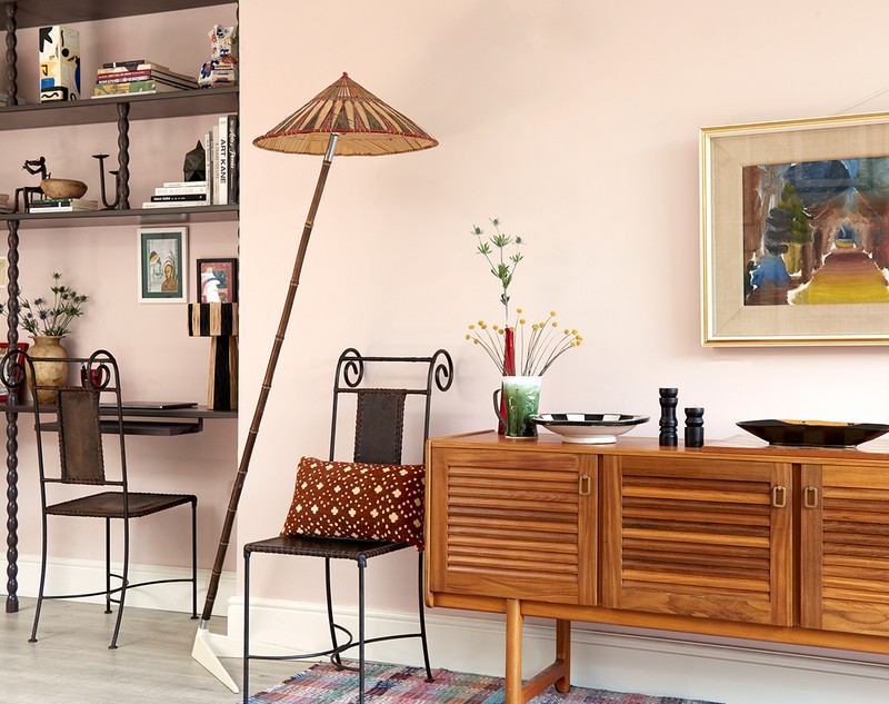
We had the unit run straight up to the ceiling to draw the eye up, too, and it was actually the last thing we added to the space; we lived here for a good eight months before it was installed. Often, people think adding a large shelving unit will make the space feel smaller, but we find it’s usually the opposite – it can help make the space feel bigger just as easily.
Originally, we were going to do shelves only, but after launching our company, we knew we’d need somewhere to work other than the kitchen table, so we incorporated the desks. We sent a photoshop of the design to our friend who is also a furniture maker/joiner and we worked together on it – it’s painted in Paint & Paper Library ‘Copper Beech’. The chairs are an Instagram find (@Max_Keys) and the mid-century sideboard is by A.H. McIntosh from Barker & Churcher. The piece of artwork above the sideboard is an original Ivon Hitchens (a family piece we inherited).
The Dining Area
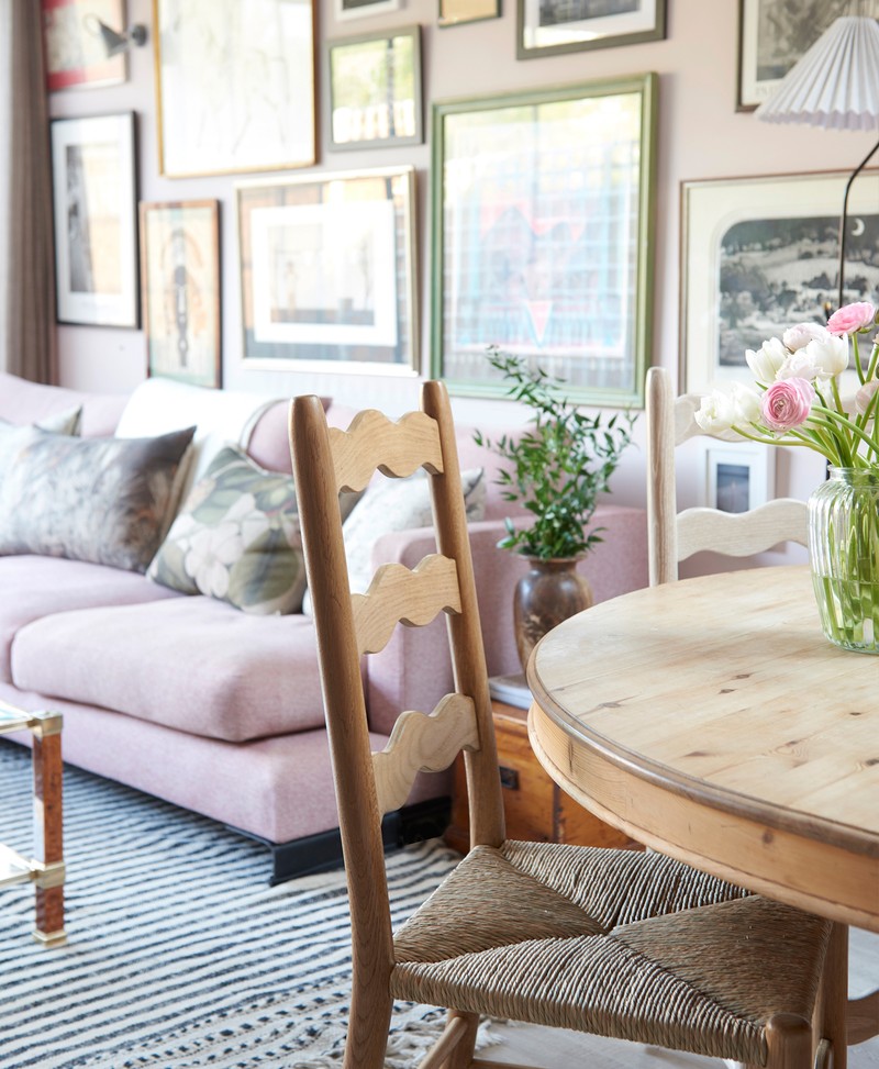
We love this big round dining table, which was handmade by our grandfather in East Sussex. The chairs are our own product – the ‘Wave Ladderback’, which are made in collaboration with The Odd Chair Company. Each piece is handmade in the UK, made from solid oak and comes with a hand woven rush seat (they’re available to order through our website).
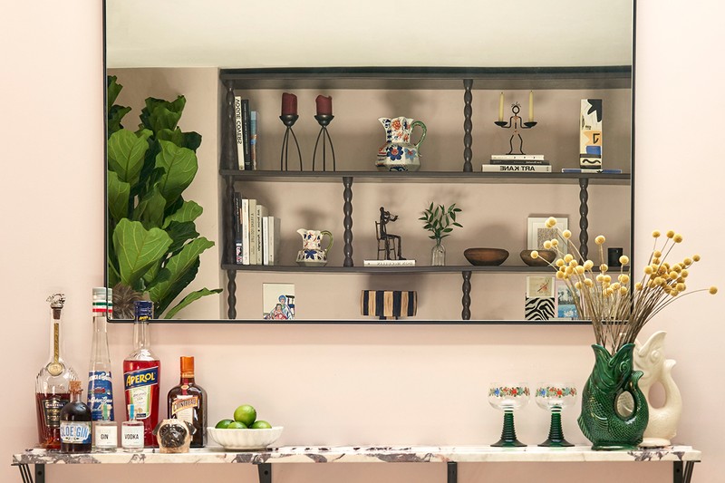
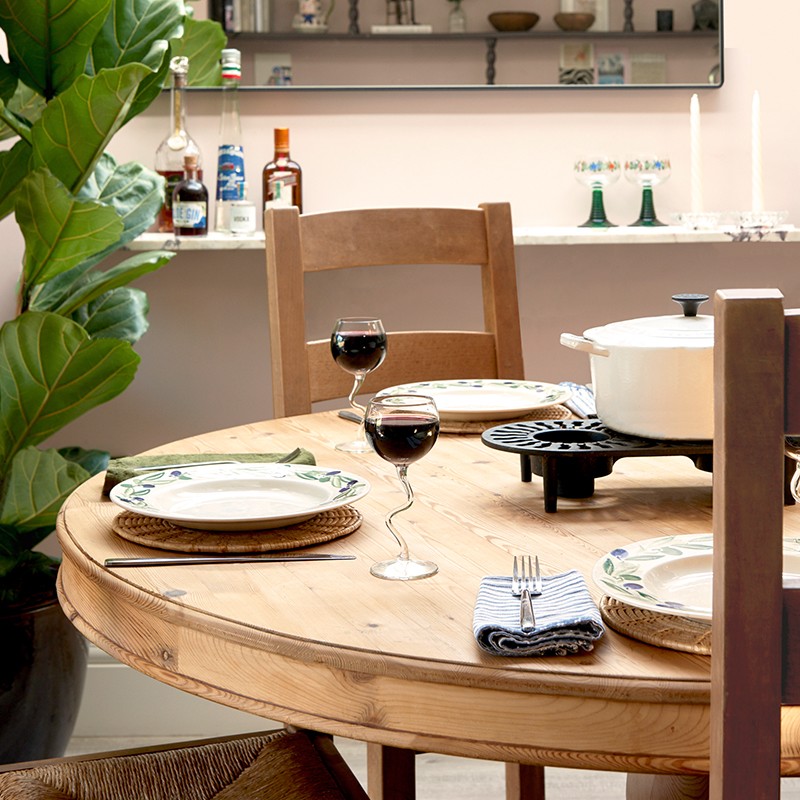
We added the Calcutta marble shelf to create a bar area behind the dining table to help zone some of the different areas in the open plan living space and add another layer to the interior. A large mirror above the bar reflects the bobbin shelves –and the pieces on them – an array of interesting ceramics we've sourced for our online shop. The marble used for the bar was an offcut that we found in a stone yard. In an ideal world, we would have had our kitchen worktops done in this marble, but it was over our budget. Using it for a smaller area is a cost-effective way of making something look considered without spending a huge amount of money. The large mirror above the bar is from The White Company.
The Kitchen
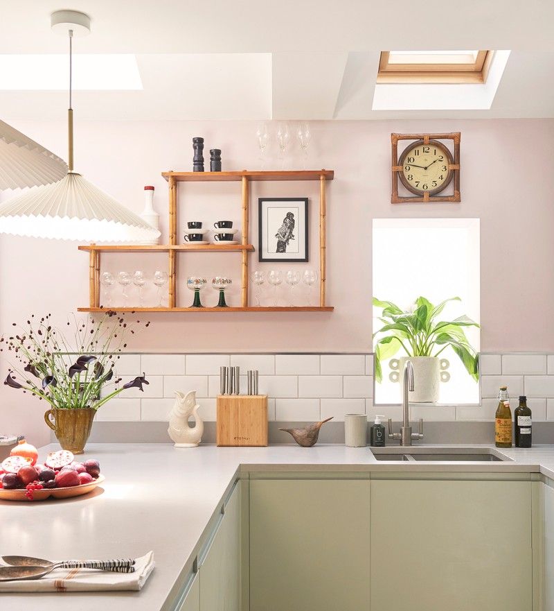
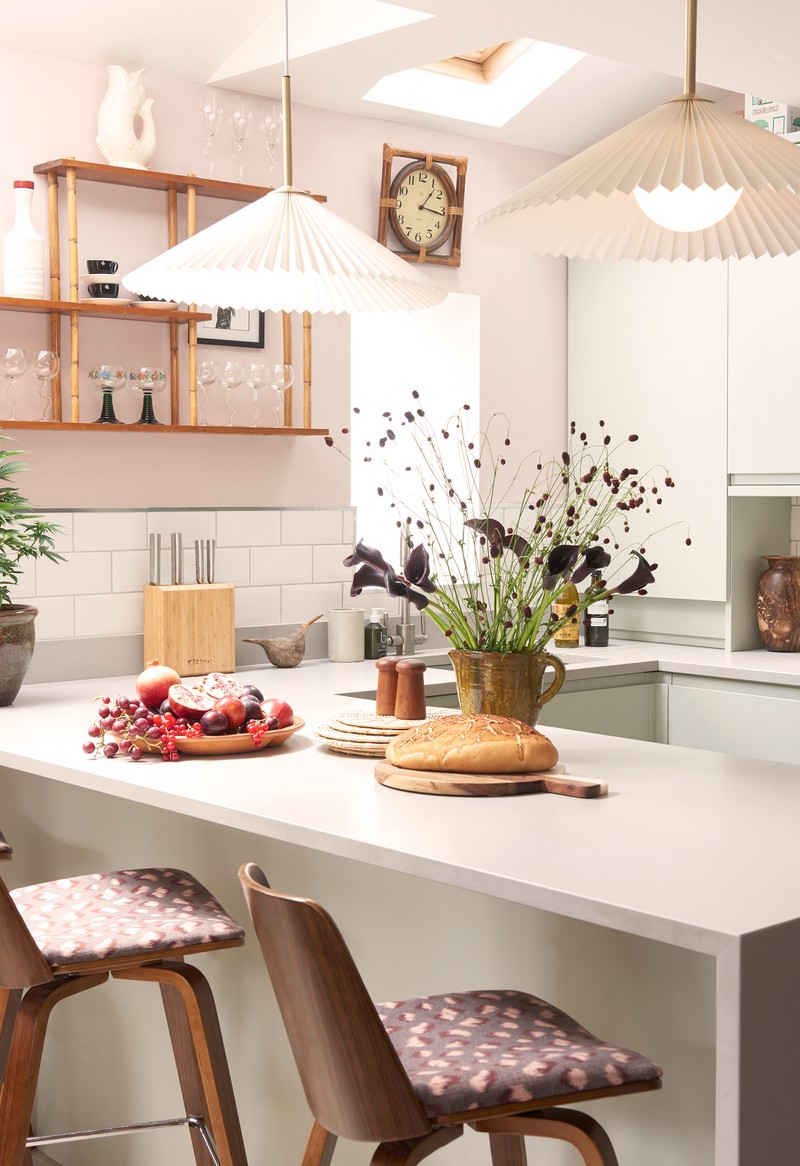
We would have loved to renovate the kitchen, but as we don’t plan to live here forever, we decided to repaint the existing kitchen instead of ripping everything out – it was a grey gloss before, and we painted it in Mizzle by Farrow & Ball, a lovely soft green colour.
We found the asymmetric bamboo shelves in an antiques market on the Northcote Road – they were actually part of the stall’s display but we loved them so much we asked if we could buy them!
The clock in our kitchen we brought over from our family house – it adds a familiar feel to the space. Being able to incorporate items you already own or that have been passed down to you is a great way to make a new space feel like it’s always been that way. Though the kitchen cabinets have a contemporary feel, the vintage bamboo shelves and clock create some balance.
The Hallway
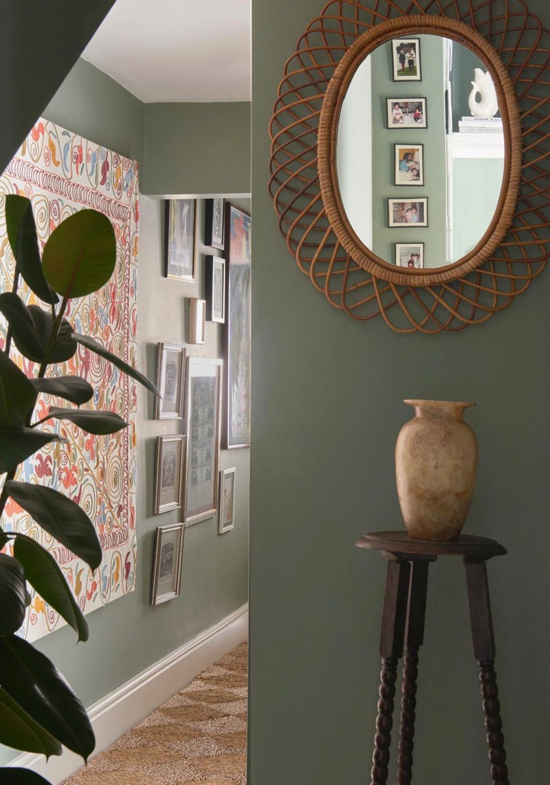
The hallway is quite dark, so we chose to embrace that and paint it in a dark colour (it’s Card Room Green by Farrow & Ball). The tapestry manages to lift the space, though, and it was a great, inexpensive way to fill a large expanse of wall. It’s probably one of our favourite purchases and is from Portobello Market. There are also four Graham Clarke artworks on the wall, which were passed down to us by our grandfather.
Caroline’s Bedoom
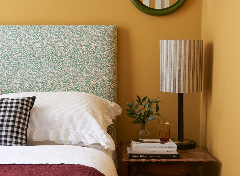
This is the first room you see when you enter the flat and it doesn’t get much natural light – the yellow really helped to add some warmth and make more of an impact as soon as you enter the flat (it’s India Yellow by Farrow & Ball).
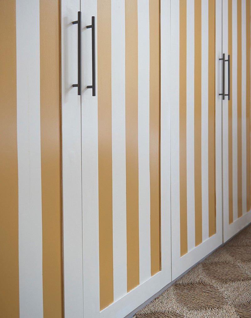
The biggest change in this room was the built-in wardrobes. We needed as much storage possible and felt it was a good investment. We hand-painted the stripe to match the walls – it’s a small space but we wanted to embrace the colour rather than shy away from it.
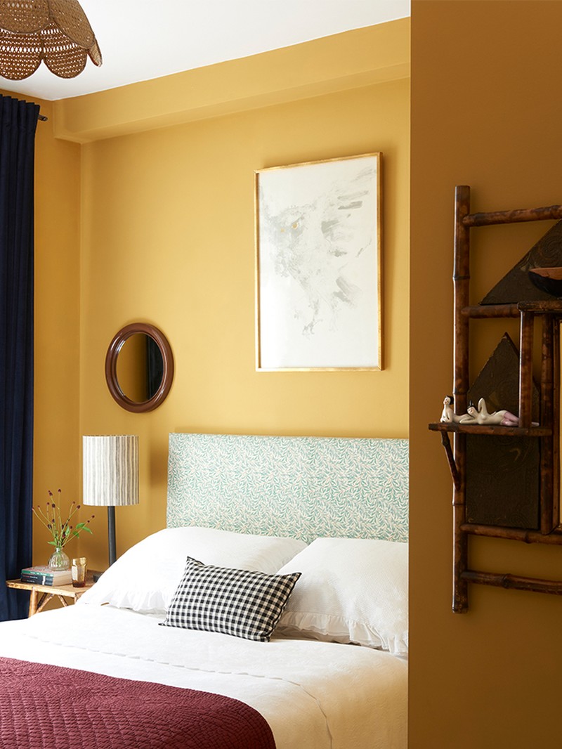
The curtains are a dark blue velvet design we found on eBay, but they weren’t quite long enough, so we added a trim to the bottom using Tibor’s Cymbelinefabric. The headboard is upholstered in William Morris’ Willow Boughfabric.
Both bedside tables are vintage, and were found at Kempton Market. The white embroidered bedspread with scallop edging is from Cologne & Cotton and the burgundy quilt is from Rebecca Aix. The black and white gingham cushion on the bed is from Zara Home and the two round mirrors on either side are vintage Habitat. The lampshades are from Kristen Hecktermann and the artwork above the bed is by Elisabeth Frink.
Sarah’s Bedroom
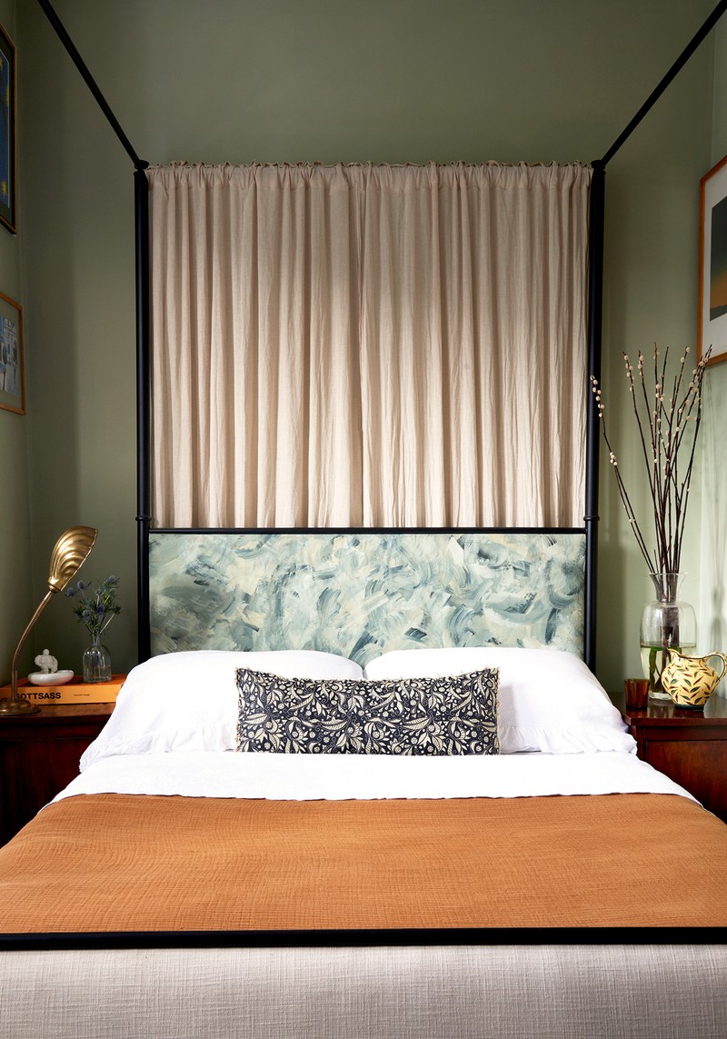
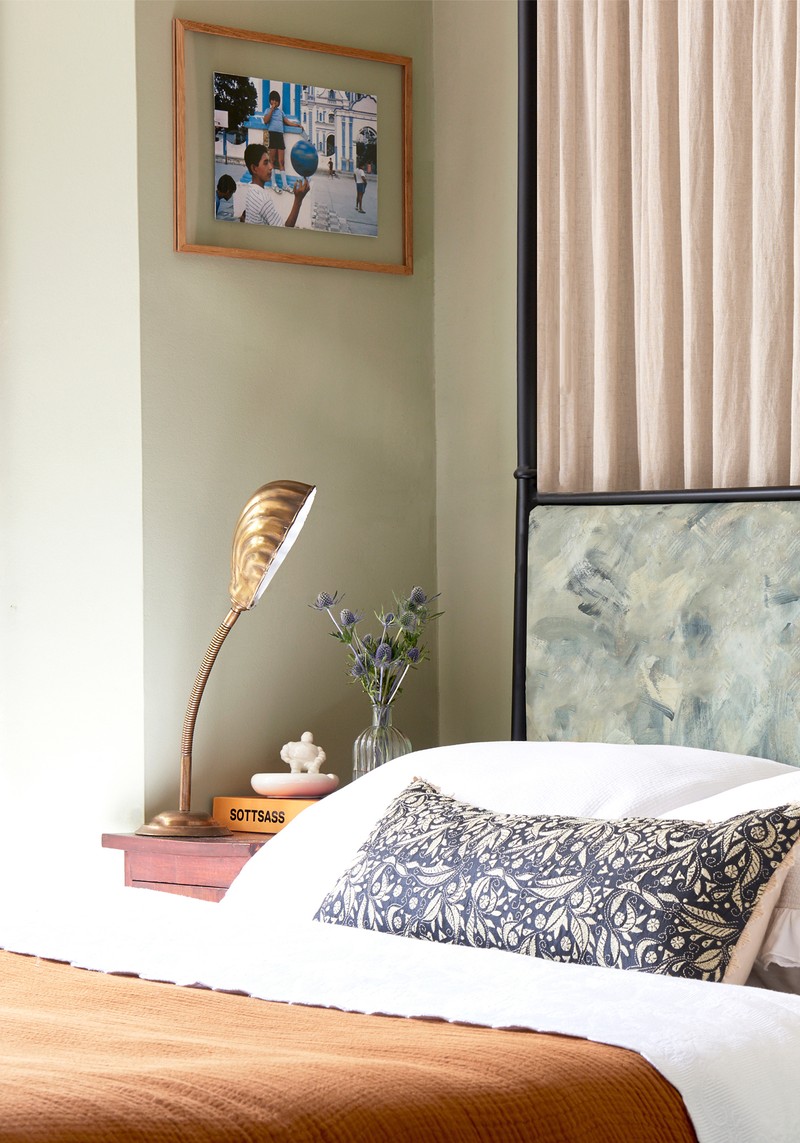
This bedroom is right at the front of the house (the view outside the bay window looks directly out onto the main road) so it was really important to make it feel cosy and private. It’s a large part of why we chose the four-poster bed. People often assume you need a really large room to make a four-poster work, but they definitely bring a sense of cosiness to a small room; the curtains also add privacy; and we used a soft linen at the back of the bed, too.
The headboard was actually a money-saving exercise – we used a lot of the budget on the built-in wardrobes and the bed itself, so we needed to be clever with the soft furnishings. We painted the walls in Vert de Terre by Farrow & Ball and used the leftover paint (along with several different shades of green) to hand-paint the headboard with large brushstrokes. The different shades really add depth to the space.
The lumbar cushion is from Birdie Fortescue, the white bedspread is from Cologne & Cotton and the burnt orange throw is from H&M Home. There’s also a gingham ceiling pendant you can’t see here, from Alice Palmer, and the bedside tables are vintage bauhaus from Vinterior.
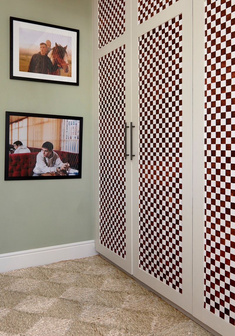
We changed the layout around to put the bed on the smaller wall and added built-in wardrobes on the wider wall. Again, storage was really important, and we wanted the bed to feel cosy while still allowing for two bedside tables. The wardrobe borders are painted in French Grey Pale by Little Greene and the inset panels are made up of a hand-painted chequerboard design. Because the bed is such a large feature, we wanted the wardrobes to balance the room out a bit. The whole scheme is based around nature, so we went for a deep red/brown colour which we hand mixed ourselves. It took two of us a solid week to draw out and paint the whole thing!
The Guest Bedroom
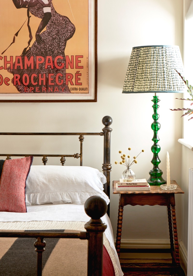
Here, the walls are painted in School House White by Farrow & Ball, the lamp is from Pooky and the bedside able is from Kempton Market. The striped throw is from Burberry and the linen red cushion with the black stripe is from an antique shop in Brighton. On the wall is a framed champagne poster we purchased from a bar near us which was shutting down – the colours perfectly compliment the soft furnishings.
To find out more visit SascalStudio.com
Photography by Angus Williams @anguswilliamsphoto / www.anguswilliamsstudio.com
DISCLAIMER: We endeavour to always credit the correct original source of every image we use. If you think a credit may be incorrect, please contact us at info@sheerluxe.com.
