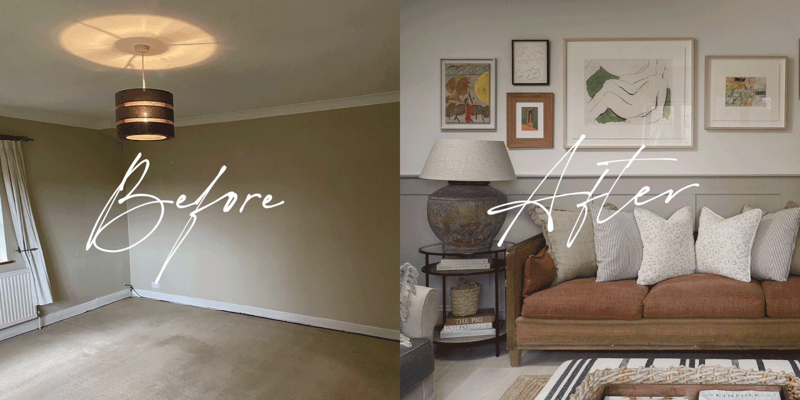
An Interior Designer’s Home Renovation: The Living Room
The Layout
The living room is my only sanctuary in this house – it’s the room I walk into and take a deep breath. It’s also the first room you enter after stepping through the front door, directly off the entrance hall. As the darkest corner of the house, it gets a hit of morning sunlight that’s gone by 10am. However, when you look out the window, you can see the valley beyond, making it the perfect spot to sit and relax. Over time, when we decide to open the ground floor and develop it into an open-plan living space, it will probably become our ‘snug’. Those sorts of rooms can get away with being a little gloomy because they still feel cosy.
The TV Conundrum
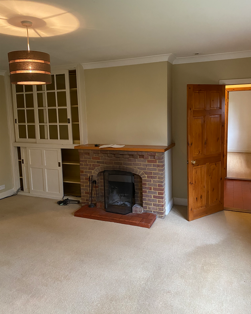
As a decent-sized square room (5m x 5m) with a working fireplace, structurally there was nothing we needed to change; it just needed a bit of a cosmetic upgrade. One of the challenges was what to do with the television. I usually urge clients to keep them off the walls wherever possible, but I had no other option given the configuration of this room. Above the mantle it went. We opted for a Samsung Frame TV – it’s a genius invention and rather beautiful when you have your very own painting to enjoy while the screen isn't in use. I’ve since used them in several client projects. Just remember if you are considering a TV above your mantle, ensure you have sufficient heat protection in your chimney breast, so it doesn’t get too hot and melt the electrics!
The Lighting Compromise
I also had to go for downlights. I tend to avoid them wherever possible as they’re usually only needed for areas which demand task lighting such as kitchen worktops. I would have far preferred a centre pendant, but the low ceiling meant I had to settle for a flush mount fitting.
The Curtain Debate
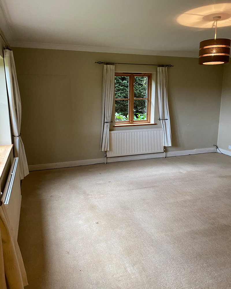
As a designer, I have a list of crimes against design and one of them is short curtains. This room was home to two pairs, so on receiving the keys,the first thing I did was remove them – even if it did mean we were all awake by 6am. In my opinion, curtains should touch the floor, or ‘kiss’ it as we say in the trade. I get asked a lot about radiators under windows and whether short curtains are designed to allow the heat to travel freely even when they’re closed. The answer is no. Your lovely long, lined and interlined curtains will keep the warmth in your room – I don’t know many people who sleep with the heating on, so it is radiators off, curtains closed. In the morning, open the curtains and bring the radiators in.
If for any reason you have a tricky window design and your curtains can’t touch the floor, a roman blind is the answer. If you need privacy, get a sheer roman blind or roller blind; if you want total darkness, get a blackout roman blind or roller blind. There are alternatives but don’t make it a short curtain. The only exception to the rule is a French café curtain – they can be really lovely.
/https%3A%2F%2Fsw18.sheerluxe.com%2Fsites%2Fsheerluxe%2Ffiles%2Farticles%2F2021%2F11%2Fjojo-reno-part-two-credit-photographer-robin-quarelle-5_0.png?itok=Ow6phdH9)
The Colour Scheme
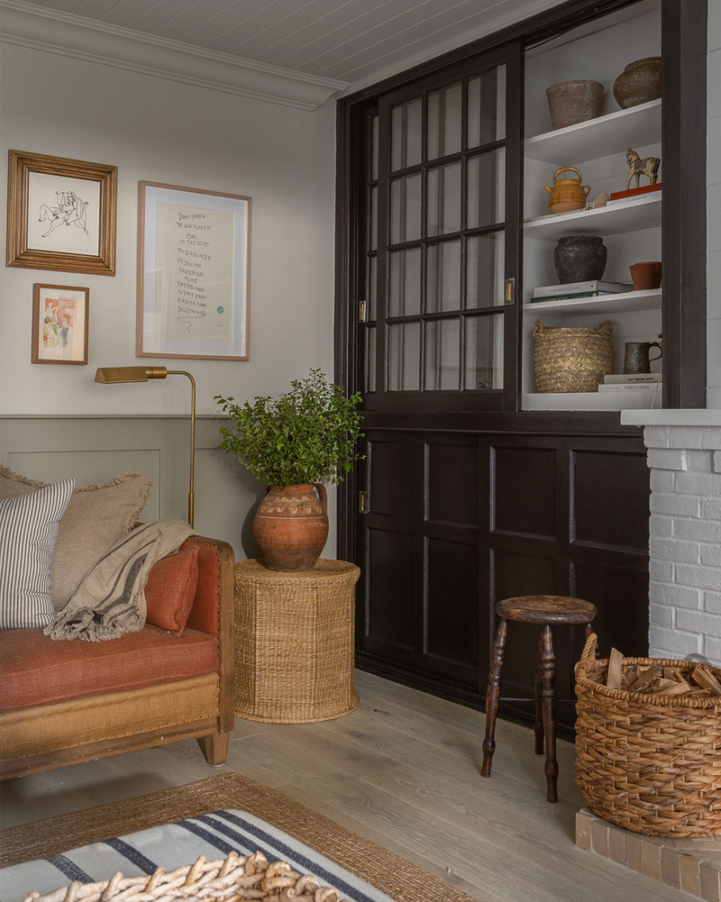
I wanted this room to feel effortless, comfortable and warm – all year round. Somewhere the family could relax together, but also somewhere to entertain our friends and family. We took up the beige carpet and opted for an engineered oak, white-washed floor by Chaunceys Timber. It was a bold move for a farm-style country house, but it lifted the room. We placed a woven jute rug over the top – we also kept and repainted the old bookcase cabinet and the existing fireplace.
We added some tongue and groove to the ceiling and panelled the walls at half height for extra character. The neutral, warm colour scheme and earthy textures are layered with autumnal colours, mixed with low-level lighting, vintage pieces and one-off finds. Comfort is key and I like a sofa to look inviting – the sofa and ottoman here are designed by House Nine, with plenty of plump cushions you can just sink into. I’m not precious about my interiors and always want people to feel at home.
The Gallery Wall
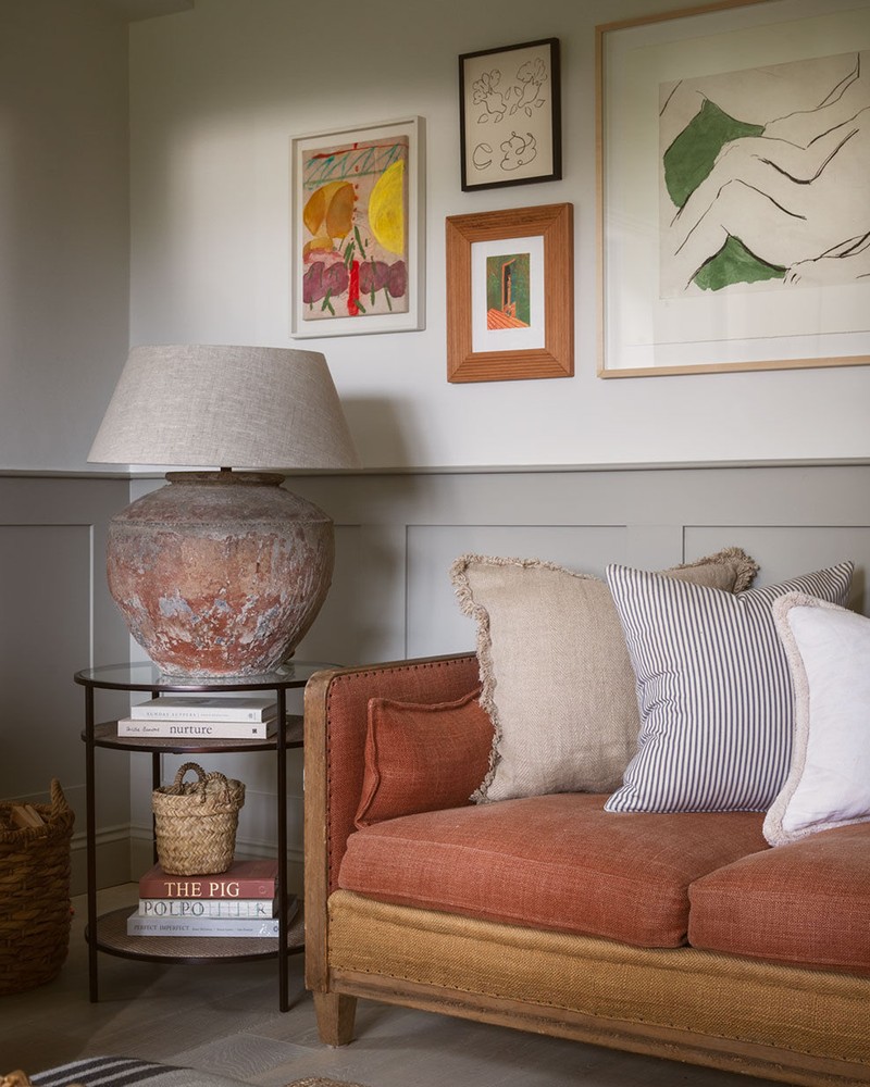
I enrolled my friends Bella and Daisy from Cramer & Bell to help me pull together an art wall using pieces I’ve had my eye on for a while. I love the artwork in here – it acts like an invisible thread pulling all the colours together and giving the room a bit of personality.
Next time: the children’s bedrooms…
Visit HouseNine.co.uk and follow @HouseNineDesign on Instagram.
Photography By Robin Quarelle
DISCLAIMER: We endeavour to always credit the correct original source of every image we use. If you think a credit may be incorrect, please contact us at info@sheerluxe.com.
