An Interior Designer Shows Us Round Her Home
The Property
I grew up in North London, so have always loved traditional townhouses. When I was looking for a property, I knew my home had to be close to my design studio and the showroom – which is in the heart of Knightsbridge – while also offering a connection to nature and access to culture and the arts.
It took me nearly three years to find this elegant Chelsea townhouse, which sits at the end of two parallel terraced streets, offering wonderful views across the neighbouring gardens. It was one of my key requirements for the property to be surrounded by greenery, even in the heart of London.
Once I found the house, it took two years to completely redesign the interior architecture and spaces to create a home which suited my lifestyle. All of the internal spaces were reconfigured, with only the façade remaining from the original building.
The Ethos
I’m an avid yogi, so I closely relate to yoga’s belief system of harmony and balance. These principles have influenced the design of my home, resulting in interiors which enhance my wellbeing and create a positive environment. Connection to nature is paramount for me, especially when living in London, where nature can be scarce. It’s why every space in my home offers a close connection to nature, from the basement and the drawing room, to my garden room and the master bedroom.
The Style
My style is a balance between classic and contemporary – the result is interiors which are light and harmonious. The style informs the colour palette and material scheme, alike. The palette is refined and muted, and while it might just look neutral, it’s alive with vibrant tonal differences.
The Kitchen/Dining Area
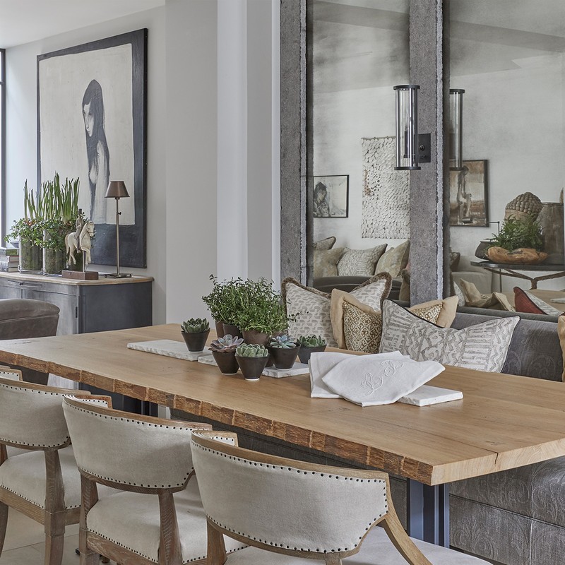
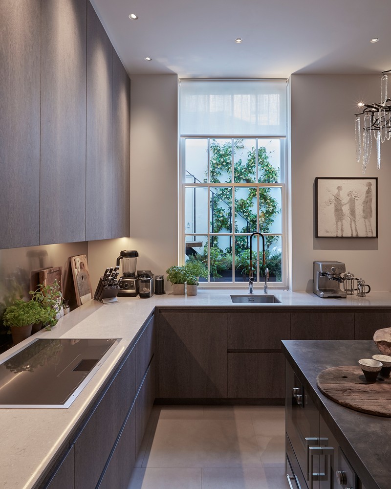
My favourite room in the house is the open space on the basement level. While the property had an existing basement kitchen and dining space, I increased the footprint of both spaces and achieved higher ceilings by digging down and back. The resulting open plan kitchen/dining area/snug became the core of my home, perfect for both relaxing and entertaining.
When it comes to clever design solutions in a kitchen, it has to have ample storage so the daily essentials are easily within reach, yet they don't clutter the space. On the right-hand side of the kitchen, there’s a large nickel and glass cabinet; we designed this to be both functional and to make a statement. It has lighting incorporated into the unit which, together with a chandelier, gives off a beautiful effect, which really enhances the space.
The Basement Snug
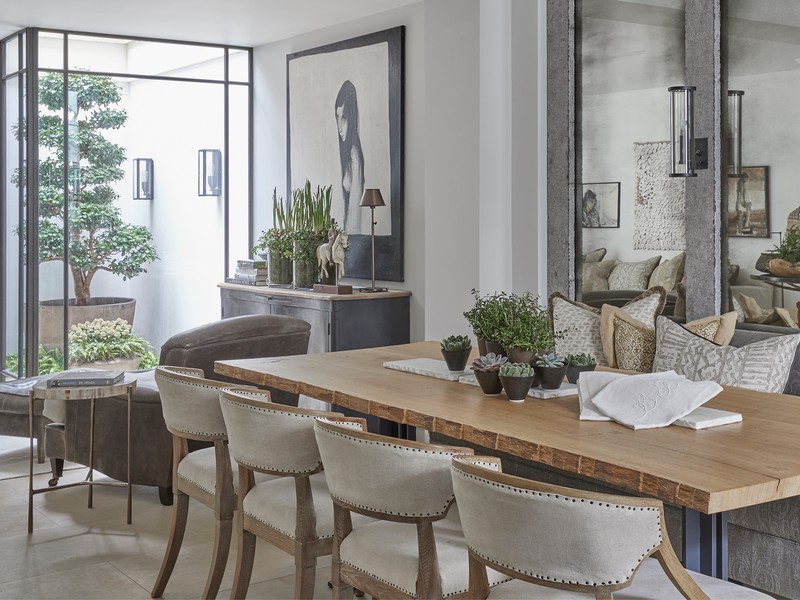
The light well introduces some natural light to the space, and also gives this much-loved Camellia tree a perfect home. The tree can be viewed from wherever you are in the space, and at night it’s beautifully lit.
The coffee table is the Prato Oak Nesting Table from the Louise Bradley Collection. The sideboard is a bespoke piece that conceals the air-cooling system, and the decorative horse was a gift from my father.
The Garden Room
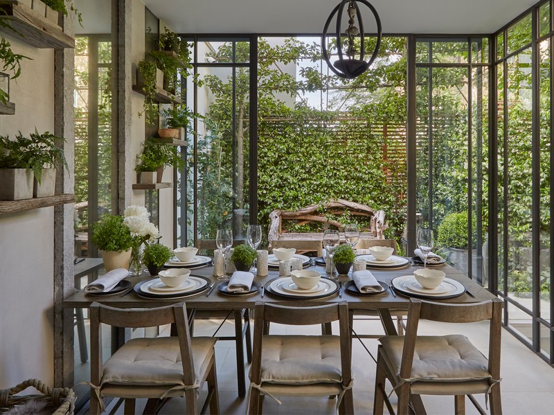
On the ground floor, I created an indoor-outdoor garden room using bespoke, bronze floor-to-ceiling windows, with doors leading to the outside. We used natural finishes and designed the furniture using distressed timbers. I often use this room for dining and entertaining, as again, the outside space is beautifully lit in the evenings.
The chairs, side table and ceiling light were all designed bespoke by the Louise Bradley Studio.
The Master Bedroom and Ensuite
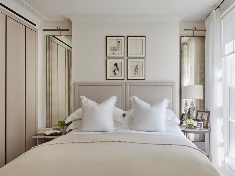
I added Ilex Crenata trees to the balcony outside of my bedroom to help bring the outside in, and they also act as a natural screen from the street. In the master bedroom, we positioned the bed so you can see the sky and treetops when you first wake up.
The bedlinen is from The White Company – it’s the Santorini Collection. The bed is then dressed with antique French decorative pillows, all of which have embroidery detail. The throw is cashmere, and available from the Louise Bradley Collection, while the cabinet is the Turin Cabinet from the Louise Bradley Collection.
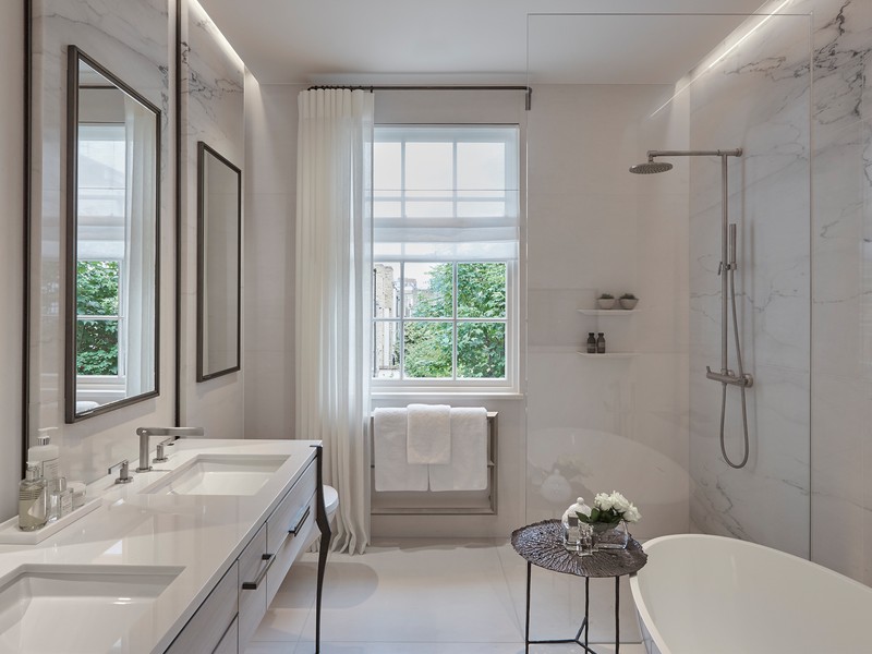
The Vanity Unit was designed by the Louise Bradley Studio, with its bronze leg detail, a veneer finish and a white marble top. The drawers offer space for everything, which meant very little had to be on display, and thus keeps the space calm. The mirrors behind the vanity also help to conceal the storage behind and avoid any clutter.
The Guest Bedroom
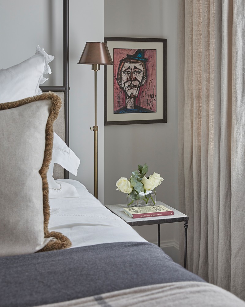
My inspiration for design comes from a range of art and design disciplines – I collect art and love beautifully tailored fashion pieces – and I also get plenty of inspiration from my travels, too. To enhance the space, I've used mirrors – a large one from the Louise Bradley Collection, and a small mirror which is an antique I purchased some years ago. It's so effective to mix the old with the new.
Visit LouiseBradley.co.uk
INSPIRATION CREDIT: LOUISE BRADLEY
DISCLAIMER: We endeavour to always credit the correct original source of every image we use. If you think a credit may be incorrect, please contact us at info@sheerluxe.com.
/https%3A%2F%2Fsw18.sheerluxe.com%2Fsites%2Fsheerluxe%2Ffiles%2Farticles%2F2021%2F02%2Flouisebradleysnug.png?itok=CKmxOnIX)

