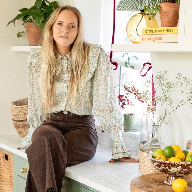
An Interior Designer Shows Us Around Her Stylish Flat
The Property
The house is a terraced Victorian property which was originally converted into two flats years ago. I own the upper maisonette on the first and second floor. When I purchased the property, it didn’t require any structural work. I lived in it for a couple of years first to get a feel for the space and work out how best to make some changes.
The interior was dated – particularly the kitchen which was very old, with melamine doors and timber worktops. I completely overhauled it and designed the whole thing from scratch. Throughout the property, I installed a lot of joinery, including built-in shelving, storage and wardrobes in the bedrooms. I also laid new carpets and floors.
The Hallway
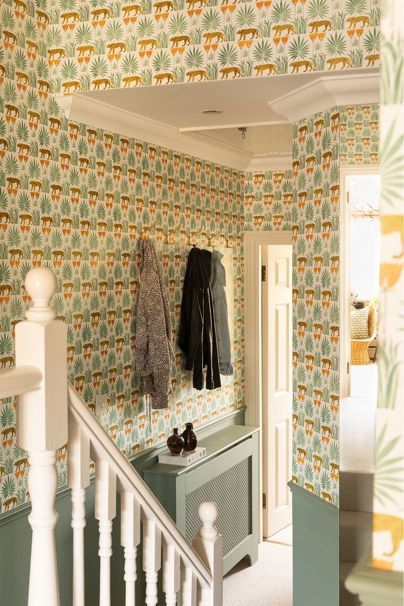
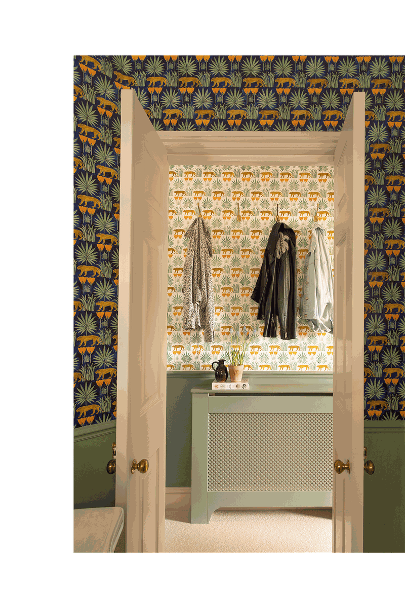
The hallway is one of my favourite spaces. I felt the space could handle this wallpaper (Lioness & Palms by CF Voysey, supplied by Common Room) as you only tend to pass through it. But because you can see the hall from other rooms in the flat, it had to work with the colours and fabrics of the adjoining spaces (specifically the bedroom, living room and bathroom). In the end, I added a dado rail and painted below it, so the wallpaper wasn’t too overpowering (plus this saved me some money). I also used the same dark colourway of the wallpaper in the bathroom to create some contrast. The majority of the flat is carpeted, including the hallway, which adds a bit more cosiness.
The Kitchen
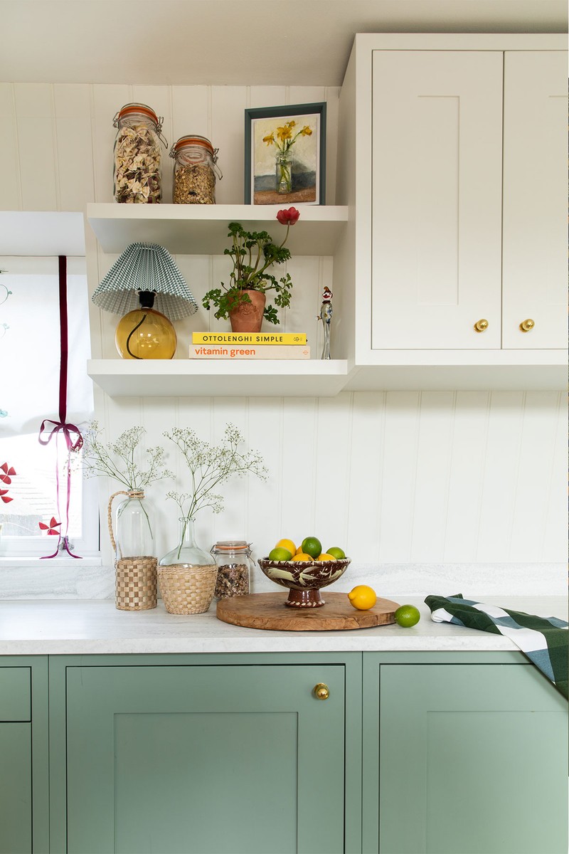
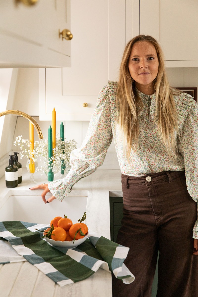
This room needed the biggest overhaul. The layout remained more or less the same, but the kitchen just needed ripping out. I replaced everything from the floors to the units to the appliances. I wanted the room to feel fresh, but also to serve as a practical space with plenty of storage.
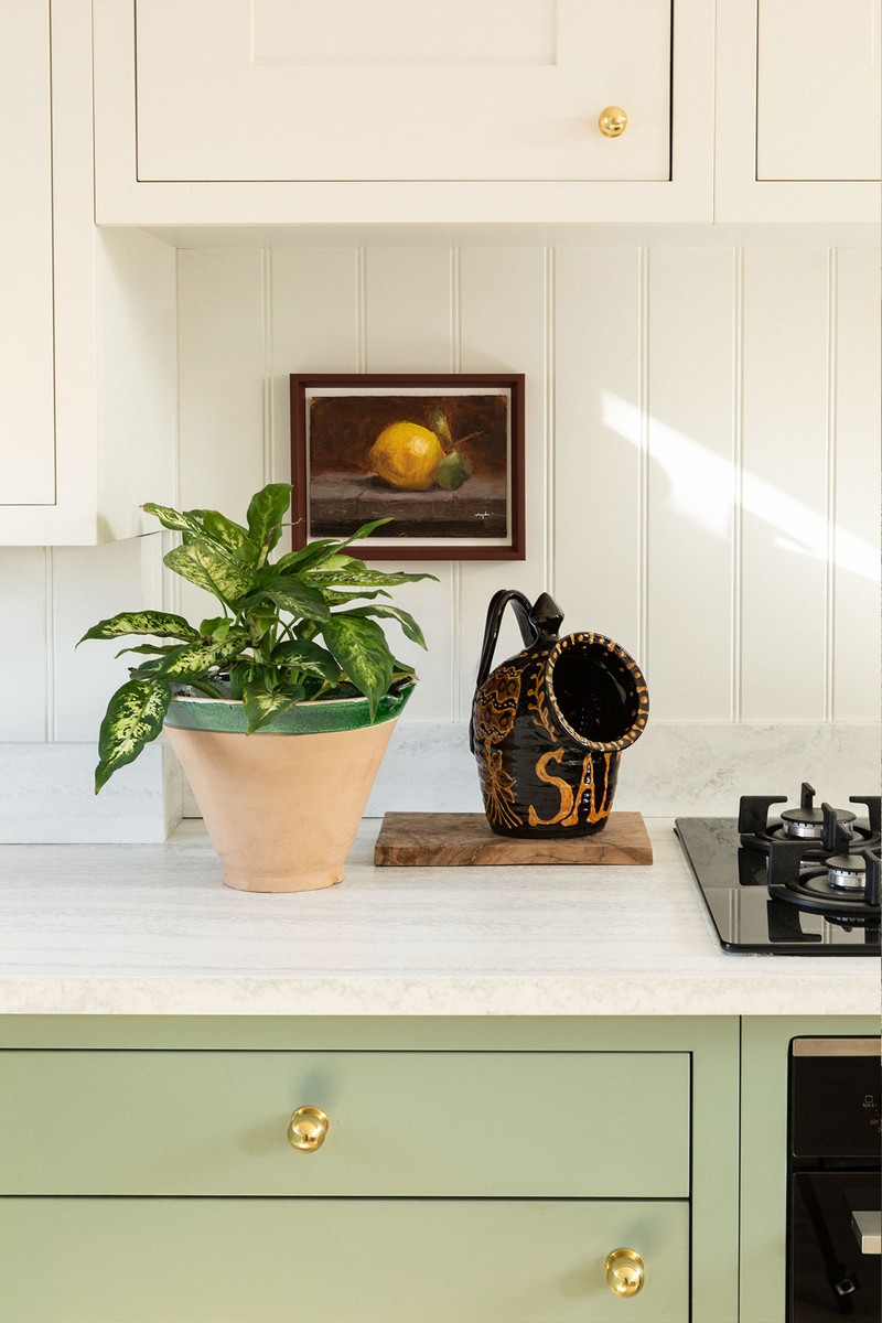
I investigated using a professional kitchen company but felt restricted by the limited unit sizes – my kitchen isn’t that big, so I needed to make the most of the space. The best solution was to get it made bespoke. I drew everything up myself, and hired a local builder/carpenter to install it for me. I knew early on that a Shaker-style kitchen would suit the architecture of the space best, plus it would be the most affordable option.
There was already a lot of green throughout the flat, so introducing a completely different colour felt unnecessary – I needed the various spaces to flow together. That said, the high units still match the woodwork to keep the kitchen feeling light – if everything was green, it would have felt too heavy. I’m not a huge fan of high-level units but I needed to make the most of the storage potential, so having those cupboards blend in with the walls helped not make a feature of them.
Budget was obviously a huge factor, particularly when it came to the materials. I knew I didn’t want a polished worktop and found this great veined honed option. The tongue-and-groove splashback was also a more affordable way to create a bit of interest without going overboard. Painting it in a wipeable paint makes it really durable.
In terms of lighting, it’s important to treat a kitchen like any other space. By that I mean having a variety of lighting to suit different times of the day. Lamps on shelves are an unexpected choice in a kitchen, but they really help soften the space – kitchens shouldn’t feel too clinical, especially as they’re often one of the most social rooms in a home.
The Dining Area
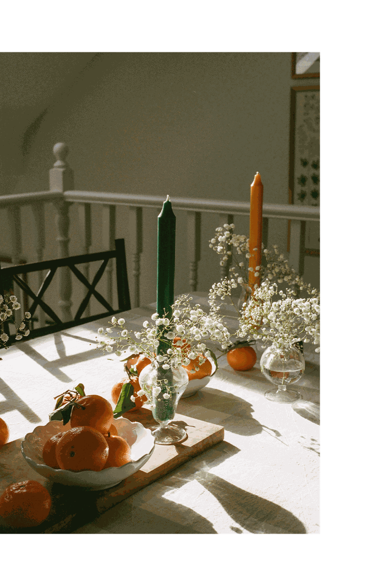
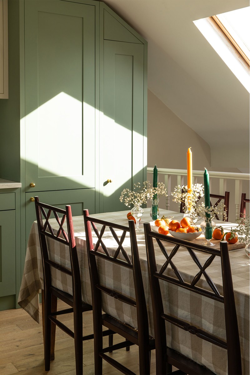
The dining table is antique and was passed down from my grandparents. The chairs are from Ceraudo. The tablecloth came from Zara Home, which does lovely table linens. Edition 94 also has a beautiful range of linens and I love the Bertioli by Thyme table linens too.
The Living Room
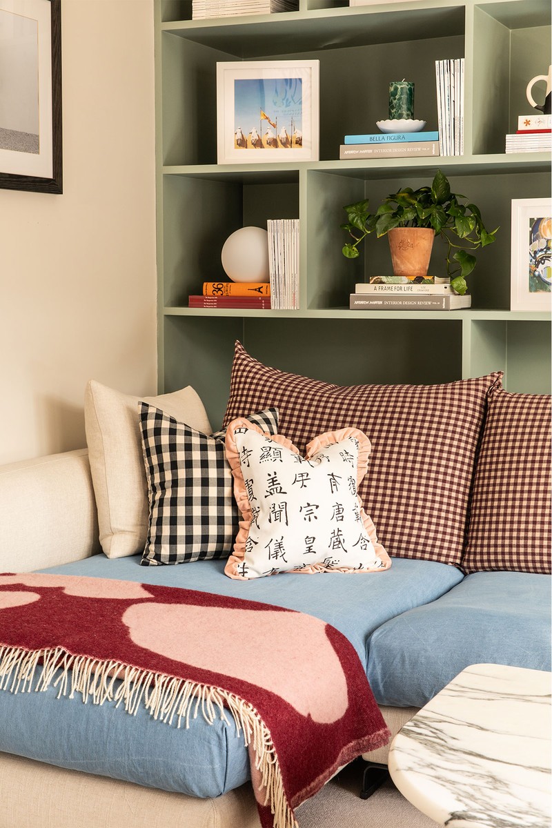
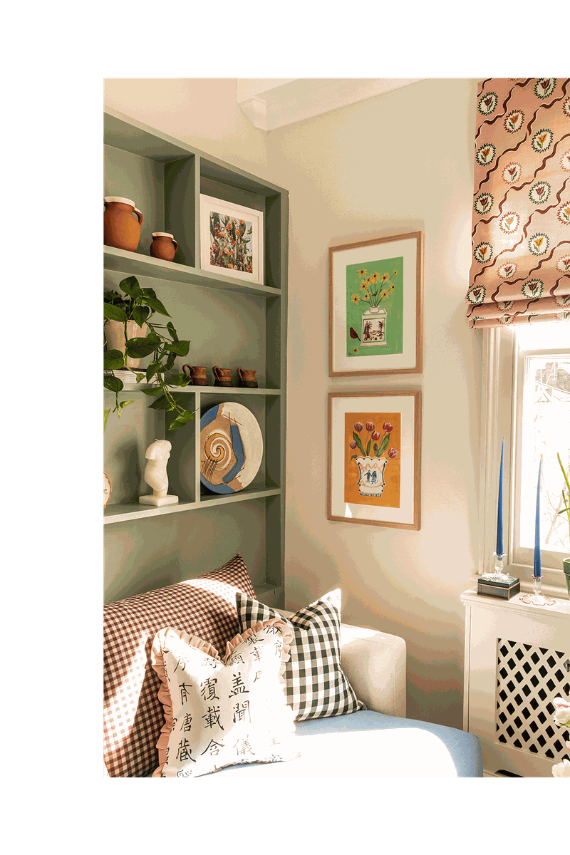
The kitchen overlooks the living room, which you can also see from the hallway, so I wanted the colour palette to feel cohesive. I continued the green joinery and designed a simple shelving unit behind the sofa with shelving above. The Camerich sofa sits in front of it and expands to the full width of the space. It adds a bit of contemporary style, juxtaposed by the vintage arabescato coffee table from Anna Unwin, which is big enough for lots of my favourite magazines and coffee-table books.
/https%3A%2F%2Fsw18.sheerluxe.com%2Fsites%2Fsheerluxe%2Ffiles%2Farticles%2F2021%2F11%2Femma-ainscough-home-tour-sitting-room-nw_0.jpg?itok=nNYH61UU)
I love using plants in a home, particularly to add some variety to shelving. I arranged them in between some of my favourite objects, many of which were found at antiques markets. The floral prints are by Polly Fern – she has a large collection which can be mixed and matched together, and they’re reasonably priced. Her ceramic vases are currently top of my wish list.
The cushions are a mixture from Zara Home and Katy Takla. Katy uses offcuts and end-of-roll remnant fabrics to create beautiful cushions with contrasting frills. The blind fabric is from Ottoline; the pink Tulips of Belgravia design adds that extra bit of pattern I was looking for.
The Bedroom
/https%3A%2F%2Fsw18.sheerluxe.com%2Fsites%2Fsheerluxe%2Ffiles%2Farticles%2F2021%2F11%2Femma-ainscough-home-tour-bedroom-fb_0.png?itok=QA8-Enfi)
Green can be very calming, which is why I went with this shade for the bedroom (Eico Paints Wedgewood Green). Cosy in winter yet cool in summer, I often find strong colours on the walls work best in smaller spaces.
On the headboard I used Bennison’s Crewelwork. It adds a splash of colourful pattern that goes perfectly with the green walls. Having specified it for clients numerous times, I knew it wasn’t the cheapest fabric, but a headboard (particularly one that’s a simple shape) only needs 2-3m. It’s a great way to make a statement in the space.
The wall light is from Pooky – a brand that offers a great range of affordable lighting and fun shades. The bedlinen is from Secret Linen Store – the quality is superb, and I love the little details. The bedside table is a vintage bobbin style on castors. An element of open storage always looks good when it’s styled with things like magazines.
Visit EmmaAinscough.com
Photography by Alicia Waite
DISCLAIMER: We endeavour to always credit the correct original source of every image we use. If you think a credit may be incorrect, please contact us at info@sheerluxe.com.
