Meet The Interior Designer: Naomi Astley Clarke
Background
After studying English and creative writing at university, I completed the Inchbald School Design one-year diploma. I worked for Sally Metcalfe at George Spencer Designs for five years, then Stefa Hart at Hambleton Decorating before launching my own studio to look after my private clients. There was never a grand plan in terms of going it alone – it’s just evolved over the years as my workload has increased.
Style & Approach
My style is best described as timeless elegance that doesn't take itself too seriously. The key words are cool, glamorous, relaxed, elegant and uplifting. We have a small team who are highly efficient, well organised and thorough. I'm lucky to be able to surround myself with people who always prioritise the interests and needs of our clients. It lets me focus on the various layers of a design. I always think of our job as being a service industry role – I’m a total workhorse and my client’s homes should make them happy. Of course, I do encourage them to try new things but I don't steer any project away from my client’s vision.
Materials, Colours & Signatures
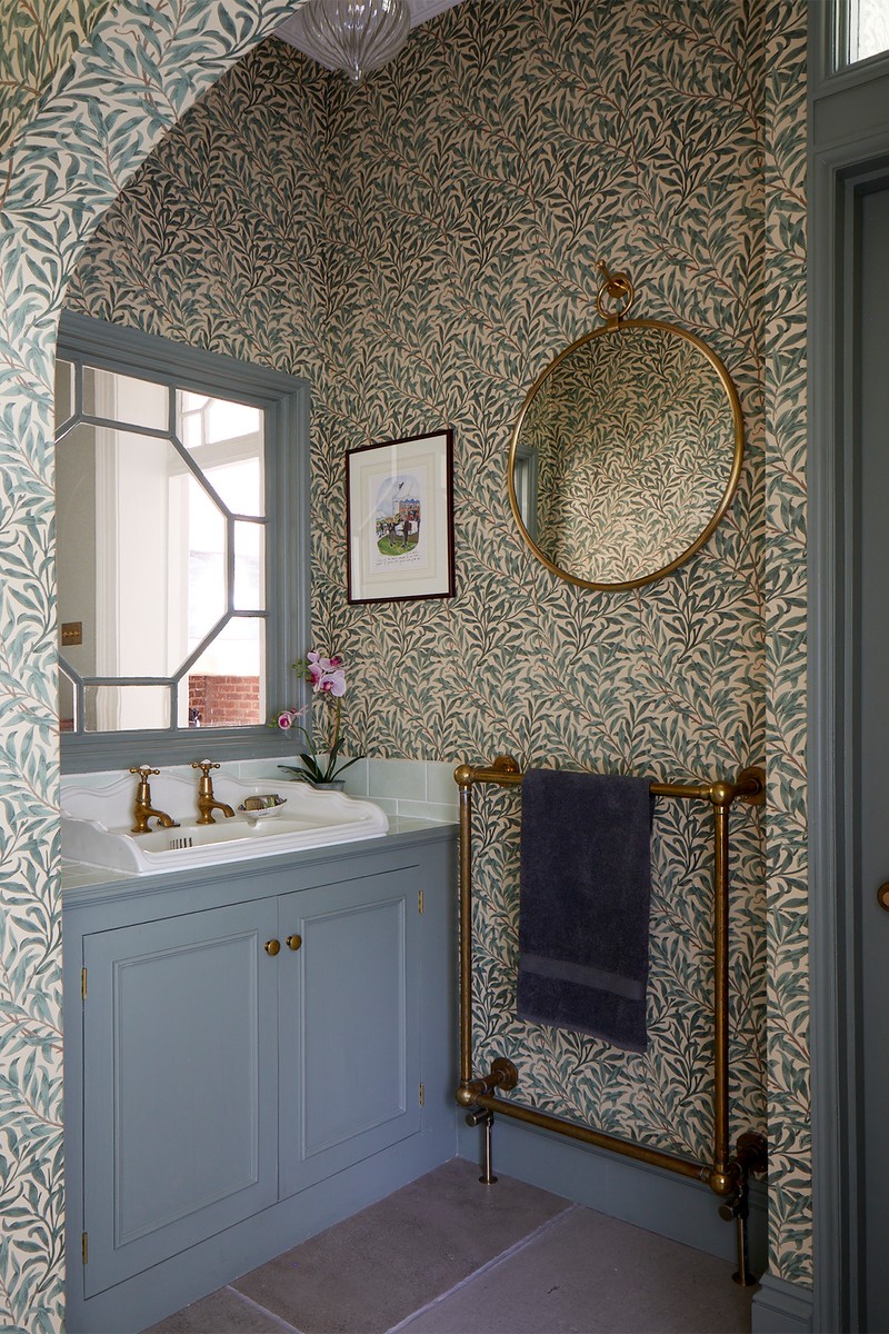
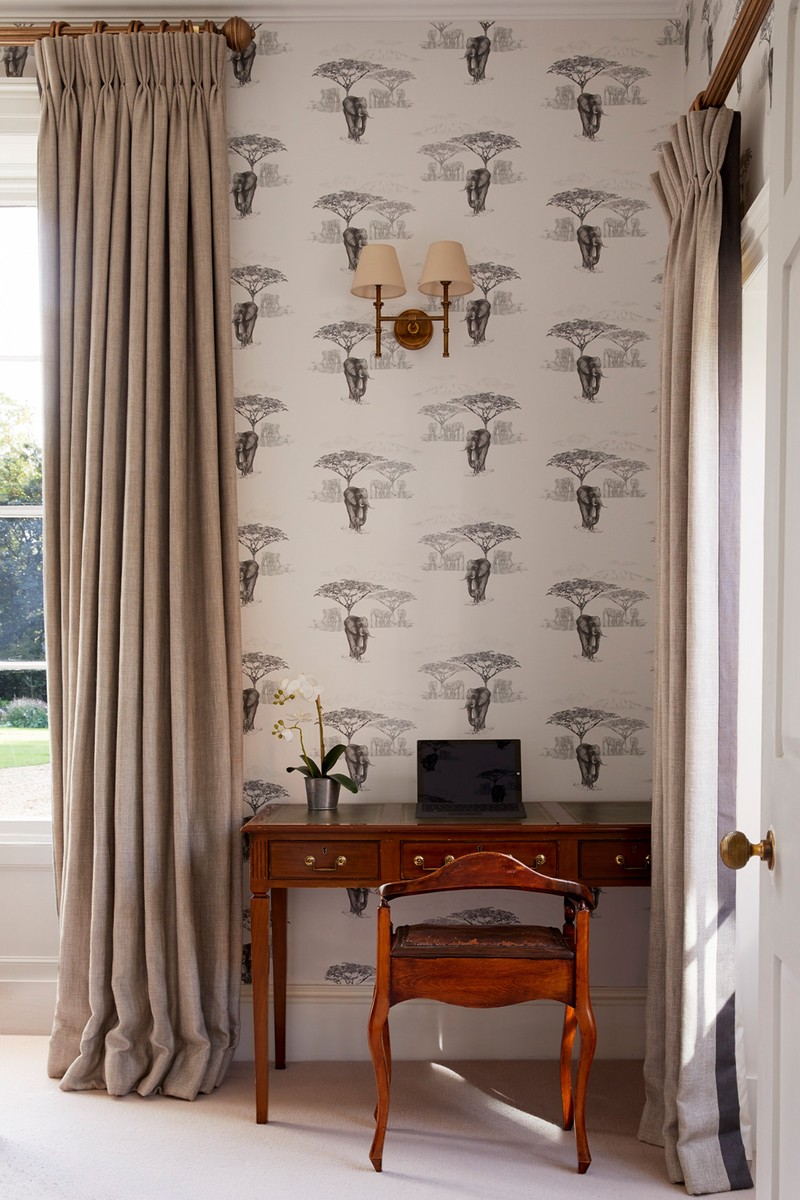
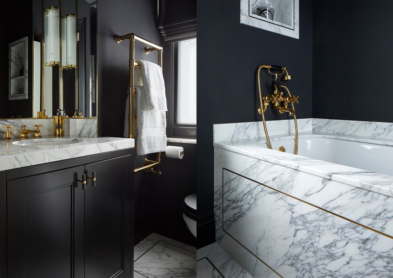
Right now, I’m working with a lot of aged brass and ribbed glass – both of which have an Art Deco quality to them. Marble is a wonderful material and I love the imperfect aesthetic the natural veining in the stone creates. I don’t like to be restricted by a specific colour palette, but I love injecting bright colours into smaller spaces – especially through the joinery and in bathrooms. In fact, I consider my bespoke joinery designs to be one of my signatures – they're made to last and exude a timeless elegance. Another signature element of my designs are the landscapes and scenic, hand-painted finishes we use on the walls.
01
Sloane Square
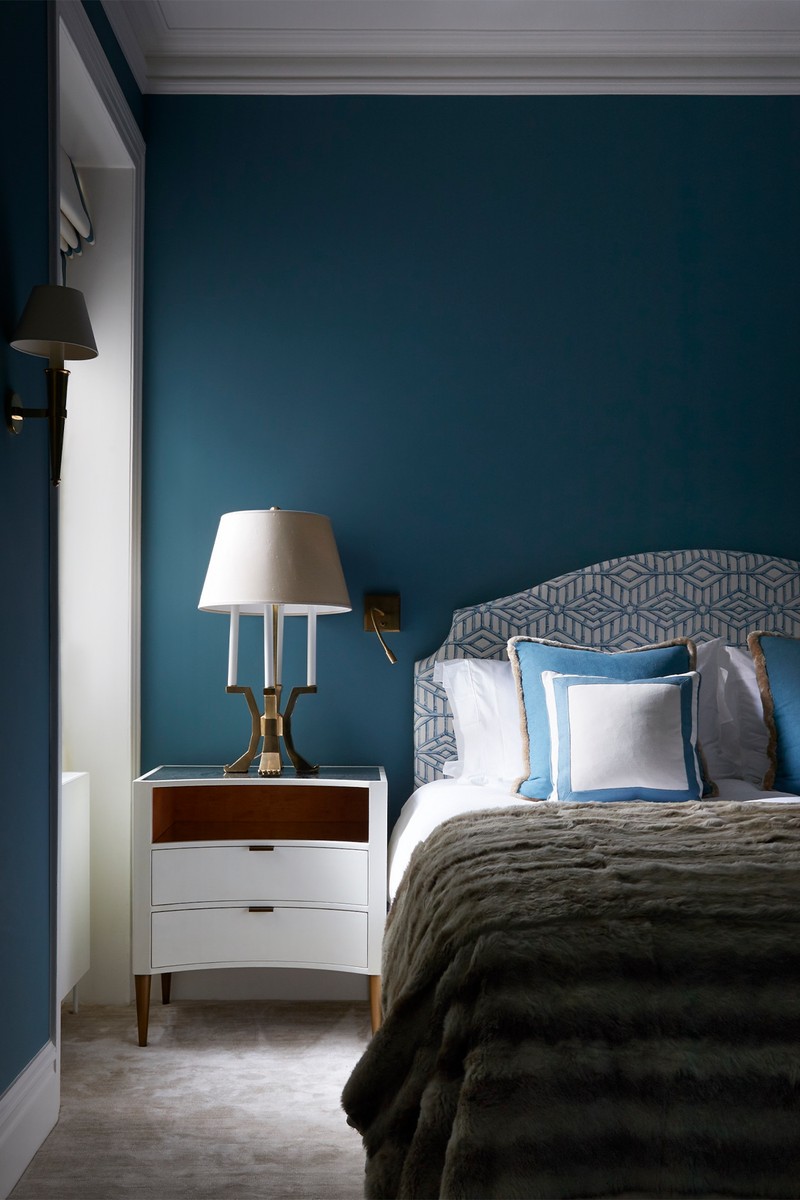
The clients had seen my work on a previous project and liked its glamorous but liveable style. They needed help transforming their London residence, and I was asked to completely renovate and furnish it. Having gone back over various projects my clients had seen and loved, we started mood-boarding. The brief was cosy but bold, glamorous but also chic and crisp in its simplicity. Furnishings such as sofas and beds were of the highest specification and, seeing as they love entertaining, premium music and audio-visual systems were a priority.
The colour palette was very much client led. They had clear ideas of how vivid they wanted things to be. We pared things back and dialled them up to get the perfect balance. I introduced dynamic textures and playful details to create an exciting, luxurious space that suited both entertaining and relaxation. All the rooms were important but the kitchen is particularly special. We created spectacular bespoke storage: off-black with brass inset cabinetry and comfortable banquette seating covered in velvet, which sets off the monochrome palette perfectly. I’m very proud that the project was selected by Andrew Martin to be featured in the 2022 Interior Design Review.
02
Penthouse Apartment
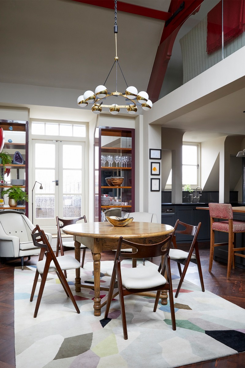
The brief here was to fully refurbish a penthouse apartment in a converted Victorian school building in Battersea. The refurbishment happened in two parts: the first in tandem with A&A Architects to redesign of all the rooms; and the second to design the master suite and add an additional bathroom.
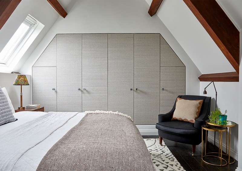
Working with large ceiling heights, I specified fabric to be applied to the front faces of the bedroom wardrobe doors. Not only does this create a soft, cosy aesthetic, it softens the acoustics in what could feel like a vast space. I love the main bathroom – it’s surrounded by bespoke joinery and behind an unassuming reclaimed Victorian timber door lies a hidden bathroom filled with beautiful brass and marble detailing.
The refurbishment respected the historic structure of the property, and I approached the interiors in a contemporary yet classic way. Details like the mirroring around the spiral staircase create a unique, thoughtfully considered scheme, perfected by quality workmanship and attention to detail.
03
Norfolk Rectory
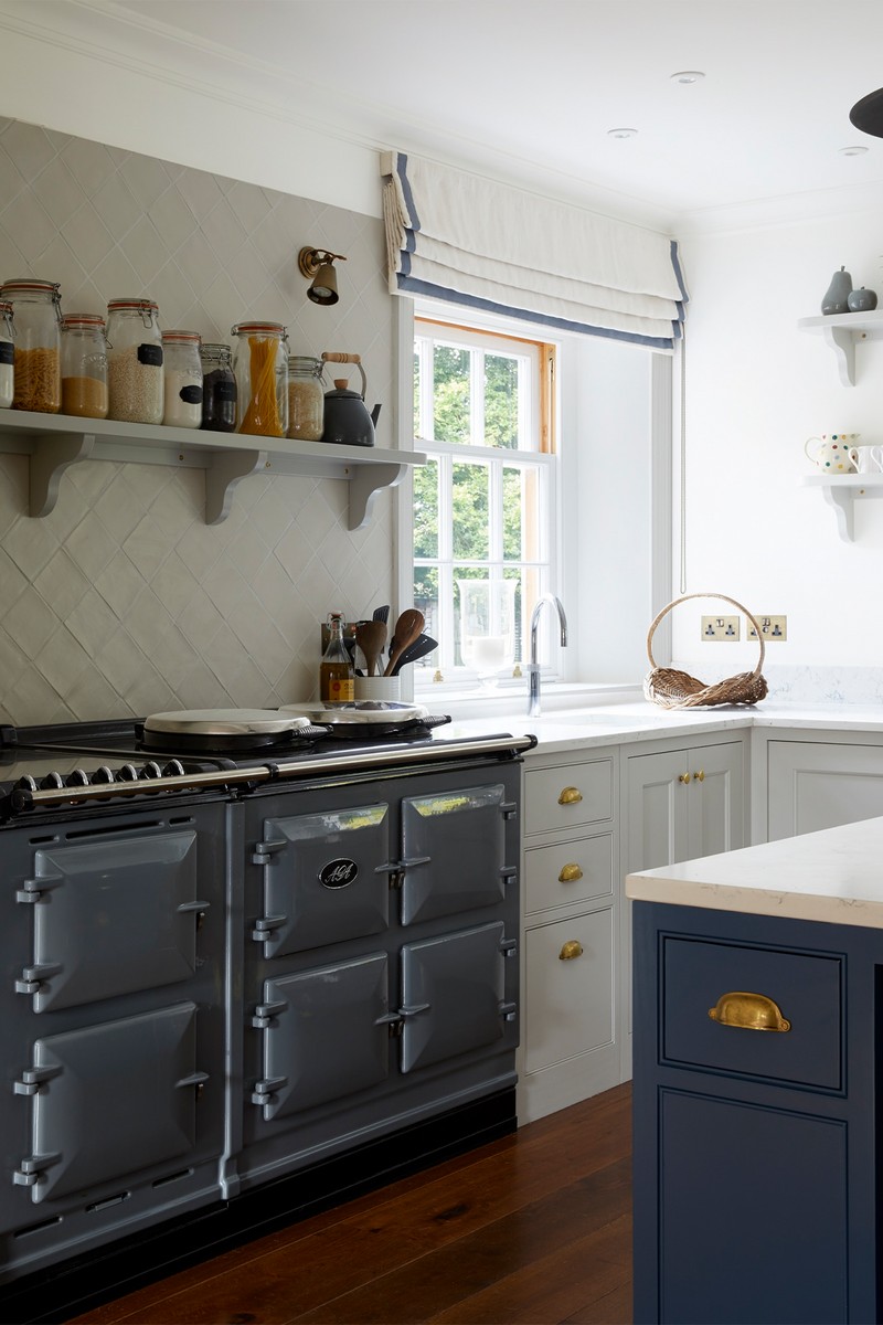
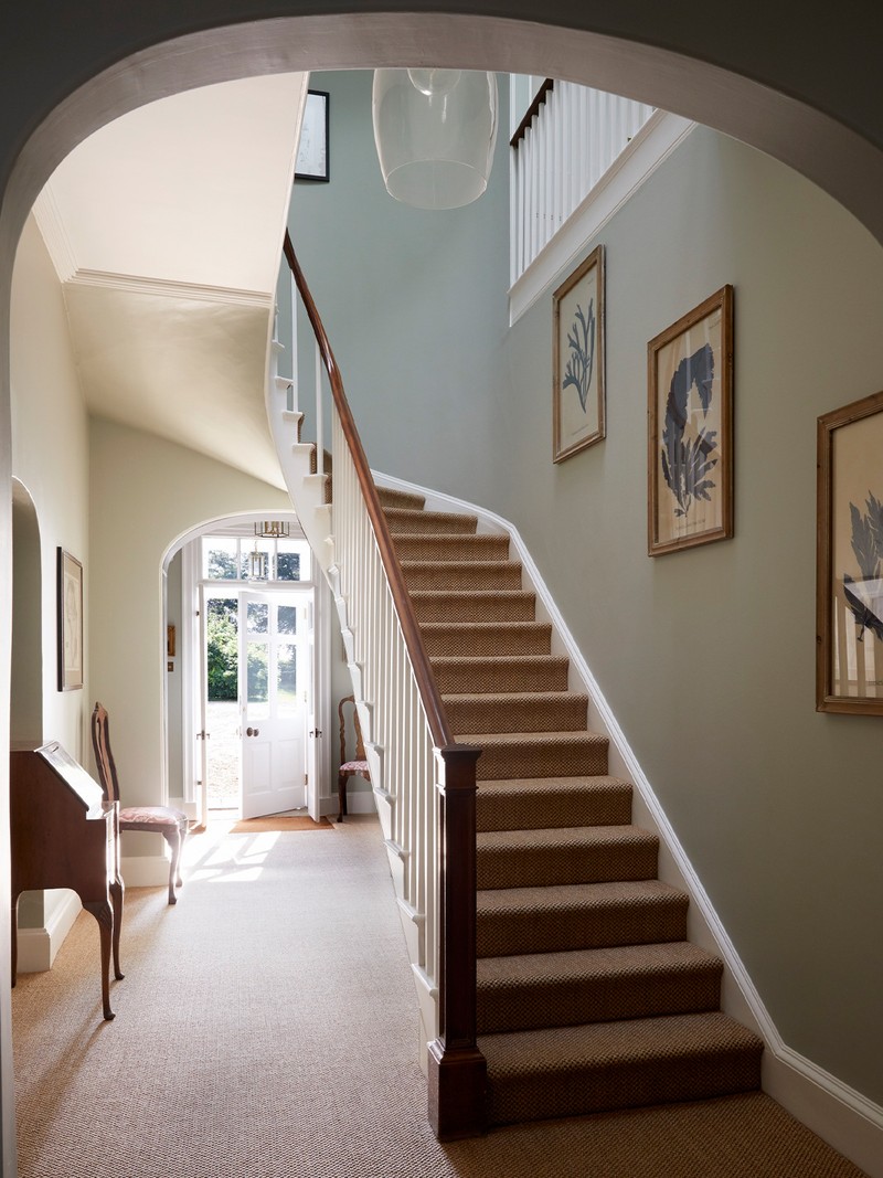
This 19th-century former rectory had been subject to a series of unsympathetic alterations which felt dated and ill-proportioned, leaving the house lacking adequate storage space. The brief was to peel back the layers of these changes and create a comfortable family home. Recognising the need for reconfiguration, I designed the layout of the ground floor to restore the proportions of the principal rooms via a new kitchen. The result is a collection of well-connected and large family-friendly living spaces that reflect the architectural integrity of the house.
The client had a collection of beautiful antiques and art, so it was essential the scheme incorporated these. A good way to seamlessly blend the old with the new is to mix colours and finishes. For example, in this project I specified a natural oak finish for one of the cupboards in the kitchen to inject texture and lift the space. It was essential to respect the historic context of the building, so I made sure the refurbishment retained a couple of the quirky details such as internal windows, and carefully repaired some of the historic joinery using traditional techniques. This, paired with subtle colours and fabrics, sourced antiques and traditional cabinetry, resulted in the perfect family home.
Visit NaomiAstleyClarke.com
Photography by Paul Massey & Judita Kunis
DISCLAIMER: We endeavour to always credit the correct original source of every image we use. If you think a credit may be incorrect, please contact us at info@sheerluxe.com.
/https%3A%2F%2Fsw18.sheerluxe.com%2Fsites%2Fsheerluxe%2Ffiles%2Farticles%2F2023%2F03%2Fsloane-square-full-bleed.png?itok=NZKmpHSj)
/https%3A%2F%2Fsw18.sheerluxe.com%2Fsites%2Fsheerluxe%2Ffiles%2Farticles%2F2023%2F03%2Fsloane-square-full-bleed-2.png?itok=aTPTaRpW)
/https%3A%2F%2Fsw18.sheerluxe.com%2Fsites%2Fsheerluxe%2Ffiles%2Farticles%2F2023%2F03%2Fpenthouse-apartment-naomi-astley-clarke-small-dual-landscape_0.png?itok=V7rNSkYF)
