15 Ways To Transform The Corners Of Your Home
Alice Leigh
“This reading corner is in the playroom of a country cottage. It has a raised platform which provides a lovely spot for the children to read and we have the added bonus of storage for books and toys – a perfect corner solution.”
“I created this reading nook in an office where it sits adjacent to some bookshelves, so it provides a lovely reading corner in what would have otherwise been a dead space. It was also an excuse to get some fun, bright fabric in there to contrast with the dark walls – plus, the added storage underneath is always useful.”
Visit AliceLeigh.co.uk
/https%3A%2F%2Fsw18.sheerluxe.com%2Fsites%2Fsheerluxe%2Ffiles%2Farticles%2F2024%2F03%2F2alice-leigh.jpg?itok=llS7hdOw)
Max de Rosée & Claire Sá
De Rosee Sa
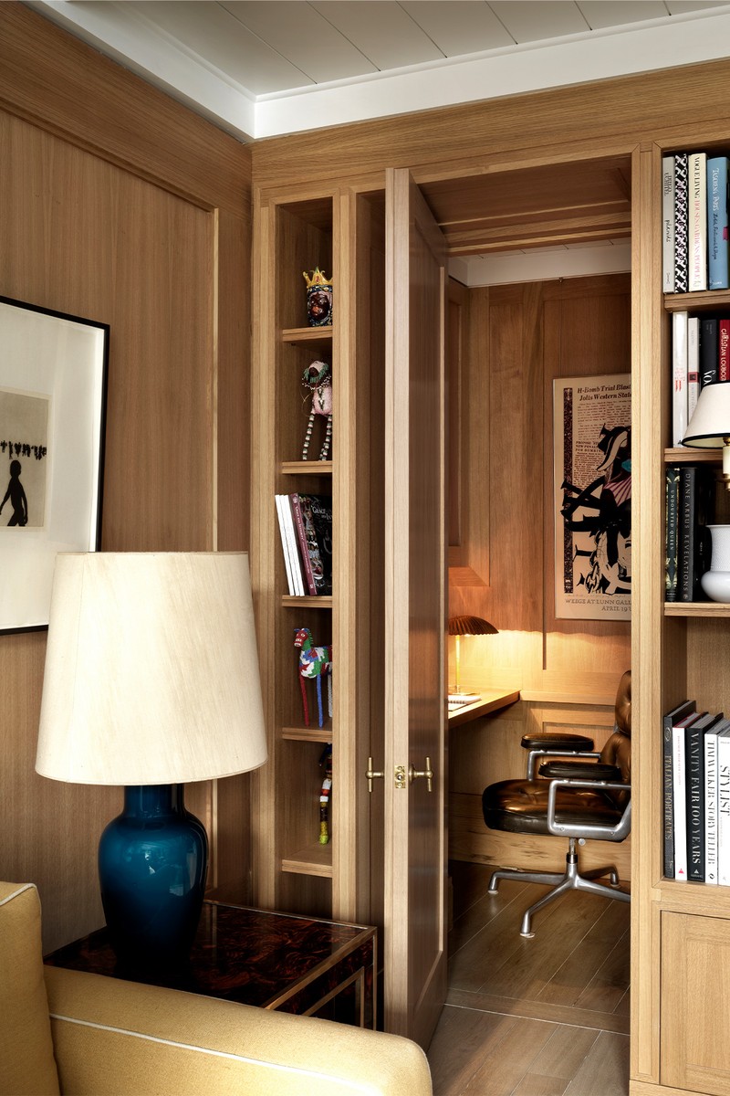
“We carved out a discreet study hidden behind a solid oak door within a bookcase in this five-floor, stucco-fronted house in west London. Tucked away from the family room and clad entirely in oak panels, the timeless space is completed with an in-set leather desk made from the same oak, a Herman Miller office chair and a Gubi table lamp.”
Visit DeRoseeSa.com
Henry Prideaux
“At this Chelsea townhouse, which was extended by a developer purely to add more square footage, a space on the lower ground floor served no real purpose. We brought it to life by adding a custom-made corner sofa and vibrant wallpaper. The sofa had to fit around some awkward columns, and we made it standard depth on one side and shallower on the other to make access into the space easier.”
“This room was part of a loft extension where we have created warmth and cosiness by layering fabrics, wallpaper, art, colour and pattern. Used as a quiet retreat, the window seat allows you to contemplate the view and includes useful storage underneath to good effect.”
Visit HenryPrideaux.com
Lucy Williams
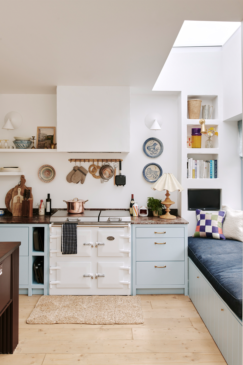
“I've always loved having a sofa in a kitchen, so I pretty much designed our whole kitchen renovation around the idea of having a window seat to curl up in. We don't have barstools at our kitchen island, so the window seat ends up being where I sit chatting with friends when they come over or catching up with my husband at the end of the day. I wanted to have a dedicated space for cookbooks, and the plastered-in bookshelves either end of the window seat were inspired by the white-washed cement interiors we love in Greece. We also installed a small TV at one end of the window seat so I can watch while I'm cooking – a guilty pleasure I inherited from my mum. The window seat tends to be where I start every day and where I retreat to in the middle of the night with my book if I can't sleep.”
Follow @LucyWilliamsHome on Instagram
Chelsie Malin
Malin + Lynn
“This L-shaped room was separated from the larger, more neutral living space through colour drenching. Painting the walls, ceiling and woodwork the same colour allowed the corner to serve its own function, which was a built-in corner desk for the client to work from home. We designed and detailed the bespoke joinery, and included fluted wall lights and LED shelf strip lighting for a more considered approach.”
“We designed this internal window within the new partition wall, which separates the principal bedroom from the en-suite. The view from the corner in the bedroom leads you straight into the moody shower enclosure, which is clad in a black terrazzo tile. An internal window also allows natural light to filter through into the en-suite, making for a more luxurious shower experience. The window feature dresses that corner of the bedroom perfectly, offset against the geometric, warm tones of the print of the armchair. We colour drenched all the walls, the radiator, ceiling and woodwork to really let the tiles, fabric of the blinds and the armchair hold space.” – Chelsie
Visit MalinandLynn.com
Tiffany Duggan
Studio Duggan
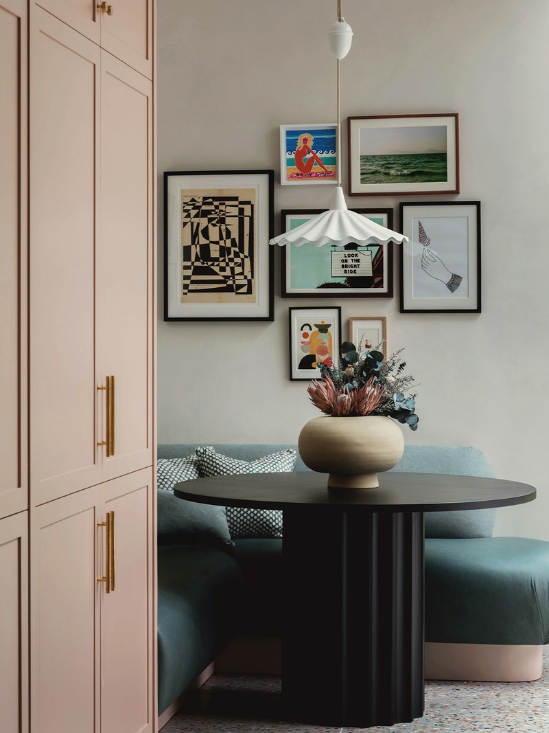
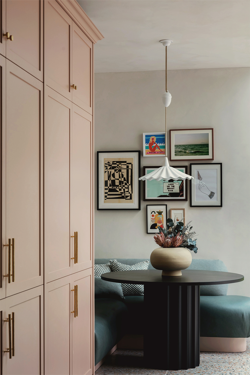
“I love having a smaller dining nook in our projects, in addition to a larger dining table, should space permit. As well as creating a more intimate dining experience, a smaller nook is so flexible – it can be used for occasional working from home or homework, having coffee or cocktails with friends, as a family games table, or even as a supplementary spot for laying out food and drinks when entertaining. They’re also true space savers, because a bench, unlike a chair, can sit flush against a wall.”
Visit StudioDuggan.com
Lucy Barlow
Barlow & Barlow
“We are always looking for interesting ways to maximise space – even the smallest of touches can transform an otherwise neglected corner and add to the function of a room. We also love creating window seats that can be used as reading nooks and, when decorated with colourful cushions and curtains, they add extra interest to a space.”
“Built-in desks and vanities that can be added to the end of a wardrobe or double up as bedside tables are a great way to add something unexpected to an unused corner. A vanity chair to sit in front of a windowsill serves as a good alternative to a built-in vanity should space be lacking.”
Visit BarlowandBarlow.com
Jane Landino
Taylor Howes
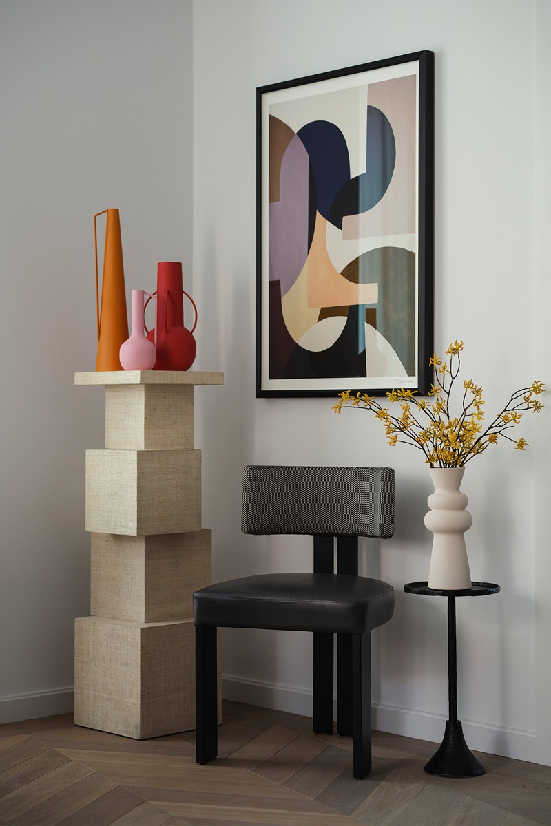
“The strategic placement of artwork in the corners of this room is a clever way of enhancing the overall design of the space. Incorporating artwork in a neglected room corner can add a layer of depth and interest that would have otherwise been absent. Additionally, the placement of artwork in a corner can help balance out the proportions of a room, creating a more harmonious interior.”
Visit TaylorHowes.co.uk
Sarah Peake
Studio Peake
“This bed nook features a removable ‘wing’. With the wing removed, the space allows for more of a cosy day bed, but at night it’s a great way of keeping little ones safe. By adding a wall light with a retractable arm, it’s easy to change the mood from task reading light to calming corner.”
Visit StudioPeake.com
Niki Wright
Lights & Lamps
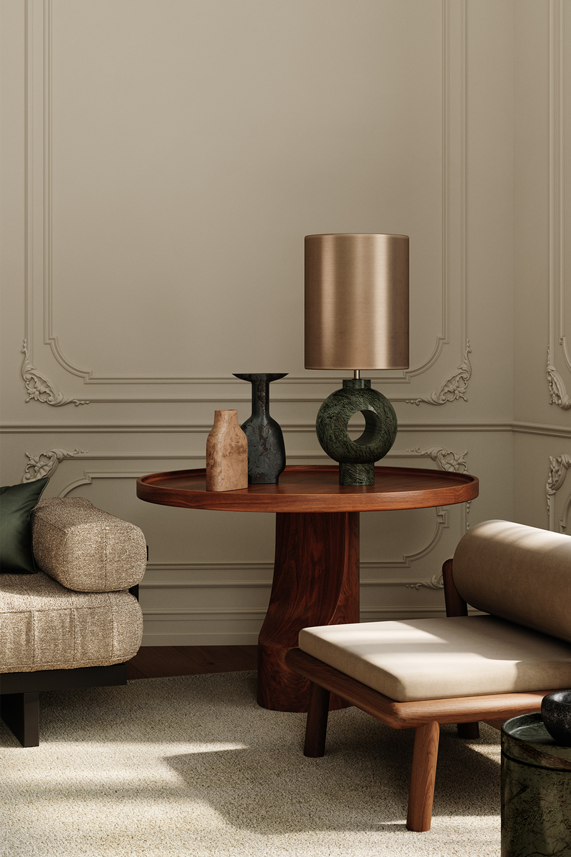
“Floor lamps and tall table lamps can help fill a dead space. A statement lamp offers interest by day, and will illuminate and expand the corners of your room by night. Drawing the eye to the furthest boundaries of your room makes your interior feel larger and maximises the space you have available.”
Visit LightsandLamps.com
Giveny Simm
Studio Howes
“Designing a workspace in the corner of a room is a clever way to maximise the available space while creating a functional and efficient work area customised to suit your needs. Additionally, you can use the walls on either side of the corner to hang artwork, photos, or other decorative items to make the workspace more inviting and personalised.”
Visit StudioHowes.co.uk
DISCLAIMER: We endeavour to always credit the correct original source of every image we use. If you think a credit may be incorrect, please contact us at info@sheerluxe.com.
/https%3A%2F%2Fsw18.sheerluxe.com%2Fsites%2Fsheerluxe%2Ffiles%2Farticles%2F2024%2F03%2Fhenry-prideaux.jpg?itok=7Mh1N-9T)
/https%3A%2F%2Fsw18.sheerluxe.com%2Fsites%2Fsheerluxe%2Ffiles%2Farticles%2F2024%2F03%2Fmalin-lynn.jpg?itok=4RvRBZO8)
/https%3A%2F%2Fsw18.sheerluxe.com%2Fsites%2Fsheerluxe%2Ffiles%2Farticles%2F2024%2F03%2Fbarlow-and-barlow-credit-jonathan-bond.jpg?itok=9cFeAsqZ)
/https%3A%2F%2Fsw18.sheerluxe.com%2Fsites%2Fsheerluxe%2Ffiles%2Farticles%2F2024%2F03%2Fstudio-peake-parsons-green-house-bedroom-photographer-alexander-james.png?itok=geTxCFd2)
/https%3A%2F%2Fsw18.sheerluxe.com%2Fsites%2Fsheerluxe%2Ffiles%2Farticles%2F2024%2F03%2F2studio-howes-corner-image.jpg?itok=KmrMCRak)

