Interior Tips From A Designer We Love
Style & Inspiration
My design ethos is always curiosity first. I want to understand who will use the space and try to uncover their stories and passions. I see myself a bit like a match-maker – curating a unique collection of pieces that fit a client so perfectly that they want to hold onto them forever. This reflects Harding & Read’s sustainability ethos too; we want people to buy well and buy once – that doesn’t have to mean expensive, just thoughtful choices that will stand the test of time.
One of my favourite projects was a Georgian townhouse in Bath. It was with a client we had worked with previously, so it was exciting to create a new home from the pieces we’d already collected for the previous property. As the building stretched over seven floors, it covered both grand and smaller spaces, so we were able to stretch our imagination and conjure up a mix of different atmospheres through the house.
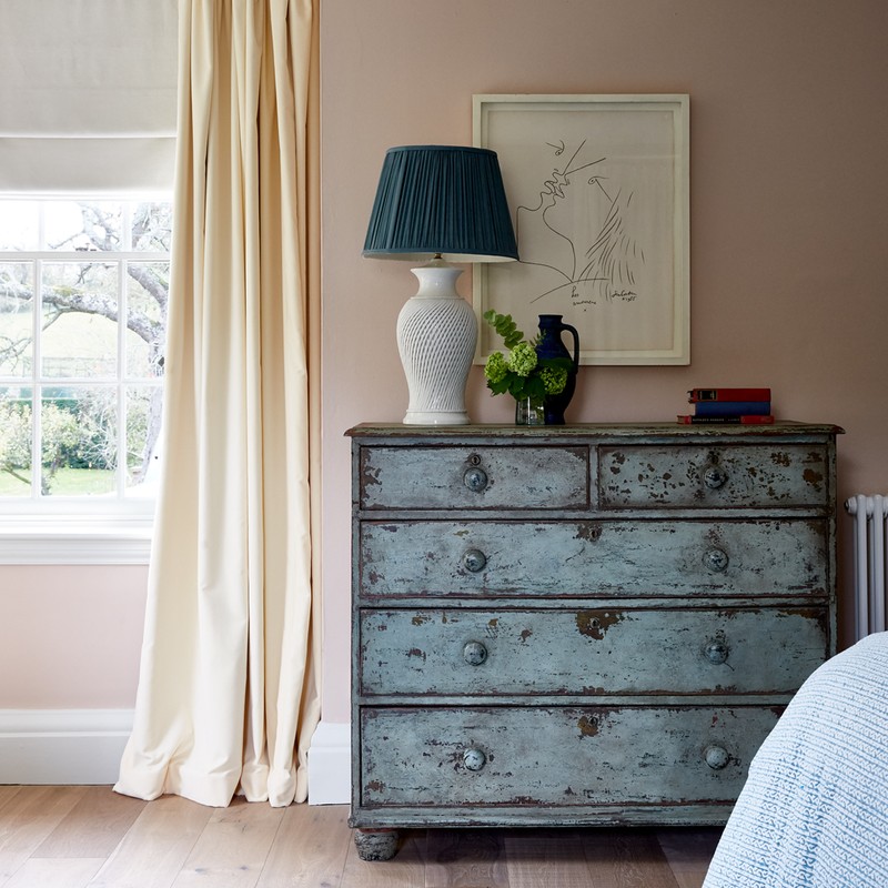
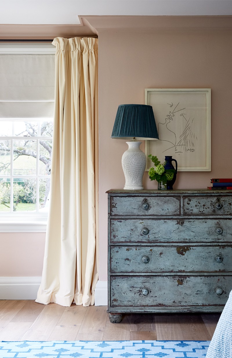
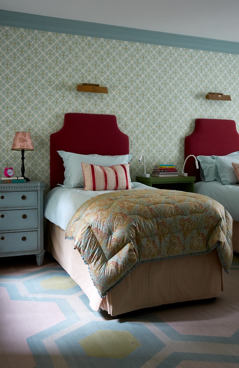
Colour nurtures the soul and I love using it as a way of manipulating the mood throughout a building. I look everywhere for inspiration – from historical colour combinations to the way colours play with each other in nature. If I had to choose right now, I love mixing dusty pinks and different shades of green.
Kitchens are my favourite room to design because it’s the heart of the home. It’s also the ultimate challenge as it needs to fulfil so many requirements – getting it right is incredibly rewarding as, more than any other room, it can completely transform a client’s experience. The perfect kitchen is always user-friendly, but also supremely comfortable. I like to create a comfortable spot for someone to chat to whoever is cooking. In a smal kitchen, I might tuck a stool under a worktop, while in a larger space I would try to include an upholstered chair, ideally next to an open fire.
There are so many designers I’m inspired by. Robert Kime, Christopher Howe, Christopher Lloyd, Arne Maynard, David Hicks, Steven Gambrel, and Roman & Williams are some of my favourites.
Old houses, history and films all inspire me. I’m fascinated by nostalgia and atmosphere, and I'm constantly questioning what subtle details trigger different feelings and associations.
Planning
Always start with the floor plan when designing a building. I like to thoroughly unpick and reimagine how a building will be used. I really challenge myself to start from scratch, to ensure every inch is used to its best potential.
Be clever with the wall finish to enhance a smaller space. The right paint colour, panelling or wallpaper can instantly transform somewhere underwhelming into something really special.
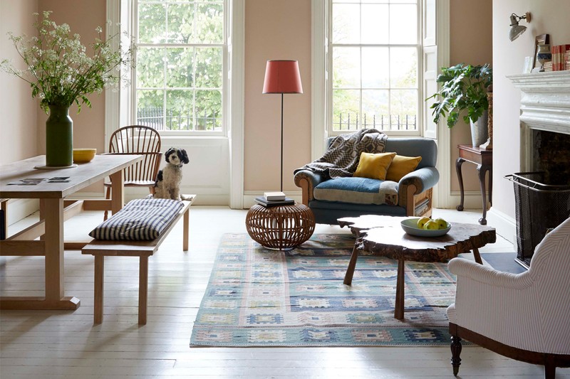
Break up a large, open plan space into 'zones' to make it easier to furnish. Lighting is also key – try creating cosy areas defined by pools of light, rather than flooding the whole space. ‘Protecting’ pockets of seating is also an effective way of anchoring zones, for example, placing a large plant or a side table with a lamp next to a pair of chairs or a generous console table behind a sofa.
Decorating
Think about how you want the space to feel when planning a colour scheme. It's important for me to know what the client wants to use the space for and at what time of day. For instance, somewhere that is used infrequently, or only at night, can take a richer colour pallete than a room that is used more for every day.
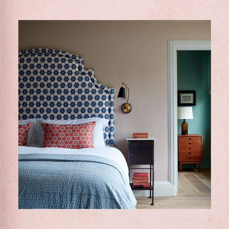
Don't use more than three or four colours in a room. Having said that, there might be several shades; a range gives depth to a scheme, while a restrained number of colours lends a sense of calm and cohesion. If you’re going for lots of colour or pattern, try to have something that brings the scheme together so it doesn’t become overwhelming.
Mix newly-found pieces into a new scheme. Whether it is a piece of furniture, an architectural addition or simply an exquisite vintage detail incorporated into some cushions, all can add great depth to a scheme. The stories they tell, their rich patina and often the remarkable level of craftsmanship that has gone into them, lend a sense of history, creating intrigue and a timeless quality. To me, there is a peculiar alchemy in mixing old with new, combining pieces from different periods, price points and places of origin.
Wooden flooring is warm and comes with good acoustics. It’s surprising how much the cold echo from a stone or tile floor can negatively impact one’s experience of a space. I am a sucker for a painted finish, and I love how an off-white painted floor bounces light into a space. Even if the floor is going to be painted, it is worth using a hardwood, so that furniture and high heels don’t dent it.
Suppliers
There’s a pretty full list, but here’s where I’d go for:
- Furniture – Howe London, Matthew Cox
- Fabrics – Tinsmiths, Tissus d'Helene, Vanderhurd
- Joinery – British Standard
- Wallpaper – Robert Kime, Howe London
- Paint – Pure & Original, Farrow & Ball
- Lighting – Rosi-de-Ruig, Samarkand, Tinsmiths
- Ironmongery - Etsy
Visit Harding&Read.com
DISCLAIMER: We endeavour to always credit the correct original source of every image we use. If you think a credit may be incorrect, please contact us at info@sheerluxe.com.
