How To Design A Side Return Extension
John Proctor, Proctor & Shaw
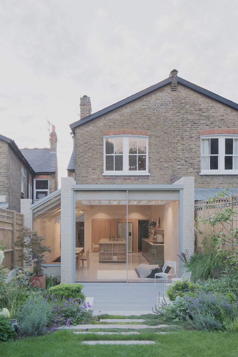
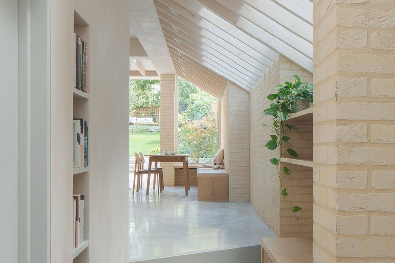
The original intention was to maximise the potential of a tricky side garden plot which sloped up towards the garden and was also thinner at the rear end. The brief was to create a large open-plan family room including a kitchen, dining and living spaces – and ideally a work-from-home study zone. A separate loo and utility room were also on the list. Most of the house had been renovated already, except for the ground-floor kitchen and dining space. The concept of a stepped wall was a direct response to the site geometry. A simple structural strategy created three distinct zones along the flank wall. Each zone was inhabited by a function: dining, social and working from home.
Consent came via Permitted Development for the rear extension, combined with a planning application for the side extension. Both parts were then built out. Splitting the consent process this way allowed us to create a large ambitious scheme. The only late change to the design, besides the usual finishing material confirmations, was the inclusion of a large roof light to the rear extension, which required some structural design tweaks once on site.
The lightness of the final look was delivered with a light buff brick to the stepped flank wall. This informed the restrained material palette, with white oiled timber work and lightly coloured Clayworks plaster on the walls. Complemented by the natural oak and greens from the kitchen and fitout, the final look is imbued with natural materials to create a relaxing, calm atmosphere. Thin-framed sliding doors and windows to the rear ensure that views of the garden are clear. Under-floor heating is installed throughout.
The site was unique, so from the outset we were excited about how the architecture and structure might define the interior both spatially and materially. As a practice, we don’t differentiate between ‘architecture’ and ‘interior’ – and this project showcases that approach well.
Visit Proctor&Shaw.com
Thea Ingram, Stanza
The original intention of this extension was to open the ground floor and link the front living room to the rear of the house to improve the flow. The kitchen design faces the garden and the seating area. The main dining area is in the middle room, which has a Crittall wall as the main feature.
The house was sound in structure but in need of attention and modernising – we did initially plan to keep the master bathroom but then renovated this as well. Victorian terraced houses naturally dictate the layout but where we can add value is through clever bathroom and wardrobe design.
The biggest requirements for this brief were luxury and ‘wow’ factor, while ensuring the house still felt like a family home. The couple were not living in the house while the work was being done but they were bold and adventurous. As a result, the house looks different to the very similar houses in the road, mainly because of the dark internal doors we installed. The clients worked with Adam at Draw Architecture and us to modernise the house and add some really interesting glazing details. The glass was thermically suitable, so the property did not get too hot or lose any heat, and the windows were all replaced so it was more efficient overall.
Visit Stanza-Id.com
Aurore Baulier, Atelier Baulier
The brief was to increase the size of the kitchen and create a living space directly opening onto the garden. The brief also called for the entire refurbishment of the existing flat to optimise storage and circulation. It was a semi-basement flat with no direct access to the garden other than the side entrance. It had been lightly renovated a decade before, but no major works had been done since its construction 150 years ago. The biggest requirement for our client was a strong connection to the garden, and a kitchen where friends could gather.
The idea was to open the space as much as possible, so we removed partitions and added the brass volume containing storage and the staircase. The rear facade was removed, the floor level lowered, and the garden excavated to blur the line between inside and out. Being in a conservation area, we had to stick to the general rules set out by the council, volume matching the neighbour’s extension, matching existing materials and so on.
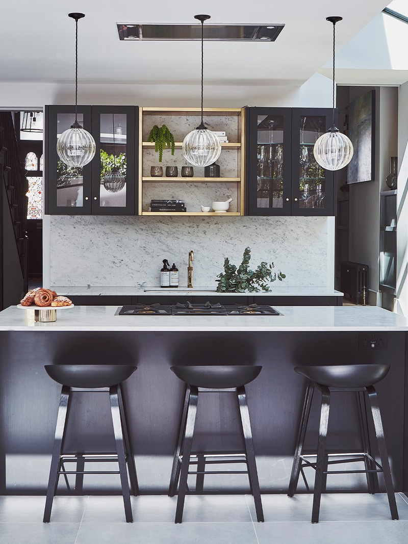
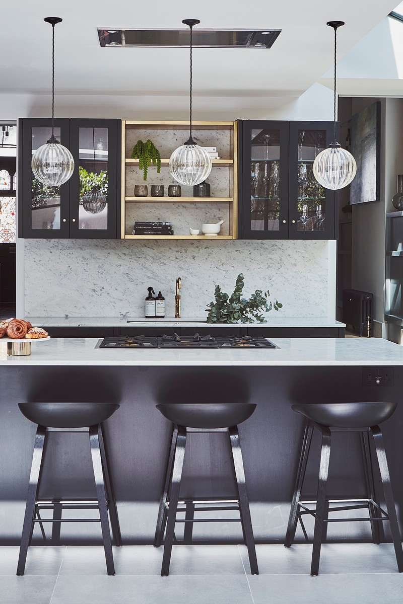
As with any project, materials are everything. The inspiration came from an image of an Italian palazzo which featured a patinated golden wall. The recycled terrazzo worktop then took centre stage on the kitchen island, balancing the minimalist feel of the black kitchen and pale grey floors. We chose to go full width with the skylight to bring more daylight into the space. The patio sliding doors were part of the brief, and we selected these for their slim profile and ability to optimise the views out.
The interior design can’t be detached from the architecture. We always address them together and, most of the time, we design from the inside out. Internal materials, flow and space are as much part of the architecture as the connections to the outside and how the light enters the building. In this project, we brought the exterior in with the use of the same bricks.
Visit AtelierBaulier.com
Ben Edgely, ConForm Architects
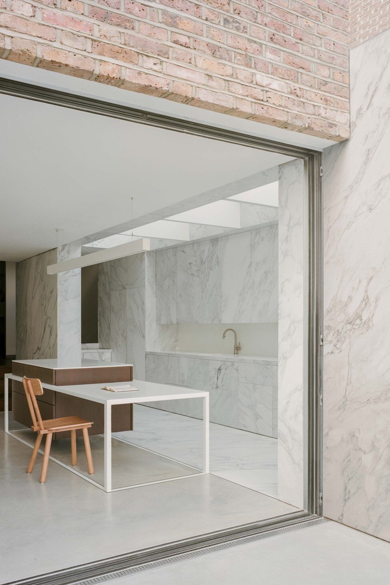
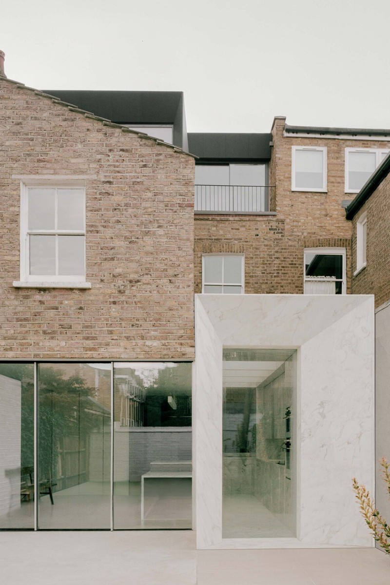
In this Hampstead house, we used a tactile interior scheme contrasted by a distinct, monolithic extension that appears entirely hewn from marble. Designed to offer a seamless connection between a renewed ground-floor plan and the southeast-facing garden, the marble side extension introduces volume and light to the previously dark, disconnected living spaces.
The brief called for a full refurbishment with a functional, serene interior, improved circulation and storage, as well as flexible, spacious dining and entertaining spaces. For a busy family with children, robust, durable but beautiful materials were an important part of the brief.
The extension is entirely clad in marble and is bookended internally and externally by two cubic frames featuring angled, chamfered edges, which direct light and views throughout the home. These sleek angular edges soften any visual bulk of the marble, which is illuminated by overhead glazing along the northern boundary and a deep-set, floor-to-ceiling window which overlooks the rear courtyard garden. Three overhead beams of powder-coated steel offer integrated LED lighting, as well as solar shading throughout the day, bouncing soft shadows and reflections throughout the bright and airy space.
Marble continues through the kitchen on the floors, walls and cabinetry to create a cohesive space. The consistent use of marble throughout demarcates the kitchen as a serene space.
We designed a convivial congregation point, including a generous kitchen island, which appears to float lightly in the centre of the space. The stained oak island is supported by a slender white powder-coated steel frame designed to bring a sense of lightness against the weight of solid stone cladding. The steel frame extends and steps down the island to form a dining table that comfortably seats four.
The openness of this space aims to reinforce the feeling of solidity of the marble side extension, and this guided all design decisions. Materials were specifically selected so they could run inside to out. These elements culminate in a seamless transition, achieving the client’s brief of an enjoyable and easy connection to the outdoors.
Visit ConformArchitects.com
DISCLAIMER: We endeavour to always credit the correct original source of every image we use. If you think a credit may be incorrect, please contact us at info@sheerluxe.com.

/https%3A%2F%2Fsw18.sheerluxe.com%2Fsites%2Fsheerluxe%2Ffiles%2Farticles%2F2023%2F07%2Fatelier-baulier-credit-henry-woide.png?itok=hlb0j0lj)
