Expert Tips From Design Duo Turner Pocock
Style & Inspiration
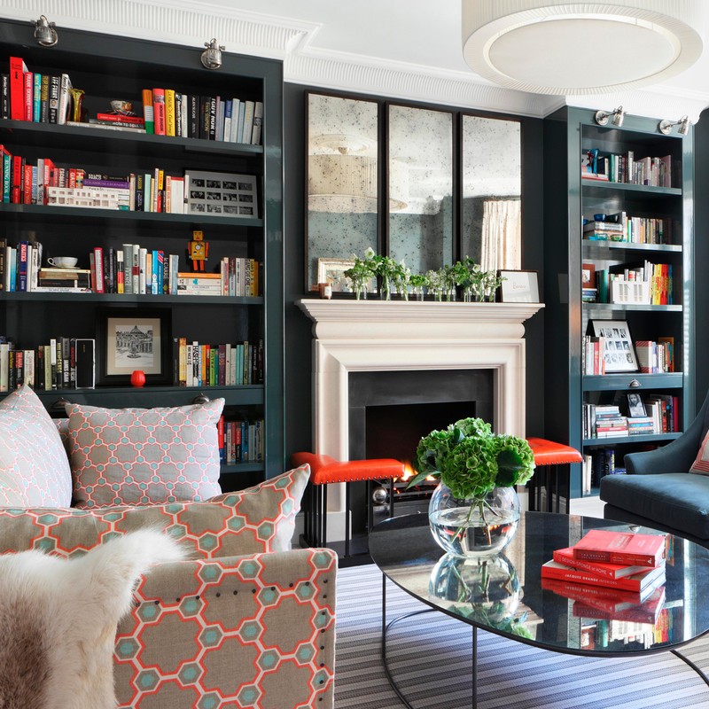
I would define my style as bold and eclectic with a love for pattern and colour. My ethos is to be brave!
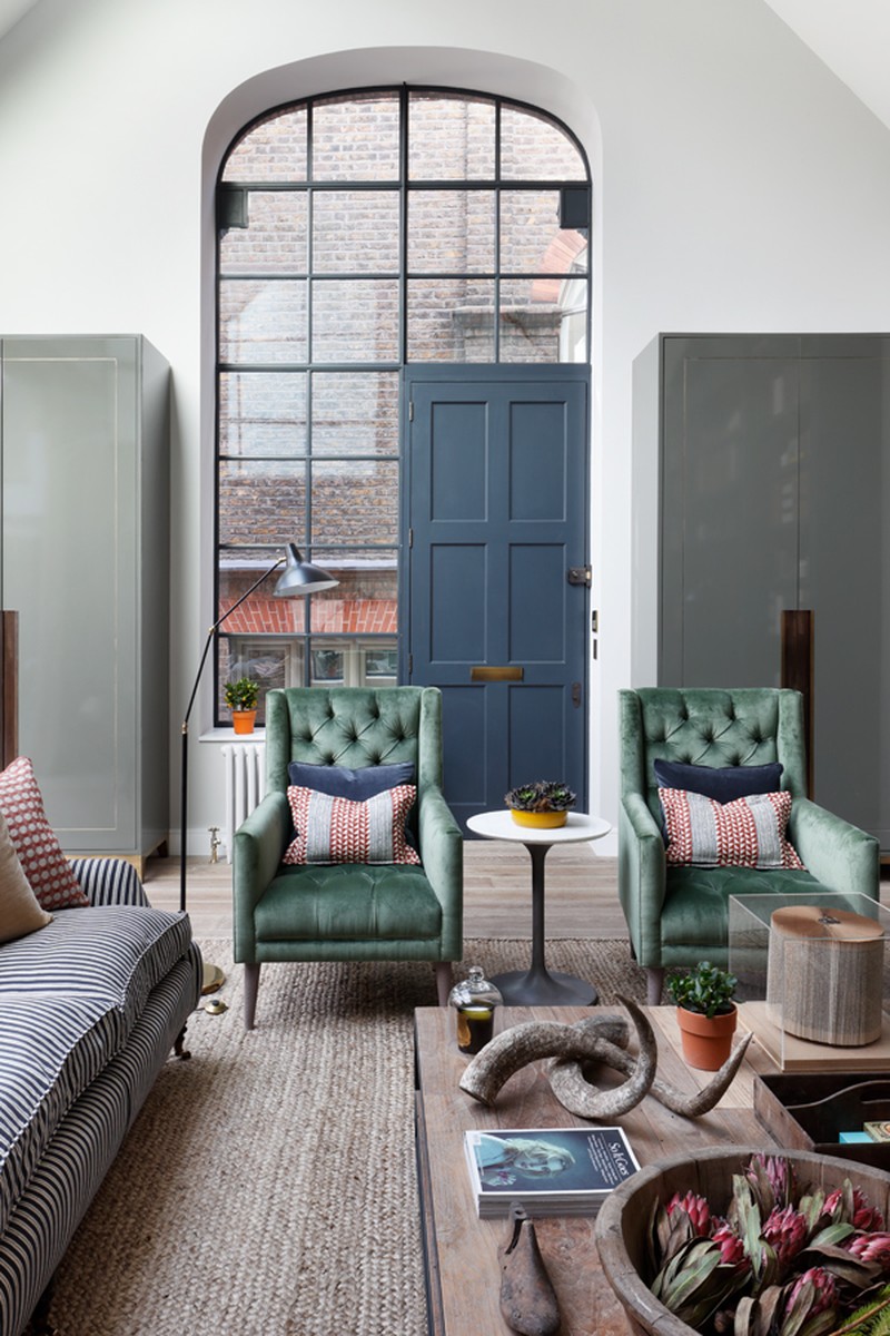
My favourite project was an amazing old artist studio in Kensington with an insane double-height reception room which was flooded with natural light – it’s the project we all would most like to live in (without kids!).
We gravitate towards tealy blues and greens with pops of corals/yellows but are very influenced by the environment we are working in.
We like to be challenged when we design and it’s the sitting room that is often the hardest to deliver in terms of satisfying function and aesthetic – but we pride ourselves on producing rooms that are great in form and function so I think this space is usually where we thrive.
Travel is really important for inspiration. I visited Rome last year and was overwhelmed by all the amazing architectural details, lots of which we have integrated into designs since. We are longing to have an extended trip to India to really explore their printmaking, pattern and colour.
We are really influenced by Belgian designers – Axel Vervoordt, Vincent van Duysen – and American designers – Steven Gambrel, Kelly Wearstler.
As designers we are like magpies, picking up ideas wherever we go. We will often take colour schemes from the immediate environment, but are also influenced by travelling, hotels, flea markets, antique fairs, galleries and museums. We are so lucky to be based in London with its huge range of resources, it’s a constantly changing landscape with new buildings, restaurants and shops springing up and breaking the mould – I don’t think there’s a better city to live in if you’re a designer! In this digital age we encourage the team to move away from Pinterest and Instagram for inspiration and look to our great library of books to try and find fresh images as starting points for ideas.
On Instagram we follow all sorts of different feeds, from fashion to jewellery to interiors – we regularly go down the Instagram rabbit hole! Some of our favourite accounts for interiors are @the.real.maggie.shepherd, @lawson_robb, @banda.property and @howieguja for a new England fix!

Planning
We begin the design process with furniture layouts, carefully mapping out the room to maximise its use. We then move on to fabric and colours, usually starting with a multi-coloured fabric (three colours or more) which forms the backbone of the scheme, pulling the various colours out in pieces across the room.
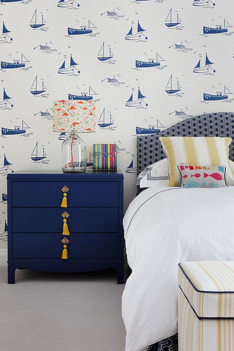
The best way to enhance a small space is to give it a function and then give it some love! Wallpaper often works brilliantly in small spaces – making them into little jewels that punctuate a home.
With a large, open-plan space, divide it into zones with specific uses for each area and use rugs (where relevant) to ground the furniture. In recent years we’ve seen a real move away from open plan living to a more traditional room format.
Functionality is the most important thing to consider when designing a kitchen – really think about how you use your kitchen, what you have missed from past kitchens and what you want from the space. In our view it should be a very practical space where you don’t have to worry about spilling things on work tops etc – once you have that right, the rest can follow.
We are big fans of a natural stone called Silver Shadow – it’s actually a marble but it comes in tile format from lots of suppliers so isn’t crazy expensive. The great thing about it is there is lots of ‘movement’ in the colour so it doesn’t show up dirt badly! We’ve done all sorts of worktops but the new man-made marble look-alike products are amazing!
Decorating
When we are creating a colour scheme or mood board, we start with a single multi-coloured fabric – this may end up only being used as a cushion in a room – but it rationalises the scheme and gives you a palette to work with, which you can then draw out across the furniture of a room.
The amount of colour we use depends entirely on the space, but the key is having enough interest whilst also creating a sense of calm – you can’t have show pieces at every turn, it makes for a very unrelaxing space.
Create balance in a room by mixing fabrics that are different textures, patterns and scales – mixing plains, stripes, geometrics and more organic patterns is crucial.
We always include antique pieces in a room – it creates a sense of authenticity and curated order. Generally, we find an interesting piece that we fall in love with and substitute an item we have considered in the furniture plan.
We try to steer clear of trends in interiors – in fact, Emma started life in the fashion industry and moved away from it because she wanted to work in a sector with greater longevity!
If things are curated carefully there is no reason why pieces from any period can’t work together.
Lighting
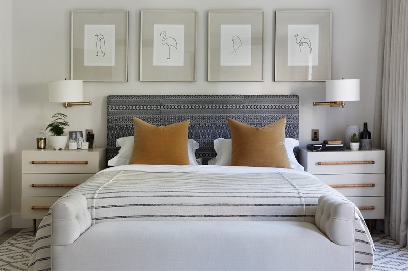
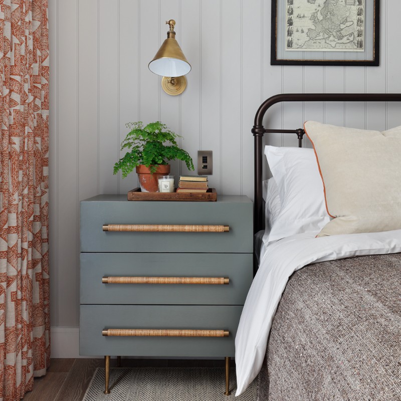
Lighting is a vital part of creating atmosphere in a room and it’s crucial to provide even low-level lighting around a room. We usually work alongside lighting designers who provide task lighting layouts for builders to execute once we have finalised our furniture layouts and decorative lighting scheme.
We have always lived by the rule that you can’t make a dark room light and so in north-facing rooms we embrace the dark side and try to create warm cosy spaces with bold colours. With lighter rooms we tend to stick with a fresher palette.
People used to install great grids of down lights in rooms which created stark environments to spend time in; now there is a move to creating pools of light around the perimeter of a room with down lights bouncing lights off curtains and walls - this creates a much cosier space. As with all elements of design the important thing to think about is the function of a room and to make sure you deliver suitable lighting for that purpose!
We would always recommend you design the whole space and then execute the plan as you can afford to – buying in a piecemeal way without a plan can have terrible consequences! Splurge on rugs, lamps and art; save on curtain fabrics!
Suppliers
Where you go for:
Furniture – so many to mention but my favourites include: Lorfords, Chelsea Textiles, David Seyfried.
Bathrooms – Porter, Lefroy Brooks, Samuel Heath.
Wallpaper – lots of different suppliers, we use grass paper a lot and love the new colour range by Amelia Carter for Altfield.
Paint - Paint and Paper Library.
Lighting - Urban Electric Co, Tyson, Penny Morrison, Vaughan , Richard Taylor, Pooky.
Flooring - Tim Page Carpets, Walking on Wood.
Tiles - Popham tiles
Kitchen hardware - Armac Martin, Joseph Giles, Buster and Punch.
Visit TurnerPocock.co.uk
DISCLAIMER: We endeavour to always credit the correct original source of every image we use. If you think a credit may be incorrect, please contact us at info@sheerluxe.com.
